"Week 1 Homework Submission"
8 months ago (in january) i've experienced the first class made by cg cookie and it helped me to progress a LOT.
I decided to try it again especially because blender 2.8 is comming soon, so i think this class is the perfect place for me to be comfortable with.
My goal during these month is to see if i became stronger or not in cg.
I've already completed the exercice of "model with primitives" a couple of month ago,
This was my submission: https://cgcookie.com/exercise/modeling-with-primatives/exercise_submissions/12261
This image is what i've made the first time i've done this exercice in the class of January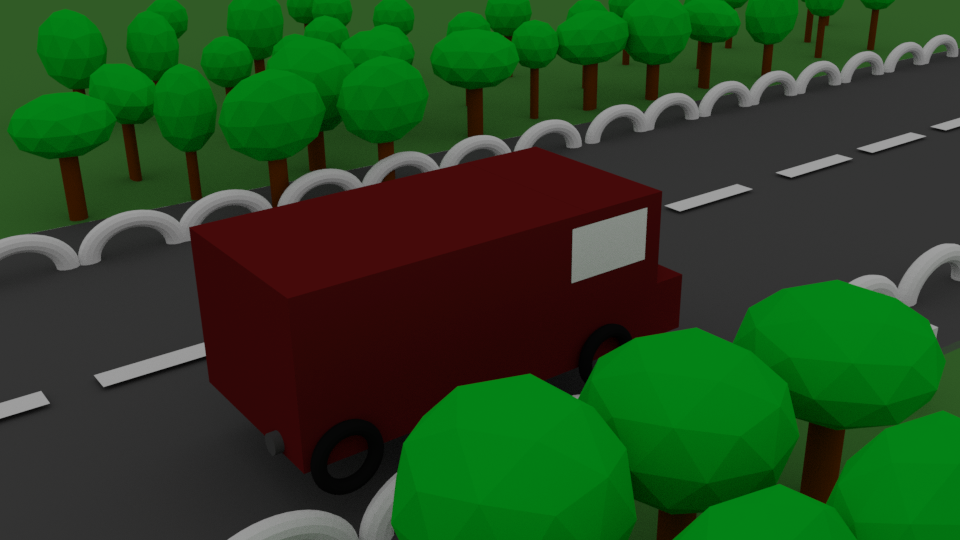
And... this is my current level and my submission: (I dont know if i have to upload it into sketchfab or not)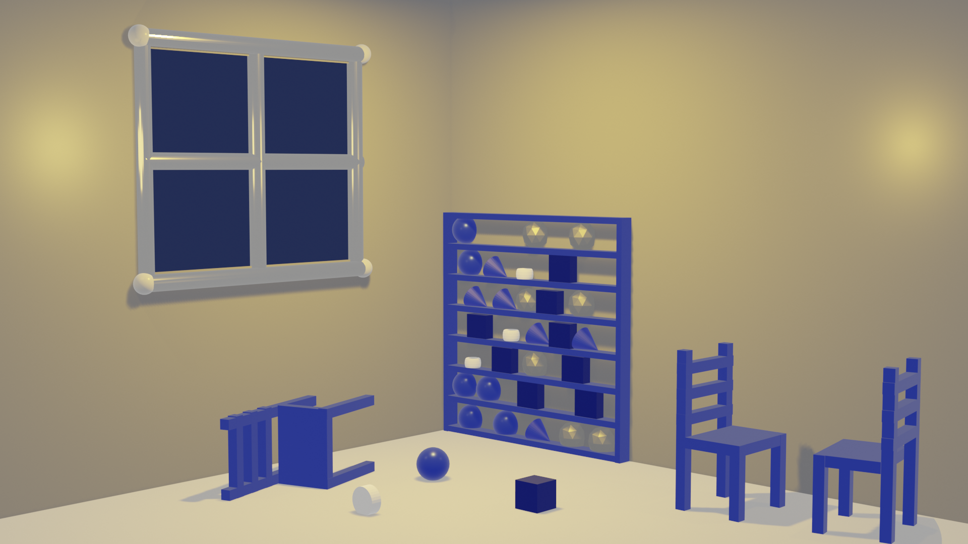 My personnal thoughts during this exercice:
It's SO HARD to be constrain with primitives only... i wanna sculpt !
At least, please give me the Edit mode... xD
![]() galledark I feel your pain about primitives haha, but the improvement is very noticeable. I'd say the chairs could *possibly* be a bit too small but that could just be my eyes playing, also nice touch with the materials, makes it really stand out.
galledark I feel your pain about primitives haha, but the improvement is very noticeable. I'd say the chairs could *possibly* be a bit too small but that could just be my eyes playing, also nice touch with the materials, makes it really stand out.
![]() galledark Good work, definetly seeing improvements, and yeah, having to work with just primitives makes things bit harder. but also more creative. :)
galledark Good work, definetly seeing improvements, and yeah, having to work with just primitives makes things bit harder. but also more creative. :)
![]() galledark I like to see that you're taking this class again and showing us where you were in January. I definitely see improvement. Nice work, Yannis. It's an A from me.
galledark I like to see that you're taking this class again and showing us where you were in January. I definitely see improvement. Nice work, Yannis. It's an A from me.
And don't worry: Edit mode and Sculpt mode are around the corner 👌
![]() galledark nice play with the primitive shapes, thanks for posting your first scene from the January class, now I remember to that
galledark nice play with the primitive shapes, thanks for posting your first scene from the January class, now I remember to that
Yup agreed... so hard not to [tab] into edit mode. Great submission - great improvement
Week 2:
Fist of all a HUGE thanks to everyone for the feedbacks, i didn't take time to answer to each of you, i only put likes to your comment, sorry for that i'll take time to answer you now ^^'.
That said lets go for the submission:
"Week 2 Homework Submission"
8 months ago (in january) i've experienced the joy of edit mode toward a project: a sword.
The name of this sword is Cigüe (it's a poison).
Here was the sword: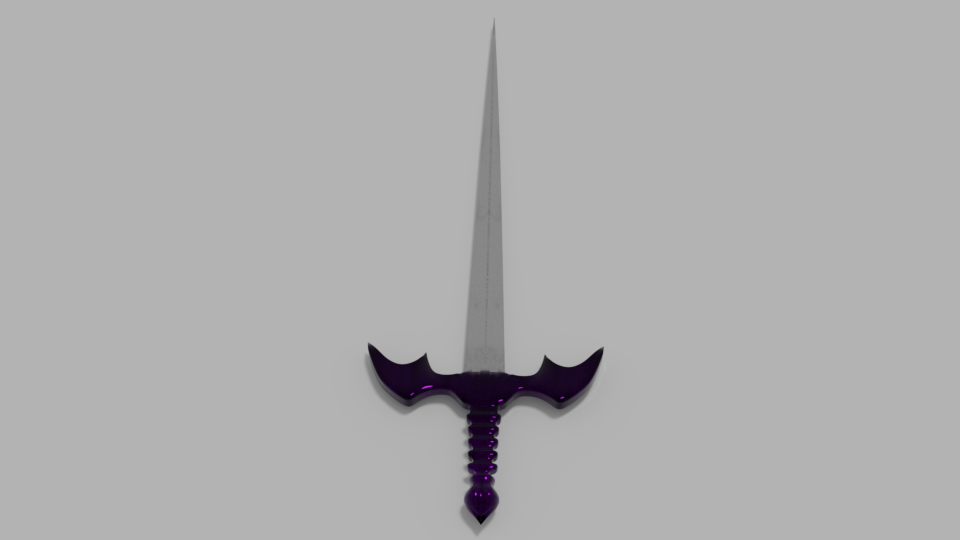 I decided to re-create it again, but this time with some...improvements ^^
This is the final render: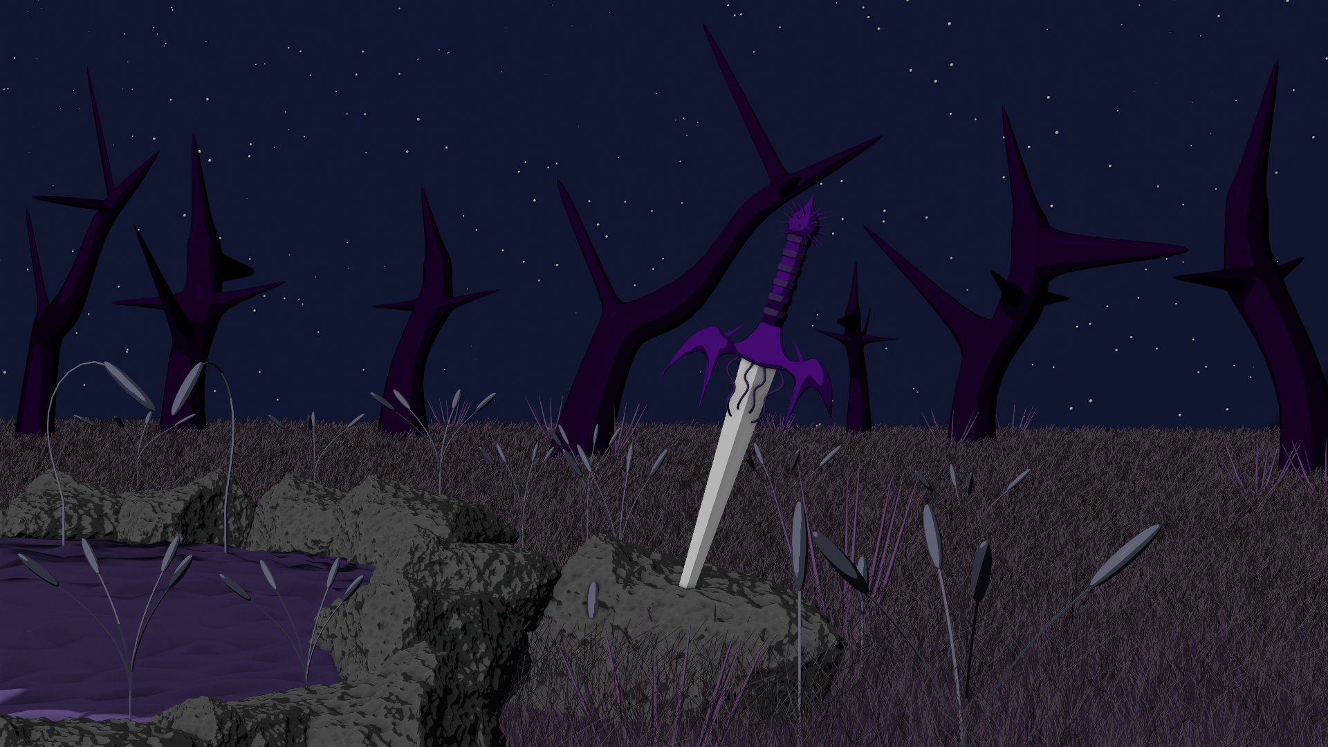
I have to thanks ggolden-kitty for his advices about matcaps it helped me to made this cartoonish style that i like a LOT ^^
AND: the course of jonathan lampel about grass and particles... this tool is so powerful....
![]() galledark That's a huge improvement indeed, it's a complete landscape! That matcap works perfectly here. Nice little scene, really enjoy it 😊 How did you make the stars background? and the dents in the rocks?
galledark That's a huge improvement indeed, it's a complete landscape! That matcap works perfectly here. Nice little scene, really enjoy it 😊 How did you make the stars background? and the dents in the rocks?
ssmurfmier1985 Thanks miranda glad you liked it =)
For the rocks i just followed this tutorial:
https://www.youtube.com/watch?v=D3Lq9SOpzDM
Its an icosphere edited with a subdivision surface (of 5 i think) and a displacement modifier.
Just be aware that the effect of the displacement (as all modifiers) shows only in object mode. So i had to tweak the options of the texture in Edit mode and switch back to object mode to see the result...
For the starry sky it's just a plane with a particle system on it.
I used the technique that jonathan lampel shows into the "creating grass in blender" course.
In the chapter 2 "modeling with grass" he shows that you can use an object as a particle to create tons of instances of it ^^.
I just took a sphere (with a emission material) and... POOF !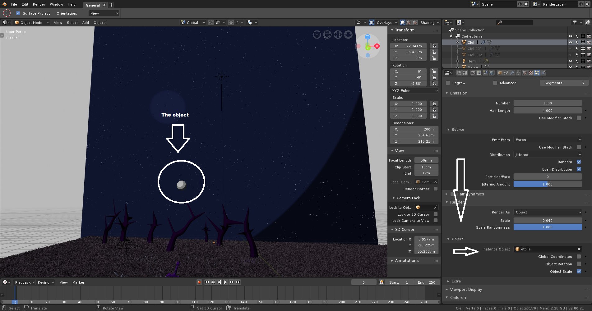
(note: the sphere must be scaled a bit larger to see results with this matcap ^^)
![]() galledark Thanks for explaining! I'm gonna try that out myself when class is over 😄
galledark Thanks for explaining! I'm gonna try that out myself when class is over 😄
Neat! I like everything except for the rocks and grass. Those things just don't fit the style the rest of the objects have, so it's jarring for me. Maybe it's too realistic compared to the more simple objects? Or maybe the rocks and grass are too noisy compared to the rest of the scene?
![]() silentheart00 Thanks for your feedback :)
silentheart00 Thanks for your feedback :)
i must admit you're right i didn't see it before but... The grass and the rock seems less "cartoonish" than the others objects (sword, plant, trees...)i dont know what cause this effect :o
![]() galledark Maybe the objects are just too complex overall? Maybe try making a basic rock without the displacement, just a bunch of flat faces, and see if that'll work better with the overall style? Don't know what to do about the grass, though.
galledark Maybe the objects are just too complex overall? Maybe try making a basic rock without the displacement, just a bunch of flat faces, and see if that'll work better with the overall style? Don't know what to do about the grass, though.
![]() galledark Very cool approach to rebuild this sword into a full scene. And wow, you're rocking particle grass in there! Way to go all out. A+ 👏
galledark Very cool approach to rebuild this sword into a full scene. And wow, you're rocking particle grass in there! Way to go all out. A+ 👏
One minor note: Compositionally it's a little dark. Can be difficult to make out shapes clearly. The cartoony aesthetic is really nice though.