My homework thread for the August 2018 Class
To keep track of the homework, I've decided to put links to the gallery here:
Week 1: Primitive village (with additional close-ups)
![]() shiennar Katerina is going to take all the XPs as usual :D Great to see that you participate again, I am always very interested in your imagined climates in Blender
shiennar Katerina is going to take all the XPs as usual :D Great to see that you participate again, I am always very interested in your imagined climates in Blender
![]() csehz That's very kind of you to say, thank you. I'm working on something special for my first scene (way too ambitious as usual) so I hope I won't disappoint. :-)
csehz That's very kind of you to say, thank you. I'm working on something special for my first scene (way too ambitious as usual) so I hope I won't disappoint. :-)
Homework Week 1
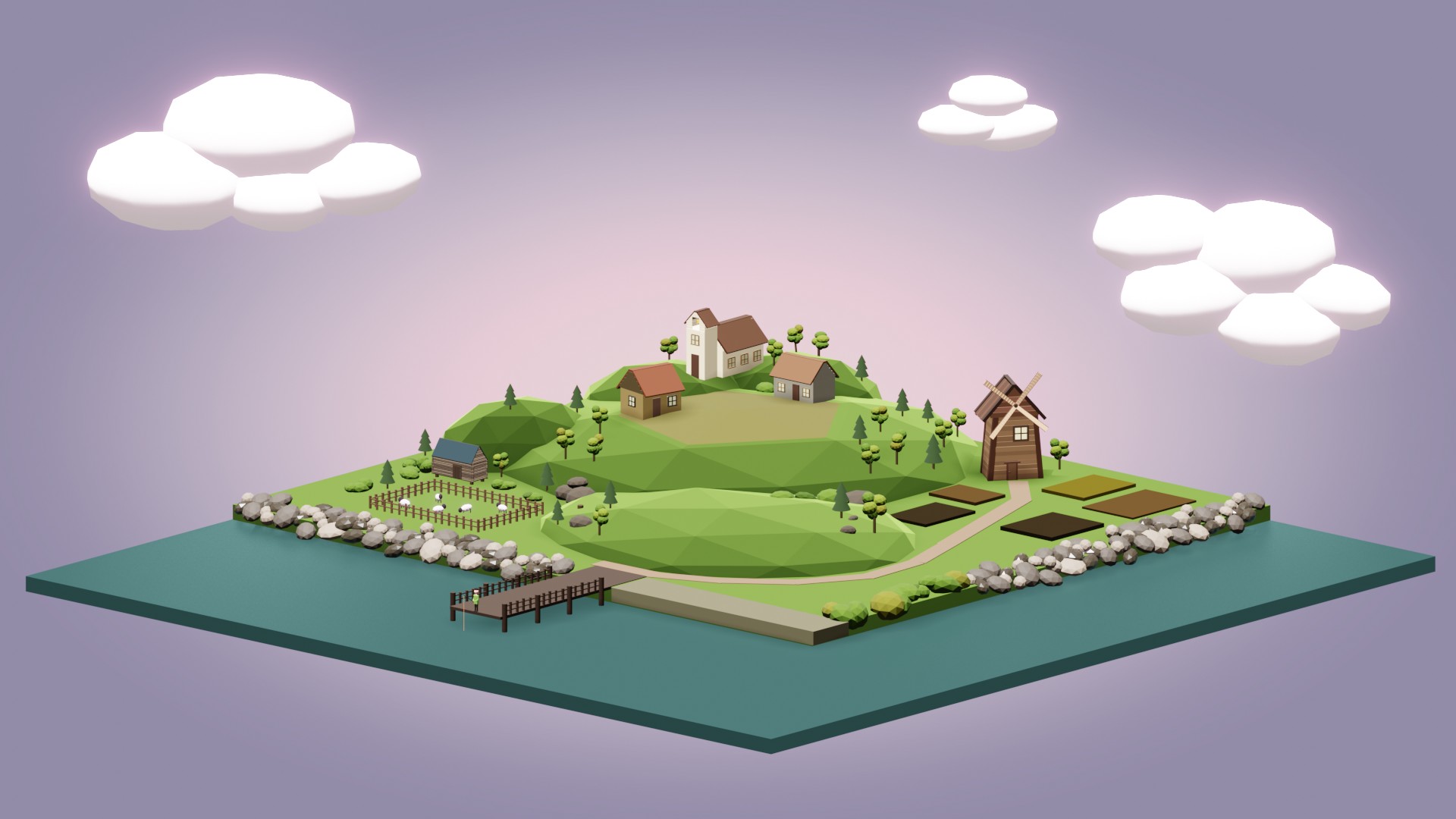
Last time I did this exercise I created a primitive room. I thought I'd go beyond that this time...
Almost a thousand objects later, I think I might have overstretched myself a little. :-) But I love this exercise. It forces you to think about objects differently and find creative solutions to problems you could easily solve in a more traditional way. (Like creating a church bell from primitives. And yes, there is a church bell. About two pixels high.)
I'm fairly happy with how things turned out, even though there are still many that could be improved. The trees are not as varied as I'd like them and there is a lot of space that feels empty. I also tried to stay on top of things by naming everything appropriately but I have developed several naming conventions so things are not 100 % neat.
With that said I'm going to post this slightly ahead of schedule so that you can find any errors I have missed (and I'm sure there are some). There is the download link for the scene.
I'm going to write my usual blog post later today where I'll detail some of the issues I faced when creating the scene. It will be available in the gallery together with the render and a few in progress images.

![]() shiennar Wow, your scene is wonderful, getting truly inspired by it! Maybe a cross on top of the church? Beautifully done Katerina, I love it 😍
shiennar Wow, your scene is wonderful, getting truly inspired by it! Maybe a cross on top of the church? Beautifully done Katerina, I love it 😍
I KNEW IT!!!! The earth is flat. I can just see that poor bloke at the end of the pier thinking "What if I cast my line just out a little further? Will I catch the fabled sea monster."
In all seriousness, VERY nicely done - all the detail - countryside picturesque
![]() pffsfs I love reading your comments, Scott, they always make me laugh. :-) And thank you, I'm glad you like it.
pffsfs I love reading your comments, Scott, they always make me laugh. :-) And thank you, I'm glad you like it.
ssmurfmier1985 Thank you. I was thinking about adding the cross, but then I thought that not all churches necessarily have them and I liked it better this way. It's one of many details that I ended up not adding - another one is boats at the pier and swans on the river. Well, maybe next time. :-)
this scene is really wonderfull . so much details like the tree's the rocks houses and those sheeps (also nice job with the fence .is it called fence ? ) and then there is the fisherman :D lovely done . i also like the lightpurple pink background with the clouds it fits completly :D
yyukinoh1989 Thank you. :-) I don't know if shepherds call it a fence but I sure did. Choosing right names for various odd parts often seemed more difficult than to actually create them. As to the background, that's another struggle of mine. Finding the colour that will complement the rest of the scene. I spent quite a lot of time in the colour picker and this was the only one I liked. I'm glad I'm not the only one.
This is beautiful. I love it! I have a soft spot for isometric low poly scene's. 😃👍
![]() shiennar "Phew! Worked my backside off finishing my homework, quite proud of it in a way! I wonder how everyone else is doing?"
shiennar "Phew! Worked my backside off finishing my homework, quite proud of it in a way! I wonder how everyone else is doing?"
*sees this*

Nah in all seriousness you've done a fantastic job, I won't lie that I'm jealous of your skills but I can certainly appreciate the attention to detail here. Looking at your previous beginners class isometric scenes really seem to be your muse so I'm really looking forward to seeing what you've got up your sleeve for the rest of this class!
![]() thecabbagedetective That's funny, Aaron, because I had the exact same reaction a few minutes ago, looking at your scene. :D And you did surpass me in the number of objects used, so there is that... I'm still lagging behind in my resolution of being more active in the thread(s) but I'll be sure to drop by and leave a comment.
thecabbagedetective That's funny, Aaron, because I had the exact same reaction a few minutes ago, looking at your scene. :D And you did surpass me in the number of objects used, so there is that... I'm still lagging behind in my resolution of being more active in the thread(s) but I'll be sure to drop by and leave a comment.
Nice! Good for you for pushing yourself. Colors are great, some of the details are nice. You know where you're lacking, so no need to repeat that. Good work.
![]() shiennar That's awesome - it makes me think of a mobile game of some kind; I want to play it. :)
shiennar That's awesome - it makes me think of a mobile game of some kind; I want to play it. :)
![]() shiennar I was eager to see your submission, Katerina - your primitives exercise from back in January is one of my all-time faves 😀
shiennar I was eager to see your submission, Katerina - your primitives exercise from back in January is one of my all-time faves 😀
This did NOT disappoint. You've got great taste artistically and plenty of skill technically. Wonderful job! A++
Thanks for sharing your .blend file! And please post a link to your blog post as well. So cool that you do that for your projects.
@theluthier Thank you. :-) I usually hide the blog post links in the gallery submissions, but here it is in full:
https://honestmisskate.blogspot.com/2018/08/primitive-village.html
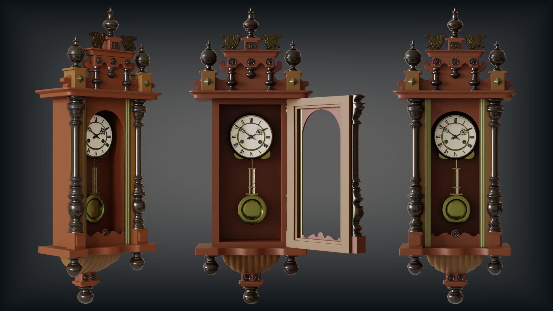
Phew, I'm happy I managed to finish this one on time. I always find hard-surface modelling difficult to estimate. What seems manageable at the beginning quickly eats up all the time in details. Anyway. I'm sorry to say that I had to do this in 2.79. I started out in 2.8 but I found out that "apply scale" doesn't work (it's more of a reset right now). And since I wanted to model it to scale... well. I thought I might texture and render it in 2.8 but when I opened it with that version today I found out that Bevel - Weight option is also broken. So, 2.79 all the way. And while I'm listing my transgressions I might also add that I used MultiRes sculpting for the eagles and flower details. I don't think that I could've done it with box-modelling.
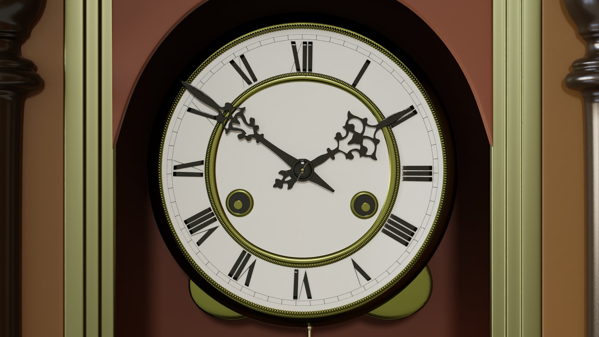
The clock was made to match this reference from eBay (pretty decent place to go hunting for various angles of the same thing). I didn't use any textures (apart from HDRI) - everything is modelled.
So, here are the renders, the Blender file for 2.79, and the blog post: https://honestmisskate.blogspot.com/2018/08/antique-clock.html

