I'm currently working through the Fundamentals of Lighting Course and there's a recommendation to create a community progress thread. So here we go.
I'll start by posting a few recent works, and take it from there.
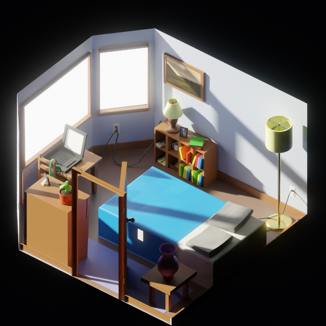
Final image from the Fundamentals of 3D Mesh Modeling in Blender low-poly room exercise. Turned out fairly well. I liked modelling some of the small details like the cords of the various appliances. Overall, it was a good way to review some of the basic 3D modelling I've been learning over the past couple months.
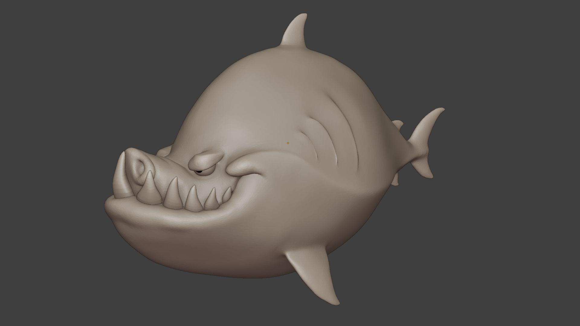
Viewport render of my final submission for the Fundamentals of Digital Sculpting course. Again, fairly happy with the result. It helped having a tablet, and bit of practice. Really loving digital sculpting, thinking of making it a focus, after I get through the fundamentals learning flow.
That's a great room! I like that you got the door in there but still have invisible walls. Very nice!
Thanks ![]() joshcanfield . Much appreciated, especially coming from you. I was checking out your progress thread the other day... that's gotta be one of the best room submissions ever.
joshcanfield . Much appreciated, especially coming from you. I was checking out your progress thread the other day... that's gotta be one of the best room submissions ever.
Working on the exercise for @jlampel s Fundamentals of Lighting course. I have the hardest time with lighting for some reason... results so far have been pretty lackluster. If anyone has suggestions to improve anything, feel free to leave a comment.
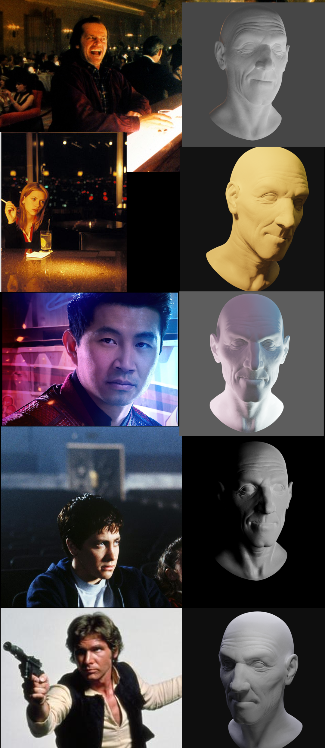
Looks great! Just one nit, the shadow on Hans face is a lot darker than the sculpt. Similar to the one above it.
Thanks for the feeback ![]() joshcanfield . I'm glad things don't look too far off, felt like I was doing an endless amount of tweaking to get things to (sort of) work. You're right about the Han one... I had a hard time getting it bright enough on the one side, and still maintaining dark shadows on the other. Maybe I'll try crushing the dark values in post again.
joshcanfield . I'm glad things don't look too far off, felt like I was doing an endless amount of tweaking to get things to (sort of) work. You're right about the Han one... I had a hard time getting it bright enough on the one side, and still maintaining dark shadows on the other. Maybe I'll try crushing the dark values in post again.
![]() jammingammon That's a very cozy looking multi-purpose low-poly room for working (laptop) and relaxing (all the other stuff 😉) ! Great work 😀👍! I very much like your idea with the door at the viewer's side of the room as a kind of invitation for entering it.
jammingammon That's a very cozy looking multi-purpose low-poly room for working (laptop) and relaxing (all the other stuff 😉) ! Great work 😀👍! I very much like your idea with the door at the viewer's side of the room as a kind of invitation for entering it.
Hey, nice work ![]() jammingammon ! Sorry it took so long for me to get to this. Here are a few notes on each:
jammingammon ! Sorry it took so long for me to get to this. Here are a few notes on each:
#1 - The light size and intensity looks really close, but it could definitely use some color. Almost no light is pure white. Even if it looks white like the bar light in the reference, it's only because it's so intense that it's desaturated. As it bounces around and fades out the saturation comes through. The reference also doesn't really have much of a rim light.
#2 - This one is pretty spot on! The light could be a little more saturated and the light could be hitting the upper part of the cheekbone more on the shadowed side like in the reference, but it's pretty close in overall style.
#3 - Another one that could really use more saturation. I wouldn't crank it all the way up to 1, but probably pretty close. It's interesting how your render has the 'evil' look where the light hits the bottom of the brows, but that's not present in the reference. The light is hitting there slightly, but in a really soft way. You can tell there's a bit of light coming from the front because of the way his nose is shaded. The reference looks calm and serious while the render is more intense and creepy.
#4 - This looks super close - just a little more direct light hitting his cheekbone on the shaded side and a bit of backlighting would make this spot on. You can tell that the main light is colored a bit warm because you can compare it to the cooler light hitting the back of his head.
#5 - Similar note to before - the little triangle patch on his cheek on the shaded side does a lot of work when it comes to defining the shape of the face while keeping the shadows relatively sharp. Also note the shadow that cuts his left eye almost in half, which really gives his character a slightly mysterious and intense feel.
Hope that helps and keep up the good work! I would love to see another crack at this if you feel up to it to see if you can capture the feeling in reference rather than the technical light placement. It's a lot harder than it looks but I know you can do it!
Hey @jlampel , no worries. I assumed you were busy working on Pothead. That course looks pretty dope by the way, I may have to check it out next year sometime, when I've finished the fundamentals.
Thanks for the detailed feedback. Color was definitely something I neglected when working on these, got a bit of tunnel vision focusing on precise light placement. I will take another look at it in a few weeks after the Halloween Challenge wraps up. Thanks again.
Participated in a couple of the challenges recently. First one is from the summer competition back in August, and the second is from the Halloween challenge that just wrapped up. Both are a little rough, but just looking to get some practice in at this stage.
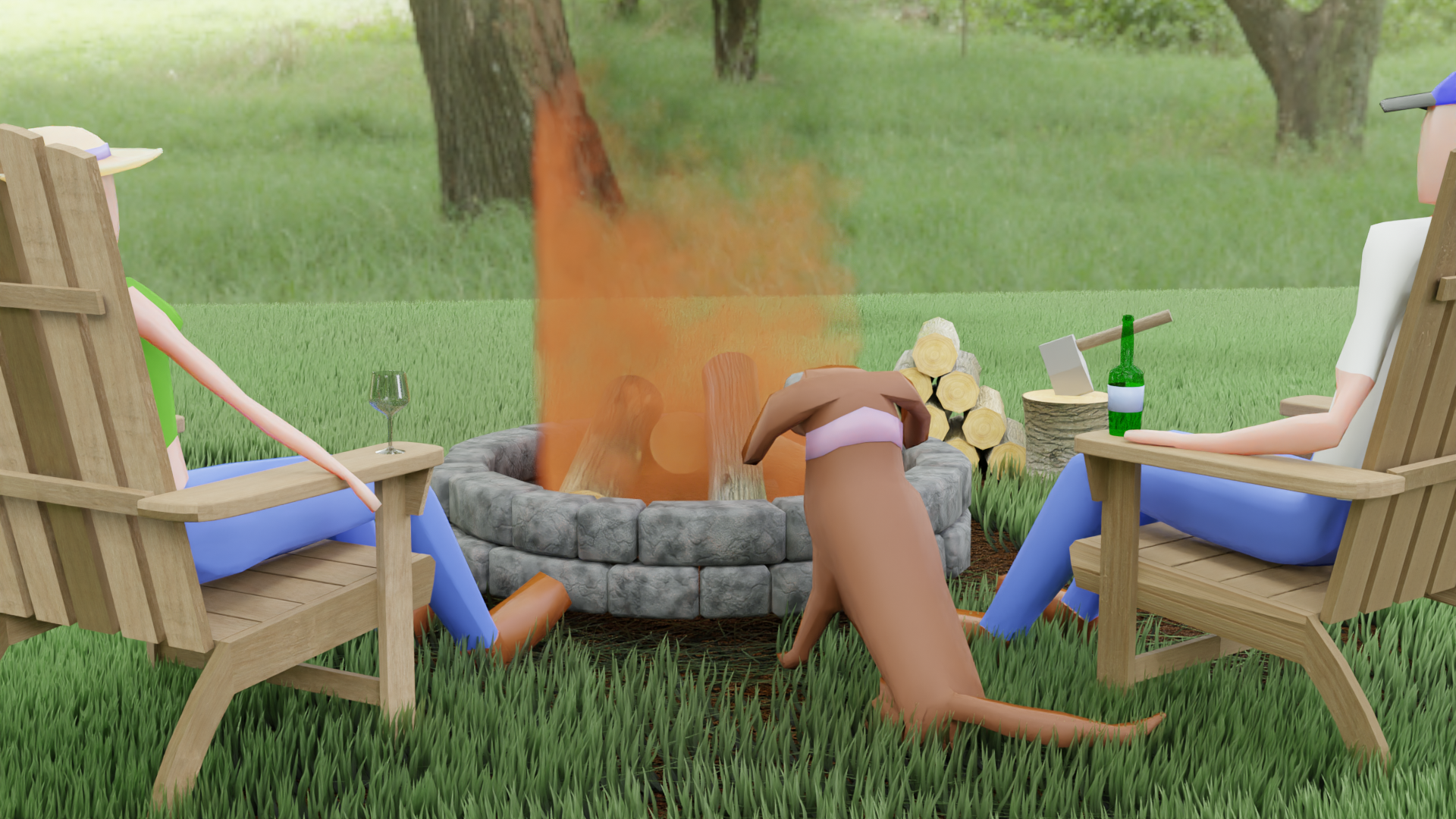
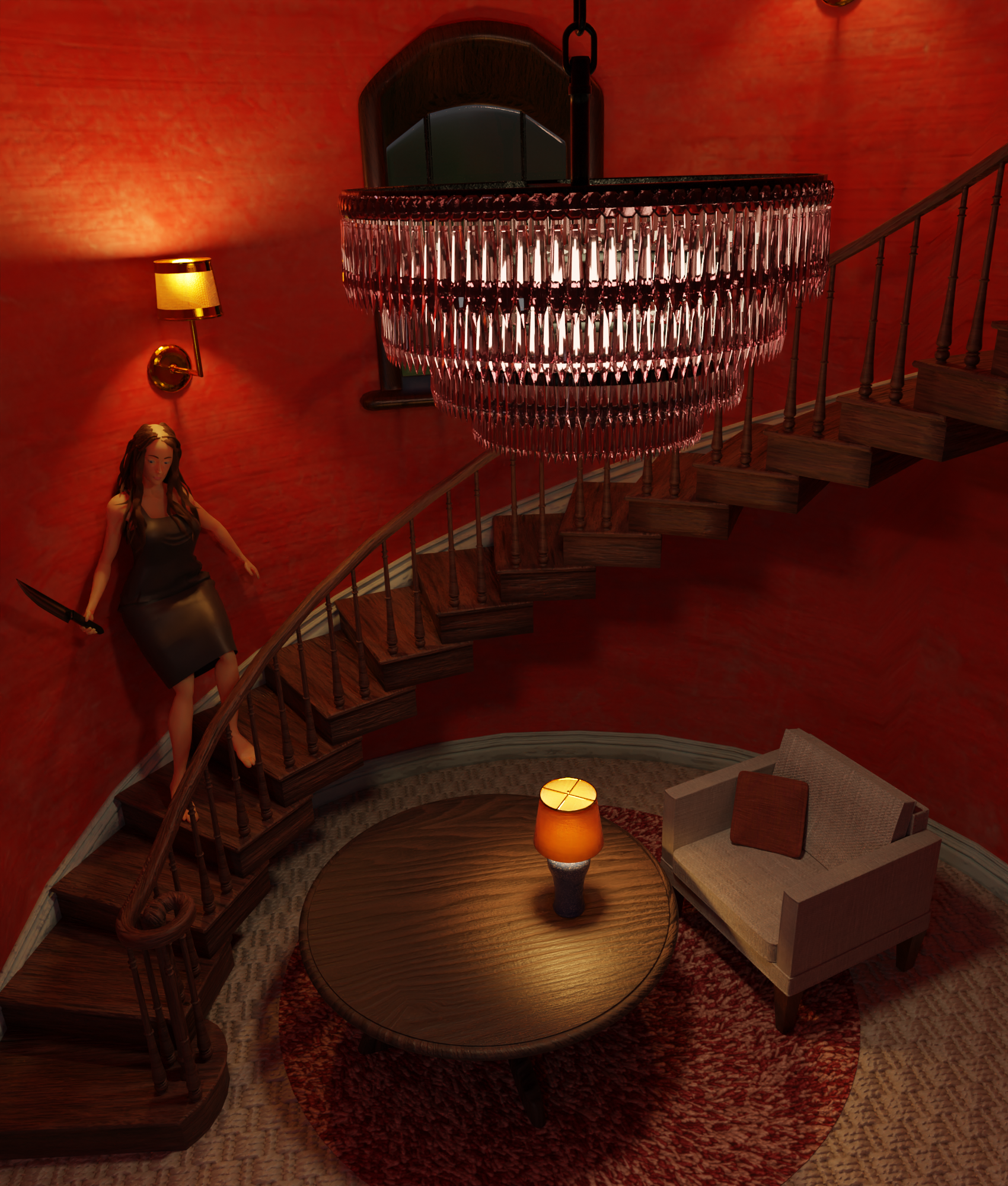
I'm planning to finish up with the Fundamentals learning flow by the end of the year, and maybe put together one more gallery project in the meantime.
Finished the final assignment for @jlampel s Fundamentals of Blender Materials and Shaders course. I think it went okay. I tried to recreate the glass shader, showed earlier in the course, and to add some yellow to the notebook papers.
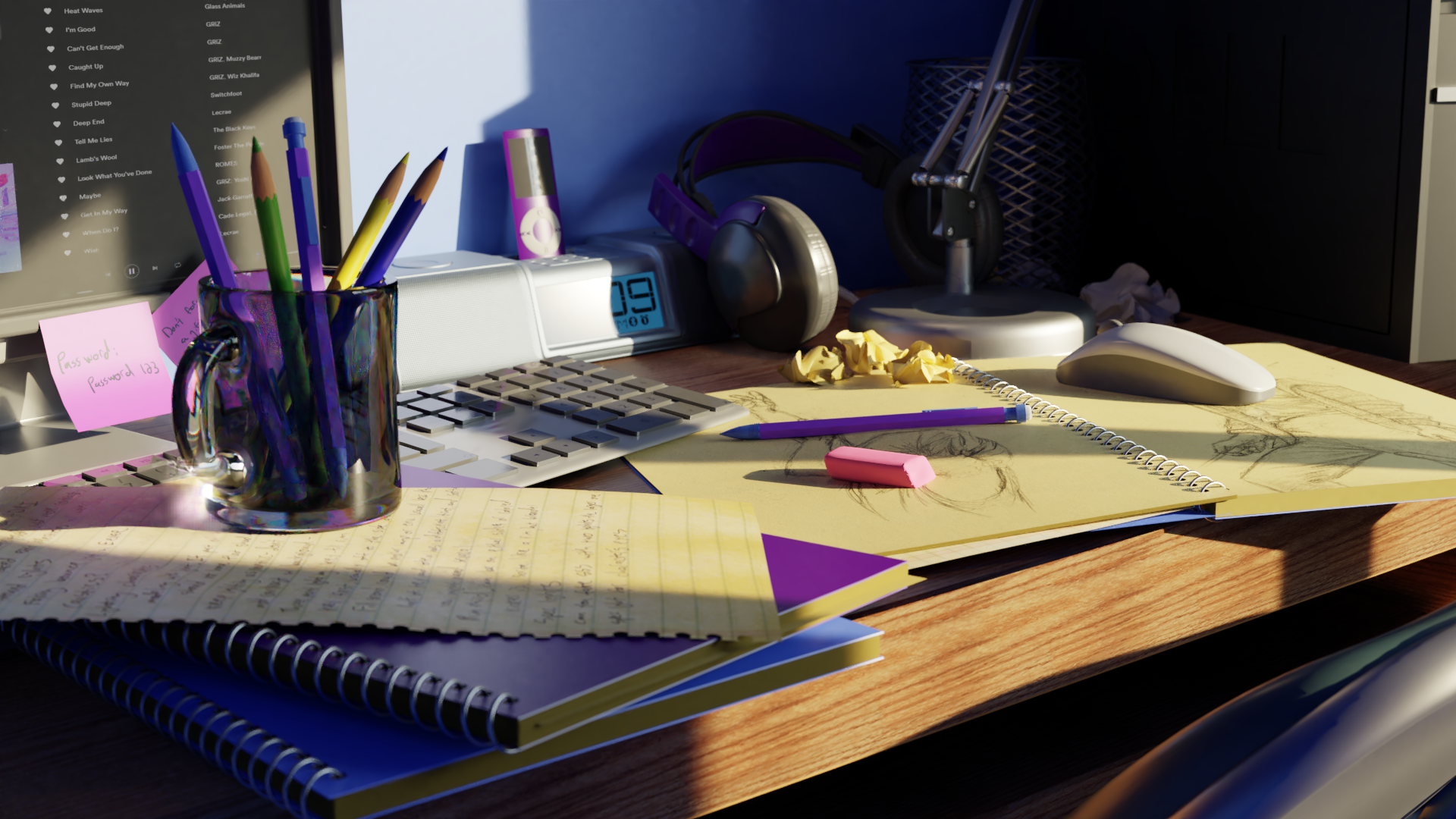
I'm submitting the exercise submission, so if anyone wants to be a pal and grade it, Id appreciate it. I'm planning on redoing the Fundamentals of Lighting final exercise next, and then the Fundamentals of Texture course, to finish off the Fundamentals Learning Flow.
I updated my assignment for @jlampel s Fundamentals of Digital Lighting course. I wasn't able to improve image #2, but I tried to implement all other suggestions, specifically I increased the saturation of lights in most images.
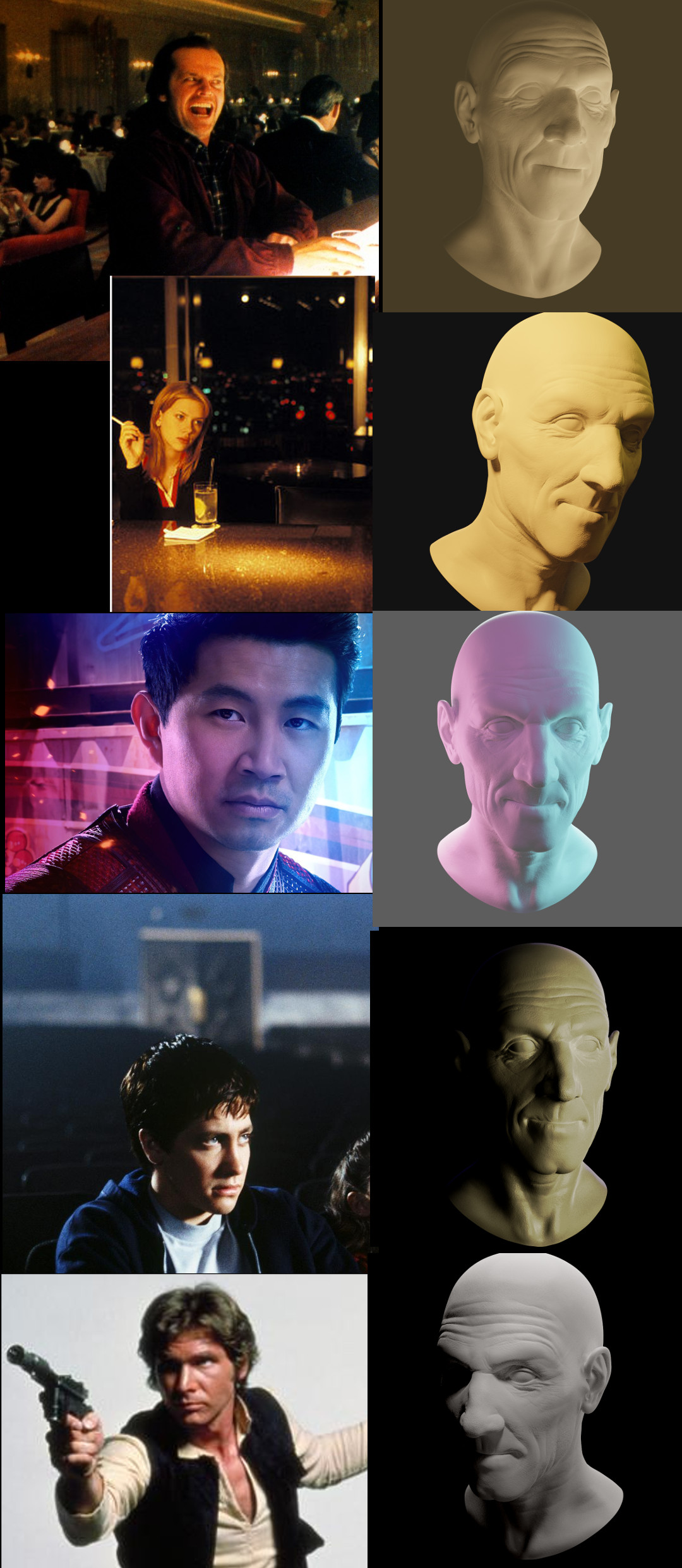
I'm also submitting the exercise for grading, so if anyone wants to head over and grade it, it would be much appreciated.
1. Jack Nicholson - way too bright
2. Scarlet Johansson - light spot on but there should be a little light at the bottom of her chin
3. Simu Liu - Perfecto!
4. Jake Gyllenhaal - there should be a rim light behind then you're all set.
5. Harrison Ford - there should be a rim light on his right.
Thanks for the input. You were right about the two rim lights, adding those improved the images. For the Jack Nicholson one, I had increased the world background strength a little, to give more of the warm bar color. I think this is probably the issue with brightness that you noticed. I tried dialing that back a bit, not sure which way was better.
I decided to take down the submission for the time being and wait to see jlampels comments.
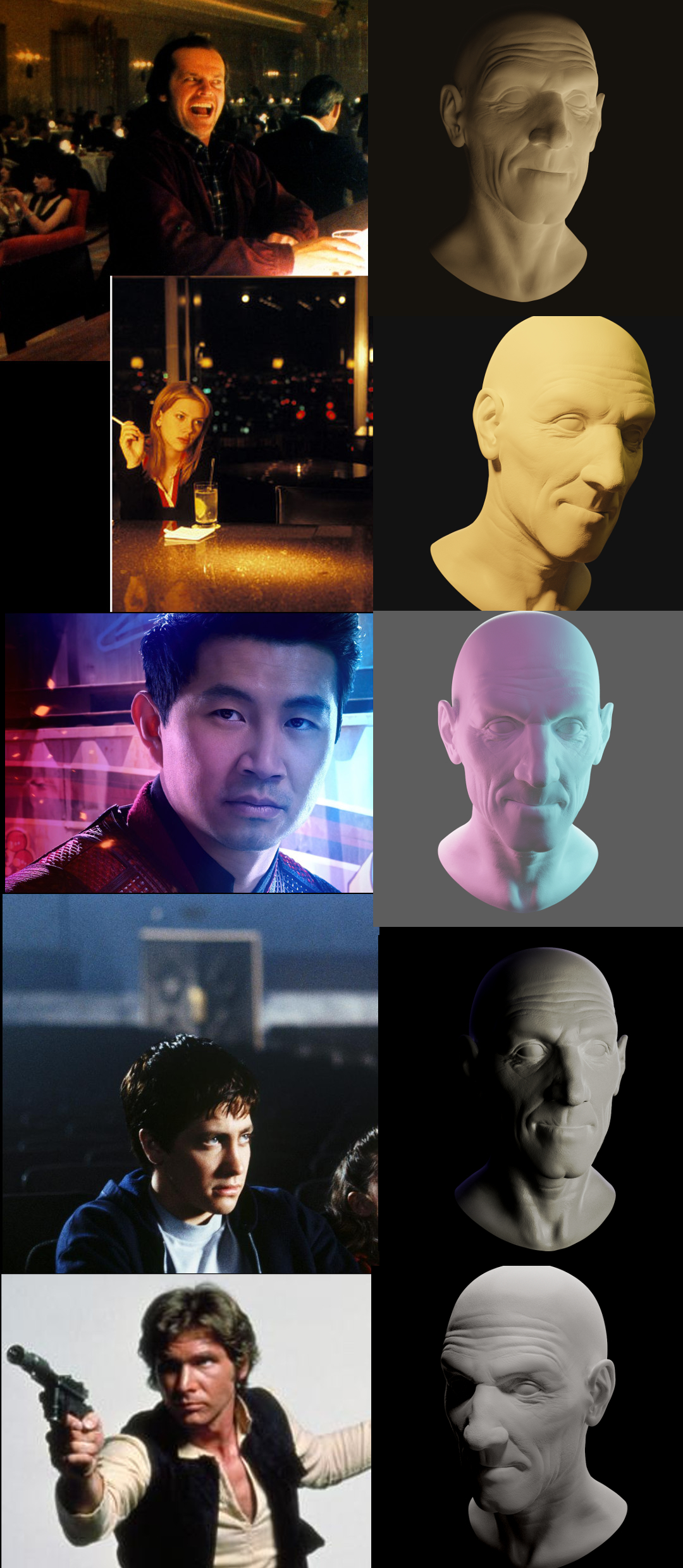
Darn. The rimlights are coming across a lot fainter now than when I was working in blender. I'll do one more update after I finish with the Texture course.
Very nice work. I really liked the sculpting as well. The fact that you get something organic from it is extremely satifying to me.
Thanks ![]() ponchismaaan ! Yeah, its pretty cool, and something I didn't really know existed until I started up with blender. Hoping to make some character sculpts in the near future.
ponchismaaan ! Yeah, its pretty cool, and something I didn't really know existed until I started up with blender. Hoping to make some character sculpts in the near future.