@theluthier , @jlampel
So I took a look at Kent's efforts to create clouds using the bush method and had ago.
Not for me, the look and shape was not happening. I feel it was a long way of the artwork.
For me this collab was about the artwork and recreating it in 3D.
So I have reverted to and redesigned the Ghilbli approach.
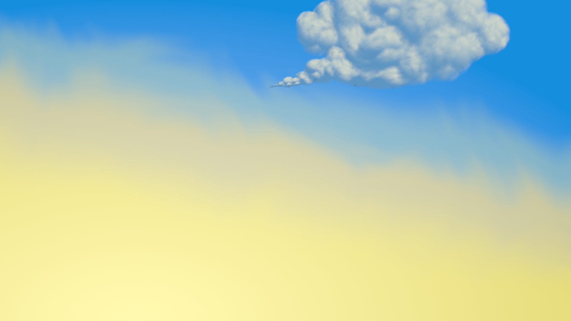
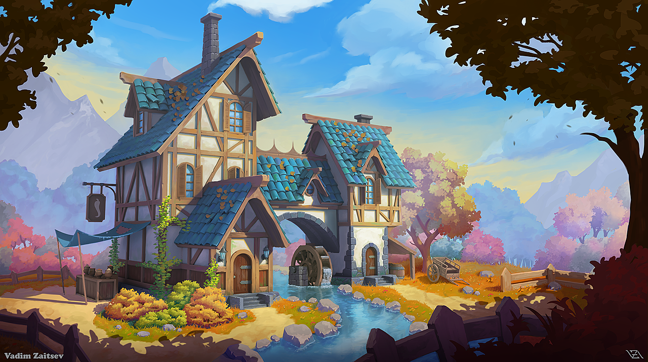
Still need to recreate two more clouds, I will try to add them today. Watch this space.....
If they are already added when you read this , don't watch this space, I'm sure you have something better to do.
...................
...................
...................
Here it is, 3 cloud render.
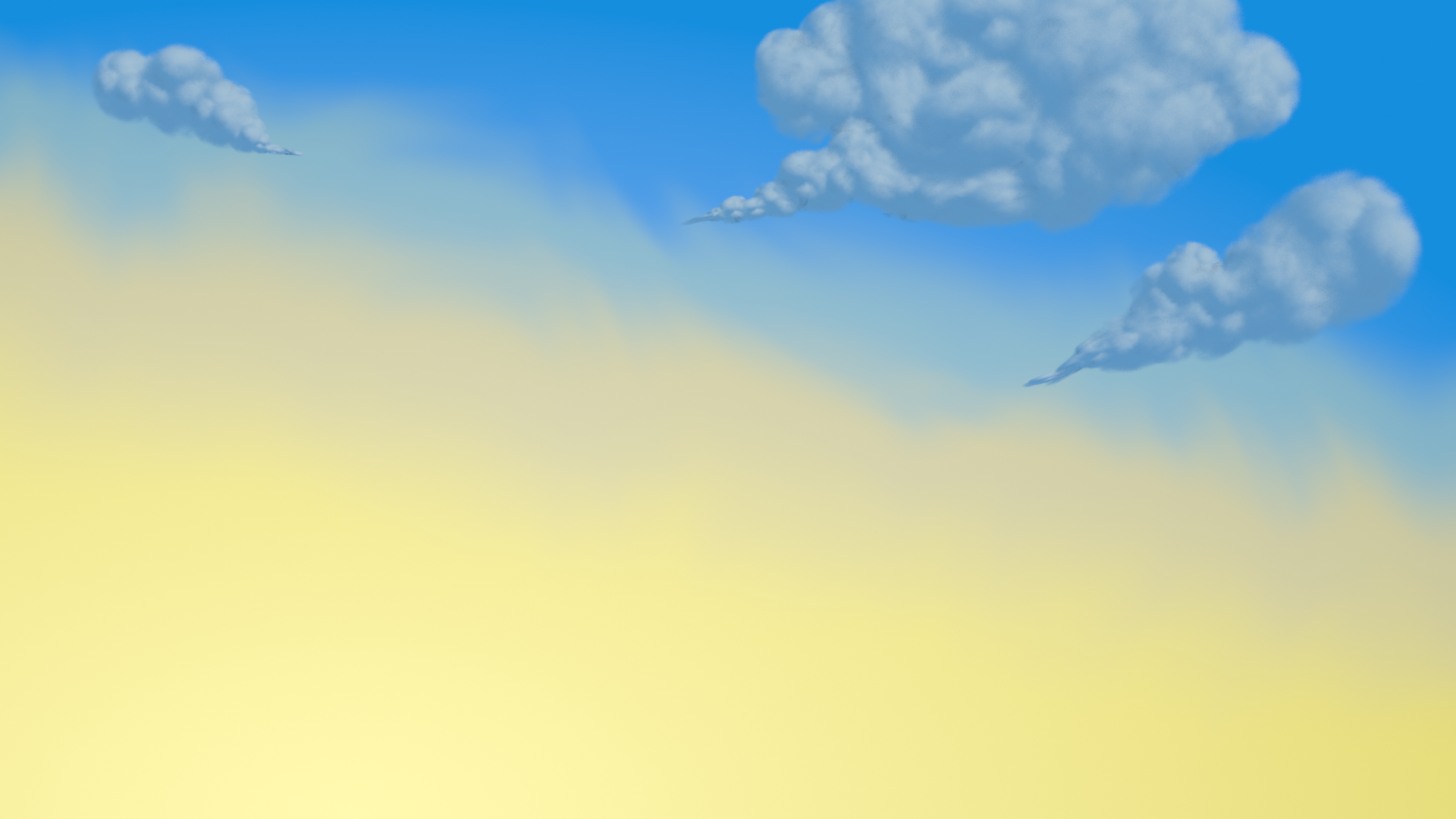
First I want to apologize for my lack of presence with you and the clouds. The nature team in general has had less direction / demonstrations for guidance AND the recommended courses haven't been the right approaches to take for efficiency...beyond that the clouds especially have been something that I say to myself: "Adrian's got this, he'll be fine."
Ultimately the clouds have been one of the weirdest assets in the whole project. I sincerely appreciate your diligence and willingness to explore techniques to achieve great clouds.
Your latest iteration is the most impressive yet. You've really applied lighting boy studios' method to great effect. Regarding transparency, I think the best words to describe what I'd like to see is "painterly" and slightly more "whispy". Your screeshot above still feels to defined on the edges for me; no variety. I played around with your scene a bit and here's what I came up with:
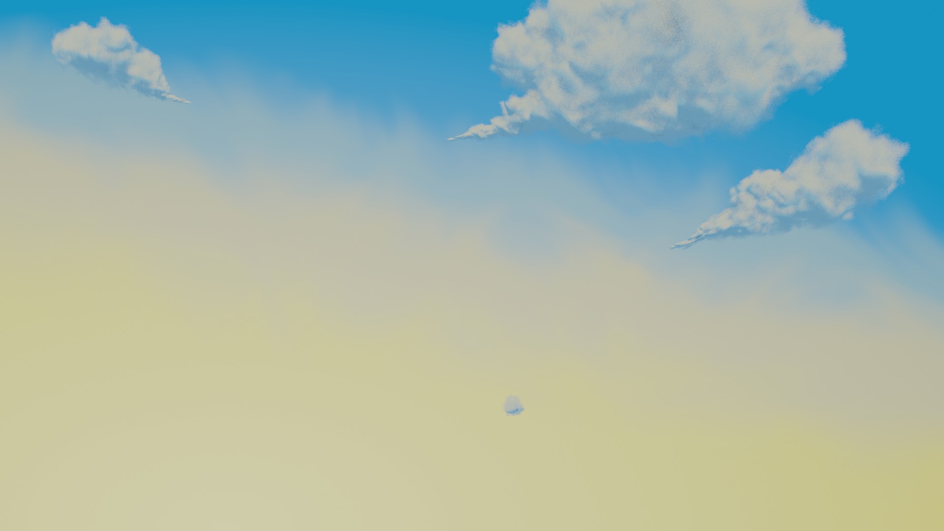
Mostly by tweaking the transparency ramp (in the noise frame) and noise-ifying the texture coordinates. The only remaining gripe I have is that the pointed trails are still too sharp. Duplicating the shader just for the pointy bits and intensifying the transparency ramp would fix it I think.
However there are some shortcomings with the ghibli "volumetric planes" method:
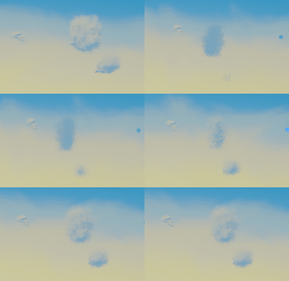
If you could adjust the clouds' proportions to look right from all angles (not skinny from the side) I think we can keep your ghibli version as a plan B. The cloud cards have proven very efficient in the viewport and I want to encourage you to make it your plan A method.
There was one new technique I added to my cloud cards that really helped; a technique I didn't apply to the bushes/trees. I'll go over it tomorrow during the stream and hopefully
Thanks @theluthier , I did feel it got a bit laggy the lower the distance in the array. I thought about adding a mirror modifier to thicken them and have the normals flipped to the otherside but that would make it even laggier. I like how the look but I'm like you not convinced they are right for this project. The pointed part I thought I might use a different base geo, to make it whispier. Using the same cloud plume and scaling so small it looks a bit too dense. Where scaling up makes it more fluffy.
@theluthier , @jlampel ,
I reinvented the cloud....
I was playing hide and seek with my fluffy friends, and I had a thought about my other friend, Sky....
So I got all my friends together in one world....
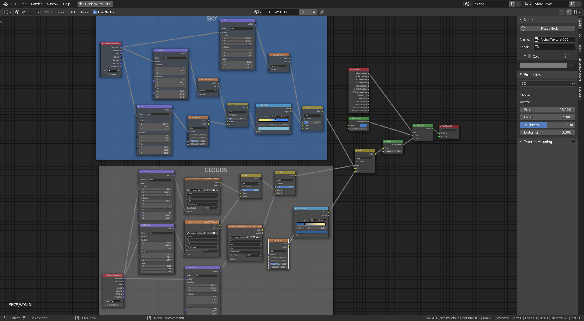
I had the alpha maps from previous experiments and added them to the spice world sky, with some adjustment in the mapping nodes for placement.
The result is interesting.
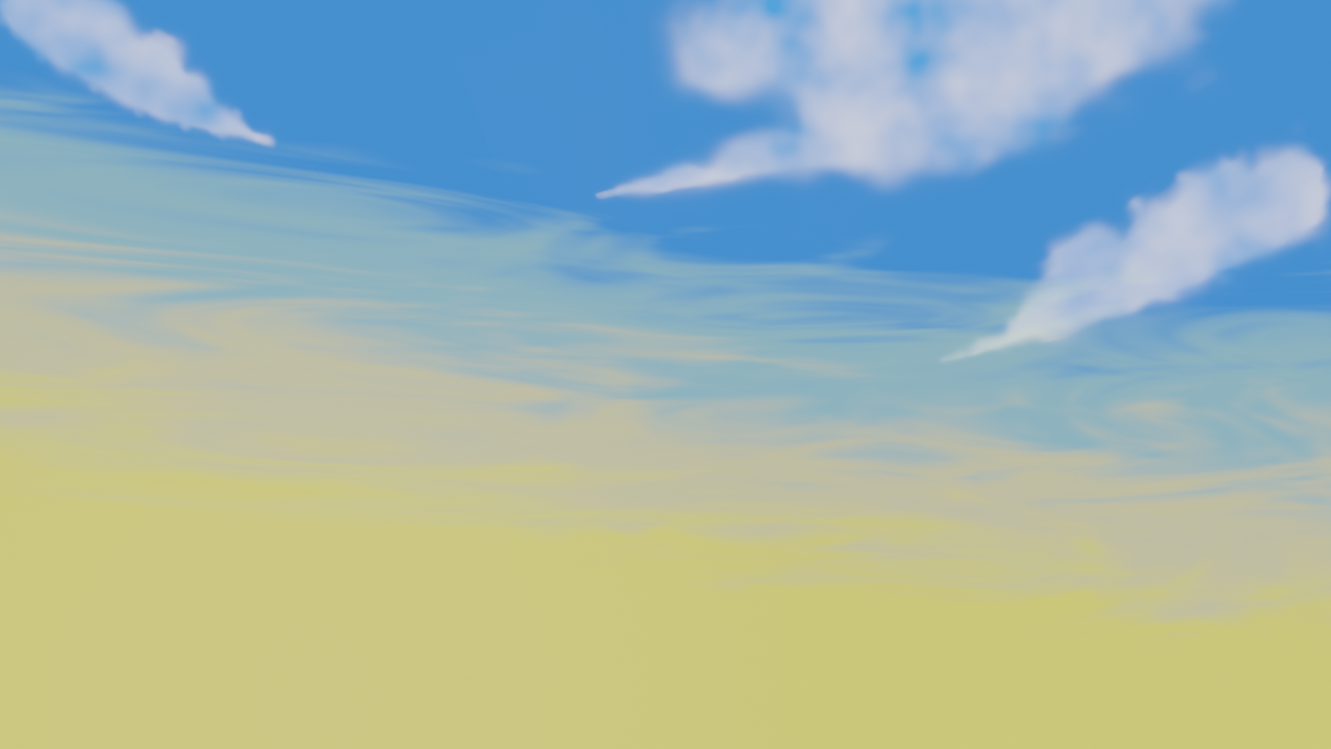
Problem is no shadow, unless I can fake it.
I'm not sure about a rabbit hole......
Perhaps a black hole
If you wish to follow me in, file is on google drive, WIP_nature_clouds_adrian2301_08
@adrian2301 You could always paint an alpha mask and put it on a very large plane and have the sunlight project the shadows through that rather than trying to make "physical shadows.
Something a bit like this to better illustrate my idea:
Unless it's needless complicated or complicates any volume effects in the main scene, or not.
@adrian2301 Your cirrus clouds are a perfect implementation of the idea! I tweaked the shader elements a bit and am VERY happy with the sky. Fantastic work sir.
Do you want to add a card-based cloud for me to place in the sky? More variety is always nice. Otherwise you're welcome to focus on the chimney smoke the rest of the time.
Some sort of animation on the smoke seems necessary...it'd be really odd to see it static. It would also probably be best as a 3D asset, able to orbit around and cast a shadow on the roof. Since the art shows the smoke bent to the side considerably, accomplishing all these things could be very tricky. Thanks to the clouds we know the ghibli method is too slow if the camera gets close/inside and volumetrics aren't a good option due to the flickering...
Perhaps this method could work for us? https://www.artstation.com/artwork/mDW6Yd
Where the puffs are card-based particles that follow a curve's path to match the art?
@theluthier absolutely animated smoke is a must.
Have you seen ![]() duerer 's smoke test?
duerer 's smoke test?
I have an idea or two how to do this.
Perhaps this method could work for us?
I was thinking along this line , but our smoke is more a steady stream of smoke, this looks like a steam engine.
Do you want to add a card-based cloud for me to place in the sky?
I can add a card based cloud if you want.
Do you want one like this method
https://cgcookie.com/questions/14277-collab2021-wip-adrian2301?page=1#answer-51938
This is a similar look as a volumetric cloud but using a plane. Did you you want it way in the distance so know one goes beyond it? For an idea of the scale.
I have learnt a lot from this Collab, as I knew I would, all the testing and 'turbulence', pun intended, is still a success. I'm happy even if my efforts don't make the final cut.
Long live the Collab!! 👍
Chimney Smoke Test
@theluthier , I know volumetric is a no go, but how about particles??. This example uses particles and it can be baked in eevee. I need to figure out a way to give more volume after they leave the chimney.
It still seems a bit too clumpy compared with the artwork, if you don't mind me saying so.
Also in Vadim's painting it looks as though the smoke gets more dense after it leave the chimney.
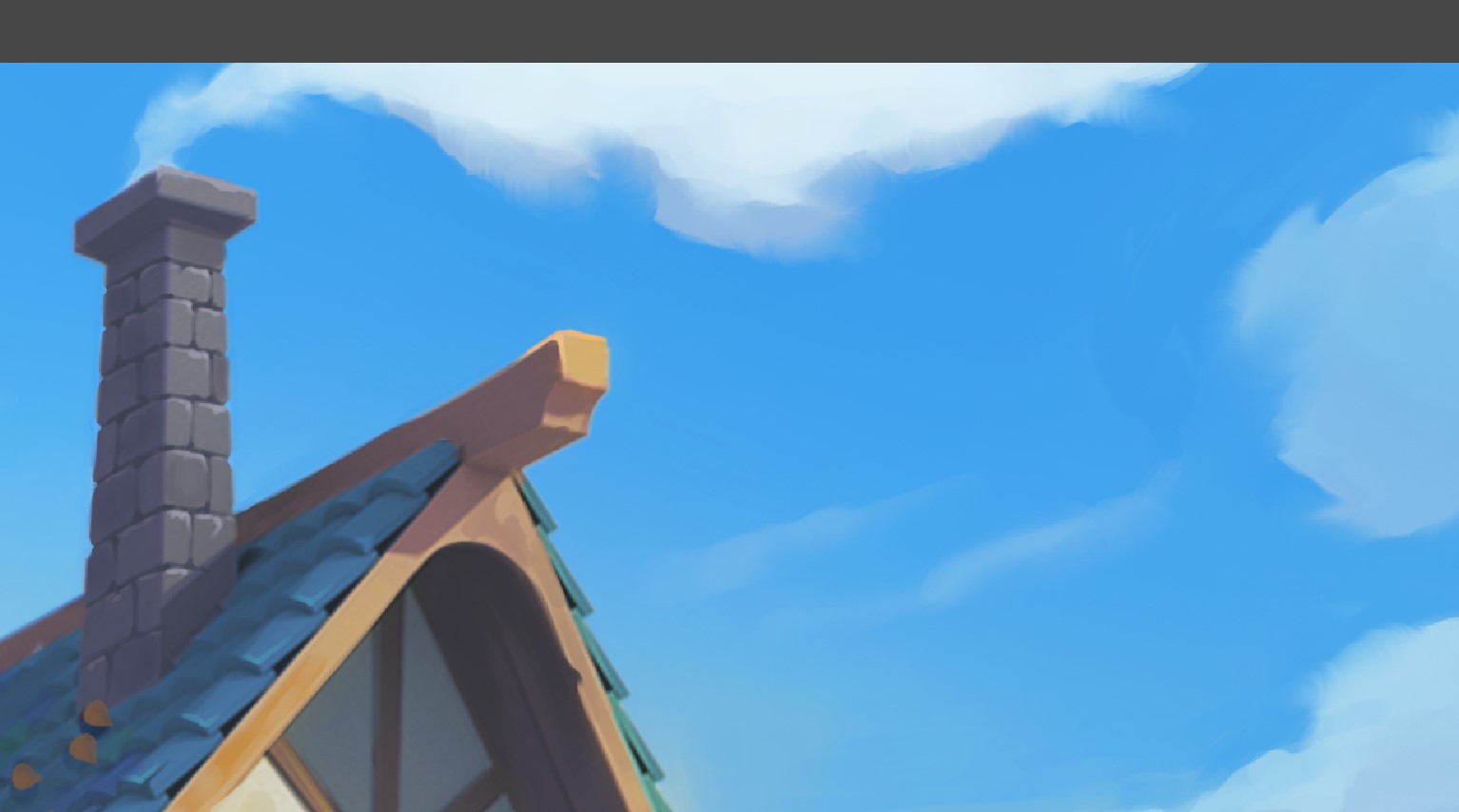
I can change that , I was thinking normally smoke would disperse and become thinner. I suppose if it is cold outside it may become more dense.
Chimney Smoke Test 3
Added a few more particles and after scrolling right to the bottom of the physics tab I remembered you can add a texture, added a blend texture with a color ramp to fade out the particles but that hasn't seem to had much effect, would of been so much easier in cycles.
Still some adjustments to make.
Lovely work on tve clouds and the smoke, the smoke looks great but adding a more subtle way of fading would be awesome. I am sure the results will be stunning
@adrian2301 - Adrian, it looks like you are finishing up with your project. I'd love to post your artwork in the TSMF Blog. Please let me know if you create a money shot.
@theluthier @jlampel not sure who wants to take this one, I have classified it under house in the drive, however we are burning wood so could be nature.
For the Smoke I have added a couple extra emitters to emit smaller and more translucent plumes towards the end to try and hide the sudden disappearing as seen in earlier test.
As for the Sky, I have added another feature to Spice World, I will let you check it out in the file. From the house view turn around and look up, hope you like it.
Nice work Adrian! Having moving smoke is going to look awesome. I don't know Kent's opinion on the use of volumes when it comes to the smoke specifically, so I'll leave that up to him to decide, but the geometry looks pretty dense. Could that be simplified quite a bit while achieving the same result?
As for the smoke popping out of existence, try using the particle lifetime value to transition them to fully transparent by the time they die:
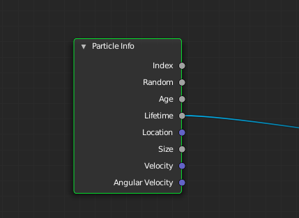
I thought the Particle Info Node only works in cycles @jlampel
I am sure volumetric is a no go because of the continued updating on each movement of the camera.
I will work on the density now, I was still in testing mode