@theluthier
Not really homework, just been testing different methods.
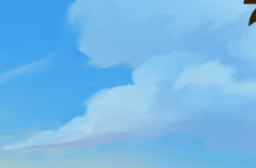
A close up of the clouds in the artwork:
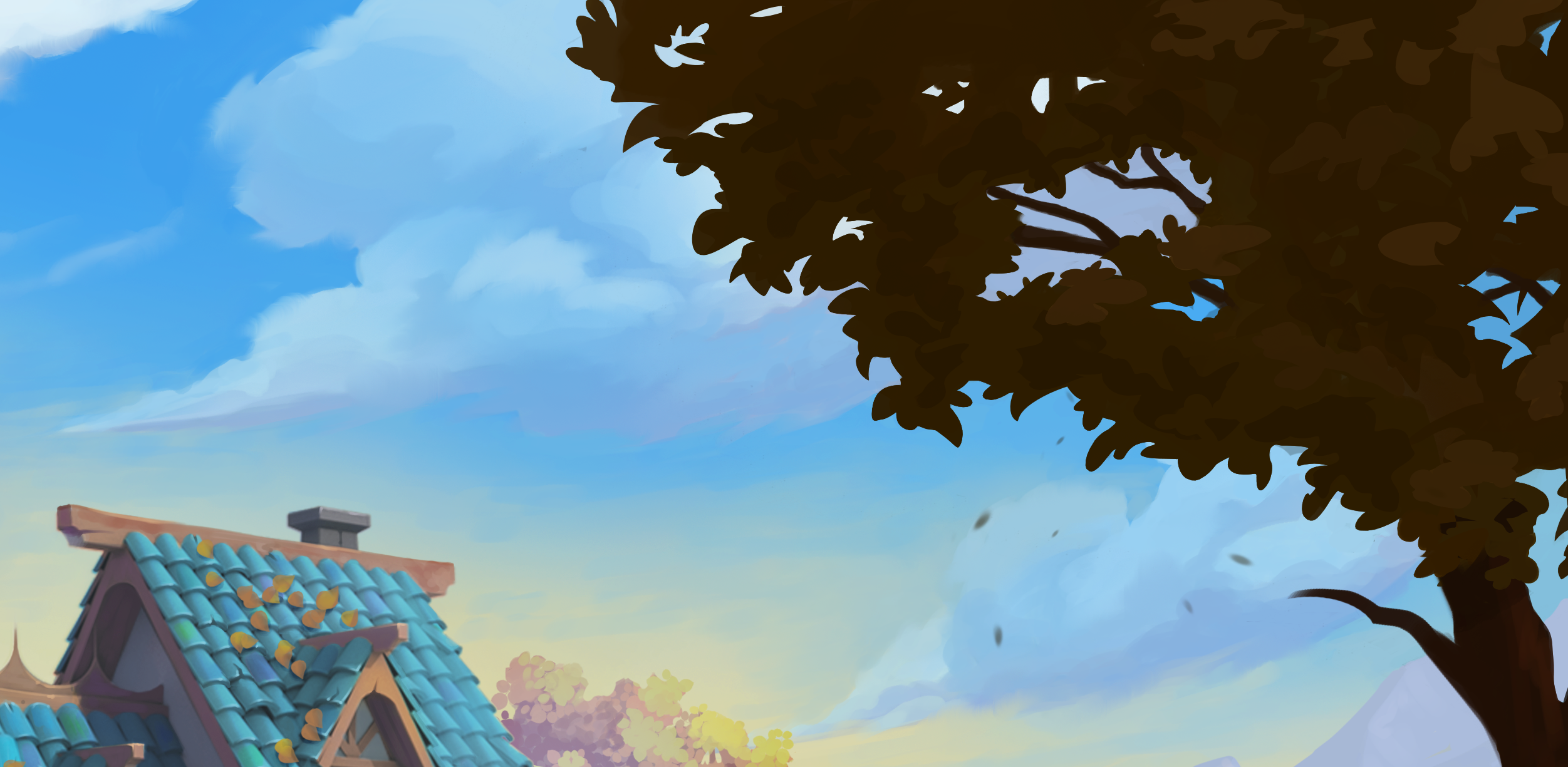
Method 1
Volumetric mesh.
Mesh objects with a volume empty and volumetric modifiers added as described previously.
Render time with my crappy CPU = 22.44 seconds.
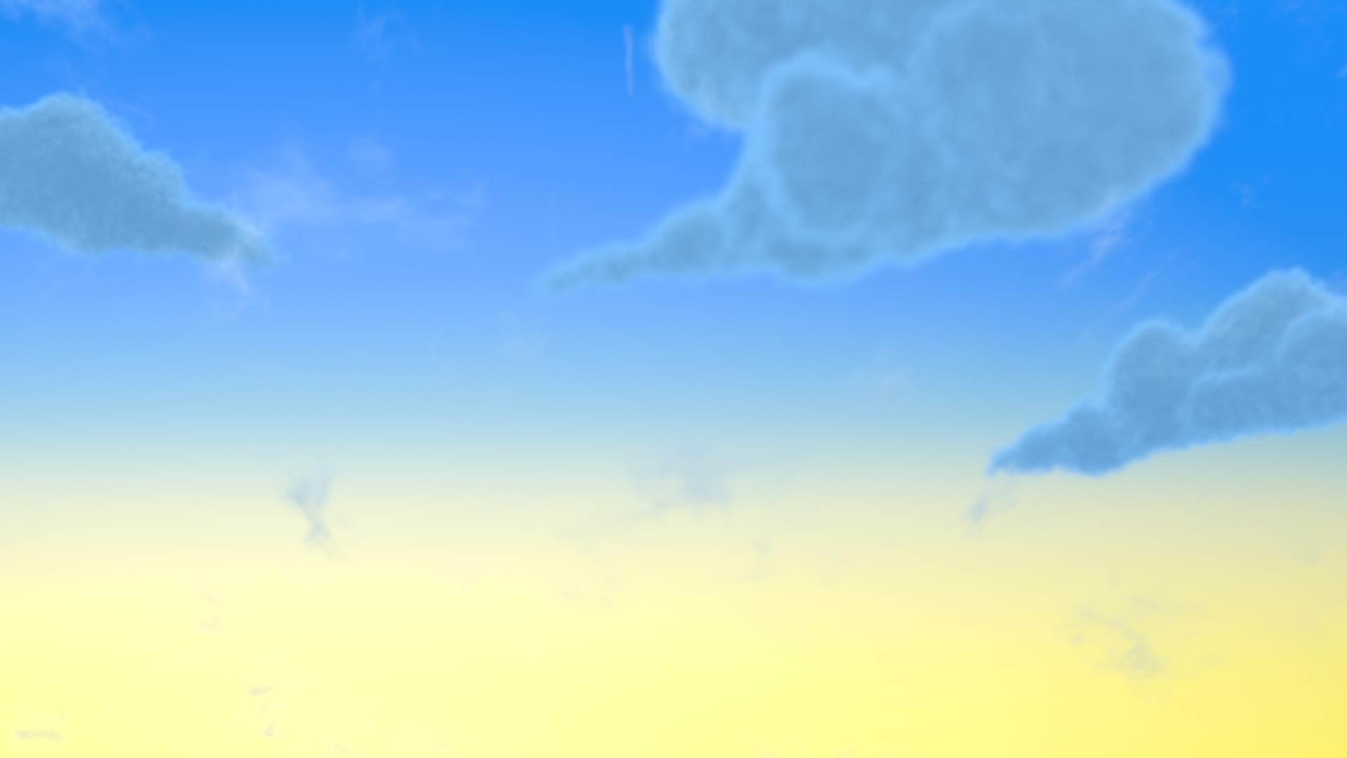
Method 2
Same mesh with Displace Mod to add shape and Decimate Mod to decrease poly count and with procedural shader.
Render time again with my crappy CPU = 2.14 seconds.
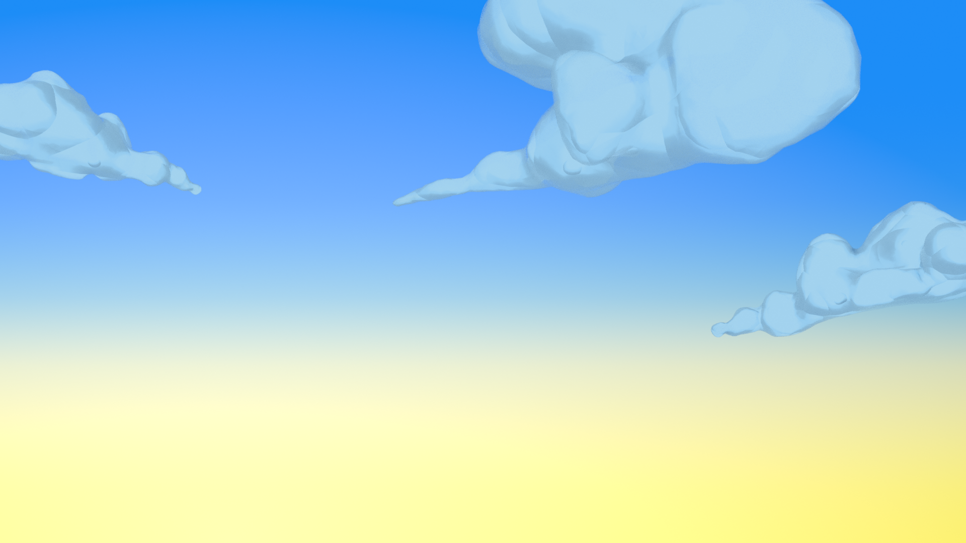
The shader
With a Diffuse shader and a Transparent shader mixed with a factor controlled by a Fresnel and Color Ramp to soften the edges of the mesh. For the color I plugged the Diffuse into a Shader to RGB Node and then to a Color Ramp and selected color for the flags. Also added some extra 'fluff' with a Voronoi , Color Ramp and Bump Node into the Normal of the Diffuse Shader.
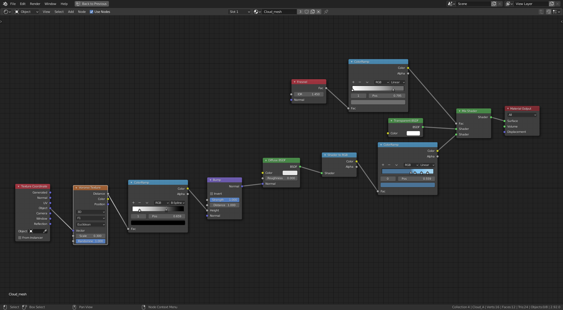
Need to work more on shape to match the artwork but my need here was to focus on a solution to reduce render time, I quite like the procedural shader route, not only for render time but also I like the stylized look and feel of this method. The volumetric method was difficult to get the color adjustment and it's still not where I would want it. Need to soften the color in method 2 also to match the artwork.
Could slightly reduce render time further by baking texture and normal maps.
Having a go at playing God and turning Day into Night.
Next I'll have a go at Jesus and turn water into wine.
What a WIP thread @adrian2301! You're going hard at the sky and clouds and your results look promising. Very nice work 👏
One note I have on the sky is to break up the gradient with some painterly effects. Currently the sky gradient looks like a simple transition from one color to another. Try introducing a noise texture or voronoi (cell) texture into the vector coordinates to muddle the gradient around. Something to give it more character and aesthetic.
As for the clouds, I'm afraid volumetrics may not be the right method. They just feel too flat and undefined next to the art. Are you using a sunlamp or just illuminating them with the world?
The second method is interesting! Definitely could use more softening to somehow feel volumetric while not being volumetric. I saw that you mentioned the ghibli clouds. I'd suggest they're worth a try. There's 2 different methods on youtube battling for ghibli supremacy:
Thanks @theluthier , I have seen the first of these vids and took some of the ideas from it, I'll watch the second one and see what I can do, I like to mix and match and try and create something more unique.
It's a shame the volumetric method is so inefficient as it can give some great effects. I have used a sun lamp but like you say it is looking flat. I think this is the difference between original volumetric and mesh volume methods. Rotating and increasing the strength still didn't help, and they also seem so dull and grey , like UK clouds, even with a second sun lamp.
The procedural shader in the second example, is based on the Ghibli shader from the first vid, but with some differences. I actually like the look of the shader result but the cloud mesh itself needs to feel softer.
Here's a render with an adjustment to the transparency.
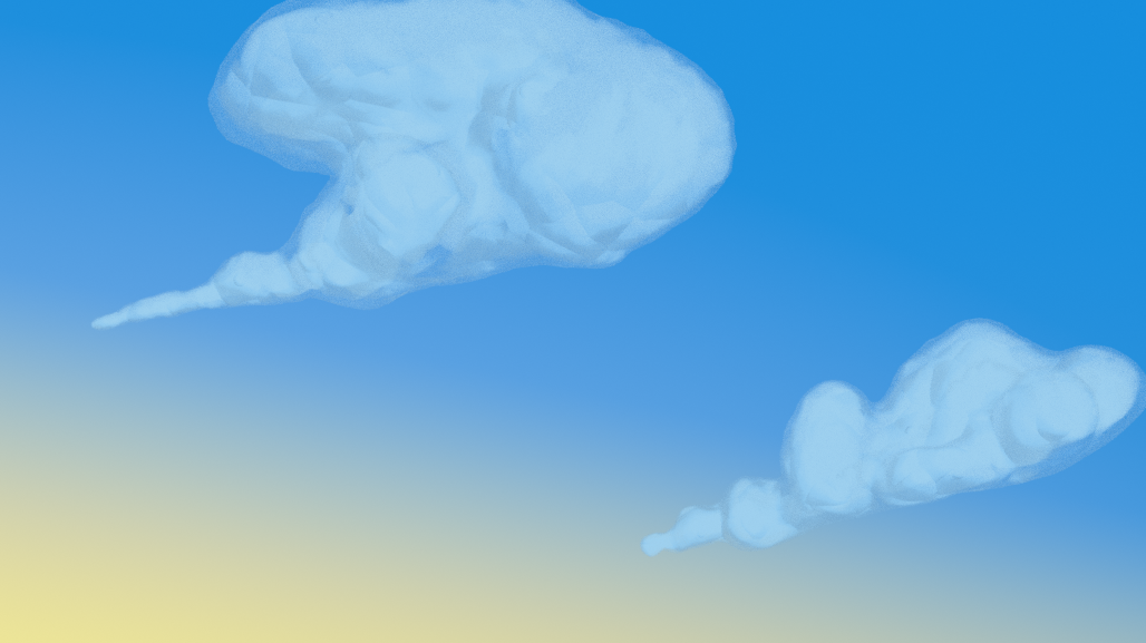
After watching the second vid I come up with this
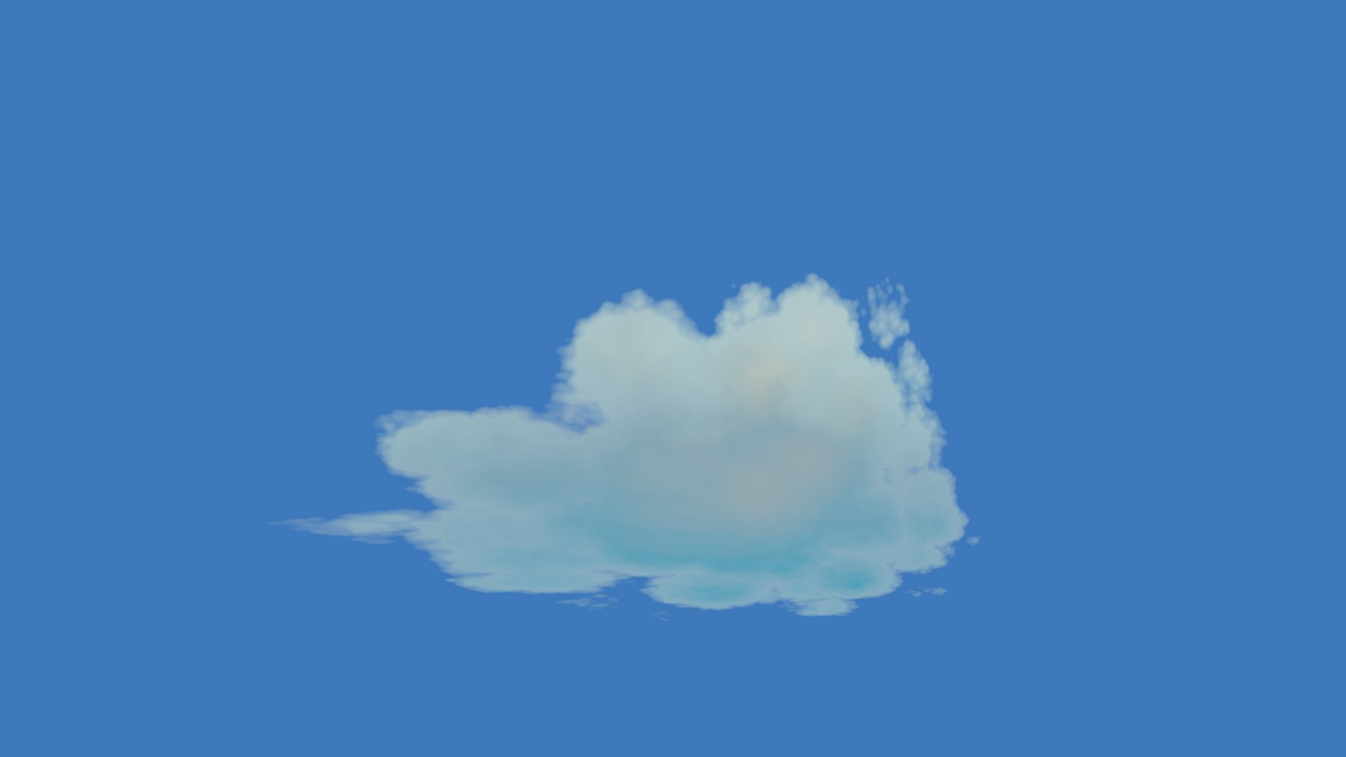
The problem we have with this method is the shape, we have limited kinda hit and miss control of the shape.
@theluthier you mentioned previously about the pointy streak of the clouds in the artwork, how close this shape do you want me to get? If I go much further than this, the stretched out look becomes obvious.
I need to come up with a combination of the different methods for more of a cloud with the look but still with control over shape. Now, where did I put those Geo Nodes, I haven't used them yet.
So these clouds have become a real pain in the arm.
@theluthier can you give me some guidance on these clouds. It's proving rather a challenge coming up with a cloud that matches the artwork.
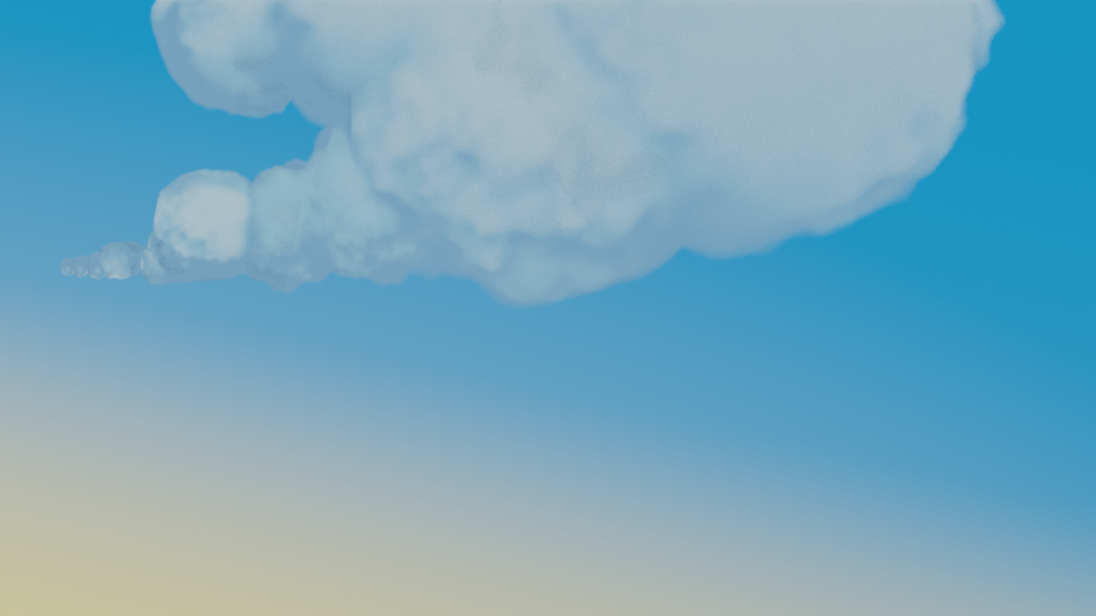
This method of Ghibli takes one ball of cloud and then with collection instancing duplicating, scale and rotate to form a full cloud shape, the problem comes with the color shading (shadow) which is based on the original, they will all be obvious duplicates, by rotating them also rotates the shading so moving the shadow to the top for example, which then looks wrong. The other problem is the long streaky pointed bit, not sure of the technical term, its a bit lumpy rather than a smooth floaty look, and again the shading looks wrong. Now, while I have been typing this I just had a thought, Collection Instancing , Keyword Collection, I can have more than one ball or streak of cloud in the collection, I've been so wrapped up in trying different methods and mixing and matching that simple solutions have eluded me occasionally. How simple it seems now to model a few rocks. I do relish a challenge and I will continue, but I maybe lost in the clouds for a while longer.
@adrian2301 This is my favorite result so far:

I know the video shows a fully procedural texture setup, beginning with a gradient texture like your's truly. But what if you hand-painted a black-n-white texture that roughly matches the shape of the clouds in the art? Then you could add the breakup textures to get the final poofy effect. Since you can adjust the UV coordinates just like any other coordinate, this could be a good way to fine tune the shape while not losing all the procedural breakup.
@theluthier
Made the recommended adjustment to the sky by adding a noise texture and a color mix node to distort the blend between the 4 colors.
For the clouds I made 3 images in Krita, one for each cloud, and tried to add them to exiting shader setup from the previous attempt, the one you said was your favourite so far, but it was more of a pain than starting fresh. So I come up with my own shader.
I may go back to Krita and soften some edges a bit more.
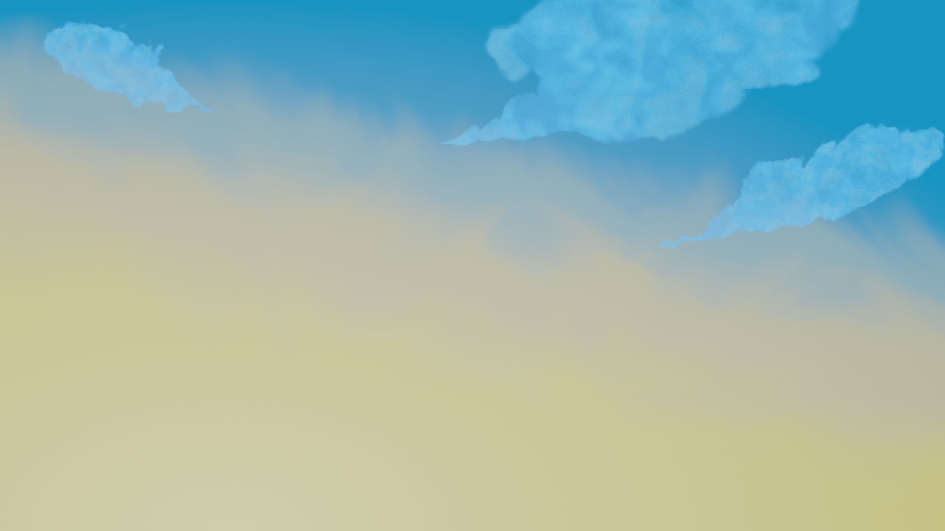
Ok added this image after blurring the edges of the images in Krita.
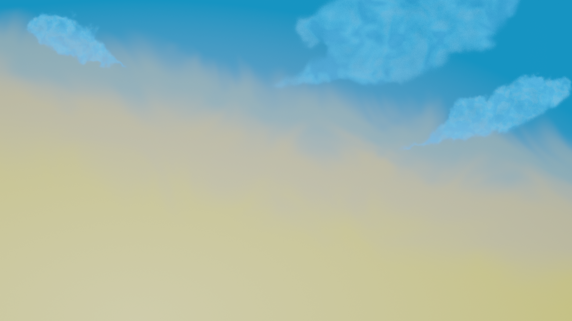
OK this is it, last edit for today
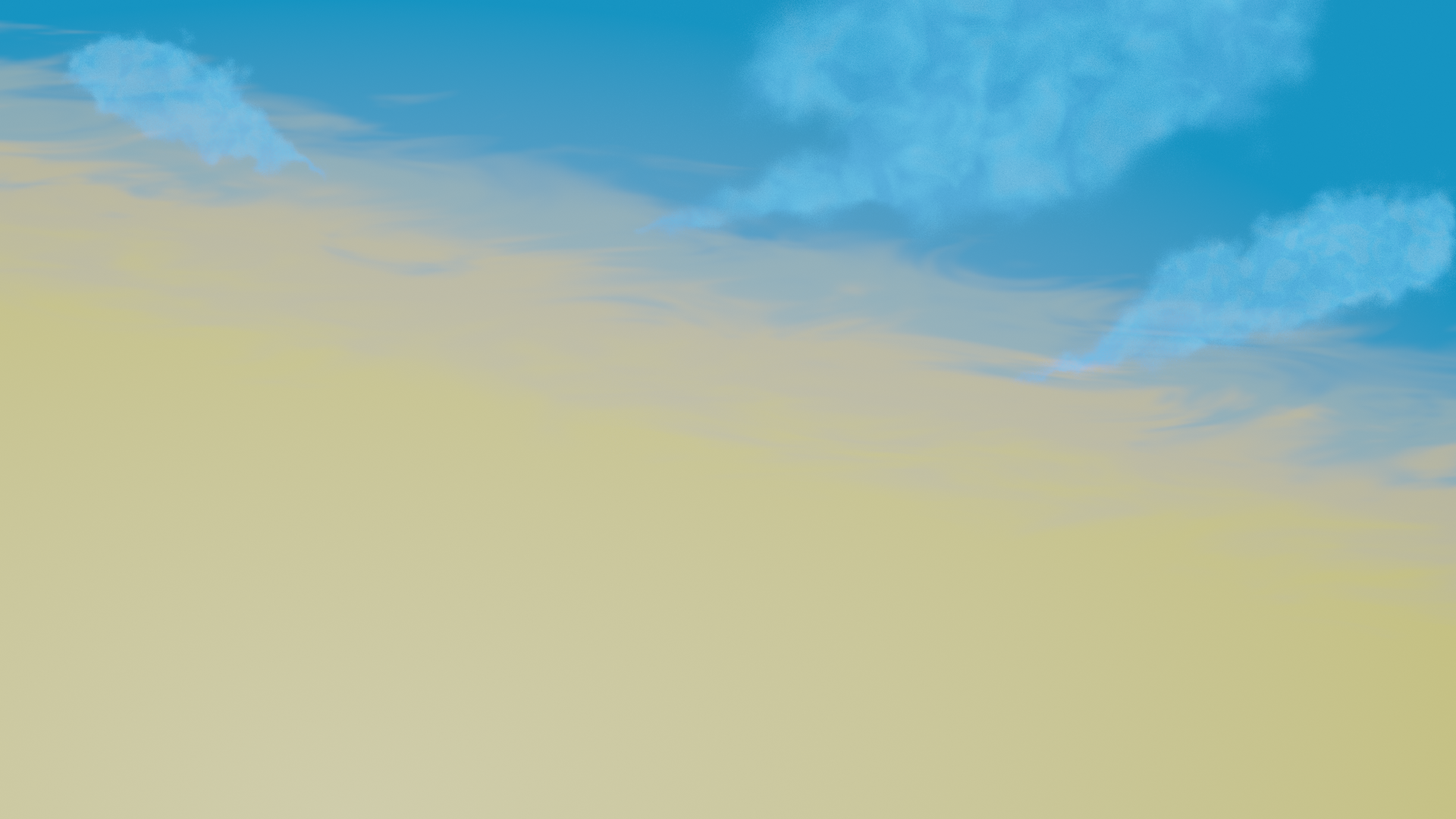
So today I thought I would weald my power and make some adjustments to the world.
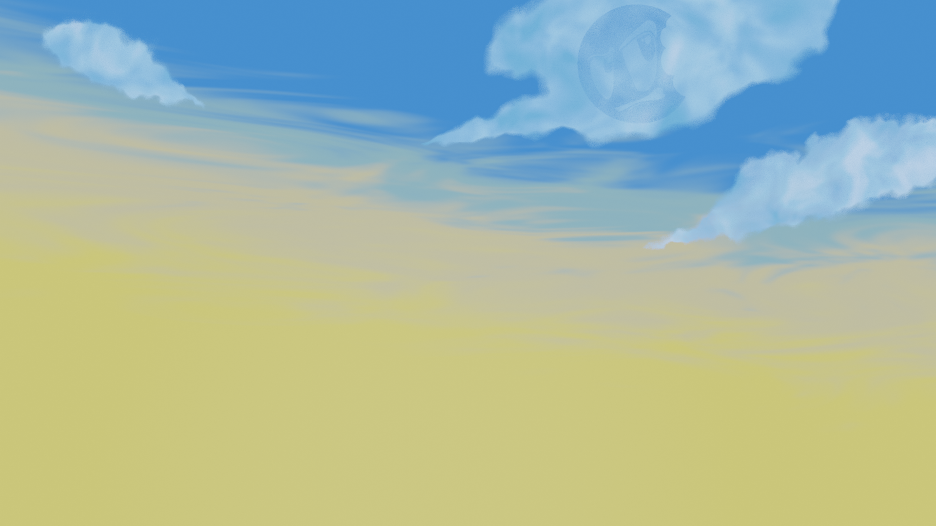
More variation in color in the clouds and tweaked some world settings , and added a sun lamp.
@theluthier you said in the livestream you needed to catch up with me about the clouds.
100% It's my #1 goal today! Sorry for leaving you hanging. There's a couple key questions with the clouds for me:
I'm going to play with techniques to wrap my head around the options and report back to you with some solid direction (hopefully)
@theluthier I looked at your example and think I can achieve something resembling the artwork. Leave it with me.
Just one question every where I look I see ico sphere's are used, can I use any mesh object? for example metaballs and converting to a mesh to try and match the shape better.
@adrian2301 if you don't mind me barging in...I am not a cloud expert, but I think that Metaballs are definitely more apropriate for clouds!
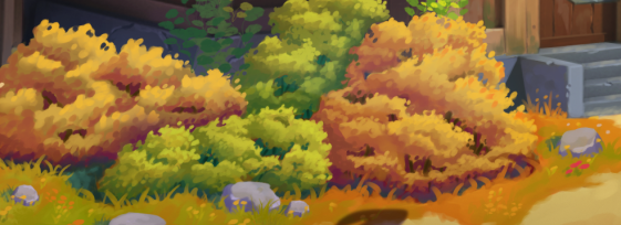
For something like bushes, I'd use (Ico-)spheres....here's why:
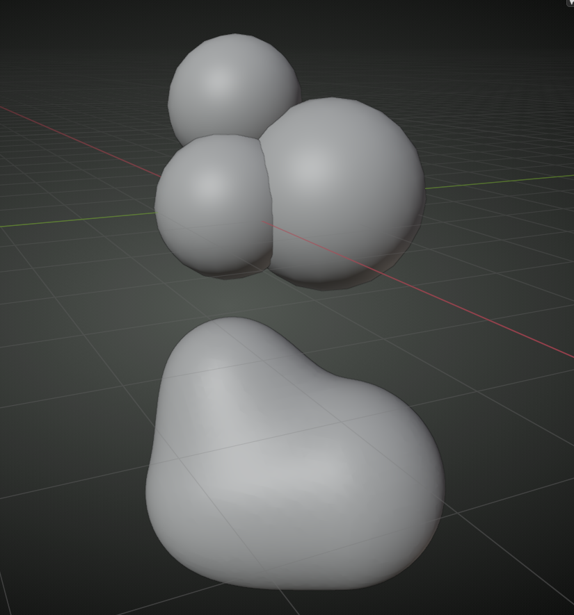 the bushes/far away trees are like a few clusters (not so round, of course):
but clouds are 'one piece':
