This is my thread documenting my progress in the Collab2021 project -- more to come (soon!)
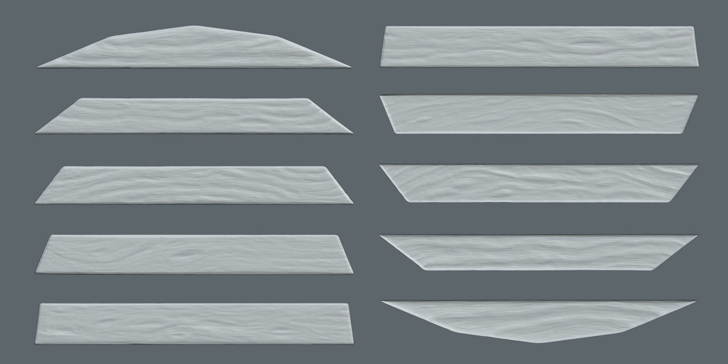
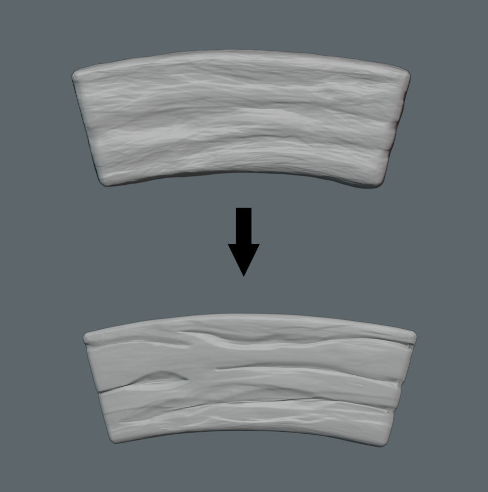
Getting a result that doesn't take forever and should work with the aesthetic dictated by the stylesheet. I hope. I feel like it's not too realistic. I think underneath painterly base colors it will do what we want.
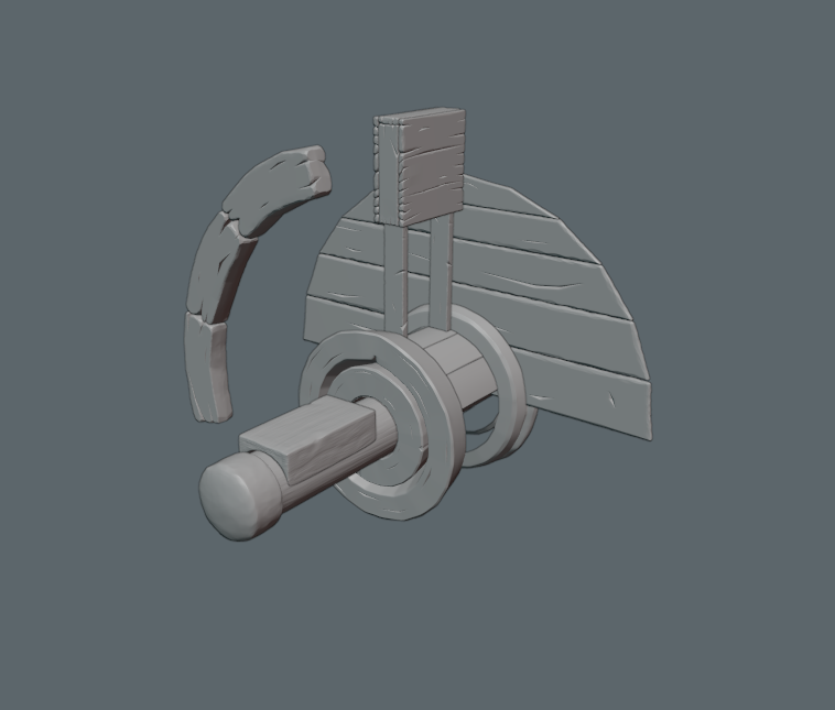
Sculpt:

As Normal Map in Eevee:

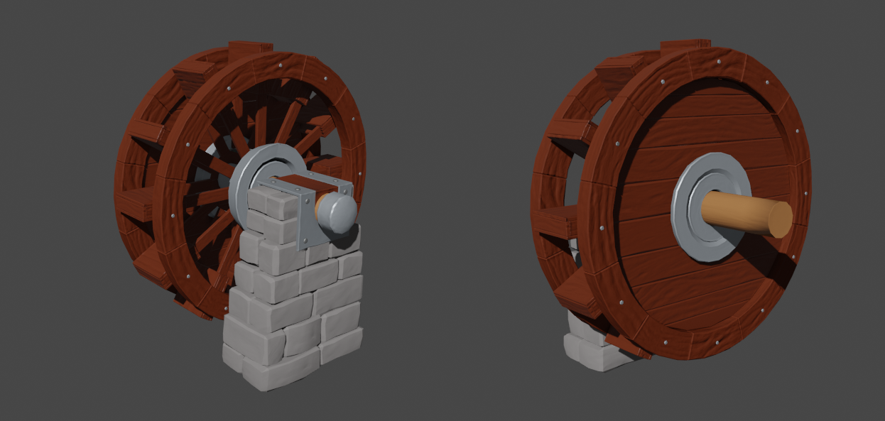
It's about 45 minutes per board, but it feels worth it. Planning on doing a second pass on all of them to add sharp cuts and scrapes. Wanna see what it looks like without. I also don't know if this water wheel needs to really look beat up.
I like this documentation and the progress. The wood looks very good.
Btw. I had also some troube with distortions. Made some mistakes.
I simple delete Seams/UV Map ;)
@theluthier
(I just realized that I replied to one of my other posts, rather than making this its own post -- deleted the old one and reposted it properly)
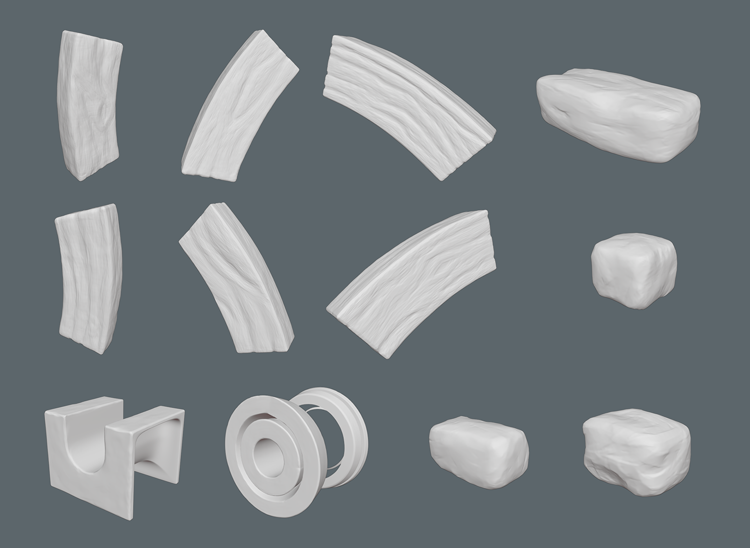
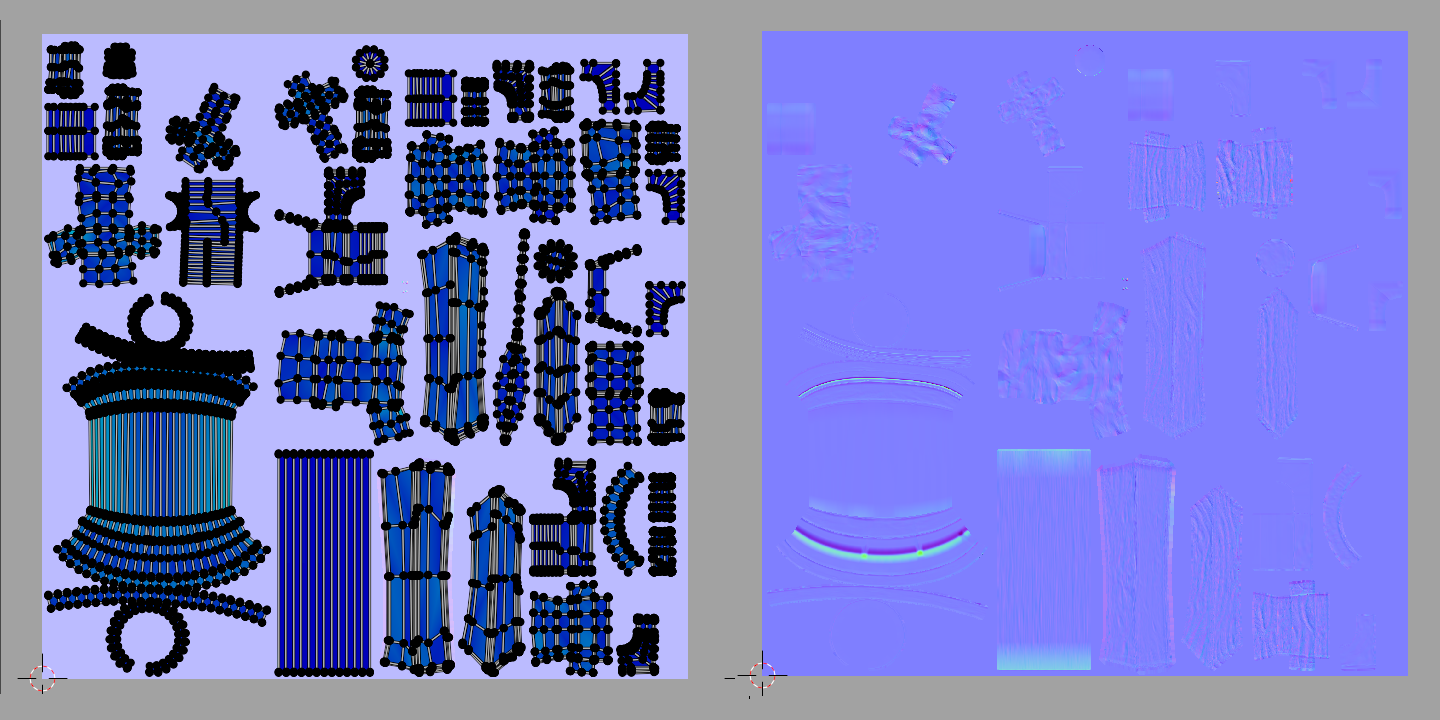
Everything is unwrapped, and I'm baking as I go to see how things look as normal maps. I figured it would help me decide what elements need to be redone after my first sculpt pass.
I plan on doing a second pass on all of the sculpts to add cracks and other details, but given the quantity of things that needed to be sculpted, I figured it would be better to get everything reasonable before going back to finalize them.
On the second pass, my plan is to pull the details into a stylized version. This is a pretty rapid process using the more realistic sculpts. I really struggled at free drawing the stylized textures, so this was my solution. Although it has been insanely labor intensive, the end result looks really great in my opinion.
In my frenzy to get everything sculpted I didn't sculpt onto the joined retopologized mesh I had made for the rocks last week, but instead sculpted the individual rocks. So the that will also need to be redone.
Similar to ![]() lucky , I haven't synced my files yet because their size has been teetering back and forth between huge and acceptable, and 15GB is pretty sparse for everyone sculpting right now.
lucky , I haven't synced my files yet because their size has been teetering back and forth between huge and acceptable, and 15GB is pretty sparse for everyone sculpting right now.
![]() lucky Thanks! The struggle has been real. I'm finalizing things the next couple days, and sooo ready to move on to painting.
lucky Thanks! The struggle has been real. I'm finalizing things the next couple days, and sooo ready to move on to painting.
Oh ffs. I don't know why this is so hard for me. I overcomplicated what should be a VERY simple sculpt. Simplicity does not come easy to me.
I just looked at a ton of the textures on FFXIV, and think that I could probably redo all what I did in maybe 1/4 the time, by just making a mask, scaling it in, then smoothing the whole geometry.

But maybe what I did will look good once painted anyway. But its more of a tree bark than a wood plank. And I honestly want to redo it all from scratch now rather than converting them to the stylized ones I started. Ahhhhh @theluthier save me from myself. What do you suggest? I have the time to go any route, and be all caught up with our homework for Sunday.I just need some direction.
I guess the last one could work. But perhaps not too much strokes on each wood part.
Just as an idea: switch between some short and longer strokes, different depth and so you have some variations.
As reference I would go with the style sheet Kent gave us.
But Iam not really in wood sculpting so far.
mmonaloren Oh I'm terrible at this. I would much rather hook a million nodes up to procedurally generate this. xD
Baked as normals it looks like this :
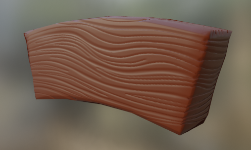
And the reality is, it will almost always be viewed at a MUCH farther distance.
So you're really gonna be squinting to see those details, but they'll make a subtle difference as camera moves due to light.
I actually like this:
 but when you want to go with the more detailed version:

the edges should be a lot sharper imho....not so 'mushy'.
sspikey Thanks for the feedback! I've been struggling to consistently replicate the first one. I like that it has the stylized worn look, but getting there has been pretty experimental. Which is why I was looking for a simple way to just get everything done.
That and the fact that the view distance for these individual pieces is probably going to be so far away, so I felt like I was maybe overcomplicating things. But maybe I should spend another day working on getting the style of the first one down so I can mass produce it.
@lexicolopolis Mass produce would be great, I still am sculpting everything by hand piece by piece.... 😅 takes some practice but after a while you get into the flow. But now I want to redo my first sculpts but I don't have the time. I also wonder if every detail will be visible when baked to a 2k map. 🤔
I'm pulling the trigger. I'm redoing it all with the faster grain method and then chunking them up to make them less perfect. It has got to be the best way to achieve the desired result.
@lexicolopolis I would say, go for it! No time to waste ;). Looking forward to the result.
![]() lucky It's funny, I shifted directions again. But I feel really good about where I am. I've been doing this all wrong and I wish someone would've stated what I now think is the obvious solution. I needed to take my low poly objects and just model in the cracks and larger details and give them bevels. And then sculpt. The style sheet makes it pretty clear that all of the wood details are done that way. I think I realized this a long time ago but then forgot about it.
lucky It's funny, I shifted directions again. But I feel really good about where I am. I've been doing this all wrong and I wish someone would've stated what I now think is the obvious solution. I needed to take my low poly objects and just model in the cracks and larger details and give them bevels. And then sculpt. The style sheet makes it pretty clear that all of the wood details are done that way. I think I realized this a long time ago but then forgot about it.
@lexicolopolis Only downside of modeling the cracks is that you can't just slap on a Multires modifier without making some extra edges in the lowpoly. It's as Kent said, the dirty way ;)
My workflow is:
1. Put bevel on lowpoly so sharp edges stay sharp when subdivided.
2. Subdivide the mesh enough to have a smooth model.
3. If everything is smooth enough, go to sculpt mode and remesh it with a small enough face size, the result will be a mesh with nice even faces so when sculpting you have the same behavior in all directions, so no stretching.
4. Add Multires modifier and start sculpting, a lot of scraping, adding seams, pinching, more scraping and so on
WOW. @lexicolopolis Your thread only gets more epic each week! So interesting to see you get caught up on various styles of sculpted wood...all of which I kinda like 😅
I'm with Spikey that this is probably my favorite:
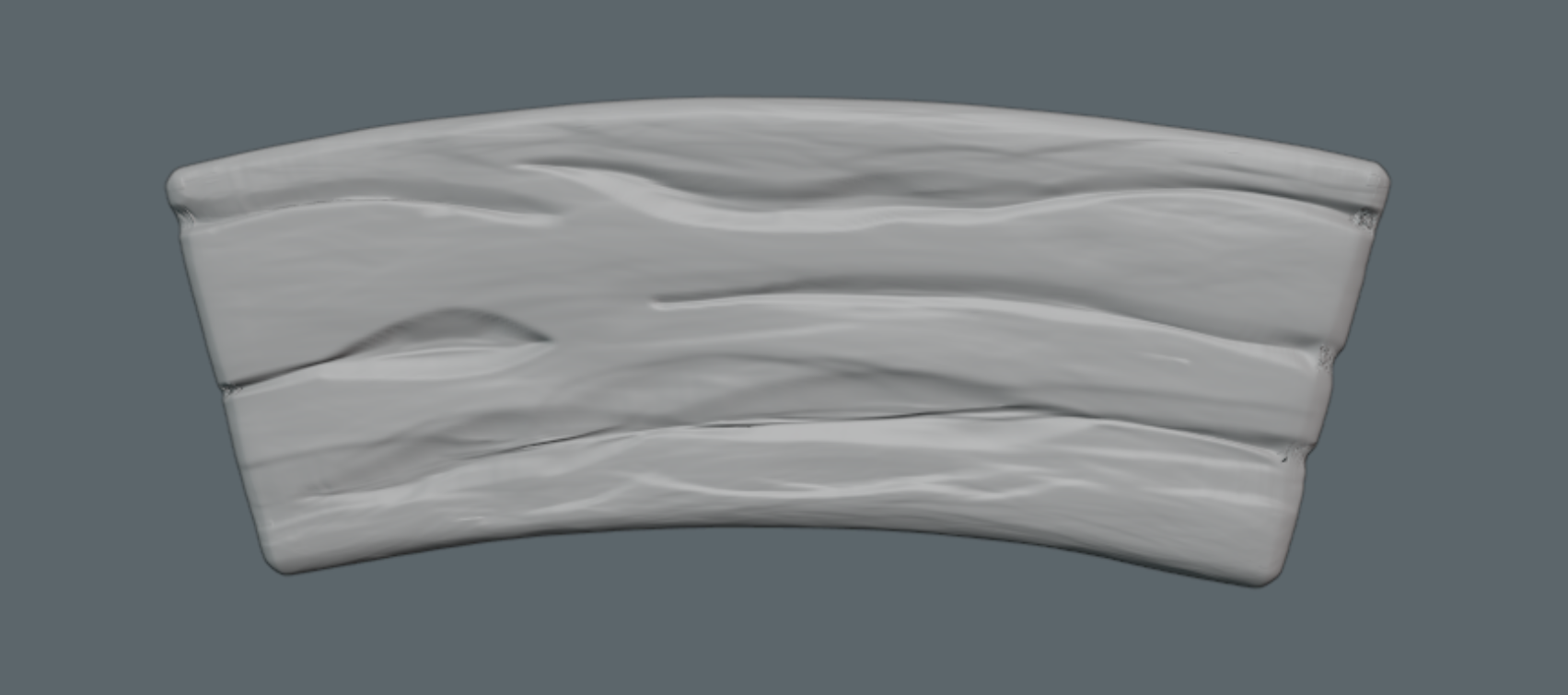
Though I really like this as well:

A mix of both would be incredible. BUT you've done so much work here that I assume you've saved versions of each one and I say go with the grey one above 👍
Keep up the amazing work. I gotta give you some extra points for the effort and dedication to style interpretation. A supervisor would LOVE to have options like this to choose from.
Finally figured out how to do what I wanted to do, and made some good progress. Just a few things left to remodel. Then I can use a mask to add wood grain. And finally be done with sculpting. Oof.
looks great!
also, just love how you've logged the entire process...