This is my on-going thread to document my progress through the 2021 Collab Project.
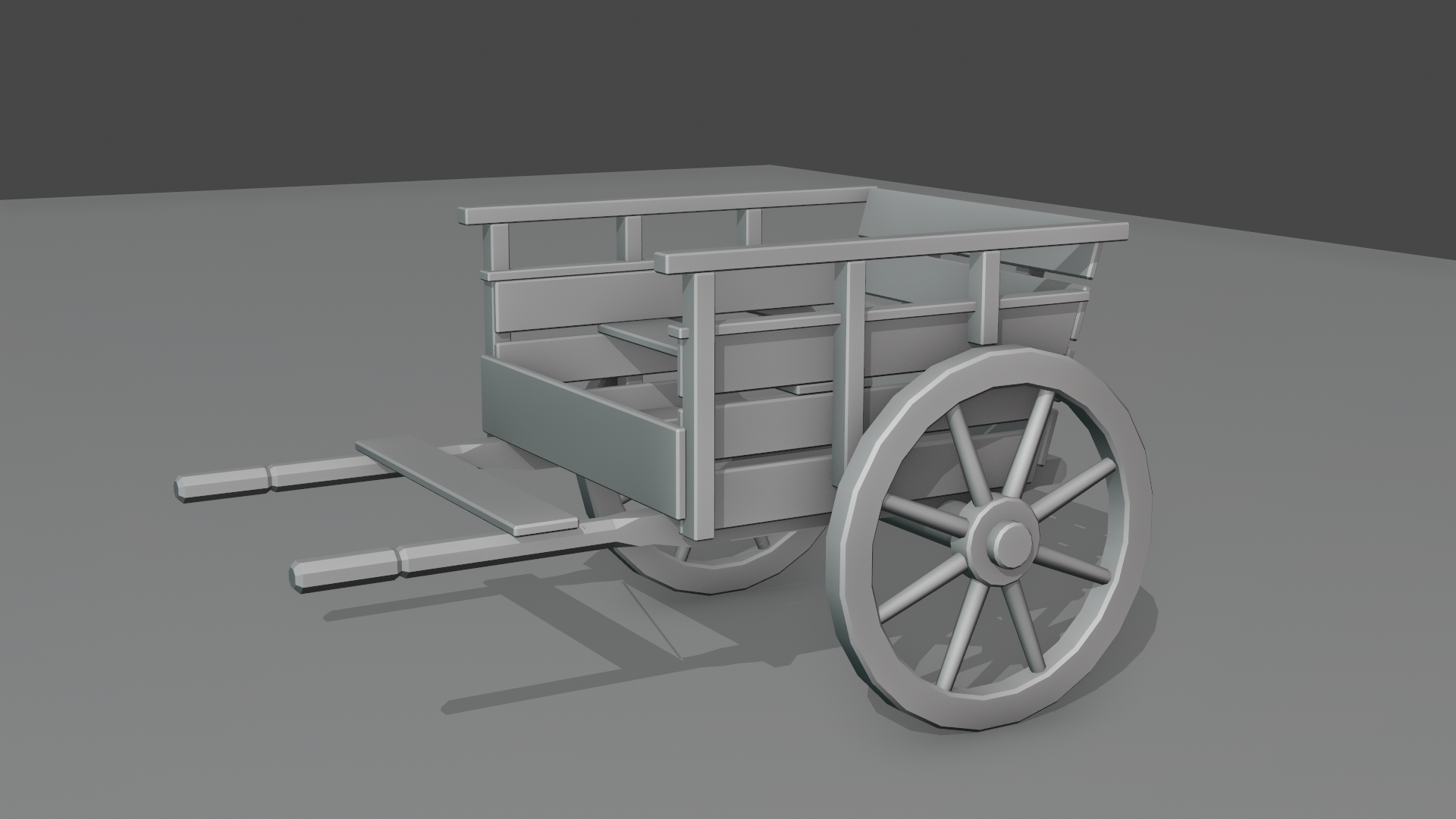
Here's my progress for the cart so far:
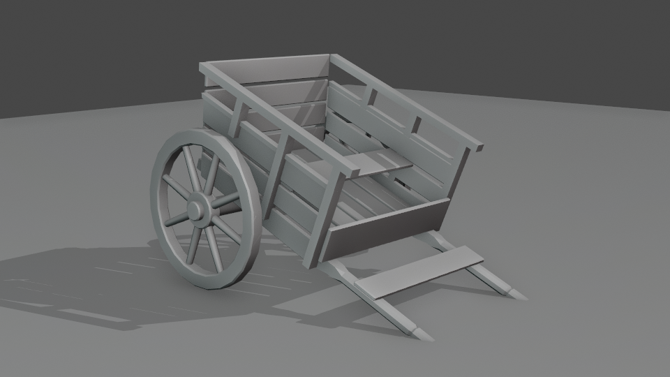
1) Intersecting a coplanar ground plane.
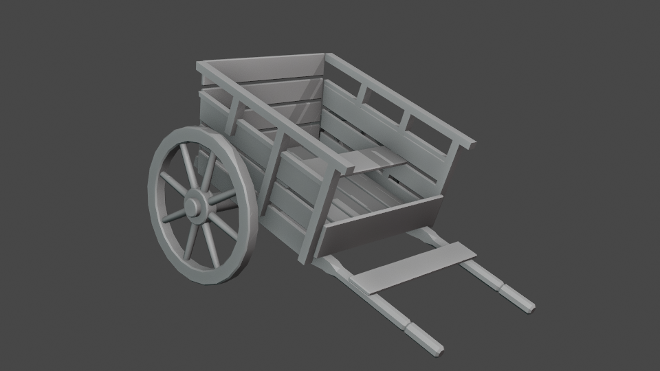
2) Ground plane turned off.
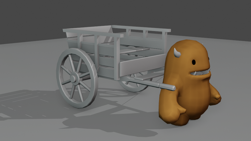
3) I also agree with ![]() sheila5 about her idea of having Melvin interact with the cart somehow. Possibly not in this particular Collab, but maybe in a future animation tutorial or such from Wayne Dixon @waylow
sheila5 about her idea of having Melvin interact with the cart somehow. Possibly not in this particular Collab, but maybe in a future animation tutorial or such from Wayne Dixon @waylow
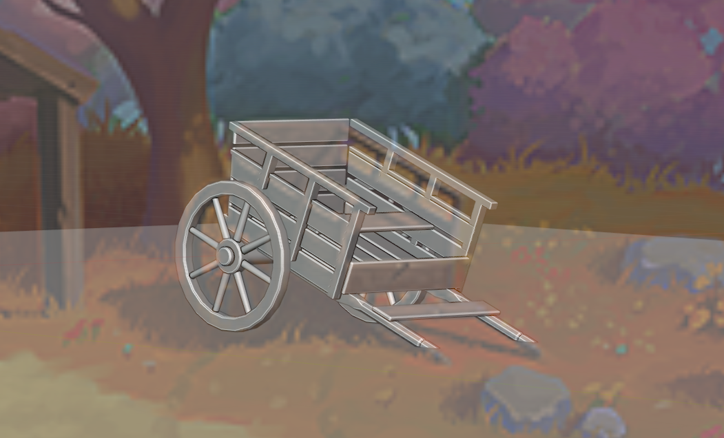
4) Screenshot of the view from the Assembly file Camera (zoomed in.)
5) Full view from the linked Assembly file Camera.
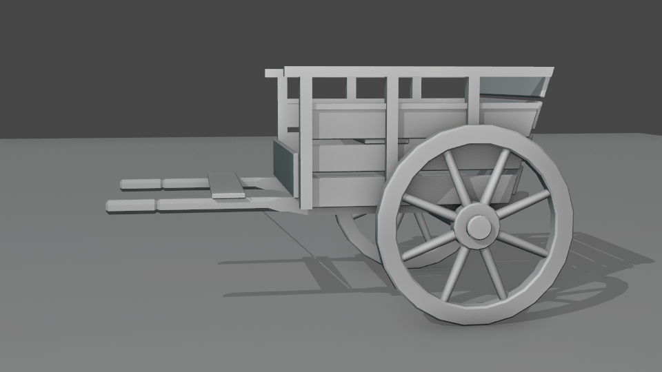
6) And a final view from the side.
It's looking great Vincent, well in tune with the reference. For stream #2 you can add details like rivets and other stuff that holds it together in real life.
Homework Submission - Week 1 - Cart
@theluthier
Here is my block-out for the Spice Vendor's cart.
I don't know if I should keep the faceted look of the cart poles or not. I'm also wondering if I should go back to linking the the railings and cart side struts into a single mesh, like it was in my previous WIP post.
And critique gratefully received.
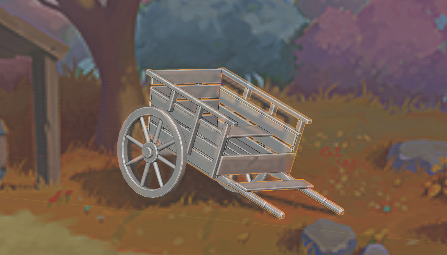
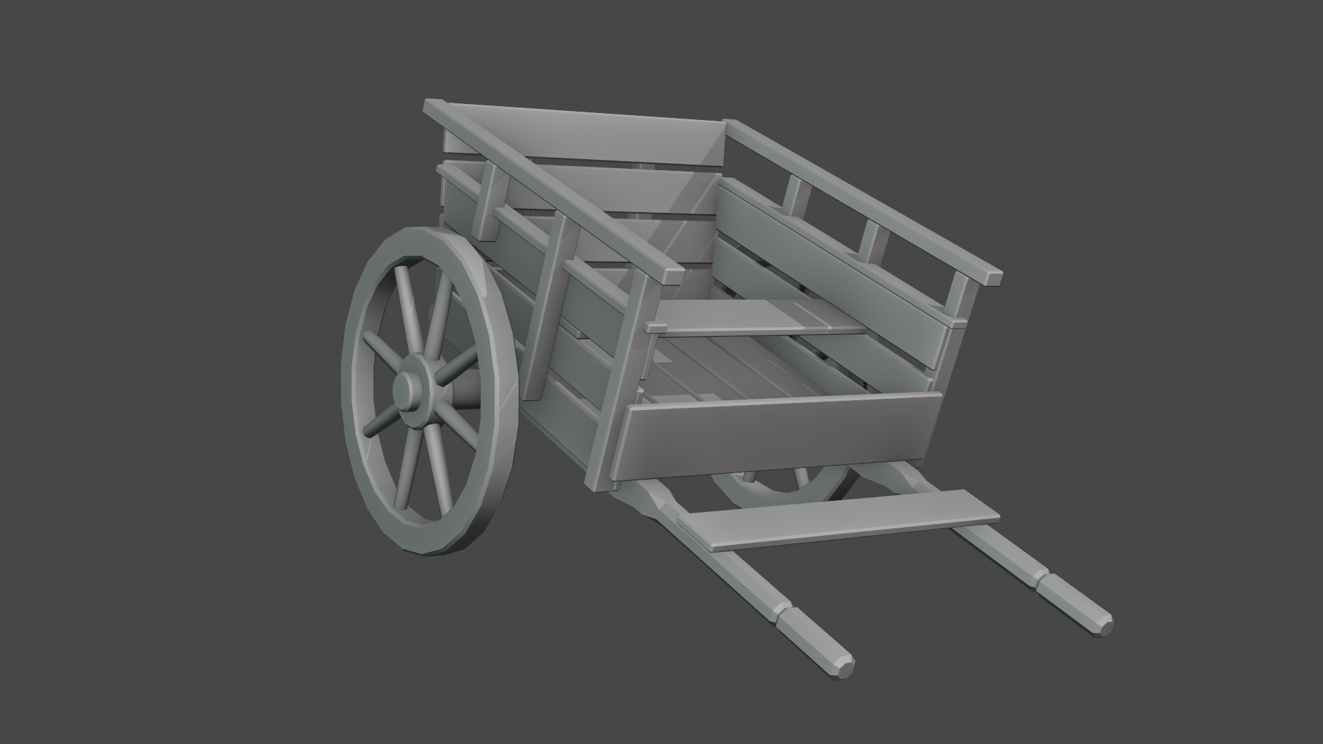
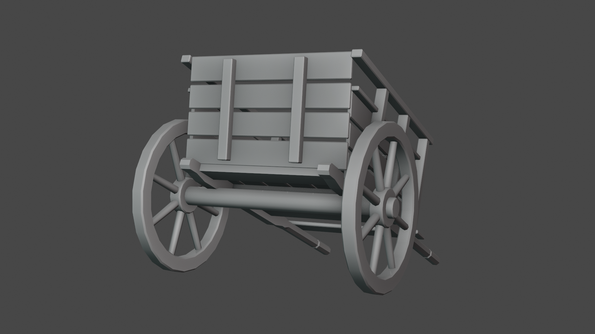

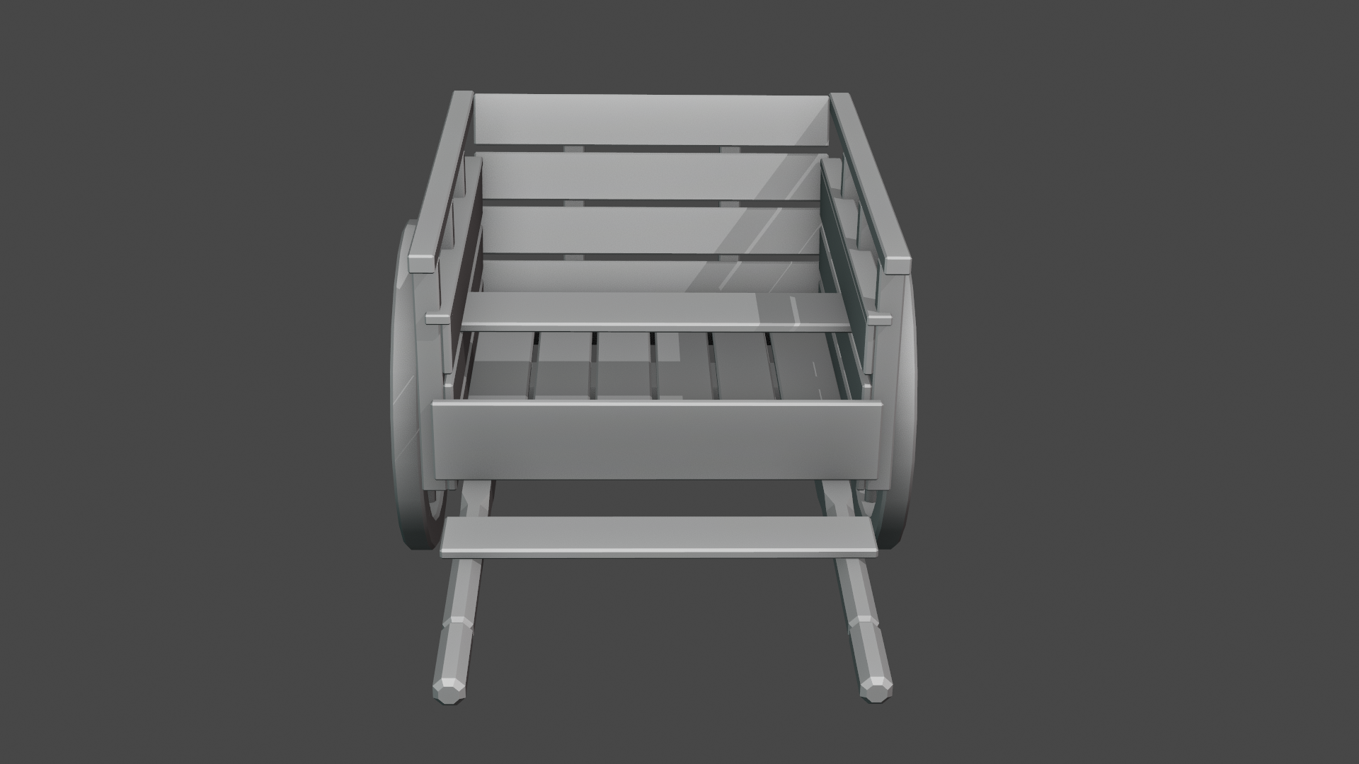
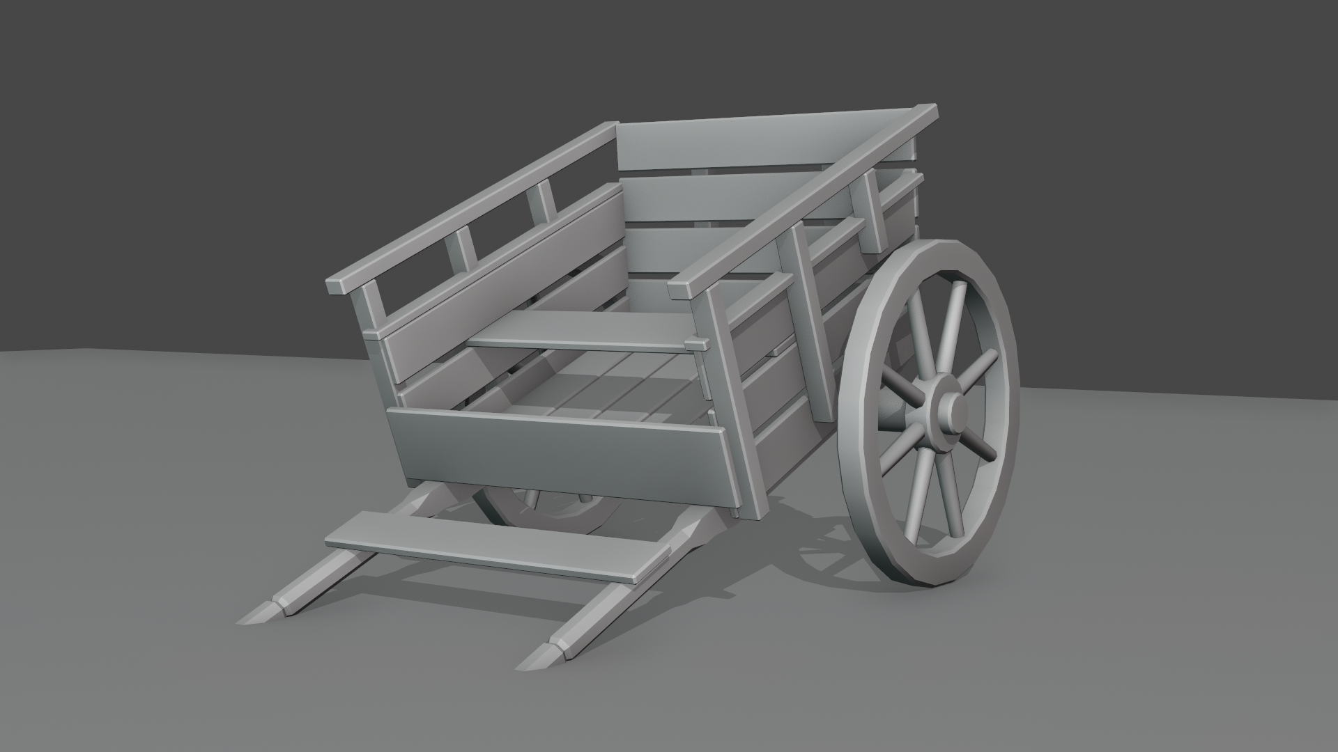
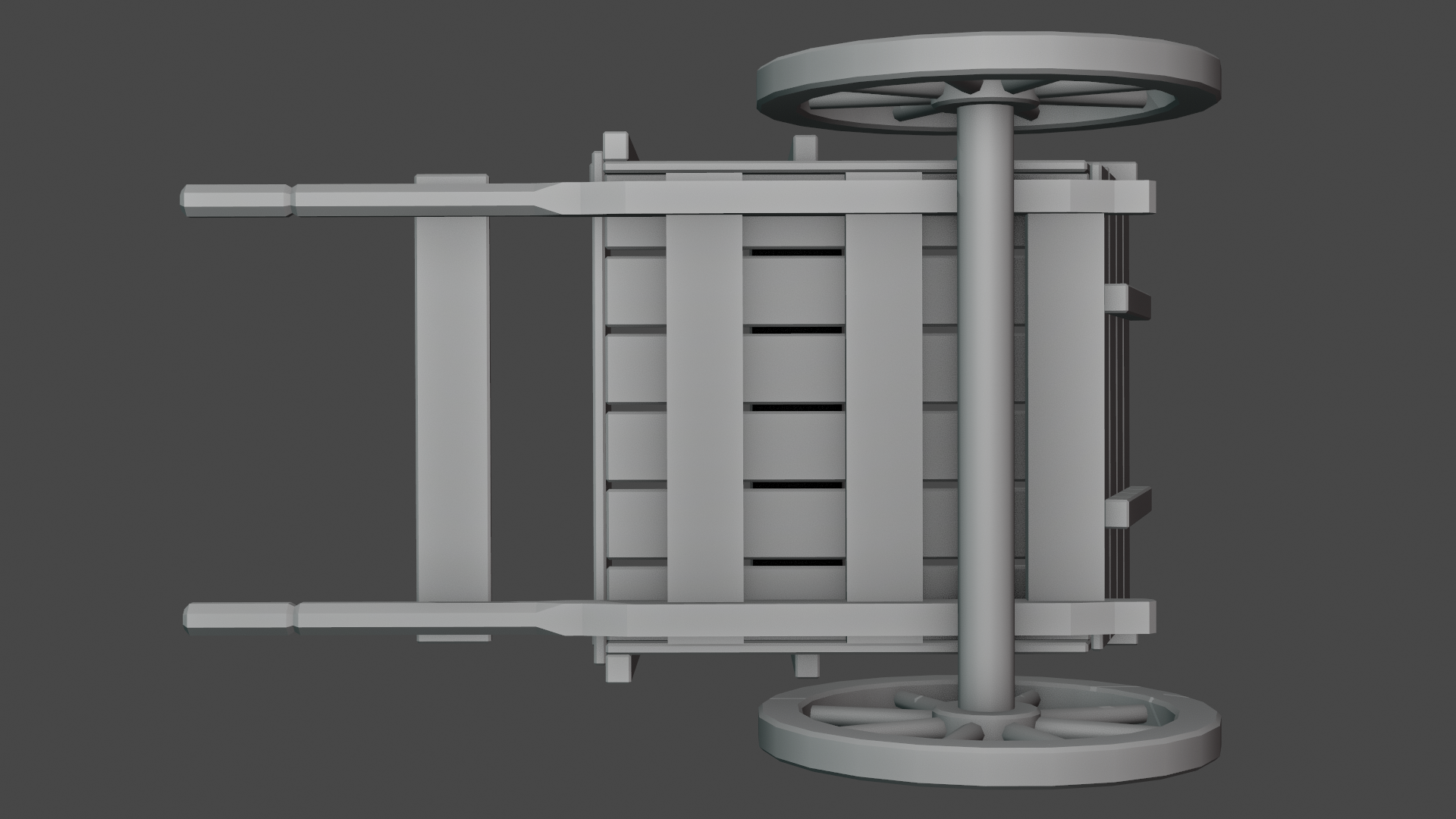
(Underneath of the cart.)
![]() vincav81 Do I remember correctly that you voted for "Shabby Chic" as our team name?
vincav81 Do I remember correctly that you voted for "Shabby Chic" as our team name?
Just a quick reminder what the proposed team names are so far:
1) Shabby Chic
2) All Access(ories)
3) Shabby Fresnel Chic
4) The Stan Dalones
![]() duerer Yes. Shabby Chic. Short and hopefully easy for Kent to remember amidst all the other team names.
duerer Yes. Shabby Chic. Short and hopefully easy for Kent to remember amidst all the other team names.
Splendid homework for week 1 ![]() vincav81! Trying to think of something else to say besides "it's perfect..." I got nothing. You easily get full points and I'm going to add some extra because I've noticed your helpful posts in various threads.
vincav81! Trying to think of something else to say besides "it's perfect..." I got nothing. You easily get full points and I'm going to add some extra because I've noticed your helpful posts in various threads.
Your cart is going to look 🤩 with sculpted details in week 2!
Congratulations, ![]() vincav81, to your well deserved full plus extra points 👍! It a pleasure to see what you've modeled so far as well as following your illustrated reflections concerning the composition of our spice vendor's house and its environment 😀!
vincav81, to your well deserved full plus extra points 👍! It a pleasure to see what you've modeled so far as well as following your illustrated reflections concerning the composition of our spice vendor's house and its environment 😀!
I know that I'm probably crazy doing this, but here is my current progress remodeling my cart.
This is because the original has some twisted geometry in places and I'd rather have a "trim and true" version to begin Week 2 from. Also I'm using this opportunity to "model smarter, not harder" @theluthier and see how much geometry I can reuse through Linked Object Data.
Admittedly this may be a fool hard attempt, as it may be while the imperfection of my submission may irritate me (I'd like to be certain that any Linked planks will actually be all the same dimension before linking them, ie. no bizarre skewing of geometry), that same imperfection may be what endears it to others.
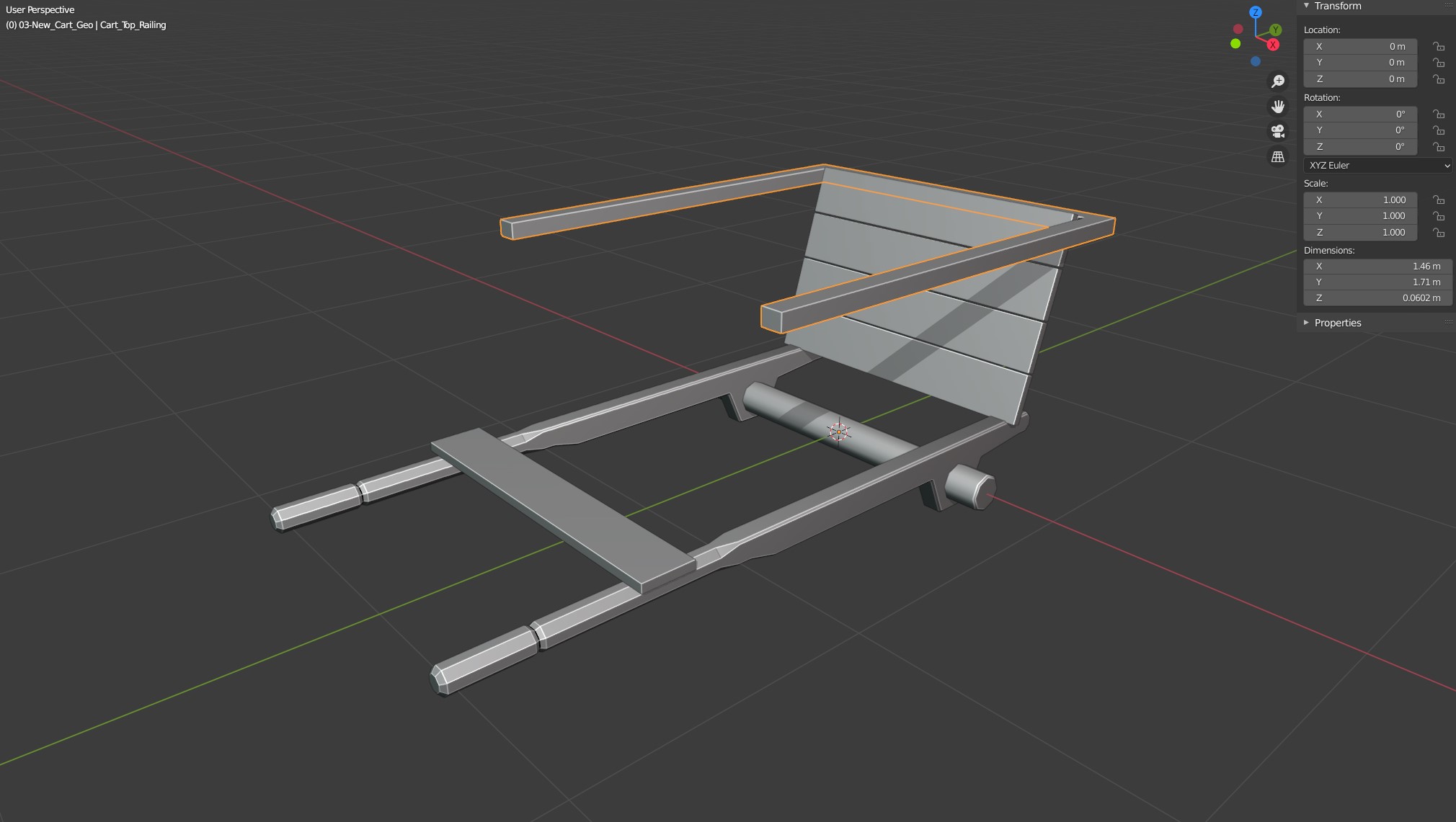
Also while beginning this second draft I realised that I'd forgot that most carts tend to have Leaf Spring suspension 🤔, so I guess the quickest fix would be to say that the Spice Vendor is a very frugal chap (a Scrooge McDuck if you may) and bought the cheaper cart without any suspension from the salesman. ![]() harbinger_ua Then use the savings to buy/find more spice perhaps?
harbinger_ua Then use the savings to buy/find more spice perhaps?
In any case I may just be needlessly wasting my efforts, but as has been told to me many a time: I'm a perfectionist. 😁
Until the Live Stream then. . .
Now I really do think that I'm crazy: I think I like the first one better.
(Dick Dastardly – "Drat! Drat! Double Drat!")
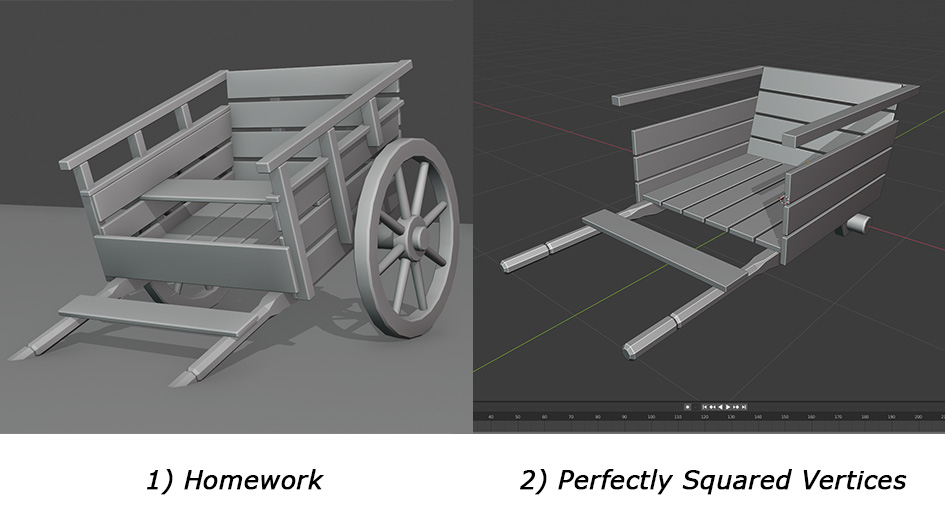
Maybe I should just split the difference and just replace the old draw bars with the 2nd version's pair.
I wanted to add metal tires to the wheels, but know I think that that would just ruin the simplicity of the 1st cart.
Any words of wisdom? Or failing that common sense? ![]() duerer
duerer ![]() sheila5 @createtaiwan
sheila5 @createtaiwan ![]() wardred
wardred ![]() dostovel
dostovel
Don't worry, it's inanimate object. I say go the Jedi way and follow your instincts, if you want to be a perfectionist, follow that. I for one like how details bring things to life.
![]() vincav81 Love it! I really enjoyed seeing Magician Melvin as a size comparison. Beautiful work.
vincav81 Love it! I really enjoyed seeing Magician Melvin as a size comparison. Beautiful work.
I can't believe this, It's so bad, using Melvin as a Donkey, what was you thinking!!!
I think we're adding details next so I wouldn't get hung up about it. I personally got obsessive about making things perfect at first so that when I went back to smash my geometry up it was a more controlled form of chaos. 😆 I think theyre BOTH great. :3
![]() vincav81 I think this is going to be a complex scene with a ton of verts, so anything you can do to link and reuse would probably be appreciated. . . as long as you don't compromise the final product. I'm listening to almost this exact point by Kent as I type.
vincav81 I think this is going to be a complex scene with a ton of verts, so anything you can do to link and reuse would probably be appreciated. . . as long as you don't compromise the final product. I'm listening to almost this exact point by Kent as I type.
I took a closer look at the cart, and I see in the original artwork everything appears to be wood. I don't think it would be breaking the feel of the artwork to add metal wheels to the cart, but I'd check with your group leader about that.
I'm hoping a lot of the how much detail to put into the project, like the springs, will be covered in today's stream. I don't know if we really want to focus on what we can see from the original art work, or if we want to be able to walk around things. If we want to be able to walk around things, it'll need more detail.
![]() wardred Thank you. I think I may just go with what I've got so far on the 1st one and worry about real life details after the collab.
wardred Thank you. I think I may just go with what I've got so far on the 1st one and worry about real life details after the collab.
![]() vincav81 I've blocked out the spice vendor's house three times until I got this relatively close match 🕵️♂️! So, welcome to the club 😉😁!
vincav81 I've blocked out the spice vendor's house three times until I got this relatively close match 🕵️♂️! So, welcome to the club 😉😁!
Ok, so here's the current progress of the lower poly version of my Homework model, for future syncing to the Collab folder.
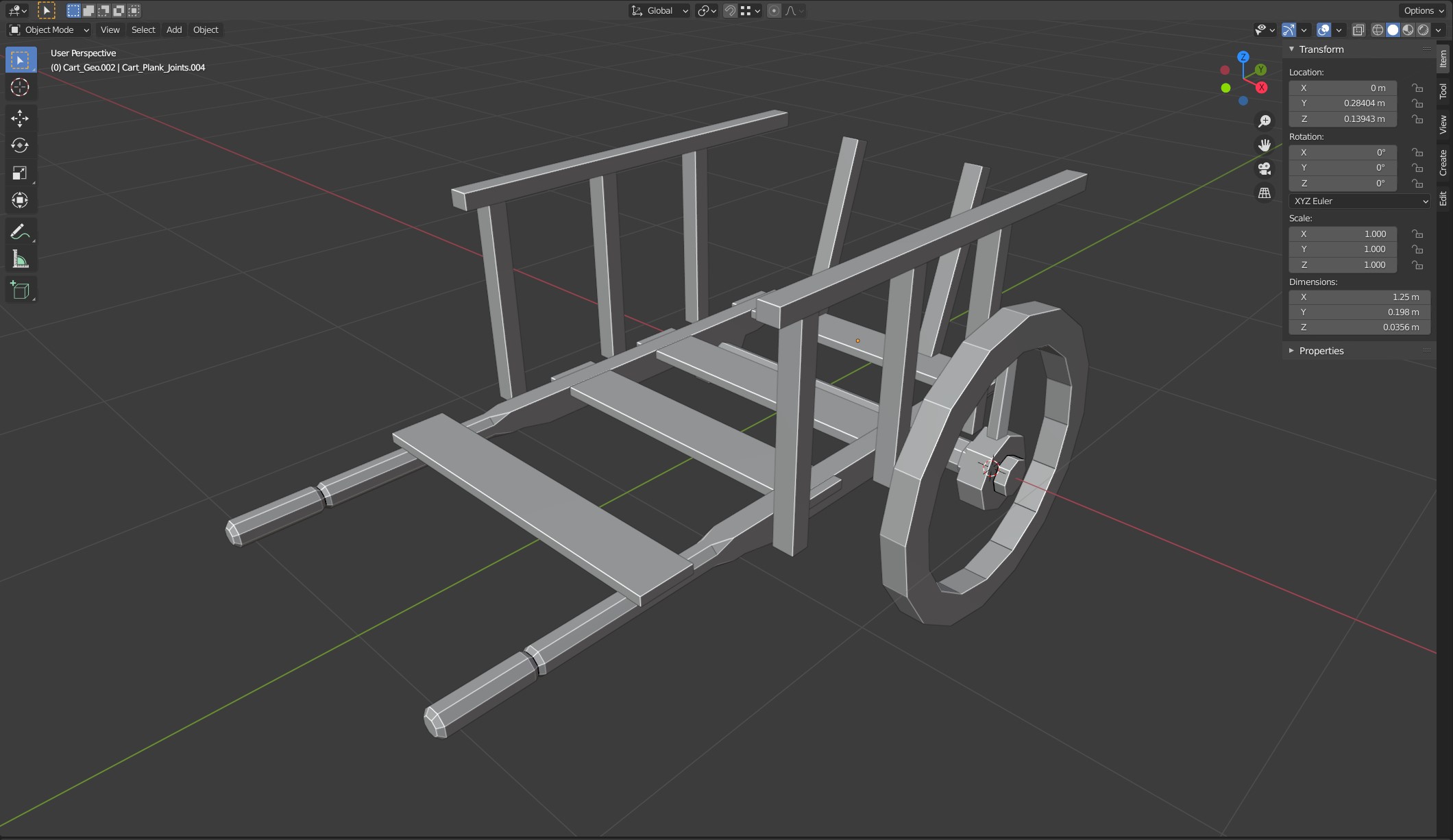
1. Current state of cart.
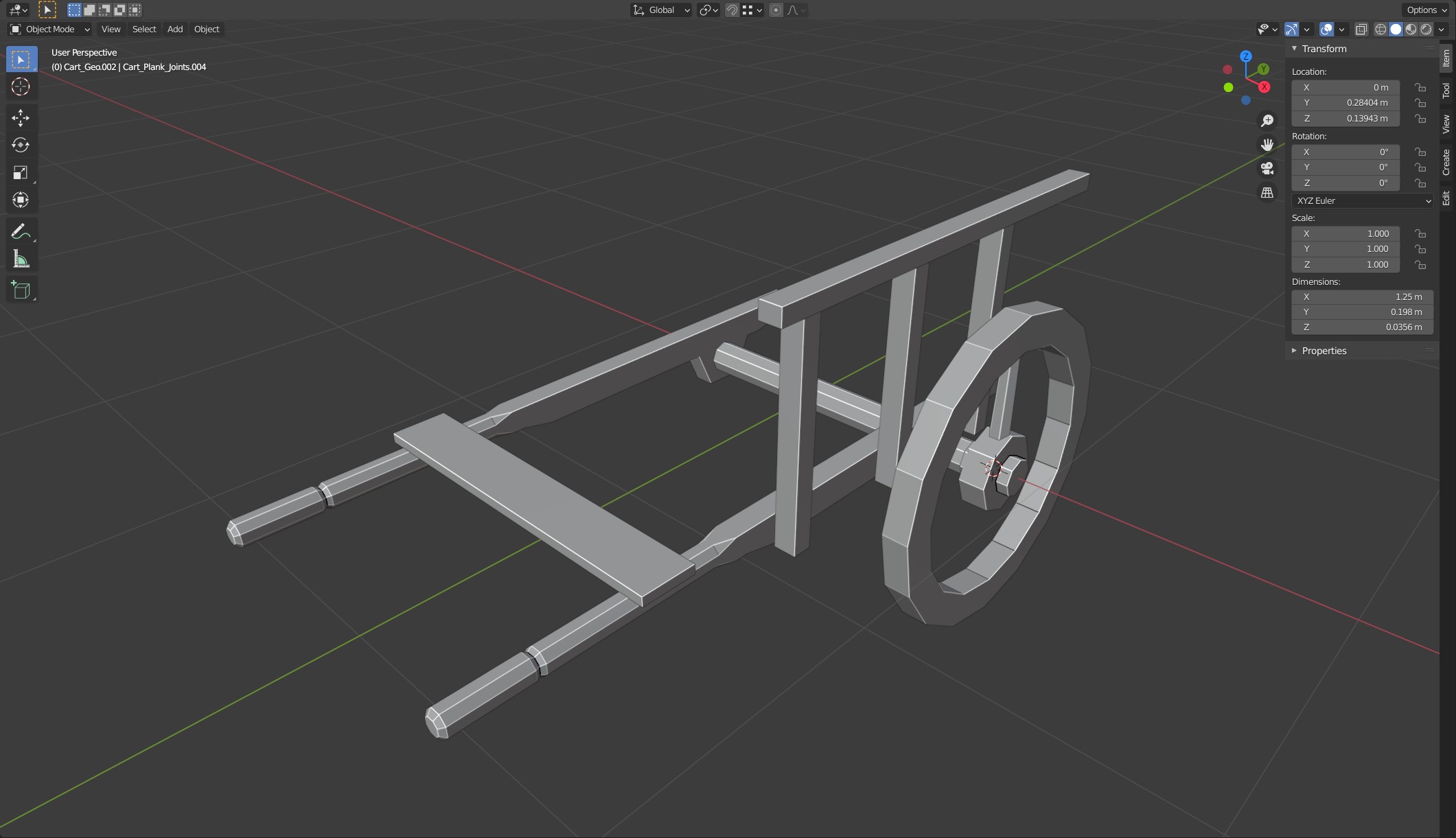
2. Cart with all the duplicated geometry turned off. (Forgot to turn of the Mirror Modifier on the handle though 😬)
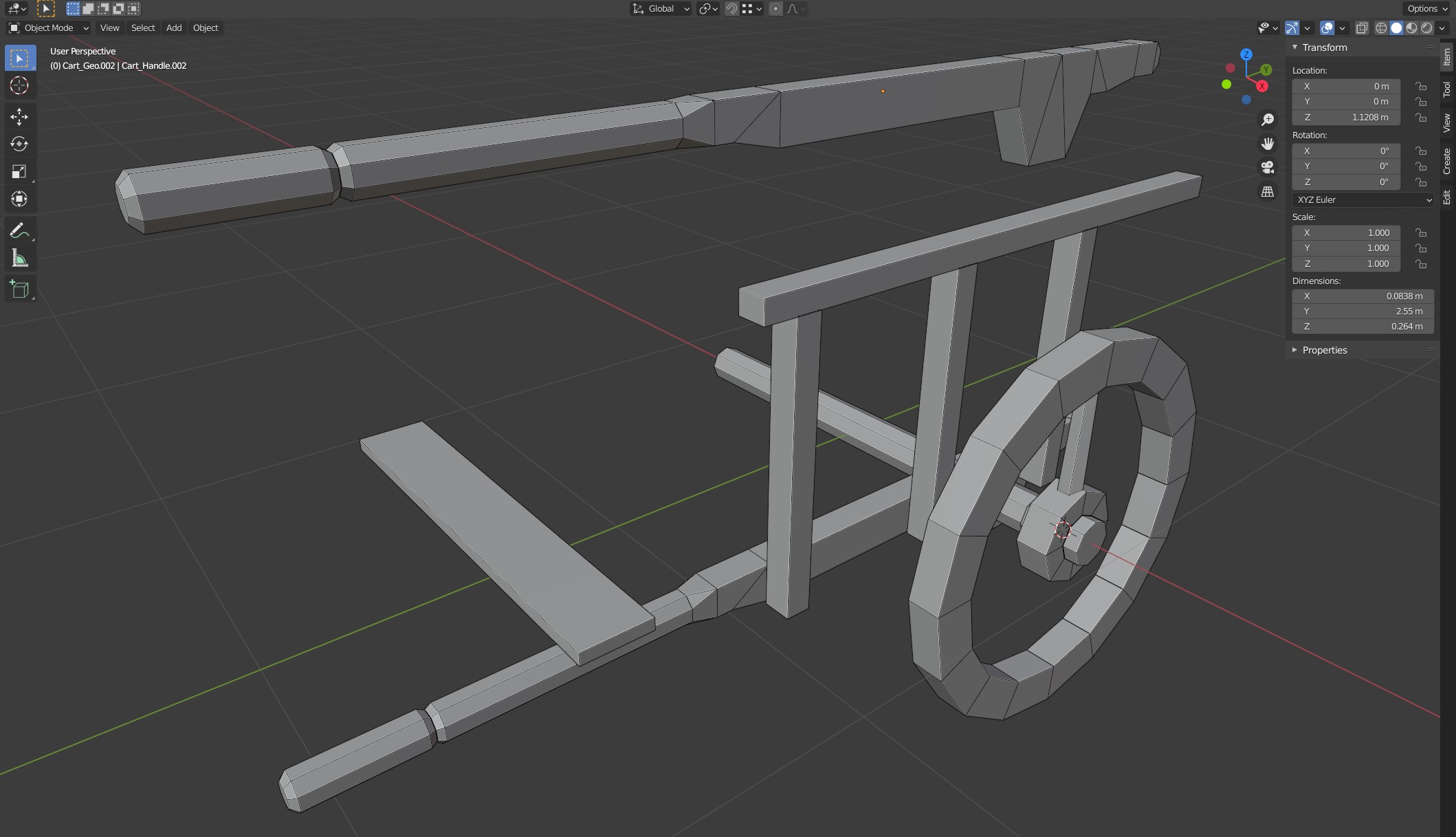
3. Cart wireframe with Mirror Modifier turned off. Handle duplicated to show wireframe separate from the other geometry.