I can't tell you how many times I go to my edit preferences. I also can't tell you how many times I get annoyed by my pop-out window of Edit Preferences disappearing on me when I am not done with it. Since the release of custom Workspaces I found a great solution to my problem!
Step 1. Open a new instance of Blender and start on a new file.
Step 2. Duplicate the Layout Workspace by right clicking on it and selecting Duplicate
Step 3. Double click on the duplicate Workspace and rename it to something like "Edit Prefs" or similar.
Step 4. Change the Editor Type to Preferences.

Step 4. Optional. Split the window and change the second half to whatever editor type that you currently want. I typically leave the second screen as the 3D viewport so I can see changes live while I am editing my preferences.
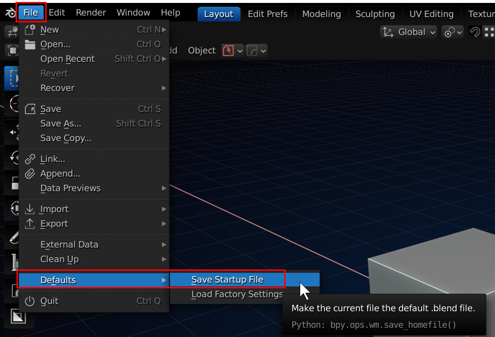
Step 5. Click on the Layout workspace again and save the startup file by clicking File, then Defaults and then click Save Startup and confirm.
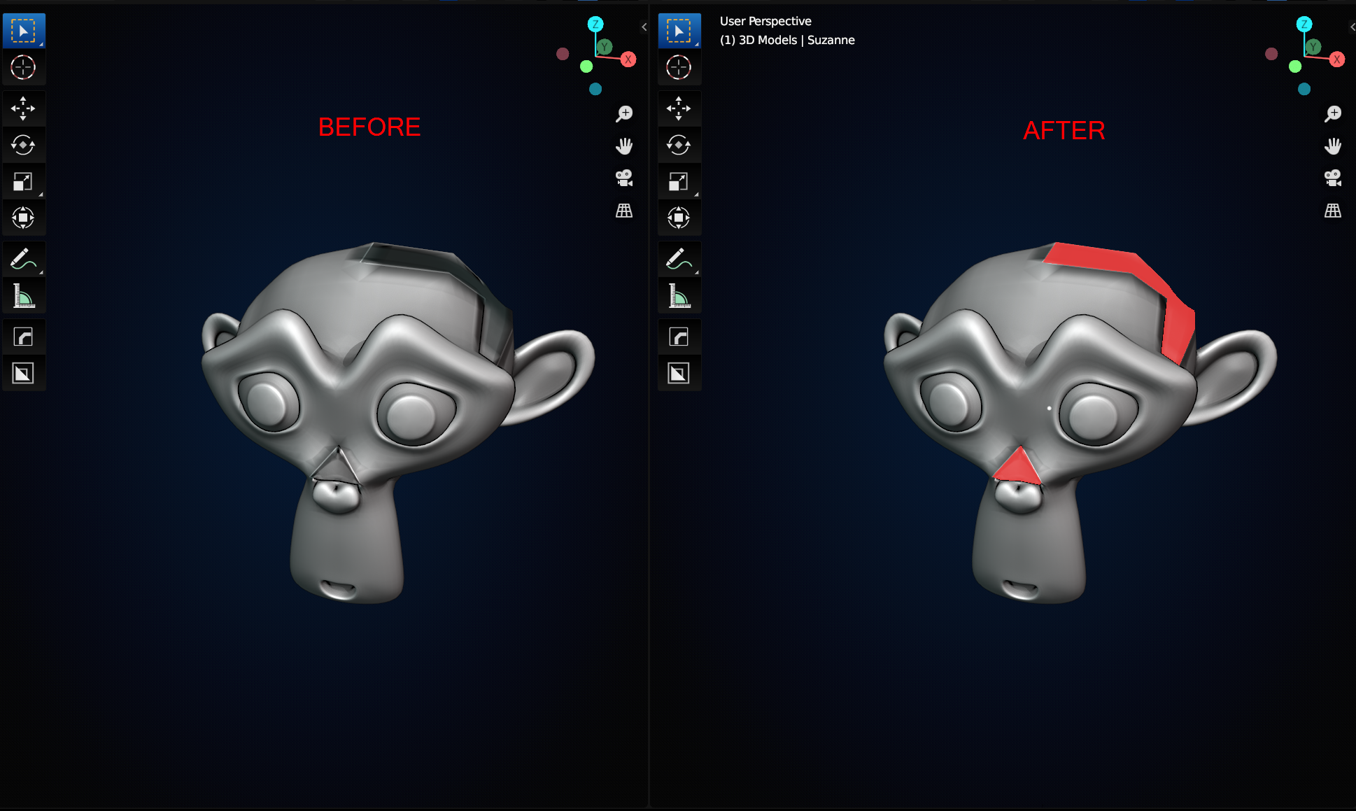
We've all been there. Working and plugging away on our beloved project. Then it comes time to add a Subdivision Surface modifier, or a bevel modifier and the cookie starts to crumble in our hands. After lots of troubleshooting and maybe a forum post or two we find that we have fallen victim to the ever elusive flipped normals! No longer will we be tricked thanks to this new treat! This one is actually credited to Josh Grambell from his video on his custom Blender Settings. Gold nugget #1 comes in handy for implementing Gold Nugget #2.
Step 1. Open a new instance of Blender and start on a new file.
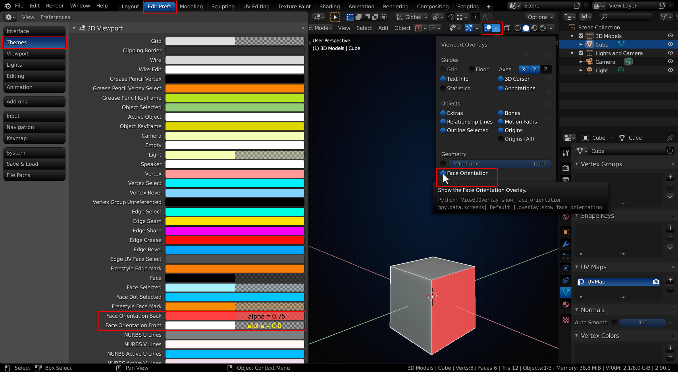
Step 2. Go to your Edit Preferences and click on the Themes tab and open up the 3D Viewport section.
Step 3. Find the Face Orientation Back and Face Orientation Front settings.
Step 4. Set the alpha on the Face Orientation Front to 0.
Step 5. Set the alpha and color on the Face Orientation Back to whatever you please. (I personally like a dark pink/red with 0.75 alpha).
Step 6. Save the Preferences
Step 7. In your 3D Viewport click on the Viewport Overlays and turn on the Face Orientation.
Step 8. Click on the Layout workspace again and save the startup file by clicking File, then Defaults and then click Save Startup and confirm.
Now anytime a normal flips without your permission you'll know instantly and can flip it back with Shift + N.
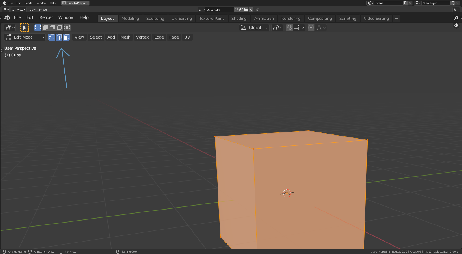
Did you know you can shift select the selection method icons in the top right of the screen and have all methods available all the time instead of switching from one to another.
All selected 👇
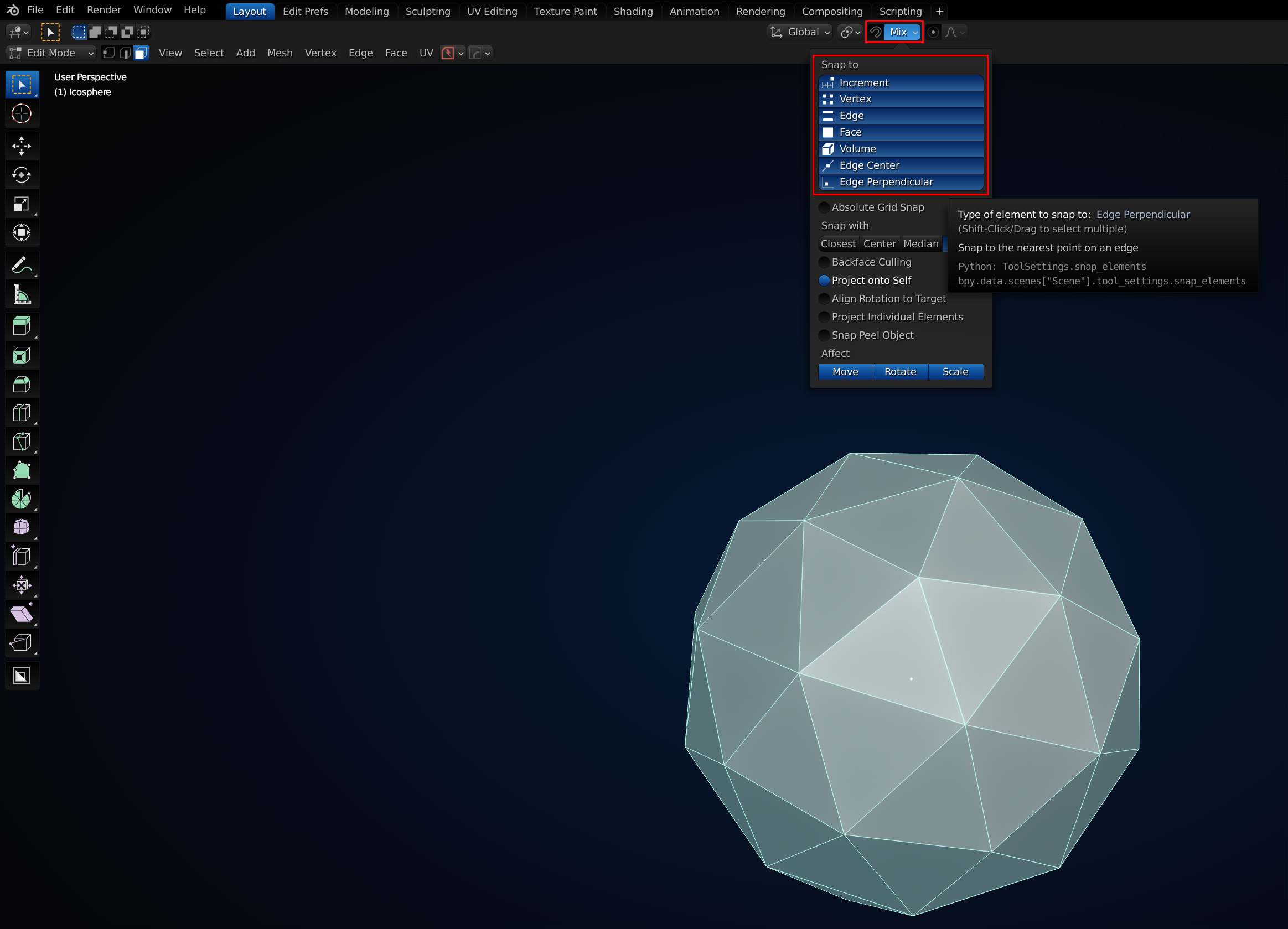
This is a follow-up on gold nugget #3 from @adrian2301. You can have multiple snapping options enabled by shift selecting them in the Snapping Menu.
Keyboard shortcuts Side note:
This is a great idea ![]() blanchsb ! Thanks for all the helpful tips so far from yourself and @adrian2301. I will certainly add any ones I come across to the list!
blanchsb ! Thanks for all the helpful tips so far from yourself and @adrian2301. I will certainly add any ones I come across to the list!
You can also define a selection of "Snapping Targets Elements" by hovering over one of these elements with your mouse pointer and pressing "a" each time. It's even possible to repeat this with one element in order to assign it a higher "Influence/Weight" in that "Snapping Target Elements Selection". After your selection is complete, move your mouse pointer away from any "Snapping Target Element" and confirm with "RETURN". This method only works with the "Magnet Button" activated (indicated by the blue color), NOT with the "CTRL" key!
The image below shows this with "Vertices" as "Snapping Target Element". The white circles and and the red-orange double circle for the last selected element show the yet unconfirmed selection: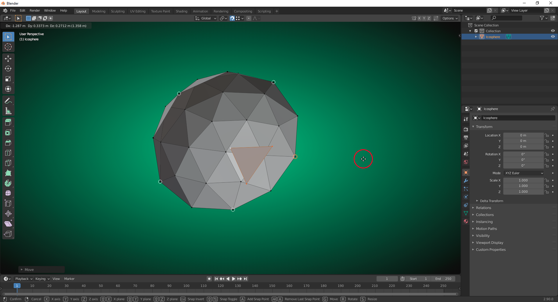
Woah hitting 'a' multiple times on one of the elements when multiple are highlighted is quite interesting and does indeed add more "weight of influence" to the selection. Hitting alt + a seems to lessen the "weight of influence on the one area.
I never even knew that was a thing! Cool nugget ![]() duerer
duerer
I finally got my favorite theme posted to the devtalk.blender.org website under their "Call for Content: Themes" posting.
My theme is called Deep Blue Something (you can Ctrl + F) to find it in the web address below...
https://devtalk.blender.org/t/call-for-content-themes/3174/523
I have found this theme has really helped my workflow. Just install it in Blender Preferences under the Themes tab and click "Install" and then navigate to your theme file.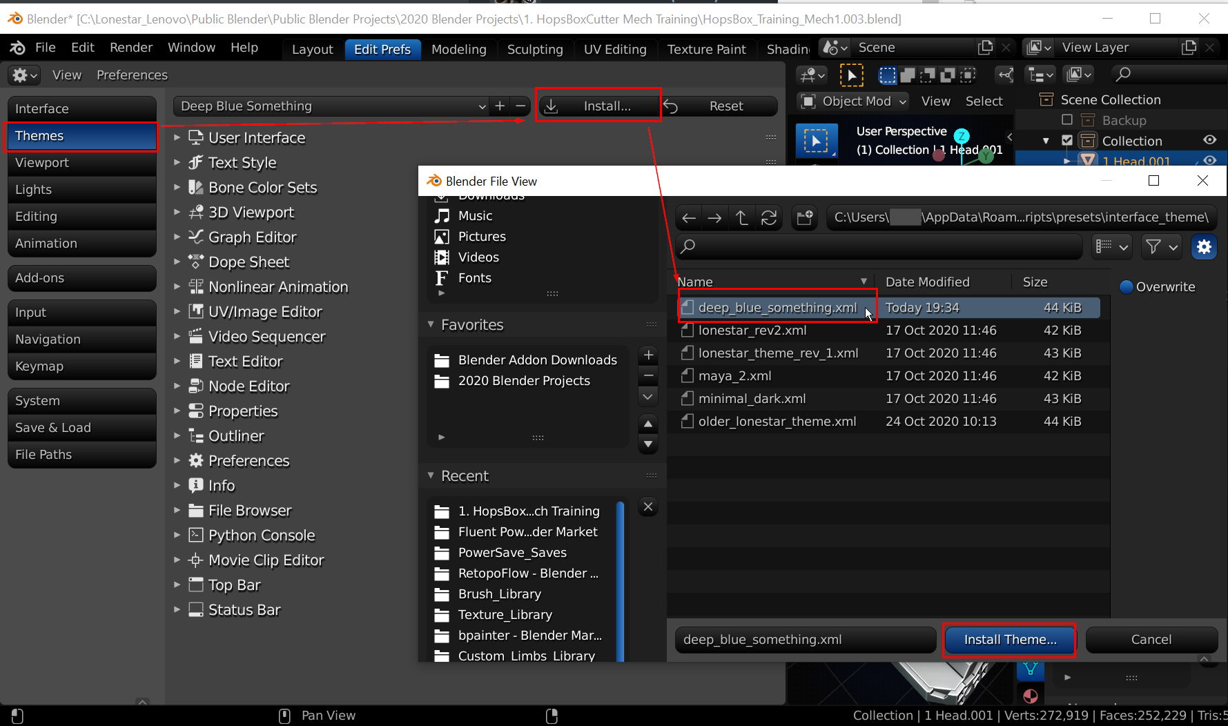
Pro Tip #1: If you continue customizing a theme that you loaded and want to save it: you can hit the '+' icon and save it with the exact same theme name to Overwrite the previous theme (or save a new name).
Pro Tip #2: Saved themes reside on your current install of blender. On windows this path is (replace underlined text): C:\Users\YOURWINDOWSUSERNAME\AppData\Roaming\Blender Foundation\Blender\CURRENTVERSION\scripts\presets\interface_theme
If you have a theme that you love. Go ahead and add it to the community.
I give all of the credit to Grant Abbit on this one during his Cavity and AO tutorial: https://youtu.be/9z2kOJiheZs?t=203
This mech I am working on has some AO that I am mixing in to make the rendered view pop a little more.
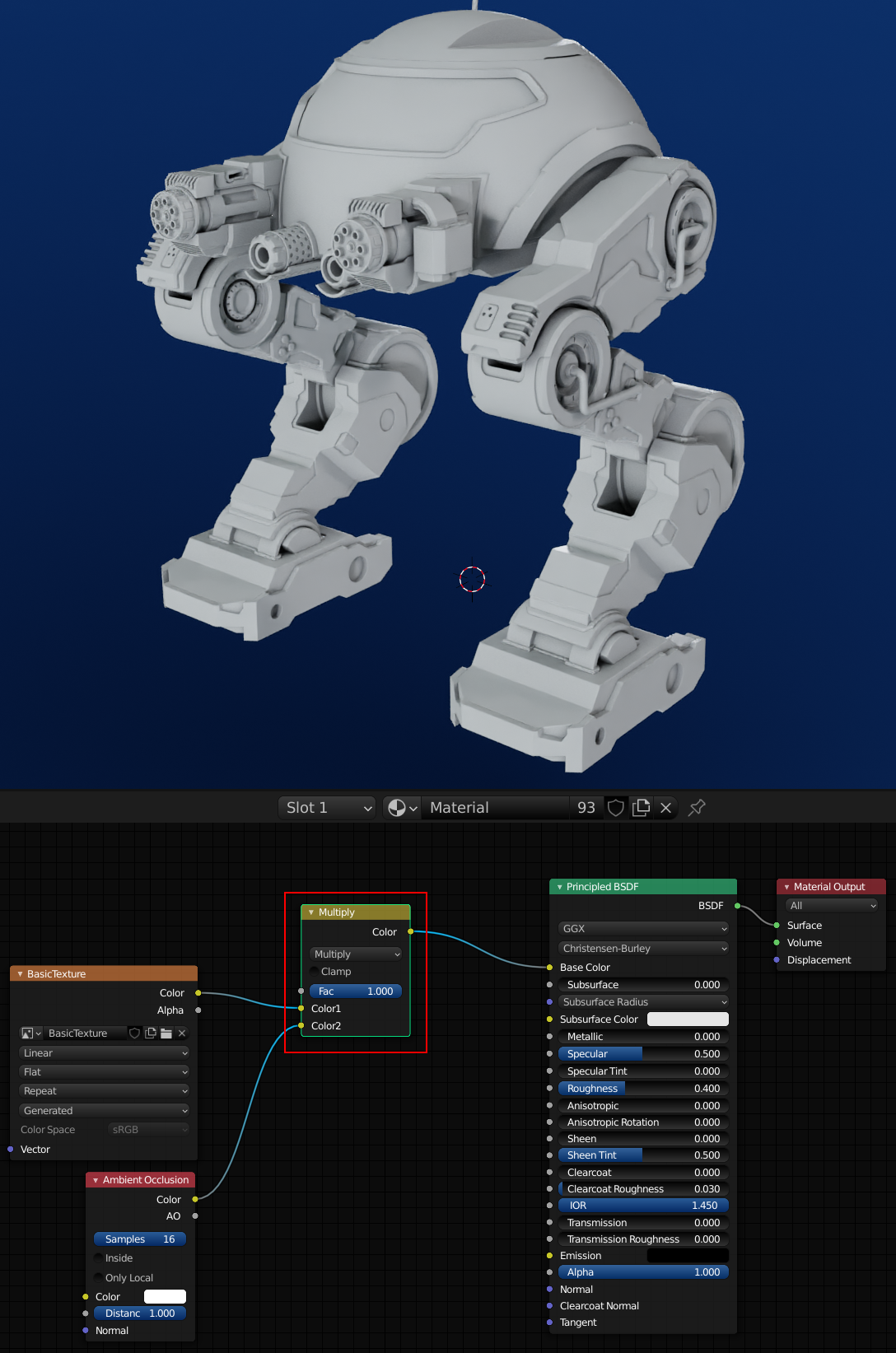 If I wanted to see the comparison of having AO included versus excluded I could select the Multiply node and click the 'M' key on the keyboard to MUTE the node.
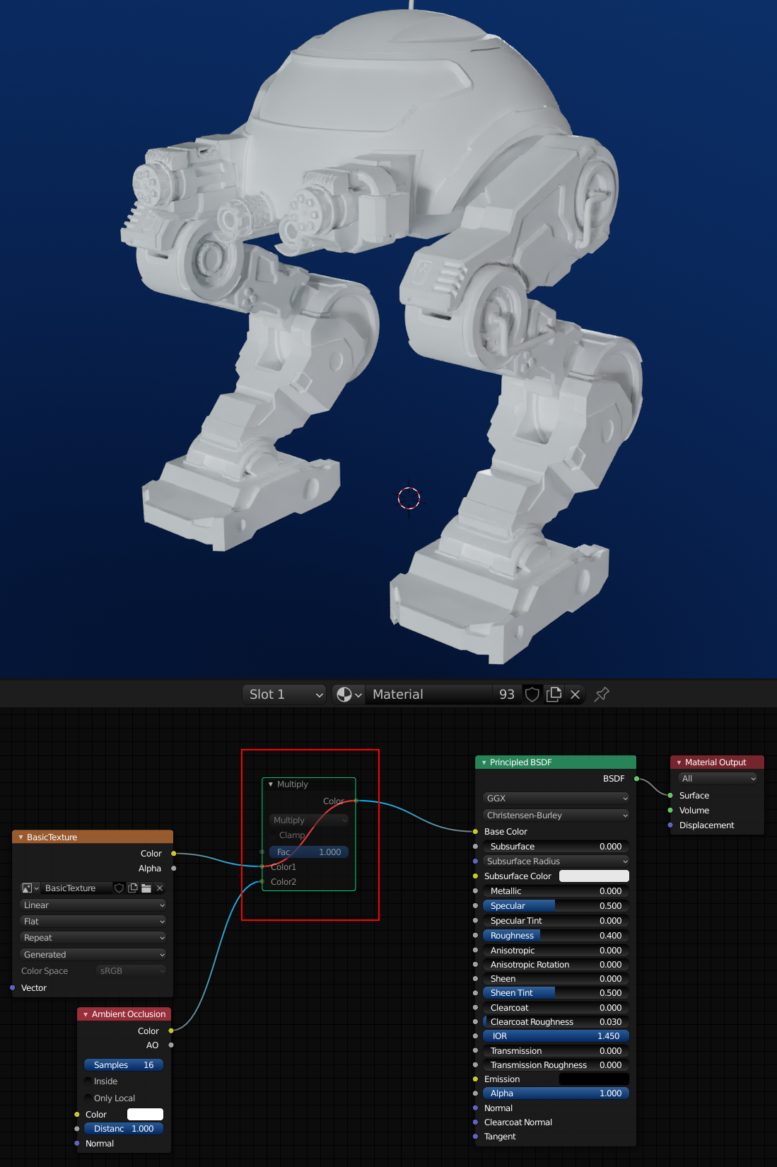 This can be very helpful to see the difference the node made versus not having it. Toggle the mute off with the same 'M' key.
You could also just focus the node to a viewer by using Ctrl + Shift + Mouse Click (mine is Left Mouse Button) while on the selected node you want to focus on. This enables a Viewer Node that only looks at 1 of the selected node's outputs. You can scroll through multiple outputs on the same node with this key combination. When you are done using the Viewer node just use the key combo on the last node before the Material Output node.
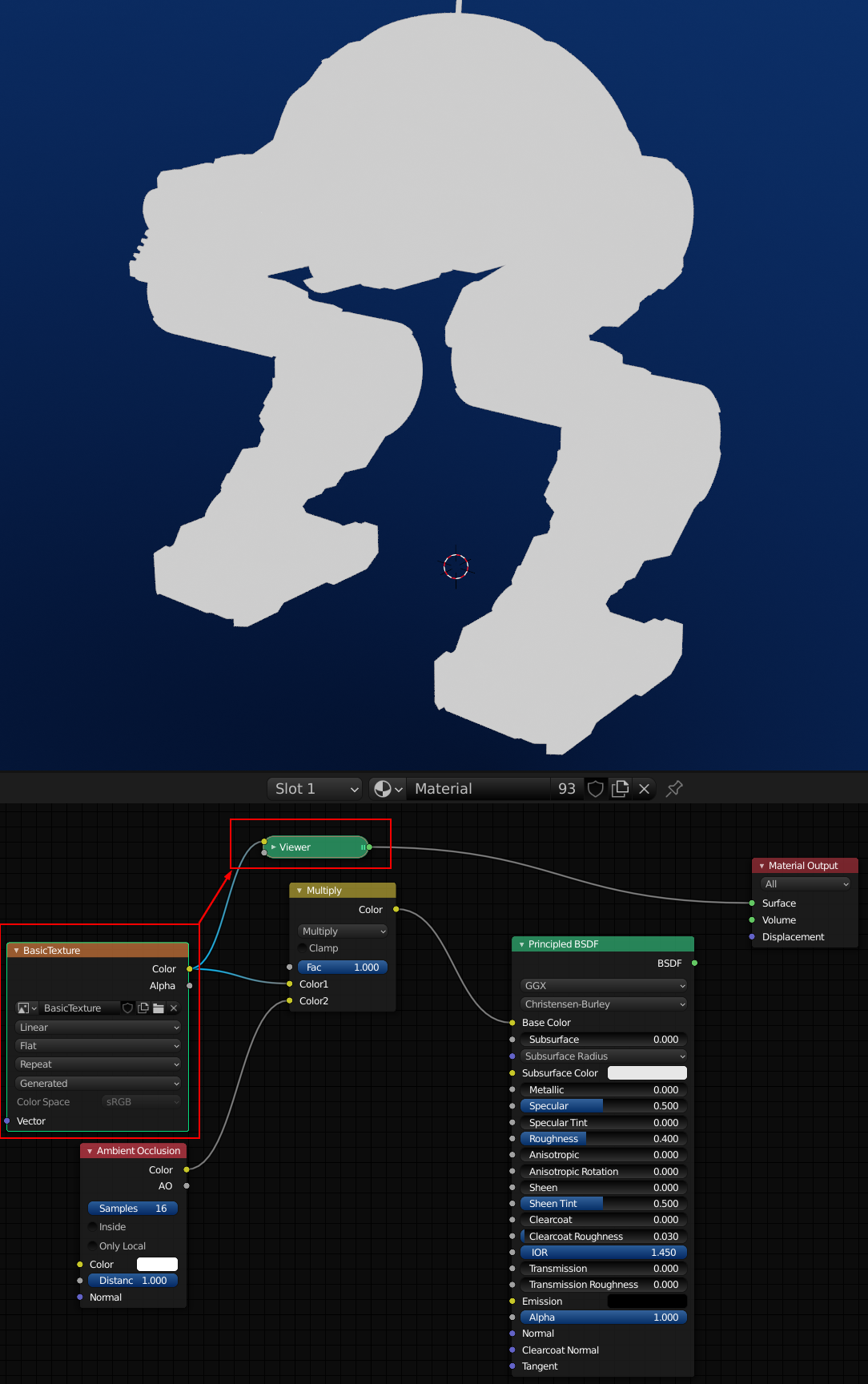
Okay Pablo gives some great use-case scenarios where this is super useful and I just came across this video today despite it being out for a little while:
![]() blanchsb Thanks, Shawn, for this video link! I always like to see Pablo presenting new features or explaining existing features that are not so well known!
blanchsb Thanks, Shawn, for this video link! I always like to see Pablo presenting new features or explaining existing features that are not so well known!
I have been using Fluent and Box Cutter a lot over the past month and been thinking about how to improve my speed on certain areas.
Blender modifiers were made to make life easier but they were also meant, if used properly, to make our work non-destructive (also called non-permanent) and able to change on the fly with extremely little effort. This modeling nugget is just something I have been trying with different daily exercises. I wanted a quick sample sheet to show the power of the message.
Todays example: Cutting holes into cylinders has bugged me for a while. So my exercise was to find a way to make it more dynamic.
The up front work pays dividends because everything is adjustable.
Step 1: Make Your Design Pattern. Orient the pattern to have a plane on the X-Z direction and set the origin to the lower left side.
Step 2: Add in an Array Modifier on the Relative Offset X-Axis and turn on Merge threshold. The count will define the adjustable length.
Step 3: Add in an Array Modifier on the Relative Offset Z-Axis and turn on Merge threshold. The count will define the adjustable diameter of the cylinder.
Step 4: Add in a Simple Deform Modifier and set to Bend and adjust Angle to 360° on the X-Axis
Step 5: Add a Weld Modifier to clean up the stray verts
Step 6 (Optional): add in a Solidify, Bevel, Sub-Division Surface Modifier as desired.
Step 7: Select object and turn on smooth shading.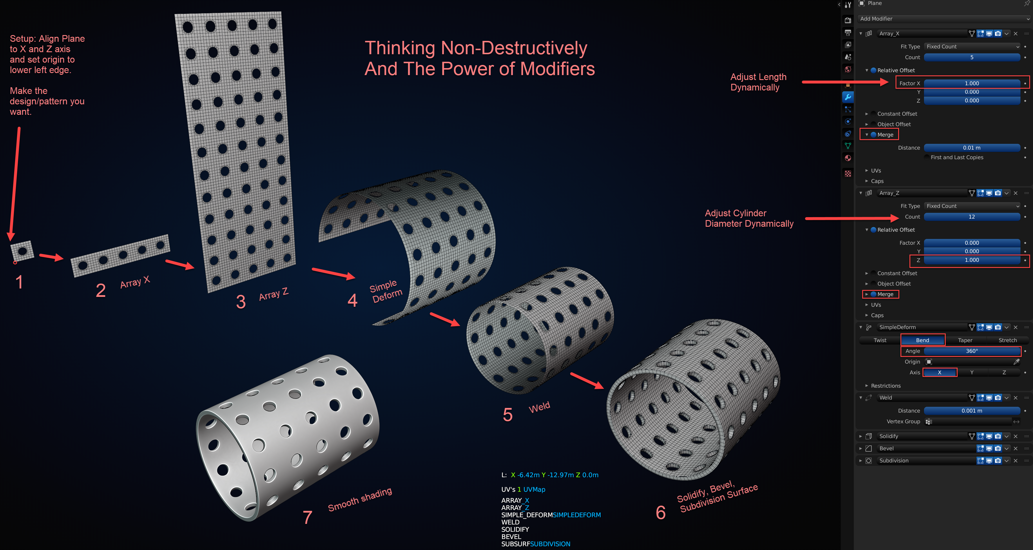
Changing the design at Step 1 opens up lots of possibilities. But adjusting Step 2 and 3 also has it's benefits.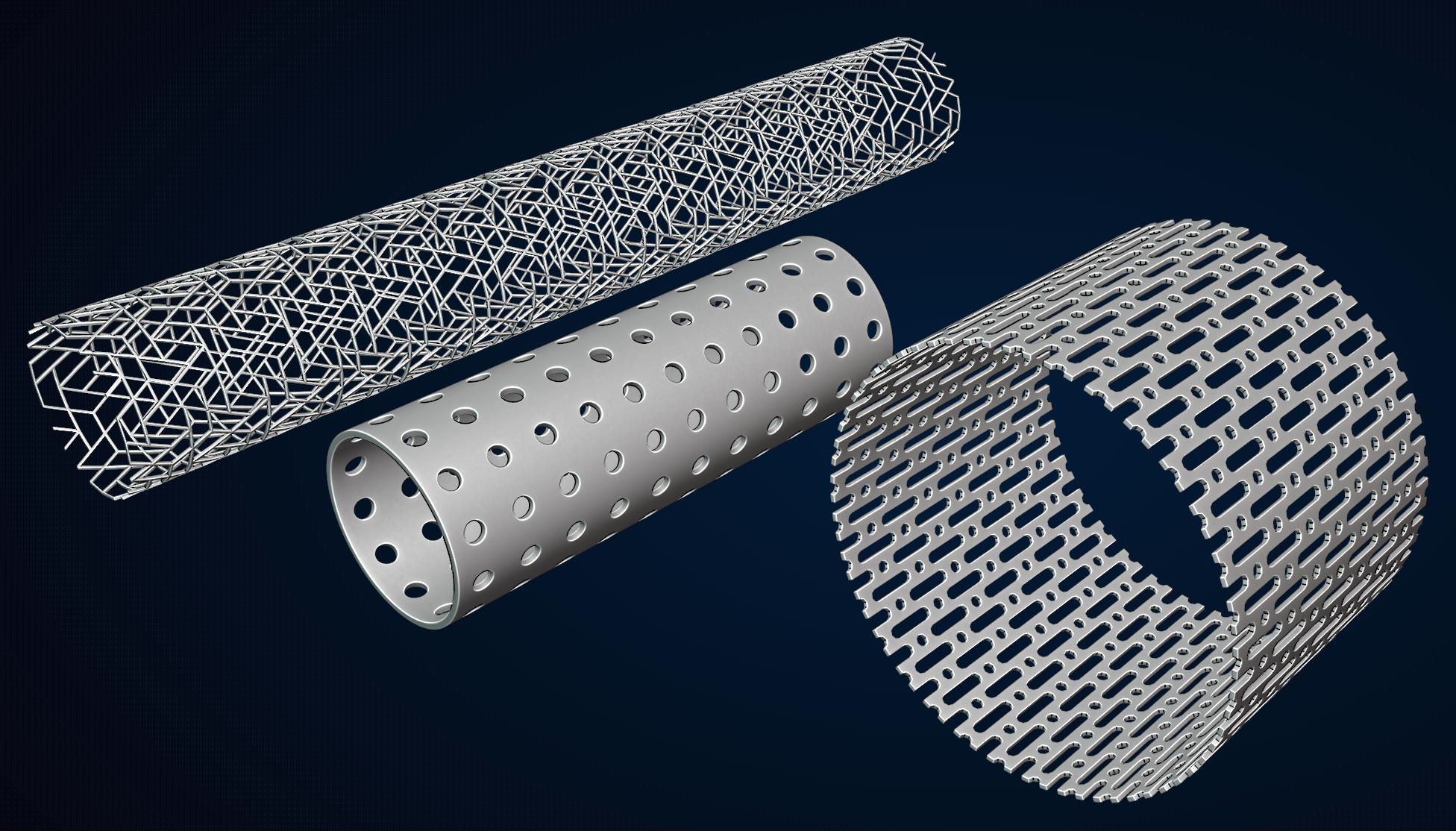
Looks great 👍! This is also possible with spheres:
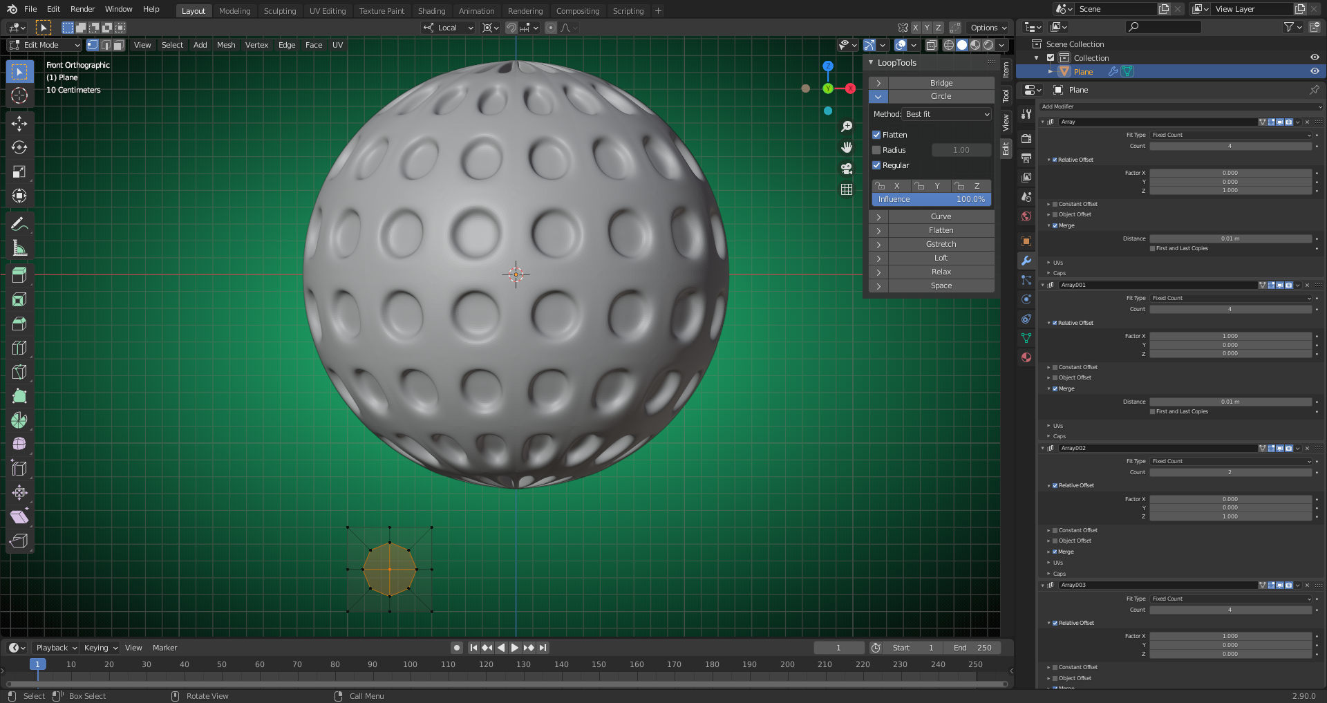
Just the distortions towards the poles can be a problem (if this is not intended for artistic purposes 😉). File is here.
I've tried something which definitively needs some further tweaking:
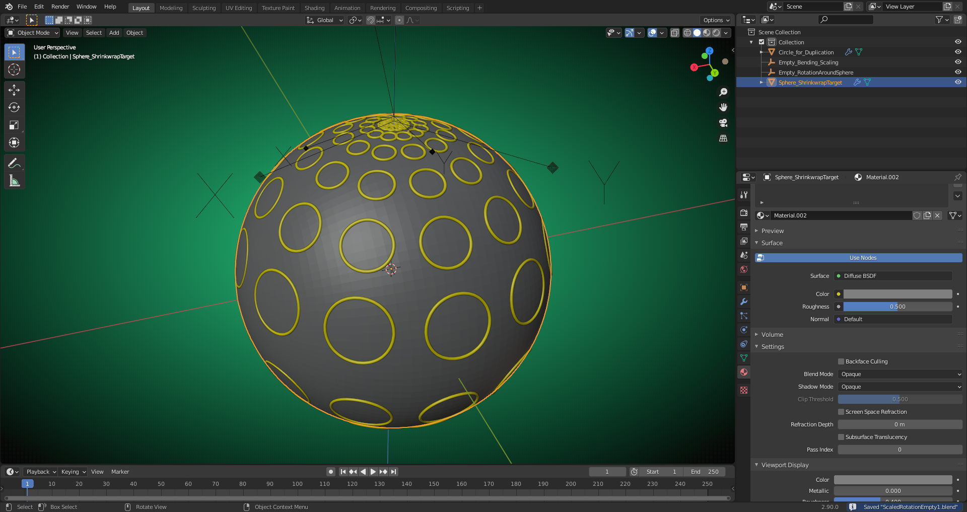
File is here. Suggestions for improvements or smarter solutions from scratch are welcome.
I think you are on to something ![]() duerer
duerer
The circles deform though so maybe incorporating my nugget methodology from my post here would solve that issue?
https://cgcookie.com/questions/12452-blender-nugget-using-array-and-curve-modifier-without-the-curve-deformations-shrinking-fattening
I'll have to take a look at it after my son's karate practice.
I've found a solution and it works essentially the way as you described it on your linked page above by using a "Face" as "Instancer" which has been duplicated with an "Array Modifier" (set to "Fit Curve") and a "Curve Modifier":
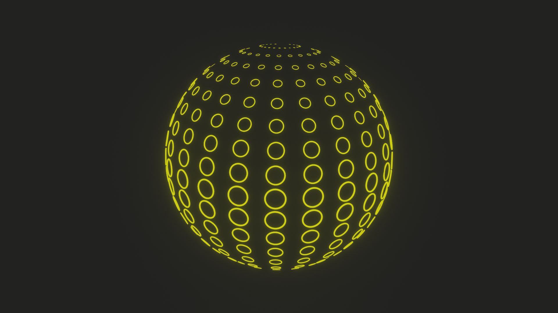
And animated (Warning: Don't get hypnotized 🤪😉):
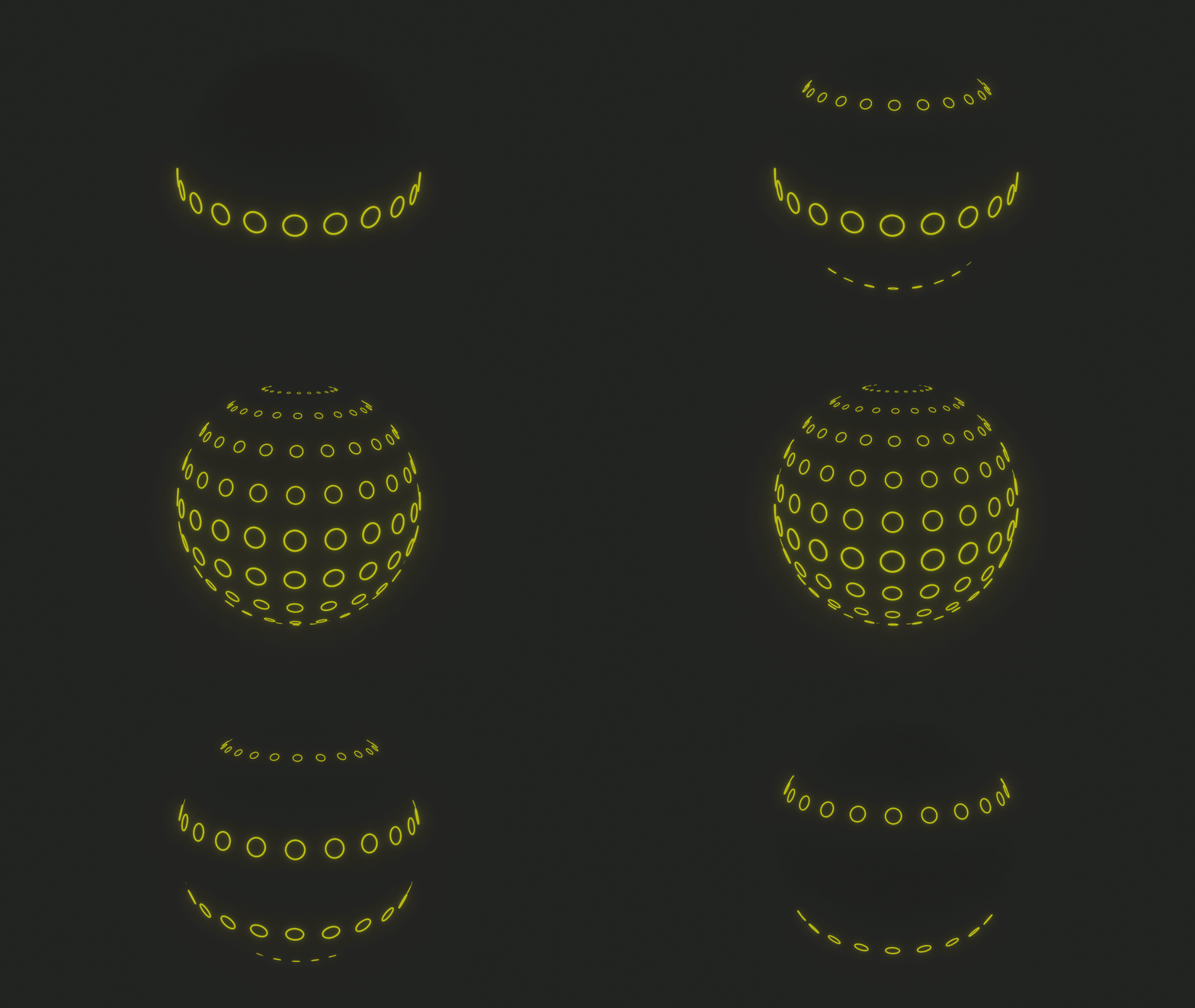
Play with the "Distance X" value in the "Instancing Plane's" first "Array Modifier":
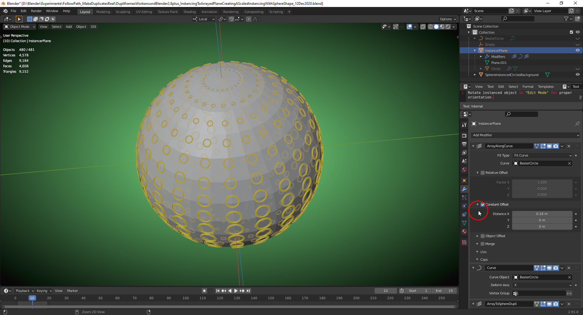
It's important to check "Scale by Face Size" on the "Instancer" (the "Plane") and to make use of "Curve Radius Smoothing":
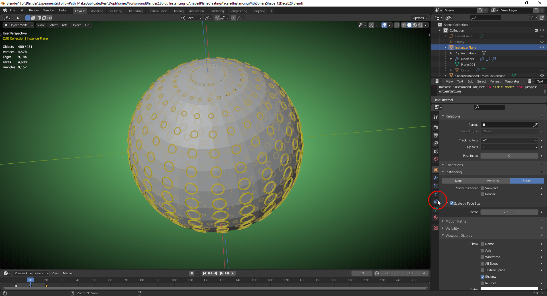
File is here.
Yes! That's exactly as I envisioned it! Super cool implementation. Saving this file to my modeling nuggets folder. Thanks for sharing ![]() duerer.
duerer.