 I made a robot for my primitive modeling challenge.
Great job, Josh!
Good design. Hands and 'wrists' look really 'attractive\pleasing'. Nice use of colors as well.
Did you use the Empty to pose the right arm?
Thanks!
I completely missed that those lines were in there. I had just watched the tutorial about using collections to mirror things and that is the origin of the collection instance. Would that be considered an empty?
Today continuing with Fundamentals of 3D Mesh Modeling in Blender, here is my single cube robot using extrude, subdivide and some scaling and moving.

I don't know how to mirror things using collections, but that is definitely an Empty;)
I saw it in this video from Production Design with Blender 2.8 and Eevee
Thanks! I'm making a point to try to do something new every day.
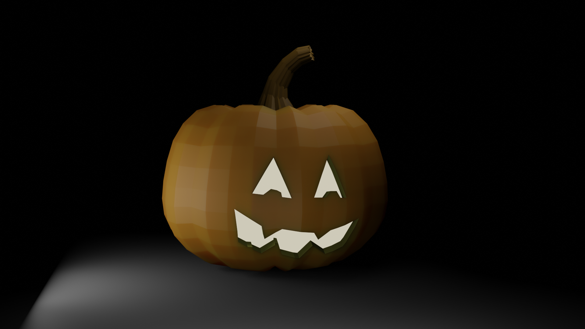
Completed a few more lessons, learned about the knife tool and took a break to try my hand at a pumpkin. Then spent an hour trying to make lights look ok... They seem to have to be way closer than I would expect?
Thanks a lot Josh! I watched that a long time ago and completely forgot the part about Instancing a Collection .
The instance indeed comes in with an Empty: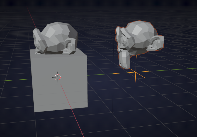
And by the way: scaling by negative 1 is not the same as mirroring; it has the same effect when in Object Mode, but I use it quite a lot and when you are in Edit Mode this trick tends to flip the Normals. Easy to fix, but just something to be aware of.
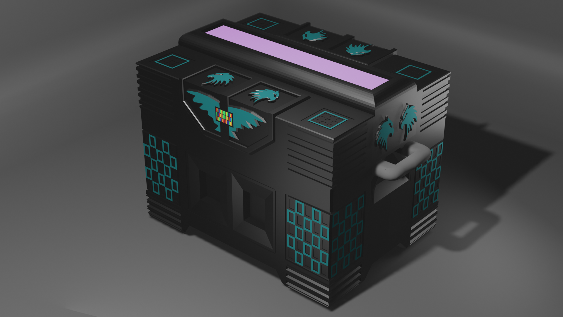
Here is my Sci-Fi crate for Fundamentals of 3D Mesh Modeling in Blender.
I really like carving with the knife tool. I found an image of an eagle head and traced it with the knife and extruded and beveled the edges.... lots of ngons, but I guess I'll figure how out to deal with those later.
I'm learning to 3D print while I'm learning blender, decided to give this model a try! This is 4cm diameter (1.57 in) around the widest part so I took an orange hi-liter and sharpie to bring out the features. It actually printed pretty well for being so small :)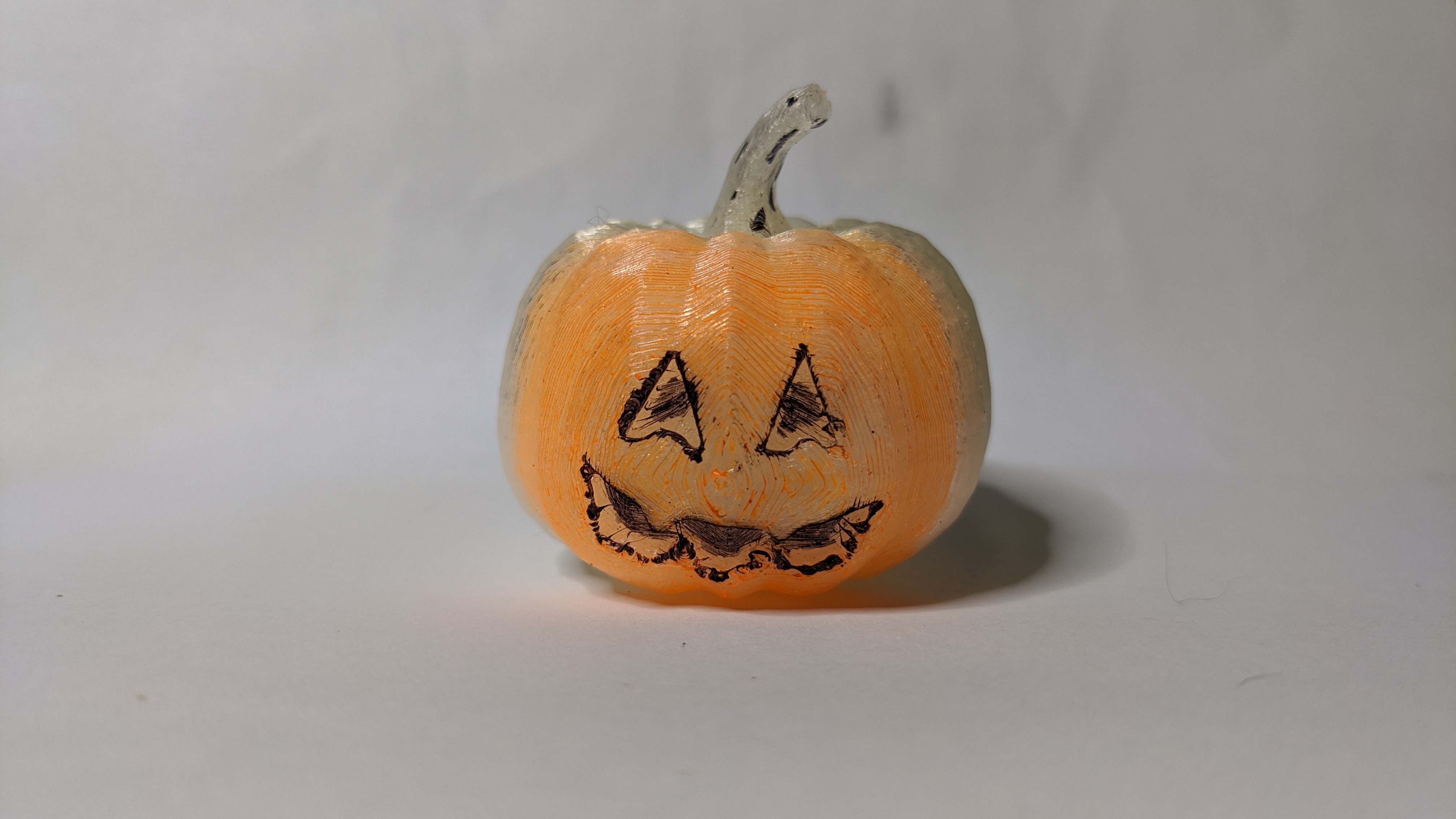
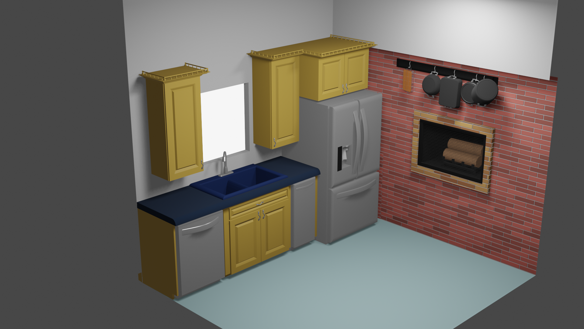
Progress: Day three of working on my low poly room for Fundamentals of 3D Mesh Modeling in Blender .
I'm probably spending too much time on details that aren't going to stand out, like the wicker basket pan holder... Eventually the pots and pans will be hanging on the wall

More progress! Got the pots hung on the wall, updated the lighting and installed a fire place. The brick wall is generated using the "Brick Texture" node. Looked at some tutorials about giving it more of a bumpy feel but I think it didn't look "low poly"...
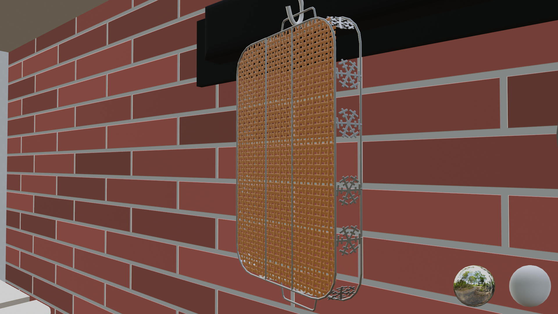
I didn't want to go through the hassle of recreating a mesh for the fireplace screen, so I copied the wicker bottom and scaled it into the fireplace space. I had to scale the bars and found switch to "Individual Origins" for thinning the bars. Those two pieces probably account for 80-90% of the polygons in the scene, not sure how to get the effect without modeling the individual bars though?
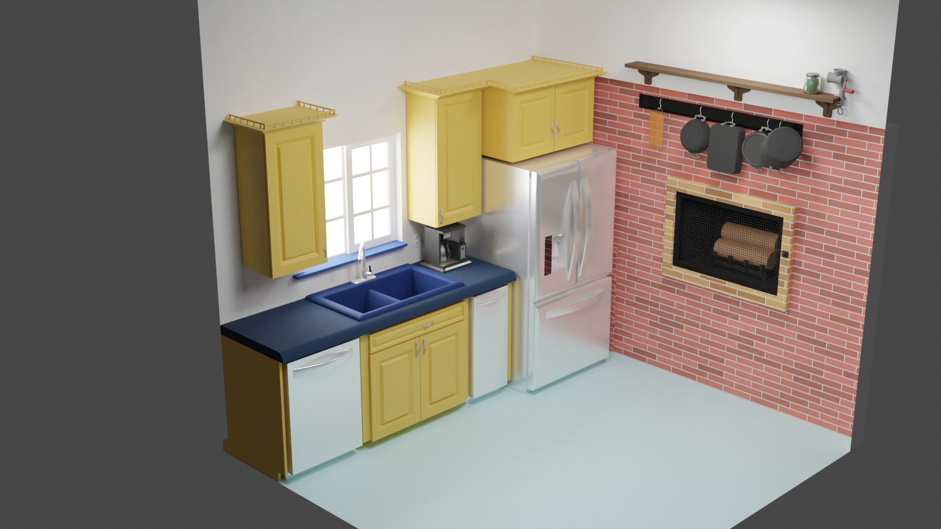
Thanks ![]() antonioc for the hint that got me to a much better render. The original example file was using Cycles to render, and I was using Eevee. This makes me much happier!
antonioc for the hint that got me to a much better render. The original example file was using Cycles to render, and I was using Eevee. This makes me much happier!
Here are a few more details... the jar on the shelf is supposed to be green tinted glass, but haven't quite figured that one out yet!
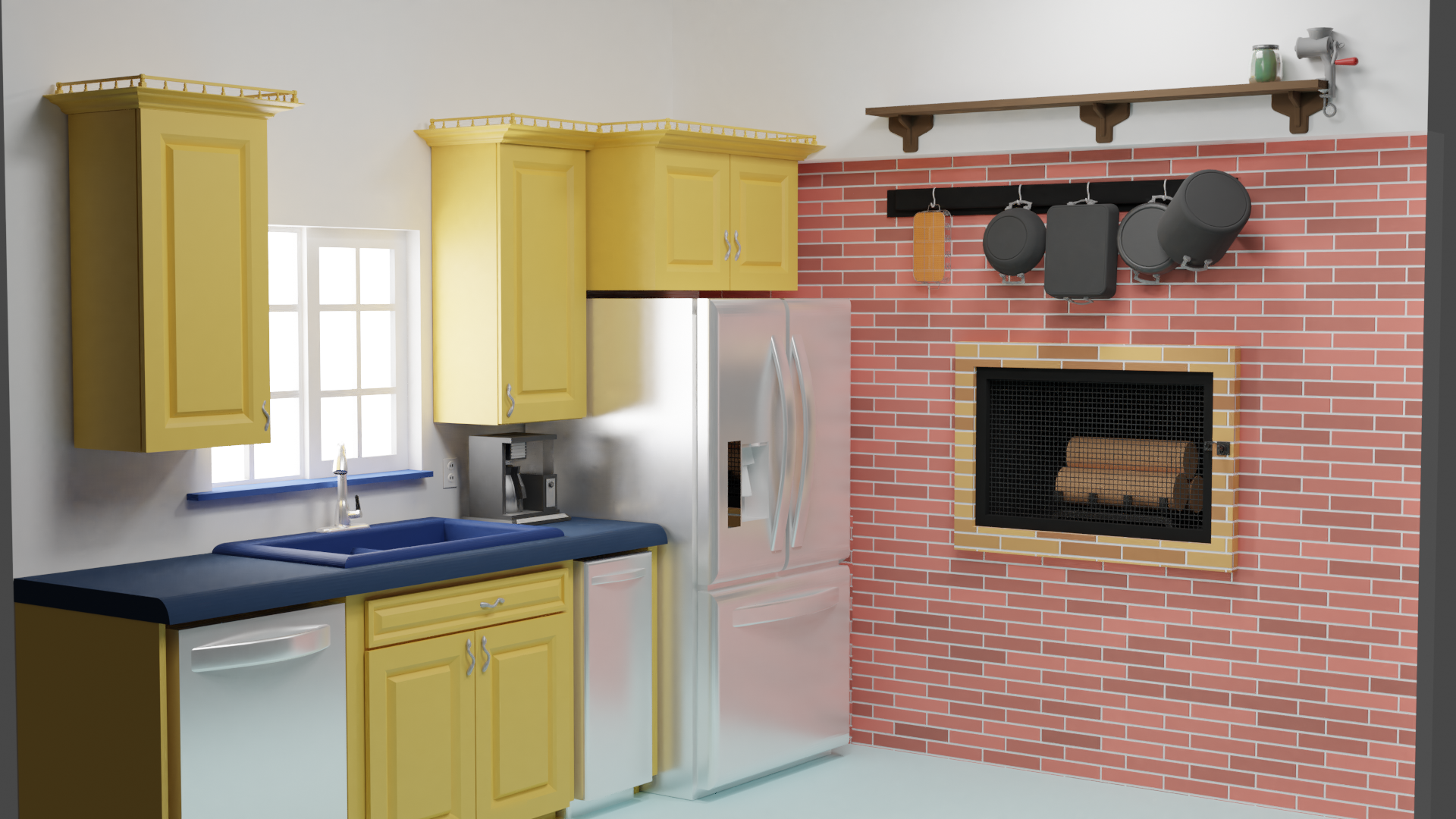
Going to have to figure out the right angle for the final render. I like the isometric look, but this lower angle looks nice too.
This is turning out great ![]() joshcanfield ! Loving the look of everything so far! That modern fridge and coffee maker is looking especially sleek! Keep it up!!
joshcanfield ! Loving the look of everything so far! That modern fridge and coffee maker is looking especially sleek! Keep it up!!
Cycles definitely provides the most accurate render at the cost of render time and resources. Eevee takes a lot more fine-tuning to get better results that look closer to cycles. @jlampel has a great course on lighting that I recommend checking out if you'd like to learn more about that, it definitely helped me.
Lots of little changes tonight, or I guess this morning!
I re-built the fireplace using modeled bricks instead of the brick texture so I could have more control over the brick size and shape. I re-worked the door with a proper latch and hinges and updated the brick color and textures. The fireplace log is supposed to look like it's been burned out. I used a tutorial about creating asteroids and one about making an object dissolve to make that work: I used a sphere with a cloud-texture displacement to create a object that I could subtract out of the logs.
I bought a texture for the floor, so I guess I learned how to buy and use a texture.
Still not satisfied with the jars, but the are at least looking more glass like.

This is really coming together! For the glass, take a peek at this tutorial by BlenderGuru. That's what I used to figure out how glass shading works and fiddled around with settings until I got it looking that way I wanted. The modeled brick definitely looks nicer than the textured version. The separation between the edge of the fireplace and the wall are much more clear. Keep it up!