Looking forward to spending some time getting used to the new version of Blender and seeing what marvelous creations everyone posts.
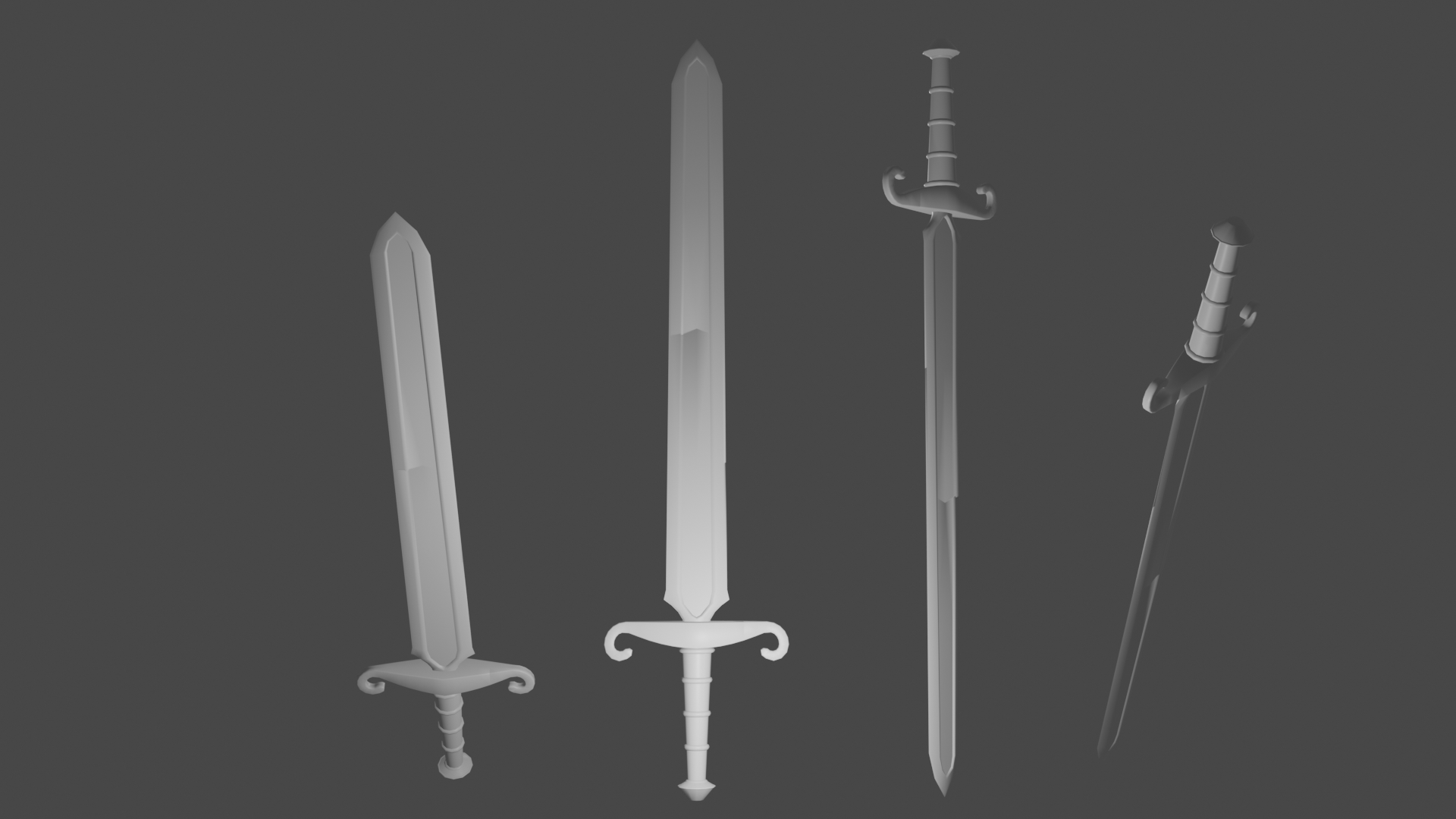
Homework Submission Week 1
I had fun following along with Kent on this one. I added a few nicks and scratches. I found the Option + V hotkey worked great to "rip and fill" the parts I wanted to be damaged.
![]() ullreym Looking good Matthew. I don't know why but your render brought me back to the times I used to play Castlevania Symphony of the Night, there was like a sword I think that floated and follow you around and hacked and slash everyone.
ullreym Looking good Matthew. I don't know why but your render brought me back to the times I used to play Castlevania Symphony of the Night, there was like a sword I think that floated and follow you around and hacked and slash everyone.
![]() ullreym Good effort! Maybe the edges of the swords could use some more obvious wear, as well, but that's up to you how beaten up you want them to be.
ullreym Good effort! Maybe the edges of the swords could use some more obvious wear, as well, but that's up to you how beaten up you want them to be.
Glad to see you in here ![]() ullreym! Overall you're right on point with this model. Though I do agree with silent that the wear and tear could be a bit more obvious. Then again you could be opting for a less worn-and-torn sword.
ullreym! Overall you're right on point with this model. Though I do agree with silent that the wear and tear could be a bit more obvious. Then again you could be opting for a less worn-and-torn sword.
Either way, for the dents and dings that are there, hardening the desired edges would make for proper normals shading imo. Here's the part of last week's stream where I did this.
I'm being a bit nitpicky though. You've earned an A in my book. On to texturing and shading!
![]() dostovel is this what you're thinking of?
dostovel is this what you're thinking of? 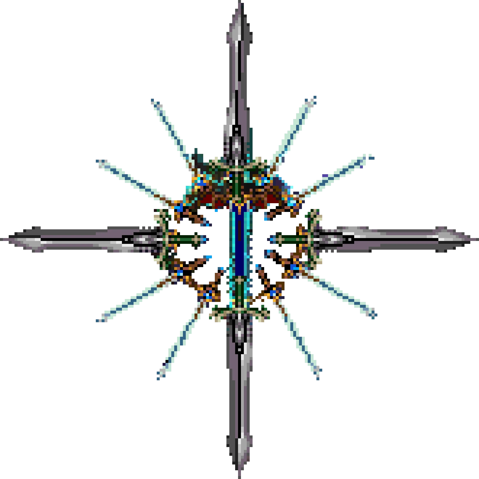
@theluthier Yep that's the one, for old times sake. Every time I see things from games of the past, in my head they looked much better. What a weird feeling. Also according to my memories, the water in Mario Sunshine is still has the best looking realistic water graphics in history. Oh boy, I can only imagine how that must look now.
Homework Submission Week 2
I was telling a CG Cookie friend some of the difficulties I ran into with this part of the project. One, I found geometry hiding inside the cross guard that the UV unwrap found for me. I had to track them down and delete. The other issue I had was that I added the texture file I was painting to the texture slot of the brush I was painting with. I created a loop and almost discovered time travel. As I was painting the sword, little tiny swords were showing up on the sword. I don't recommend this one bit.
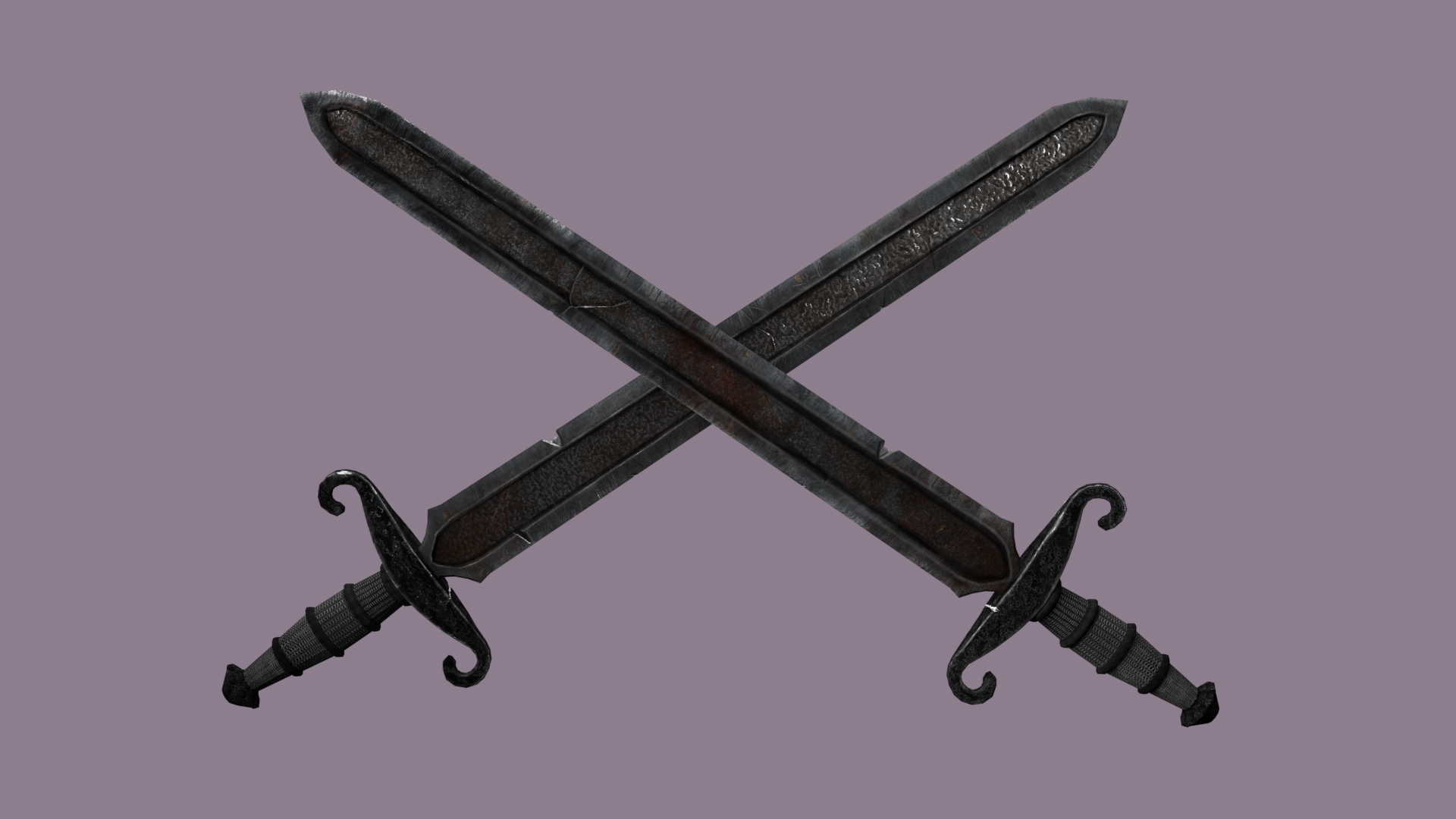
![]() ullreym Dude that looks really good, I love that aged vibe it gives. And I have that Castlevania feeling once again. It's like maybe you're trying to tell us you're a vampire and those used to be your swords back in the 12th century.
ullreym Dude that looks really good, I love that aged vibe it gives. And I have that Castlevania feeling once again. It's like maybe you're trying to tell us you're a vampire and those used to be your swords back in the 12th century.
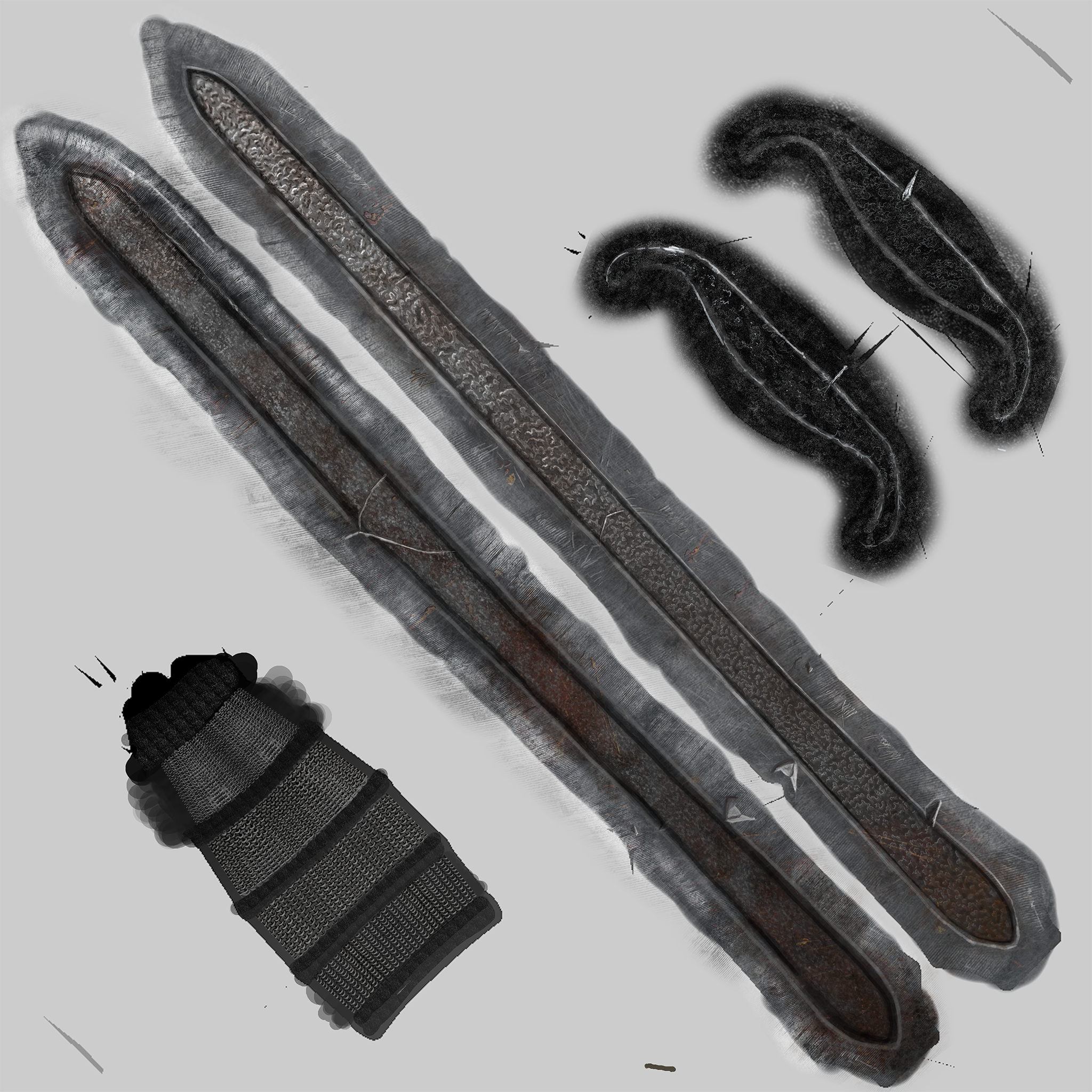
Here is the texture. The chainmail grip took a long time to paint. 🙄
![]() dostovel A thousand thank-you's my old friend. I imagine the dried blood and rust could be what is unsettling you. "Blah-blah-blah!" 🧛🏻♂️
dostovel A thousand thank-you's my old friend. I imagine the dried blood and rust could be what is unsettling you. "Blah-blah-blah!" 🧛🏻♂️
Good God man, I thought I was doing a good job and now this? Jesus. Good on you though, that detail is impeccable.
![]() ullreym This is....hand....PAINTED?!?! I was just about to commend your use of photo-sourced texturing then I noticed Omar's reply. Now I'm speechless 😶
ullreym This is....hand....PAINTED?!?! I was just about to commend your use of photo-sourced texturing then I noticed Omar's reply. Now I'm speechless 😶
Seriously this is near photo-realistic texture painting. Imagining how the reflections will dance off your sword gets me giddy! A++ work this week my friend 👏
My only note is to make absolutely sure all this detail shows up in the final material. It's leaning a touch toward the dark side the way it's applied to the model currently and it would be a literal travesty if any of this detail wasn't displayed in its full glory. Just something to keep in mind :)
@theluthier Thanks Kent, I am a bit embarrassed to admit that a misunderstanding has occurred. About 90% of the texture is hand painted in Blender. About 10% was thanks to Mr. Gregory Voronoy's texture and CC0 Textures. I splashed some Corrugated Aluminum and rust on the blade and then when back and accentuated parts by hand. The chainmail grip is all mine. ;-)
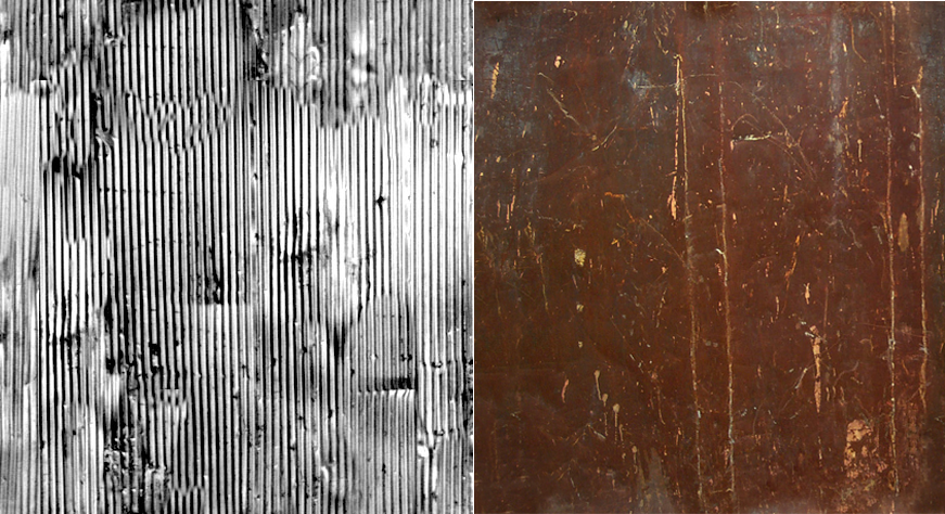 I hope this full disclosure hasn't had a disillusioning effect on your opinion of my project.
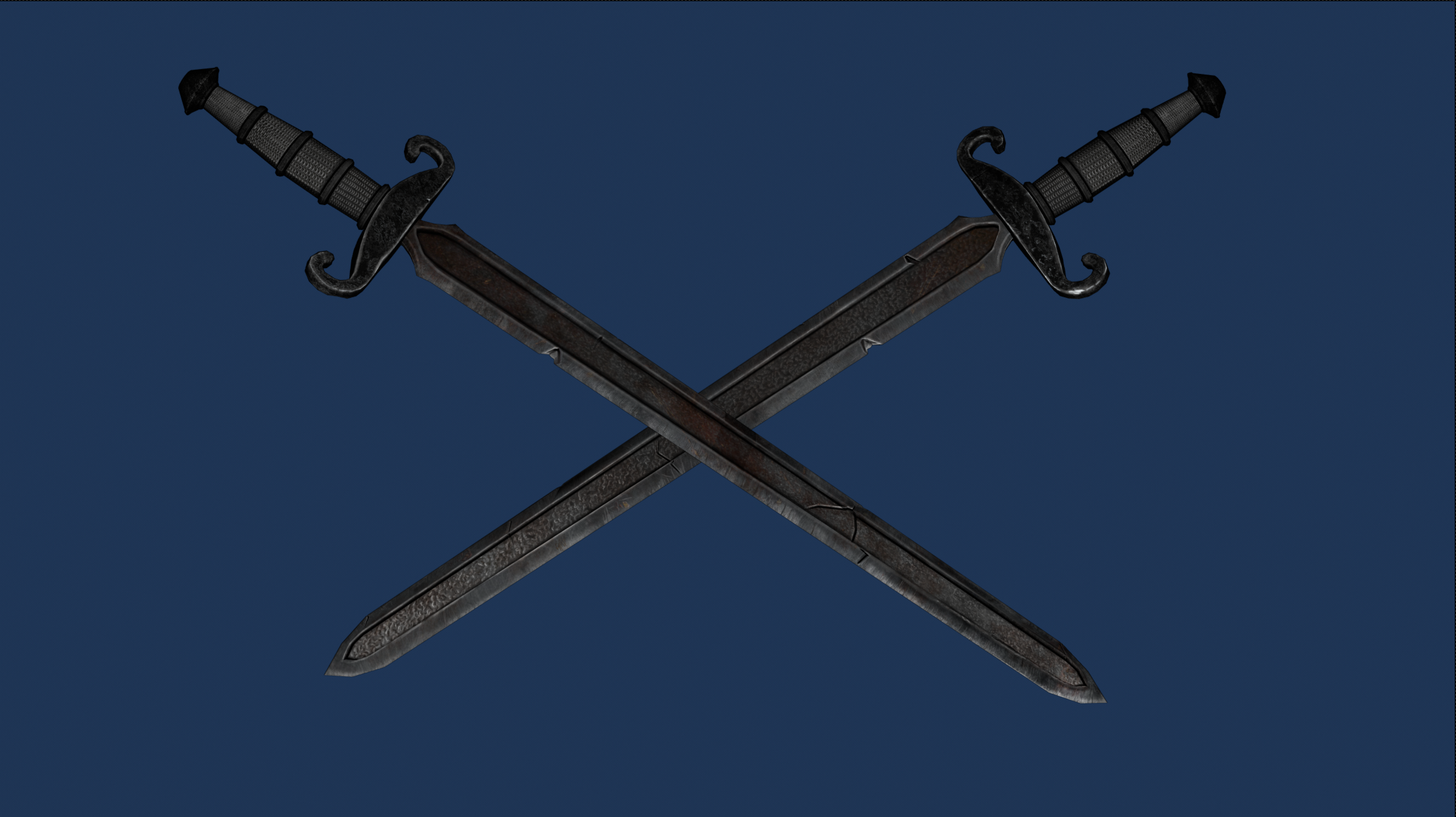
Last Tuesday's live stream was so helpful. It really helped me understand the differences between Eevee, Cycles and workspace render modes. Then the tips about HDRI lighting. Wonderful. I was able to add the Mutianyu.hdr to the LookDev HDRIs in the Lighting Preferences. This was very helpful to get a preview of what the render might look like.
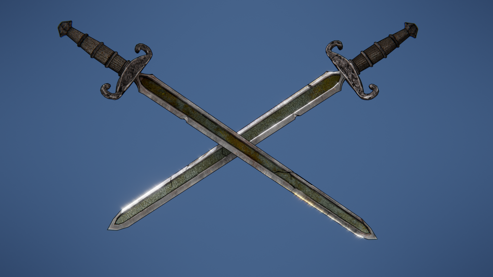
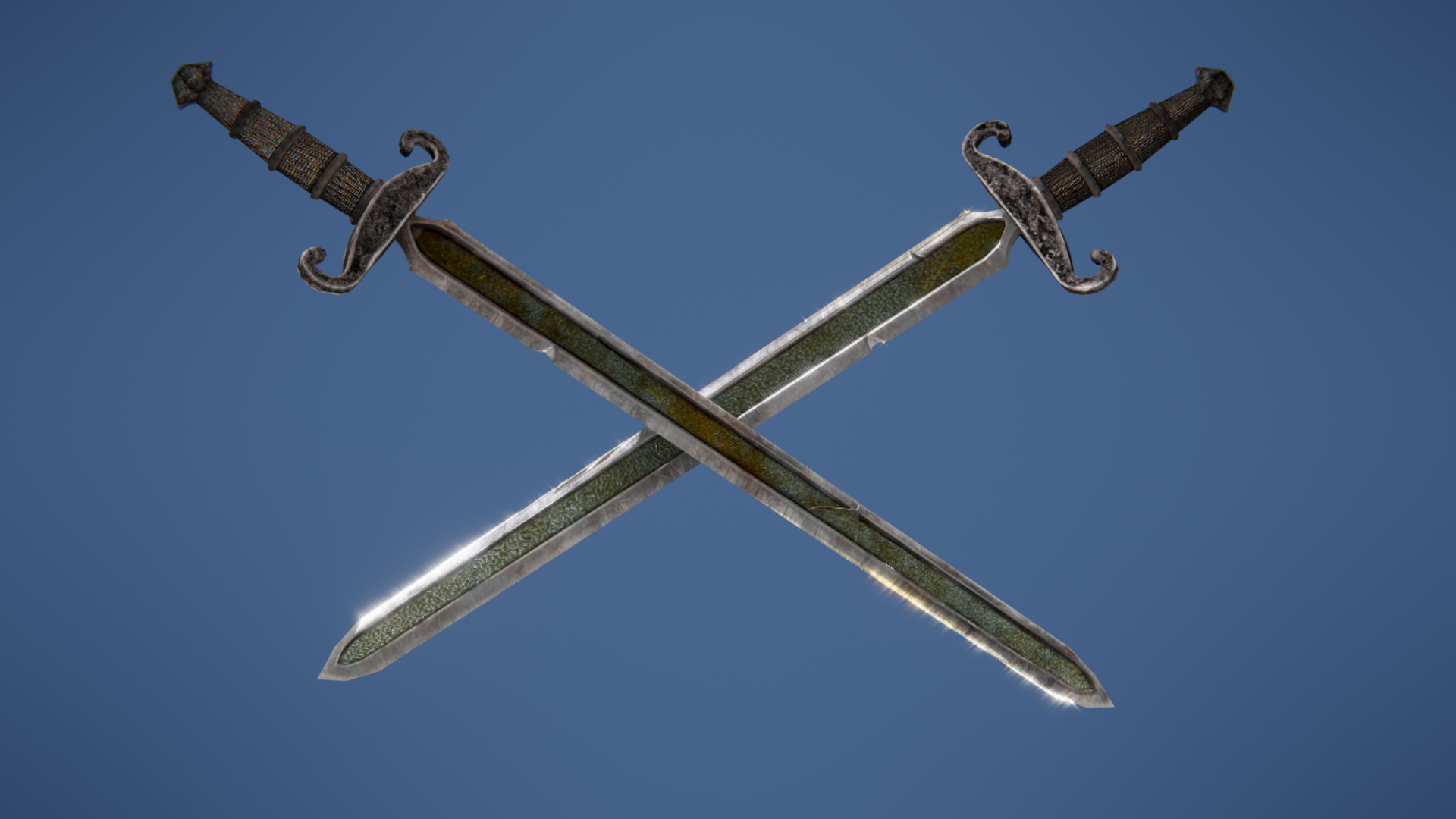
Here is a screen shot, a render with the Freestyle lines added, and a final composite render of the sword.
![]() ullreym No need to be embarrassed - I would be first in line to use photo-sourced textures to achieve the look you did. What about the middle of the blade, that organic noise-like pattern. That still looks hand-painted to me and I don't see evidence of it in the photos you posted... 🤔
ullreym No need to be embarrassed - I would be first in line to use photo-sourced textures to achieve the look you did. What about the middle of the blade, that organic noise-like pattern. That still looks hand-painted to me and I don't see evidence of it in the photos you posted... 🤔