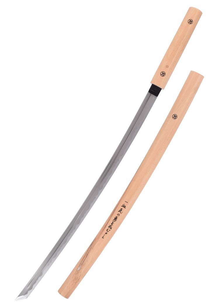
I was really stuck on what I want to do. I've already settled on a sword but there's two that I want to do: a shirasaya sword or the two swords that belong to archer from Fate/Stay Night. Well, guess the only real choice is to combine the two together so that's just what I'm going to do. Hopefully, it comes out decent at least.
Damn, two for one? That's quite the workload you have set out for yourself, I'm interested in the result!
Cool idea! I can only guess how it's going to look, but that could be quite the sword...
At first, I created a single pommel and then flattened one side of it to get the flat look I wanted. I then used the mirror modifier to create a second one that would appear as if they were together. I also did something similar with the blade but I used the pommel as the mirror object so that the blades would always be in the middle. I also added the Ying-Yang circle on the very end of the pommel to take more inspiration from the twin swords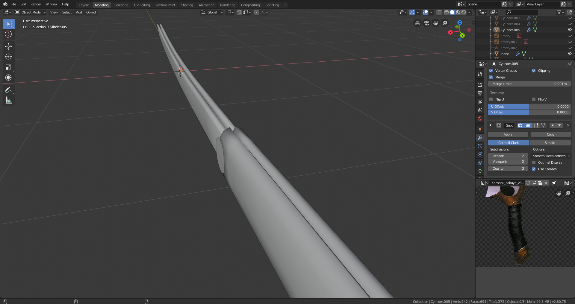
Very nice.
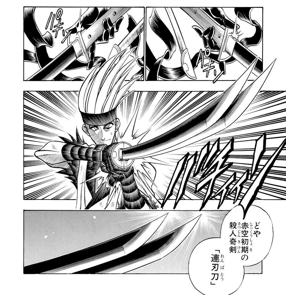
Useless note : The double blades reminds me of the manga Kenshin, where one antagonist has suche a weapon, making the cuts too hard to stitch correctly.
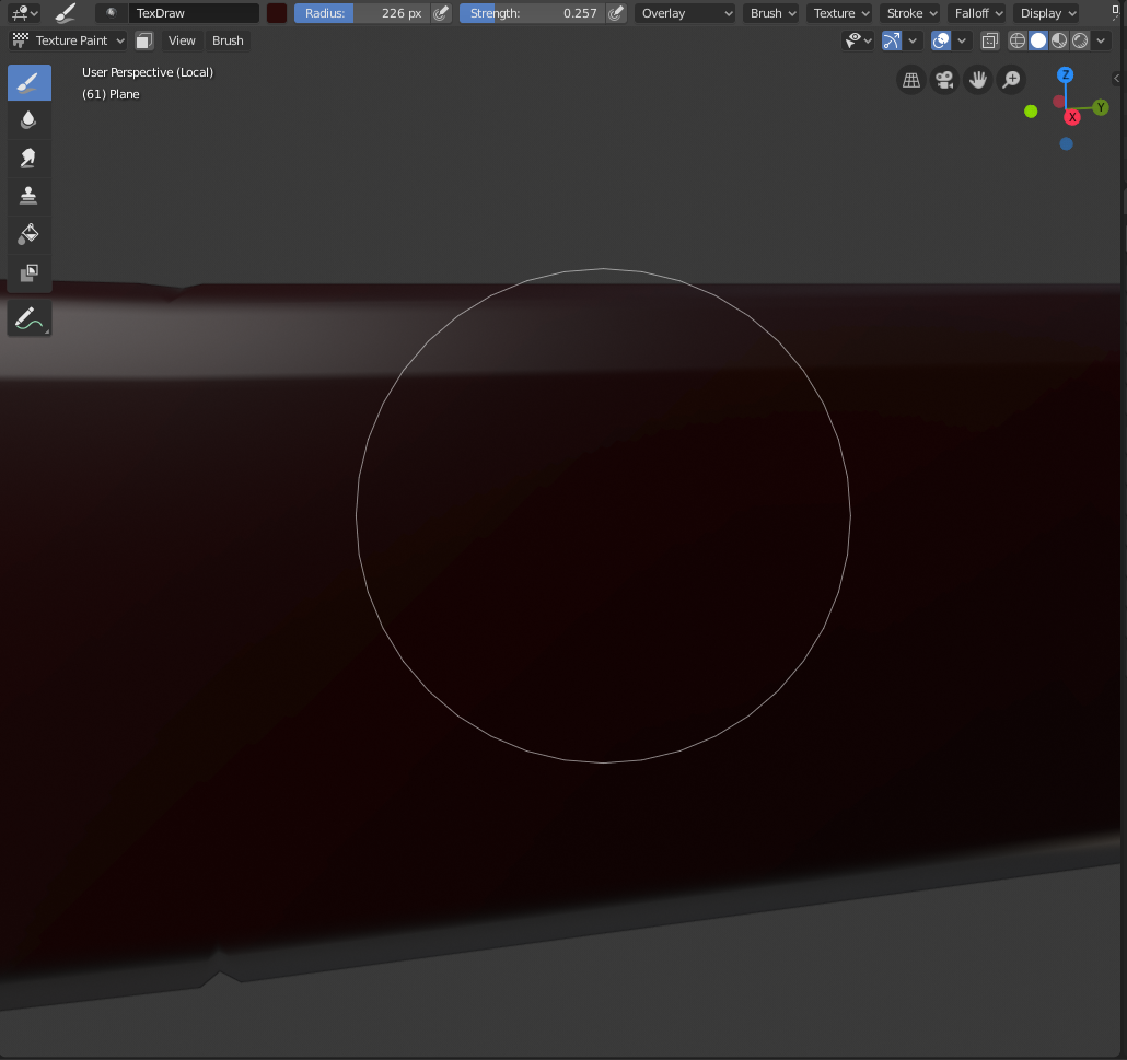
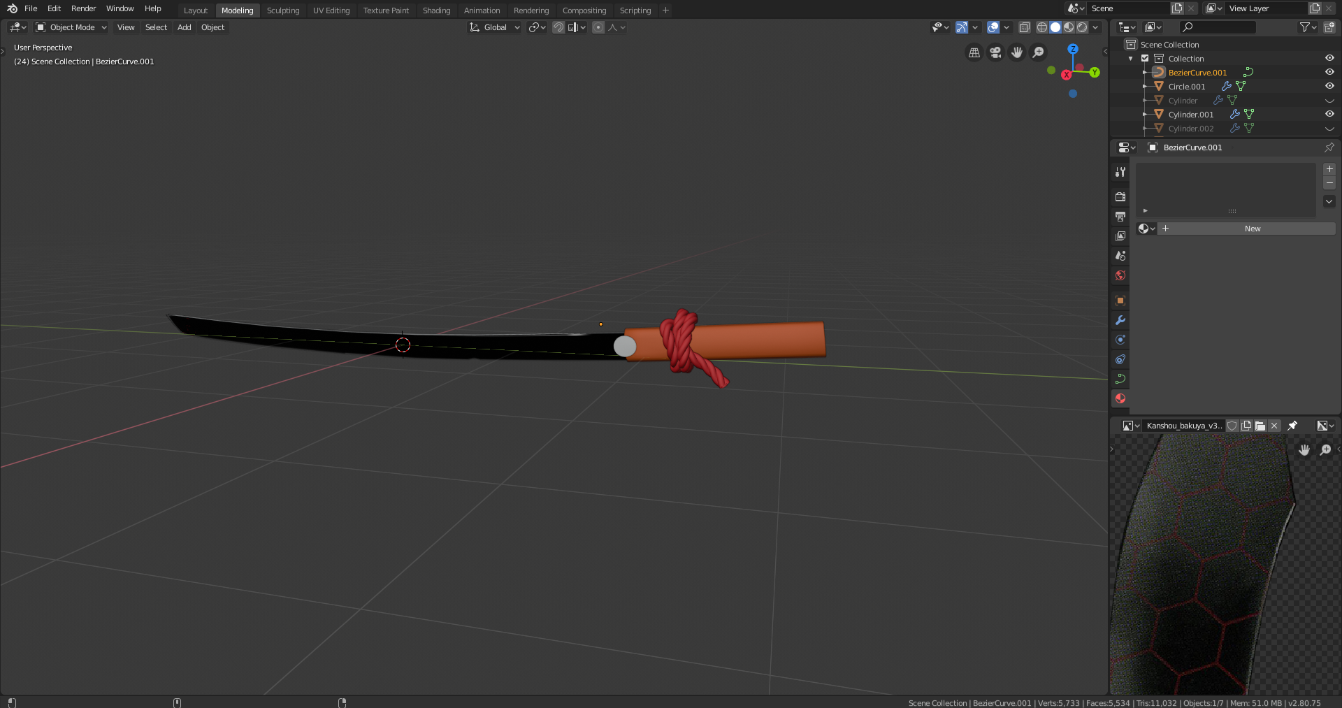 Still making some last-minute design choices to the swords. At first, I wanted to put a cloth around the handle of the sword but that proved to be too difficult for me so I decided to make a rope tied around it instead, using the screw and curve modifiers. I wanted to add the hexagonal pattern in the black sword onto the model but is it better to make another model and use snapping or the shrinkwrap modifier to project it onto the blade or would it be better to apply it as a texture?
@richm On your reference image it just looks like a painting on the blade, so I would assume keeping it for texturing is fine.
@richm Rurouni Kenshin.... I haven't heard that name in years... One of my favorite mangas from a younger time. Never finished it. The art style is so crisp.
Your sword is shaping up!
@theluthier A little typo from Kent, he meant the knot and not the not...
In mathematics there is a 'Knot theory' and one of the, unproven, theorems is that for every knot, there exists a 'not knot',, which cancels out the knot,
But then again, who cares;)
@richm Is it the thin lines? Kinda looks like the viewport grid floor to me..If that's not the case, feel free to pack your .blend file (to include textures), save as a new packed version, then upload to dropbox (or equivalent file hosting service) and post a download link. Then I'll take a look at what's happening with your file.
@theluthier It was not the thin lines. I was referencing the green-like color that is appearing. Looking at it again the brush strokes also seem to be creating some jagged-edges. Thank you for helping here is the link: https://www.dropbox.com/s/6up5m0npxtwjz31/Packed_Sword_Richard.blend?dl=0