Hello! I'm sorry I'm late.
Originally, I was going to make a crossbow. However, I recently got Terraria*, and I decided to make a sword from that game. After careful deliberation, I chose the Night's Edge. Unfortunately, it looks rather simple in game:

Therefore, I will use this as a base with which to add my own embellishments.
*As far as I know, Terraria is the only game where you can shoot a giant flying eyeball with a machine gun stuck into a shark's mouth while riding a unicorn in the underworld.
It's going to be interesting to see your interpretation of that sword! Maybe you could use it for the voxel course later, for the full Terraria look!
![]() jack07 In my opinion, the "full Terraria look" doesn't look good in 3D. The low poly style of this class fits it well, though.
jack07 In my opinion, the "full Terraria look" doesn't look good in 3D. The low poly style of this class fits it well, though.
The basic shape of the Night's Edge is surprisingly difficult to model; it will probably end up with less embellishments than I originally planned.
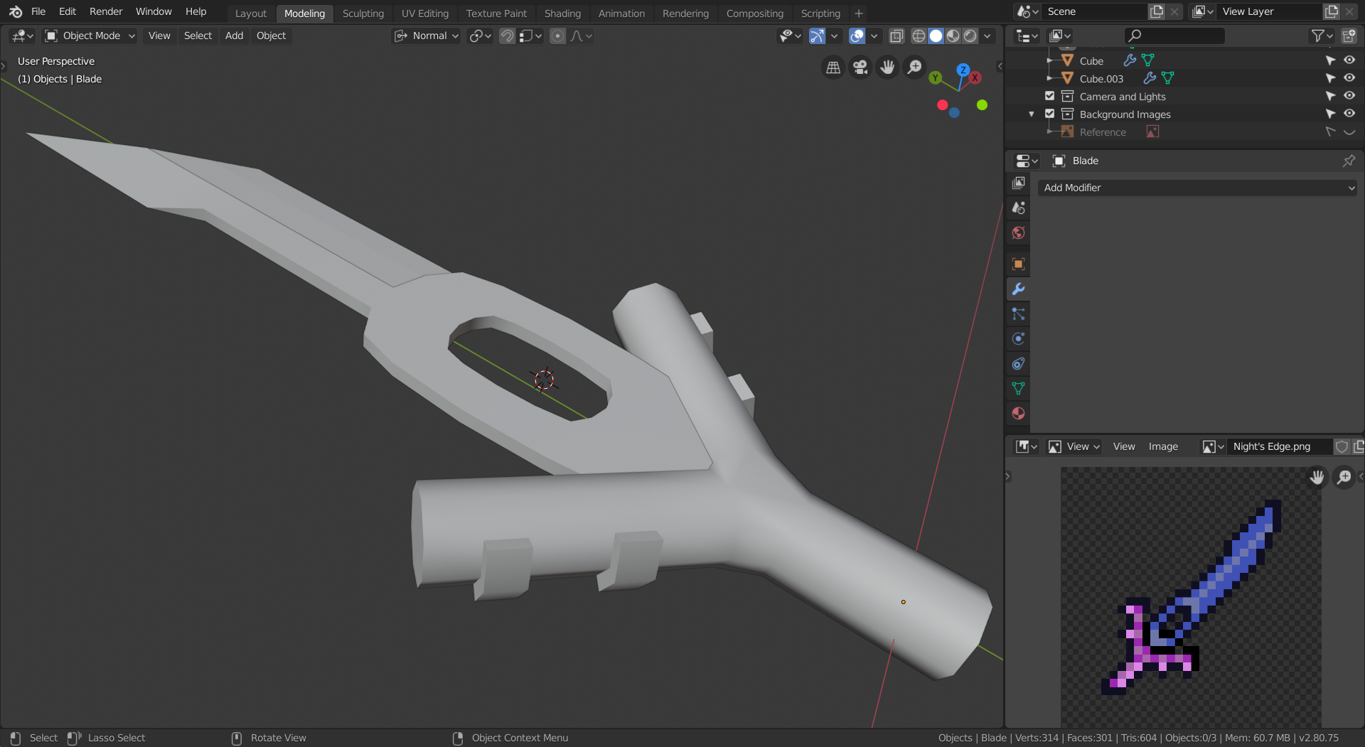
I have a problem with the round parts. They aren't high poly enough for the smooth shading to really work on them, as you can see here:
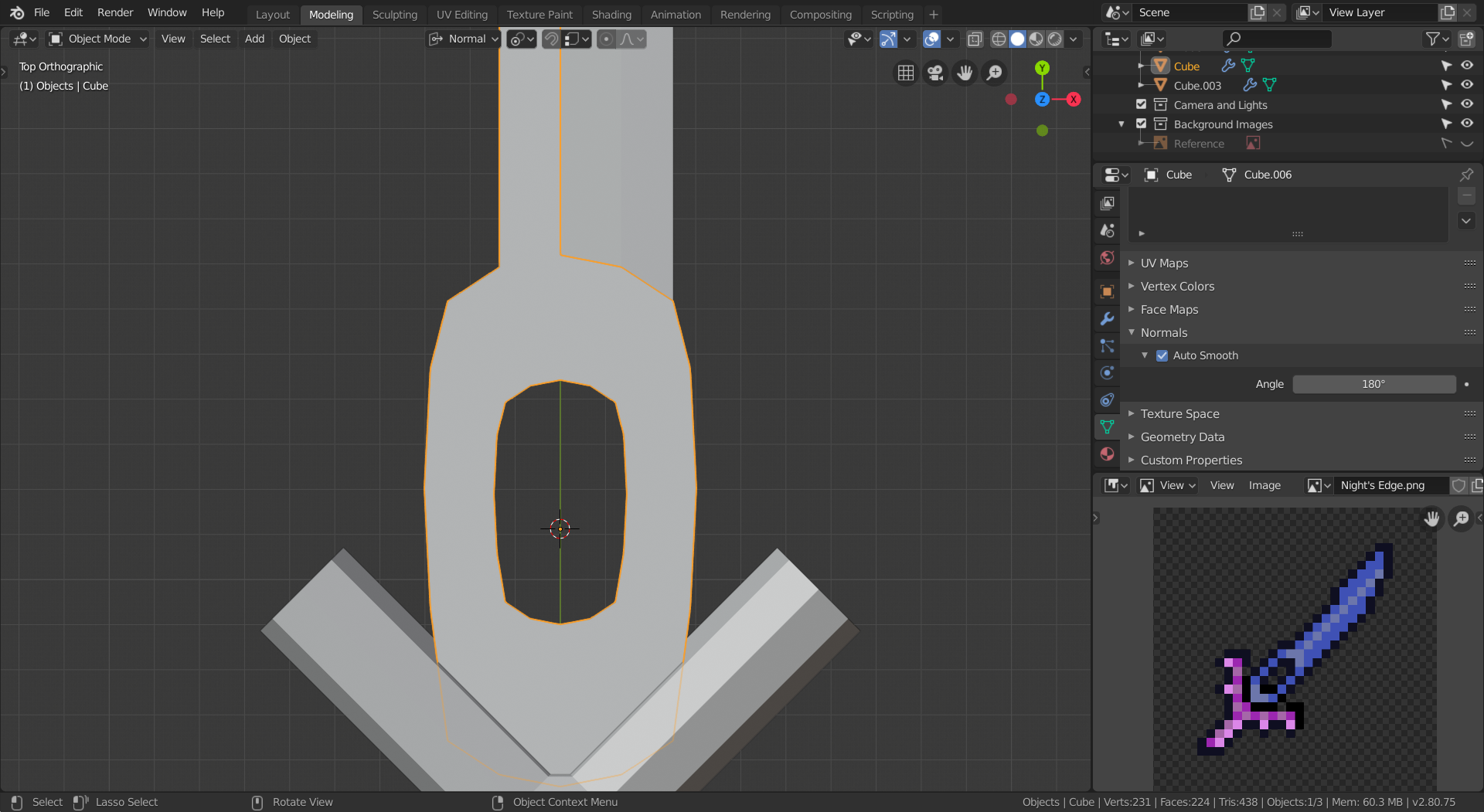
(I hadn't smooth shaded the hilt yet when I took this screenshot.) In this image, the blade has smooth shading on, but the hole still appears faceted. Is there a way to increase the poly count without redoing the entire blade?
![]() williamatics I've suddenly become more aware of my Eye of Cthulhu plush just... staring at me...
williamatics I've suddenly become more aware of my Eye of Cthulhu plush just... staring at me...
To answer your question, to my knowledge there isn't a way to increasing the poly count without edge loops or subsurf/multires but the former seems to defeat the purpose of what you're asking and the latter would disqualify being low poly (though there doesn't seem to be a hard rule against this, so if you feel it necessary feel free).
I presume you marked the edges as sharp? Might be pushing what's considered redoing the mesh here but you could possibly bevel the edge - either destructively or via the bevel modifier (so I guess there is a way to adjust polycount other than the above mentioned - with about three loops or so, that might give you what you're looking for.
![]() thecabbagedetective You're a genius! Thank you! It worked!
thecabbagedetective You're a genius! Thank you! It worked!
I added some gems to the handle. I didn't do much to the blade other than implement Aaron's advice, though. It's looking kind of plain. I'll see what I can come up with tomorrow.
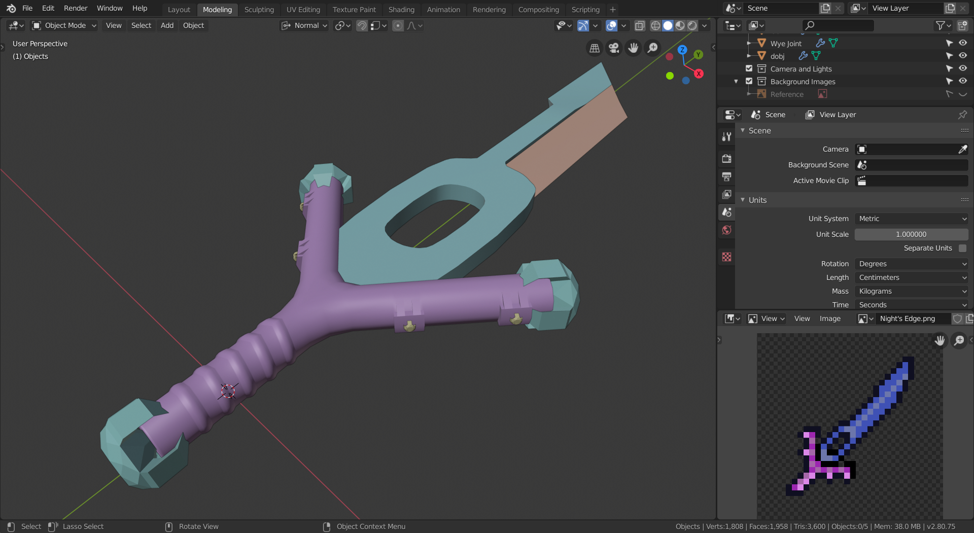
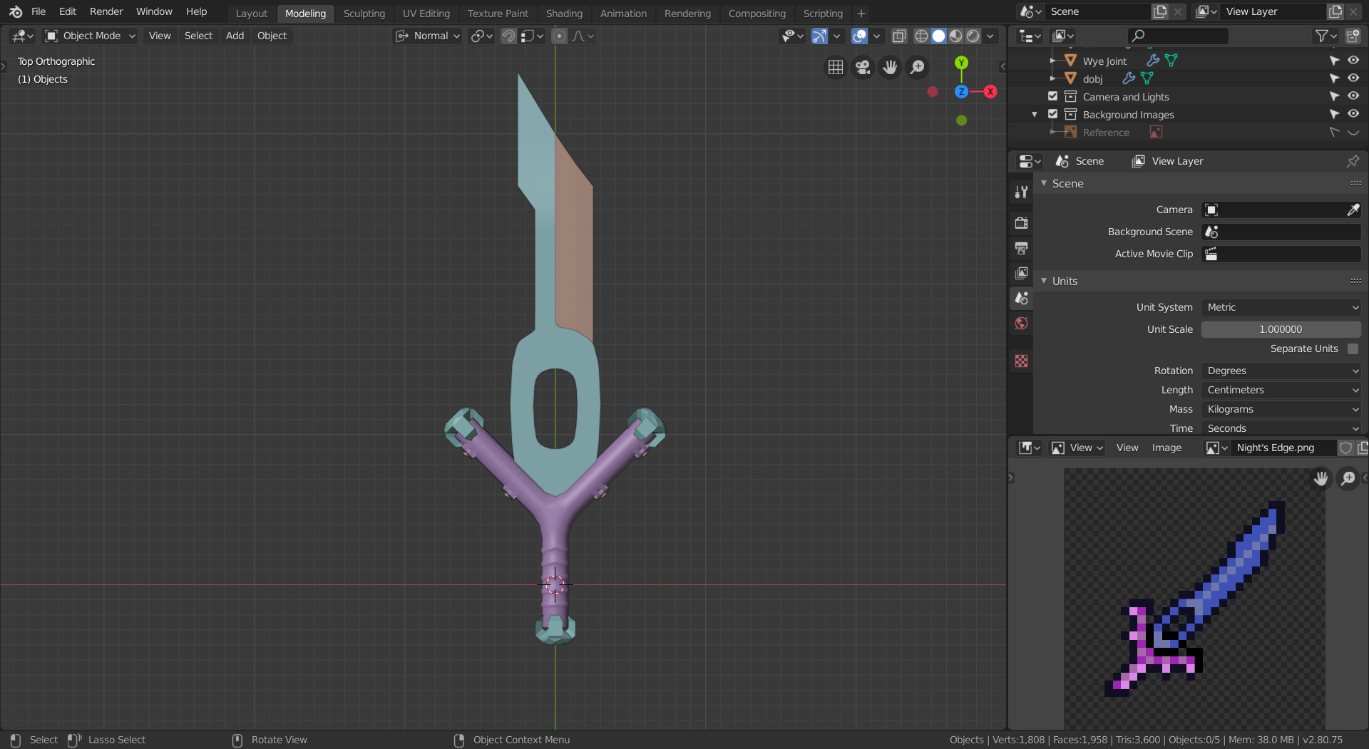
![]() williamatics Cool!
williamatics Cool!
The proportions seem a bit off though...
Maybe make the blade a bit longer and the handle a bit thicker?
![]() spikeyxxx Well, it does match the reference, but then again, I'm taking a lot of artistic license with it, so I will do that.
spikeyxxx Well, it does match the reference, but then again, I'm taking a lot of artistic license with it, so I will do that.
Week 1 Homework Submission
As I submitted this image, I could feel a slight rumbling; a vibration of sorts that seemed to come from deep underground, as the outside temperature dropped. I felt like something evil was watching me...
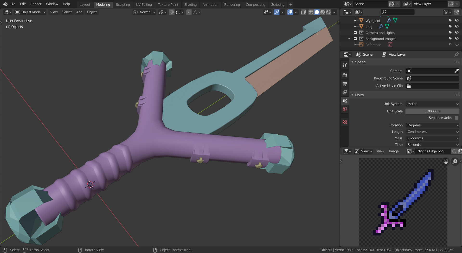
I considered adding dents and imperfections, but I realized that I pictured this as a shiny, clean sword. I'll add the imperfections in the texturing stage.
![]() williamatics Interesting interpretation of the sword from pixel art. A challenge for sure. Good effort.
williamatics Interesting interpretation of the sword from pixel art. A challenge for sure. Good effort.
![]() silentheart00 Are you a VA? I would guess so based on the replies you have made to other people's homework threads.
silentheart00 Are you a VA? I would guess so based on the replies you have made to other people's homework threads.
I was kind of worried about the lack of detail compared to other people's submissions; I suppose I should have added at least one or two dents to make it more interesting. Your "good effort" lifted my spirit, though. Thanks.
Did the picture disappear for anyone else? I had to delete and re-upload it.
![]() williamatics Yes, I'm a VA.
williamatics Yes, I'm a VA.
This is a good interpretation from pixel art, but if you're looking for potential improvements, there's one spot you could improve upon. The hole around the blade could use some more detail, whether that's an inset or whatever else you think would look good there. There's potential to put something there to break up the big form with smaller forms. Other than that, looks good to me.
![]() silentheart00 Thank you for the feedback! Is it too late to change the submission?
silentheart00 Thank you for the feedback! Is it too late to change the submission?
@theluthier My submission hasn't been graded yet. Could you grade it, please?
![]() williamatics Very interesting project. I've used some lo-resolution reference in my day, but nothing this pixelated. It's definitely an intriguing exercise.
williamatics Very interesting project. I've used some lo-resolution reference in my day, but nothing this pixelated. It's definitely an intriguing exercise.
The main thing with a project like this is interpretation, which is subjective. Personally I interpret more angularity in the pixelated reference, so I would have gone more angular with the handle + crossguard combination. But I know that subjectively you have the right to choose the more rounded shape, like a slingshot.
In fact this makes me think that this topic would be a good challenge for the commnity: Everyone starts from a small pixelated image like this and each models their own interpretation. That could be neat.
Anyway, back to your sword. The only other note I have is that the end caps on the pommel and ends of the crossguard "arms" is a little tricky to understand visually. It's noticeably lower poly that the rest of the model and kinda gives an impression of an impossible shape. Maybe it fine but for what it's worth, I have a hard time making sense of it visually.
Overall though I like that you chose a challenging project and the majority of the model is high quality. It's a B+ in my book 👍
@theluthier Thank you for the grade! The things on the crossbars are gems, which will be more obvious when you see the textured version.
I unwrapped the blade and saw that the UVs were all various shades of blue. It has no apparent pattern to it, which is driving me crazy. I suppose it doesn't need to be perfect, though.
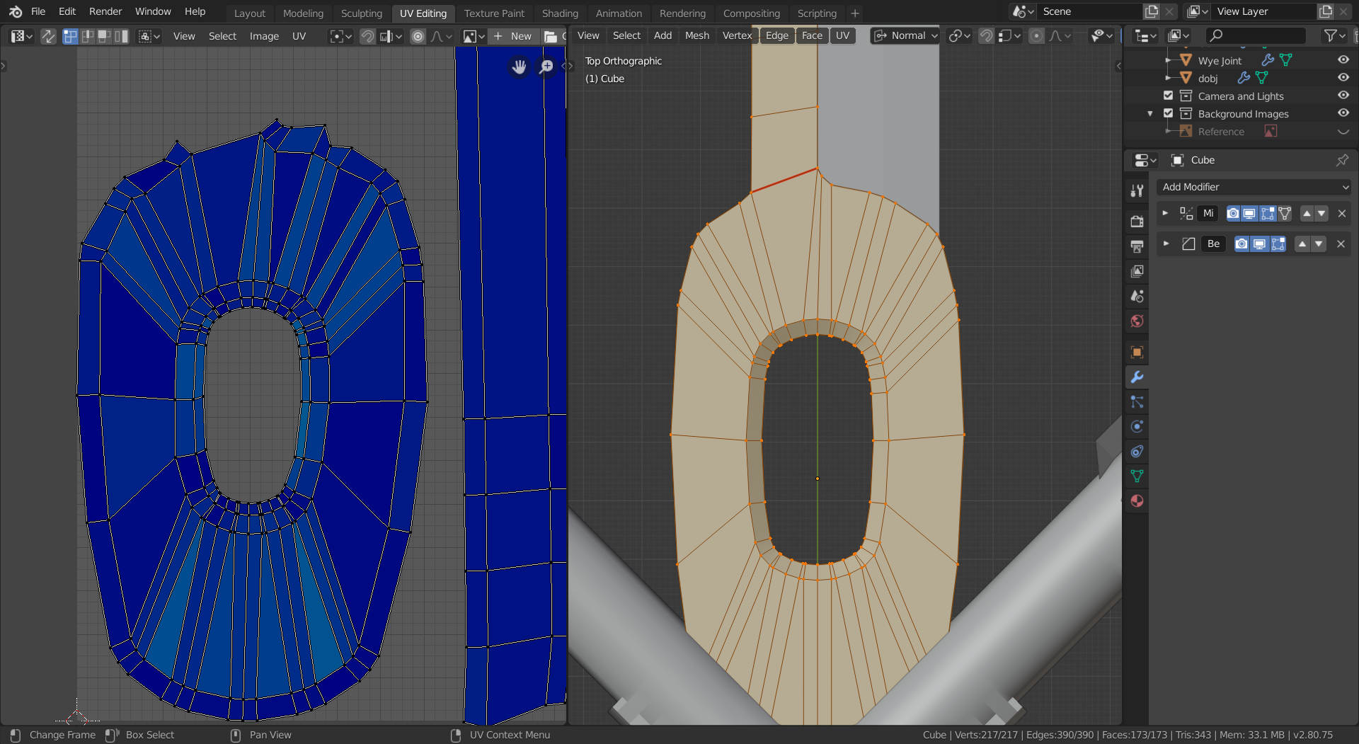
Should I combine the separate objects and unwrap and texture them together, or will leaving them separate work?
![]() williamatics It's okay if the UVs are all blueish, it's problematic when you see other colors. You can have all your objects using the same texture: select all of them in object mode, if they are all unwrapped you can work on their UVs at the same time. Average the scale and pack the islands.
williamatics It's okay if the UVs are all blueish, it's problematic when you see other colors. You can have all your objects using the same texture: select all of them in object mode, if they are all unwrapped you can work on their UVs at the same time. Average the scale and pack the islands.