My homework project. Midas and Mithril
Homework Submission Week 3 in file attachments.
![]() blanchsb I like your concept blanch :) you already got some great tips I see. I personally use the flatten method a lot, but both methods work wonders. Keep it up, curious to see how it will look with some textures :)
blanchsb I like your concept blanch :) you already got some great tips I see. I personally use the flatten method a lot, but both methods work wonders. Keep it up, curious to see how it will look with some textures :)
![]() louhikarme Thanks Kaj, so I think the problem lies in that the quad of a face is not planar with itself. When I cut an edge loop it instantly facets (i don't even have to move it). The picture in red above is me cutting two edge loops on what appeared to be a smooth face that instantly facets when an edge loop is created. What's worse is it facets in both cut directions.
louhikarme Thanks Kaj, so I think the problem lies in that the quad of a face is not planar with itself. When I cut an edge loop it instantly facets (i don't even have to move it). The picture in red above is me cutting two edge loops on what appeared to be a smooth face that instantly facets when an edge loop is created. What's worse is it facets in both cut directions.![]() spikeyxxx I love that add-on. Thank you. Yeah the problem I explained above to Kaj is also making it hard to use the Loop tools. When I flatten one blade entire face it facets the other sharp turn faces where I have a damage detail (endless circular argument).
spikeyxxx I love that add-on. Thank you. Yeah the problem I explained above to Kaj is also making it hard to use the Loop tools. When I flatten one blade entire face it facets the other sharp turn faces where I have a damage detail (endless circular argument).
Ultimately I think maybe I need to remake the blade. I am struggling with how can I get a planar face from 1 quad that extends in a 3 axis directions but also maintains a flat plane. I am not sure if that makes sense but I want to try and get the look of the picture in red where there are defined edges that take sharp corners in 3 dimensions but make use of the least amount of quads as possible.
![]() blanchsb Your Midas and Mithril model turned out great! I like the proportional change you made to the handle. Seeing in context with the character was a big help. It's also really cool to see how the gold part can detach from the underlying cross-guard and handle.
blanchsb Your Midas and Mithril model turned out great! I like the proportional change you made to the handle. Seeing in context with the character was a big help. It's also really cool to see how the gold part can detach from the underlying cross-guard and handle.
You've certainly earned an A from me this week. Keep up the good work and this will look awesome textured and shaded 👍
![]() blanchsb Sorry for the late reply! It's been a crazy week. As for your question about the mechanism to hold the two pieces together: I'm not sure. I'll have to find some references out there. Maybe you can as well, and we can discuss. I'm not sure if I'll be able to get at it, though, as I am quite far behind in my own things. But hey, if you don't find an answer now, that doesn't mean you won't find one eventually.
blanchsb Sorry for the late reply! It's been a crazy week. As for your question about the mechanism to hold the two pieces together: I'm not sure. I'll have to find some references out there. Maybe you can as well, and we can discuss. I'm not sure if I'll be able to get at it, though, as I am quite far behind in my own things. But hey, if you don't find an answer now, that doesn't mean you won't find one eventually.
![]() silentheart00 I figured it out. I am adding 3 spring loaded slots that also double as an extra detail. I also added an exterior handle for the sword blade edge because I didn't think about how they were going to separate haha. Inside the new handle I added the push button to retract the spring-loaded details that hold the blade into the handle of the hammer.
silentheart00 I figured it out. I am adding 3 spring loaded slots that also double as an extra detail. I also added an exterior handle for the sword blade edge because I didn't think about how they were going to separate haha. Inside the new handle I added the push button to retract the spring-loaded details that hold the blade into the handle of the hammer.
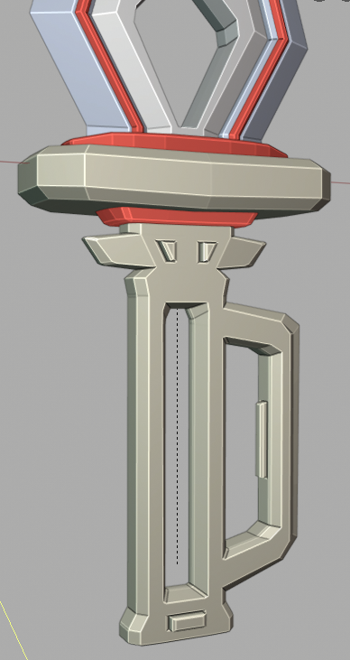
What do you think? I think that looks more believable and should hold the blade in quite nicely.
Homework Submission Week 2 (I also attached a file at my main thread posting).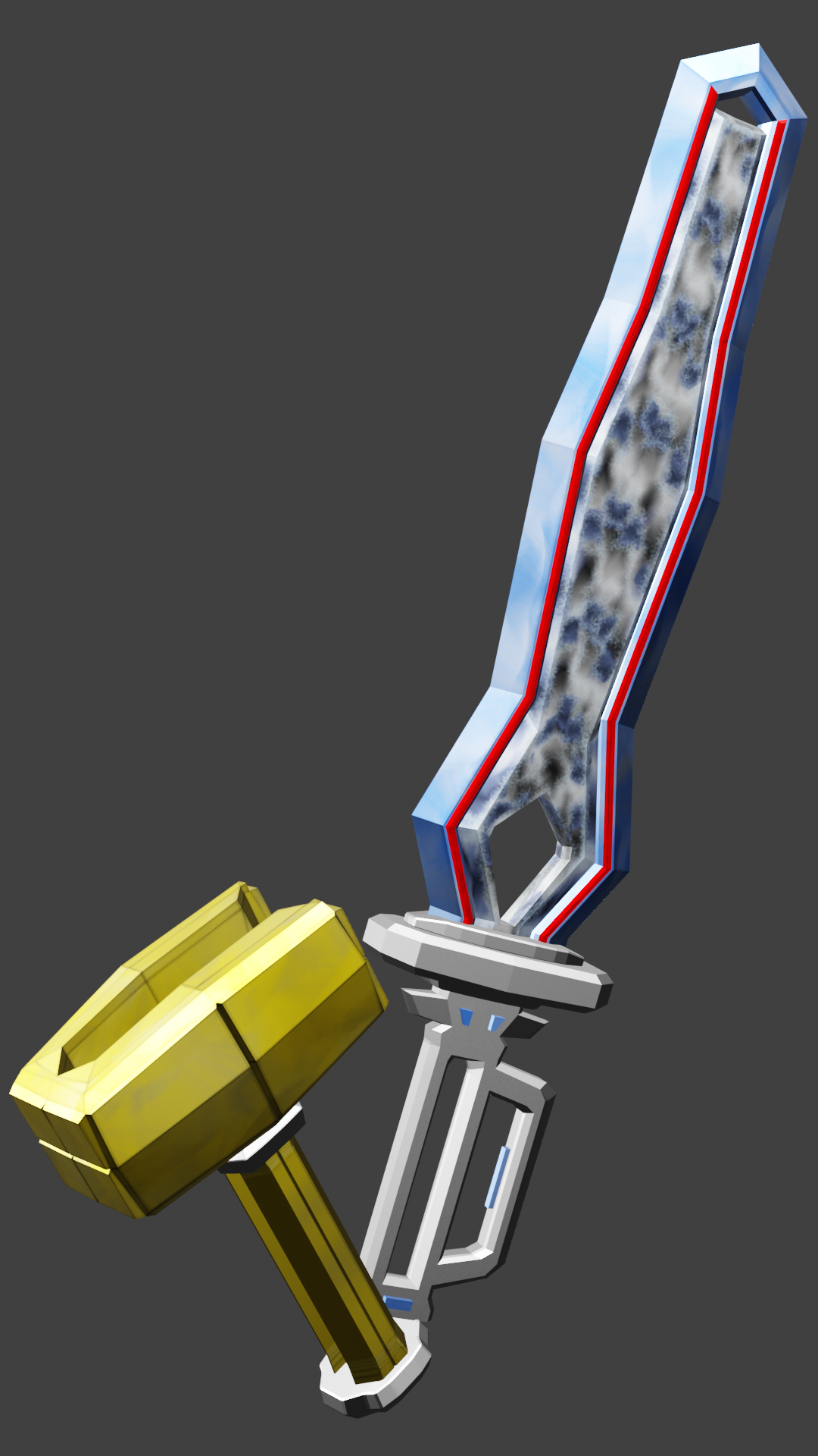
![]() blanchsb Here's some WIP of the texturing part. I am not happy with the middle piece on Mithril but I will correct it this week. (I was going for some lightning textures and it turned out like marble when wrapped around. Details lost in reality haha.
blanchsb Here's some WIP of the texturing part. I am not happy with the middle piece on Mithril but I will correct it this week. (I was going for some lightning textures and it turned out like marble when wrapped around. Details lost in reality haha.
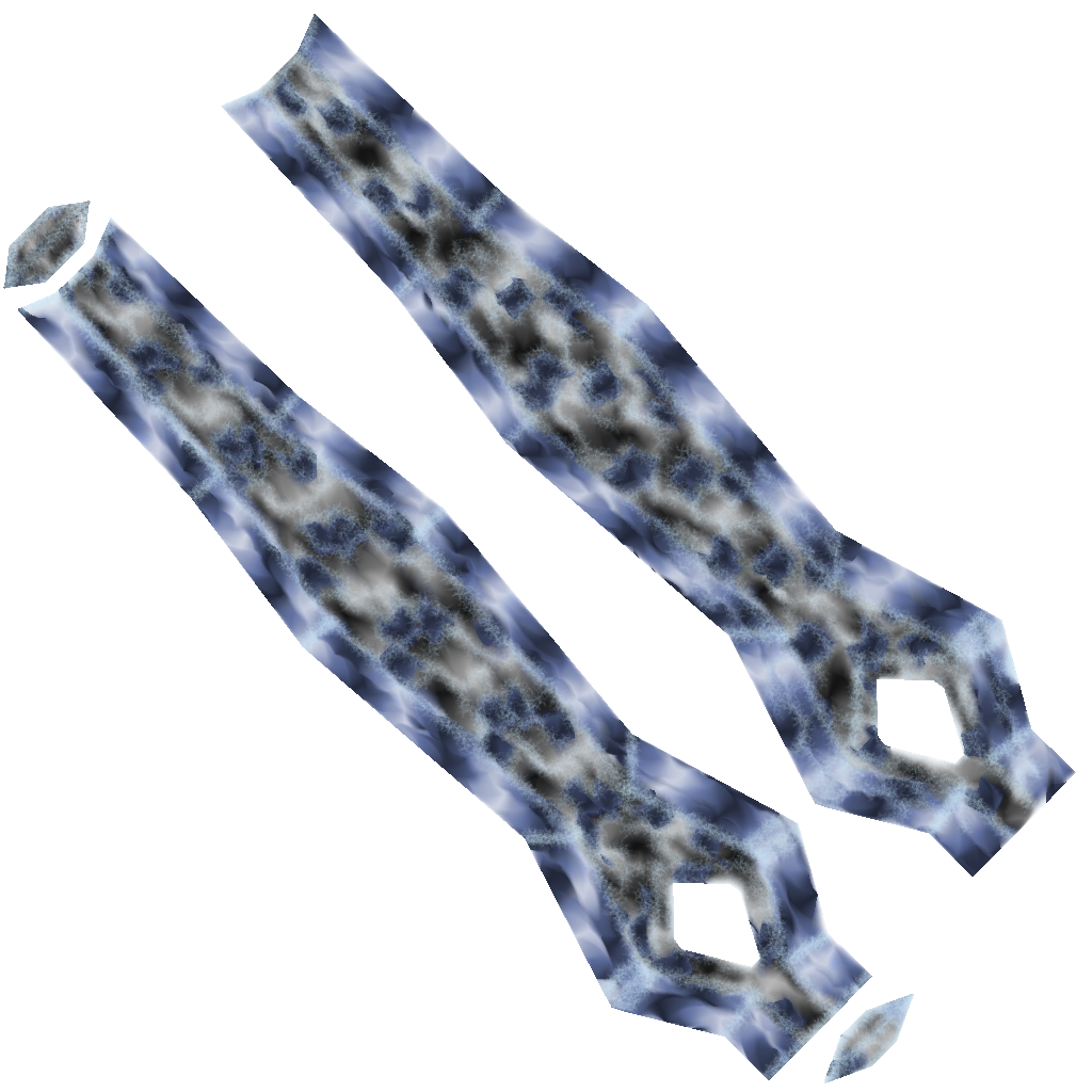
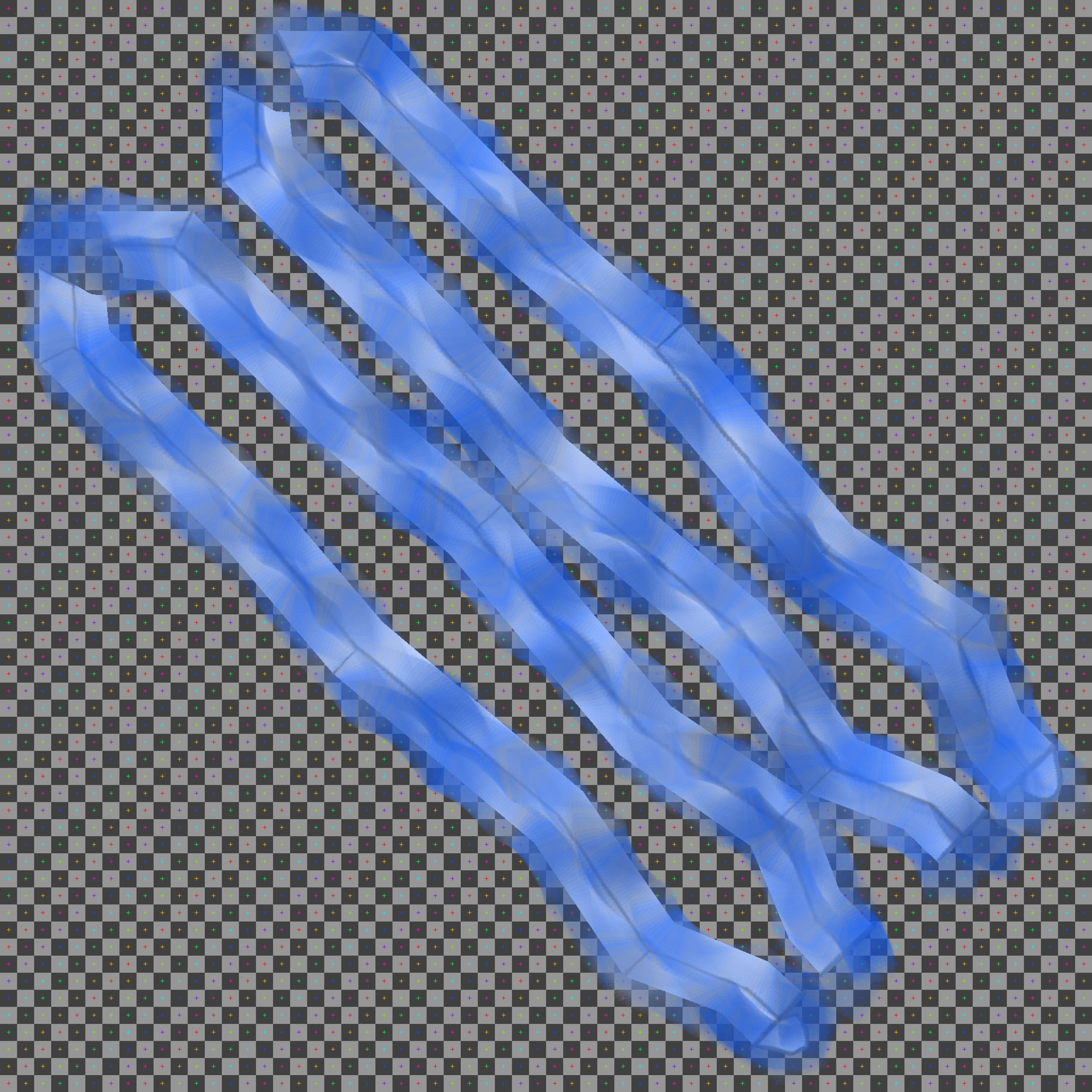
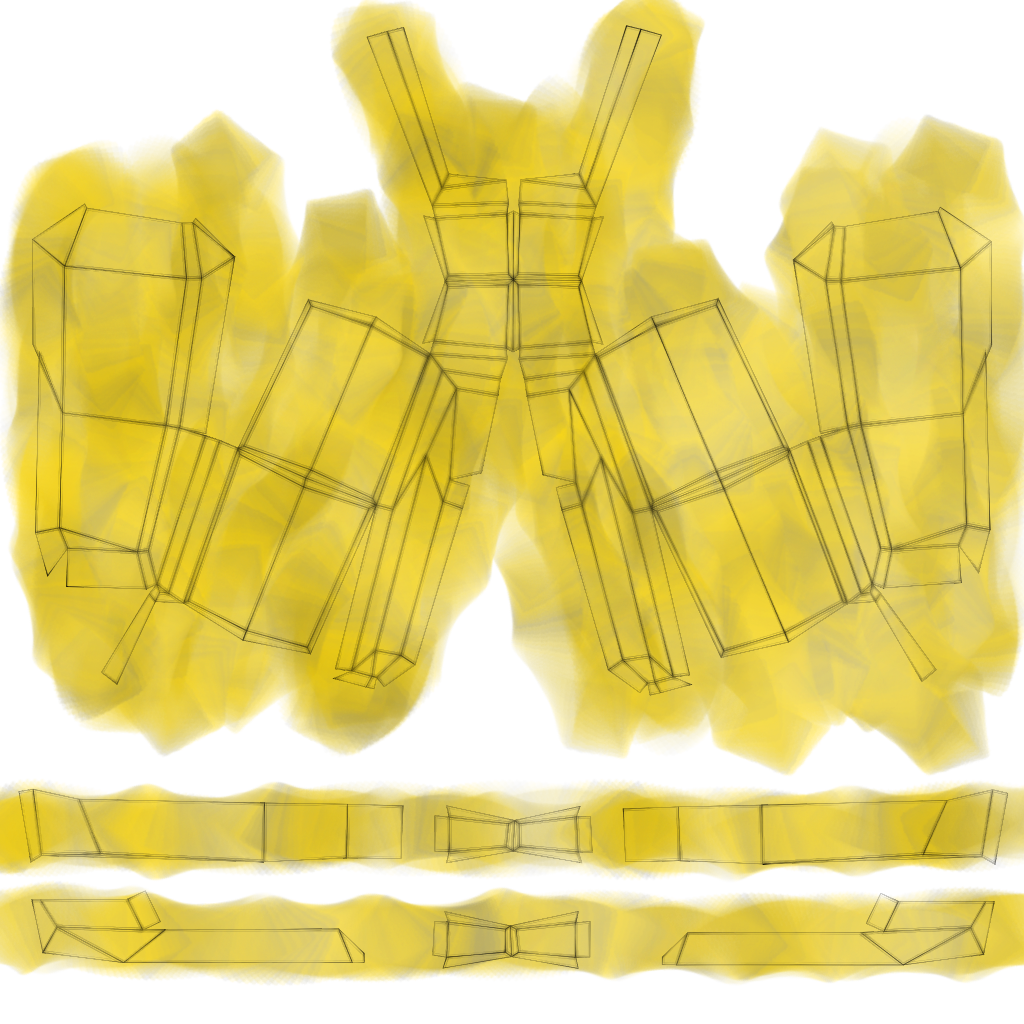
![]() blanchsb Nice job finishing the homework within the deadline. My main note about the texture is that it doesn't really clarify much what the sword is made of. Texturing is powerful because it can illustrate a model's composing (metal, wood, etc) as well as details (edge wear and crevice grime. However with yours I don't see these elements incorporated into the painted texture.
blanchsb Nice job finishing the homework within the deadline. My main note about the texture is that it doesn't really clarify much what the sword is made of. Texturing is powerful because it can illustrate a model's composing (metal, wood, etc) as well as details (edge wear and crevice grime. However with yours I don't see these elements incorporated into the painted texture.
I was going for some lightning textures and it turned out like marble when wrapped around
I agree, I'm not getting the lighting effect. It looks like a procedural texture honestly. Same with the outter blue color. the yellow-colred handle suggests it's a gold material but with some edge highlighting it would be more apparent.
The material is the other half of the surface quality equation, but I still think there's more than can be done in the texture here. It's a C+ from me this week.
@theluthier Thanks for the constructive criticism Kent. Yeah I agree it definitely doesn't showcase any material in that sword at all. I did however paint everything by hand. I used a unique brush that rotated a texture on the center blade and I made multiple multiple passes to get a texture I thought would look good with some bloom effect but it flopped terribly. This is an area I am quite novice at and I should have stayed basic like with the hammer. I like how that turned out but I agree some edge highlighting should make it a lot easier to tell that it is metal in nature.
...but it flopped terribly. This is an area I am quite novice at and I should have stayed basic like with the hammer...
![]() blanchsb You don't need to think of it that way. It's a learning experience! Being a novice, you should feel accomplished that you took a risk to achieve an effect by exploring brush tools not covered in the class. Even if the effect didn't result 100% intended, you surely learned stuff along; added tools to your own "Blender utility belt".
blanchsb You don't need to think of it that way. It's a learning experience! Being a novice, you should feel accomplished that you took a risk to achieve an effect by exploring brush tools not covered in the class. Even if the effect didn't result 100% intended, you surely learned stuff along; added tools to your own "Blender utility belt".
Rest assured that the best artists learned their way through the novice stage too :)
@theluthier oh I agree. I learn through failure. Yeah I try to spread my unconventional wings a little to branch off but kinda stay on topic. I'm not giving up, moreso it lit a fire under me. I have gone back to the model to work it some more to get the look that i want. Then I will take another stab at the texture. Shading is an area I have a little more experience in (not much but I at least know some stuff from a few courses on the shader forge series) and I think I should be able to get a better result. Thanks for pushing me along. I need this kind of feedback to push me harder.
Back to the drawing board on the textures..... Working the hammer head. I made some dents/nicks/slashes to represent some intense battles.
I exported the UV's to Affinity Designer on my iPad Pro and then made a base color for the metal using a texture brush (has a gritty rectangle) that I spiraled around as it painted in a custom curve for size/luminosity/rotation/and color saturation (I guess I didn't really need the UV's much for this part LOL) and then reimported the image to paint details within Blender.
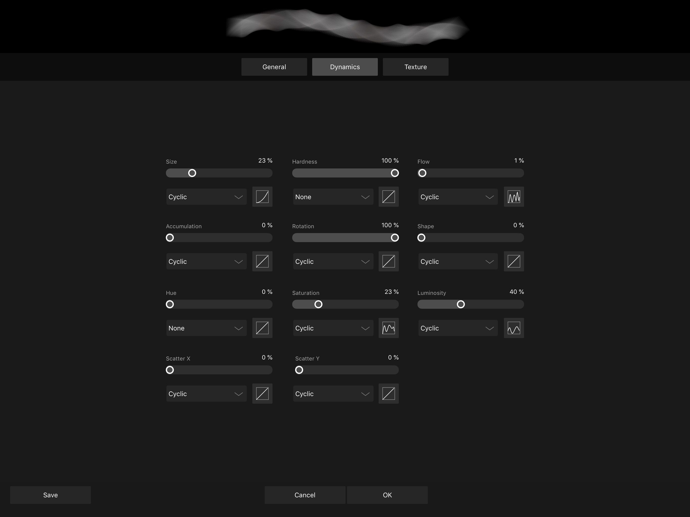
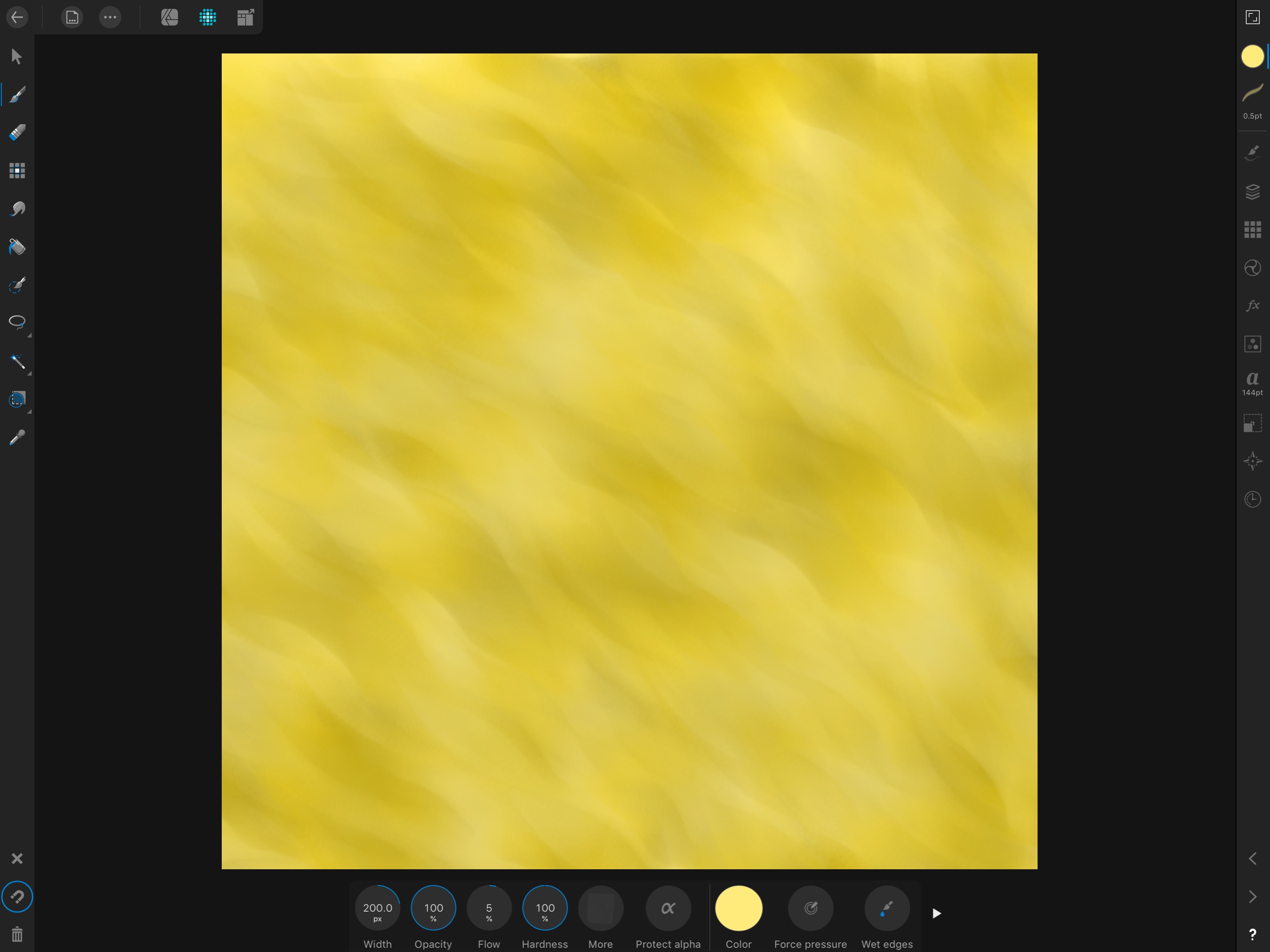
I am using my iPad Pro and AstroPad connected to my MacBook. Turning on emulate 3 button mouse helps a lot when using that workflow.
I want a semi toon/stylized feel from the texture like in Jack's textures.
I only got the Hammer Head 2/3 done tonight. Long treck tomorrow and into the weekend to make up for mistakes/learning from what not to do haha. Challenge accepted.
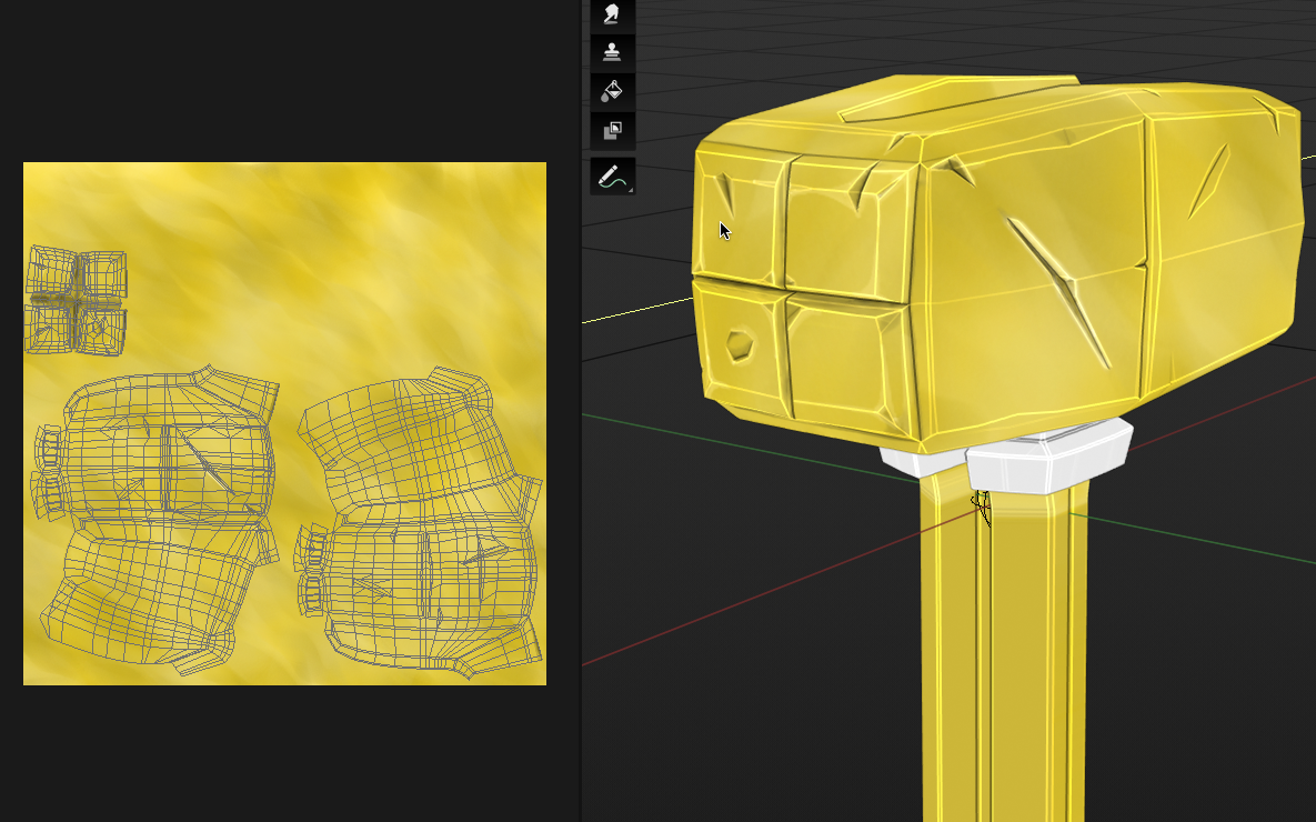
Not sure how to turn that wire frame off while in texture paint mode on the left there. But here are some close ups of the painting.....oh wait just changed modes from Texture Paint Mode to Object Mode and it turns off........ I found that the viewport Flat Shading Setting with Cavity and intensity turned up on the hills and valleys really helped me see the sharper edges better so I didn't have to paint over those darn wires in 3D mode. That helped a lot.
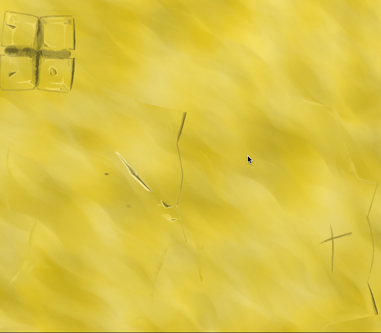
![]() blanchsb Sorry, I'm late to the party. Yeah, that looks like a good solution! The texturing this time looks like a better attempt. As for the tints and shades, it looks like you're adding just white and black to the colors. Have you watched the Color Course, specifically the Hue Shifting video? By using white and black, it tends to dull down your base color. It can be tricky to implement hue shifting for something like a shiny metal, but give it a try and see what kind of result you get. Otherwise, there's good attention to the edges and crevices to add depth. Overall, good work.
blanchsb Sorry, I'm late to the party. Yeah, that looks like a good solution! The texturing this time looks like a better attempt. As for the tints and shades, it looks like you're adding just white and black to the colors. Have you watched the Color Course, specifically the Hue Shifting video? By using white and black, it tends to dull down your base color. It can be tricky to implement hue shifting for something like a shiny metal, but give it a try and see what kind of result you get. Otherwise, there's good attention to the edges and crevices to add depth. Overall, good work.
![]() blanchsb don't fear failure. embrace it and use it. somewhere along the way i've read following quote "if you are strugling, it means you are out of your comfort zone and pushing forward" and that certainly rings true for me. That said, it doesn't mean you have to struggle all the time. :) just when you need to learn new things. :)
blanchsb don't fear failure. embrace it and use it. somewhere along the way i've read following quote "if you are strugling, it means you are out of your comfort zone and pushing forward" and that certainly rings true for me. That said, it doesn't mean you have to struggle all the time. :) just when you need to learn new things. :)
![]() louhikarme thanks for the encouragement. Yes I am very familiar. It is okay to completely botch a job as long as I learn from it. I remember the feeling of submitting on Sunday night and thinking, "wow, this was the wrong direction" but then I got some good feedback and I continue to receive it. I am glad to see so many VA;s and other peeps helping Noobs like me.
louhikarme thanks for the encouragement. Yes I am very familiar. It is okay to completely botch a job as long as I learn from it. I remember the feeling of submitting on Sunday night and thinking, "wow, this was the wrong direction" but then I got some good feedback and I continue to receive it. I am glad to see so many VA;s and other peeps helping Noobs like me.
Also, thanks for recommending the smooth shade idea. I ended up using the smooth shading with sharp edges (I just didn't know about the AutoSmooth part, or I forgot it) it helped a lot. I drove myself crazy trying to keep all quarts perfectly planar and was getting very frustrated when making the cuts and dings due to faceting. You and ![]() spikeyxxx hit it on the head and at the end the loop tools add-on and sharp edges helped me push it through.
spikeyxxx hit it on the head and at the end the loop tools add-on and sharp edges helped me push it through.
A followup question: Is there a way to get a Render with the same effect as the Cavity effect that Eevee utilizes for the viewport? What Node does that? Bump with Normal and/or Fresnel perhaps?
![]() silentheart00 I almost went down the road of using some hue but I backed out at last minute. I knew I could get some decent results with just a 2 color shift in the dark and light directions of the gold color, but maybe I need to visit that some more. I know I can apply a Hue filter effect to my drawing in Affinity or perhaps it would be better to paint with some hue shifts in another layer and I can blend it as I want. I'm always up to see some more content to help me on my path. Thanks for the video I will take a loot at it today during work.
silentheart00 I almost went down the road of using some hue but I backed out at last minute. I knew I could get some decent results with just a 2 color shift in the dark and light directions of the gold color, but maybe I need to visit that some more. I know I can apply a Hue filter effect to my drawing in Affinity or perhaps it would be better to paint with some hue shifts in another layer and I can blend it as I want. I'm always up to see some more content to help me on my path. Thanks for the video I will take a loot at it today during work.
![]() blanchsb Looks a lot better! Way to go!
blanchsb Looks a lot better! Way to go!
One of the great things about Blender though, is that you don't need other software. Now I know that when you are used to using certain software, you tend to keep using it, and sometimes things can be done better or easier in other software, but I think it's a good thing to try and do it in Blender. Sometimes it's easier to do everything in one program, than constantly exporting and importing...
Now, I'm a huge fan of Blender, so don't just take my word for it, but what you did in Affinity Designer, can easily be done in Blender as well. ( If you paint with a texture, under Texture, if you set the Mapping to View Plane, you have an option called Rake)
Or something abstract like this:
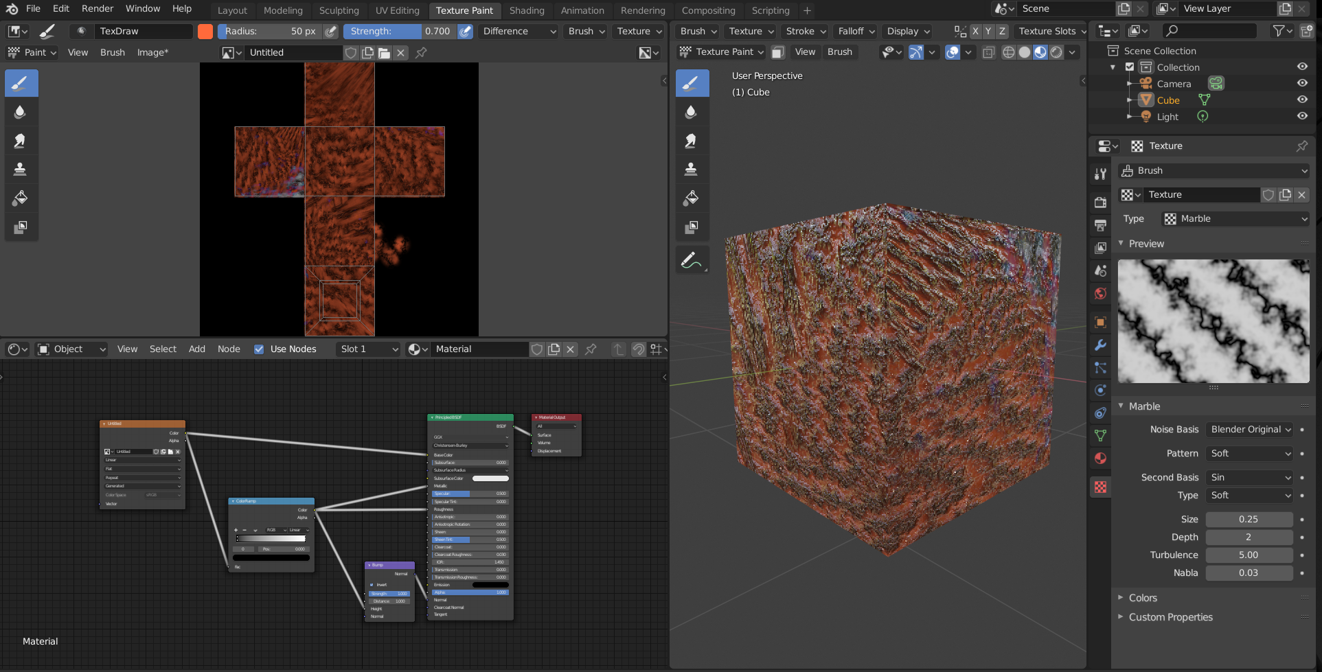
which took me less than a minute.
Just saying, you don't have to do everything in Blender, but it's a lot more powerful than you think.
This is what I accidentally discovered a few days ago (two minutes work):
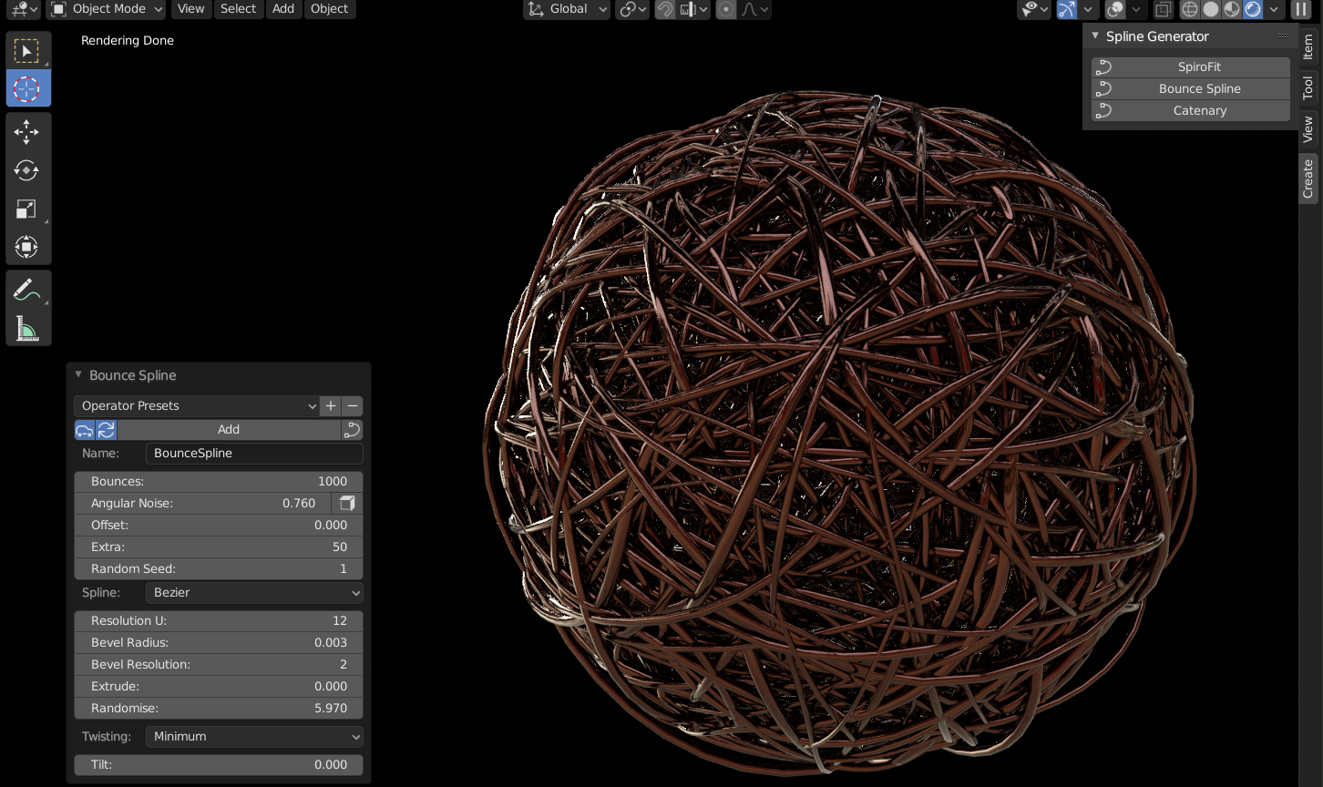
Any way, enough blabbering from me; get on with your work, it's going to be great!
![]() blanchsb This is looking way better! The tonal variations in the gold (pretty wild that you achieved the pattern on your iPad) the damage and edge highlighting are all fantastic additions👏
blanchsb This is looking way better! The tonal variations in the gold (pretty wild that you achieved the pattern on your iPad) the damage and edge highlighting are all fantastic additions👏
Thanks Man! For being a free software I really am scratching the surface of what Blender can do. I have seen that "Textures" section before and then I run away screaming like a little girl who wants to be Alice but fears the rabbit hole I could get lost in. Some days I feel like Blender is Underland: the more I explore -> the more I find -> and therefor the more I don't know. Get's overwhelming at times and I find myself getting lost down seemingly-forbidden paths haha.
What is a good place to start looking into the blender texture workflows?
I think I will still juggle blender and Affinity sometimes because I don't always have my laptop handy but my iPad is so portable that I can export an image and work on it away from home. But I agree working in 1 program is so much easier than trying to juggle multiples. I spent hours figuring out how to set up cloud workflows where blender and affinity share the same files remotely. It does make it nice once I got it setup because all I have to do is click "Reload Image" in blender and the texture file updates.
Not sure what the heck happened but when I woke my 2011 MacBook Pro from sleep today 2 things happened. One is a common blender 2.8 thing the other is a first.......
Glitch #1 - Repetitive and not sure why (like a snake in the bush sometimes): I got this weird effect on the blender app where all of the text everywhere turns into some kind of hieroglyphics. I have to close blender and reopen it in order for things to work again.......
Glitch #2: Opened my file......now Eevee is now acting extremely..............slow and glitchy. Some objects are rendering quite pixelated. After Eevee figures it out I still have some ghost effects and nothing seems to work on the shading engine side.....
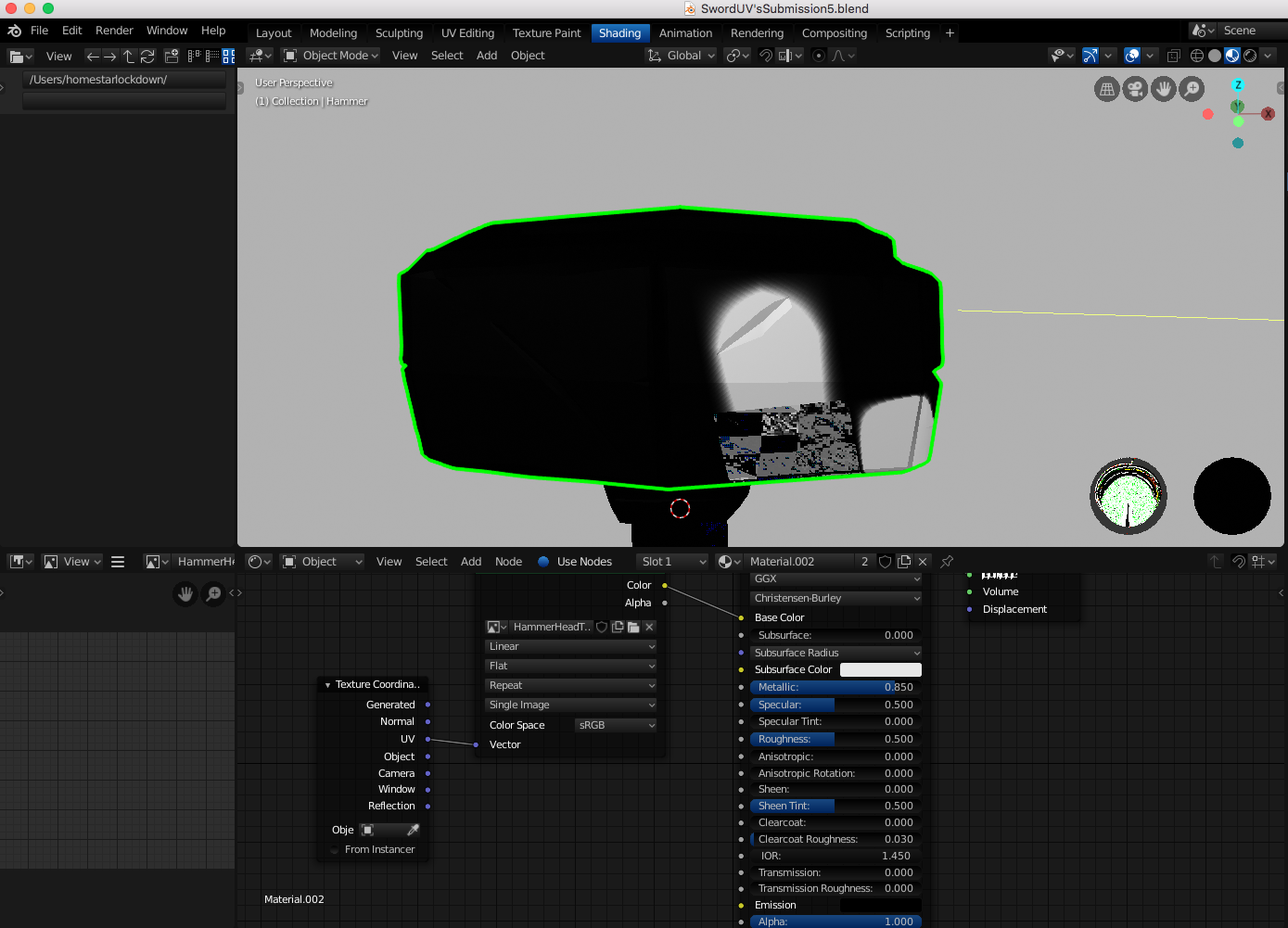
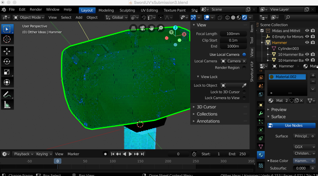
Wondering if my graphics took a dump (this computer doesn't have a compatible graphics card so not sure what is happening). I can work fine in the workbench mode though.......
Update: I decided to uninstall blender (sigh) and it actually fixed whatever the issue was for the second issue. The hieroglyphics thing is most likely going to come back after the waking part but I think this part is solved.
![]() blanchsb Hi Shawn, don't worry about feeling overwhelmed.
blanchsb Hi Shawn, don't worry about feeling overwhelmed.
The first few years, when I was learning Blender, a new version came out every three or four months. With changes and new features. I thought I would never be able to catch up; Blender was developing faster than I could learn...
I have never used texture painting, but I watched a lot of tutorials and just picked up things here and there. So I couldn't tell you where to start.
Good you found a comfortable workflow, so just keep using that until you know more about how to do this inside of Blender.
Sorry to hear about your recent problems, but I can't help you there; there are definitely more issues on a mac, for one, because Apple no longer supports OpenGL and as you already mentioned, your GPU isn't compatible with 2.80.
Good luck with everything!