I can't believe it's been a year, I shouldn't have got myself frozen!
Anyway, this is going to be a busy month. I did the treasure chest course last week, and it was so much fun I decided to start a modular set for a fantasy tavern, take a look: 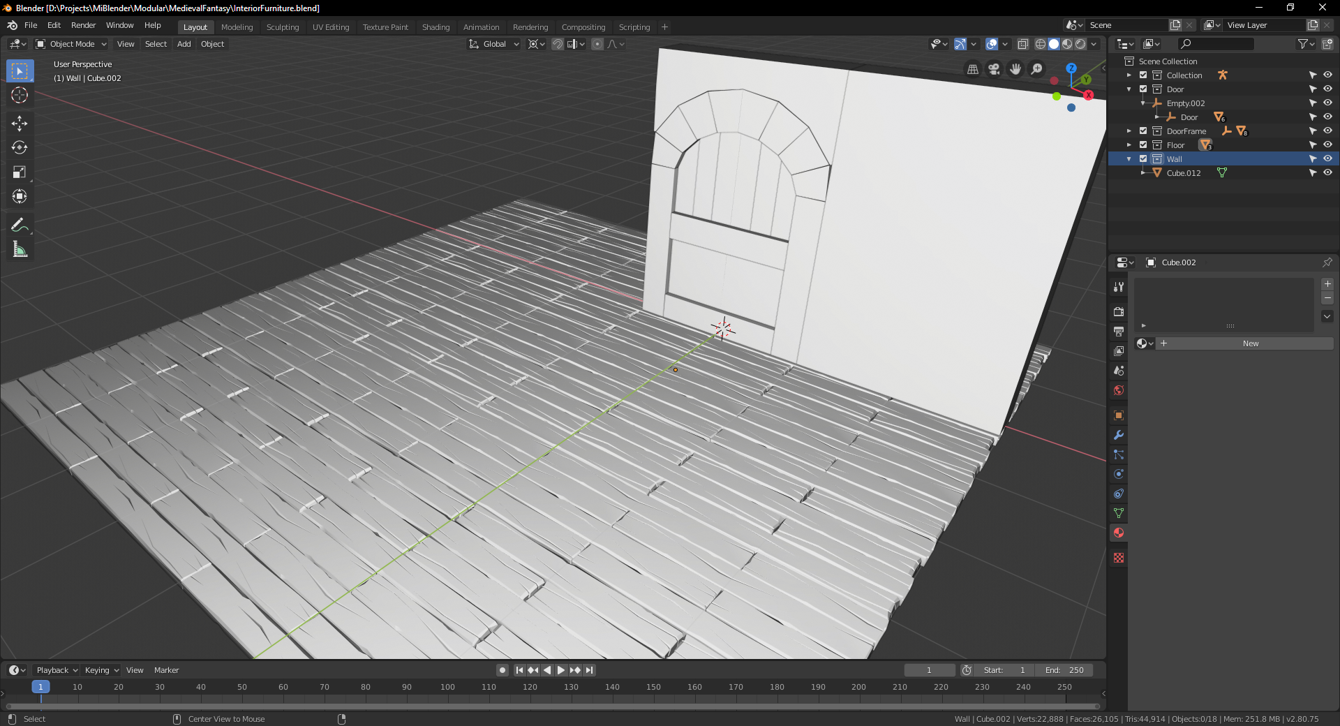
I only have a tillable floor complete and the block of a door with a frame and a wall. The barrel and sword are going to go along nicely! If I finish in time...
Also, the sword!
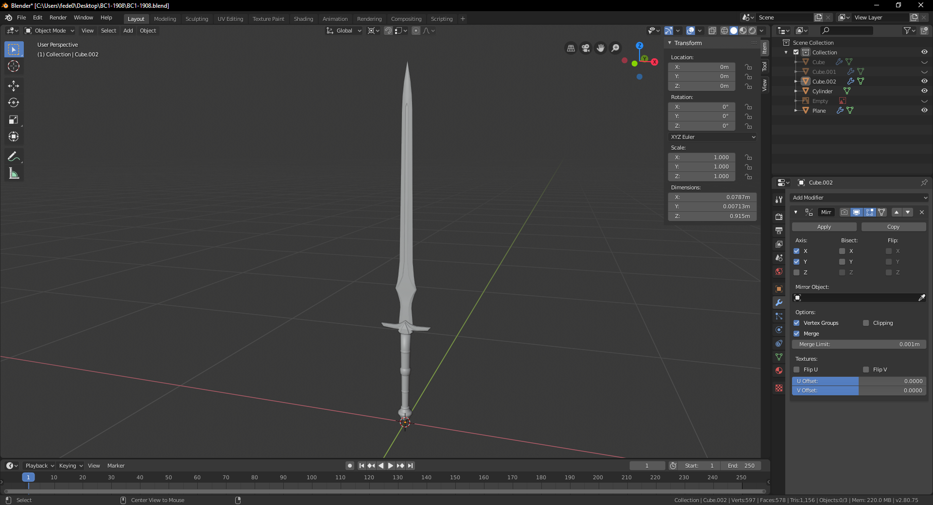
I'll probably try to make other pieces with a different style, to mix 'n match 'em. I love modular stuff.
I have no idea how I'm going to get enough time, I also wanted to make a demon king... decisions, decisions!
Maybe I should worry after shading lol
![]() jack07 Definitely solvable for week 3 shading 👌
jack07 Definitely solvable for week 3 shading 👌
![]() jack07 You got very far in the limited timeframe as even was able to create a scene, congratulations for that itself.
jack07 You got very far in the limited timeframe as even was able to create a scene, congratulations for that itself.
Loving also the original shape of that knife, very creative
Homework Submission Week 2
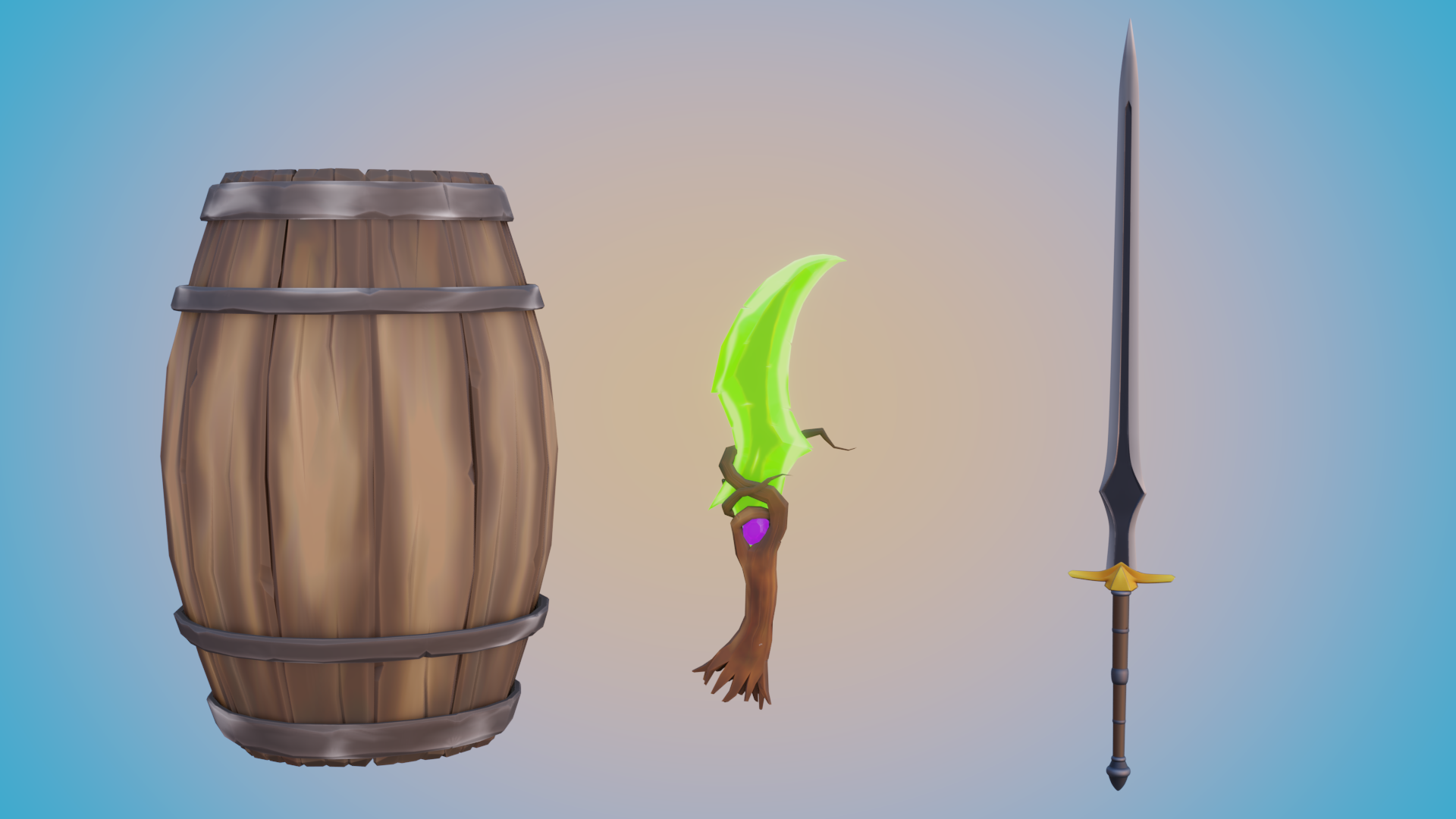
I didn't have time to work much on the scene this week, nor I could participate much in the forum, sorry :(
I like how the barrel and the dagger turned out, considering I draw like a little kid. I just realized the jewel is the same color of Blender's "TEXTURE MISSING" thingy...
The regular sword on the other hand is a disgrace that needs a lot of extra work and love. You can tell which is the favorite child.
![]() jack07 Wow that shading totally has a toon feel to it. This is the art style that I really go for. Can you give any pointers on the shading? That small blade and barrel are just amazing. My textures don't look near that crisp.
jack07 Wow that shading totally has a toon feel to it. This is the art style that I really go for. Can you give any pointers on the shading? That small blade and barrel are just amazing. My textures don't look near that crisp.
![]() jack07 Your assets' textures are awesome! I agree with blanch that your painting has a lovely 'toon' feel to it. It's very appealing. Really good work this week - it's an A+ from me. 👏
jack07 Your assets' textures are awesome! I agree with blanch that your painting has a lovely 'toon' feel to it. It's very appealing. Really good work this week - it's an A+ from me. 👏
I just realized the jewel is the same color of Blender's "TEXTURE MISSING" thingy...
Haha it totally is! Blender has trained my brain to see that color and thing "Danger, danger, something is wrong." 😅
The regular sword on the other hand is a disgrace that needs a lot of extra work and love. You can tell which is the favorite child.
LOL I relate to this so much. Favorite child...that's pretty good 😂
![]() blanchsb There's not much really, the workflow I used is very similar to the one from the chest course. Because I can barely draw, the details are in the mesh. For the texture I use the fill tool with each piece, using the main color they will be. Then I paint darker and lighter tones where it will make sense. For example, for the barrel I think if it's been rolled on it's side, it would be lighter in the middle and darker on the tips of the planks. Something similar to the magic dagger, it's a green crystal that has been sharpened, so the sharp parts and the dents should be lighter. Then I use the smear tool to soften them.
blanchsb There's not much really, the workflow I used is very similar to the one from the chest course. Because I can barely draw, the details are in the mesh. For the texture I use the fill tool with each piece, using the main color they will be. Then I paint darker and lighter tones where it will make sense. For example, for the barrel I think if it's been rolled on it's side, it would be lighter in the middle and darker on the tips of the planks. Something similar to the magic dagger, it's a green crystal that has been sharpened, so the sharp parts and the dents should be lighter. Then I use the smear tool to soften them.
AO maps are a game changer!
@theluthier Thanks!! I want to add something more to the jewel so it doesn't look like a giant error, but I'm not sure what it could be...
I'll try to do something for the poor sword today, if not this week!
Homework Submission Week 3
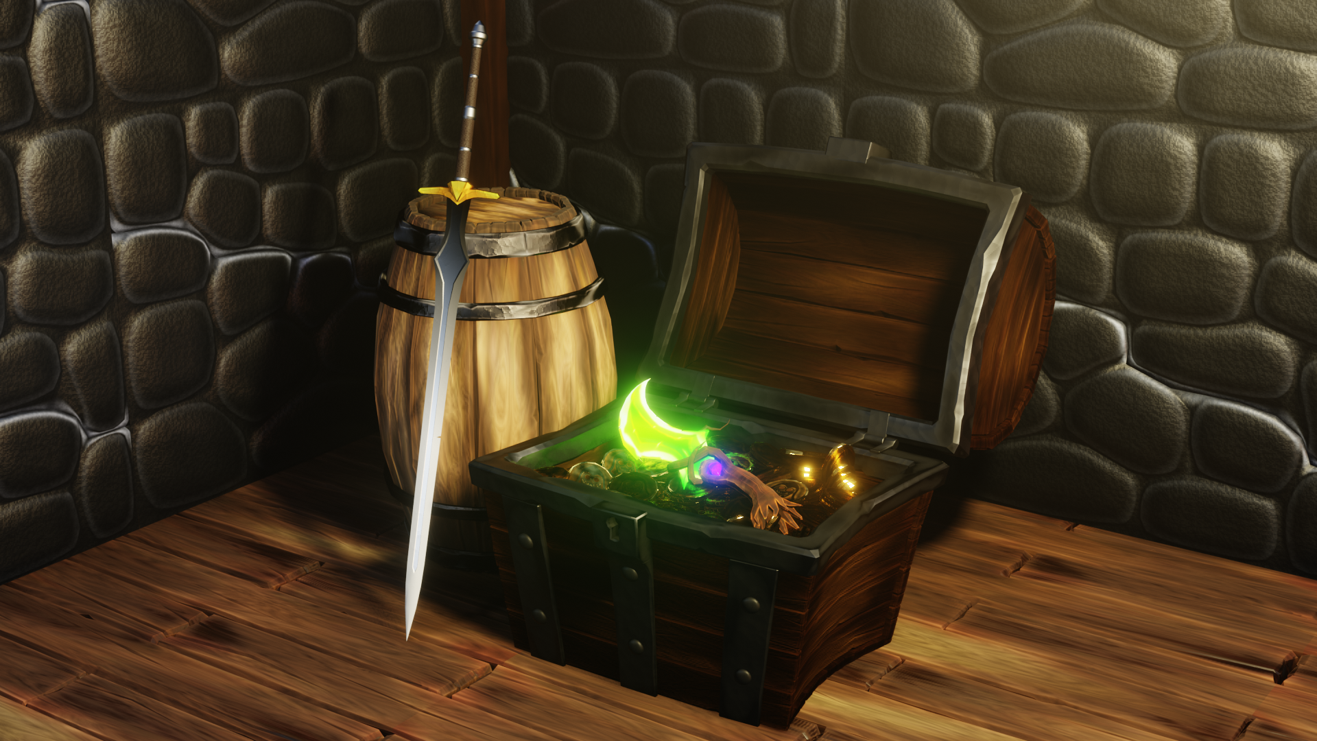
I think I'm done. Man, this week was busy. What I'm doing with my life? Where I'm going? Is it worth it? Tomorrow me has a lot to think about.
Existencial crisis aside, I see it and I don't believe it. I Started playing with textures and color mixers and ended up with this. The wood especially looks so different now! This is the barrel's texture to give you an idea: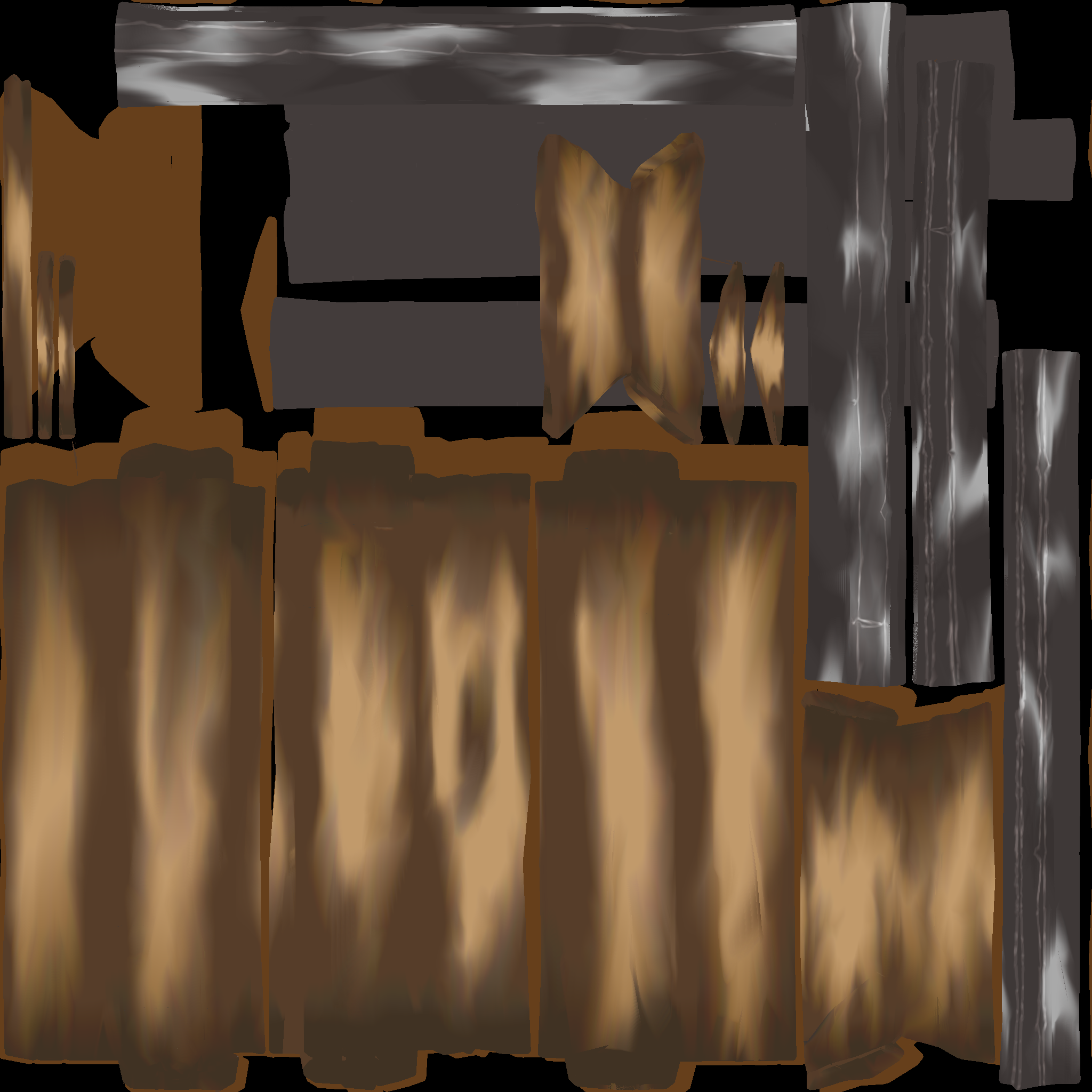
And the material: 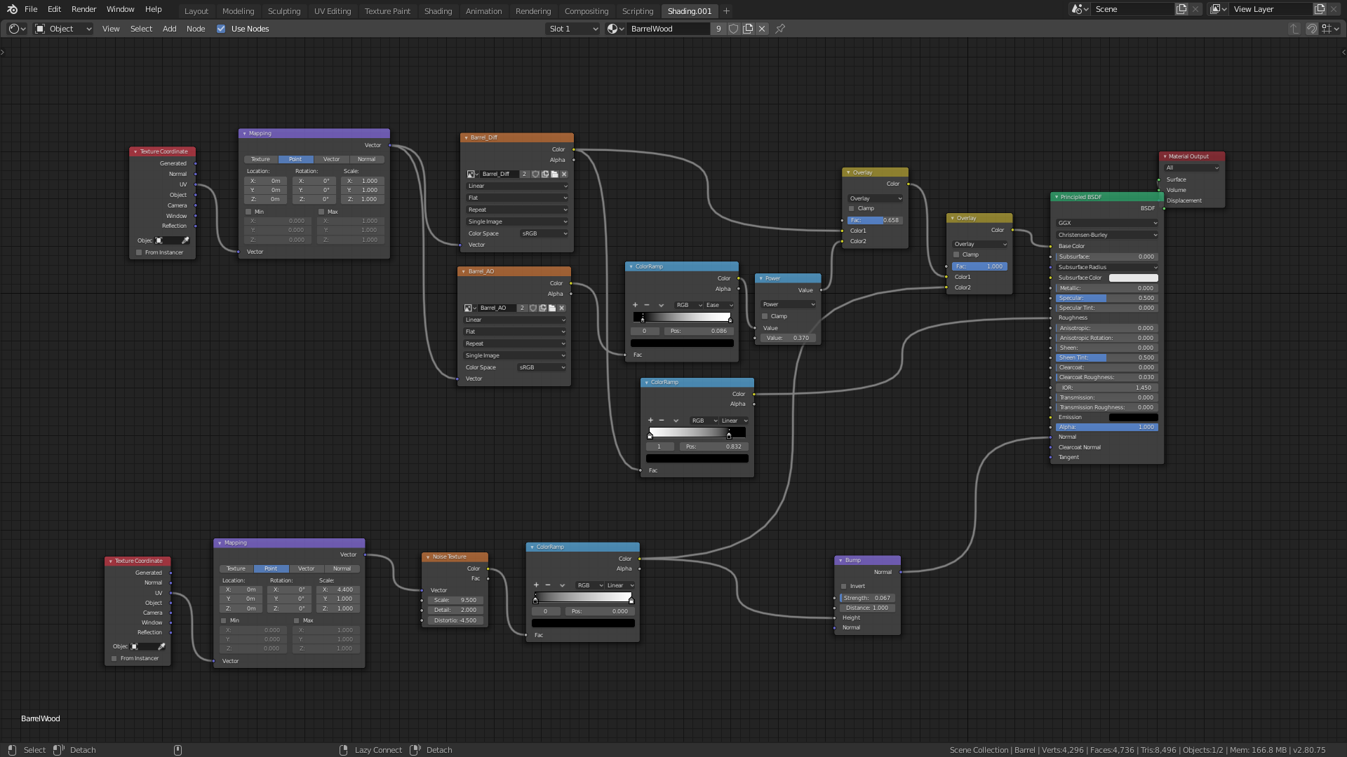
It doesn't look as crazy than I thought!
I also found a method for edge detection while googling something else: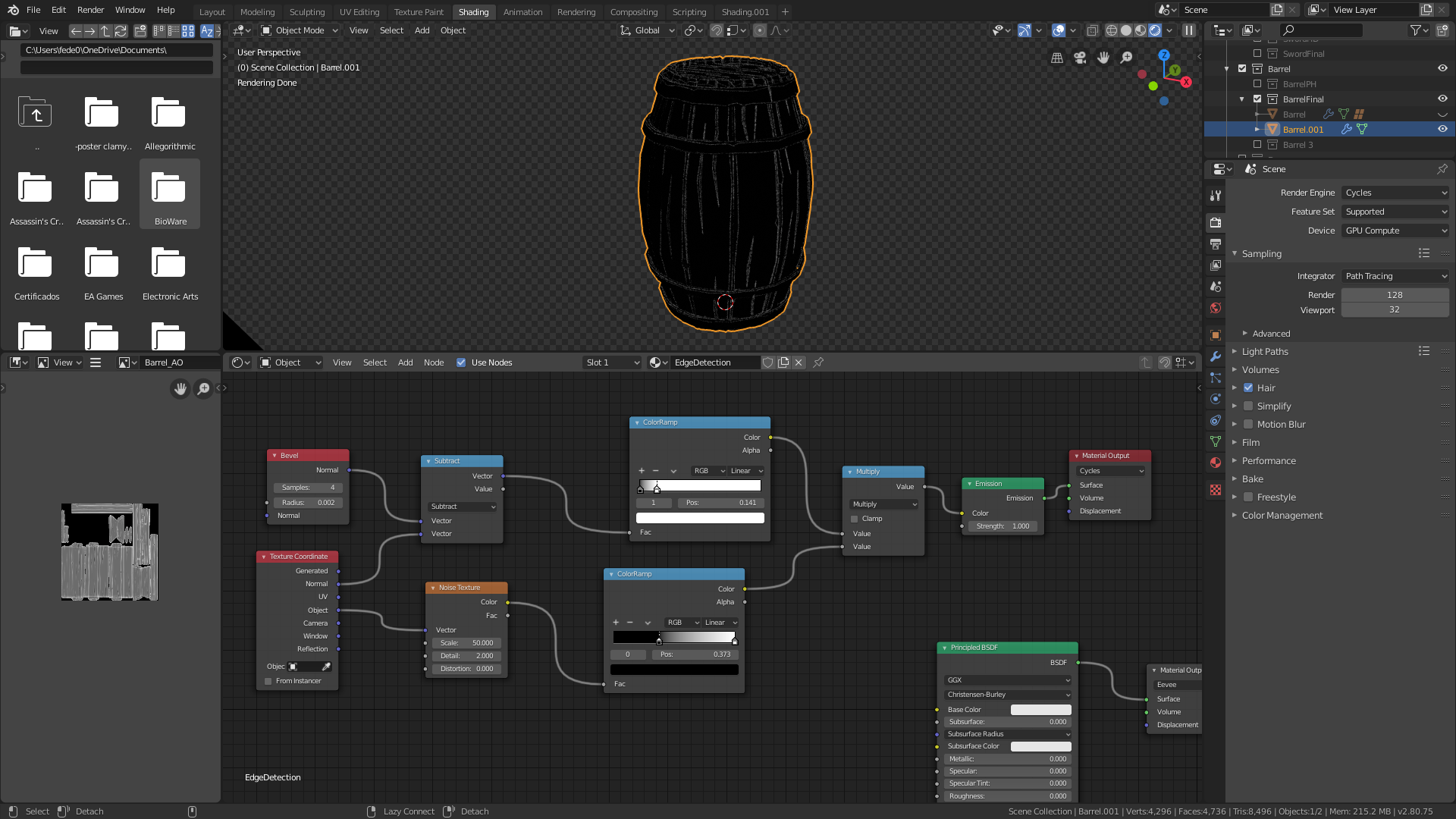
It should be useful for adding wear and tear, and bake a texture for it. But I'm not sure how to use it, if somebody wants to play around with it.
Overall I'm surprised with how it ended, considering it looked like a sad joke at first! However, I believe still have to learn about lighting...
![]() jack07 You should be proud of your final submission! You did a lot this month. Sword, dagger, barrel, and chest is a lot. The wood does look noticeably more detailed in the render compared to the texture. My guess is it's the noise texture as a bump that's increasing the detail of the material. You could try decreasing/removing that if you prefer the texture look.
jack07 You should be proud of your final submission! You did a lot this month. Sword, dagger, barrel, and chest is a lot. The wood does look noticeably more detailed in the render compared to the texture. My guess is it's the noise texture as a bump that's increasing the detail of the material. You could try decreasing/removing that if you prefer the texture look.
It looks good either way. The glowing dagger blade is really cool! The glow effect is spot on; feels really bright. The lighting is a little on the dark side, especially in the shadows that approach black and hide a lot of lovely detail (front of the chest). But lighting isn't a major part of this class so I'm not grading that too hard.
Primarily it's clear that you spent time working out your materials and you've earned an A+ for the plethora of assets you included. Really nice work this whole class, Jack! 👏
I also found a method for edge detection while googling something else
Does the bevel node work with Eevee now? Last I tried it did not. That's great! Thanks for sharing.
@theluthier Thanks! I used the noise texture for both bump and detail on the original texture, I like how it looks!
Lighting is my biggest weakness :(
The bevel node still doesn't work with Eevee, but you can bake a texture to use it with. I don't know how you could use said texture however, I only know it should be posible, as other programs like Substance Painter can do it from a texture. But then, Substance is what it is for a reason...
Thanks for the class Kent! I always feel refreshed after them <3