I can't believe it's been a year, I shouldn't have got myself frozen!
Anyway, this is going to be a busy month. I did the treasure chest course last week, and it was so much fun I decided to start a modular set for a fantasy tavern, take a look: 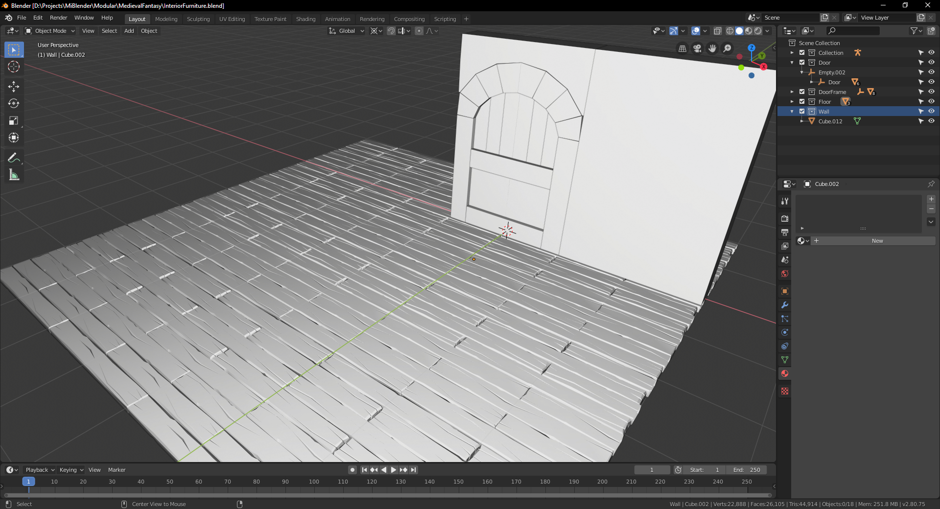
I only have a tillable floor complete and the block of a door with a frame and a wall. The barrel and sword are going to go along nicely! If I finish in time...
Also, the sword!
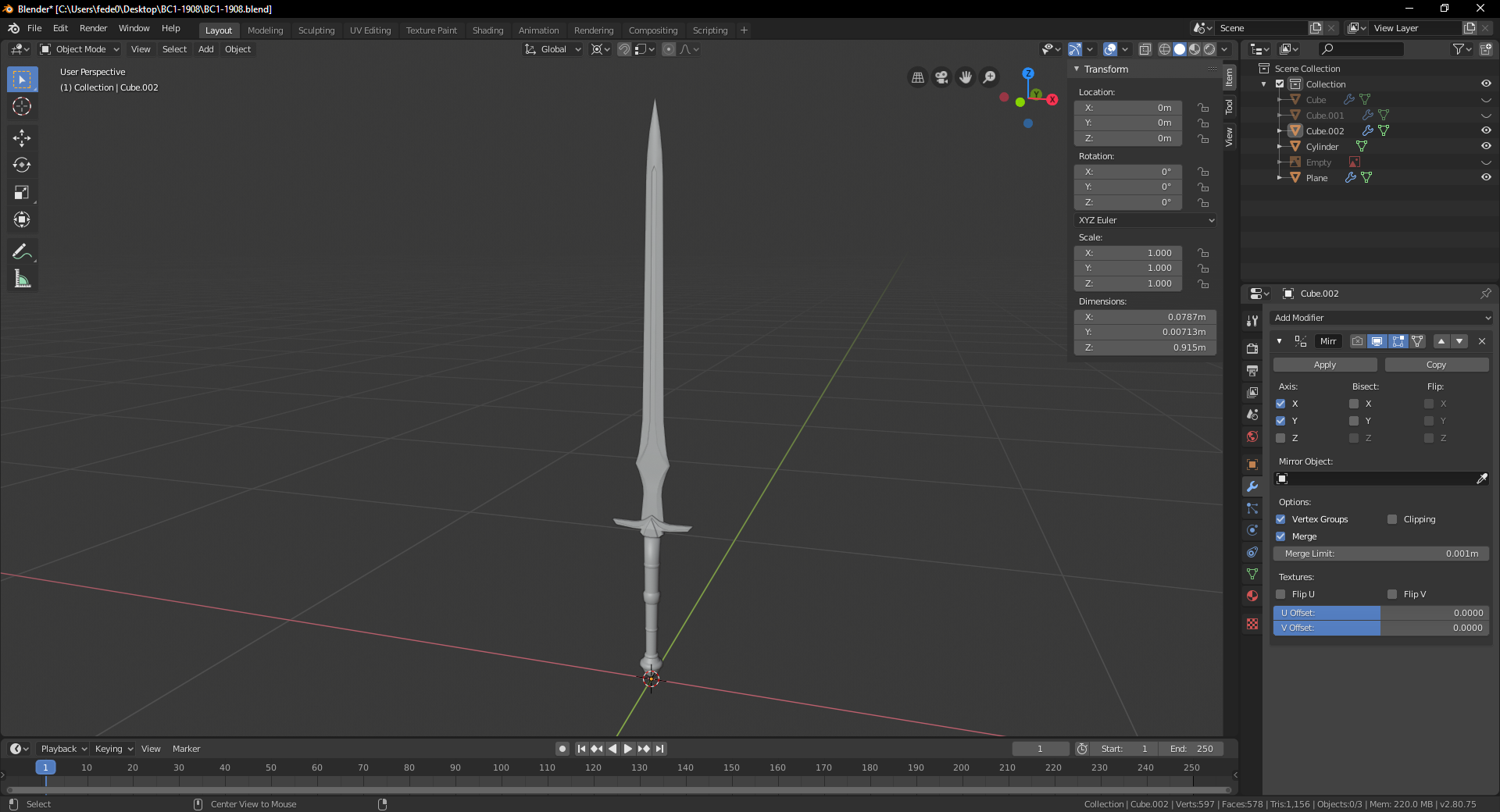
I'll probably try to make other pieces with a different style, to mix 'n match 'em. I love modular stuff.
I have no idea how I'm going to get enough time, I also wanted to make a demon king... decisions, decisions!
![]() jack07 Oooo, extra challenge! Looking good so far.
jack07 Oooo, extra challenge! Looking good so far.
Maybe for the tree part, you could sculpt it, then retopologize. Give it a shot.
![]() silentheart00 That's not a bad idea! I'm experimenting with curves, but I'm not sure it's going to look how I wanted.
silentheart00 That's not a bad idea! I'm experimenting with curves, but I'm not sure it's going to look how I wanted.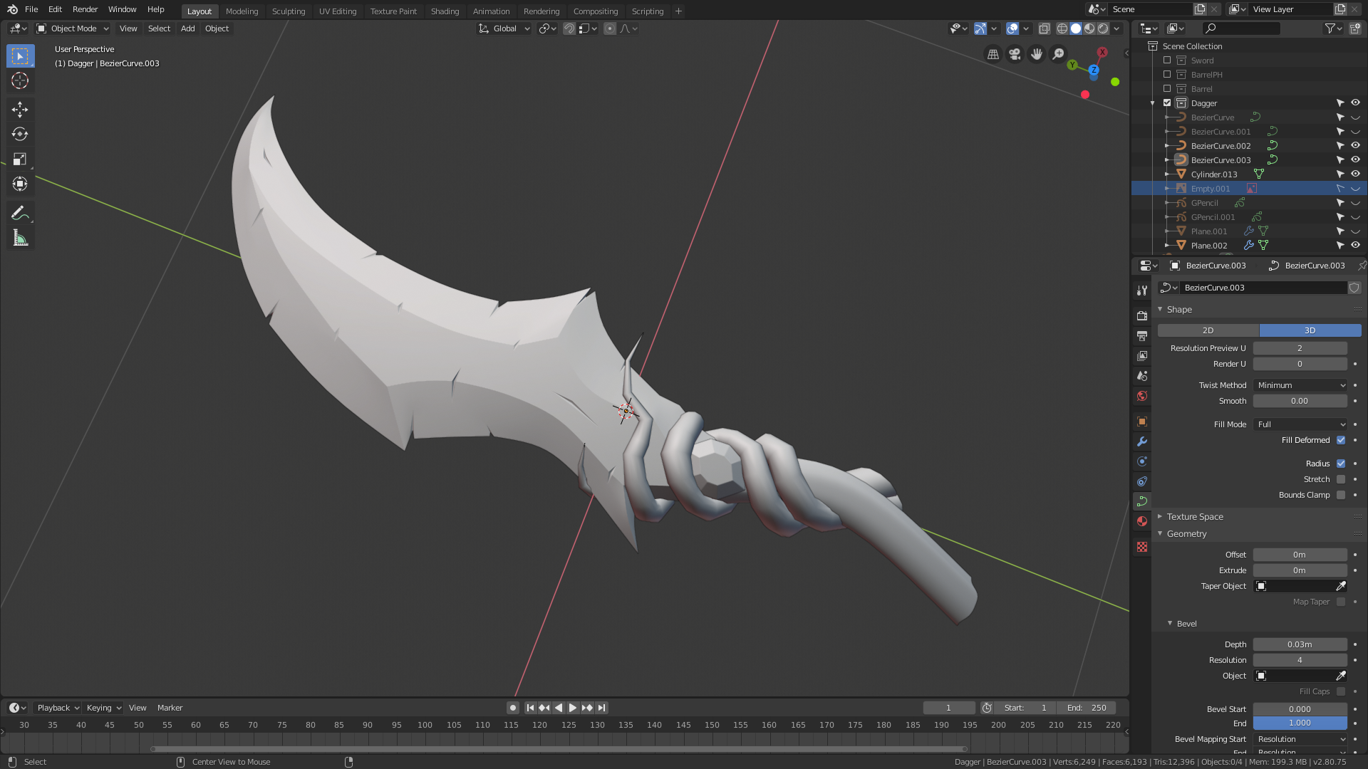
Maybe a mix of both will do the trick...
![]() jack07 Looking nice! Maybe you could have some little twigs branching off the "handle" using curves? Though that might be overdesigning a tad.
jack07 Looking nice! Maybe you could have some little twigs branching off the "handle" using curves? Though that might be overdesigning a tad.
@thecabbagedetective Thanks! I'll see if I can add a one or two ramifications to the tips, thing is, those would probably break on first use lol.
![]() cruento @spikeyxxx @richm Thanks!!
cruento @spikeyxxx @richm Thanks!!
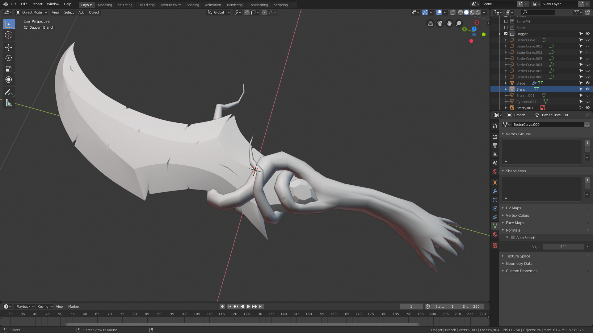
The sword so far! I simplified the handle to make it more comfortable, I think the main shape is ready, but maybe it needs to be thicker? What do you guys think?
![]() jack07 Neat idea Jack, the blade looks like it would feel great and a bit hefty - which is good!
jack07 Neat idea Jack, the blade looks like it would feel great and a bit hefty - which is good!
Homework Submission Week 1
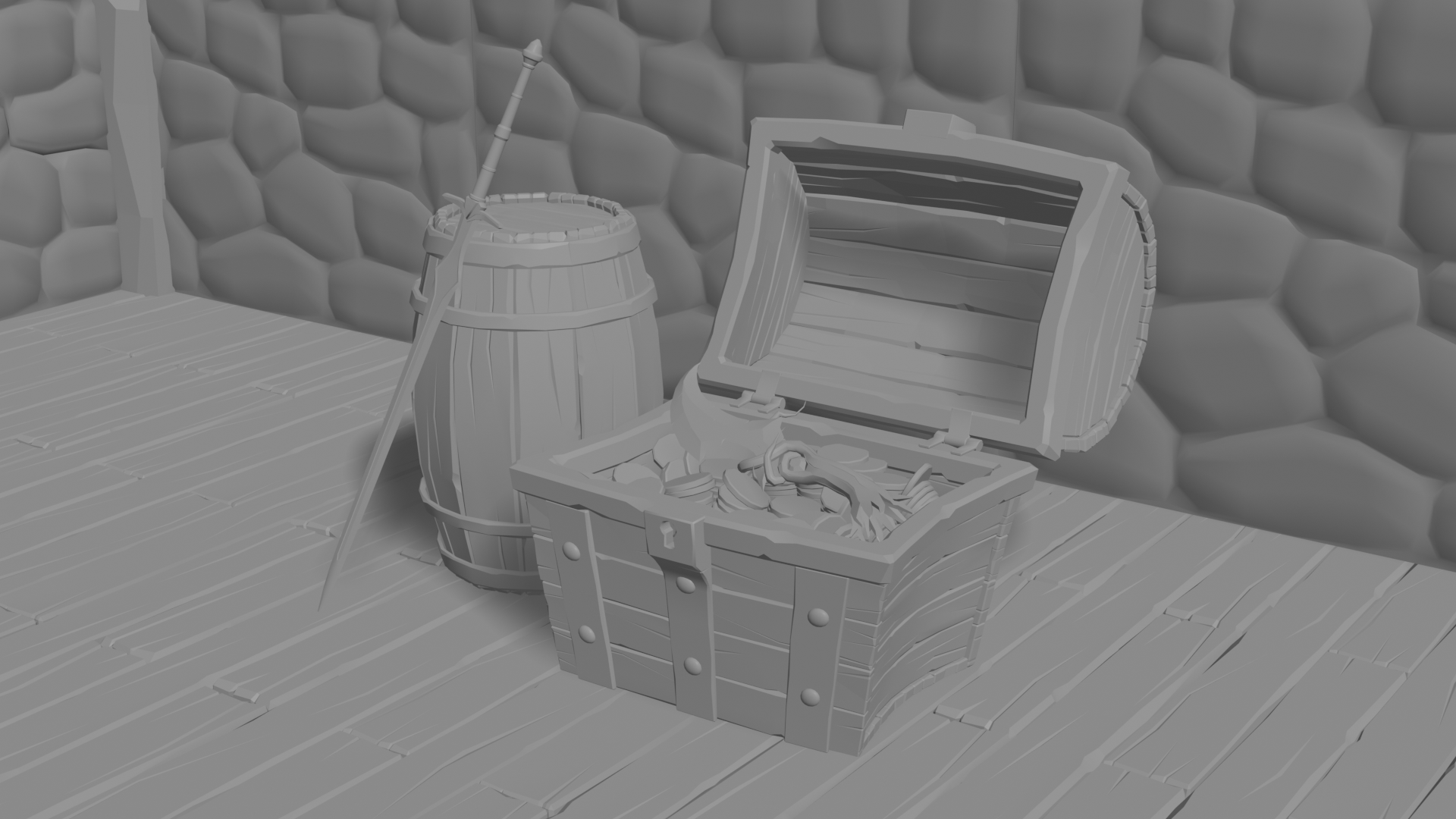 Disclaimer: The chest was done before this class, just wanted to add it to the scene.
I ran out of time for this week, the walls took longer than expected, and need a lot of extra work. But overall I'm pleased with how it's turning out!
Here's a better look at the items I made for homework: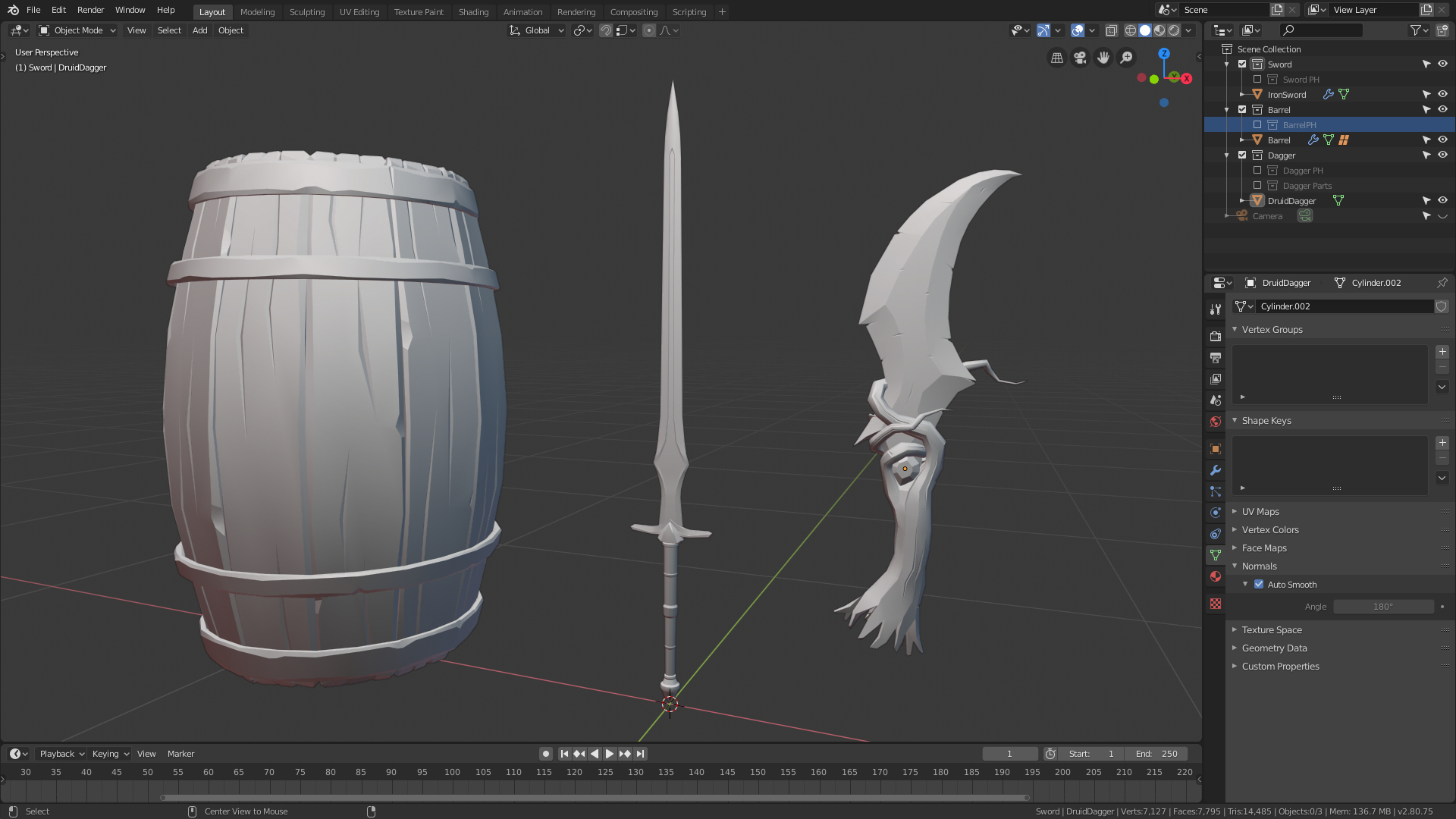
The regular sword keeps giving me the feeling it will spontaneously break...
![]() jack07 What a collection! I'm really liking what I see so far, Jack. I almost didn't notice the dagger on top of the coins. It will surely stand out much more obviously one textured and shaded.
jack07 What a collection! I'm really liking what I see so far, Jack. I almost didn't notice the dagger on top of the coins. It will surely stand out much more obviously one textured and shaded.
I don't have any criticisms at this point. The quality of your modeling is evident and the fact that you're modeling 3 assets certainly earns you an A+ this week. Keep up the good work! Can't wait to see more from you👏
@theluthier Thanks a lot! I don't know why the blade is so difficult to see, I think it may be too flat? Maybe I should worry after shading lol
![]() silentheart00 Thank you!
silentheart00 Thank you!
![]() jack07 I was instantly on the look for that blade and figured it would be the prize in the chest. I wasn't disappointed. Nice work!
jack07 I was instantly on the look for that blade and figured it would be the prize in the chest. I wasn't disappointed. Nice work!