🚨🚨🚨 UPDATE: 22 of you submitted this time! That leaves Lampel and I only 5-6 minutes per critique which isn't much. So we decided to split them between two streams. The first 11 (including everyone who said they would be attending tomorrow, May 28th) will get critiqued tomorrow and the second 11 next week on June 4th.
We're hosting a FREE live critique stream for your Blender projects on May 28th @ 2pm EDT (UTC/GMT -4 hrs). All you need is a free CG Cookie account to participate. Of course Citizen members are welcome to participate like usual.
If you would like the focused eyes and advice of Kent and Jonathan Lampel to help push your Blender Art to the next level, please submit one of your projects to this thread. Both of us specialize in modeling, texturing, shading, and lighting but any projects (including animations) are welcome.
Sounds fun. I'm probably not going to submit, but I'll try to make it to the live stream.
I'm sure there are some free users that are excited for this. We usually just have the critiques for members.
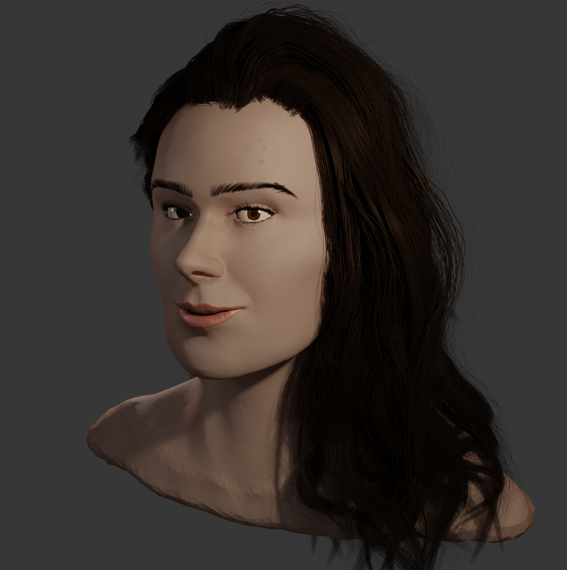 Was hoping to get some critique on my latest Project.
I wanted to focus on improving my general skills with sculpting the human face. I used reference pictures of a person to guide me plus the awesome Hair Tutorial by Kent to help me with the Hair, because I've never modeled hair before.
My main goal was to get the facial Anatomy right, so this would be the most helpful advice, but because I'm quite new to 3D sculpting so every criticism is appreciated.
I'll most likely be able to be there live. Let's hope nothing unexpected gets in the way. :)
Maybe I could get my profile picture critiqued. I've been trying to figure out how to give it a pasty look. The goal was to make cookie dough that would stand out as a profile picture. So I made it flashy. I also want some realism in there, but I couldn't get the texture in the dough just right, or the material.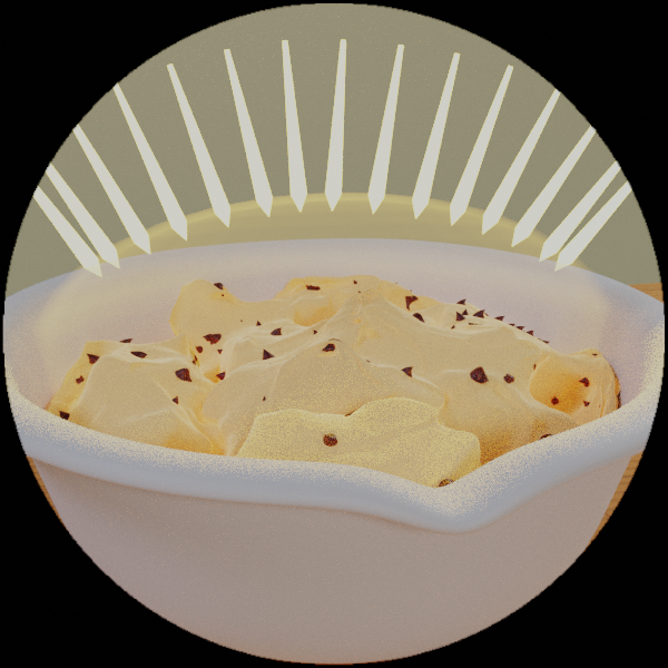
Please can I submit this project.
I don't hate it, but I'm not overly happy with how it turned out. Feel free to rip it to shreds :-)
Goal - I was just aiming for a nice jungle picture, the kind of thing you might hang on the wall. In terms of what I was going for - "atmospheric", "pleasing" "passive" - rather than "striking". I hope that makes some kind of sense...
Advice - I guess helping me see why it doesn't really... work? Composition? Lighting? Colour? When I look at it I can see it doesn't quite hit the eye right, but it's hard to see why.
I will try and attend the live stream, but I'm not sure if I will be able to due to work. I might have to watch the recording.
Woohoo! Not sure if I'll be able to post something for critique as this is a really busy week for me. We'll see.
I would like to get some critique on this one.
https://cgcookie.com/u/tomasplasil/projects/stylized-house-final
My goal was to create a kinda menacing and mysterious setting for the house I modeled. I wasnt making it for any game or something in particular, just to have a nice render.
Im pretty happy with how the house turned out, but I think the overall composition could be better. I cant really put a finger on what is bothering me about it. So some tips about composition and lighting would be awesome.
Most like I will be able to attend the stream.
Thanks in advance.
Hello BLENDERions,
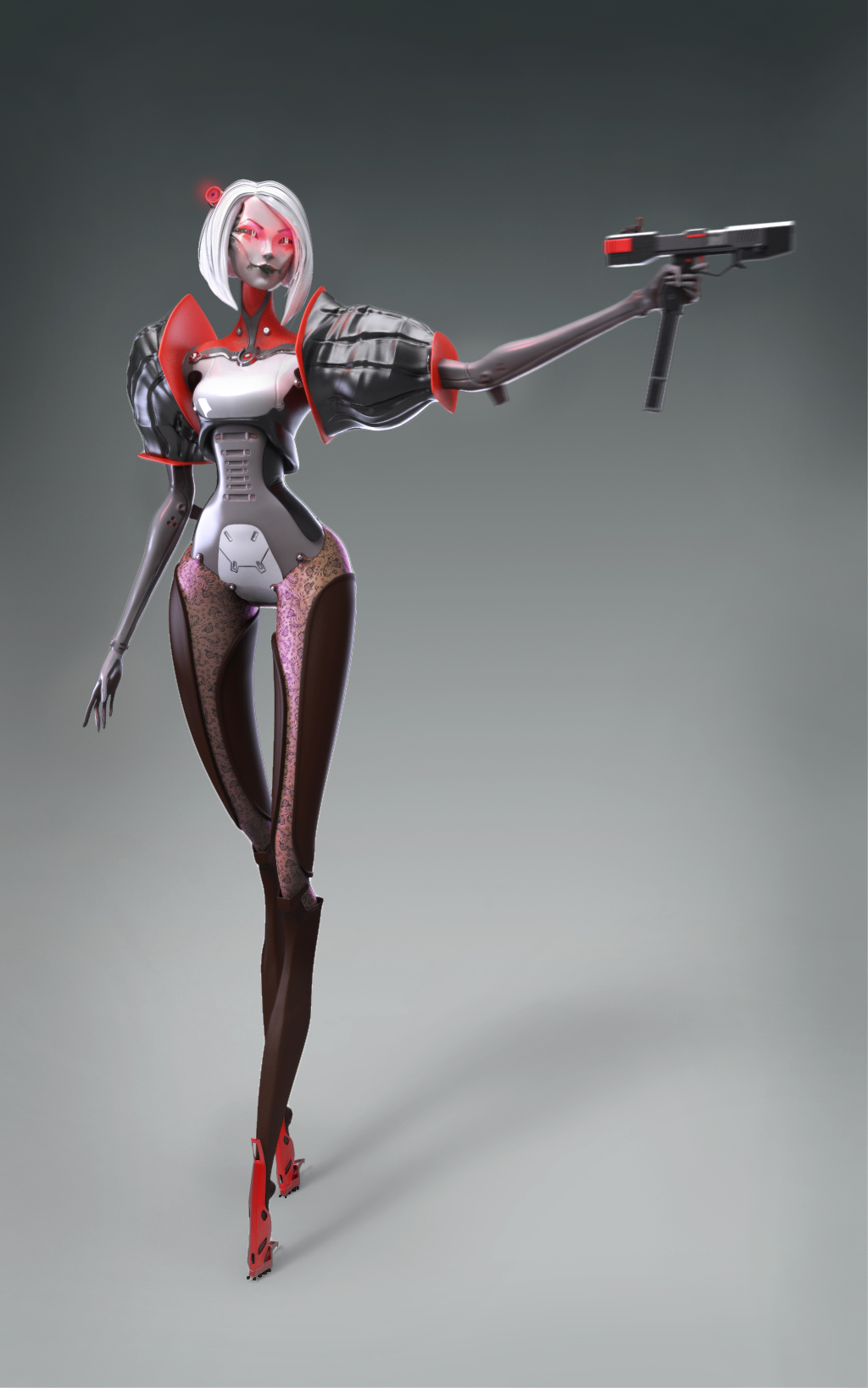
This is my latest personal project based on a concept of the 2d concept artist Ivan Yakushev.
Since I always dreamed to challenge myself to sculpt a female android character, a task that will put my skill to the test in terms of hard-surface modeling and organic, so I gather all my courage and did this artwork. I got some feedback from Ivan in the early stages of the progress, and that helped me a lot!
So I would like to know your feedback regarding every aspect of this artwork like:
- Character likeness
- Female silhouette
- Hard surface pieces
- Materials maybe
Etc.
Thank you so much and see you on the 28 of May!
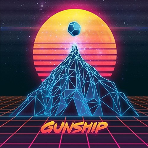

Hello! This is my little challenge. I was trying to get the same result in 3d.
On background i use HDRI. Mountain is just 2 materials (one with bloom) with wireframe modifier on it. Pretty same mat on the floor, and the wireframe too.
The Sun....it was the hardest part for me. It has to be like a glass, so the stars shine through it. In the other hand sun must be 2 colored and. Shine with pink halo! I make a glass material with mix shader of yellow and red, then with help of texture coordinates mix this two colors. Then i tried to put some light sorce from back side of the sun, but it gives me not that result in the end. Help me with that part please, what i miss or doing wrong from begining.
(Yeah, i know that the sun must be more smother^^)
Thank you, for your mega source! I love it!
Hi!! So...this is from that Eevee VS Cycles challenge, and what's more: It's the first scene I've ever made...that I can call a scene.
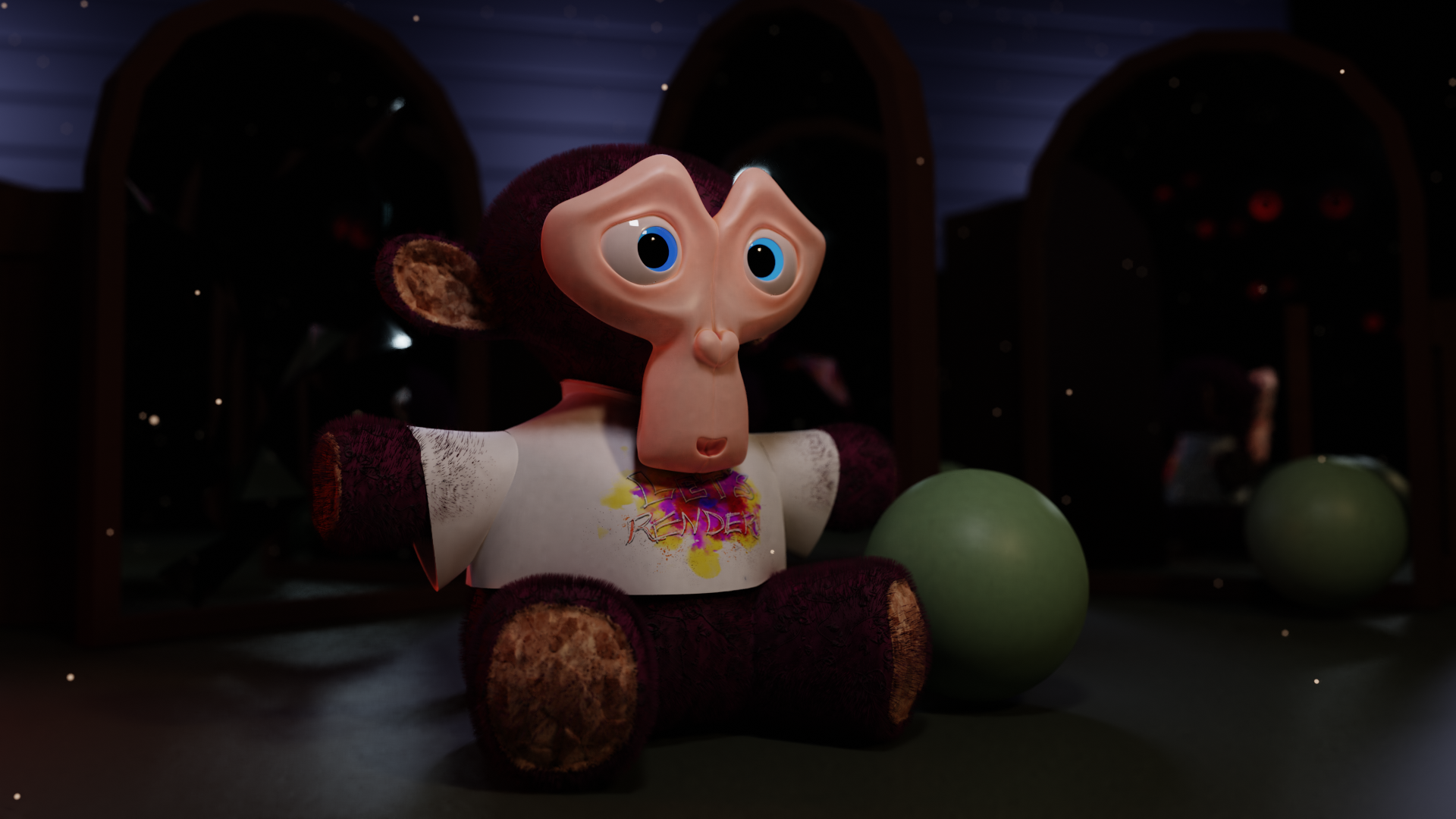
It's more of a "Next time, I'd love to..." kind of thing. I've never made a scene this in-depth. As long as I've used Blender, this is the case, and I'm discouraged about that.
I want to make some fun, whimsical, even sometimes creepy scenes. I like making stories, so it would just be great if I could confidently make scenes.
I could use advice about how to make characters, simple and quick as possible. I suck at sculpting, but I do want to know. Also, lighting, really setting a better mood with lighting. This one was meant to be a bit creepy, but I don't think the lights work quite well enough yet. Also, I don't know if I make good compositions. I really can't tell. Maybe some advice on how I can understand it better. Even when I studied composition, it just doesn't click yet. (I always wonder if that's because of my eyes being turned inward or what it is. I was told once not to bring up my visual impairment when getting crits...)
I won't be able to make the live stream, but I do want to see the advice for later.
Thanks a bunch!
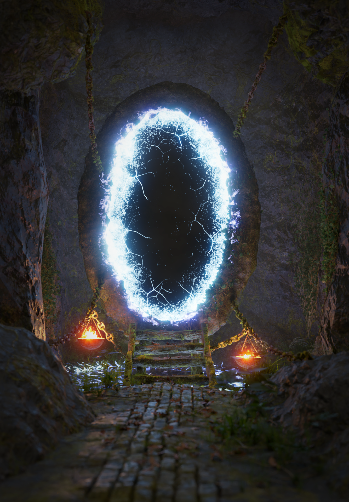
Hey! It's really awesome you do that free ArtCritique! I have this render here, I aimed to have some mysterius cave with a magical portal. But when making this I ran into several issues that I think im not experienced enougth to fix myself.
I planed there to be water underneath the portal, but it looks odd and one does not guess it's water. Additionally I had serius problems with RAM, as you can guess by the rockwalls that have very low topology, do you know a way what I could do to fix RAM issues (have 20gb at this moment). Additionally I just think this sczene feels empty, It has brigth points and lots of contrast to lead the eye but it is missing something, i tried having another dimention istead of the black area in the portal but that disctracted more than helped to fill it up!
I would be really glad if you could help me out there as I often have the problem of empty feeling scenes, or that something is off and i cant point my finger at it!
Unfortunately I cannot watch the stream
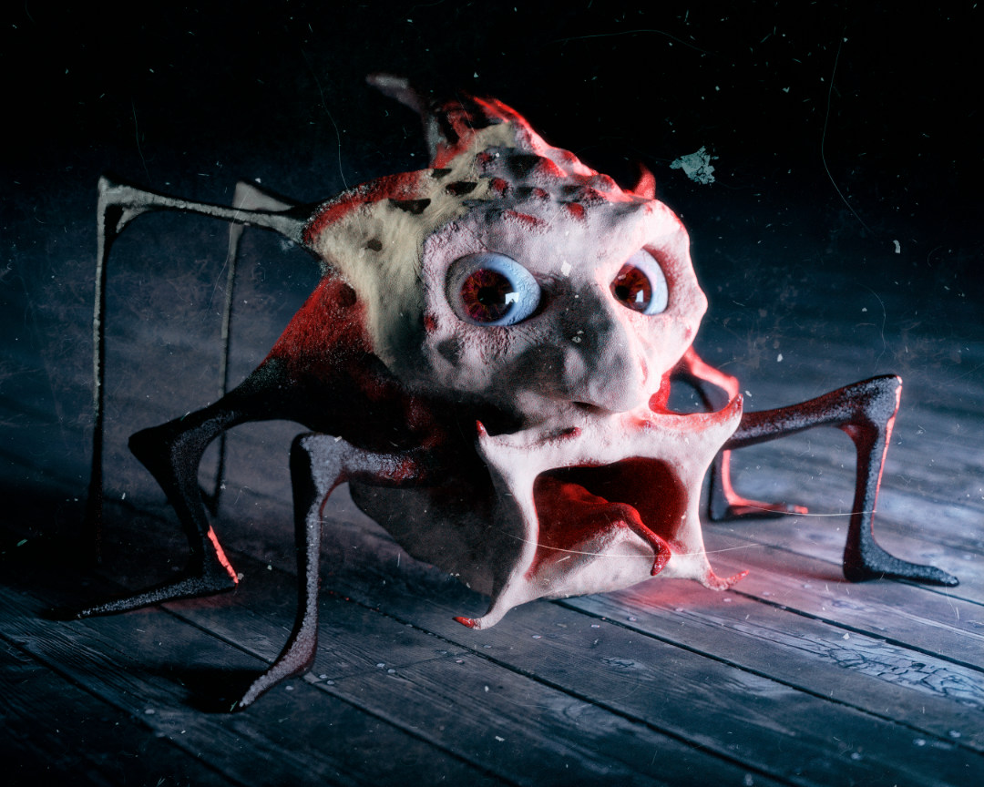
This is a random one-off shot of a creepy dude I sculpted and textured. I'd eventually like to either animate characters like this or turn them into game assets, but I'm having a tough time venturing into proper topology, uv unwrapping, rigging, etc. Do you have any advice for buckling down and putting time into learning the less fun/creative aspects of the 3d world?
I can't be there for the live stream, but I'll watch the recording later. Thanks!
Here's an Orc Character that I sculpted in Blender. I'd love to hear any critique or feedback you might have for me.
Thanks!
Character Post on CG Cookie:
https://cgcookie.com/u/ryanking/projects/3d-orc-character-sculpt
Here's the Character on my website:
https://ryankingart.wordpress.com/2019/05/07/3d-orc-character-sculpt/
Character on Sketchfab:
https://sketchfab.com/3d-models/orc-character-sculpt-3a8bd9c7f93448bd9246c17bc556b699
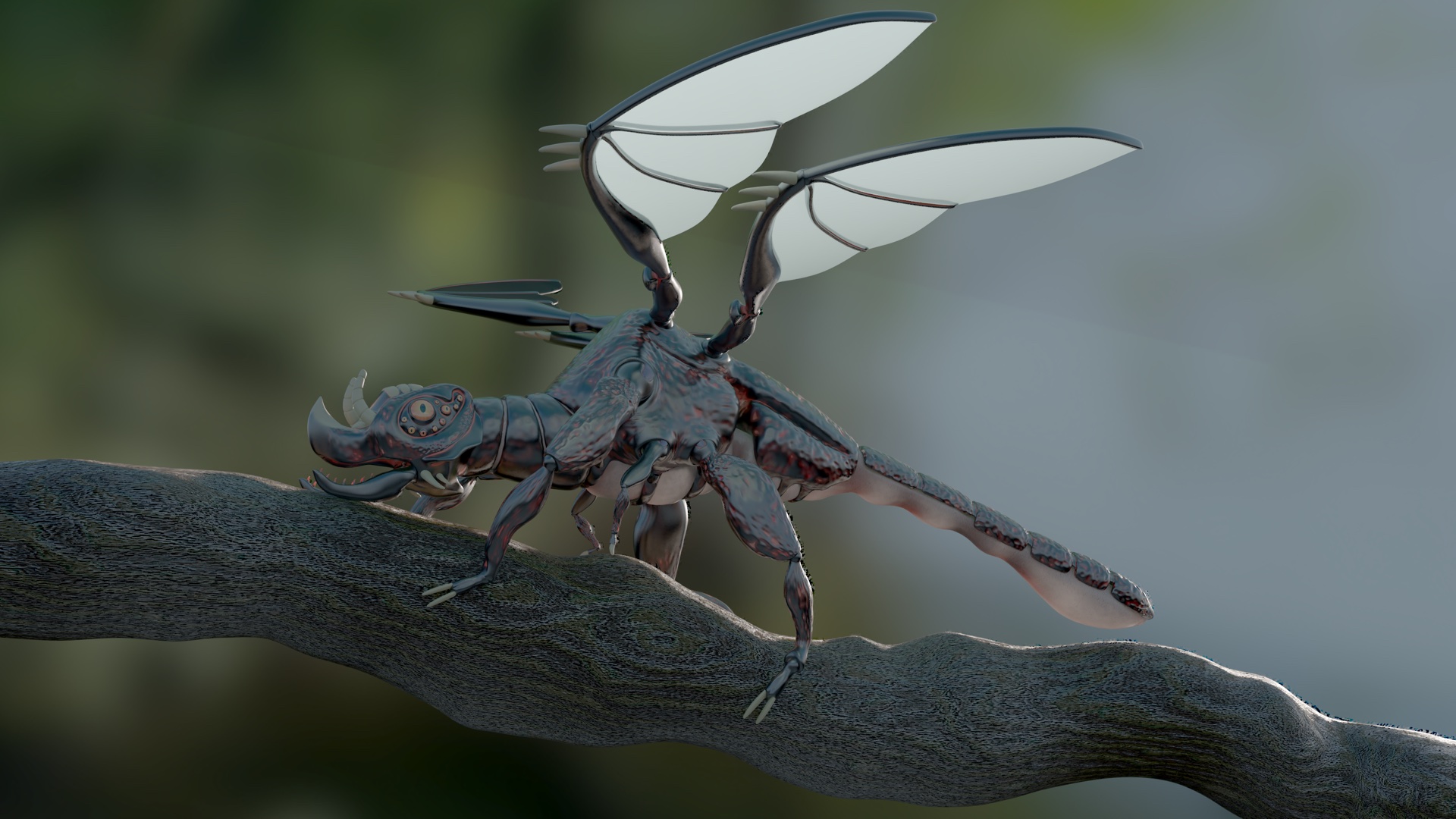
Pretty happy with this one so would love any feedback on how to improve it, mesh, lighting, materials or anything else.
The Idea behind it is to blend the shapes of a mythical/fantasy western dragon and the dragonfly insect.
Hello! my name is Quentin Steinke. I am trying to go for realism. I have studied anatomy for a while now and am getting to the point where I am not sure what I need to improve on even though I know something is off. Thanks you guys for doing a critique session, it is really helpful!
I have two sculpts, but you can use whichever one you think would be best for critiquing..
Hi,
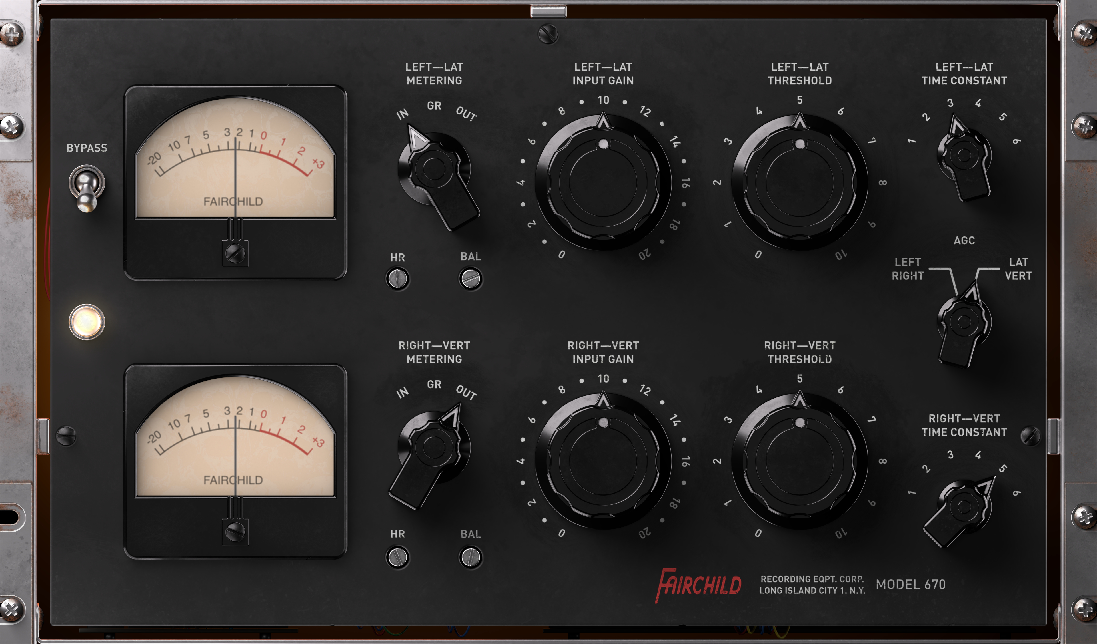
I'm learning to model user interfaces for audio plug-ins for music production. For this one, I've used MOI 3D, Blender (2.8) and Affinity Photo.
A high-resolution version can be found via this link: https://we.tl/t-MdfEuXKTb0
Would love to hear some critique and get some feedback on how I can improve it.
I will watch the part 2 session on June 4 live!!
I made this project to practice sculpting, retopology and texturing. For texturing human skin I use a hand-painted mask and mix RGB nodes and mix shaders. I need advice on how to improve the materials for the skin. click here to access the project
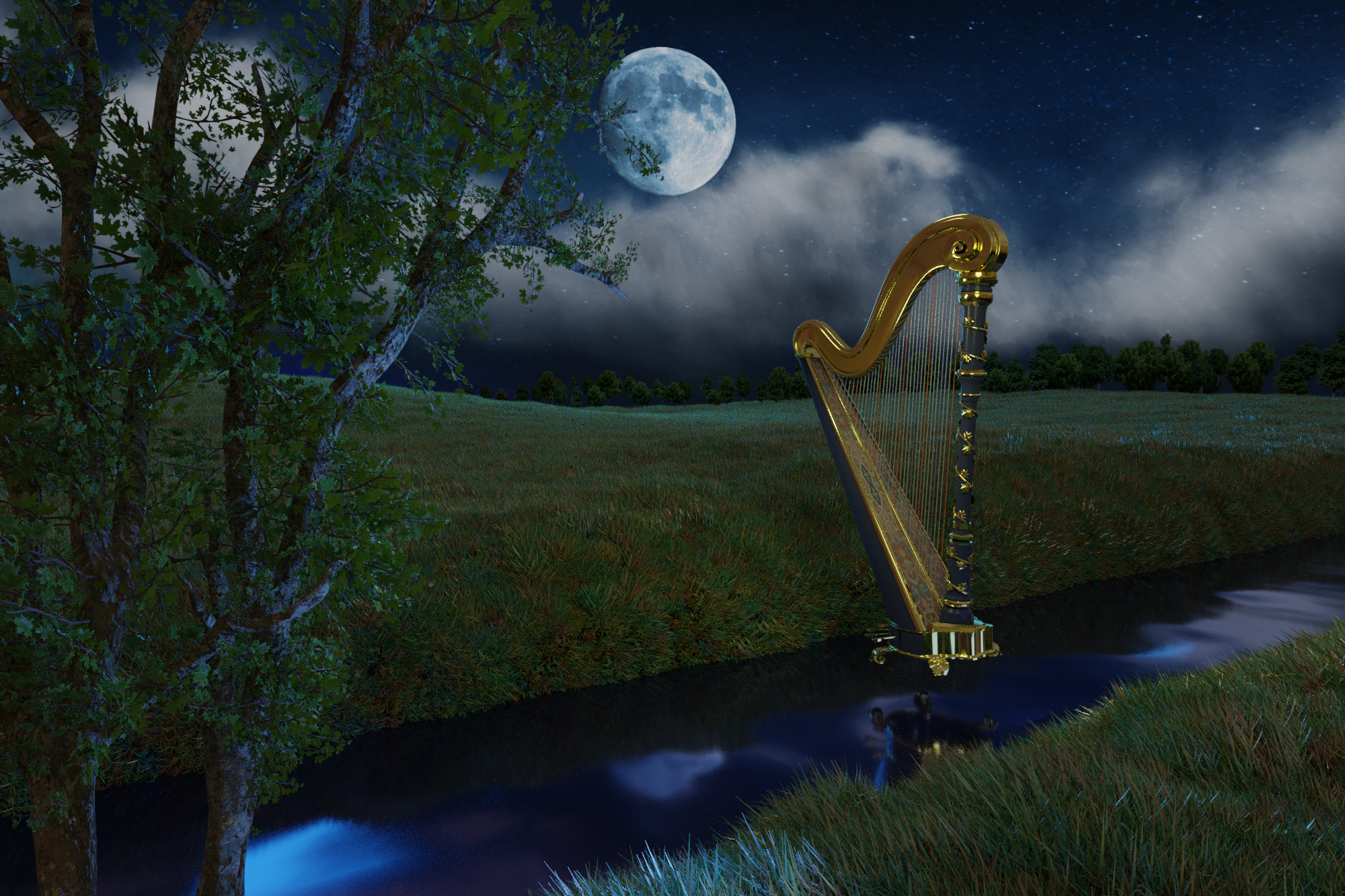
I'd like to submit a commission I'm working on for a friend of mine. It's based on a personal experience of her. The request was some grassland with a ditch (i think it's called?) with a harp floating a bit above the water, and the moon in the background. I added a tree to make the image a bit more interesting.
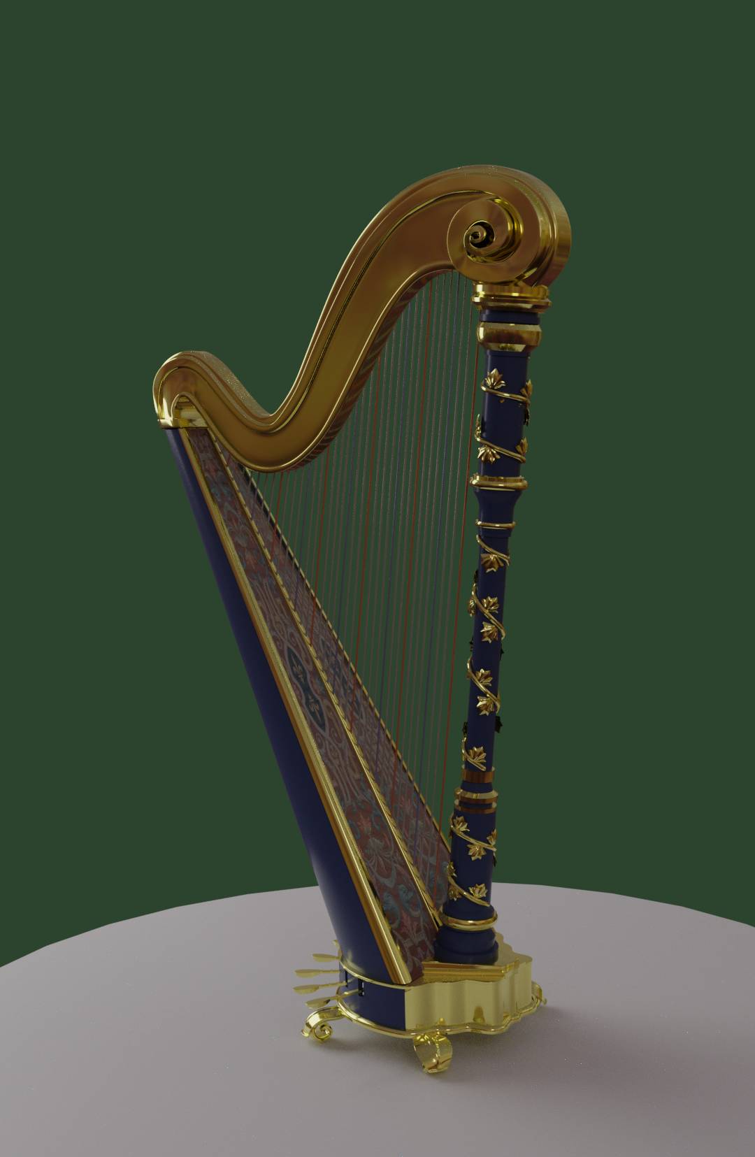
The modeling is as good as done. I've textured the tree and the grass, and I'm just about to texture the harp in in Substance Painter. I want to do some more decorative relief (I hope I spelled this right) in the top of the harp.
All commands are welcome, but I'd especially like to know if I could improve the texturing of the harp and the lightning of the scene.
Here's a picture of the current state at this moment. I know the lightning under the tree in the bottom left is not good. I'm still working on that :)
And here's a test render of the harp by it self in it's current state (textured in blender):
I can't wait to see your response :)
I will probably be watching the stream live. See you then :)
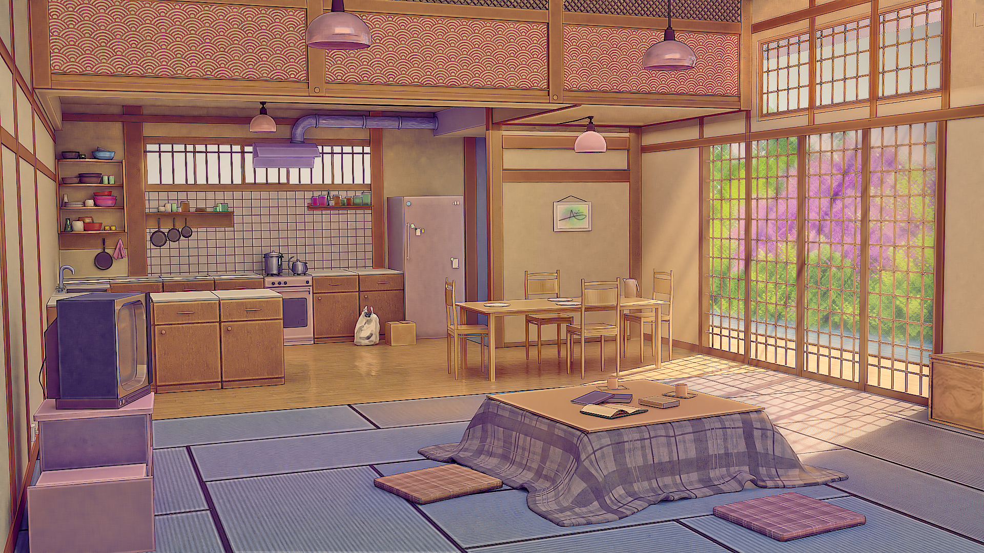
Hello! I am trying to replicate the picture by Arsenixc :https://www.artstation.com/artwork/NoJB1
mainly I am trying to make anime style with minimum post processing in a painting program,
Any critiques and comments are appreciated :D
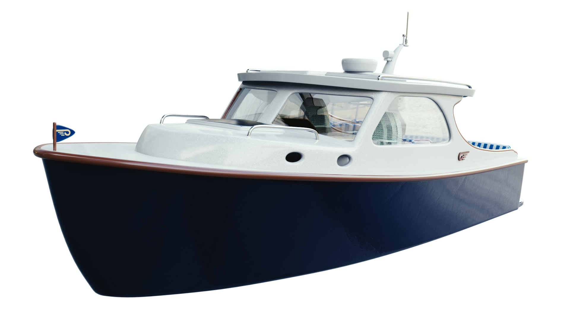
This was my latest Project that I worked on. HINCKLEY T34
Artstation Link: https://www.artstation.com/artwork/xzelx1
Goal: 1) Wanted to create realistic materials
2) Improve my Modeling Skills
I found out that the Materials were not that close to realism...How can I improve My Materials and How can I set the Scene (background) without spending a lot of time on it?
