🚨🚨🚨 UPDATE: 22 of you submitted this time! That leaves Lampel and I only 5-6 minutes per critique which isn't much. So we decided to split them between two streams. The first 11 (including everyone who said they would be attending tomorrow, May 28th) will get critiqued tomorrow and the second 11 next week on June 4th.
We're hosting a FREE live critique stream for your Blender projects on May 28th @ 2pm EDT (UTC/GMT -4 hrs). All you need is a free CG Cookie account to participate. Of course Citizen members are welcome to participate like usual.
If you would like the focused eyes and advice of Kent and Jonathan Lampel to help push your Blender Art to the next level, please submit one of your projects to this thread. Both of us specialize in modeling, texturing, shading, and lighting but any projects (including animations) are welcome.
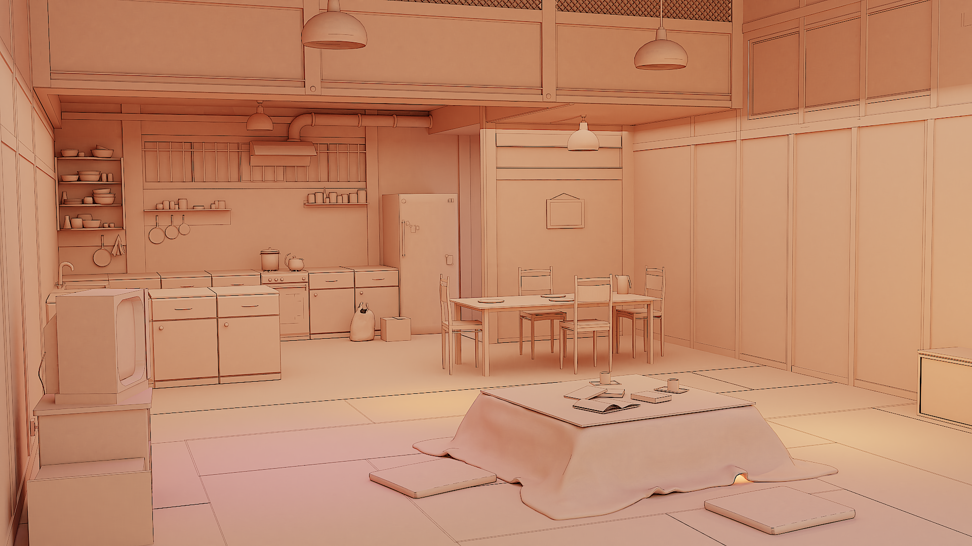
aanasofoz Wow, that's really well done! I'd love to see how you've set this scene up. Is it just a lot of handpainted textures or did you make a specific shader to achieve this effect?
Most of the textures are from the Internet but edited with Gimp, I overlay some grunge on top and increase sharpness, and also there are many glossy materials used, sometimes I add two materials together to get the desired look. I also dont render in very high samples, I use denoise because it gives this painted "rough " feel, and of course I use freestyle to get outlines.
This is the clay render, 
Link Wetransfer:
Here's the link for my video. It's a demo of the demo reel. I'd say it's about 35% complete since there's some other renders to include, so lots left to do. I don't know if I should get some wireframes in there or maybe make it less so dramatic? I don't know if perhaps I should only make turntables of the models so they can be appreciated and not lots of jump cuts and so on.
Music and SFX is all CC0, freebies is the way to go in this YouTube dictatorship.
Let me know if you got to download the video, Kent.
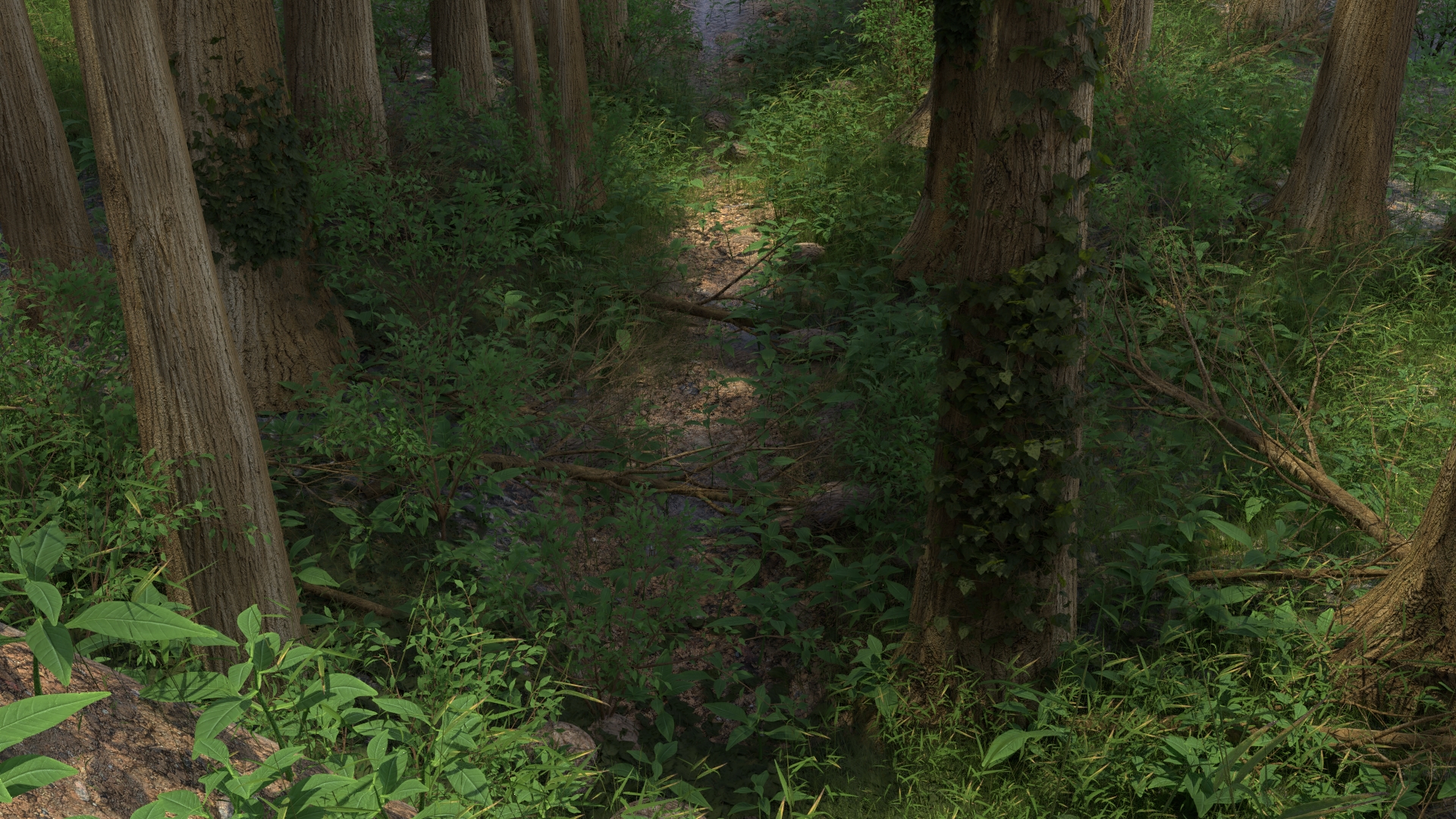
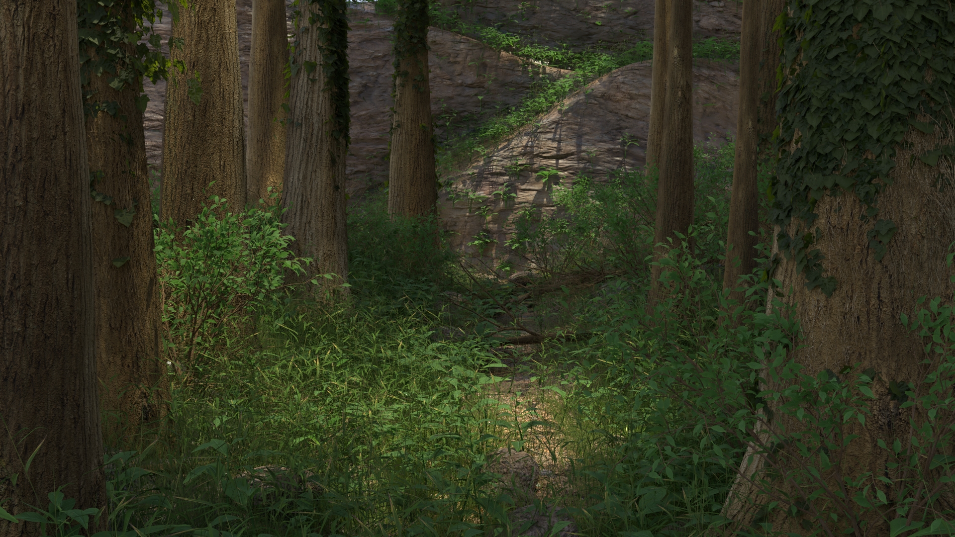
This my next woodland scene. I basing of the urban forest around home that are full of grass, unfornuately. But I lie the green lush feel. I am trying a couple different camera positions for this time. I am going for photo realism again. I have spent many hours working in it, and am about ready to set it aside and work on something else. I would like your thoughts about what is the weakest part of the image and what elements I could get the most improvement on.
Unfortunately I won't be able to make the live stream. 

Hi
Sorry i'm a little late to post my project, i hope i can still make it to the stream, if not its ok ! =)
It is still a WIP, don't mind the mess in the back with the floor, i fixed it but i'm unable to re-render it for the moment because blender 2.8 crash.
It is a personal project, the design is original (not a real car, not even inspired by any car existing). This is curently made with EEVEE. I'm looking for some advice on my lighting work (any other advices are welcome, even on the design) . The rims and tyres material is temporary.
Thanks you !
@theluthier Darnit! Oh well, I don't have much to show anyway. Been busy packing and moving.
@theluthier Man, I'm literally just minutes late in uploading. Oh well, will still check out the stream. Here's mine because why not.
Here's the link to the project with additional pictures
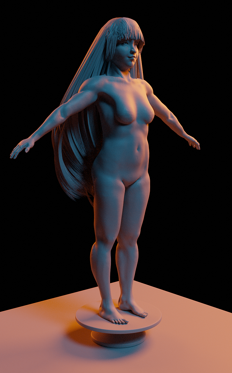
https://cgcookie.com/u/numbernine/projects/human-body-sculpt-for-critique
"WIP for the 'Designing Realistic Characters' course, uploaded for a critique stream. This is my first attempt at making a realistic character sculpt. I was pretty nervous about it, but I like how it's turning out so far. Lots of things to improve, but I'm mostly interested in the arms (especially forearms) which kind of turned into a blobby mess. Anatomy gets kind of tricky here and there!"
Hi guys, my name is David Arguedas.
With this model I wanted to produce the best cartoonish / Stylished anathomy I could, based on the course of Jonathan Williamson. I tried to make a good looking render for my portafolio.
In this case I think that for this proyect would be interesting to make another style instead of the manga style proposed in the course, in that way I could improve my skills on toon details, particularly the eye shapes, hands and ears....... produce a stylish/cartoonish character that people could see and dont go like "Is lloking good but......there something wrong with this and that"..........something that have the correct anatomy, related to the style I choose.
Important: When I was doing the boots, when I applied it, I noticed that one of the boots get some weird sculpt error on it...........but to me, that error looks lik "Oh, its something different......disrrupting, and that teels some history behind that boot.........maybe a dog destroyed it............maybe an airplane crash.........we dont know.........xD" so I decided not to fix it, specially when was so easy to fix.......I decided to keep the imperfection on it..........(May be that wasnt the perfect desicion xD but...whatever xD)
https://cgcookie.com/u/txpetillo/projects/character-modelling-course-stylish-hair