Hello,
Looking at all that nice progress in your polybooks a decided to create one too. Maybe it will help me in more consistent work despite lack of time.
For this year i made a decision not to create new projects until i complete the ones i have already started, otherwise it is a wasted time exept course exercises. I also try to be more active here in the community to help others. Hope you will find here something inspiring, helpful or just interesting :)
Thanks for visiting :)
https://www.artstation.com/palopiktor
Sooo, as you know i have hard times finishing my private works. Therefore i offered help as volunteer on blenderartists site.
First project was (still is in progress but no new request from the author so far) a CG movie highpoly assets.
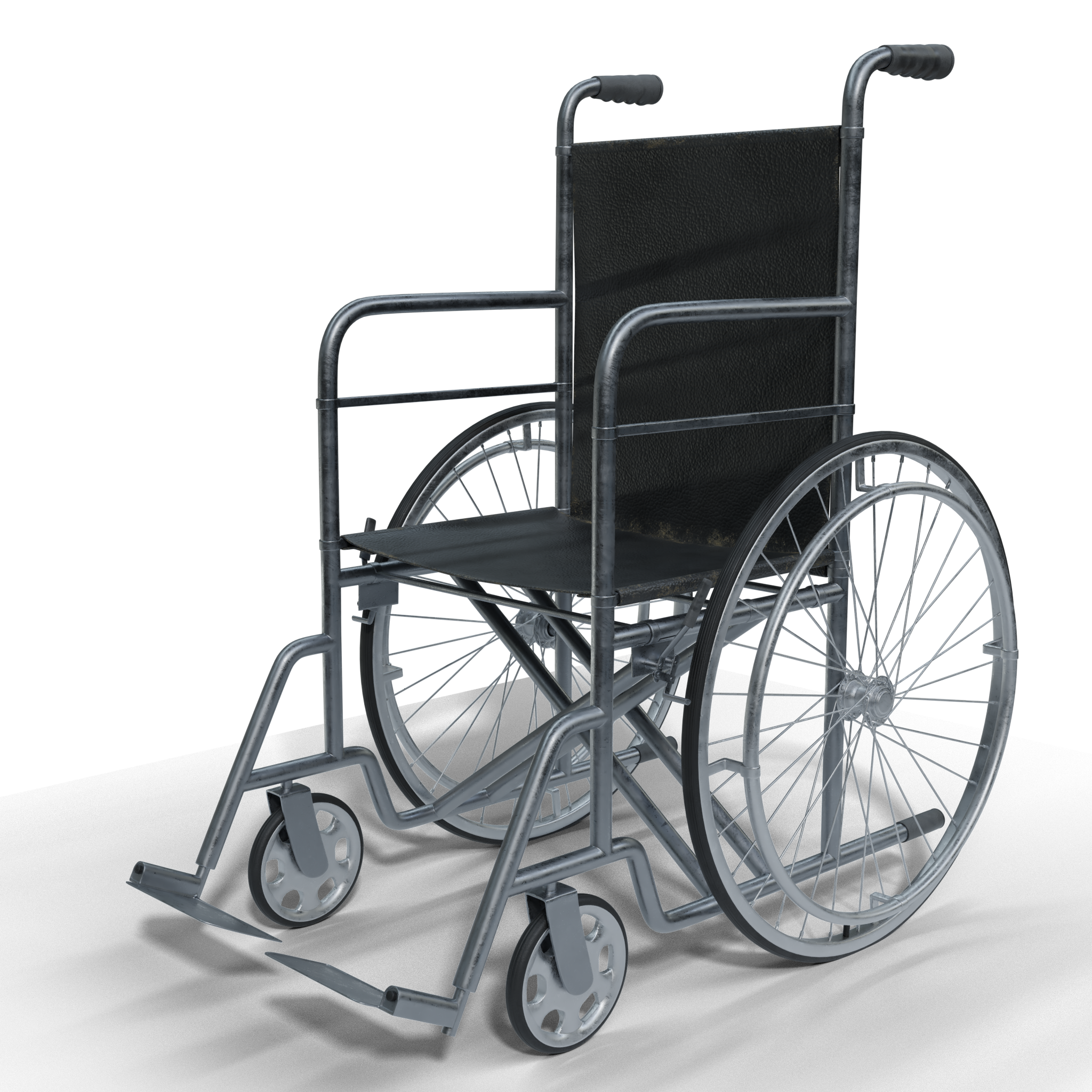
Wheelchair
And som details
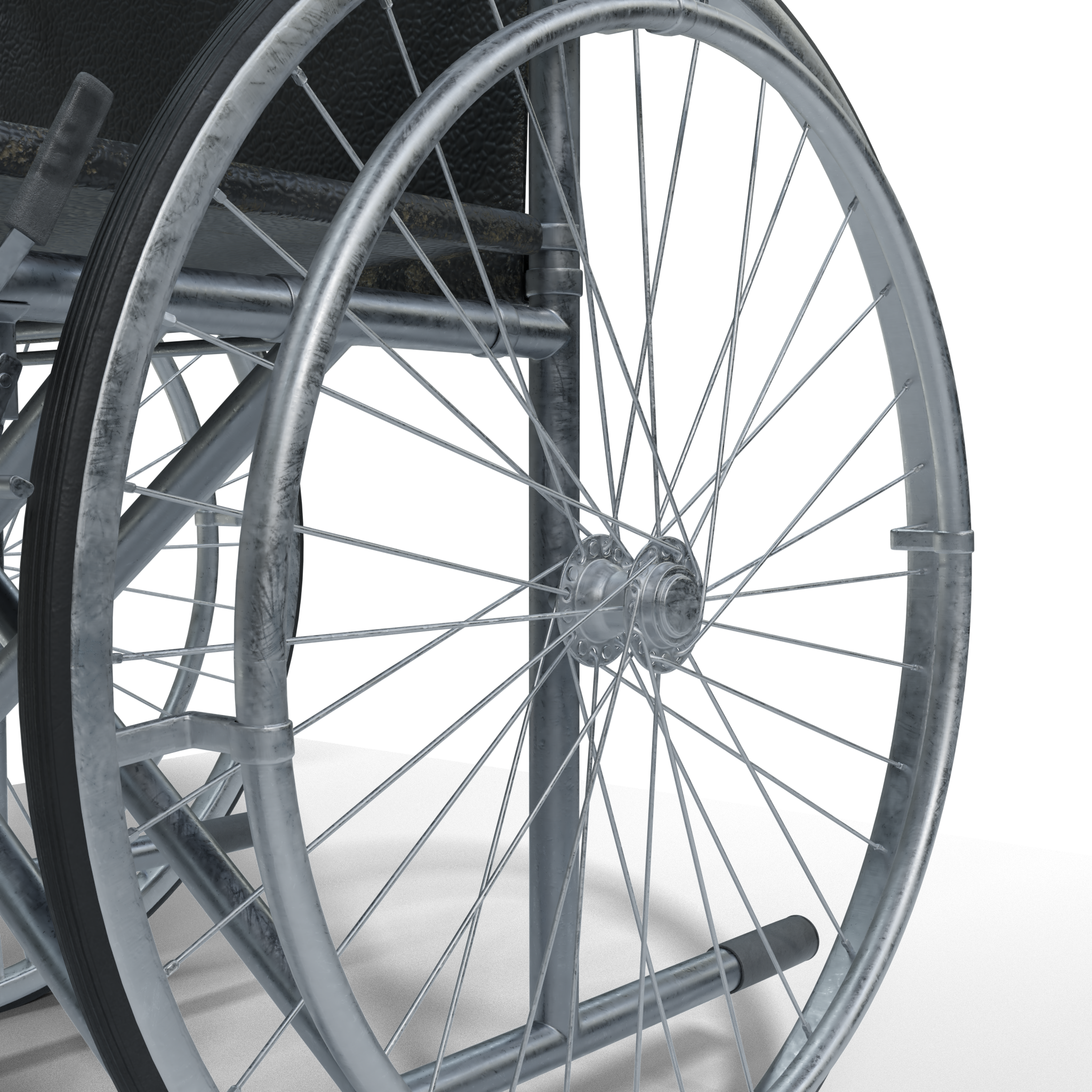
I want to be as accurate as possible and had to learn how the wheels wickerwork is done :)
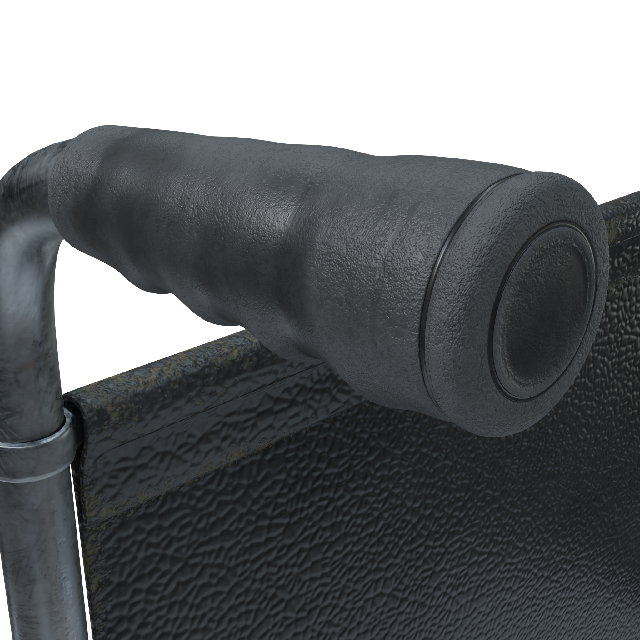
Modeled in Blender, textured in substance painter/designer.
Output was as required 4K PBR (metal roughness) maps separately for each material. Oh i cant wait to see UDIMs support in Blender.
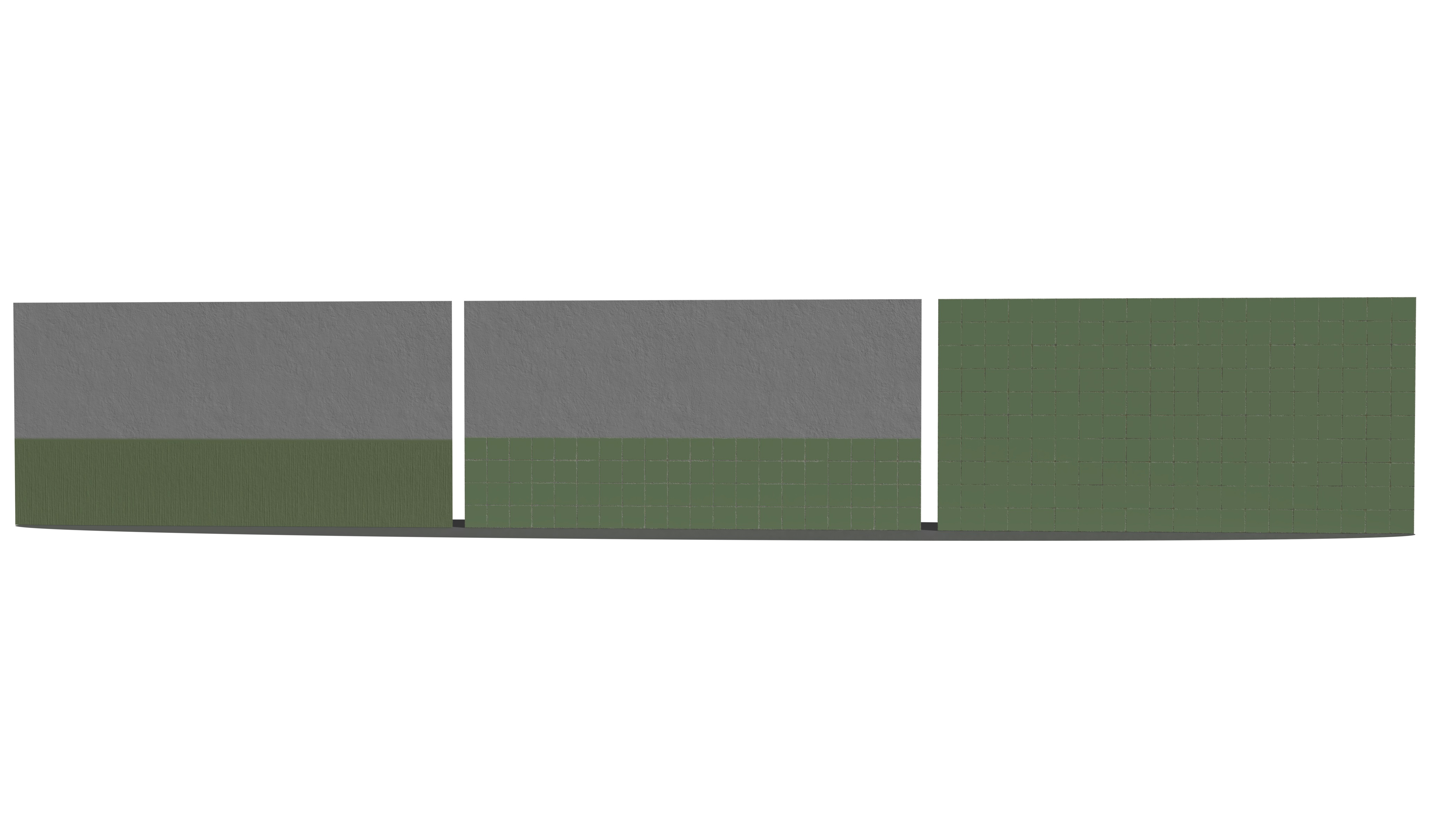
Next i was asked to create tileable texture for old hospital surgery room walls and floor. Texture created in substance painter/designer. Tiling tested on assets in Blender.
Another project is FPS game. Guy who asked for help is a Csharp programmer. So all graphical aspects are on me.
I work on map of a wasteland swamp area in Unity and to learn most i try to create all stuff myself. As for now trees are from bought package. Will be posting terrain soon.
Here is a device which should be a combination of dosimeter and an anomaly artefact detector.

Modeled in Blender, textured in Substance painter/designer. Shown version rendered in cycles.
Output: FBX, 2K PBR (metal roughness) maps, including hand painted emission map for the light.
And some private stuff. My loooong lasting wip archviz kitchen project :)
I want to push my modeling skills to the limits so i try to model every detail. At this stage i have already unwrapped all shown models and developing materials in substance designer.
Some of the details
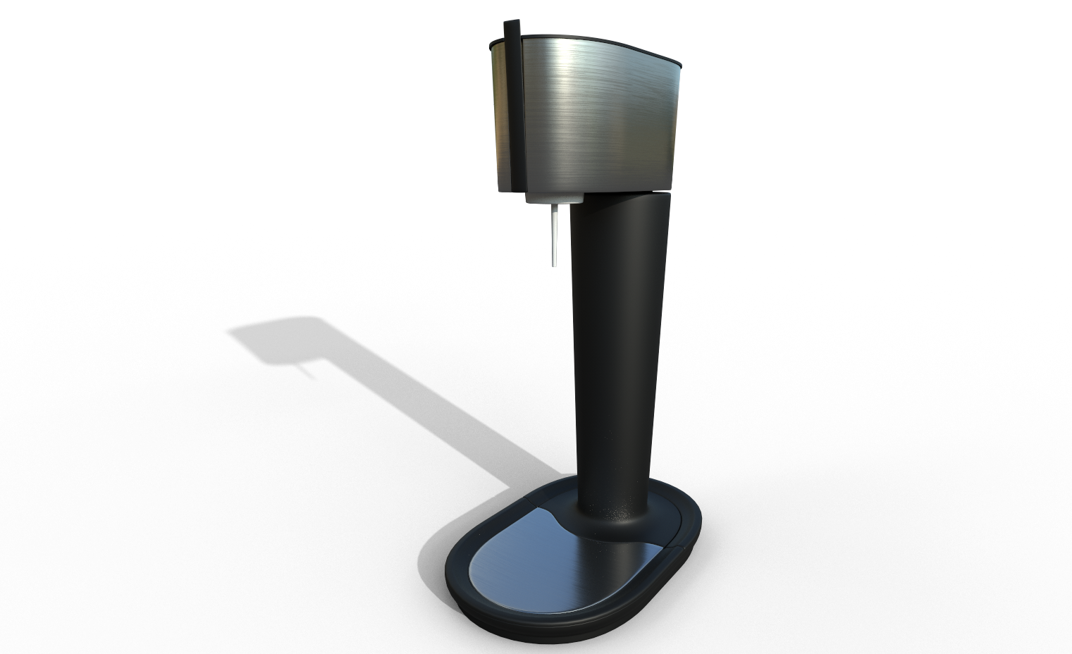
Some exercise stuff
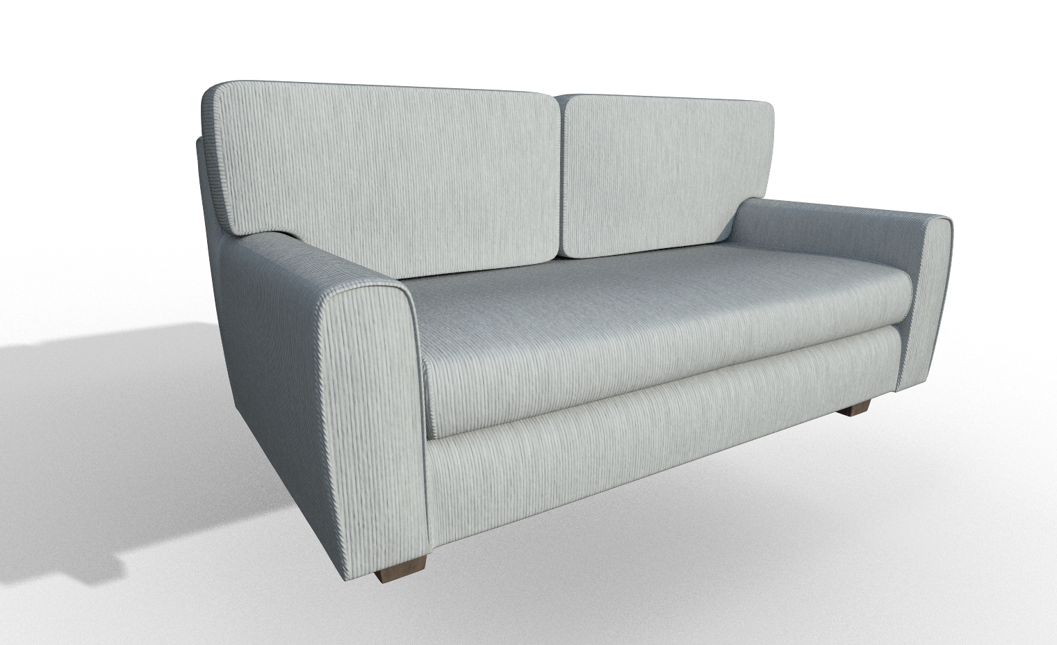
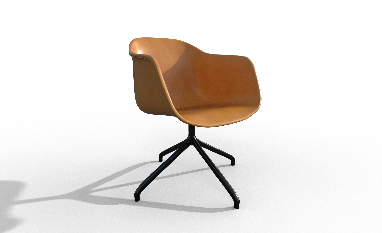
Rendered with Iray directly in Substance Painter.
tthepainter Hey, nice work! For the wheelchair, there's nice wear and tear, but it's too consistent across the whole, especially the metal sections. I expect some highly used areas to have more wear and the less used areas are more pristine. Other than that, good work.
![]() silentheart00 Thanks, good point. Yeah you are right. I was pretty satisfied with the textures until you pointed this out. I took the time to paint accurate wear and tear on the handles but totally forgot to do the same on steel parts. Fresh eyes are very helpful.
silentheart00 Thanks, good point. Yeah you are right. I was pretty satisfied with the textures until you pointed this out. I took the time to paint accurate wear and tear on the handles but totally forgot to do the same on steel parts. Fresh eyes are very helpful.
Only have a couple things to point out. The dosimeter/artefact detector is looking great. Modeling looks solid, and the textures look beleiveable. only thing that I notice is what appears to be stretching dirt on the handle as it curves downward. Otherwise fantastic work.
The sofa's back cushions, look really hard to me. It 's contrast verses the soft billowed look on the rest of the sofa, just stick out as a little too weird. Like heavy slabs with cloth covering them.
Your looking like a great 3D artist! keep it up :)
ppandoraspencil Hi Duncan. I appreciate your feedback, thank you very much. It will be easy to fix texture stretch and for the sofa i think i will sculpt some details.
I am working on a undeground fps map for our project Independent Zone, since developer decided to change from exterior to interior.
First stage was whiteboxing a level inside unity with a couple of prefabs representing doors, walls with a scale of 1 unit in unity = 1m
I mean really few, one door and one straight 1m long wall.
Right after i created a first part a small hall with elevators with real life scale in mind, i came to conclusion that i it will be better to use larger scale of assets. Sense of scale from a player POV and real life is really different.
For example: I thought it would be ok to have tight corridor like 1m wide. When i tried to play it, it was not tight, it was super tight. Based on this knowing a decided to double the scale considering 2m wide corridor as tight :)
Right after the level was approved by the developer i started to plan assets modularity in blender.
This is the first modularity idea. Colors represents different assets.
ssmurfmier1985 Miranda, i think this might be helpful to you :)
Back to the kitchen :)
Dont know how to call this material. It is for kitchen countertop. Render from IRay in Substance Designer.
tthepainter somehow I didnt get a message that you tagged me ☹️ so I'm just seeing it..
Thanks!! This is very useful and clears up some mystery for me! Will definitely use this as an example for white boxing my game level 😃
Funny that the level is white for white boxing 😆
Question,
So you created it in Blender, and then imported it into Unity to test out? Or did you create it in Unity, and then somehow brought it into Blender (or reproduced it)?
tthepainter Looks like a more color variegated butcher's block counter top to me. Very pretty colors. Maybe a little more shine? Hard to tell in this image. They're conditioned with mineral oil, so it would be a little reflective.
Question,
So you created it in Blender, and then imported it into Unity to test out? Or did you create it in Unity, and then somehow brought it into Blender (or reproduced it)?
ssmurfmier1985 On the first image I used primitive objects inside Unity. I created a box and then scaled it. Then i positioned it so one of the verts is right on 0,0,0. After that i created empty game object. Pivot from empty will be used as pivot for local snap positioning to grid. I made this a prefab. Renamed it and than just copying and moving. Same for the door object.
From time to time i played the level to see if player has enough space for moving and if it looks interesting.When i had a complete white boxing and level design approved i moved to blank Blender.
Second image. Based on what i did in Unity, i started planning for modularity. So i try to stick to the whitebox as much as i can, but still have as much modularity as i can. That way there will be slight dimensions changes in the level as i create it in Blender.
With all the basic assets created i have a good starting point for modeling details.tthepainter Thanks for the detailed explanation 😄 I'll try a similar approach , if I get stuck or got more questions I know where to find you 😉
Sounds like a cool start of the level by the way!!