Hello,
Looking at all that nice progress in your polybooks a decided to create one too. Maybe it will help me in more consistent work despite lack of time.
For this year i made a decision not to create new projects until i complete the ones i have already started, otherwise it is a wasted time exept course exercises. I also try to be more active here in the community to help others. Hope you will find here something inspiring, helpful or just interesting :)
Thanks for visiting :)
https://www.artstation.com/palopiktor
Do you remember this my reaction ?
ppandoraspencil Hi Duncan. I appreciate your feedback, thank you very much. It will be easy to fix texture stretch and for the sofa i think i will sculpt some details.
Well, i was wrong. It requires more work than expected and after couple of trials to create low poly version from it i decided to go from the start once again. It will take much less time to build it again from ground up than to try to fix. Also i dont like the meter area.
Based on a new knowledge from creating gun for fps shooter which i watched couple times, i have now much better model with less geometry and ready for bake .
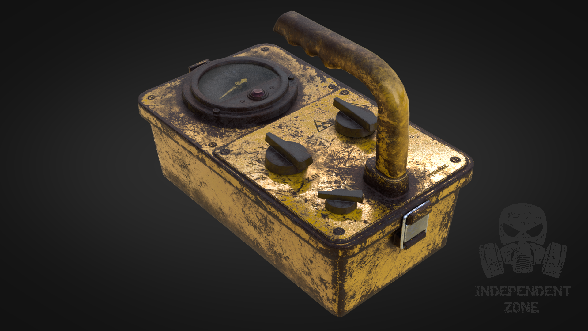
Here is a new version of dosimeter device with all the details. Please, let me know what you think.
tthepainter hello ! u r going heavy with rust dust .. i have the impression that there is no more reflections !?
very good modeling and workflow btw
tthepainter definitely an improvement over the first one! The rust looks sweeeet 😃 As from what you've told about the game (dark underground facility, weird life forms) I think it will be a old and dirty facility right? Bit of an abanded / apocalypse feel to it? That's the idea I had in my head when you told it, and this amount of rust fits that feel.
I do also notice, like Malhomsi, the dull reflections though. Your first model had more reflections on the paint an such, I think that would improve the look a lot.
Good job! Keep it up 😊
u r going heavy with rust dust .. i have the impression that there is no more reflections !?
mmalhomsi Thank you for feedback. I think i will have to better balance rust on some parts. Yeah good point, i will reduce roughness for metal parts.
definitely an improvement over the first one! The rust looks sweeeet 😃 As from what you've told about the game (dark underground facility, weird life forms) I think it will be a old and dirty facility right? Bit of an abanded / apocalypse feel to it? That's the idea I had in my head when you told it, and this amount of rust fits that feel.
ssmurfmier1985 Miranda, thanks for the feedback. It should be really rusty, but mmalhomsi is right. I forgot to bake higher res normals and downsize it to 2K. I had the feeling my UV layout needs improvement.
Here is a comparison of uv layout before and after. Bad news is, i will loose my textures so far and have to repaint them.

That empty space marked with arrow is occupied with a glass which is flat plane only and therefore i didnt bake normals for it.
tthepainter the new layout is much better, now you're using all the texture space :) good luck with the painting! good practise ;)
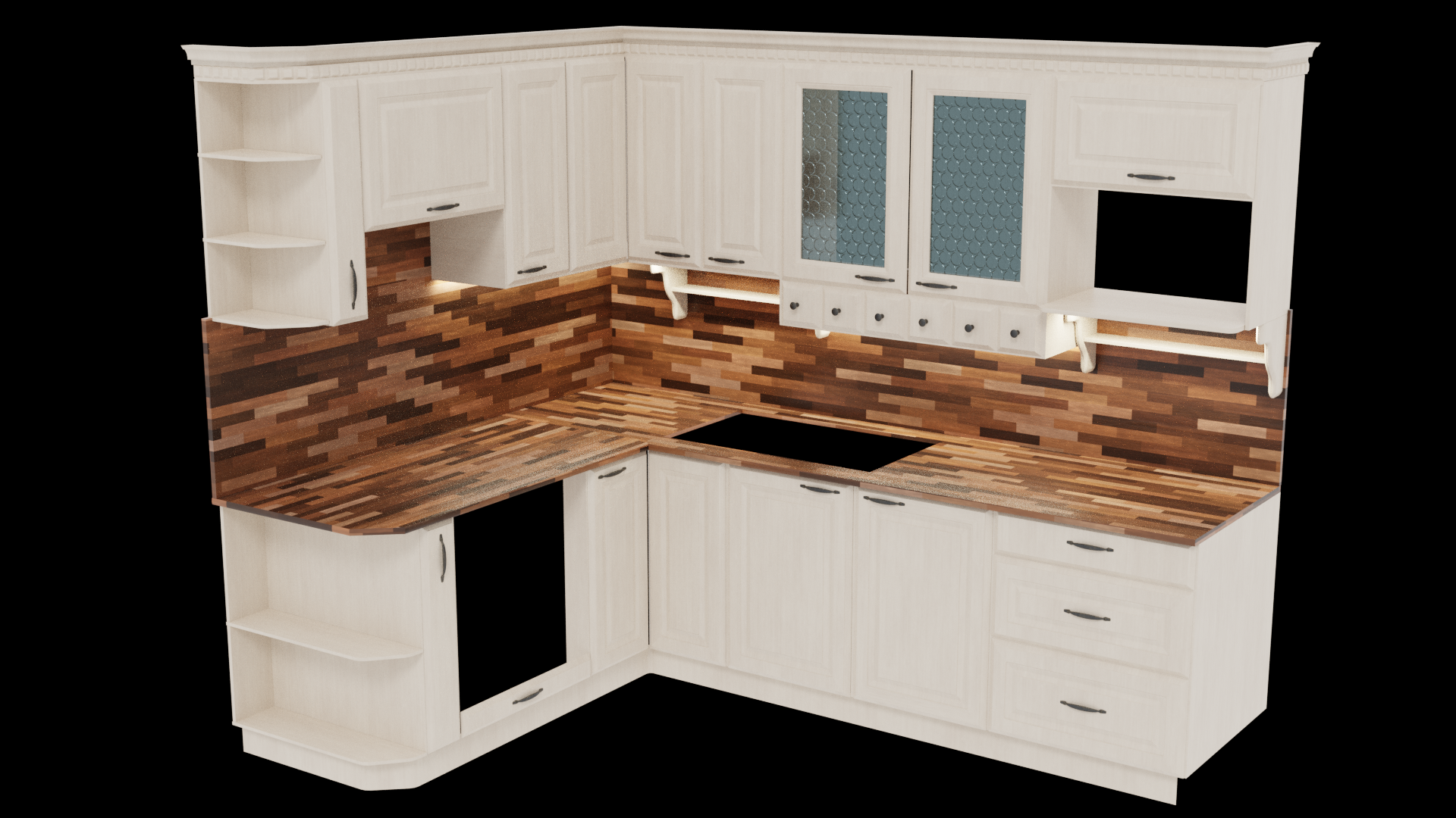
While waiting for dosimeter decals to arrive i switched to archviz to create textures for the oven. Substance painter viewport screenshot.
Testing my custom materials created in substance designer. Screenshot from blenders viewport.
4 x 4K textures divided to bottom part, upper part, counter top/ back panel, decorations and inner parts.
I still need to create a glass material and inner parts for upper cabinet.
I have also prepared material for handles. I decided to model more of them to have some variety between them and not just one copy for all handles.
First render
Added glass material, placed handles, lights for countertop, basic scene lighting setup. More to come :)

tthepainter Looking good! The wood sections feel a bit much to me personally. Maybe a nice cool (as in color) marble counter top could help to balance it out.
Hi, Silent. Thanks for the idea, but it will stay as is :) just like in the refs i have. The combination is really pleasant in real life. This is very subjective.
Remember my dosimeter model ? It was quite some time ago since i last worked on it. Finally i can now present you with the final approved version and a sketchfab version https://skfb.ly/6KUKO

tthepainter The Dosimeter model is pretty slick - should be great in your post-apocalyptic game. Pretty cool :)