Here it is. I'm starting a polybook too. Hope to get some useful critiques:
Let me start off with some stuff I did the last couple of months. Most of the stuff I posted on the forum, or on the gallery already. But it might be useful here too. (Not necessarily in order of appearance):
The Robot:
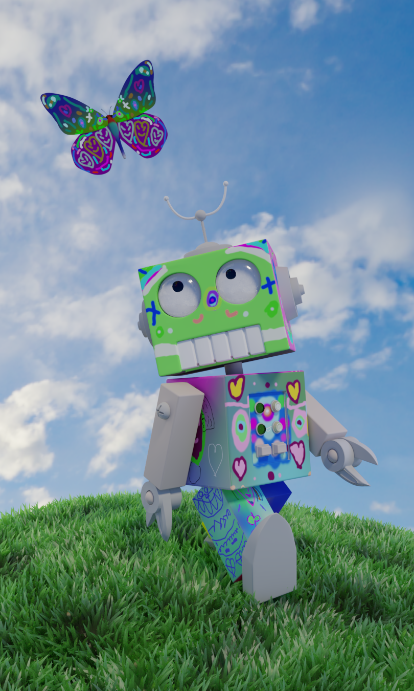
This is the last update to the robot I made some time ago. I got a demo of Substance Painter and tried to texture it in there. I just textured the robot itself in Substance Painter. The rest is pure blender.

My daughter (5 yrs old) made a start painting the robot in Blender (with some help of course):
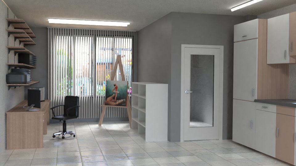
In the last live classes about shading and texturing, before the end of the year break, I did not have time to finish the last weeks home work in time (ArchViz). But I wanted to work out a plan I had for a home improvement a couple of years ago. The home improvement never got realised, but I liked the practice, and wanted to use it for the live class. I know it's not really ArchViz, but I like the result non the less.Here's how far I came before I got side tracked on other projects :) :
Then I got side tracked on the printer that's on the first shelf above the desk. Since I couldn't find printer that matched mine, I decided to build my own. Did not anticipate it would take me this long (about a month, off-and-on). I didn't get around the texturing part yet.
-edit- Just a note: the painting on the ezel I painted in real life.
 I wanted to modelpart of the inside of the printer (like the glass plate under the top lid, and the the inside behind the front lid that pops open forward when the printer starts printing.
ccarrotnl Hi Wilco! A polybook is whatever you want it to be. You can post WIP's, finished works, ask for feedback, do a big project and post the progress, do a lot of small projects, etc.. Whatever you like.
I see it as sort of a Homework Thread like in classes, but then more personal to whoever made the Polybook. I use mine for posting work I do in the courses, WIP's, asking feedback, finished projects, keeping myself acountable to make sure I do something and to document my learning progress towards becoming an animator 😊 Others use it for sculpting, or hard surface stuff, or 2d art (those are usualy Sketchbook instead of Polybook), etc. So it's really up to you what you want to do with it!
On to the robots, I love the wear & tear on your red robot. Also really like the color sceme, nice and bright. Fits the character! Your daughter has great imagination, I love all the different patterns! I think it's really cool you do these kind of projects with her, daddy of the year for sure! 😄
Looking forward to more work from you 😊
ccarrotnl We were posting at the same time it seems 😉
The lighting & shading of your room looks really natural. Especially like the tile floor (nice and shiny!) and the chair (feels like a real leather chair, looks really good).
About the printer, I do not know how it looks in real life of course, but the buttons seem a bit off to me. Maybe they should stick out more above the surface? Or maybe the space around it should be a touch bigger? Or maybe shading will fix it when there is more contrast between colors. I don't know, you should experiment a bit I guess. I do love all the other details and seams! Good work 😊👍
ssmurfmier1985 You right about my daughter. You should see the stuff she creates daily just with pencil or marker. She is so creative. I imagine her to be a better artist the me, when growing up, if she continues like this :)
ssmurfmier1985 This is the printer I own. The buttons are at the same height as the panel around it. And I did not make it an exact replica :)
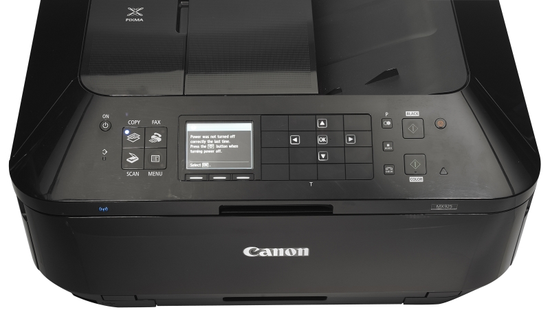
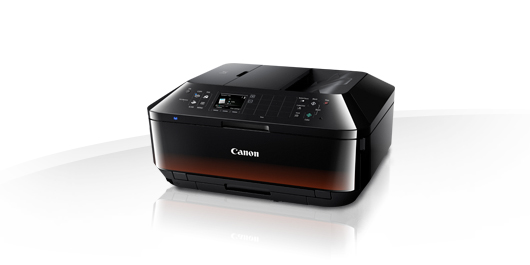
ccarrotnl Fits the style of your reference then, good job :) I'm sure adding shading and dust will improve the look once you get to that part. Keep it up!
ccarrotnl Hey, nice to see some work! That's a nice robot. Your daughter has a wonderful imagination; foster that as much as you can! I remember doodling on whatever I could, even on mirrors with dry erase markers!
Ah, yes, that archviz room. It's coming along. Good textures and lighting all around. That floor is really nice. The metal bits look strange to me, maybe missing some fresnel? I'm not sure what engine you're using. Or maybe it's too consistently shiny? I'm not sure. Not sure what you want for a (possible) home improvement in this room, but there's a lot of neutral tones here. Maybe adding an accent wall of color could help break up the neutral tones. Whatever makes you happy.
That printer is recognizable as a printer to me, so good work there. Now, depending on what you want to do with it, you can't even tell there are buttons in the render, but if you want to be thorough, then cool. It'll be great for desk shots or closer renders. Good work, Wilco!
Here's another one. It's an unfinished sculpt.
I tried to do an anatomical study, of a rather normal proportioned, a bit slimmer, but not to slim female.
I don't like the legs and the feet. It seams there a bit off, but I cant exactly find where the problem lies.
The head is nowhere near finished.
Since it contains nudity, I will display it as URL's rather then images:
![]() silentheart00 Thanks. I remember doodling a lot too as a kid, but no where near as good as my youngest daughter. Even now she's doodling at the dining table, fresh out of bed, while I'm doing my blender stuff. And she get better at by the week :)
silentheart00 Thanks. I remember doodling a lot too as a kid, but no where near as good as my youngest daughter. Even now she's doodling at the dining table, fresh out of bed, while I'm doing my blender stuff. And she get better at by the week :)
You're right about the metal in the room. I haven't done any wear & tear yet. It's all just the basic shading. And about the color: I just picked the colors that are currently in my living room, since I wanted to expand the room a few meters in the backyard. But since it's not going to happen, I might just as well spice up the coloring scheme a bit. Good idea.
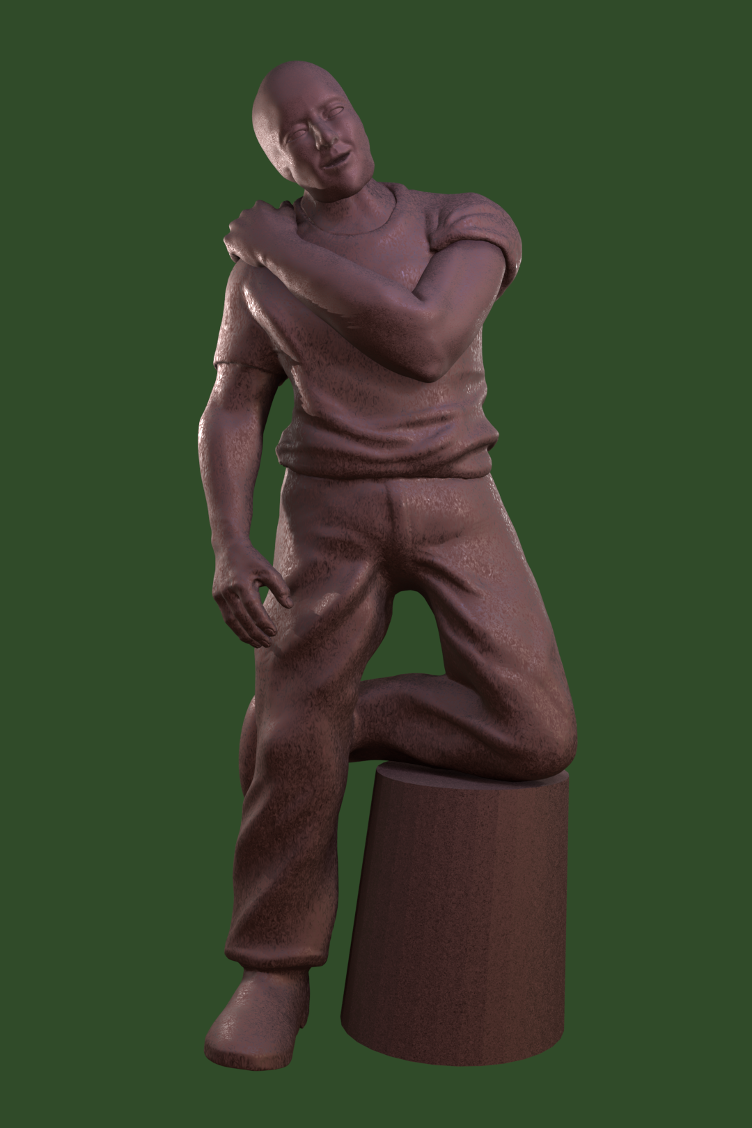
Here's my latest sculpt. A bit more finished. I've been doing this one for a few month, every Sunday, about 1 hour a times, after church.
It's supposed to be more like a statue. I've not yet decided what to let his knee rest on. Maybe a tree trunk or a bucket or something like that. I'm favoring towards the tree trunk.
I've done a little texturing, but not to much yet. I'm more posting it for the sculpting at the moment.
I like the folds in the shirt and the top of the pants, but I don't quite like the folds in the bottom. And of course I only did one shoe at the moment. I will work on the other shoe this afternoon. I also really like how the hands turned out. I'll have to work on the right arm a bit too, because it's form is a bit off, I think. And of course; no ears yet.
Also the head and the left arm (on the right) are not connected to the main sculpt yet.
ccarrotnl Hello Wilco! Glad to see you with your brand new polybook :) Looking forward to your works!
About the latest sculpt - can you show it from a few more angles?
ccarrotnl nice. I think jaw a looks a bit bulging from the left side, but that's probably because, as you said, head is not connected yet.. Overall pretty nice sculpt!
ccarrotnl really great work so far . those sculptings just amazing job both love the female as the male one .
the looks really great . i think maybe the white shine is a bit too much perhaps but you did really great . the design is trully nice done .
i really love the arch viz. the lightning and shading is really great done . that painting also damn good done .
then the robots they both are cool. the left one looks more realistich while the one on the right i would see that one more in a cartoon show in some magic kind of world or a robot world .
indeed youre daughter has some great talent too . its fun how both of you worked on them .
what you did so far in this short time , really amazing work Wilco . i love to see more of you as well works of you and youre daughter :) .
![]() nekronavt yyukinoh1989 Thanks for the nice reactions :)
nekronavt yyukinoh1989 Thanks for the nice reactions :)
@nekronavt Your right about the jaw, but there's still a lot to do about the head. Maybe some hair too. And I think the back needs some more work. It's kinda boring compared to the front of the character.
@yukinoh1989 The white is kinda ment as a rim light and supposed to be bright. But as this render is done in Eevee, maybe it will look a bit better in Cycles in the end result. Eevee is kinda rough in my opinion :)
I too will love to see more art of my youngest daughter. Where all impressed with what she's doing already at her young age. We try to encourage her (and my older daughter too) to be creative, and it seams to be working. Although I find the enjoyment of the creative proces more important then a beautiful end result.
ccarrotnl Got some good sculpts! There's something strange with the man's left shoulder from the back. Not quite sure what it is, but how the shoulder connects to the back looks strange.
![]() silentheart00 Thanks! You're right about the shoulder. The left arm is still disconnected from the shoulder. When I connect it to the rest of the sculpt I want to make the shoulder look better. But first I want to work on the underarm, as I think the form is still a bit odd.
silentheart00 Thanks! You're right about the shoulder. The left arm is still disconnected from the shoulder. When I connect it to the rest of the sculpt I want to make the shoulder look better. But first I want to work on the underarm, as I think the form is still a bit odd.