Homework Submission Week 1
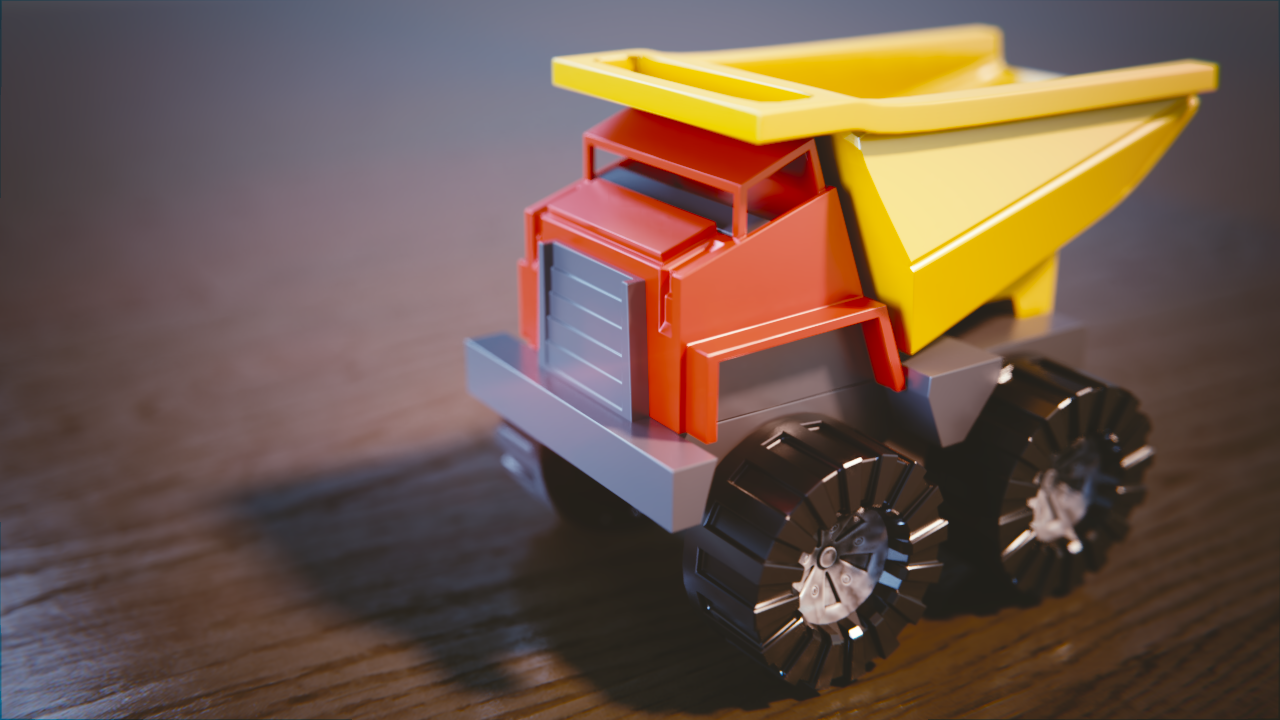
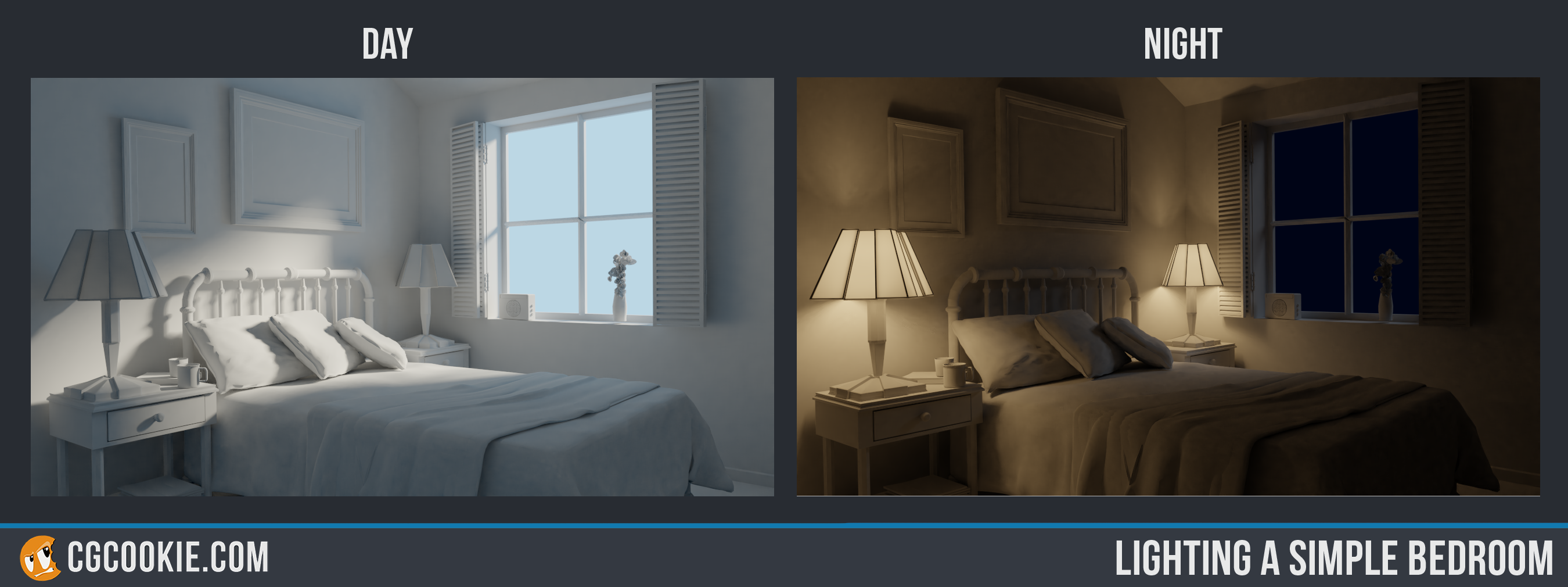 It's been a while! I think I barely got it in time.
I was going to make a more interesting material for the toy truck, but I wasn't sure how to start, even after making some from tutorials around the web. I mean, I just can't realize which nodes I need for the desired effect. Anyways I left a "dirty plastic" material for the wheel caps I made that only looked good there ha.
I miss the old "everything in one place" style of submitting, hope there will be something like a "frontpage" that shows the last post of each personal thread in the final class system 😉😉
Bonus Halloween themed submission:
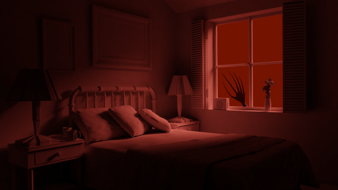
I hope that's a strong window...
----------------------------
The truck looks solid to me. Day and night scenes are nice, too. Good work.
That Halloween scene is creeping me out. Good work.
Excellent renders this week - all of them. And thanks for the bonus halloween version! A+ for the week.
I miss the old "everything in one place" style of submitting, hope there will be something like a "frontpage" that shows the last post of each personal thread in the final class system 😉😉
The official class system will be dope! It will definitely have a frontpage type situation. Ideally achieving the best of both the former method (singular massive class thread) and this method (individual threads).
That Halloween scene is creeping me out. Good work.
Mission accomplished then, thanks!
Homework Submission Week 2
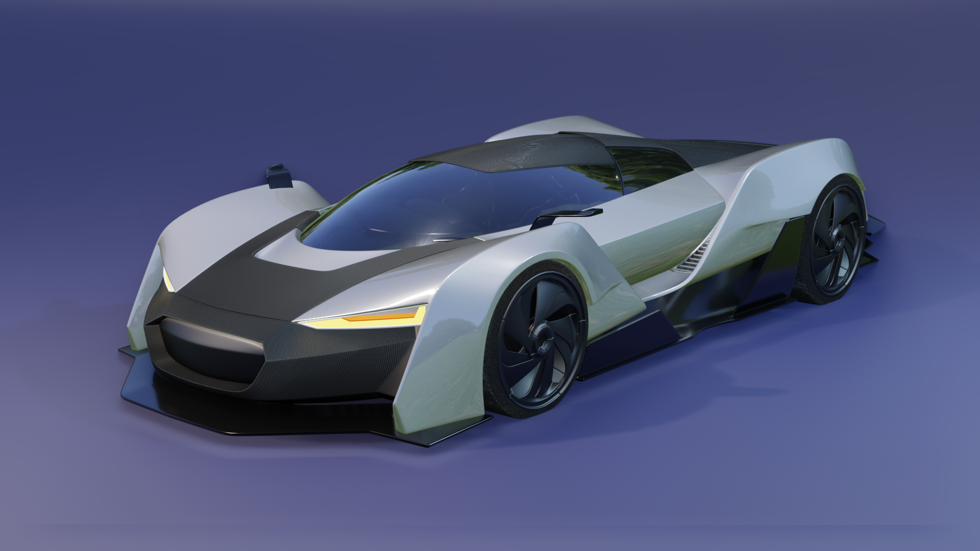
All made in eevee:
And the Lighting Match exercise:
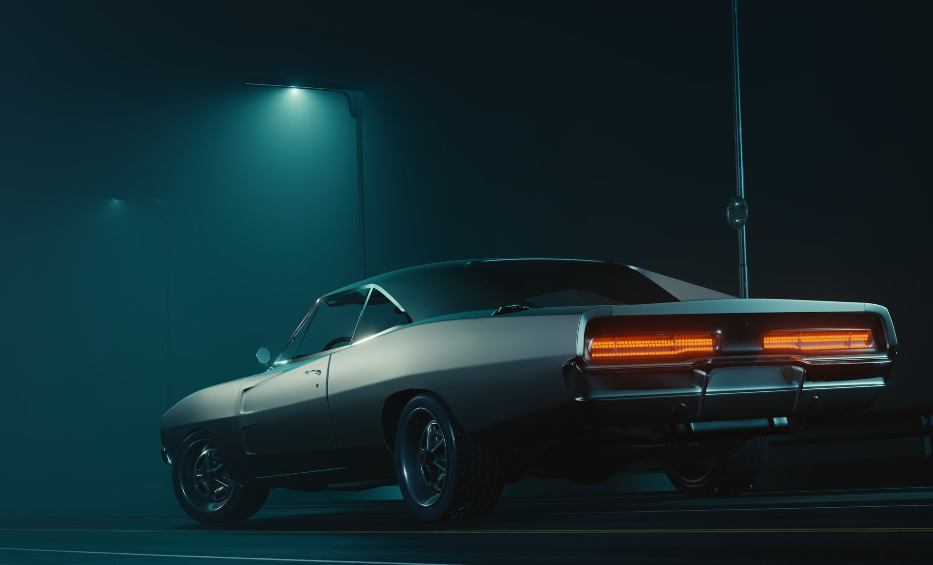
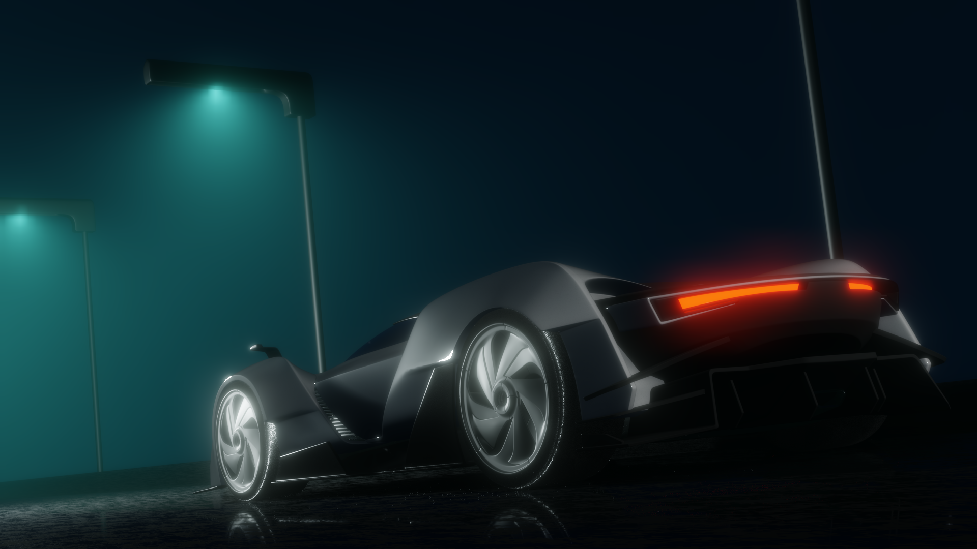
First one by James O'Brien (Vadim Ignatiev), and second my foolish attempt.
I'm so tired I don't have much to add. Eevee keeps surprising me, but the amount of bugs and weird design choices make my head hurt...
😩
Eevee keeps surprising me, but the amount of bugs and weird design choices make my head hurt...
Ouch sorry to hear that. It's certainly an adjustment and if you saw last week's stream, you know I've been frustrated by Eevee lol. But you've done solid work this week! It appears as though you figured out Eevee pretty good. I've only a couple notes on the main vehicle render:
All things considered though, it's good work. A B+ in my book.
As for the light match, you're extremely close. At first glance they look like you rendered different cars in the same scene. Diving in for a closer look I can see some simplifications but I know time is a factor here as well. Still a great effort. Another B+ from me 👍
![]() jack07 Late to the party. The vehicle looks good. I agree with Kent's critique. Good work.
jack07 Late to the party. The vehicle looks good. I agree with Kent's critique. Good work.
@theluthier Thanks! I think I'll have some extra time to go bananas with this week's homework, already starting looking more on AO and shadows. Speaking of which, I have some trouble with the material I chose to recreate. I decided to use a modified version of the 3D Print Resin from the shader forge, and I get a very good result in eevee, still needs some adjustments but I like it. Cycles on the other hand... well take a look: 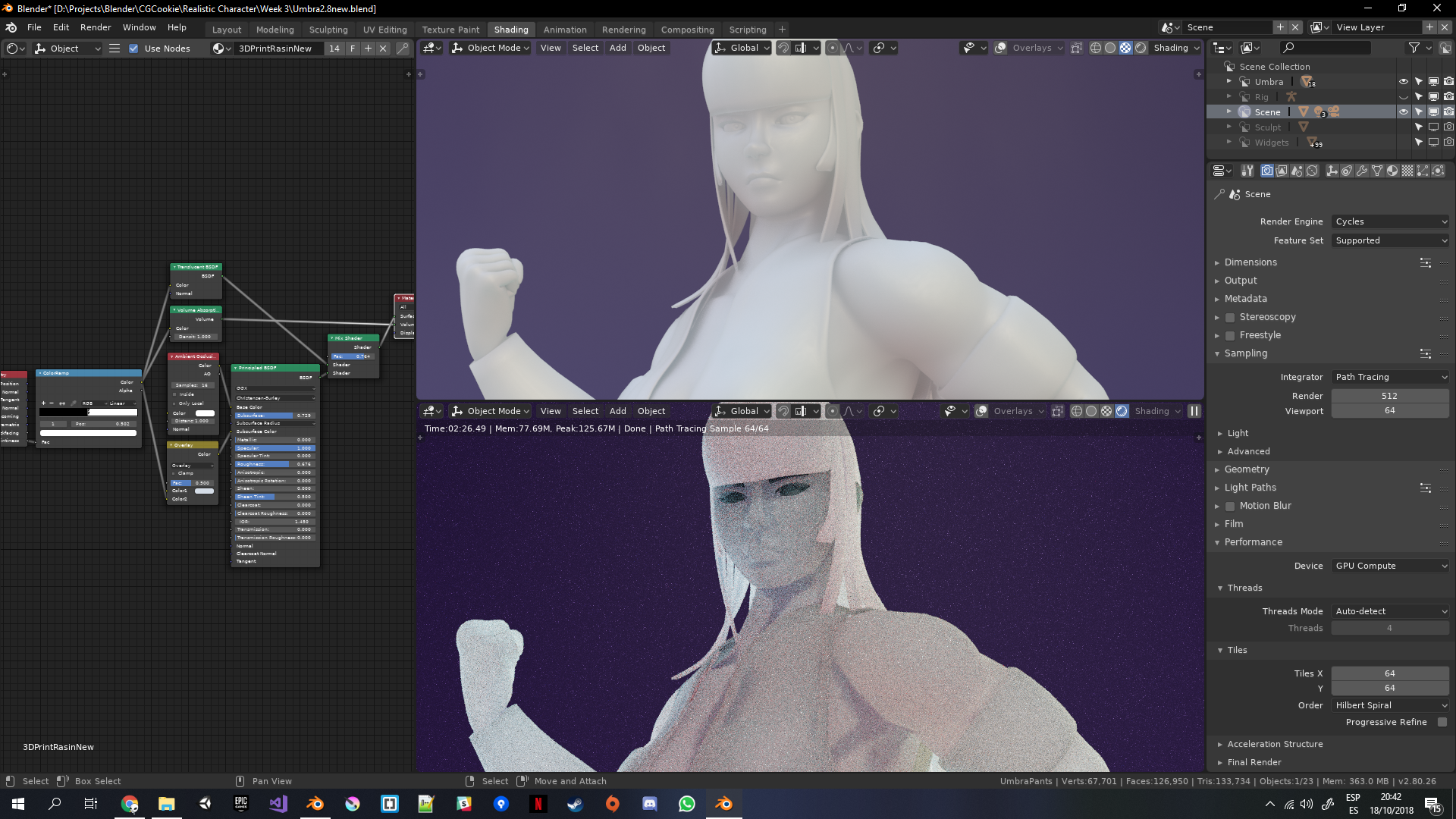
Disclaimer: I didn't check "Use scene lighting" for eevee, however it only looks slightly darker.
Maybe I should do a separate version for cycles. I noticed differences before (I mean, of course there's going to be differences, it's a complete different rendering style) but they weren't this drastic lol.
Anyways, should I go for a different material? Clay? Gold? Ballistic gel? I'm not sure what would be good to do to get a good impression. I will take take a look to artstation for Ideas, there's a "moonlight" scene I would like to recreate if I have enough time...
![]() jack07 Yeah, the differences between the engines in this case may warrant separate materials, one version for Cycles and one version for Eevee, maybe.
jack07 Yeah, the differences between the engines in this case may warrant separate materials, one version for Cycles and one version for Eevee, maybe.
WIP for week 3
I got some extra time to play around with lighting, was starting to roll into a blender depression so I said F it and changed values randomly. and I got this:
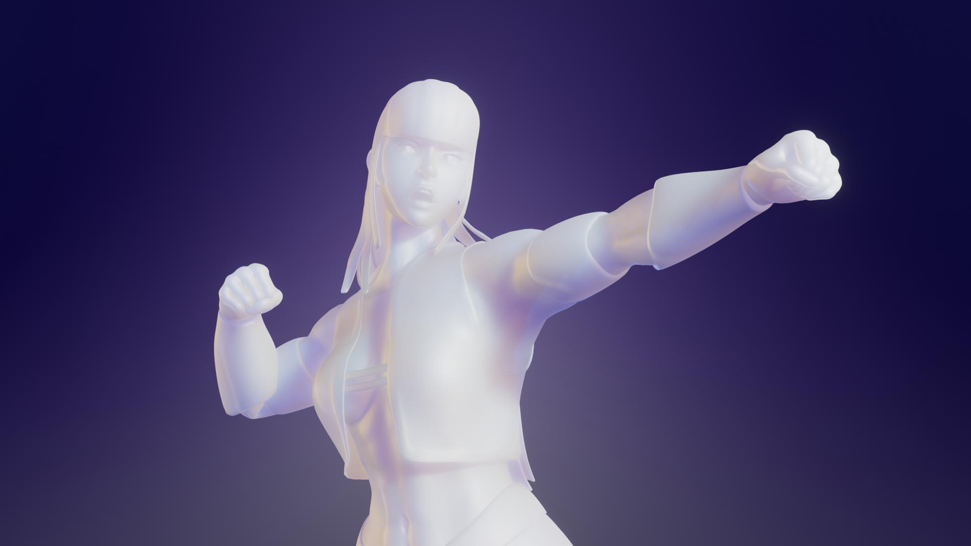
I don't know if found the right path lol. What do you guys think? Should I keep the lighting and go for a full body render? Is there something I should tweak? Maybe it is too bright...
mmalhomsi My man! Are you doing this class too? If you are I can't find your thread on this sea of students lol
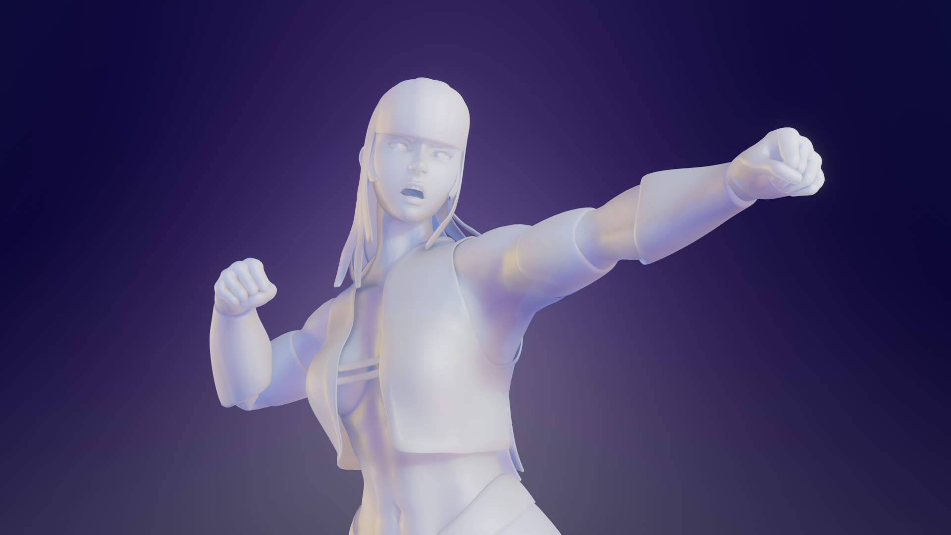 Turned down the brightness and fixed the AO not rendering. A surprising difference!
mmalhomsi Glad to have you back! I hope you get better, I was missing your beautiful art!
I'm not sure what I'm aiming for, we are supposed to "make an impression", but I have little experience with presenting my models.
Speaking of progress, the character I'm using is one I made, she's called Umbra and this is how she looked a year ago! Can't wait to make some good shaders/textures and start work on her sister!