Homework Submission Week 1
![]() It's been a while! I think I barely got it in time.
It's been a while! I think I barely got it in time.
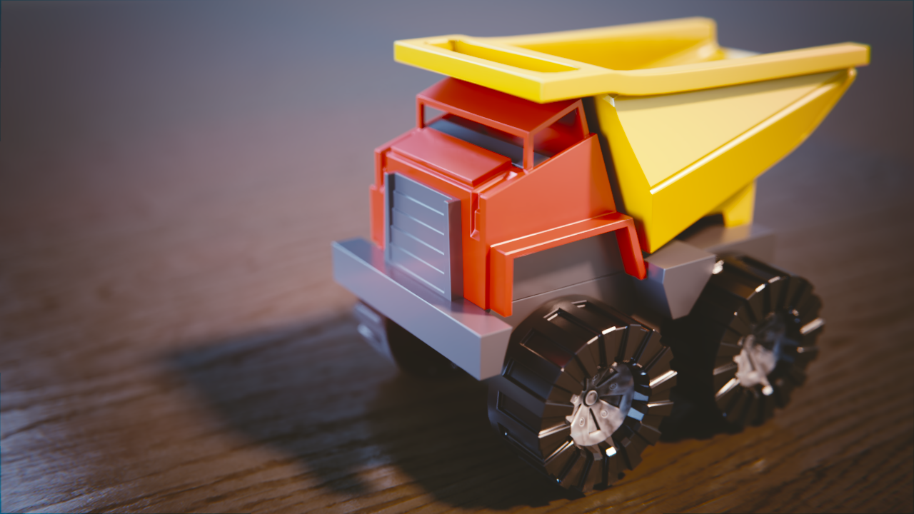
I was going to make a more interesting material for the toy truck, but I wasn't sure how to start, even after making some from tutorials around the web. I mean, I just can't realize which nodes I need for the desired effect. Anyways I left a "dirty plastic" material for the wheel caps I made that only looked good there ha.
I miss the old "everything in one place" style of submitting, hope there will be something like a "frontpage" that shows the last post of each personal thread in the final class system 😉😉
Bonus Halloween themed submission:
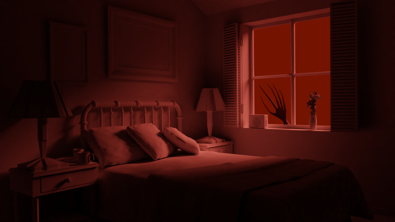
I hope that's a strong window...
----------------------------
mmalhomsi I'll see if I can get sharper shadows, but it will take a while. It has been quite the headache to get eevee to do what I want!
mmalhomsi Eevee has a lot of potential, It's possible to get close to cycles but in real time, it's crazy when it works. But it's still really buggy, be sure to have a 2.79 backup of your model!
I took all the lights and added a new key light, due to the material I use the shadows lose some sharpness, take a look (with a placeholder material):
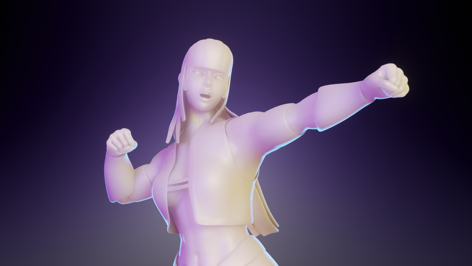
It already looks more "actionish"! What do you think?
Thanks for your help!
mmalhomsi I finally got something I'm proud of, and it's thanks to you my friend! There's still some tweaks to do, but I like where it's going!
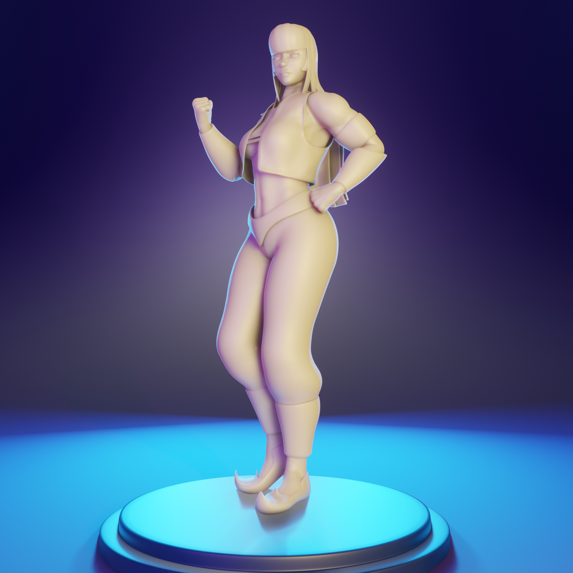
Homework Submission Week 3
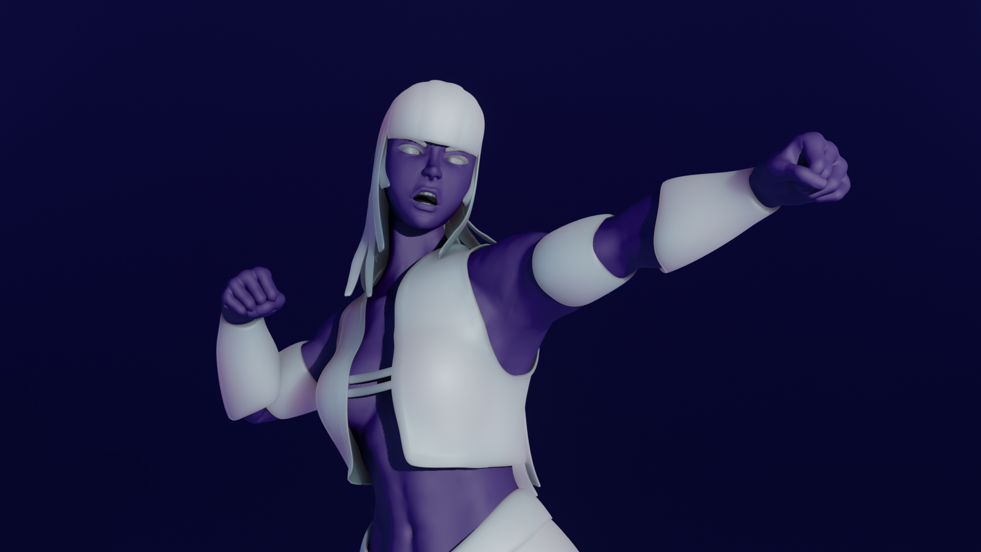
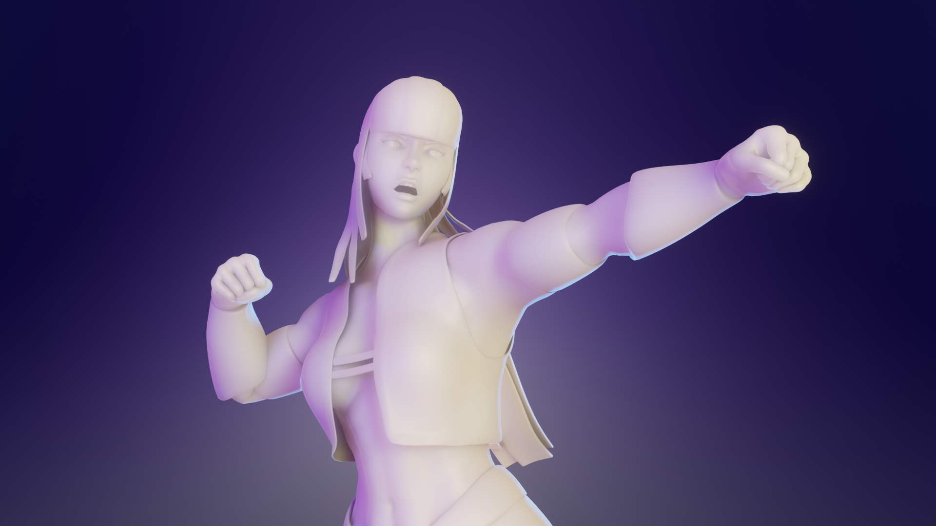
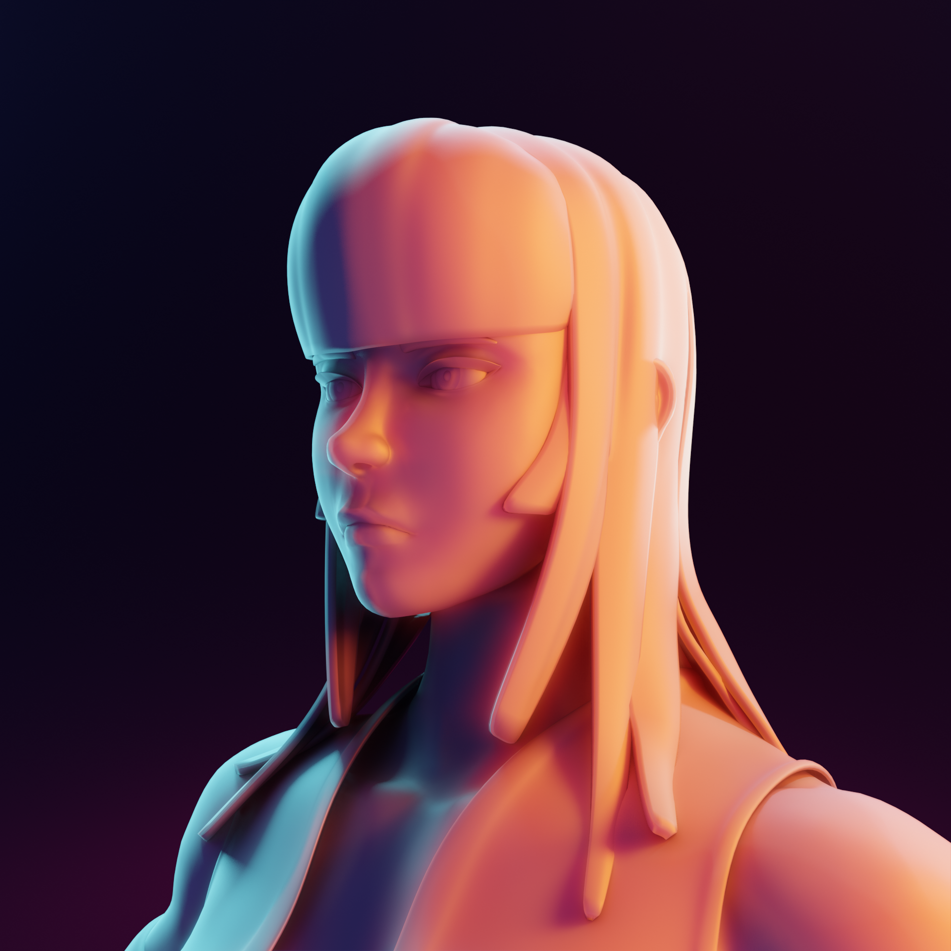
I present you my character Umbra:
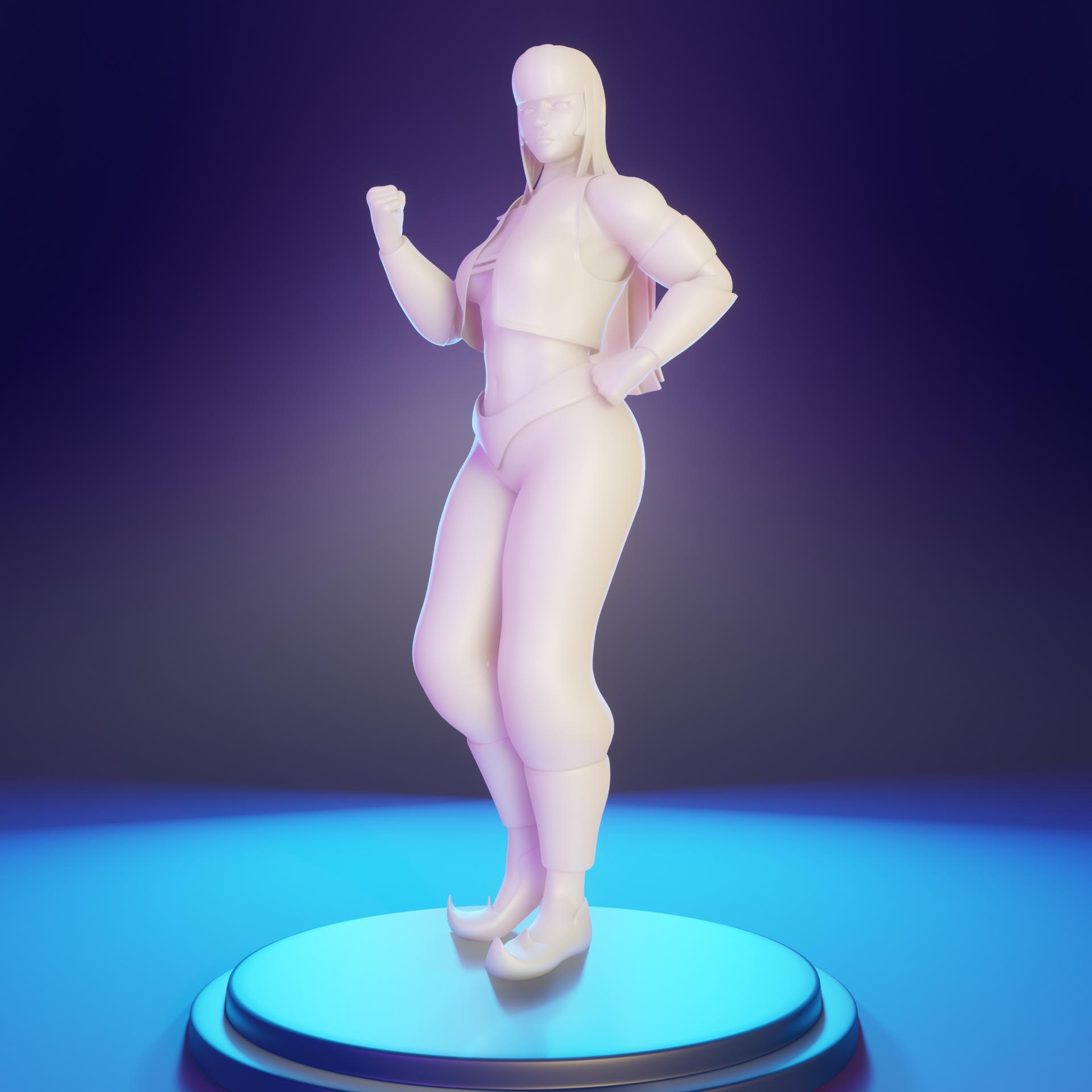
 She's a tough one ^^. Thanks to mmalhomsi for showing me the way!
I'll see if I can finish some shaders for her, I have a "gold" shader ready and now working on her clothes.
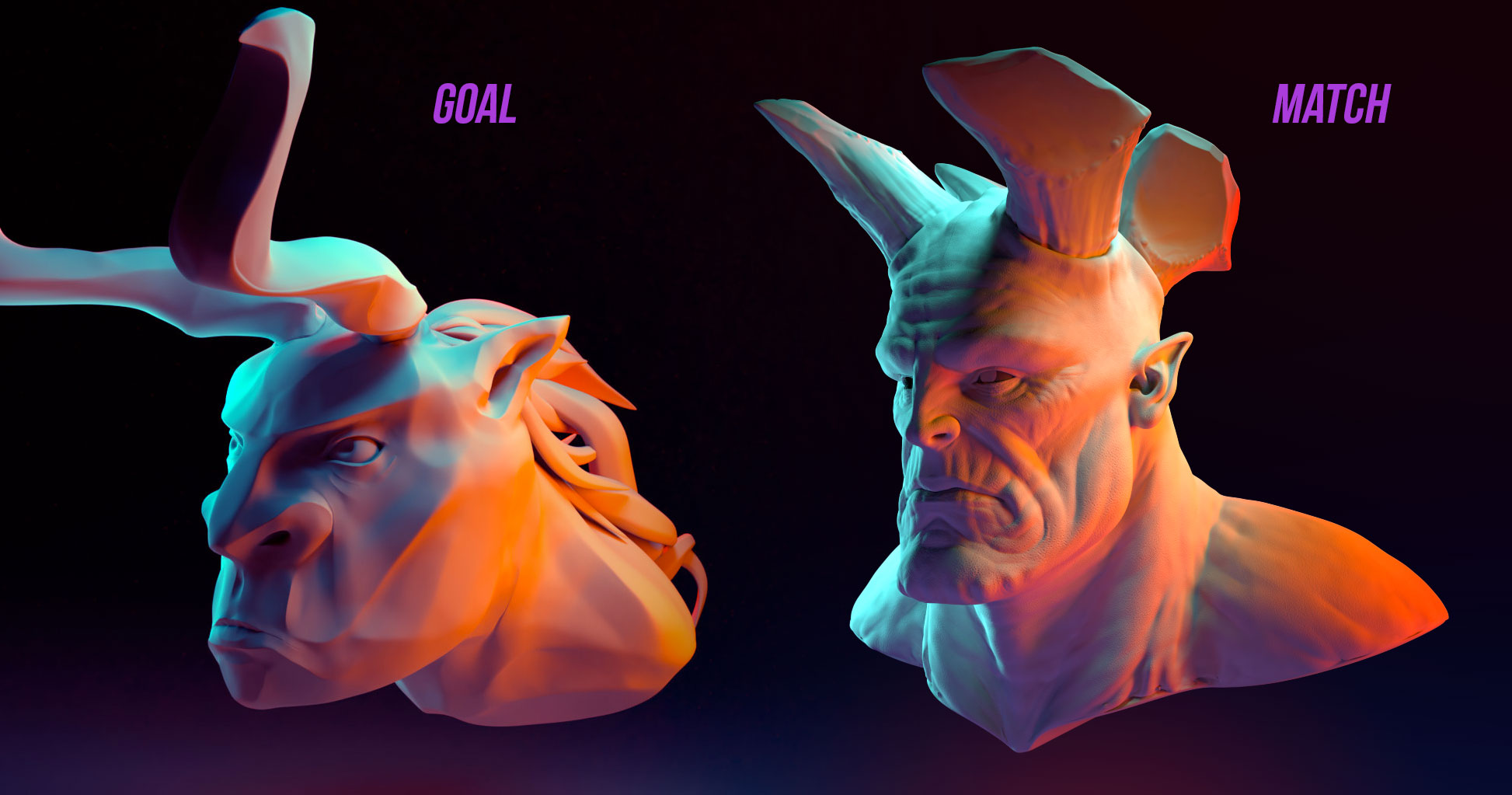
And here's the lighting match exercise, original by Tamás Sárffi first, followed by my attempt :
Found out my model has an awkward smile. So in character!
Lighting is hard, but now I feel like I can take a rock and make it beautiful!
EDIT: More defined version:
![]() jack07 On the character shots, the character itself is so bright in general with little shadowing to help see the features. For this reason, i think the lighting in the color match is better for showing off the character's work. As for the color match itself, great job! definitely feels really close!
jack07 On the character shots, the character itself is so bright in general with little shadowing to help see the features. For this reason, i think the lighting in the color match is better for showing off the character's work. As for the color match itself, great job! definitely feels really close!
![]() gradyp Thanks! You are right, I should tone down the light in the first ones, it could also be because of the material I made. I was running out of time so I didn't realize lol
gradyp Thanks! You are right, I should tone down the light in the first ones, it could also be because of the material I made. I was running out of time so I didn't realize lol
![]() jack07 Loved your work this week! Your progression from initial character renders to the final version is a testament to improvement. My biggest note with initial versions was contrast and you brought the whole thing around wonderfully in the end. You've taken advantage of the full color range (very dark shadows and bright highlights) instead of limiting your render to a smaller range. You've also not been shy with coloring your lamps and the render is more interesting for it. And that rim light is razor sharp! The character pops off the background beautifully.
jack07 Loved your work this week! Your progression from initial character renders to the final version is a testament to improvement. My biggest note with initial versions was contrast and you brought the whole thing around wonderfully in the end. You've taken advantage of the full color range (very dark shadows and bright highlights) instead of limiting your render to a smaller range. You've also not been shy with coloring your lamps and the render is more interesting for it. And that rim light is razor sharp! The character pops off the background beautifully.
My one note would be to push the key light more to the side. Currently it looks like the key is nearly directly in front of the character, kinda creating a camera-flash effect. It's not that negative but I think pushing the key to the side a bit more would generate a little more gradient across the character's front.
Still excellent work: It's an A in my book.
And your light match is like a 95% match. Only real difference I can tell is the slightest difference in the background gradient. The source render's bg gradient looks a tiny bit more noticeable than yours. But that's barely a note at all. It's another A from me.
@theluthier Thanks! I was very lost at the beginning, but thanks to malhomsi and looking around artstation it ended as a fun assignment :D
![]() jack07 Good progress. I agree with the critiques. I did notice in the action shot, the thumb on the right hand looks like it's really pulled over. I tried that, and it feels a little more unstable than having the thumb rest on the first two fingers, but that's a really, really nitpicky thing. Good work.
jack07 Good progress. I agree with the critiques. I did notice in the action shot, the thumb on the right hand looks like it's really pulled over. I tried that, and it feels a little more unstable than having the thumb rest on the first two fingers, but that's a really, really nitpicky thing. Good work.
![]() silentheart00 You are right! I got my right thumb broken when I was little, and because of it I can pull it that far, I didn't consider to compare it to my other hand, haha.
silentheart00 You are right! I got my right thumb broken when I was little, and because of it I can pull it that far, I didn't consider to compare it to my other hand, haha.
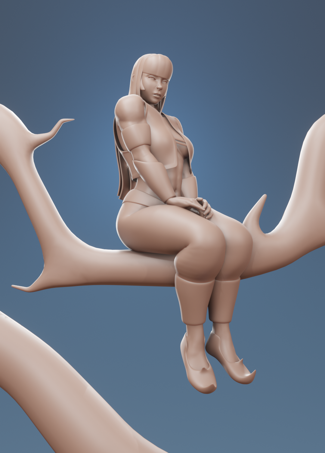
![]() jack07 She does look very tough. Congrats for finishing so fine looking character.
jack07 She does look very tough. Congrats for finishing so fine looking character.
Don't have too much more to say about the lighting than it does look GOOD.
Homework Submission Week 4
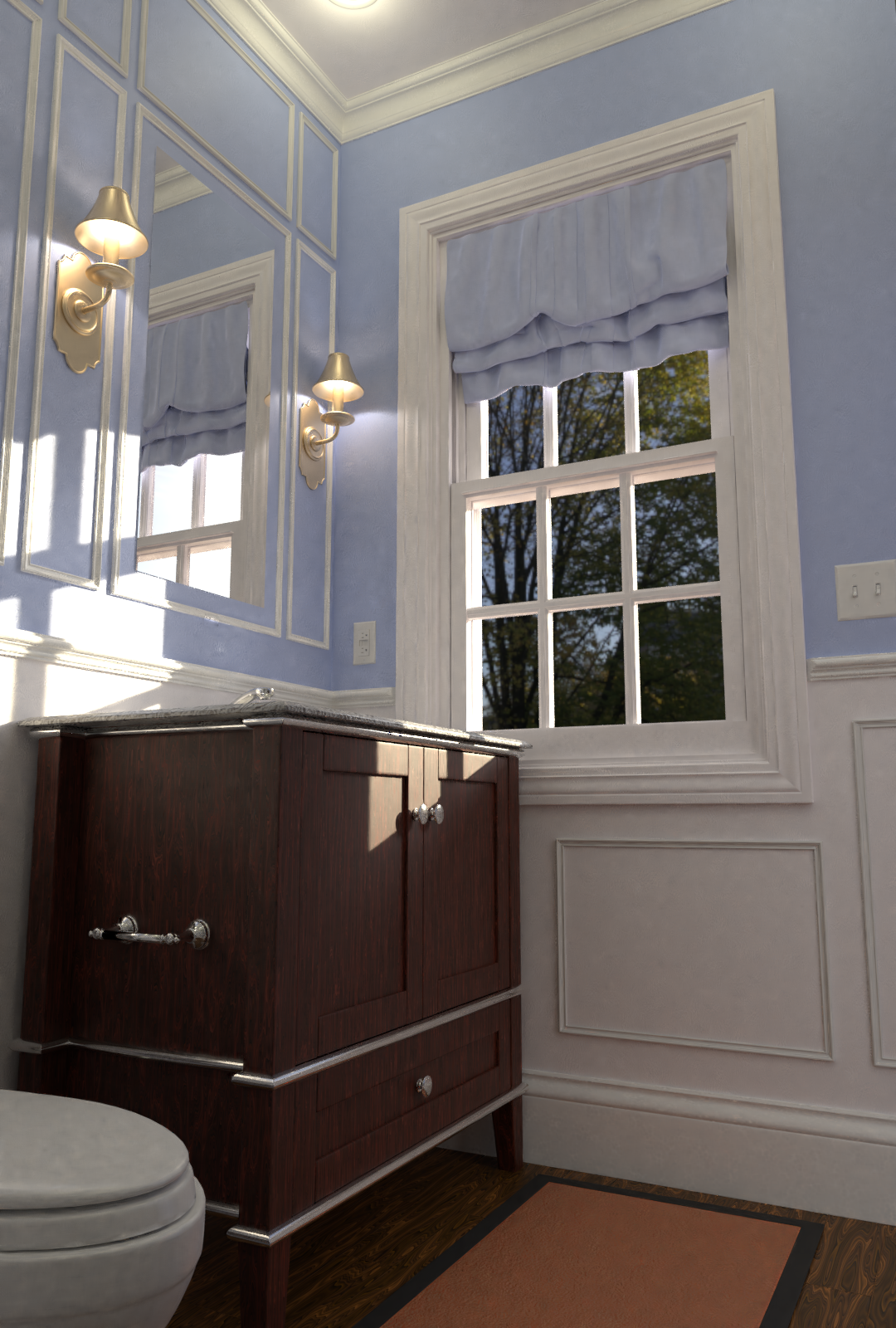
Originally I was planning to make more unique shaders and colors for the window, lower part of the walls made of wood and so on, but I realized that that would end up looking like too much going on. After I looked around my house to give me ideas, I ended taking my "painted wall" material and modified it for the window and what was going to be wood on the wall. I probably should have changed the floor to tiled ceramic...
Anyways, the only things I don't like are the lack of light inside the room, I don't think it looks realistically lith. The sun look great though. And then I don't know if I used too many white materials, the barely look different than a simple diffuse shader, even though I made stuff like paint imperfections, bumps, and so on. They are very small details afterall.
Also, I don't know why there big dark spots all over the toilet, didn't use any texture or bump for that one.
Here's an alternate version, I wasn't sure which looked better:
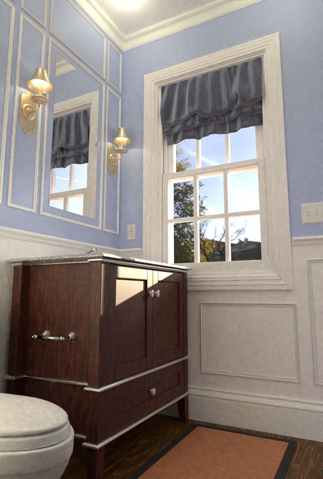
For the lighting match exercise I choose one of the provided examples:
I realized that while there's a lot of amazing cg artist out there, very few of them take their time to make a good looking light setup. Most go with a black and white render that has nothing special or helps the model in any way. I know it's hard, but the thumbnails that took my attention were the ones with very unique, colorful lighting.
As proud as I am of my model, she is a very simple, barely detailed, soft one. Yet the lighting makes her look amazing.
![]() swikni Thanks! I'm very proud of her :3. Sorry for the late reply, it was a busy week!
swikni Thanks! I'm very proud of her :3. Sorry for the late reply, it was a busy week!
Good job ![]() jack07 ! It's pretty realistic overall. I like the first version a little better because the sunlight's shadows on the left wall are more interesting to me. I only have a few notes:
jack07 ! It's pretty realistic overall. I like the first version a little better because the sunlight's shadows on the left wall are more interesting to me. I only have a few notes:
It's a B+ from me 👍
Your light match is very appealing. I completely agree that bold lighting can do wonders for good and less-good models. The biggest difference I see between yours and the source is the intensity of the cyan lights (stronger in the source) and that there seems to be 2 of them: One from the left (which you have) but also one from the top. It's a small note though. Worthy of an A overall.
Way to finish strong!
mmalhomsi I live to the limit(? Thanks! I wasn't sure about the colors, as far as I can tell bathrooms usually have 2 or 3 colors, mostly white. I should have made my own room lol.
Took a look at your submission, you are a wizard malhomsi
:P