Hello, these are my bedroom lighting images:
Day scene: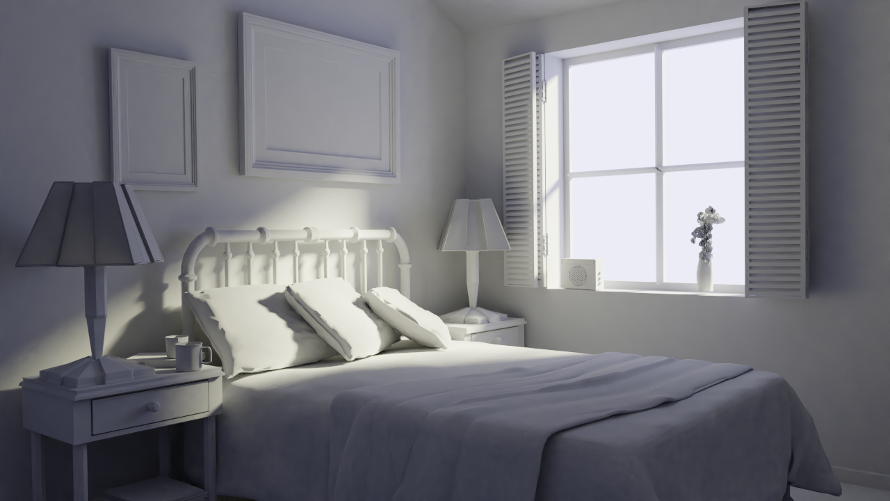
Night scene: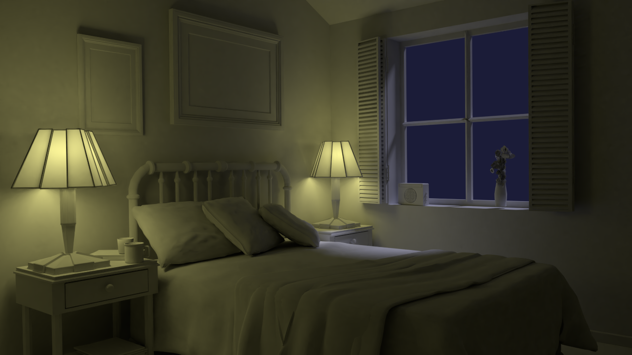
Didn't know how to simply increase blooming although I switched the color management to default preset instead of filmic.
link to exercise submission: https://cgcookie.com/exercise/lighting-a-simple-bedroom/exercise_submissions/16593
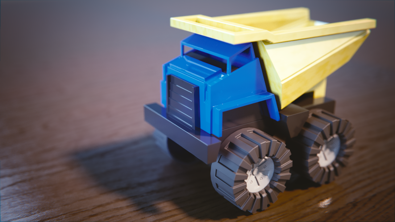
For the toy truck I already did the exercise, but turns out that I forgot to use the fresnel node so here's the updated version:
link to exercise submission: https://cgcookie.com/exercise_submissions/16316
Nice day scene. There's a play between the orange and blue. The night scene is good, a little strange yellow color for the lamps, but if that was intentional then cool.
Truck shader is solid. Good work.
Excellent work this week, Ahmed. I put a small note on your day/night exercise about the color of your night scene lamps. And your toy truck looks great. Very much reads like plastic. Plus it looks like you've got some subtle scratches, which I like. Definitely earned an A this week 👍
![]() silentheart00 Thanks for the review. For the night scene I didn't pay attention to the color :) , should be a yellow close to orange as Kent noted on the exercise.
silentheart00 Thanks for the review. For the night scene I didn't pay attention to the color :) , should be a yellow close to orange as Kent noted on the exercise.
@theluthier Thanks Kent for the review. I'm definitely learning a lot from you guys.
![]() ahmedc Good work on the car. That's solid shading effort.
ahmedc Good work on the car. That's solid shading effort.
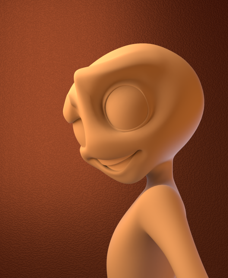
The lighting match is pretty good, too. Maybe the light could be a little more behind the model since the intense lighting is following the shoulders down, but that's a small thing.
![]() ahmedc Liking the lighting match! Though in the goal it does look like they used some kind of blur node in the compositor, so if you're feeling brave maybe give that a try?
ahmedc Liking the lighting match! Though in the goal it does look like they used some kind of blur node in the compositor, so if you're feeling brave maybe give that a try?
![]() silentheart00 Thanks for the review. Well noted for the color match. I think next time I'll use the rigged baker model to match the pose also, that should make things easier.
silentheart00 Thanks for the review. Well noted for the color match. I think next time I'll use the rigged baker model to match the pose also, that should make things easier.
![]() thecabbagedetective Thanks ! I'll definitely give it a try, I'll have to learn compositing because I had no idea about it :)
thecabbagedetective Thanks ! I'll definitely give it a try, I'll have to learn compositing because I had no idea about it :)
![]() ahmedc Ah no worries there, once you understand the basics it's all one big mixing pot of experimentation, really fun!
ahmedc Ah no worries there, once you understand the basics it's all one big mixing pot of experimentation, really fun!
![]() ahmedc Ahmed that is a good idea to use the HDRI as scene and the car is finally really in harmony with it, nice one
ahmedc Ahmed that is a good idea to use the HDRI as scene and the car is finally really in harmony with it, nice one
aarev Yes it was bumpy :), I used five lights and an ellipsoid in the background, but I feel I exaggerated the purple color a bit.
![]() csehz Thanks Zsolt, I saw something similar on HDRI haven so I decided to give it a try.
csehz Thanks Zsolt, I saw something similar on HDRI haven so I decided to give it a try.
link: https://hdrihaven.com/files/gallery/L/Shukurlu%20Javid_vignaiolinight_FAlW.jpg
![]() ahmedc You vehicle render was among my favorites during the stream! Just an overall solid render. Only note is the ground plane's edges abruptly end and the puddle pattern is a little too uniform. I love the puddles, just would recommend making them less evenly spaced and sized. Still it's an A from me.
ahmedc You vehicle render was among my favorites during the stream! Just an overall solid render. Only note is the ground plane's edges abruptly end and the puddle pattern is a little too uniform. I love the puddles, just would recommend making them less evenly spaced and sized. Still it's an A from me.
Your light match is very close too. I've only 2 notes:
Overall pretty small notes. It's a B in my book 👍
@theluthier Thanks Kent for the great review! I wish I were able to watch the stream yesterday, I'll watch the recording as soon as it comes out. Those exercises and the feedback provided are really beneficial!
Hello,
This is my homework for week 3:
Character lighting:

Here's my lighting matching attempt,
Goal:
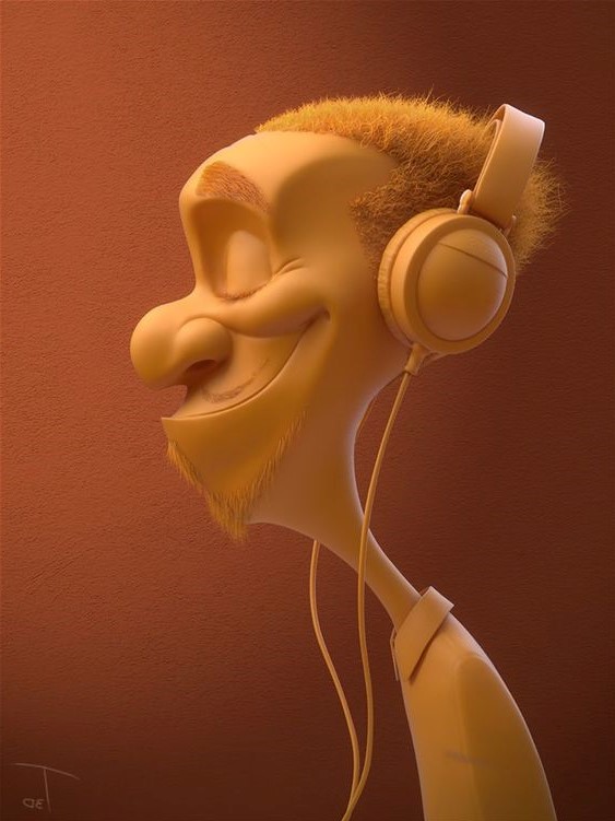
Result:
