Here is my homework thread for the October 2018 class
The truck looks good. Not much to critique there. Your day scene is nice; I can see the warm light and cool shadows. The night scene is very nice on colors; really intense yellows and blues. Feels like a moody piece. Good work.
![]() silentheart00 Thank you! I'm new to Blender but I'm learning a lot with these exercises.
silentheart00 Thank you! I'm new to Blender but I'm learning a lot with these exercises.
Really nice work on all assignments jjm3d. Pretty impressive for being new to Blender. It's an A for the week from me.
Do you have experience in another 3D package?
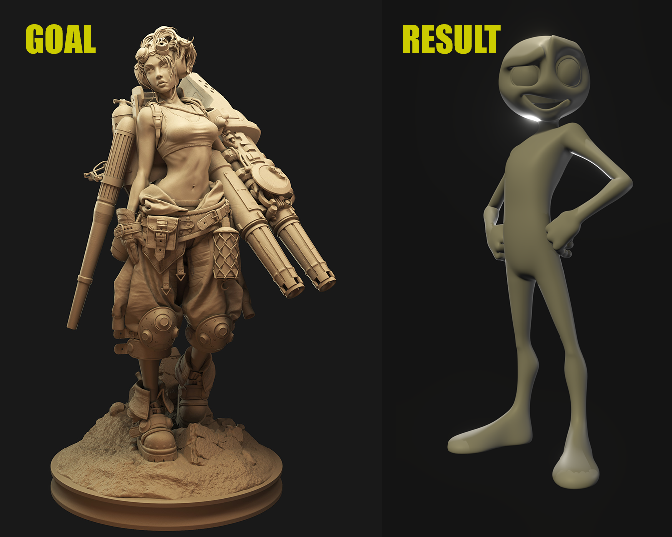
Lighting Match #1

I chose to light match this model by Losha Magee from artstation.com https://www.artstation.com/artwork/JXPWd
jjm3d Your car paint is very nice! It's definitely stealing the show. Love the subtle but noticeable specks. Color is great. The rest of the materials are a little on the simple side by comparison. Just not too much happening with them; makes it feel a bit unfinished as an overall image. Also there's some questionable lighting from a technical sense. I see shadows on the front end but almost nowhere else; not even in the most obvious places like under the sides of the car on the ground. It's got that very CG look of floating geometry.
The lighting on your lightmatch, while it looks pretty good, it doesn't look that similar to the source image. Which is a good choice btw - very strong character render. Here's my notes:
You've done good work this week, John. It's a B in my book 👍
jjm3d Good work, i was about to comment on the colour diference but i see Kent have already mentioned it.
@theluthier Thank you for the feedback! I agree with all your notes. Honestly, I am struggling with Blender 2.8. The interface really confuses me compared to 2.79 and I also had a tough time lighting with Eevee. I think I need a lot more practice with it.
jjm3d John I had the first impression is that the car rendering is maybe too shiny, but then the second is that it is finally harmonizing with the colors.
So just let's forget all the theories and let's enjoy it, really nice one
jjm3d Late to the party. The gold paint is really nice, but I agree the rest feels less polished than the paint. I agree with the lighting match critiques, as well.
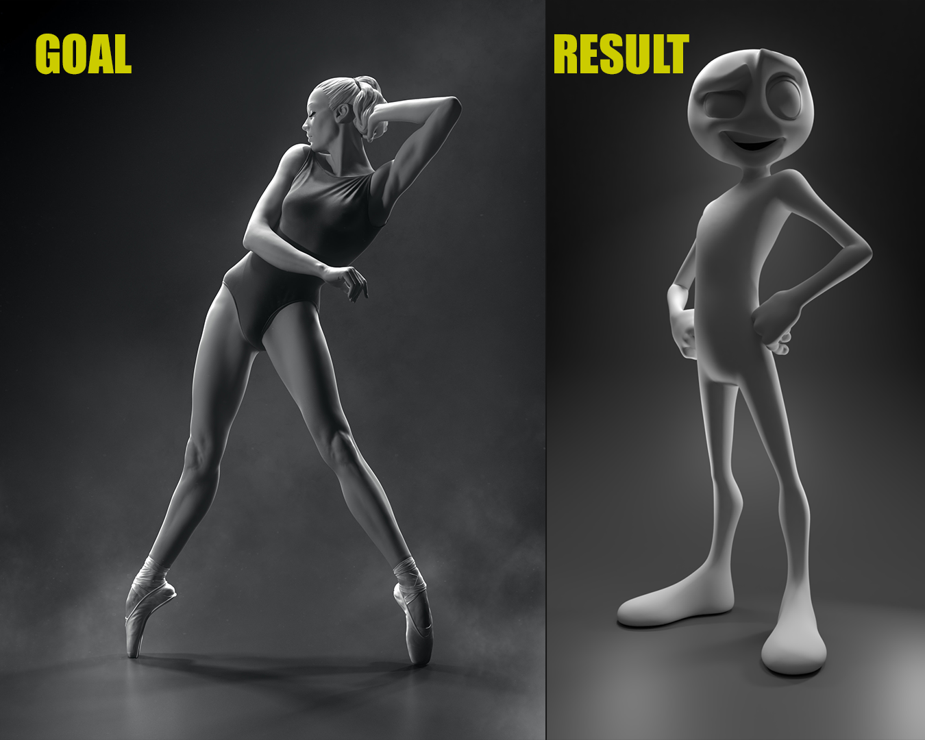
Lighting Match #2

I chose to light match this model by Sergey Zinovjev and Andrius Balciunas from artstation.com https://www.artstation.com/artwork/gJJwqE