Hey Guys,
Had a go at the homework. The lighting was very interesting. In the end I wasn't happy with some of the light colours. I added a second light in the room in the daylight scene. I thought it necessary so the sun didn't crush some of the detail. A low strength Hemi in white. Using the HDRI images is super fun. There are some gorgeous images around. I went to HDRI Haven. Heaps of cool stuff there. The author has the right idea
The toy truck was interesting. I used the complimentary colour wheel that Kent showed in the Live stream. It was fun. Palettron.com was the site. Thought it was amazing. I end up dulling the reflections with a subsurface scattering. This was way too noisy and I couldn't get it to look good. In the end I put a noise texture into the roughness value on the Glossy BSDF and left it on default. This took the real sheen from the glossy BSDF and allowed a more "plastic" feel.
PS. Colour was super fun
Truck looks good if you're going for more of a dull plastic feel. Interesting color scheme. It looks like a triadic color scheme to me.
Your day scene looks nice. Maybe the light is a little bit bright for my taste. The night scene is nice, too. White bulbs are kind of boring, though, and tends to make things feel clinical. It's getting a little dark on the right side, too. Try changing the color of the lights and see what happens to the mood. Good work so far.
Good stuff ssparkes983! Sounds like you're making good strides with material nodes. Glad you had fun with colours and palettron.
I agree with silent that the toy plastic is a little dull. But I don't dislike it. Most of the time the issue is making the plastic too shiny.
Solid lighting with the day and night scenes. Something about the landscape in the window feels odd though. Like the window is right beside a big hill or cliff. Not that that's an impossible situation but it kinda makes for a clostrophic feel to me. I don't know - that could be a difference of taste though.
My only note on the night scene is the white lights. I prefer warmer lights BUT I also know that white bulbs are becoming quite popular. I hate em but they exist 😅
Overall it's an A from me this week.
Take 2 based on the feedback. Changed the image in the day scene. I thought I could change the window view to just a blue tranparent plane, but it made everything blue. Can this only be done as an after effect? Night was a better result. I liked the colour mix better with the moonlight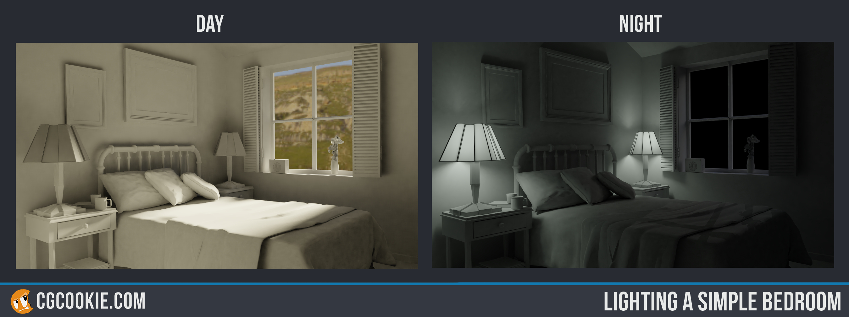
 Second Attempt
had a play around with the noise texture settings. Plugging it in as a colour had a mottled effect, but got a bit of colour back into the red. I feel like this could be done a bit better with some more info on the settings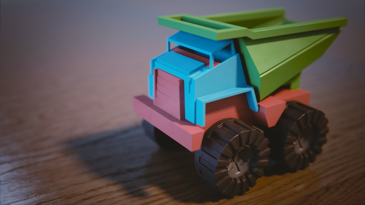
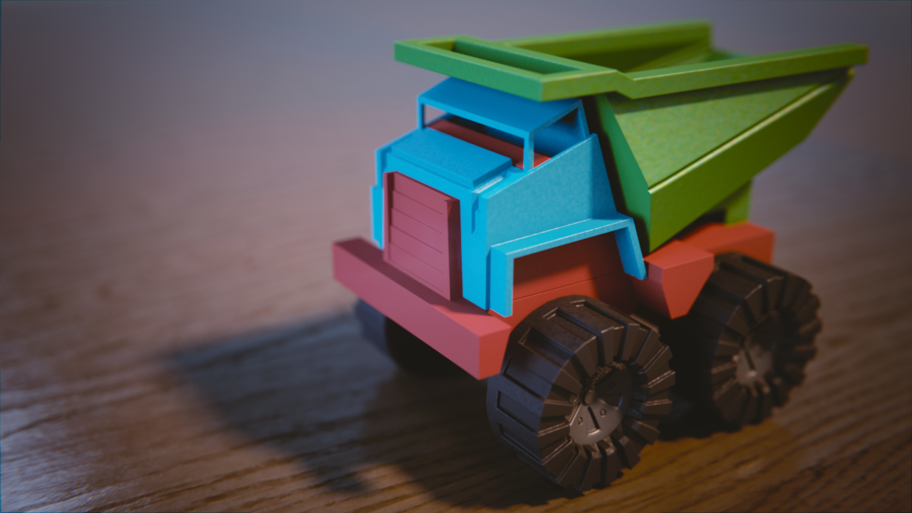 Second Attempt
ssparkes983 Your second attempt looks nicer, with a better play between colors in my opinion. For making the view out the window blue, how were you doing that? Was it 2.7 or 2.8? Cycles or Eevee? I noticed when I switched to Eevee and then tried changing the environment color it affected the whole image, not what was seen through the window.
The updated truck is interesting, like a clear coat of plastic is peeled off in areas.
![]() silentheart00 Hey,
silentheart00 Hey,
Thanks for taking the time to have a second look. I was working on the lighting exercises in 2.79b. I placed a plane over the window and added a transparent BSDF set to a skyish blue. It was way too much, just couldn't see how to dull down the lighting effect of the pane and keep the appearance of a blue sky.
In relation to the truck, I'll be moving on from the noise texture, it's a cool effect, but not appropriate in this situation. What's nodes should we be steering to to achieve the dulled/plastic feel ?
ssparkes983 For the truck, I used only 4 nodes, not including the output node. I suggest breaking down the plastic into components. What elements are contributing to the whole plastic look?
![]() silentheart00 I kept it quite simple. As attached. Really only tried to play with some settings in the noise texture node. Still quite green on the node editor, so didn't try too much. Tried plugging the noise texture into different nodes, found tinkering a little helped. Which nodes did you incorporate ?
silentheart00 I kept it quite simple. As attached. Really only tried to play with some settings in the noise texture node. Still quite green on the node editor, so didn't try too much. Tried plugging the noise texture into different nodes, found tinkering a little helped. Which nodes did you incorporate ?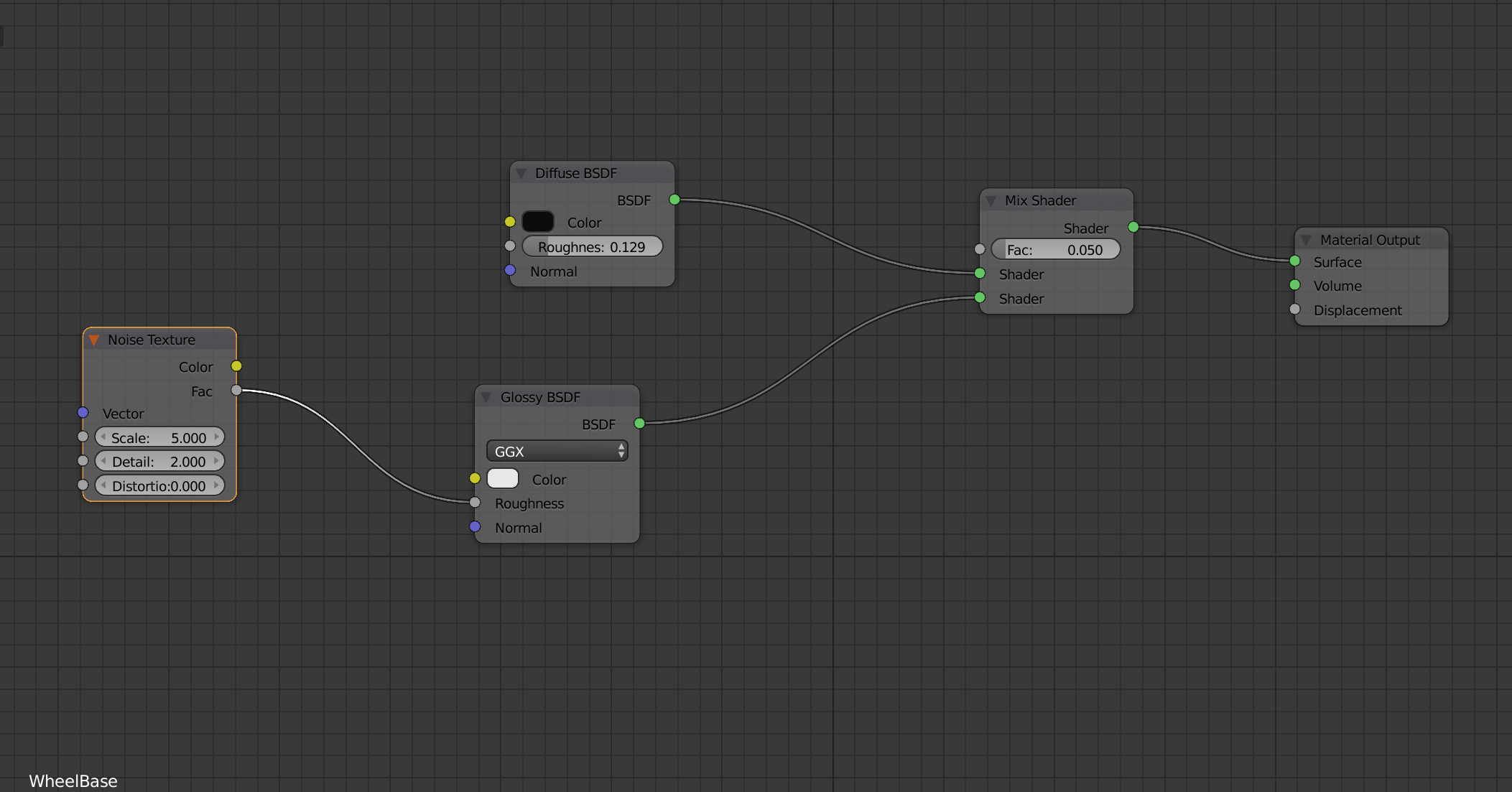
ssparkes983 I have everything except the noise texture. There is one more thing that is absolutely required if you want to make a realistic shader. Do you know what that is?
hmm guess i might miss it too then trough i do have a big set of node's on all parts xD . at first i was happy with this set up but the farther i get and kept adding details i was like wow just how big is this already xD
i really am curious what other node is required for the plastic look (or is it the fresnel ? since i do have that also implented)
![]() silentheart00 Thaks for the reminder. I forgot to watch the follow up video on the exercise. Fresnel is key here. Also adjusting the roughness on the wheels, which was what I was trying to avoid by adding the noise texture. Cheers.
silentheart00 Thaks for the reminder. I forgot to watch the follow up video on the exercise. Fresnel is key here. Also adjusting the roughness on the wheels, which was what I was trying to avoid by adding the noise texture. Cheers.
yyukinoh1989 Hey, as mentioned, Fresnel is key. Also the roughness value on the wheels, which I could't solve by myself. Thanks guys. The follow up video is key
Righto, last one. Added Fresnel to all elements. Good result. Ended up added a glossy clamp of 2.5 to remove fireflys from wheel hubs. Moved the roughness up on the wheels and found the result alot better. Thanks for the help guys
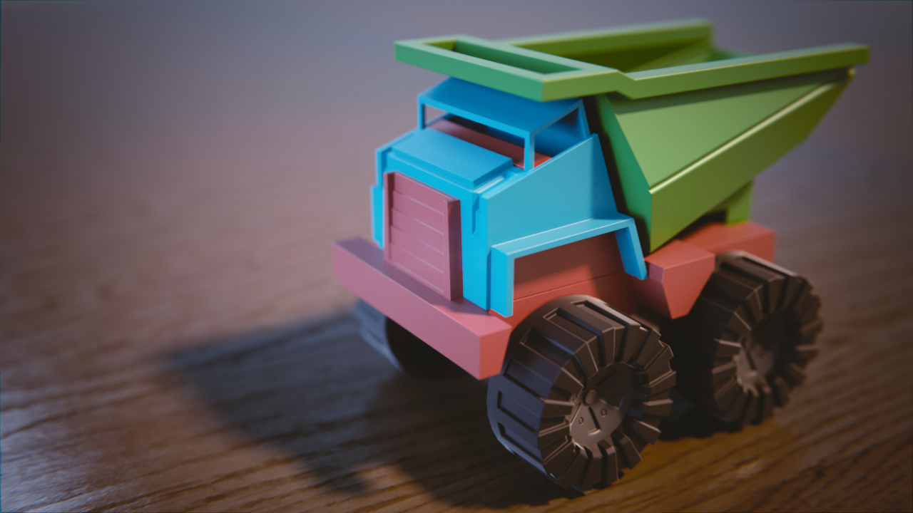
ssparkes983 Hey, there you go! Reminds me of plastic, maybe duller than the other submissions, but it works. Good job.
Solid toy truck progression too 👍
Thanks to to some feedback from Miranda, I checked some of the settings. AO and shadows were enabled, however the specular settings were not enough to allow reflections. The overall surface is too shiny, but better. The settings for the textures in the colour ramp were changed to make a better surface. The scale on the bumper and a couple othe pieces in the texture settings were adjusted. Getting there.
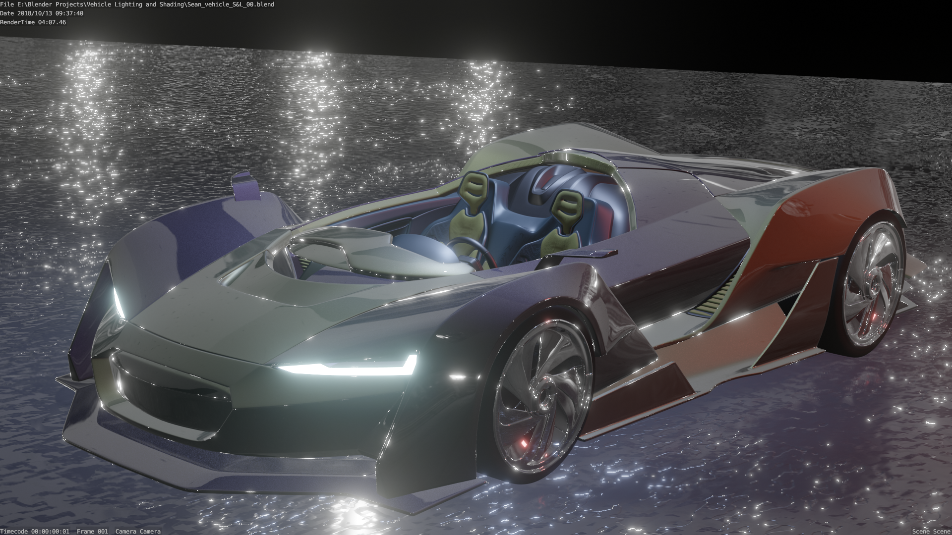
ssparkes983 yes much better than the previous one! Keep going you'll get there 😊
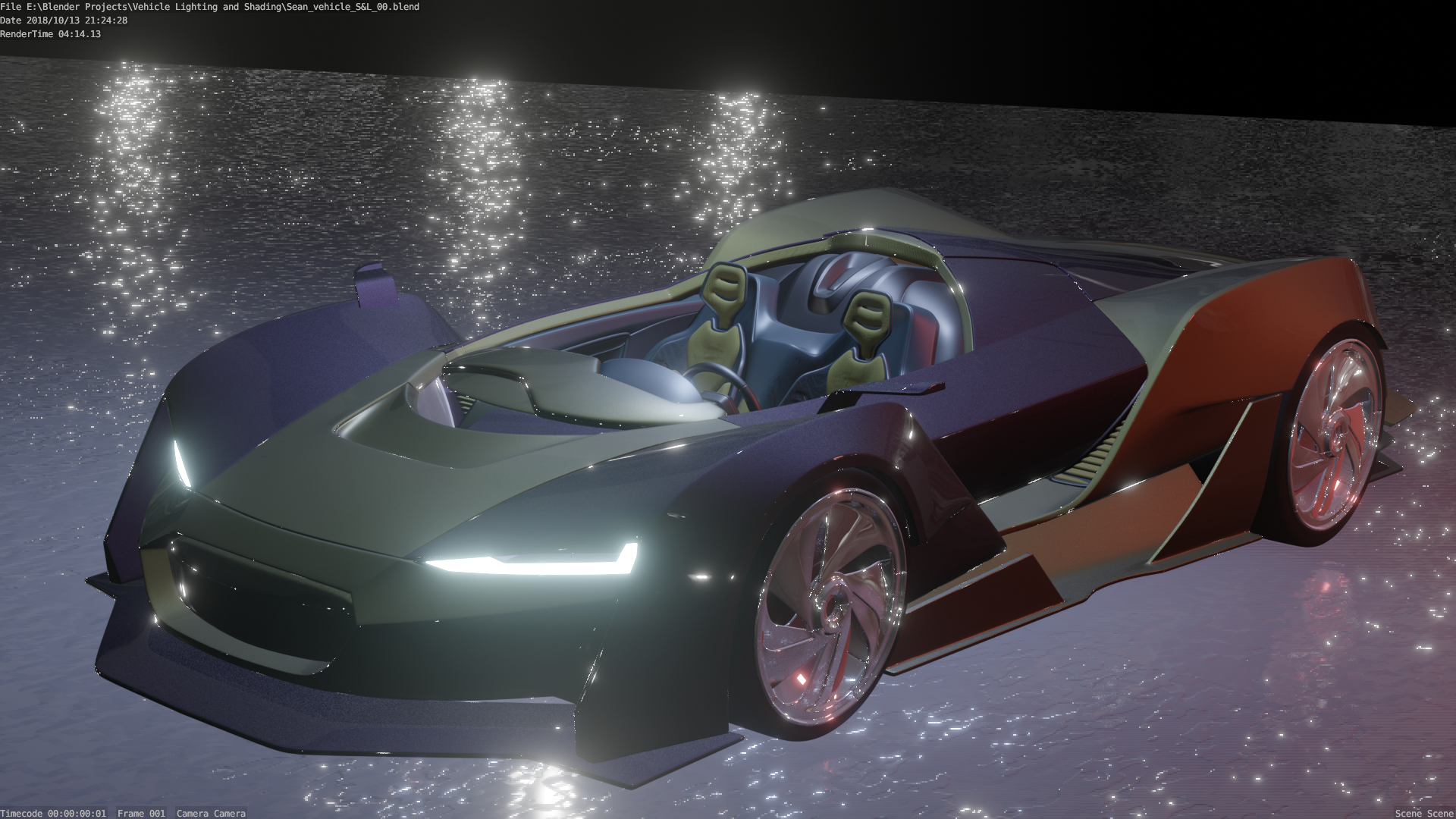
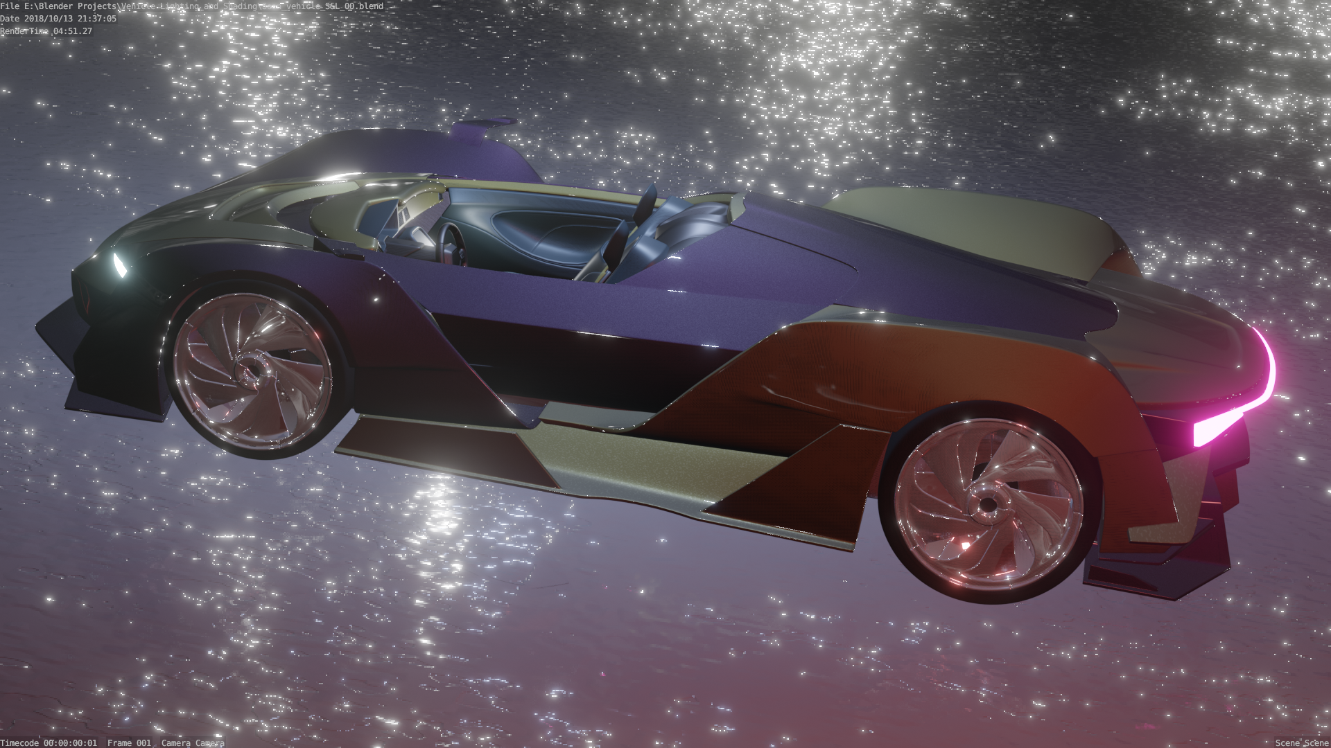
Hey Guys,
Thought I had mixed results here. some good points, I was happy with the car paint and colours. Some of the interior was cool to play with. Thanks from the input from you guys, helped alot. I ran out of time for the lighting match. A quick, easy one is what I thought I picked. Aparently it all takes time. Definetly will spend more time on this