Hey Guys,
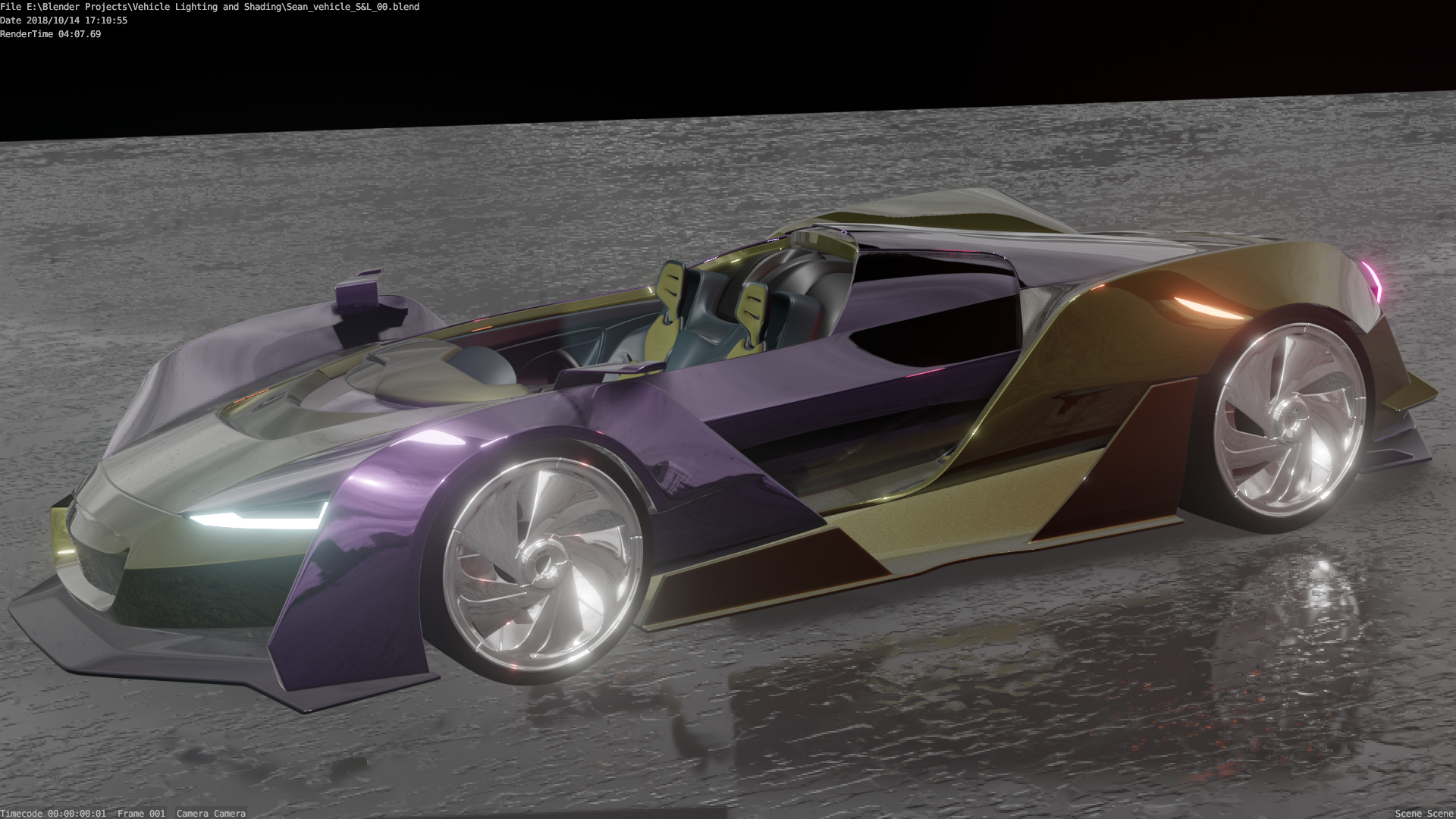
Had a go at the homework. The lighting was very interesting. In the end I wasn't happy with some of the light colours. I added a second light in the room in the daylight scene. I thought it necessary so the sun didn't crush some of the detail. A low strength Hemi in white. Using the HDRI images is super fun. There are some gorgeous images around. I went to HDRI Haven. Heaps of cool stuff there. The author has the right idea
Just a quick note .I Stuggled to get as much "ambient" light as Kent was achieving with only the HDRI enabled. Had to dial the strength right up and made the scene unbearable. Did anyone else have trouble? Using a Windows build. Updated almost daily

ssparkes983 Nice, now we see the reflections on the floor. You're improving with each render, great job! 😄
ssparkes983 hey really great work. One thing I do notice is that with the match the shadow left is really sharp, while right it's more blending out in the background. Not sure if you can make the shadow sharper too but still like I said before awesome work. Love you're car too
yyukinoh1989 Hey Friend, Thanks for the feedback. I actually did try and sharpen it a little in the colour match, there are definitely enough settings to play with. I'll take another look. Cheers
ssparkes983
i am not sure but if i remember correctly the shadow's change depending on how close or far youre lamps are .
and i think also if there are other lights pointing in that direction. but you sure did amazing good :D
ssparkes983 You're super close with your light match! Only nitpicky note is that your shadows are softer than the original, though I like yours better. Did you sculpt the model or is it a 3D scan? Looks good regardless - A from me.
Your vehicle render is especially shiny. From the colored-chrome of the car paint to the glossy ground and emphasized by the bloom, it's yeah, shiny. With that in mind it's not overly realistic or believable but it also looks like you had fun in Eevee! It's a B from me. Keep up the good work 👍
@theluthier Hey Kent, Thanks for the feedback. Definitely had fun in Eevee. I got so excited with the sports car, I wanted to make something from Gran Turismo or Forza. I'll spend a little more time on it. Some bits were a bit frustrating with the lighting values
The light match was a model from Blendswap. I wish I was at that level
Character Lighting Week 3 **WIP**
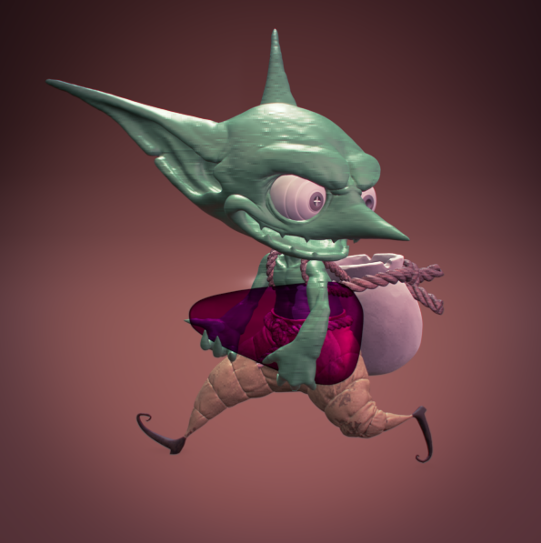
This again, was too much fun. Thought I had some good points here. Any feedback? The Pancake Hobo video was an inspiration for me, very impressive. Felt my workflow was better this week too
ssparkes983 I'm liking the cool direction you're going in! I believe this is the first fully textured goblin I've seen. One thing to note though is that the gem (I presume) the goblin is holding looks a little plain, and instead looks like he's holding a massive slab of glass, or a giant piece of candy. I'd recommend you watch this series of tutorials which go over how to give gemstones a more realistic look. Keep at it!
ssparkes983 Looking fun. I agree the stone in the arms may not be reading how you want it to be read. It's a good start.

Heys Guys,
Thanks for the feedback, the gem was fun. The overall result was pretty good. Had to change from EEVEE to Cycles to get the gem effect to work, and it put the lighting off somehow. I couldn't piece it together, but overall happy. Super fun, Love Goblins
ssparkes983 Good work on the goblin this week. It's a unique choice to make the candy corn a gem - I dig it. The skin material is quite interesting. I like how you darkened the crevices. Looks nice. I like the stains on the pants as well. You also did a good job making a subtle background + floor.
The only thing I'd like to see more of is a strong rim light. It's a B+ in my book 👍
Did you do a light match?
@theluthier Thanks for the feedback. I didn't have a chance for the colour match. Busy moving. I'll try and get two out with the Arch Viz. Maybe. See how the time goes