First class for me. Also first post in the Forum. I'm super excited.
Week 1
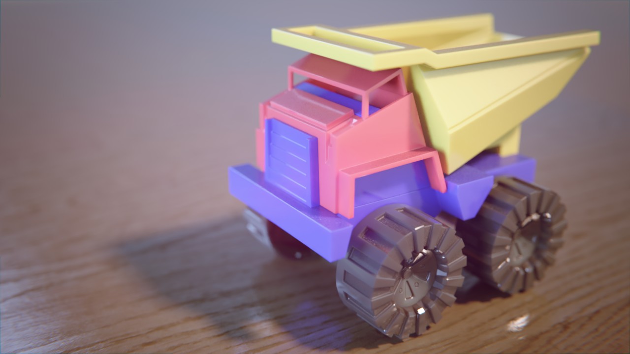
The truck looks like something a really small child would use, so Iassumed it is made out of a more robust plastic. Like this
I tried to achieve this look with vibrant colors and subtle SSS.
Also:I was not sure if we are allowed to use the Principled BSDF?
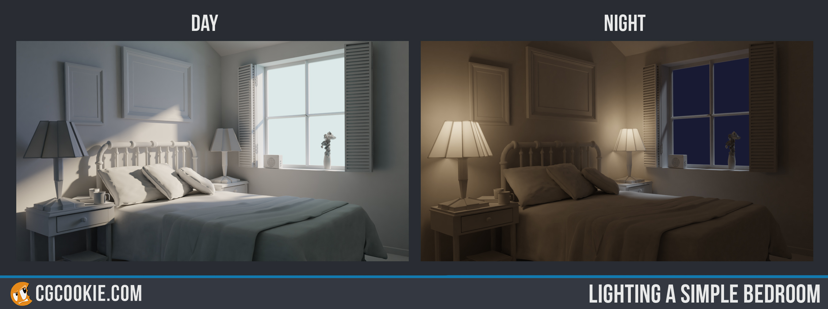
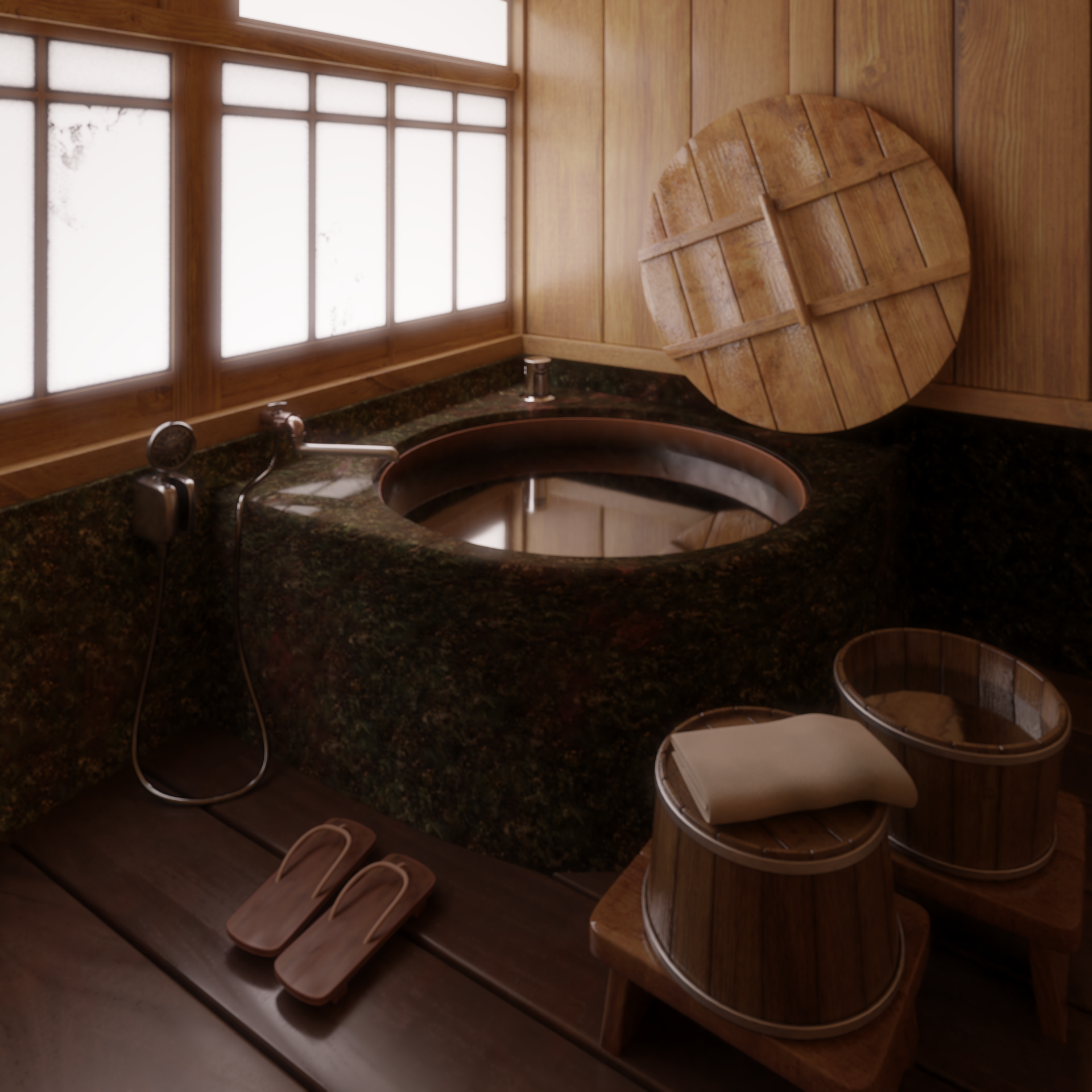
I tried to get the bedroom scenes as close to the example as possible. The Daylight scene was easy but i strugled a little with the overall temperature of the night scene. I also had to increase the transparancy of the lamp shades to get a more satisfying result
Submissions:
Week 2
Week 3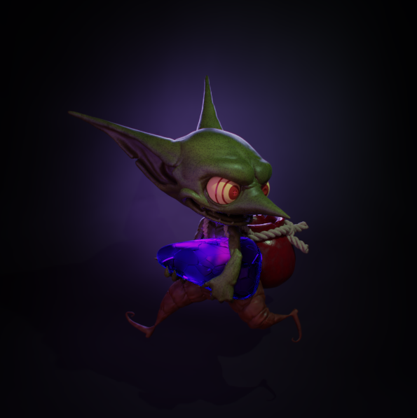

Week 4
I think it's nothing bad about principled BSDF in this exercise. You can try classic way, but I think principled shaders are what you'll work with most of the time.
The truck definitely looks like plastic, but maybe it's too much SSS. But that's for my taste.
And welcome to CGCookie forum! 🎈
Welcome to the class! The community here is incredibly wonderful and helpful, so you're in good hands. The truck looks good, the colors are probably a bit too desaturated for something like a child's toy, but that's a really nitpicky thing. The SSS might be a bit much to my taste. Otherwise, good work.
Gonna reiterate what ![]() nekronavt said in that the Principled BSDF is perfectly acceptable. I like the shading too! The SSS was a nice touch.
nekronavt said in that the Principled BSDF is perfectly acceptable. I like the shading too! The SSS was a nice touch.
![]() nekronavt at a second look i agree with you. The SSS could be more subtle even though it is already very very low. Thanks for the feedback
nekronavt at a second look i agree with you. The SSS could be more subtle even though it is already very very low. Thanks for the feedback
Very glad to have you in the class @slimgrim. And way to start your homework off with a bang. I like you toy truck because you have definitely avoided the 'sin' of blacks being too black. The SSS is a nice tough. Overall a very plastic feel. Good stuff.
And the day and night scenes are just...great. I've really nothing critical to say about them. Awesome job this week. Easy A in my book.
i had a horrible busy week. Of course i had to cram my homework into the last few hours of sunday.
I planned to finish my camaro classic model for the car shading excercise but nope... my day job was in the way.
So here are my two submissions for this week:
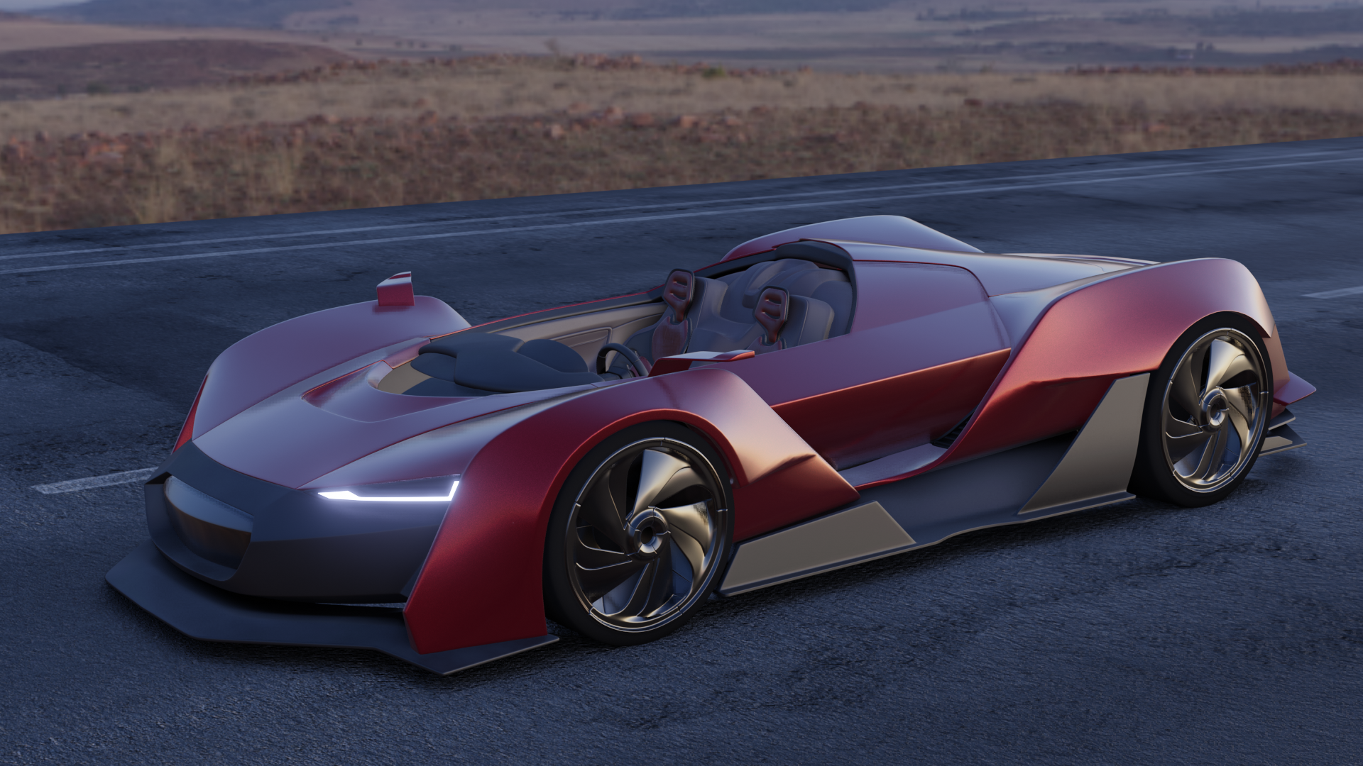
The HDRI is from hdrihaven.com
The Street is one of the free textures from poliigon.com
I definitely will add the glas front this week but i couldn't find out how to get a proper result in eevee.

I used this model from ronin19587 over at blendswap.com
I had a really hard time matching the temperature of the orange rimlight. Still not satisified but time is running out.
Overall, both excercises took around 8h in total
sslemgrim Hey, that's a solid attempt for having a busy week! Good work. The lighting match is pretty good. Maybe the scene is too bright compared to the original, but it's a good attempt.
Oo, a camaro! Looks good so far. I recommend one of the more specular matcaps to work with, like the shiny red or shiny blue one to help see how your surfaces are behaving before shading and lighting.
![]() silentheart00 thx for the feedback!
silentheart00 thx for the feedback!
You're right. On a second look (like always) my LM feels more saturated than the original.
I use the shiny red matcap all the time but deactivated it for the screengrab ;) I was super annoyed because i couldn't find the "render viewport" feature in 2.8
sslemgrim if you hit F12 to render a render viewport will automatically pop up 🙂
sslemgrim Really nice work this week! Your vehicle has an appealing early morning feel to it. All the shaders are reading well too. An A from me.
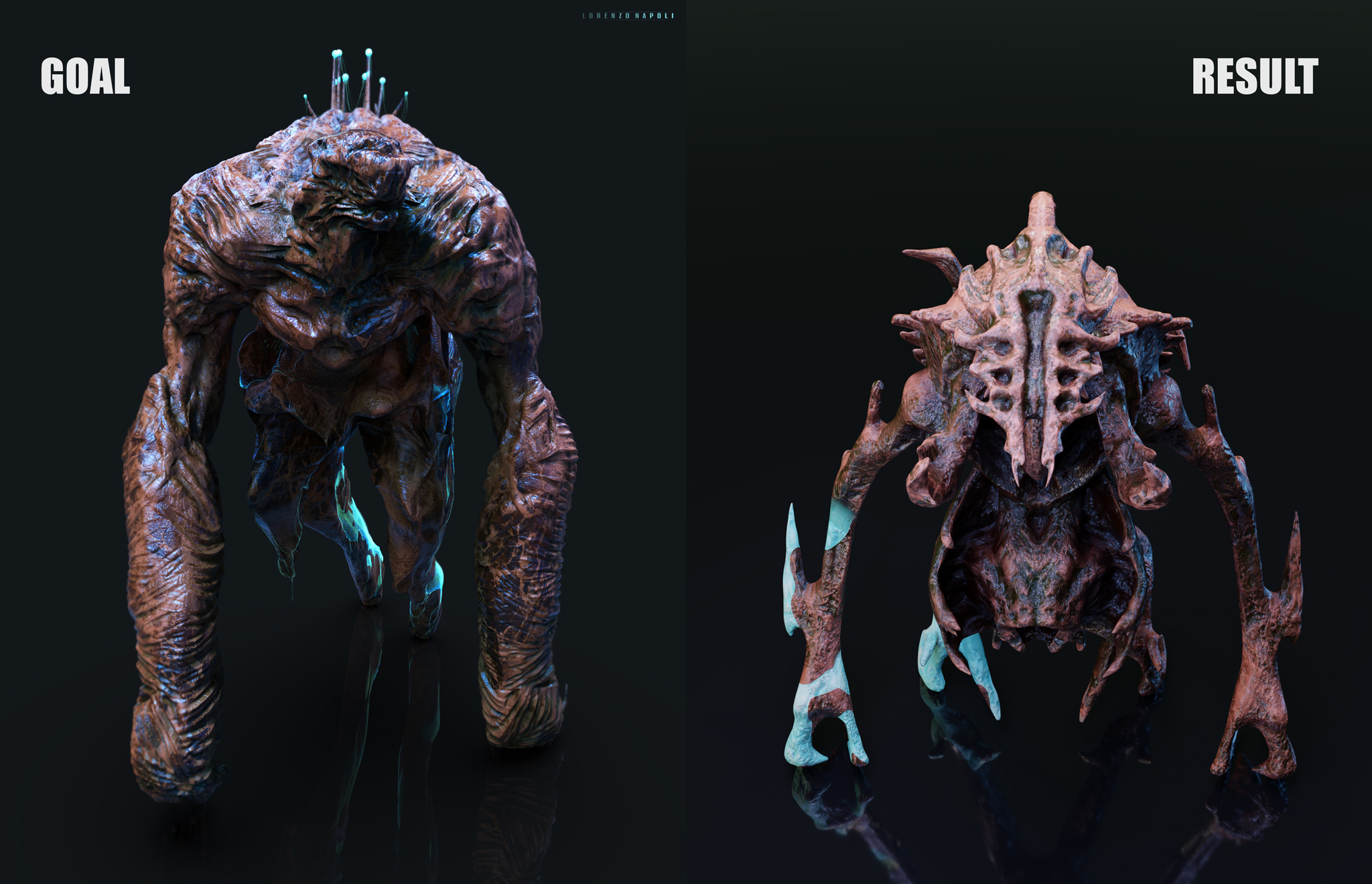
Your light match is quite close too! Though it kinda looks flipped horizontally where the warm keylight is coming from screen-right in your image but screen-left in the source. Did you flip it around by chance? Either way it's quite close. Another A from me 👍
@theluthier Thank you!
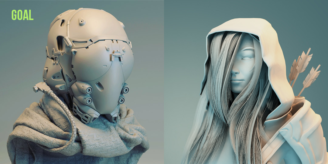
I flipped the whole light setup in my LM on purpose. In the beginning the model was oriented the same way as the goal image (looking to the left). But since the model has a lot of hair on it's left side i flipped the direction she is looking so that her face is shown. I thought i stick to the goal image with it's keylight shining on the back of the model instead of blindly following the light directions.
This time i'm super late with my homework. Somehow everything comes together in Oktober. Lots of work related stuff and local comic con (i have to help my significant other with her cosplay).
Here is my homework for week 3. I understand if i don't get any points because i didnt deliver in time. But it was important to me to get it done anyway.
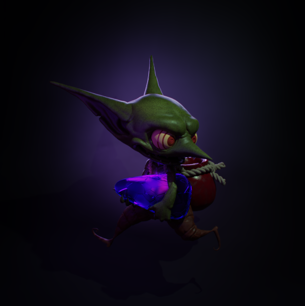
I planned to model my current DND character (A dwarf warlock) and shade it for this lesson but i soon realised that i can't finish it with the limited time i have. After a few hours i thought "Ok, lets finish on of your WIP projects for the lesson". 5 hours in i realized "Oh, the lesson is about characters. Not objects". So i dumped it and started to work on the goblin. Stupid me.
I used only procedural textures for the goblin. The skin is a mix of voronoi and 2 layers of noise for color, bump and roughness. I also used an inverted AO for SSS.
The nice texture on the stone is done with a voronoi node.
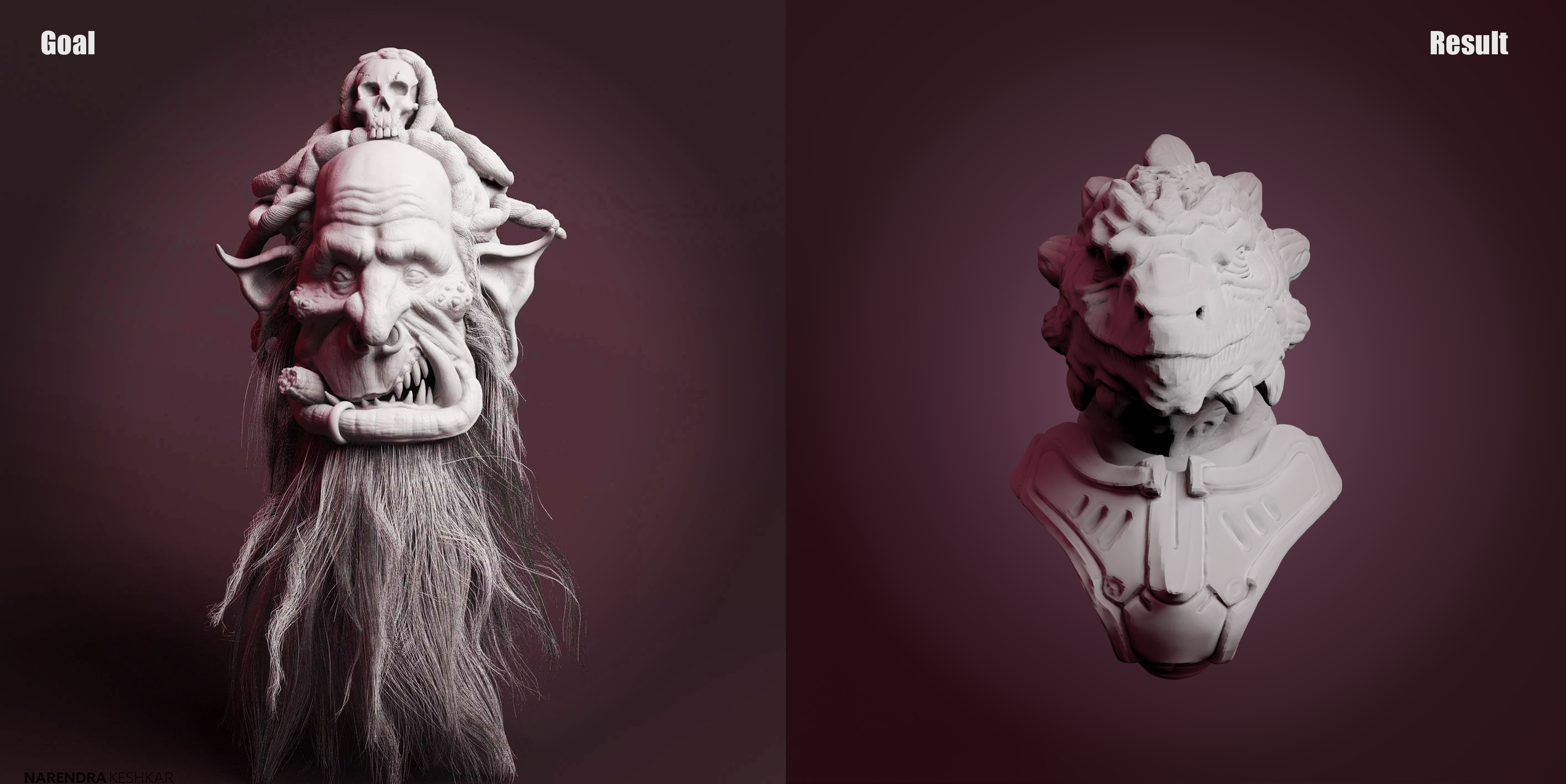
I had a hard time with the LM this time. The other two LM's in the previos weeks were quite easy.
I couldn't figure out how to get the dark shadow in the lower left corner without adding to much light to the background.
I have a redish/purple environment light, an almost white key light and a spotlight for the circle in the background. The spotlight has a slight red tint.
The model is from Davyd Vidiger
The inspiration comes from Narendra Keshkar
I Should have waited a little before posting. When i look at the pictures i see a lot of mistakes. The goblin is way to dark (may needs a fill light)
And the LM is way of. The white in the reference image is way stronger and the background has a slight pink/purple tint
sslemgrim if you're fast you can upload an improved version before Kent grades you, it's only 07:15 am now in the US so he's probably just waking up 😉