Your exercises look good. Not much to critique on those. Looking forward to what you can do next!
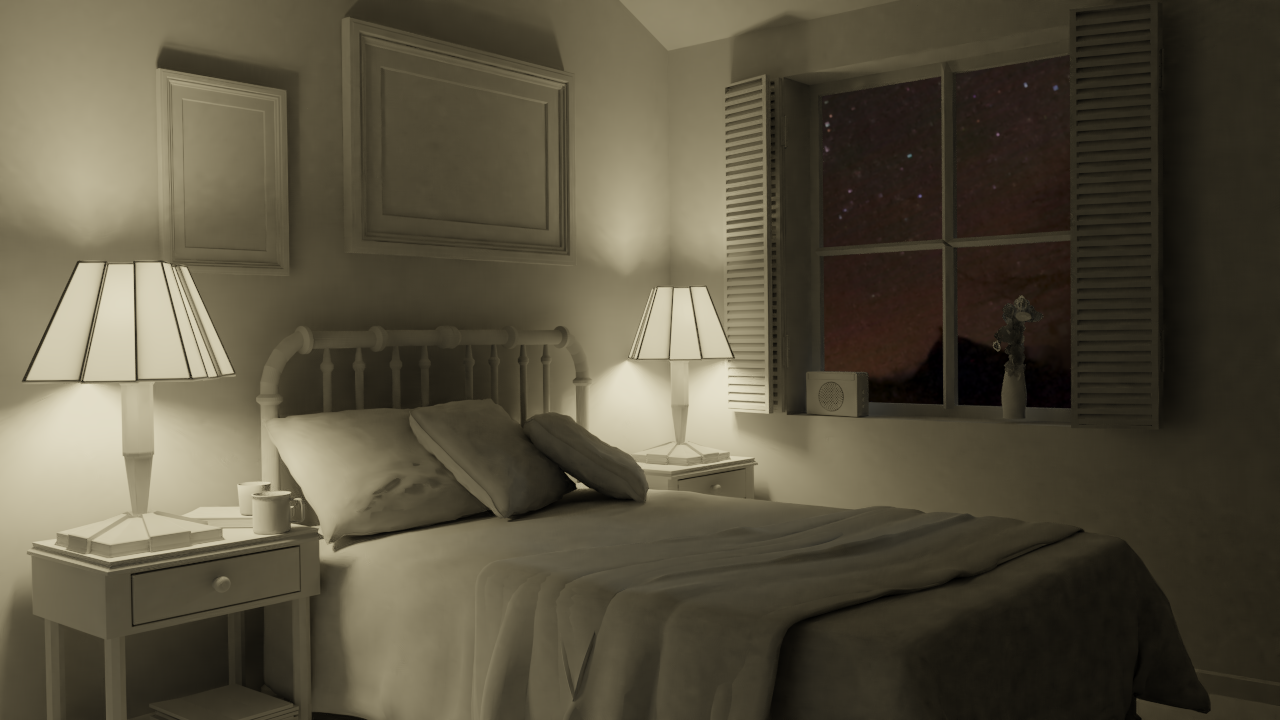
ttomaslapes Looking good, especially the nighttime render! Nice touch with the HDRI, feel like I recognise it, you a HDRIHaven peruser as well? Haha
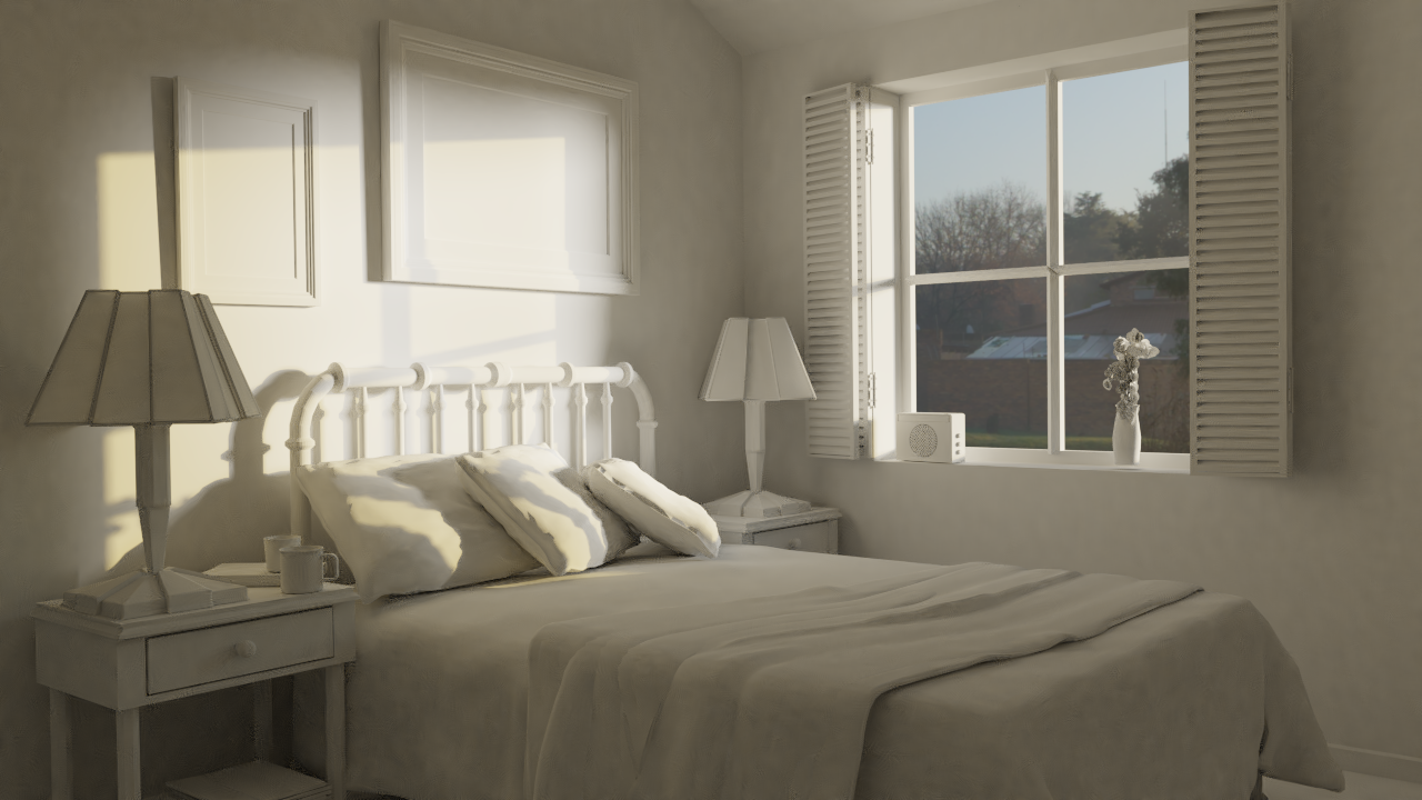
Nice job on the exercises ttomaslapes! The toy truck looks very nice - very plastic, very toy. The lighting in both the day and night scenes feels good but there's a lot of rendering artifacts.
It looks like denoising is overworked with too few samples. A couple questions:
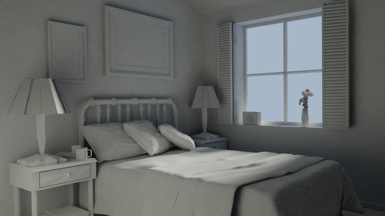
@theluthier Hi I used the default settings which came with the file. I unfortunately lost the original file so I recreated it.
I am really looking forward to this class. Shading,texturing and lightning are areas where I still struggle a bit.
Tomas
ttomaslapes Bummer about the lost file! The new scene looks nice, but the image is weirdly mottled, like maybe there was some lossy compression? It's nice otherwise.
![]() silentheart00 Thanks!
silentheart00 Thanks!
I think it is because the denoising because even at a 1000 samples it did not render without noise. Probably because of the 8k HDRI.
Is there any solution to this other than to increase the sample count?
Nice work. Sad you lost the file but good work with the second daytime render. The nighttime is my fave one trough
ttomaslapes I love the new daytime lighting! It's unique from most of the submissions I see. A distinctly yellower tone; feels like a golden sunrise.
Increasing your sample count is unfortunately the best way to clear up the splotchiness. I'm going to try and dig into the denoising settings in preparation for week 4. It's possible that messaging those parameters could help with the splotchiness without increasing samples.
Tomas Lapes: Good work. I like how you use hdri to give the impresion of the world outside the window.
ttomaslapes Like Kent said, probably not without increasing the samples. I'll take a look into lighting settings when I can.
ttomaslapes I think they're both good choices. Each has different colors of light which will be fun trying to match, so go with the one you like the most 😊👍🏻
ttomaslapes I agree with ssmurfmier1985 .. In fact.. the one on the right was the one I used on my second attempt.
My result:
ORIGINAL:
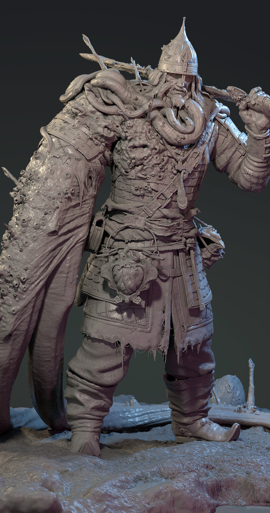
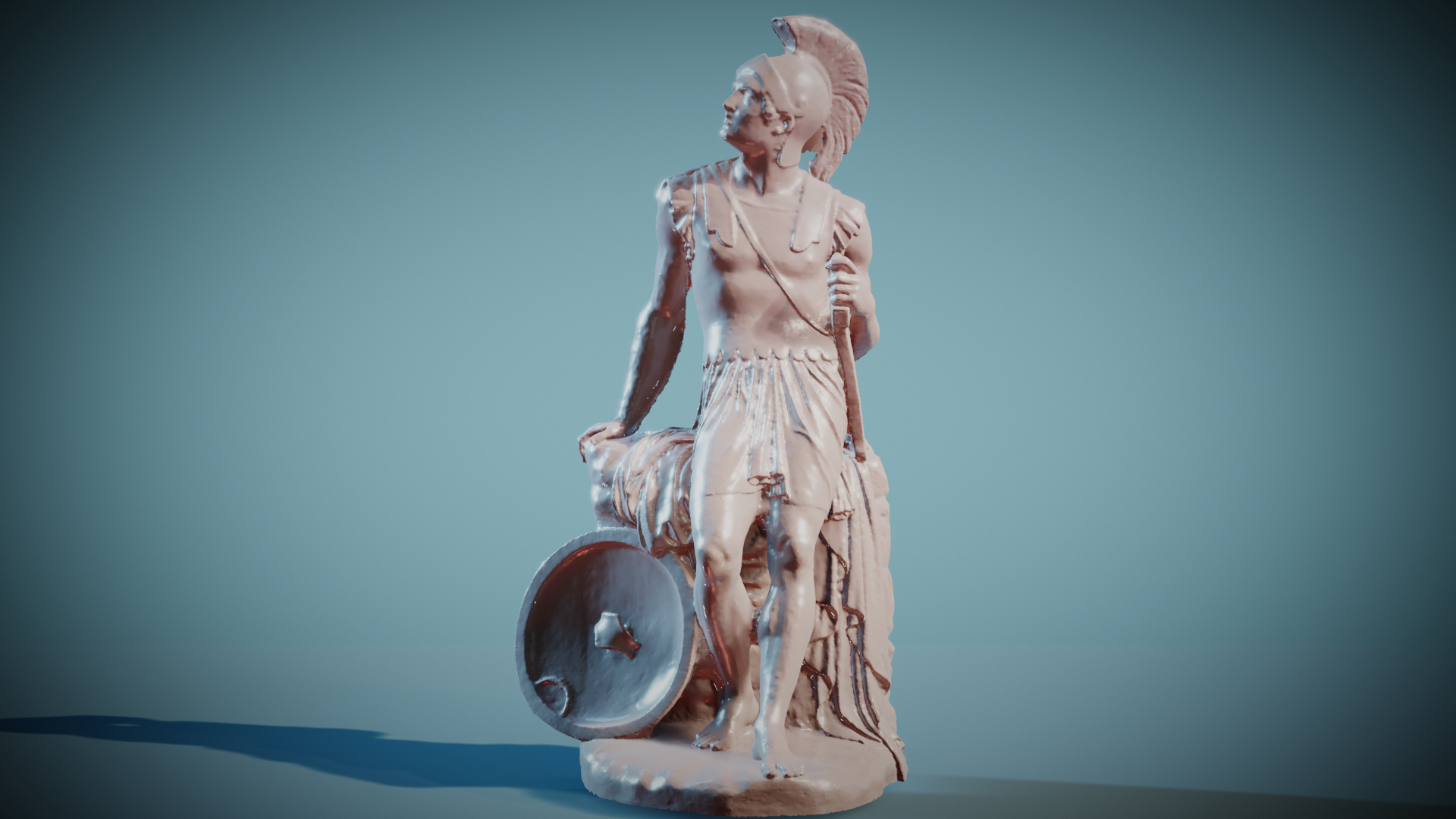
Hi, this is my submission to the light match exercise.
What do you think?Credit for the model: Geoffrey Marchal
ttomaslapes Great choice for light match. It's a very strong character presentation. You also picked a good model for matching.
Overall it's a good job matching - certainly in the right direction. A few notes:
Still it's a good effort in the right direction. It's a B in my book for this part of the homework.
@theluthier Hi,
what type of lamps should I use? In my result, I used sunlamps because I find area lamps hard to work with.