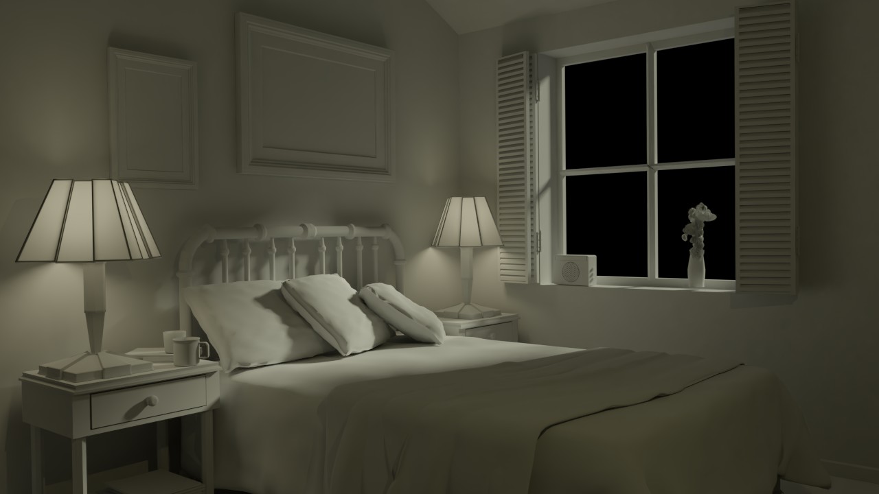
Bedroom day.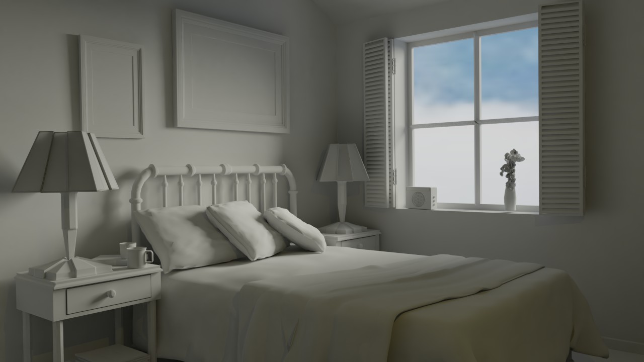 Bedroom night. I have imagined myself that the moon shines through the windows iluminating some of the bed, hence the sharp shadows on the pillows.
 Week one homwork Toytruck.
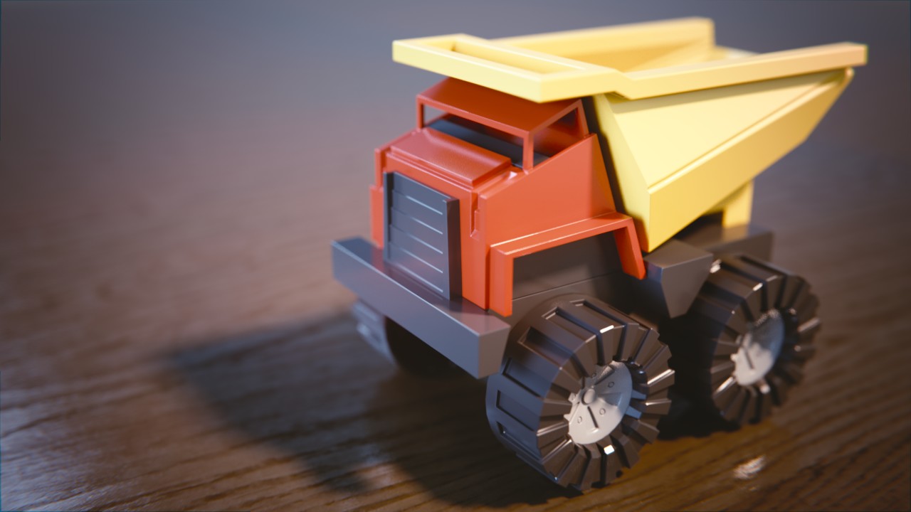 Link to exercise submision: https://www.cgcookie.com/exercise/shading-a-toy-truck/exercise_submissions/16525
Due to technical issues i cant submit the bedroom exercise in the submission section. I hope its suficient to leave it here only.
Looks good. The colors are maybe a bit desaturated for a kid's toy, but the shaders are good.
I had to do some last minute changes when i realised how bluish the day render of the bedroom was. I am more satisfied with the dayrender i replaced it with.
@theluthier Yes i do, its probably another methof with gimp. I tried with Krita as well?
@theluthier Finally figurd it out. Here is my homework submision. You can also see the images in a larger version on top of the thread.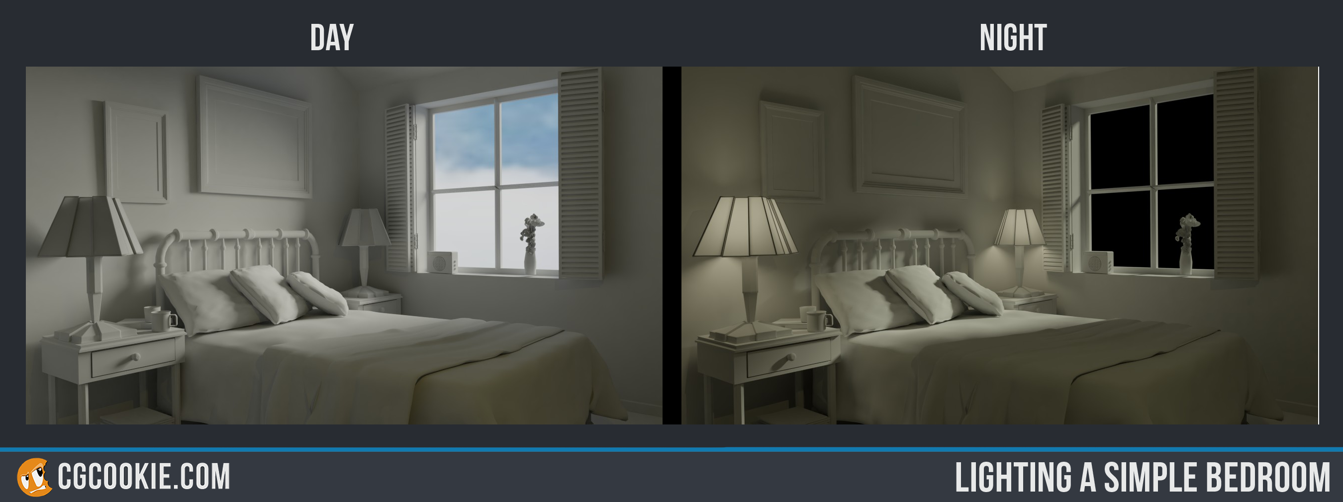
aarev Glad to see you figured it out! Good job too. I've got a couple notes:
While the environment texture in the window matches the lighting well, it kinda looks like the room is in a floating house. Or in heaven. Maybe that's what you're going for, but if not I'd recommend a texture that shows a little bit of terrain as well.
In both the night and day scenes the colors are a little muted. I suggest you get more blue into the shadows of the day scene, a little more warmth (orangy-yellow) in the sun light, and more orangy-yellow in the lamps of the night scene.
Still it's good work this week. Certainly worthy of an A 👍
aarev Hey, you figured it out! I agree with Kent's critique. Otherwise, good work.
Yeah, the colour of the lighting was an isue through the whole lighting for me. The day image i had originally uploaded was extremly blue. I was using f.lux, a program that reduces blue light from the screen to make it less hard for your eyes.
aarev Ah, yes, good old f.lux. Gotta watch out for that lol. But hey, you got it done.
This is my submission for week 2. Both homework submissions are odne in eevee.
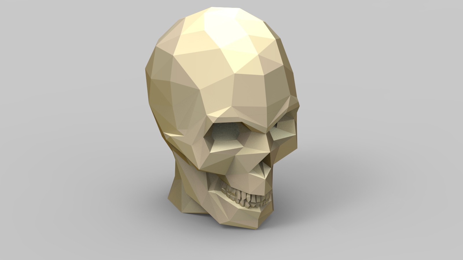
Vehicle.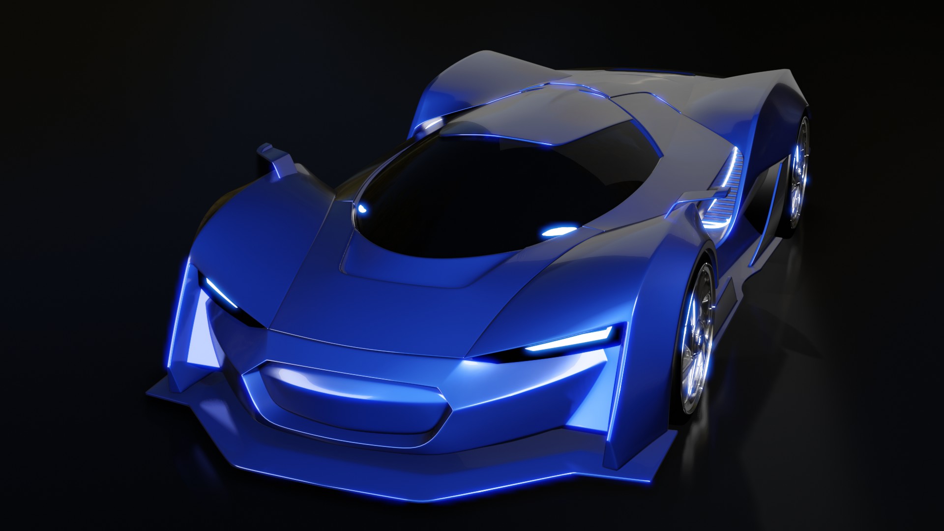 This is my lighting match. I tried to match this render of a skull.
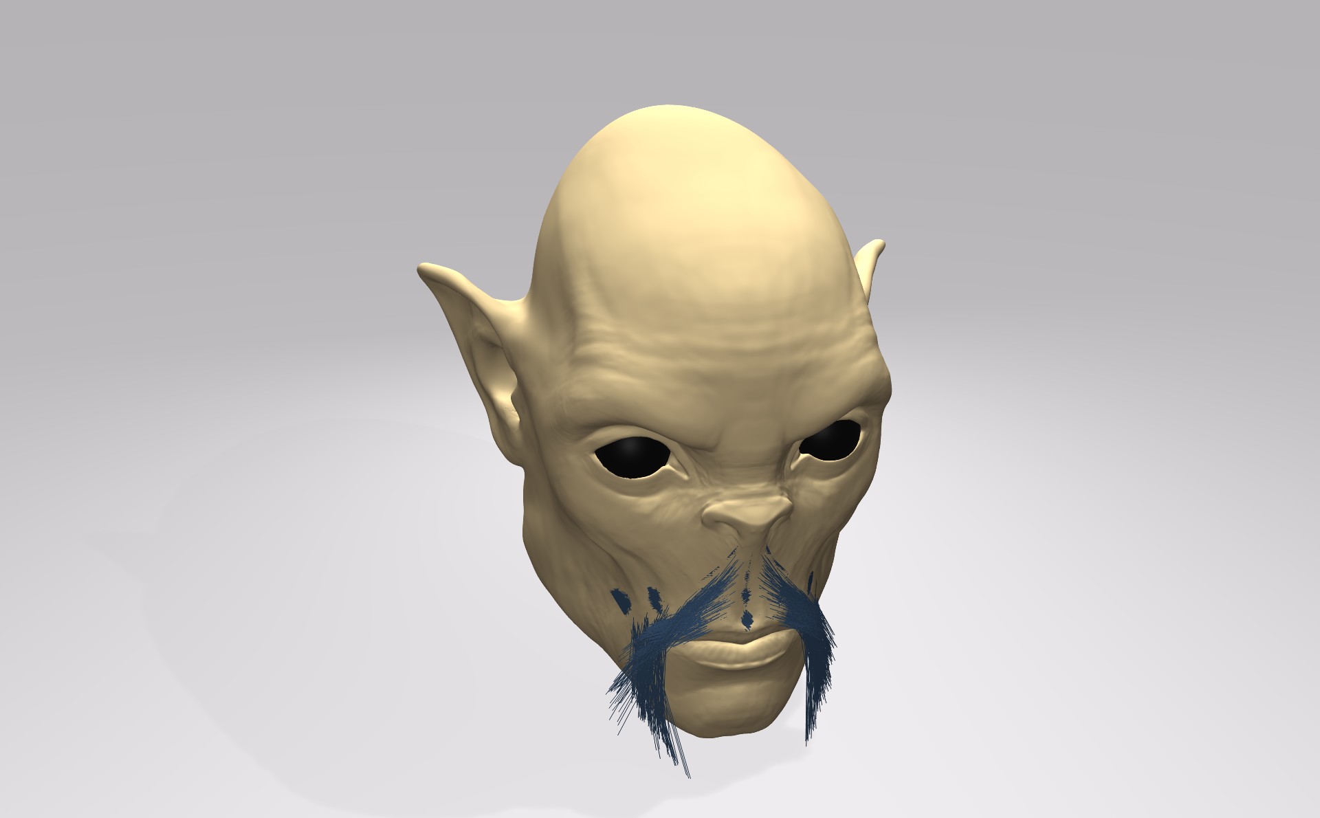
 Here is my render of a face.
aarev That car is beautiful, presumably there could be some critiques as the paint has a kind of light weight or plastic kind of feeling, but the render is in harmony so who cares, I like it, also the reflections on the ground very much
aarev Looks pretty good. I agree the car paint is kind of creeping into plastic territory, but it's good work. The match looks pretty good, too.
Zsolt Cseh: I could probably have cranked up the metalic abit. I ran out of time though.
aarev Your car paint looks really nice! Something about it and the lighting is working great. Good job 👍
With the light match your certainly pretty close. The biggest difference to me is your head seems to be floating and lacking contact shadows with the ground the way the skull is. This suggests ambient occlusion isn't enabled, which would also help with contact shadows across the entire model.
Unfortunately the source render isn't that great in my opinion. Not really one to emulate. Still it's a B from.
@theluthier Ambient oclusion was enabled, not sure why the efect didnt show. Maybe the rest of the lighting was weakening it?
This weeks homework didnt go very well. I had setup the hole scene and everything looked to be going the right way, then the render turned out quite diferent than in the wievport. The render has a very redish colour and does not look anywhere near what i was trying to achieve. Rooting out this problem took most of the time, i had only time for some simple shading. Despite asking for help on several sites i was unsucessfull rooting out the problem. This is my submision for week 3.