Week #1 Homework Submission:
Here is the truck. Tried to give it a little wear. Couldn't quite get the wear where I wanted it (ha, wear where...), but I was more or less happy with the result. Blender crashed several times while shading this, and I'm not sure if that is something I am doing wrong or my computer just having trouble. I feel like it should be able to handle a scene like this real easily, but sometimes when I make adjustments with the sliders it just crashes.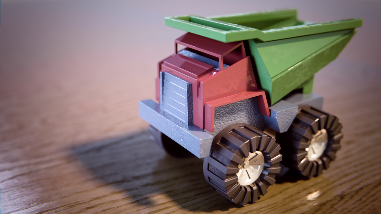
I had done this one before (over two years ago) when I first started doing CG, but I mulliganed it for the class. I am not sure the result changed that much, but I sure understood a lot more of what I was doing :)
pprocyonlotor Lovely day and night scene. There's not much I can critique there.
The bumping on the truck chasis (light grey) looks wrong. Something about that doesn't really sit right with me. Maybe it's too extreme of a bump? I like it on the cab and the bucket(?) Maybe the treads could use some wear and tear, too. I see it's between the treads, but maybe it could creep up into the treads a bit.
Sorry to hear about the crashing issues. Hopefully you can pin that down and fix it.
![]() silentheart00 thanks for the critique. I did that bumpy plastic material because I feel like I remember it being on many of my toys as a kid, though now that you call me on it, no particular toy comes to mind. It is a pretty strong bump, but I feel like it pretty well represents what I was going for. The wear on the tire treads did give me trouble. I tried to get a gradient from the pointiness node and use it as a factor for the grime texture, but I couldn't seem to get the settings right. It was either just in the crannies or all over with no real gradient either way. I even tried multiplying a fresnel value over top to get a more even grade, but it still didn't turn out how I wanted. In the end I decided to go ahead and render it out before things crashed again.
silentheart00 thanks for the critique. I did that bumpy plastic material because I feel like I remember it being on many of my toys as a kid, though now that you call me on it, no particular toy comes to mind. It is a pretty strong bump, but I feel like it pretty well represents what I was going for. The wear on the tire treads did give me trouble. I tried to get a gradient from the pointiness node and use it as a factor for the grime texture, but I couldn't seem to get the settings right. It was either just in the crannies or all over with no real gradient either way. I even tried multiplying a fresnel value over top to get a more even grade, but it still didn't turn out how I wanted. In the end I decided to go ahead and render it out before things crashed again.
pprocyonlotor Man that sucks aboit your crashing computer.. hope it holds up better the rest of the class. I like that you tried something special with the truck to give it more character. Good work!
pprocyonlotor Alright, if that's what you were going for, then cool. Hopefully you can get that crash thing sorted out.
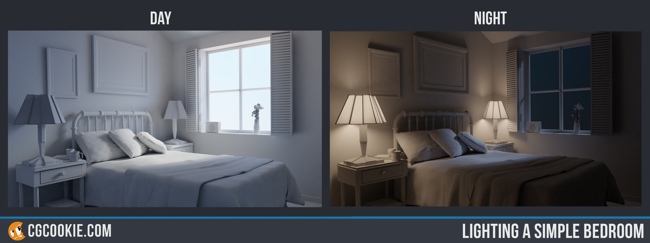
pprocyonlotor Very nice lighting exercise. Wonderful night-time-scene. I can almost feel the cold winter night.
Great effort with the truck as well. I would tune the fill light a little bit down, but that might be personal preference.
pprocyonlotor Nice! I feel the bumps on the "chassis" of the toy truck are a bit too extreme, but the initiative is well appreciated, and the smudges on the wheels are a great touch. Nice work on the lighting exercise too, especially like the nighttime one, with how the different coloured lights clash.
pprocyonlotor I've nothing but good things to say about your day and night scene! Day time feels like a completely believable sunny day and the night time has a lovely contrast between warm lamplight and cool moonlight. One of the best I've seen.
I agree with the general consensus about the truck's wear and tear: A good effort but also off the mark a touch. The bump on the chassis is too strong and the texture plugged into the plastic glossiness is too contrasted, making for spots of very reflective next to spots of barely reflective. I like the idea on the breakup but just a bit extreme.
Still I really like the effort to go above and beyond by incorporating wear and tear. It's an A this week, easily.
Homework Submission Week 2 Pt. 1:
This was the first time I tried 2.8, and it took me awhile to get the hang of it, but I was SUPER impressed with Eevee!! Excited for the software to be fully polished. I used Kent's model since I bailed on the vehicle class (sad face) and did a little touch up on the image in PS, but Eevee did all the heavy lifting.
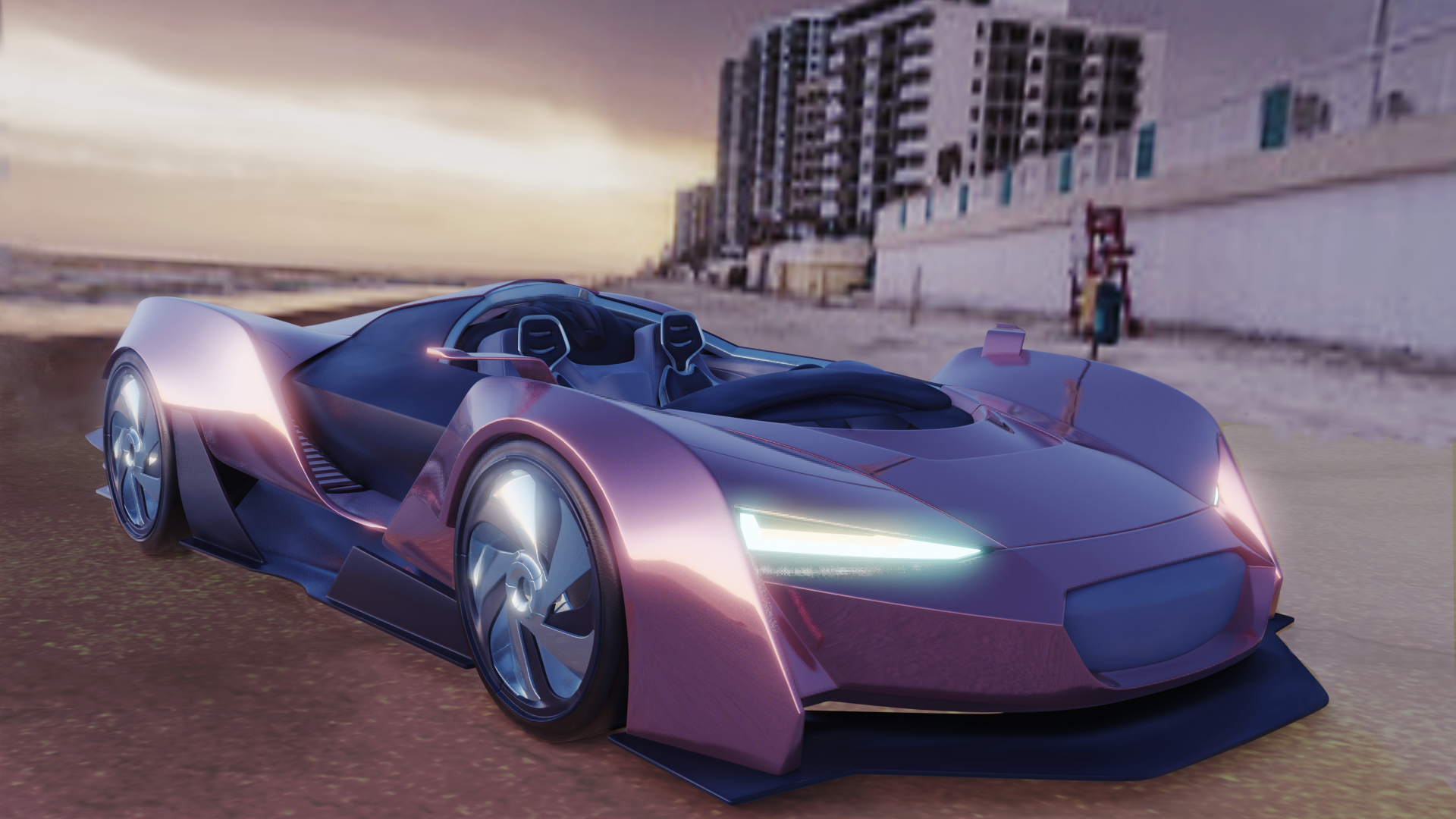
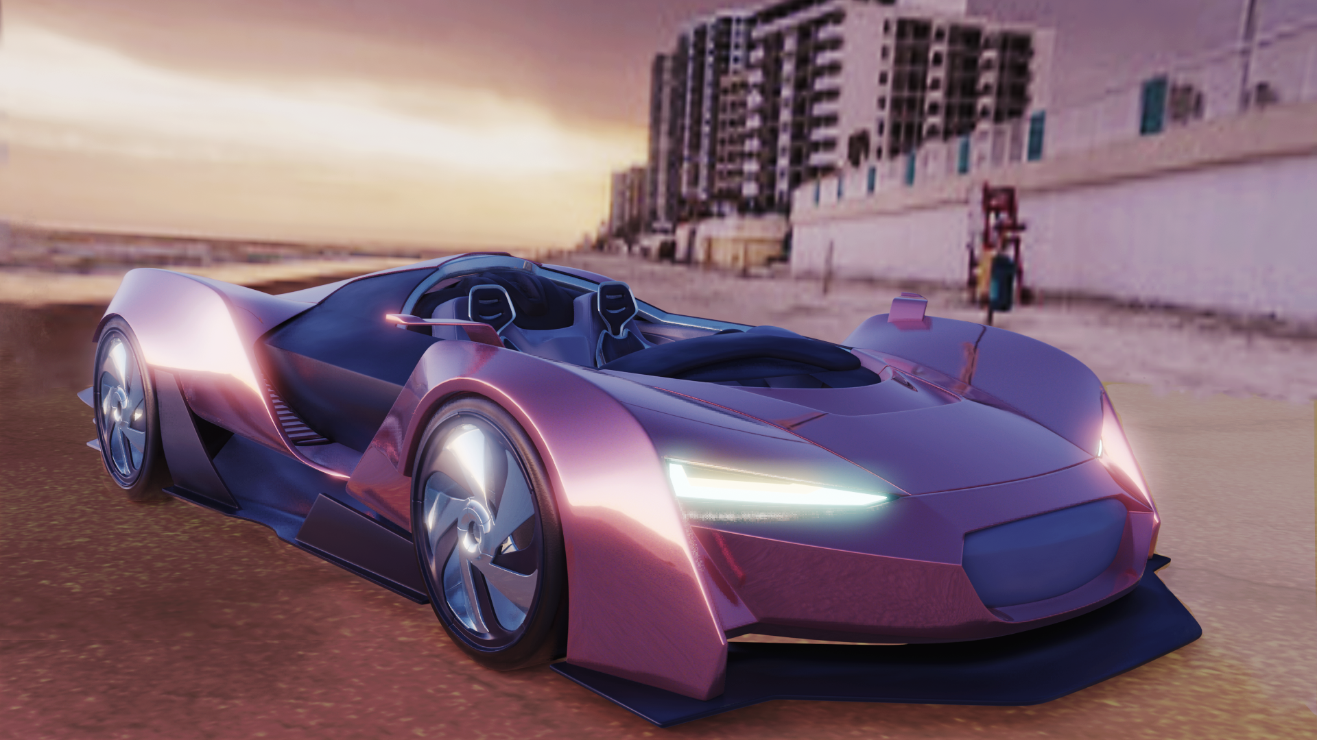 So I normally keep the red shift on my computer screen cause its easier on my eyes, but sometimes I forget to turn it off when I'm color grading images. Here is the image with a bit more red and saturation which is what I thought I was submitting last night.
pprocyonlotor Both look great, but I do like the more intense color on the second one. It's a really nice colored metal shader. Could you post some shots of the interior, too? I'd like to see your work in there as well.
pprocyonlotor This car looks nice! The colors make it something unique, beautiful. Love the second one the most. Great job! 😄
Homework Submission Week 2 Pt 2:
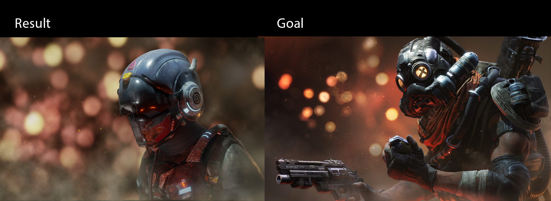
I grabbed my light match from fellow cookie user ![]() tommywright at this link. And credit to polish farmer for his model on sketchfab here. I had to do the dust in photoshop cause I don't really understand volumetrics (it shows, I know), and the picture didn't look at all similar without it, but the lighting was done entirely in Blender. I did remember to turn the redshift off this time though :) I had trouble getting the same harsh lighting on top, but I couldn't tell how much of that was my fault and how much was just geometry; since the helmet is pretty smooth I couldn't seem to get the same contrast up there as the goal photo. The red glow presented a similar problem though to a lesser degree. Here is the final result. Let me know what you think:
tommywright at this link. And credit to polish farmer for his model on sketchfab here. I had to do the dust in photoshop cause I don't really understand volumetrics (it shows, I know), and the picture didn't look at all similar without it, but the lighting was done entirely in Blender. I did remember to turn the redshift off this time though :) I had trouble getting the same harsh lighting on top, but I couldn't tell how much of that was my fault and how much was just geometry; since the helmet is pretty smooth I couldn't seem to get the same contrast up there as the goal photo. The red glow presented a similar problem though to a lesser degree. Here is the final result. Let me know what you think:
pprocyonlotor Looks great! And hey, if you can fake it, then no problem there. It looks like 2 images from the same artist. Good work.
![]() silentheart00 Thanks silentheart00! You and Miranda are doing a fantastic job of keeping up with everyone, so kudos to you guys! I did not save the blend file I'm afraid so shots of the interior will not be coming, but it wouldn't be terribly impressive if you were to see what it was as I didn't plan on it being in the render. It was just a few materials similar to what is on the outside (with one color changed to blue to complement the red) haphazardly scattered on the various objects.
silentheart00 Thanks silentheart00! You and Miranda are doing a fantastic job of keeping up with everyone, so kudos to you guys! I did not save the blend file I'm afraid so shots of the interior will not be coming, but it wouldn't be terribly impressive if you were to see what it was as I didn't plan on it being in the render. It was just a few materials similar to what is on the outside (with one color changed to blue to complement the red) haphazardly scattered on the various objects.
pprocyonlotor Wow that's a great light match, really close! Great solution too, you gotta use all the tools at your disposal 😊👍🏻
And thanks! Doing my best to keep up but there are sooo many classmates this time it's not easy, lol! But that's a good thing the more the merrier 😄
pprocyonlotor Beautiful recreation, borderline spot on!
pprocyonlotor Excellent work this week, John. Your sportscar render has a wonderful 80's Miami vibe going on. My only note is that the background image is way too low resolution. It's pixelating hard agains the crispness of the car. Along that line the ground/sand texture is noticeably low res too. But considering my notes are on secondary elements, that's a compliment to the main attraction - that car 👌
And WOW how about that lighting match! Complete with textures even. BTW textures were not expected but if you hadn't I think it would have hurt the comparison. So way to go the extra mile. What can I say....You nailed it! Beautiful job 👏