Did a quick review after the stream to solidify some of the ideas, and here is the result. Hopefully it will help me improve in the next iteration. The character is one I have been modeling for the last couple of week's following ![]() pieriko 's course. He still has bit more left to model, then one last sculpt pass for the details, but I am hoping to get all that done this week in time to texture, shade and light him for the homework. Let me know what you think.
pieriko 's course. He still has bit more left to model, then one last sculpt pass for the details, but I am hoping to get all that done this week in time to texture, shade and light him for the homework. Let me know what you think. 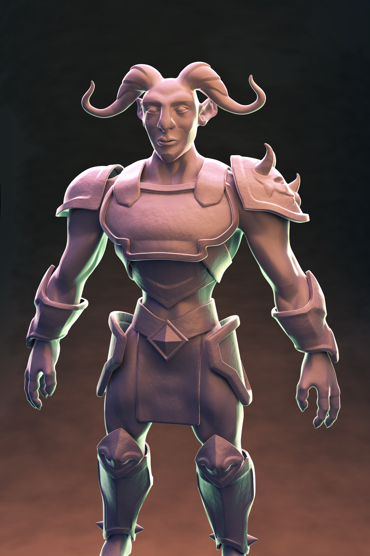
Week 3 Homework Sumbission:
Time got away from me this week, and after a few surprise plans on the weekend, I didn't get as much done as I was hoping. Here are my submissions, along with apologies for their tardiness. Both were a bit of a struggle this week and I'm not super pleased with the results, particularly the light match: I spent several hours and was never able to really get the same feel. Light match reference from here. Feedback welcome!
Light match:
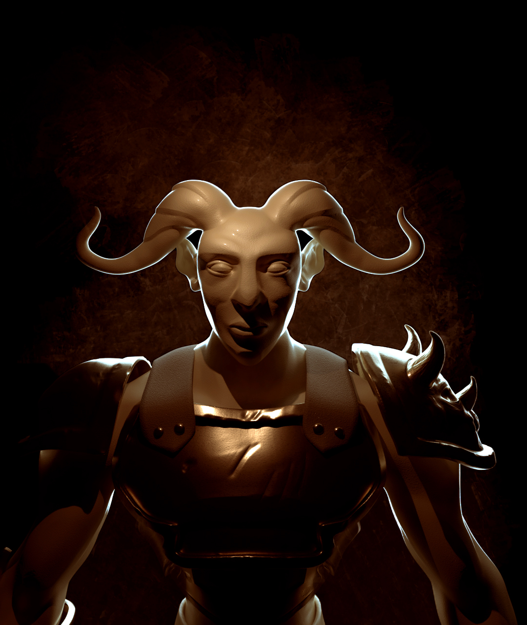
Character (I was going for dramatic; sure does reveal my shortcomings in modelling):
pprocyonlotor Your light match was among my faves this week. It's very close to the source in terms of S&L. My only note is the lack of a ground plane + smooth transition to background. I talked about it more during the stream. Recording will be available soon.
Overall it's a B+ from me.
You really nailed the sharp rim light in your character lighting - especially the head. While I like the dramatic direction, I do think the darks are too dark. Or rather where it gets really dark it disappears into the background. This issue is most noticeable on the character's right arm (screen left). I'd recommend brightening the background to remedy this or add a touch of fill light to the character via low-powered HDRI environment.
Another B+ from me 👍
Homework WIP:
Here is what I have come up with so far. Let me hear your critiques. Thanks.
Cycles; 2000 samples; 128 bounces; had to crank the HDRI strength to 3.
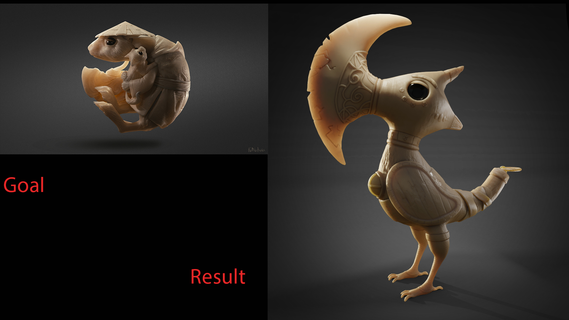
Light match WIP:
Really wanted to challenge myself since this is the last week. I thought this model by Kasia Mikułowska was well lit, and had a very cool jade-like material. I tried to accomplish the same effect with SSS (not sure if that's really the best way to do it). Subsurf is something I haven't really played with much and I only have a rudimentary understanding of how it works. Please tell me all your ideas, even if its chucking out SSS altogether and going another route.
Kudos to lizzykoopa at sketchfab for the "Battle Beak" model. It was the best fit I could find for this challenge.
Homework Submission Week 4:
Here they are, unaltered from my earlier posts. Been aiming to get my pumpkin done for next week!


pprocyonlotor High quality work this week! Especially love the light match, it's spot on 😄👍🏻
pprocyonlotor Whew that light match is brilliant, John! I saw that source image on artstation the other day and had to look at the maximized version to look closer at the subsurface scatter. You nailed the equivalent look. Great job. A+ from me.
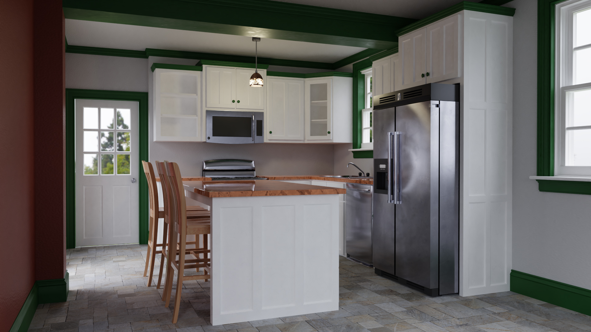
Your arch viz leaves me conflicted. You've done so much good in terms of photorealism. The stainless steal looks amazing with reflection breakup that looks believable but not grimy. Also the subtle reflection breakup of the green paint (on the ceiling beam above the light fixture) - that's a wonderful touch; wonderful attention to detail. Lighting looks good too.
However some colors and material choices confuse me. Perhaps it's just because I've never seen this color scheme before, but the blood red crimson wall and hunter green trim seem like particularly uncommon choices. It's a little jarring for me. Also the stark white matte cabinets feel unfinished/unpainted next to the bold red and green. Combine that with the honey oak countertops and chairs and it just feels unmatched. Also the stone floor is very interesting but I think would be more interesting with some subtle reflectivity + bump to it.
Since I'm mostly critiquing subjective things like paint colors and material choices, you've still earned an B+ from me. It's the best stainless steel I've seen in this kitchen scene.
pprocyonlotor Good work. I agree with the critiques. Very nice lighting match. Maybe this'll help your understanding of SSS.
pprocyonlotor +1 for that light match John, absolutely awesome, I would say better than the reference so you achieved 100% + 10% :-)
Also the kithen is very good, somehow it gives reality to it, that the sun is not always shining. Maybe the 'air' is too clean inside, but as we can see also in other's post, that small magic is the hardest to reproduce in architecture vizualisations
![]() csehz Thanks! I appreciate the comment, and yes, I think the right amount of atmosphere/fog/dust is one of the hardest things to capture in any "clean" render.
csehz Thanks! I appreciate the comment, and yes, I think the right amount of atmosphere/fog/dust is one of the hardest things to capture in any "clean" render.
![]() silentheart00 Thanks for the link. It covers the rudimentary info I was talking about. What I don't have much sense of is what the radius settings are doing under the hood. For this render I played with them a bit. I got some really interesting banding in the light that was an appealing effect, but didn't in any way match what I was attempting. I may check out those links at the bottom later though, even though they aren't for Blender.
silentheart00 Thanks for the link. It covers the rudimentary info I was talking about. What I don't have much sense of is what the radius settings are doing under the hood. For this render I played with them a bit. I got some really interesting banding in the light that was an appealing effect, but didn't in any way match what I was attempting. I may check out those links at the bottom later though, even though they aren't for Blender.
@theluthier Ha. As I told Katerina, I have no knowledge of interior design. The colors looked fine to me, but it's entirely possible that any designer anywhere would unanimously agree they are awful. I picked them somewhat arbitrarily, so I will be sure to do some research next time and mimic someone else's color scheme.