week 3 Melvin https://skfb.ly/6AX87
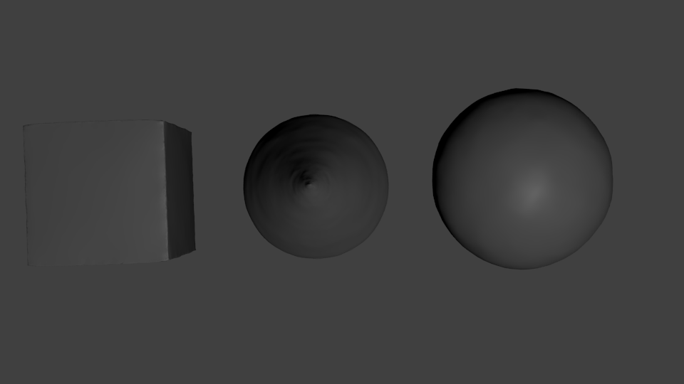
week3 primitives


and skulpt:
Link: https://skfb.ly/6AXNy

Week 4 homework:

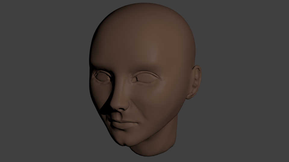
![]() dragonice69 for eyes it's easier to just put separate spheres on it and sculpt around. Good work so far. And with a mouse, wow.
dragonice69 for eyes it's easier to just put separate spheres on it and sculpt around. Good work so far. And with a mouse, wow.
![]() dragonice69 Good work! I agree with Pavel; make the eyeball a sphere and sculpt the lids around it. Easier that way.
dragonice69 Good work! I agree with Pavel; make the eyeball a sphere and sculpt the lids around it. Easier that way.
I agree with ![]() nekronavt and
nekronavt and ![]() silentheart00 ... Use spheres as a sculpting Target.
silentheart00 ... Use spheres as a sculpting Target.
As for your sculpt, it looks great! the one thing bugging me... It seems you're going for a more realistic head, in which case I think the ear is a little far back. I think the front edge of the ear should be closer to the middle of the head instead of so far back.
![]() gradyp Oh. Ok thx good tip. I'm not the best with proportions still ;p
gradyp Oh. Ok thx good tip. I'm not the best with proportions still ;p
![]() dragonice69 The fact you attempted this with a mouse is very, very brave. You pulled it off pretty well too, so good work!
dragonice69 The fact you attempted this with a mouse is very, very brave. You pulled it off pretty well too, so good work!
To echo some comments being thrown around here, making the eyes a separate mesh is much better than carving them into the sculpt in my opinion. I usually use the crease brush, set it to subtract, enable smooth stroke and "draw" an outline for my eye, then use the inflation brush (set to deflate) to hollow out the sockets. You can then use other brushes like pinch and crease to tighten it up.
![]() dragonice69 My apologies for the late reply - I've been a grading hurricane this morning 🌪
dragonice69 My apologies for the late reply - I've been a grading hurricane this morning 🌪
Solid work with your face sculpt! The mouth and nose are formed very well, which is great considering those are areas that often fall short. The eyes can use some more time but it's a good start. A general feeling I get is that the face is overall a bit flat, where it looks good from the front but breaks down from the side. Often this happens when using front and side photo reference to guide modeling/sculpting, where there's too much favoring how the sculpt lines up with the photos and not enough favoring of 3D interpretation. It's one of the more difficult parts of accurate face sculpting and likeness achievement.
Still, I'm not grading at that level - You've more than accomplished the assignment this week. It's an A+ in my book 👏
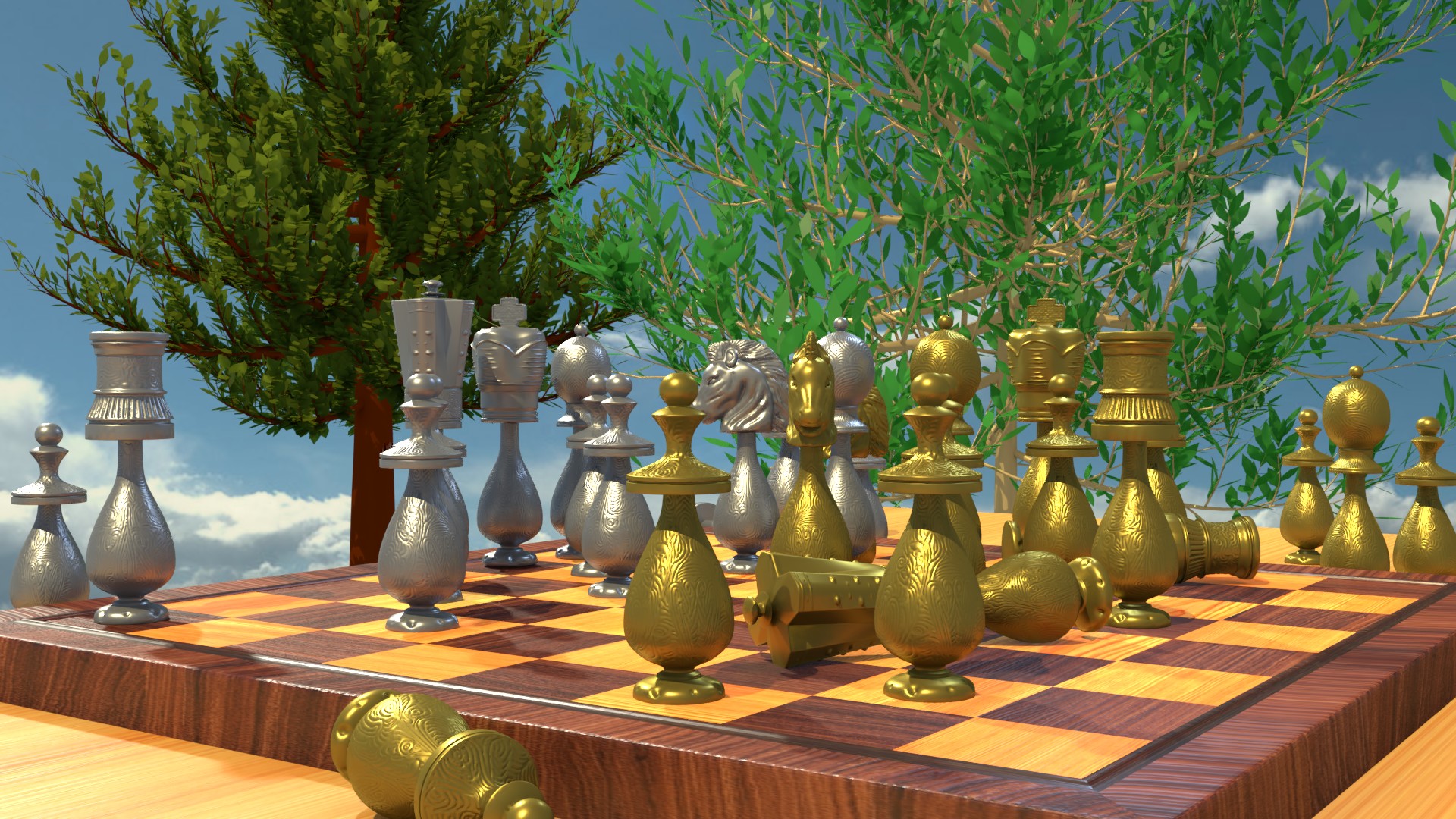
![]() dragonice69 What a good idea is that for Week4 with the chess set, I am also planning to make once in a class. I was wondering who is lying there I think the bishop :D
dragonice69 What a good idea is that for Week4 with the chess set, I am also planning to make once in a class. I was wondering who is lying there I think the bishop :D
![]() dragonice69 Love the chess board! Very interesting, detailed design. And the wooden board material looks quite nice. It does feel a little like the board is floating higher in the air than sitting on a regular-height table. The trees in the background + no ground/terrain and only sky also contributes to the floaty feel. But besides that it's very nice; an A in my book! 👏
dragonice69 Love the chess board! Very interesting, detailed design. And the wooden board material looks quite nice. It does feel a little like the board is floating higher in the air than sitting on a regular-height table. The trees in the background + no ground/terrain and only sky also contributes to the floaty feel. But besides that it's very nice; an A in my book! 👏
Overall, I'd say great job!
Just as someone who plays a little chess.. I'd be curious to know if this position is from an actual game or if you placed the pieces more randomly.
One note, though about the pieces... Often, pawn pieces in chess sets are significantly smaller than the other back row pieces, often at about half the height of the King/Queen, which is one thing that makes them easier to distinguish between other pieces, like the bishop.
Keep up the great work!
![]() dragonice69 Ah. Ok :D From this angle, it's really hard to see the actual game position, which is why I asked :D Still, looks great :D
dragonice69 Ah. Ok :D From this angle, it's really hard to see the actual game position, which is why I asked :D Still, looks great :D
![]() gradyp Thank You so much. They don't look so great but I spent a lot of time making :)
gradyp Thank You so much. They don't look so great but I spent a lot of time making :)