week 3 Melvin https://skfb.ly/6AX87
week3 primitives

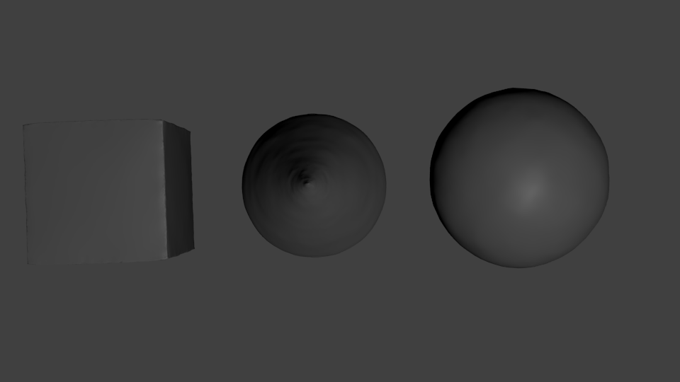
and skulpt:
Link: https://skfb.ly/6AXNy
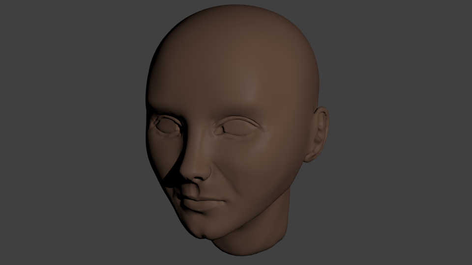
Week 4 homework:
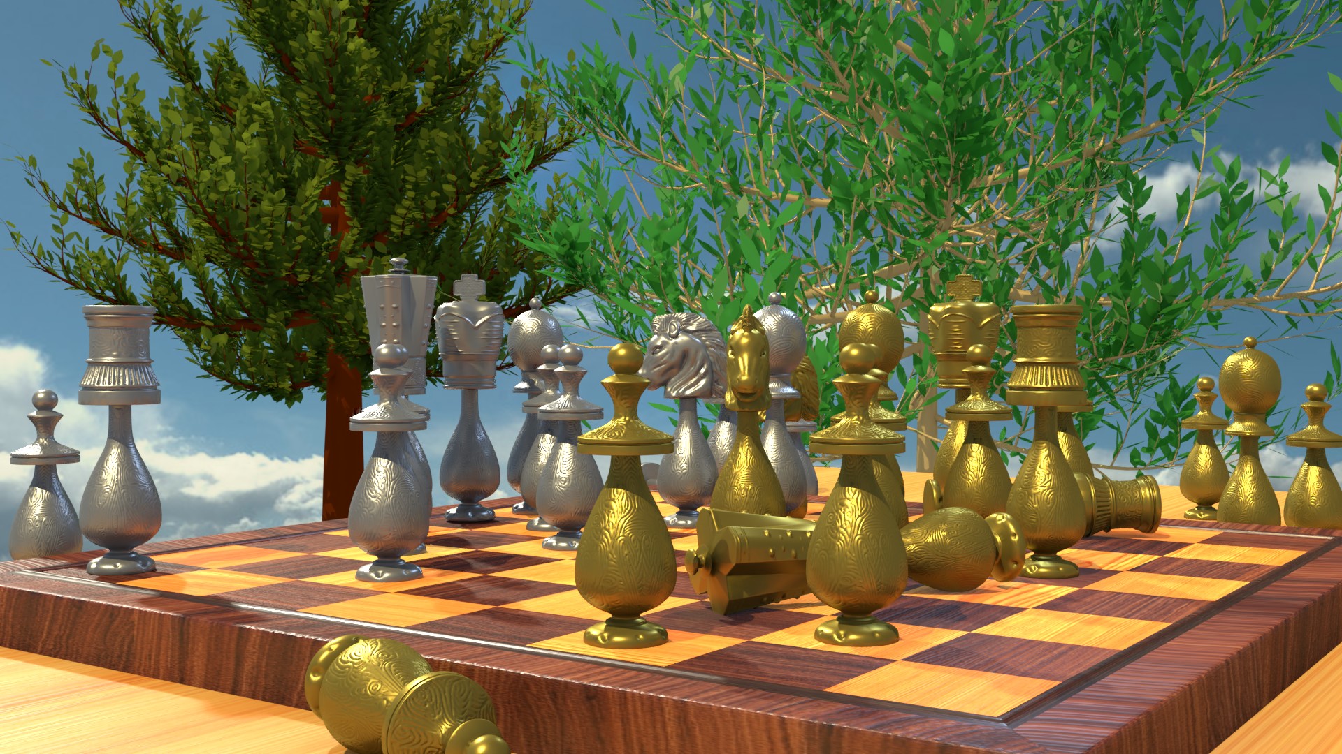
![]() dragonice69 Nice work! The lighting is really throwing me for a loop. I thought those were stairs to nowhere!
dragonice69 Nice work! The lighting is really throwing me for a loop. I thought those were stairs to nowhere!
Dragonice... a lot of putzy placement work in the railing and stairs. overall good design based on your inspiration. Nice
![]() dragonice69 That house is wild. As if Jean Luc Picard just listed it on Zillow last week.
dragonice69 That house is wild. As if Jean Luc Picard just listed it on Zillow last week.
Nice work! I had to look up "putzy" lol but I think I see what Scott means. That the placement of hand rails are oddly placed, protecting some areas and leaving other more dangerous areas wide open. Ultimately though, that's not what you're being graded on this week - just more of an FYI. It's an A from me!
Hi again. I'm so sorry for being late one more time. Please forgive me :)
I have no idea about lightnings or materials so be easy on me pls.
I've had couple issues with 2.8 for ex. needed to make a spring in 2.79 and export it then but generally as a total begginer 2.8 is way better and easier to learn.
Kisses...
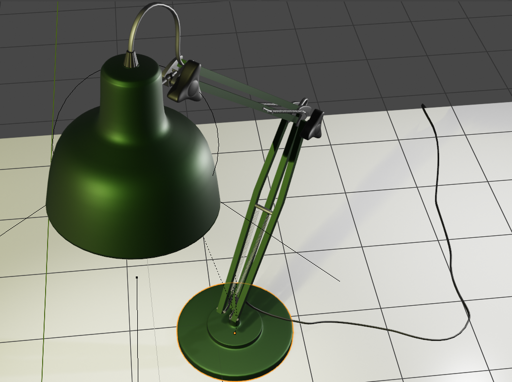
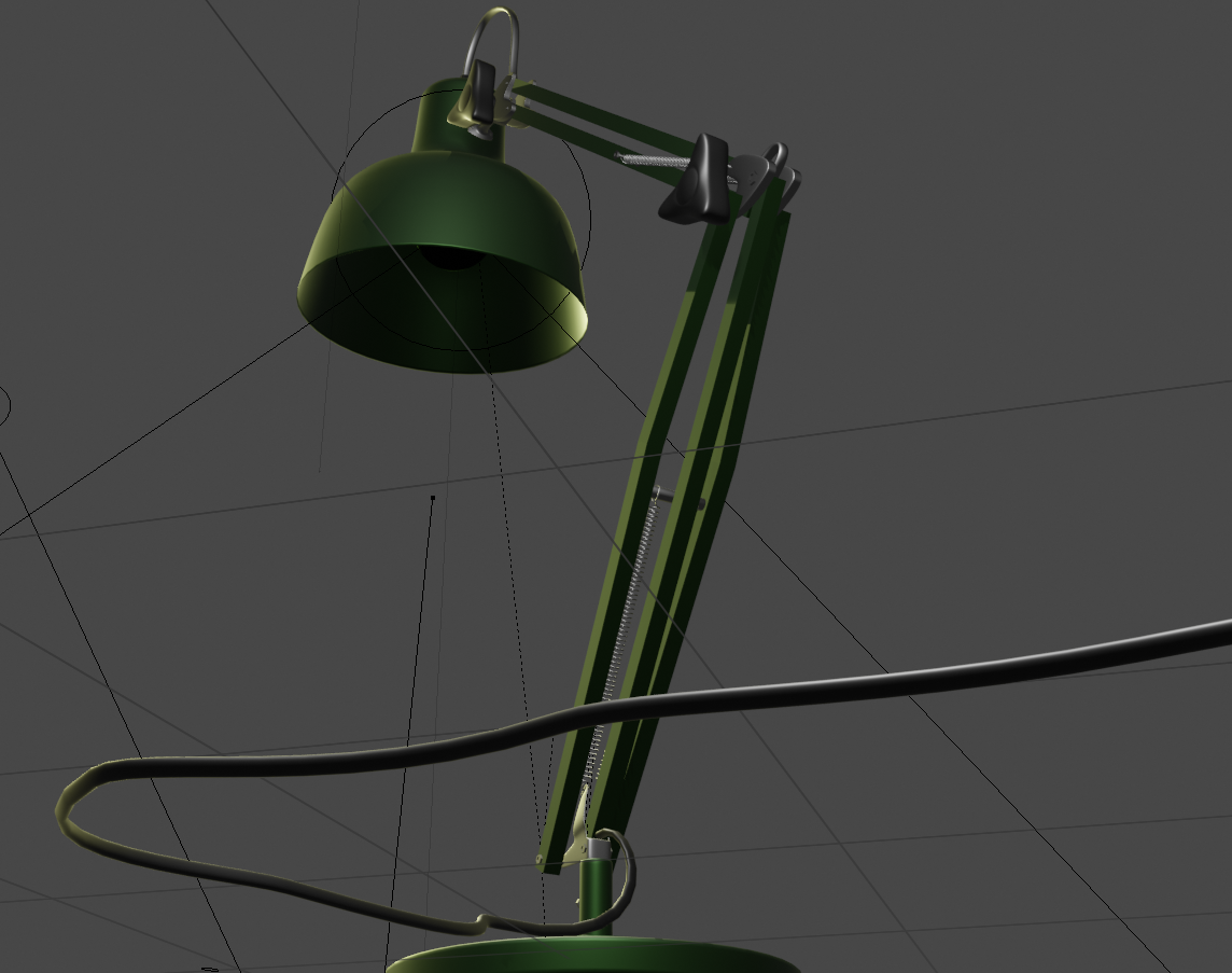
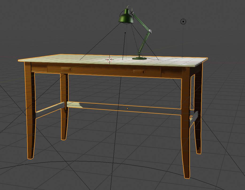
![]() dragonice69 I like that lamp very much. Nicely executed model and I can see many challenges there during the process.
dragonice69 I like that lamp very much. Nicely executed model and I can see many challenges there during the process.
![]() dragonice69 Great work with the lamp and the desk, specially liek the lamp the material looks good to me, and love all the little detials you made for it, too bad you could not get the spring to work on 2.8, personally I m also liking it quite a bit but still lacking so much stuff or just having a few problems here and there that make things a bit hard to work with
dragonice69 Great work with the lamp and the desk, specially liek the lamp the material looks good to me, and love all the little detials you made for it, too bad you could not get the spring to work on 2.8, personally I m also liking it quite a bit but still lacking so much stuff or just having a few problems here and there that make things a bit hard to work with
![]() dragonice69 I'm really liking those curves, they can be tricky to pull off convincingly, nice!
dragonice69 I'm really liking those curves, they can be tricky to pull off convincingly, nice!
![]() dragonice69 Brilliant work on the lamp + desk! Pixar's Luxo has met it's match. A+ in my book 👏
dragonice69 Brilliant work on the lamp + desk! Pixar's Luxo has met it's match. A+ in my book 👏
...but generally as a total begginer 2.8 is way better and easier to learn.
This is really interesting to hear. No doubt this is precisely much of the motivation behind 2.8's UI decisions. Easy to learn = more future users.
I just started the Fundamentals of Sculpting course and it's my first time ever with sculpting but still wanned to stay in 2.8 so much but...
mutlires is not working, when I'm on multires and click SHIFT + left click system crushes, both multires and subdivide are working very funny in object mode (I'll show some renders ((not print screens huehuehue)), CTRL + Z in object mode is eather not working at all or is cruching the system.
So I give up ;( going back to 2.79
<very sad face>
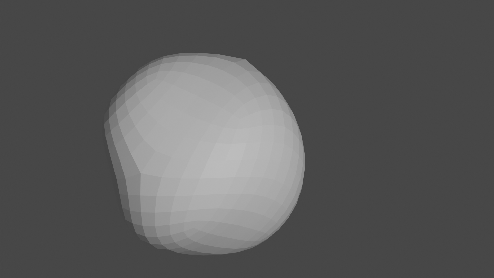
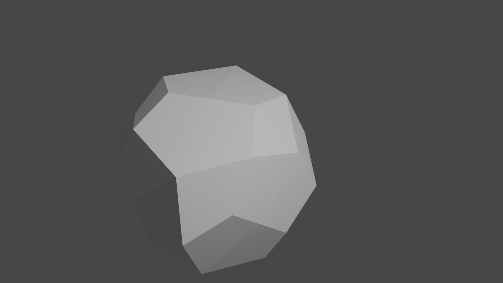
![]() dragonice69 Bummer, dude! I'd report that to the devs to at least make them aware of it if they aren't already. But hey, at least there's 2.79 to fall back on.
dragonice69 Bummer, dude! I'd report that to the devs to at least make them aware of it if they aren't already. But hey, at least there's 2.79 to fall back on.
![]() silentheart00 I don't know if there is any dude who would write " <very sad face>" thing :D
silentheart00 I don't know if there is any dude who would write " <very sad face>" thing :D
Just saing, I'm not a dude :* :D
![]() dragonice69 Sorry about that, but I use dude as a gender neutral term. I'll call you dudette if you like that instead. Or whatever you'd like.
dragonice69 Sorry about that, but I use dude as a gender neutral term. I'll call you dudette if you like that instead. Or whatever you'd like.