Homework Submission Week 1
Hereby opening my personal BC1-1808 room, welcome everyone who click into it :-)
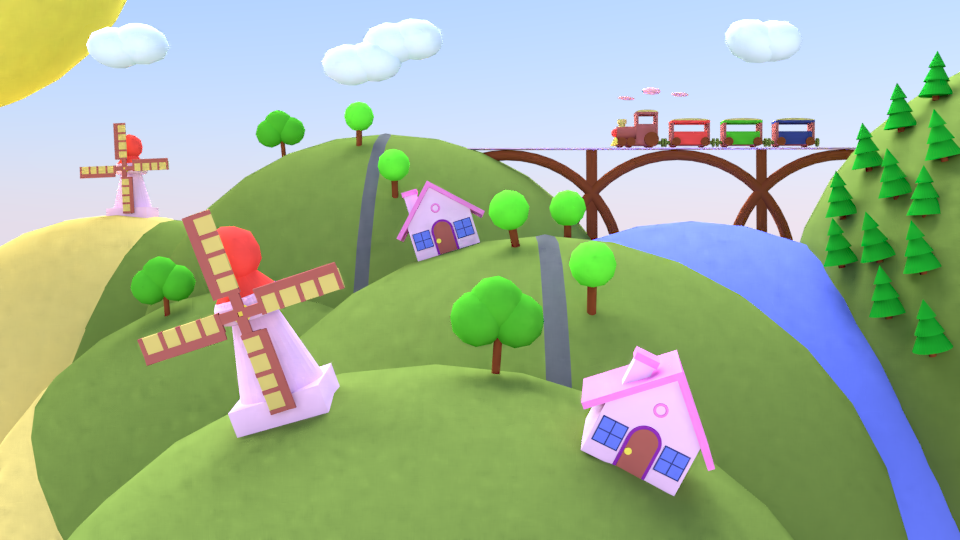
Actually I built this scene with still 2.79 because often having time constraint, so left 2.8 for the developers yet, but already being interested very much in general.
My intend was to composite something, which builds somehow itself, adding things here or there till a kind of balance formed on the picture, hopefully you feel the fresh air there, even the locomotive breathing pink steam :-)

Homework Submission Week 2
Homework Submission Week 3


Homework Submission Week 4

Very nice! I like the colors are very fun and happy, and I like the composition. I find it a little weird that there are cone trees. Something feels off about that side and I don't know exactly why. I wonder if you swapped the back house and windmill positions what kind of balance/ symmetry that would do. I like it overall.
Real cute, and glad to see you on this class! I do have to agree with ![]() silentheart00 though in the fact that it feels a little lopsided, at least in the foreground. Maybe swap around the windmill and the house? Could work. Great choice of colours though, they really stand out, it looks real nice!
silentheart00 though in the fact that it feels a little lopsided, at least in the foreground. Maybe swap around the windmill and the house? Could work. Great choice of colours though, they really stand out, it looks real nice!
The trees on the far right feel like they're glued to the side of the hill.
Cool picture, liking it. composition wise it seems to be a bit everywhere. bit hard to tell which is the focal point if its the locomotive, the trees on right could be more tilted. the left close windmill maybe have another ground ball on left of it so you could then tilt the windmill towards to the right.and maybe change the middle house on the right side of the road so its point aswell to the locomotive.
Thanks guys a lot for your perceptions, yes agreeing with all of them, surely there could be improved with spending some time on it yet.
Basically the left windmill is placed there as that yellow area is some wheat field or something by the concept. So just thought that is there while one house in the middle.
In general being glad that the composition itself started a kind of brainstorming about its balance if it has at all, maybe inspite of being of a picture, the objects on it are moving :D
![]() csehz This looks straight out of one of my kids tv shows. Love the colors - love the vibe. Great job! A+ from me.
csehz This looks straight out of one of my kids tv shows. Love the colors - love the vibe. Great job! A+ from me.
I can see where people are coming from with the 'lopsided feel". Part of it is the chosen style. The trees on the furthest right hill..it feels like the bottom of the hill is a sphere and sloping under itself; causing the furthest front trees to be parallel.
Also the terrain is very round and rolling, but the right edge of the river is straight. Feels out of place a bit.
Overall, it's a fantastic submission and these notes are minor. But part of being better at computer graphics/art is that the critiques get more plentiful and more nit picky. We just see something great and want to see it be great+ :)
Your model makes me happy inside! lol makes me imagine if I was tiny I could go play in your town and it would always be sunny with lots o' play dough to play with :D Nice work can't wait to see your next one.
@theluthier I absolutely understand and being grateful for the constructive critiques, finding it as a very important feedback.
Also thanks for everyone for the nice words, this week had to stay back a little bit on the forum as needed to focus on the homework on week 2 :D
Homework Submission Week 2
In January there was the tyre challenge in some phase, which inspired me to do something similiar but with flowers, as long time planned to experiment with flower petals.
Please find in which variations it came out from a resized cube as base, even did not combine with its shape too much, rather left the rest to the array and lattice modifiers, plus subsurf applied on all of them.
The diversity shows so much possibilities, that once in Python would like to do some flower generator kind of something, it is a dream but who knows maybe will be able to present the results in the planned Python class once
![]() csehz I like that you made so many different ones, smart to use array and lattice, nice work 😊
csehz I like that you made so many different ones, smart to use array and lattice, nice work 😊
![]() csehz This would make a great poster on my wall, cause I just want to stare at it:D Nice!!
csehz This would make a great poster on my wall, cause I just want to stare at it:D Nice!!
![]() csehz Oooooo that's creative, smart use of modifiers too, I need to use Lattice more, nice stuff!
csehz Oooooo that's creative, smart use of modifiers too, I need to use Lattice more, nice stuff!
![]() csehz Looks like the array modifier is doing major work for you, Zsolt. Great job! I really enjoy clever modeling. So much variety from simple shapes. A+ in my book.
csehz Looks like the array modifier is doing major work for you, Zsolt. Great job! I really enjoy clever modeling. So much variety from simple shapes. A+ in my book.
![]() csehz Hey this is so cool! You seriously modeled the petals and they look like flowers without any textures. Just great, Zsolt!
csehz Hey this is so cool! You seriously modeled the petals and they look like flowers without any textures. Just great, Zsolt!
aaaltuvem Andres sorry I just have just spot your question, conretely these variations came out so from a resized cube as a single flower petal, on which SimpleDeform, Lattice and Subsurf modifiers were applied, while the Array modifier ensured the multiplying of the petals around an added Empty.
Surely the complexity could be increased for example maybe assigning the petals also to a curve or spiral for going around several times and providing additional variety
Homework Submission Week 3
Being not sure whether will get time on the weekend for sculpting the face as extra credit, this is why posting already the other two tasks.
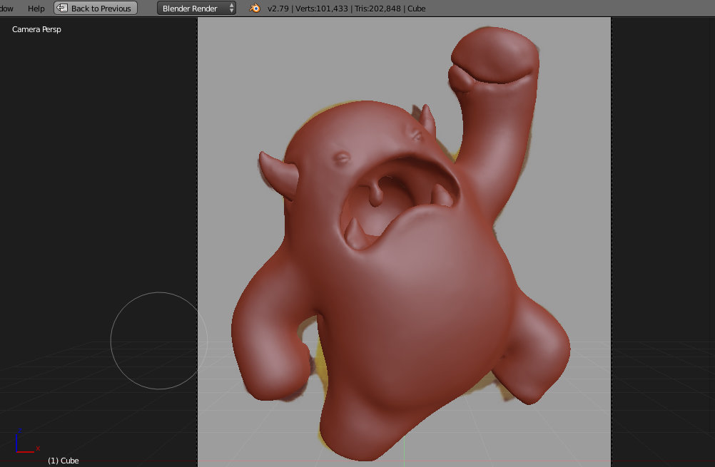
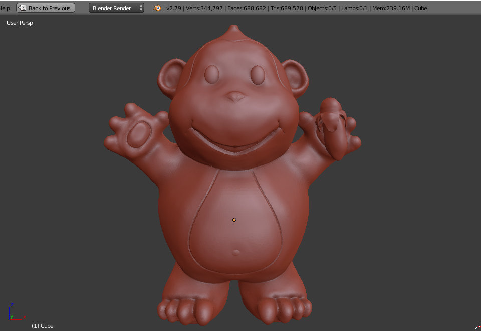
Melvin v4 - sculpting Melvin fourth times (still with mouse) now and again learnt from it of course, basically that tutorial is brilliant from Kent in my opinion, it has so good rhythm and contains alone the most of the things from sculpting techniques.
Sketchfab link - https://skfb.ly/6AWSv

Three primitives - the sphere and cone could be resized in Object mode although that would not show the reality, that they became smaller during the smoothing and the quad view also show where things stayed not perfect. Also learnt from it again, this was done second times during my career :D
