Hi, welcome to my sketchbook. I am currently trying to better my concept art skills but I almost feel like I'm not making any progress. Any critique or suggestions would be great! The biggest thing I feel like I have a problem with is coloring and putting together a nice composition.
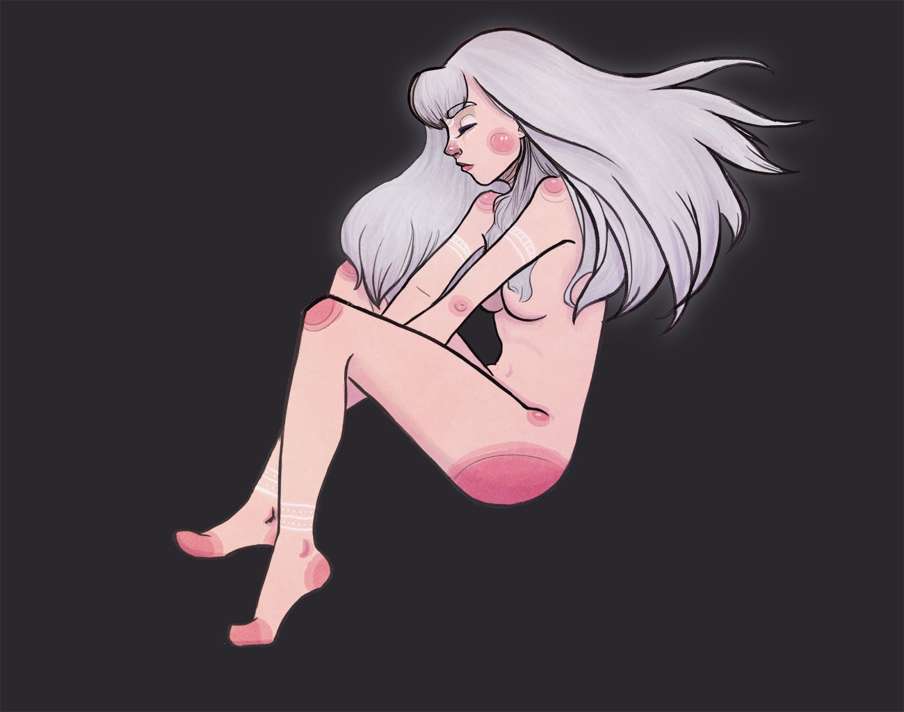
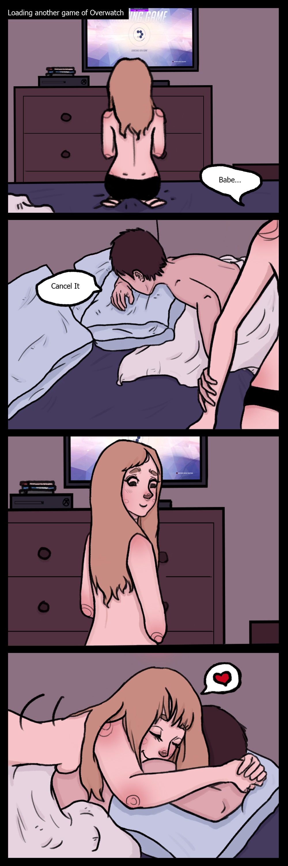
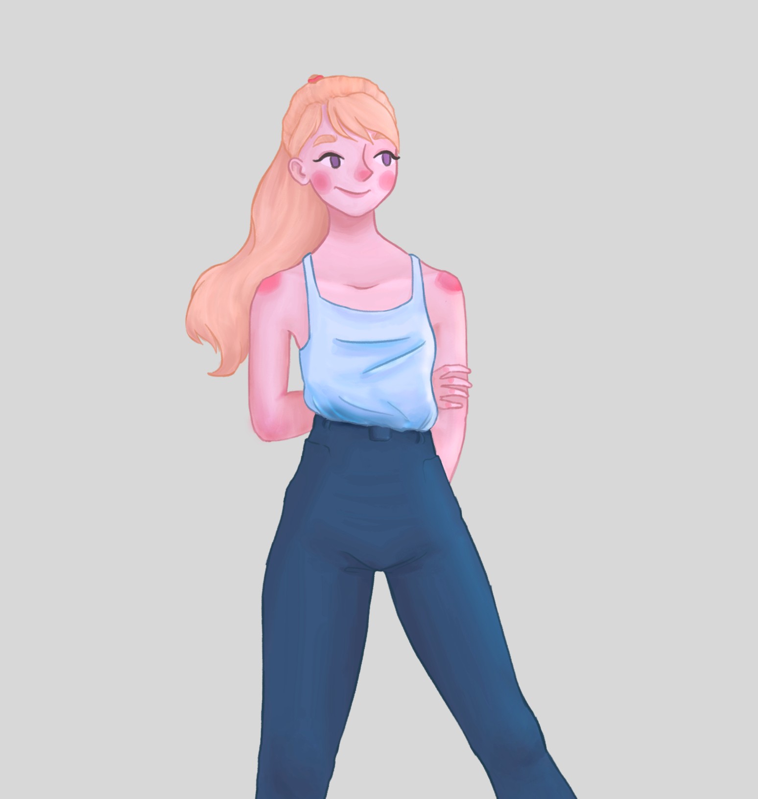
These are a couple of my finished drawings. Just thought I'd post these first.

Going to be posting some studies/WIP's. Any critique would be greatly appreciated!!
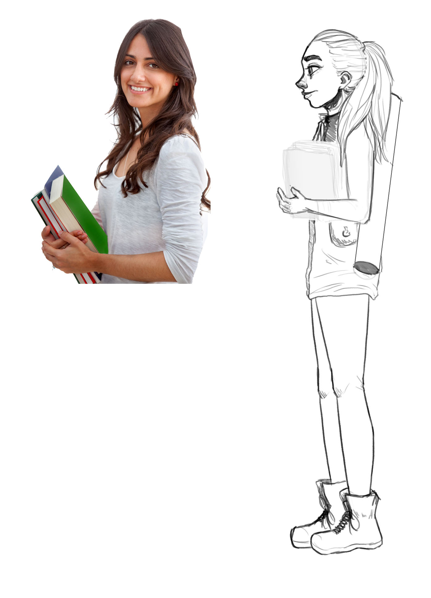
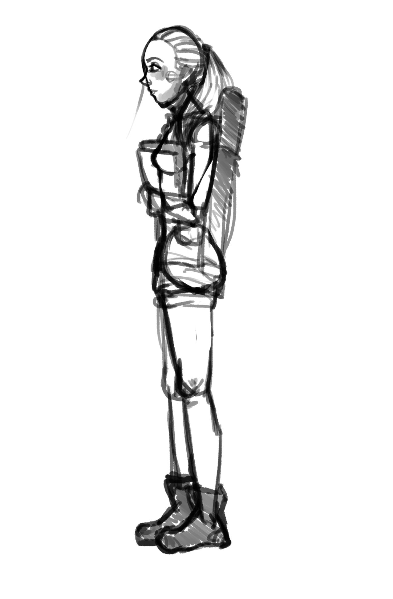
Anyone seen the anime movies Berserk? I kinda went for their style of eyebrows here :)
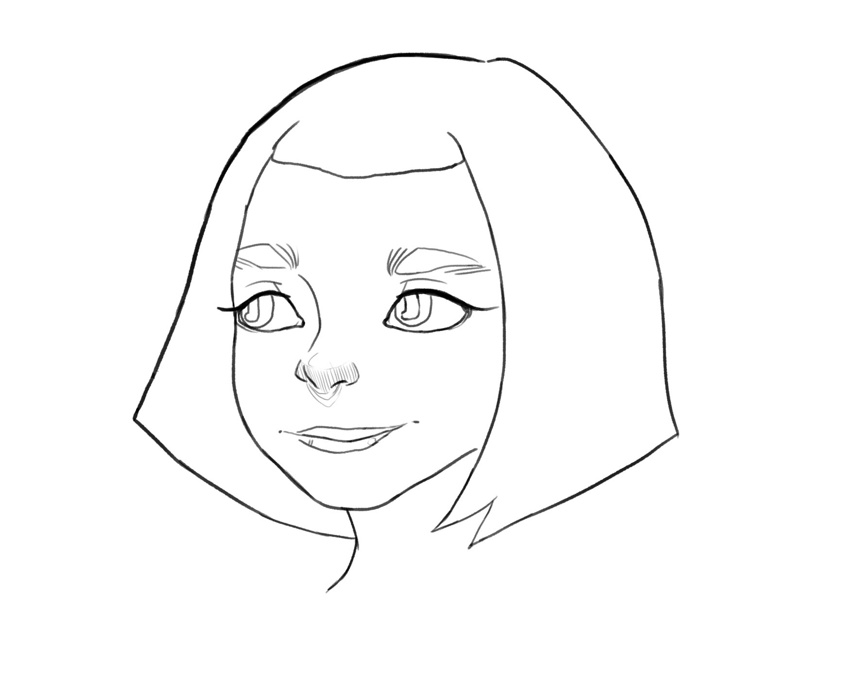
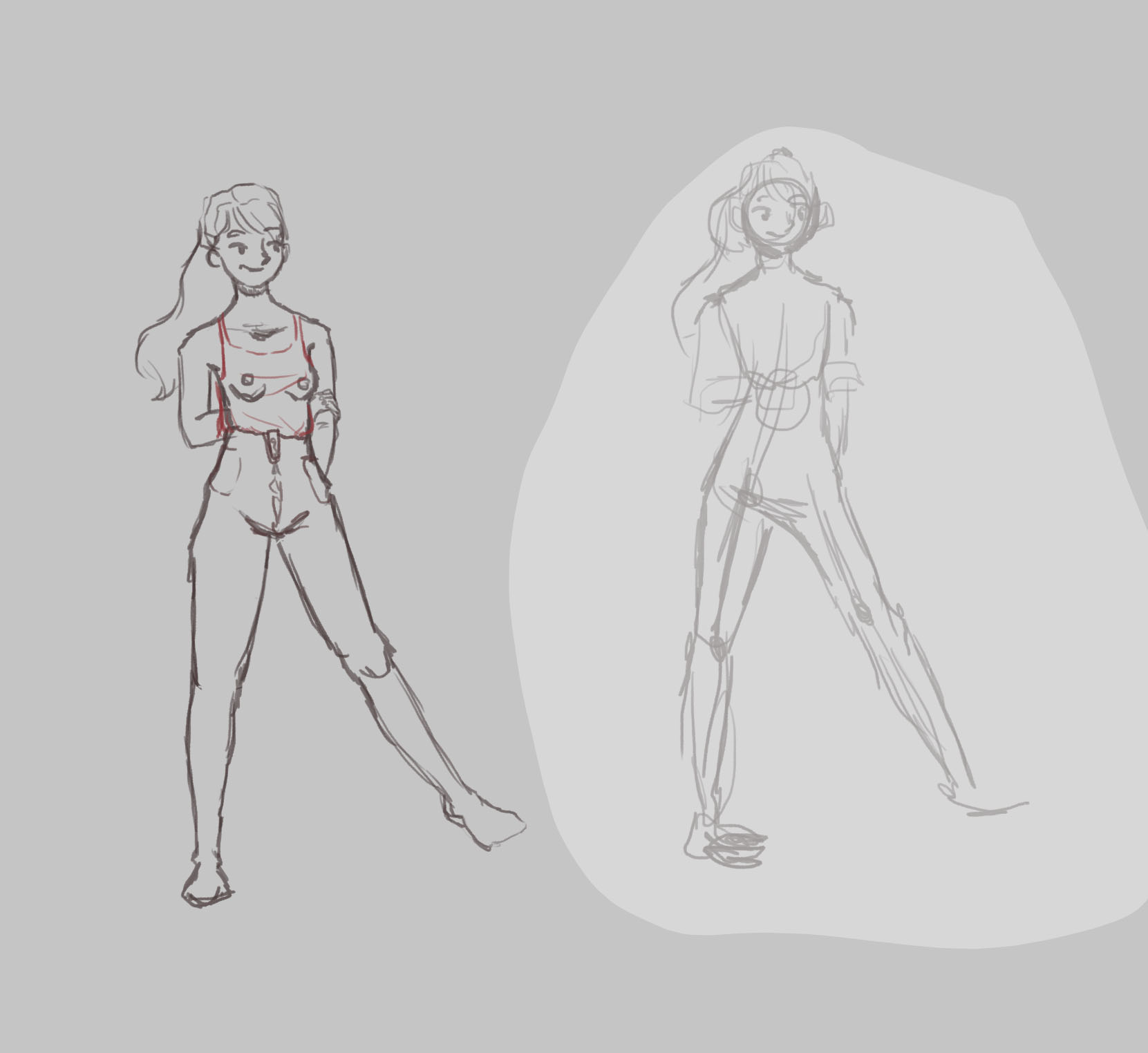
Forgot to add the finished piece!!
Great stuff :) You wanted some critique for your studies? Here you go!
If you do studies, you should always keep in mind on what subject you set your focus on. Is it pose and dynamics, anatomy, color, lighting or texture?
After choosing the theme you go through different steps in your study. First you analyze your references and try to recreate it. How does this pose work? How´s the lighting in the picture or how´s the structure of the face. That´s the first step.
But to truly learn and understand the subject matter you have to go deeper. For the second step you take what you learned from your references and apply it to variations. Can I find other ways to pose that character but with an equal appeal? What if I change the lighting in this room? Can I draw the same face from different angles too?
So that´s my critique. I personally often forget about the second part - but this is the most valuable.
Thank you. That makes a lot of sense! I forget that studying art is not just practicing but actually studying.
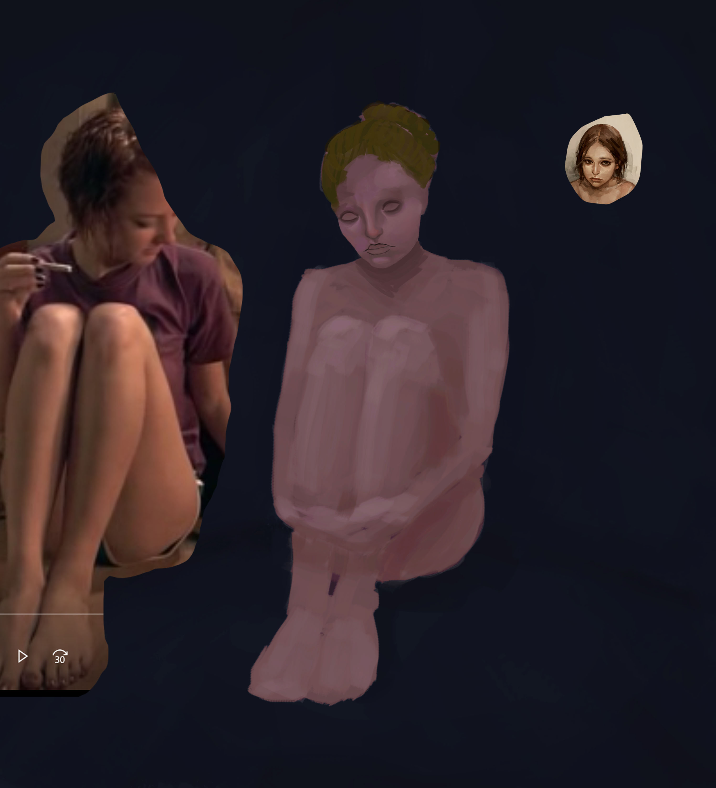
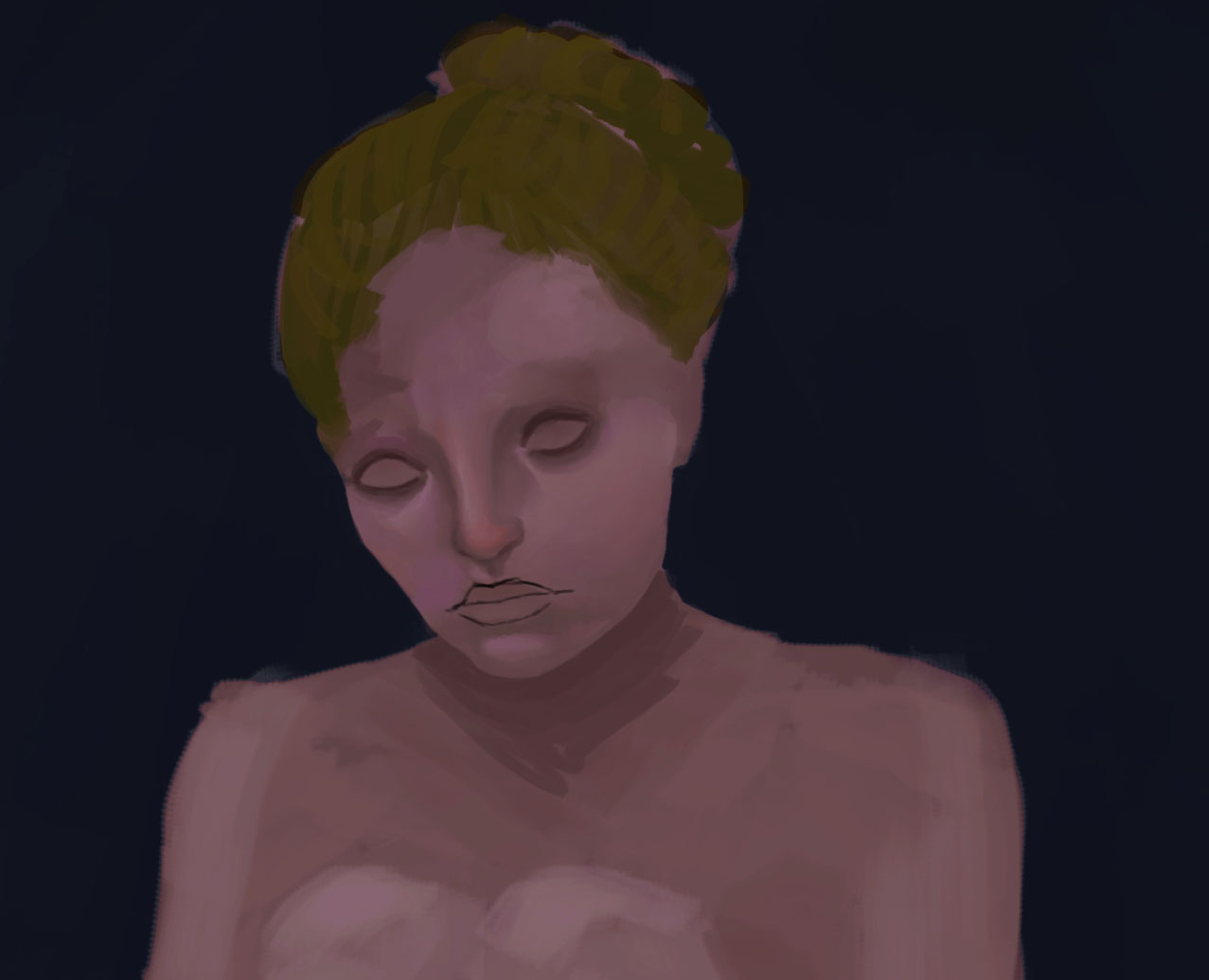
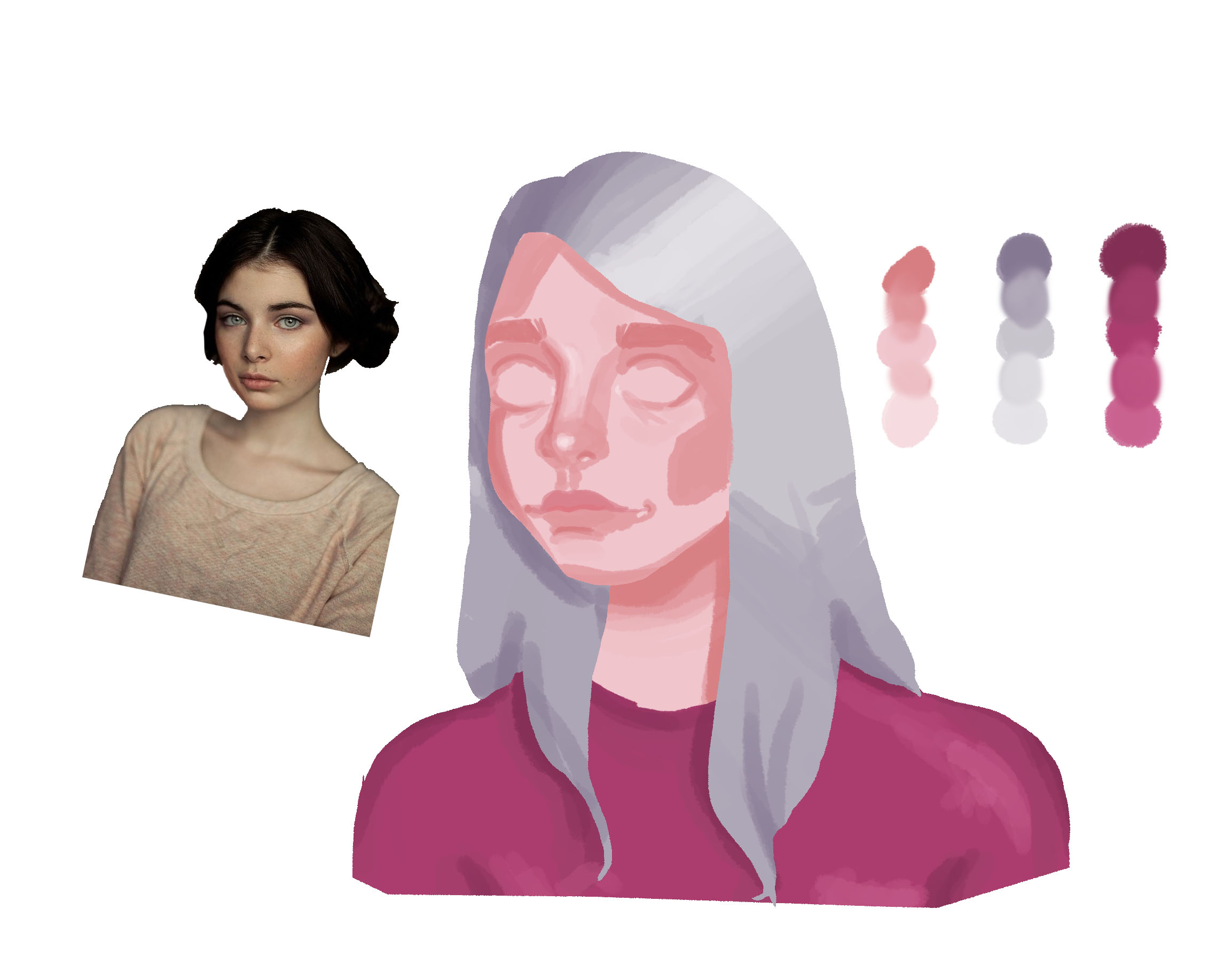
I started on this but the skin tone just ended up looking really sickly and bad so I stopped out of irritation. I re did the colors for hours but couldn't get it right. (The reference is Franky from Skins UK)
Things I think I did well: The shading of the nose(I was really proud of this :) ) and the overall anatomy.
Things I think I could work one: Color of the skin, overall composition.
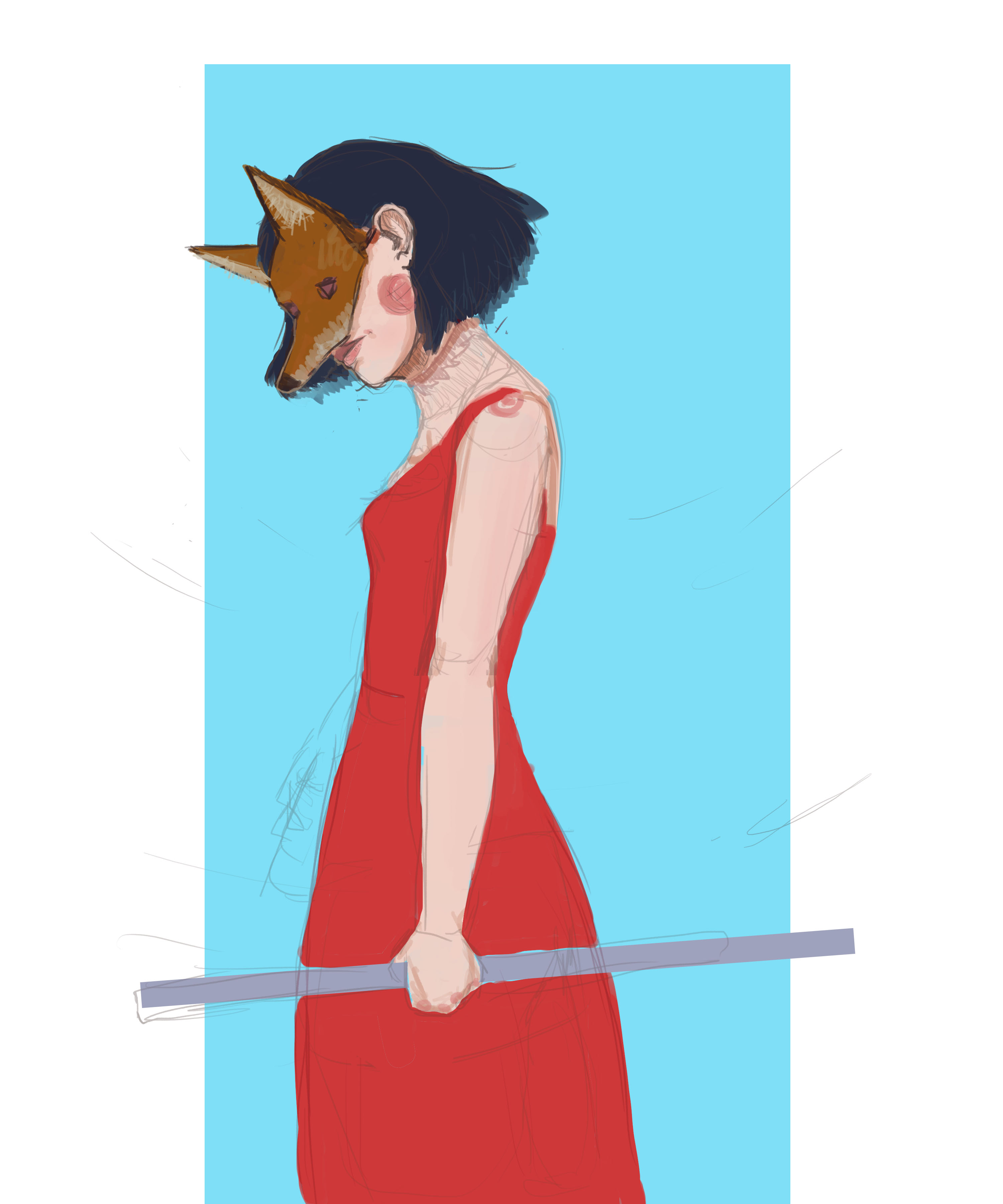
This was a drawing I did for the Kay-9 mask contest on here. I wasn't able to finish on time because I kept starting over.
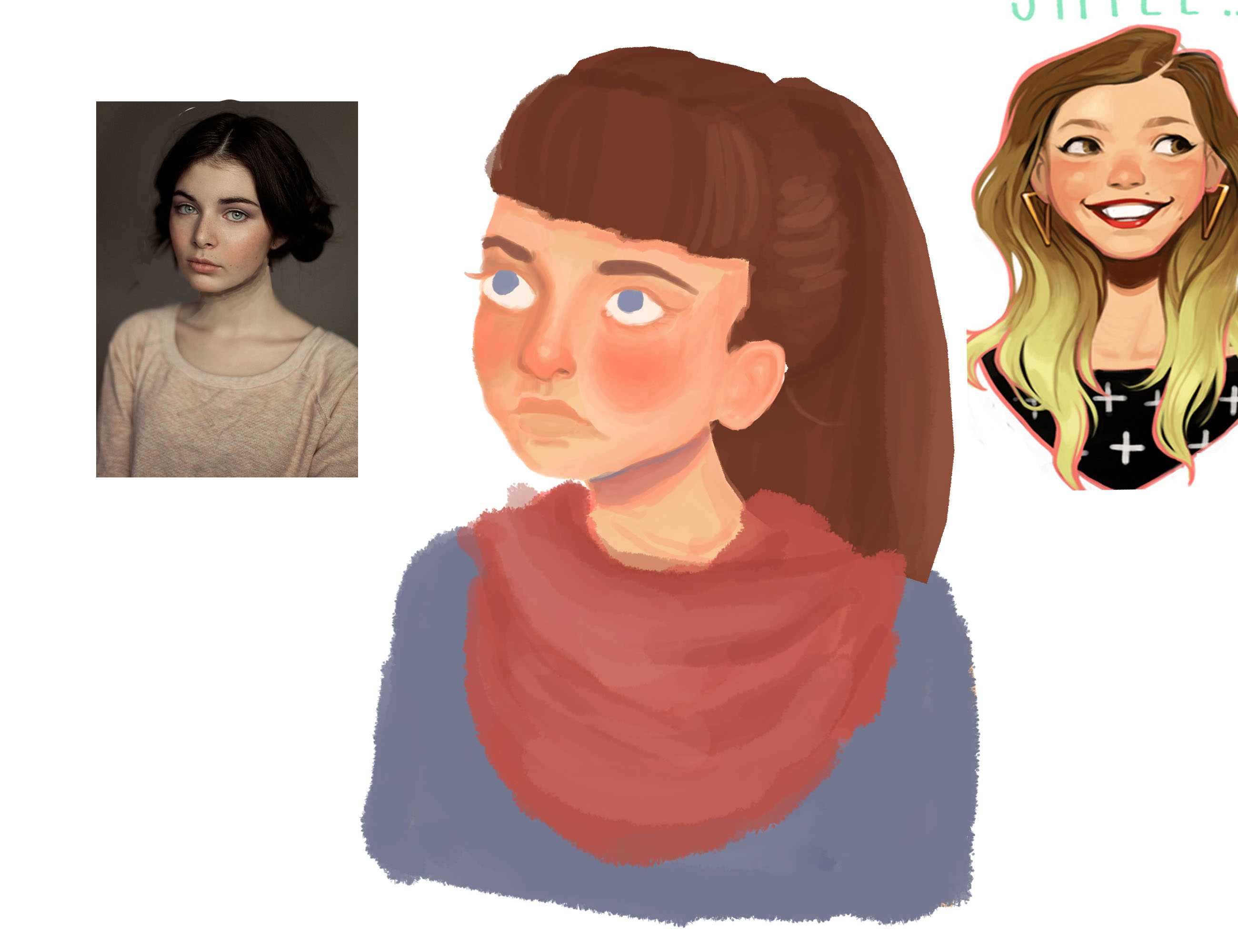
I know that I am probably improving but I am getting irritated about how slow I am improving. I need to go back to practicing everyday and that is exactly what I am going to do. At least one quick study a day even if I don't finish it. When I improved a ton a year or two ago it was because I started drawing everyday. I gotta focus on anatomy, color, shading, and other basic dynamics.
For this one I was trying to practice color, harmony, and the parts of a face.
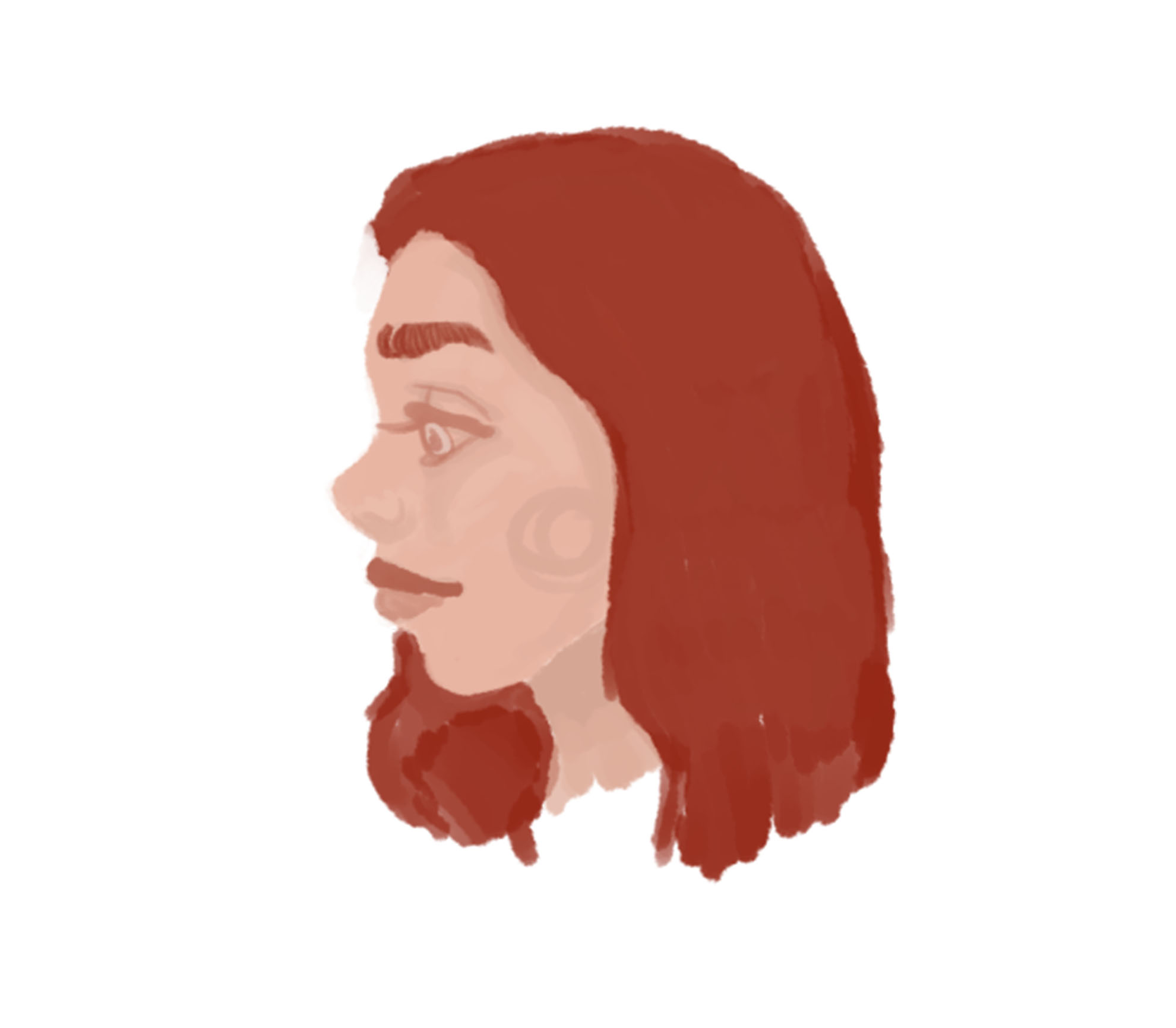
This was a random sketch I did trying to practice drawing without line art. I was trying to work on color, color harmony and the parts of the face.
So here I tried to not focus on blending but focus on value and lighting. I know that it is a bit messed up. I used to reference just to remember the face shapes. Even when I get the colors and shapes down I can rarely get from here to a polished piece.
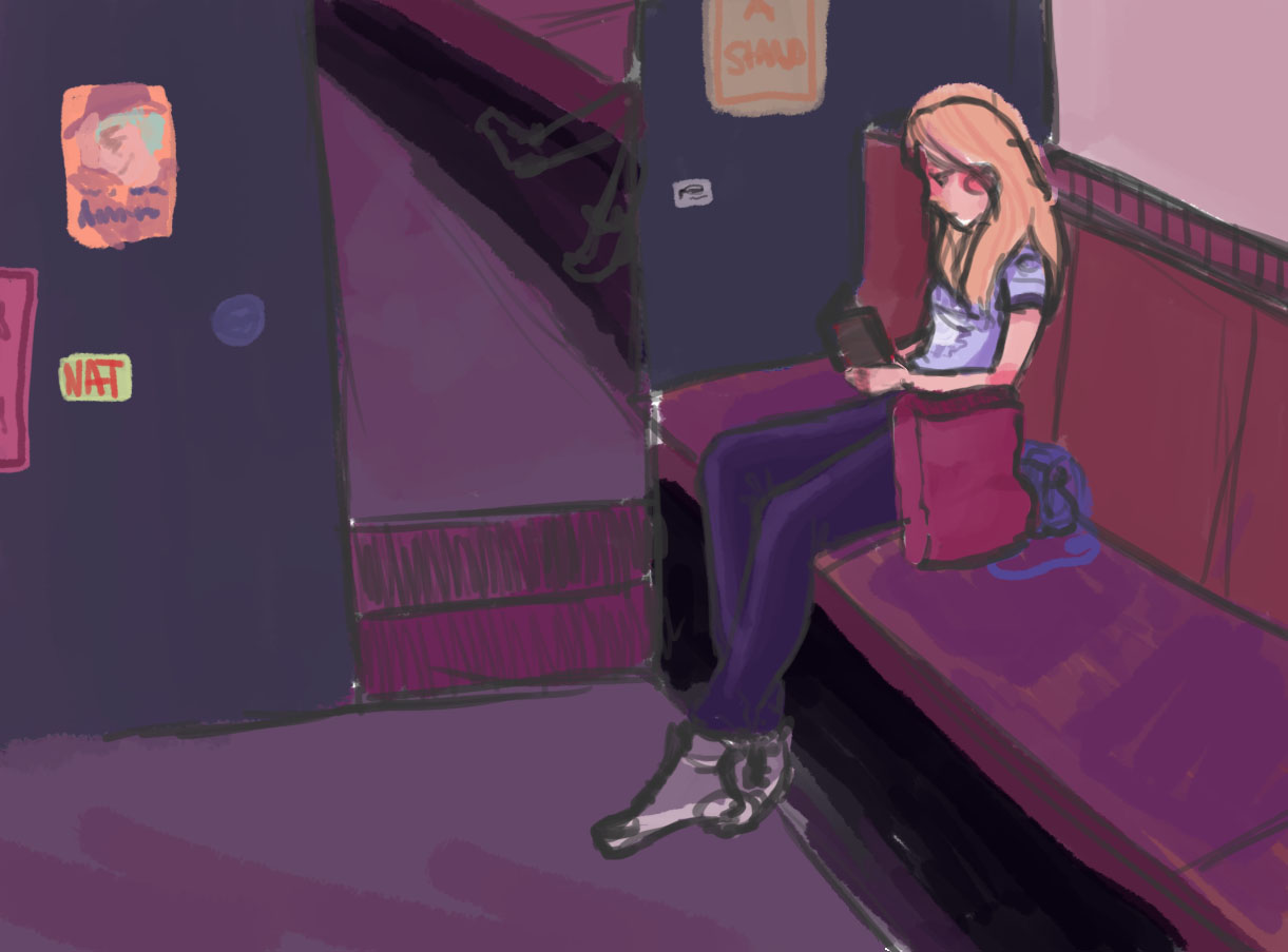
Again, I am really bad at color. I tried to make a full sketch with a background and everything. I'll probably finish it someday. I was mainly focusing on color and making a full scene. I was also trying to keep color compensation in mind.
New practice. This was from a scene from The Host. I really need to practice backgrounds more.
Things I think I did well: Creating a metal effect on the car and the overall tone of the piece
Things I think I could work on: Backgrounds(definitely my worst skill.), and values.

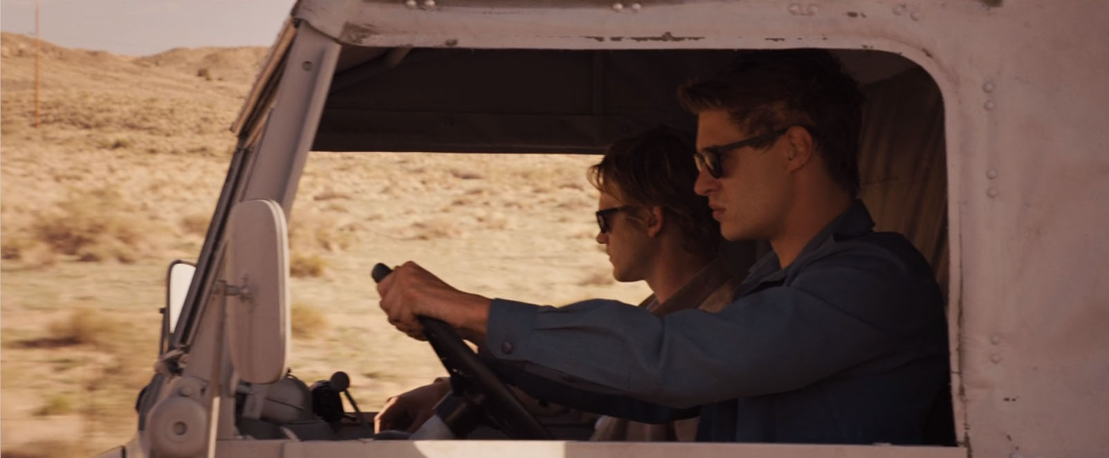
Things I think you did well: The Foreground!
Things I think you could work on: meh. Dunno - I don´t think the background in that case seems to be a problem. In that peticular scene the focus lays on the two guys in the car. You can blur backgrounds out to emphasize your focal point. It even suits the picture.
But you should work on your values. Take your reference and turn them into grayscale. The guys in the truck do have the darkest value in the frame and are in total contrast to the bright illuminated background.
Thanks for your feedback. Looking at it again, I don't think my background is as bad as I did when I had stared at it for hours XD And yeah, values are definitely something I notice I don't do well. Whenever I paint dark values I always feel like they overshadow everything.