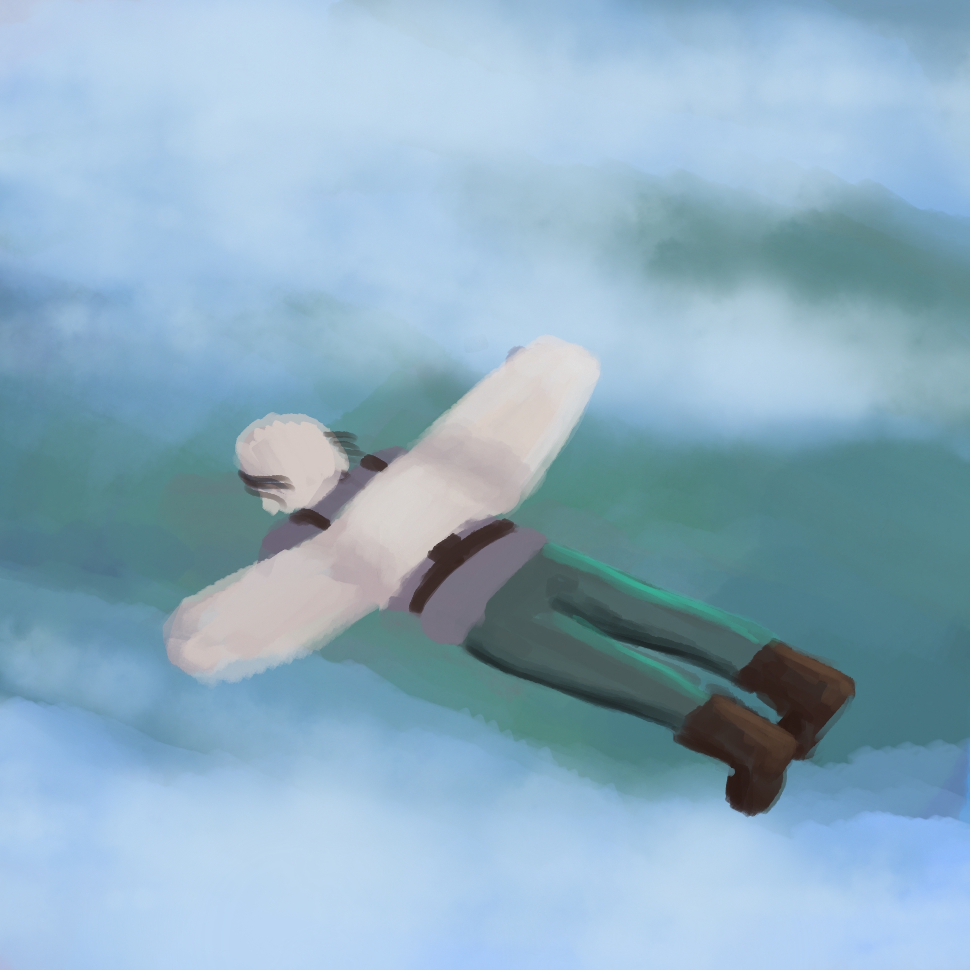
Hi, welcome to my sketchbook. I am currently trying to better my concept art skills but I almost feel like I'm not making any progress. Any critique or suggestions would be great! The biggest thing I feel like I have a problem with is coloring and putting together a nice composition.
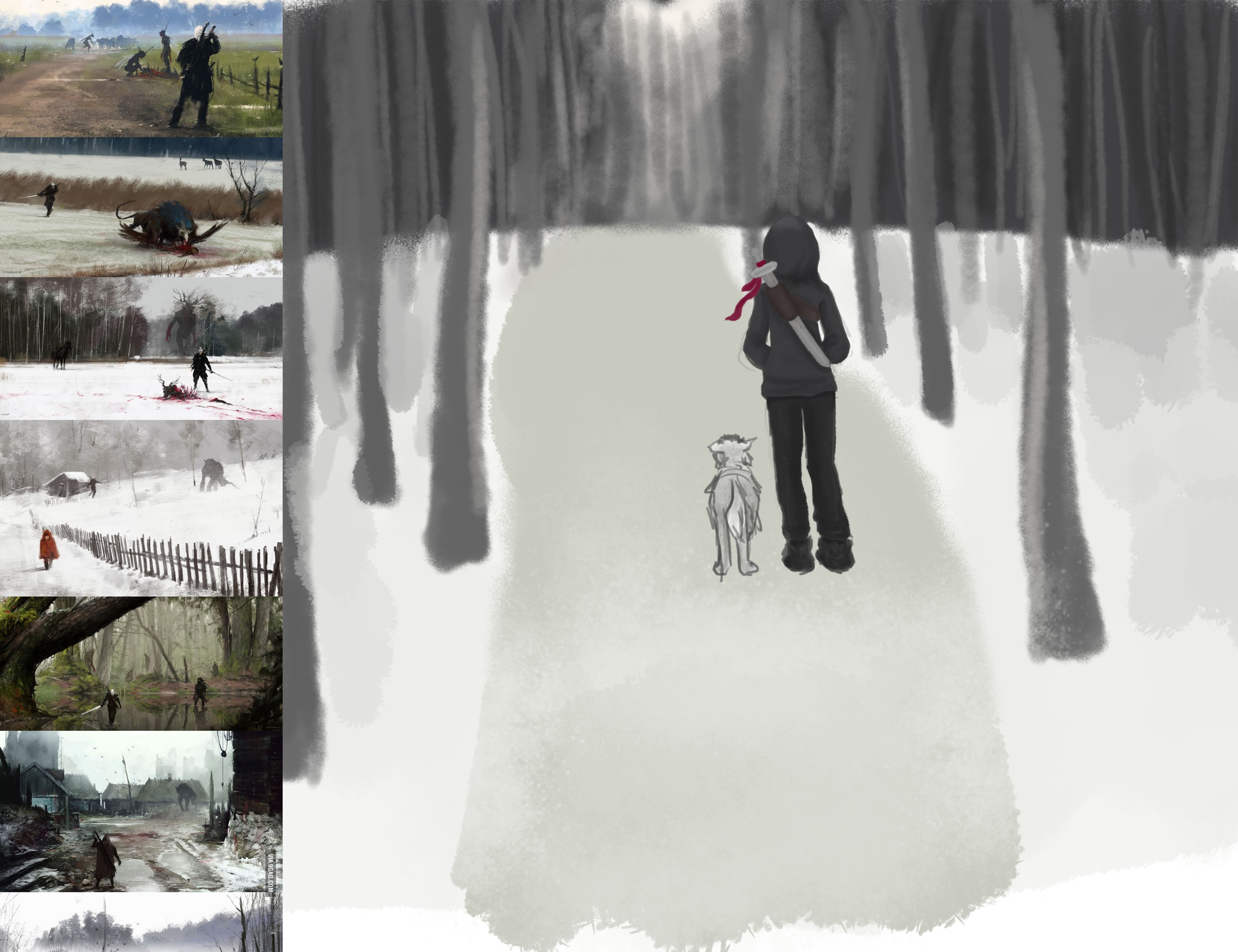
I have worked as a storyboard artist for a film company before, but it was low key and not really real work. They didn't really need a storyboard artist so it was mainly practice for me. But today I received my first storyboard job. It's short term, just a few panels and the pay is crap, but it is good experience. Anyways, they gave me specific instructions on each of the panels and they need to be done super quickly. They wanted them to be more detailed than normal storyboards and almost like detailed illustrations.
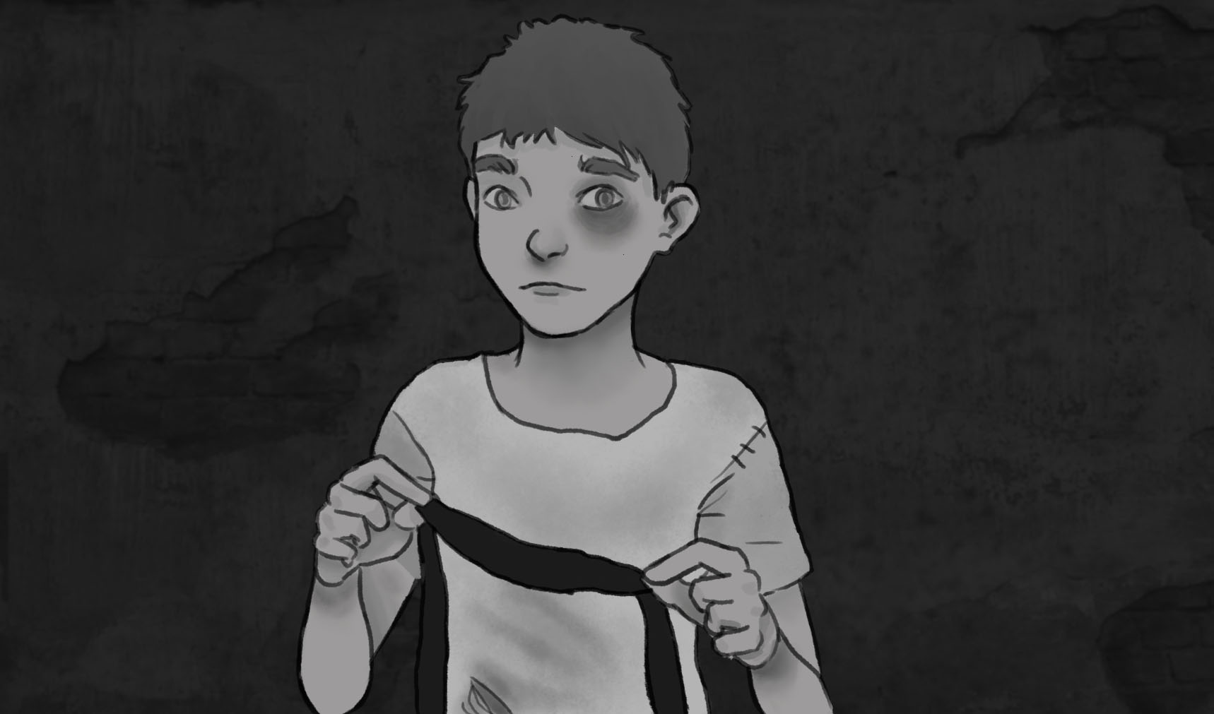
I had to do four today and it took me all day!! So I am curious if I am just really slow or something. These shouldn't take me so long at my skill level, right
Ignore the white spot!
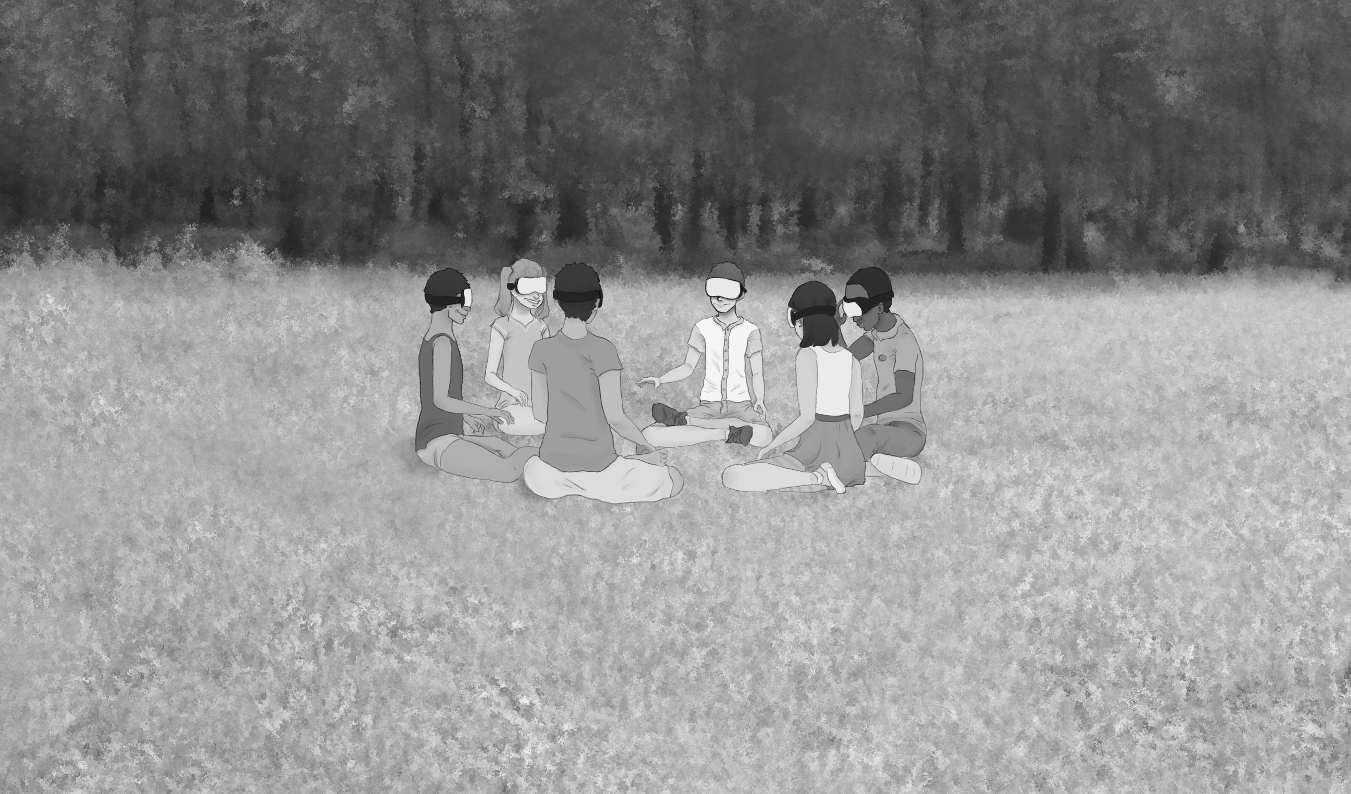
Forgot this one ^^^^^^
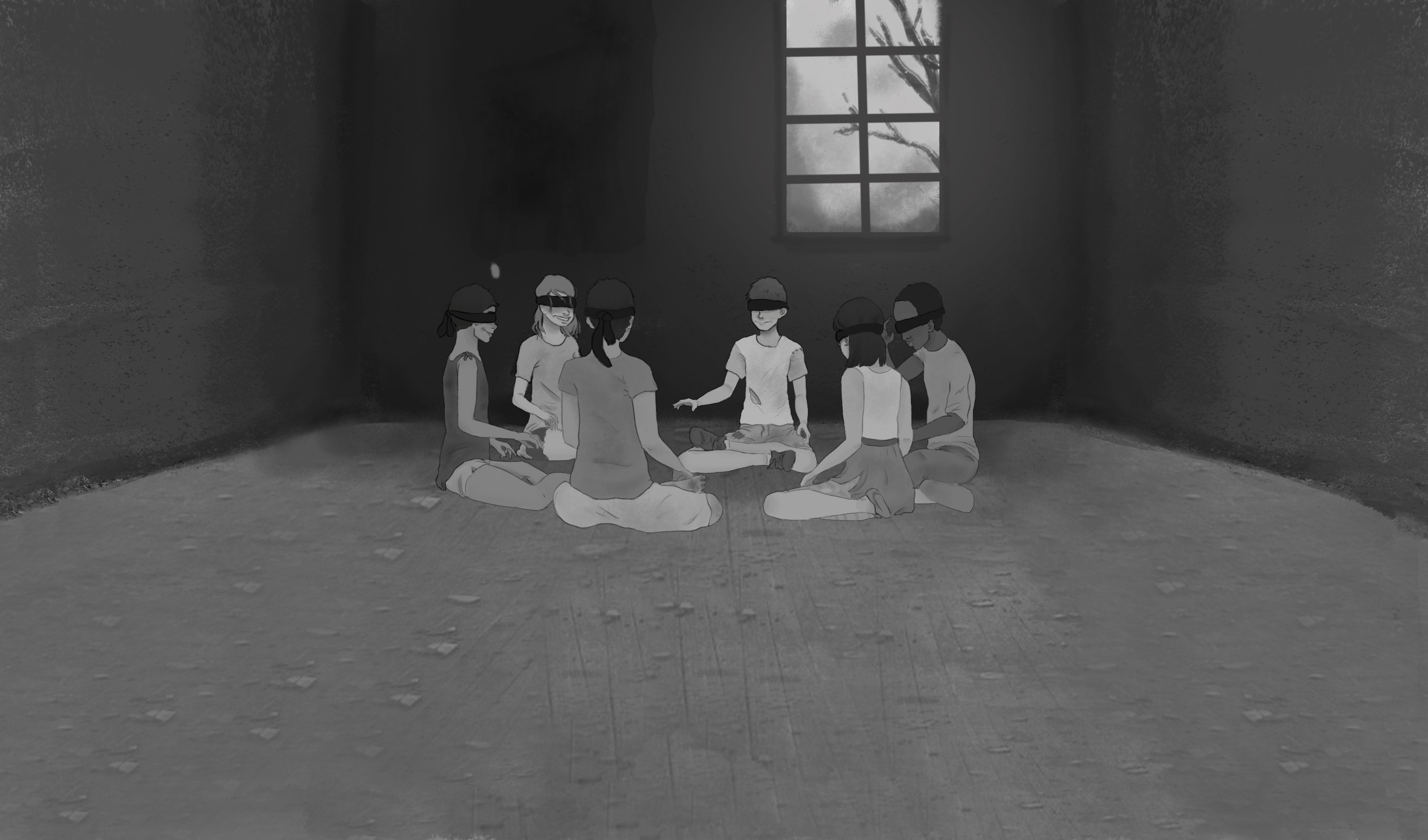
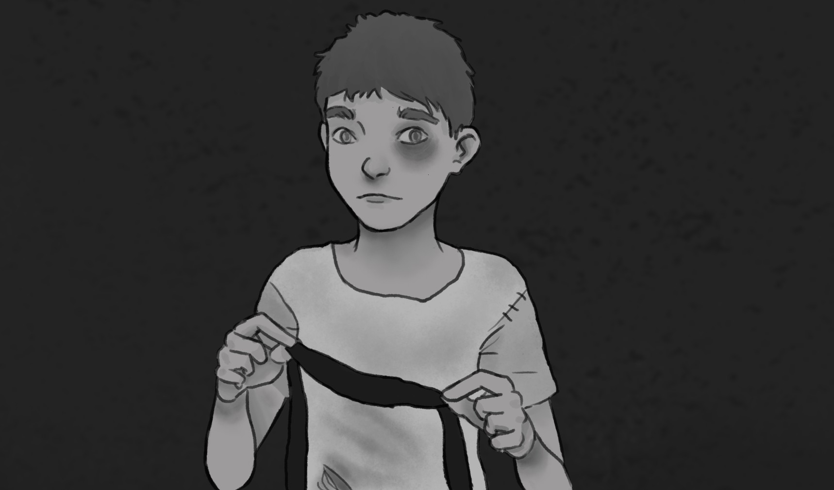

Any tips on speeding up to painting process???
I can barely do these greyscale paintings quickly, how do artist do colored pieces without working forever!!!
1) Normally you don´t storyboard too detailed because in the first attempt you focus on the flow of the storytelling. So you just lay out the content, the composition and look if your sequence of images makes sense.
My Tip: Do quick rough sketches and time yourself. 5-10 minutes for your basic sketch. 30-45 min for the lines and color blocking. (timing yourself is always a good attempt. It is keeping you focused and concentrated on the essence.)
2) Narrow down what your client understands under "detailed storyboard". Does he have examples in mind on which you can orientate yourself? Can you make different versions of one short frame sequence? From a quick overworked sketch to a worked out, detailed and lined frame. What does your client prefer? When he wants the complicated stuff, your pricing should go up a bit! ;)
3) Work with the right tools. I have made the experience that storyboarding in photoshop is pain in the a*** :D. For my bachelor thesis a friend of mine introduced me to the software "Storyboarder" (https://wonderunit.com/storyboarder/). I tried it out and it was amazing. It gives you only a handfull of simple tools to storyboard but that makes it possible to concentrate on the essential and not to waste time with too much detailing.
4) Forget about doing correct grayscale and lightning in a storyboard enviroment. A storyboard always transports the necessary information. You can´t work out the backgrounds in every frame. Just block a value in. Only paint a lightning situation if it is really crucial for the story or the composition. Ask yourself, what information needs to be in the picture and only paint that.
5) Don´t stress yourself too much. I´ve made the experience that normal people look at your art way relaxed than you might do yourself. You see all the faults, the flaws and the possibilities to improve. All other people just see the image and will add the rest in their mind.
Thank you so much for your input! Great advice.
1. I will definitely try timing myself. I think I got all stressed out because I felt like every storyboarding position would be this detailed and I would never be able to complete them all!
2.Yeah I definitely should have asked for a more detailed drawing but I didn't know it would take me this long. I've never done a piece like this so I had no idea. (Amateur hour over here lol)
3. Storyboarder looks really cool. I'm downloading to try it out right now!
4 & 5. Very good advice!
All great advice, thanks :)
My client asked me to add a few things, I don't know if I'm suppose to post revisions?...


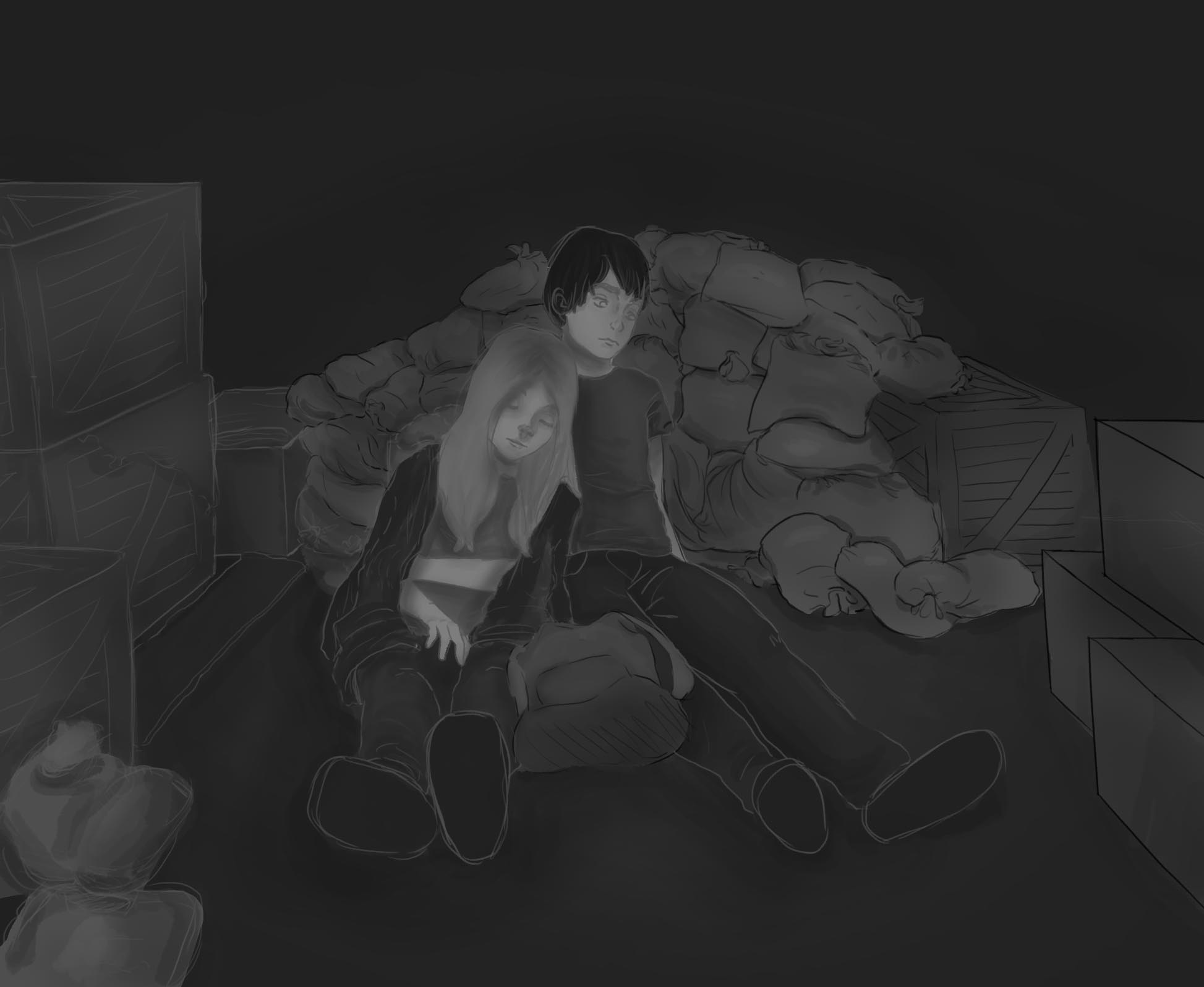
This is a new piece I am working on. I want to create a really nice digital piece with full color and everything. I suck at values so I wanted to start in a grey scale. Here is what I have so far... I usually can't get from here to a finished piece but I hope this time will be different. This is a very rough first draft but any critique so far?
So I do hope I haven´t crossed the border of your artistic proud with my feedback and insulted you by overpainting your work. But I really love your concept and the story you want to tell - so I tried out myself how to push the composition. Actually I am trying to study values and painting as well - so it was more of a quick learning experience for me.
Feedback:
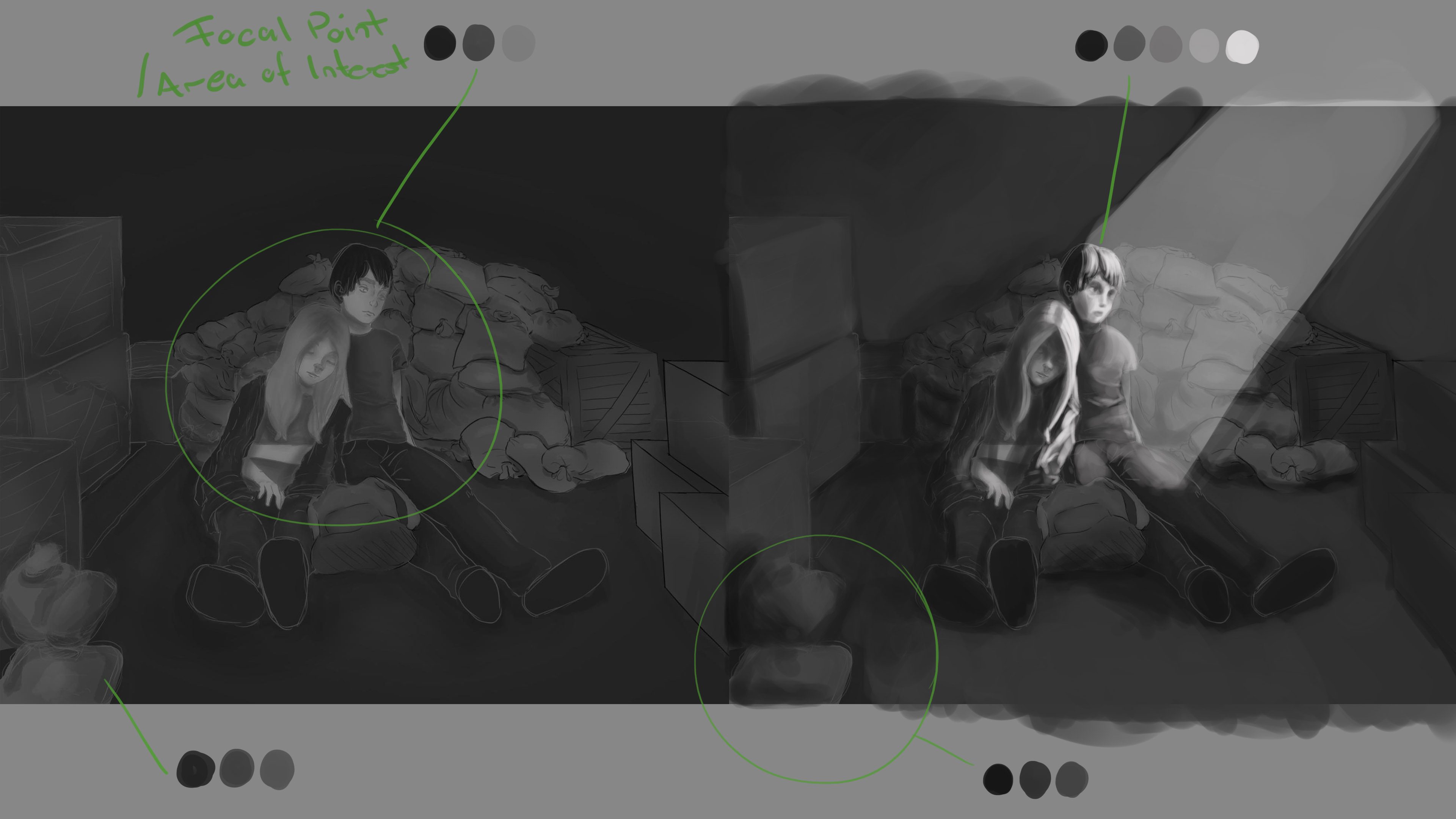
Thank you for the critique. I wasn't sure about lighting because I wanted them to be in a train car so there wouldn't be any direct light like that but I don't know how to portray that. It's suppose to be a night time so the lighting wouldn't be so bright. I tried making another picture as if the train car is open but that is kind of odd looking too.
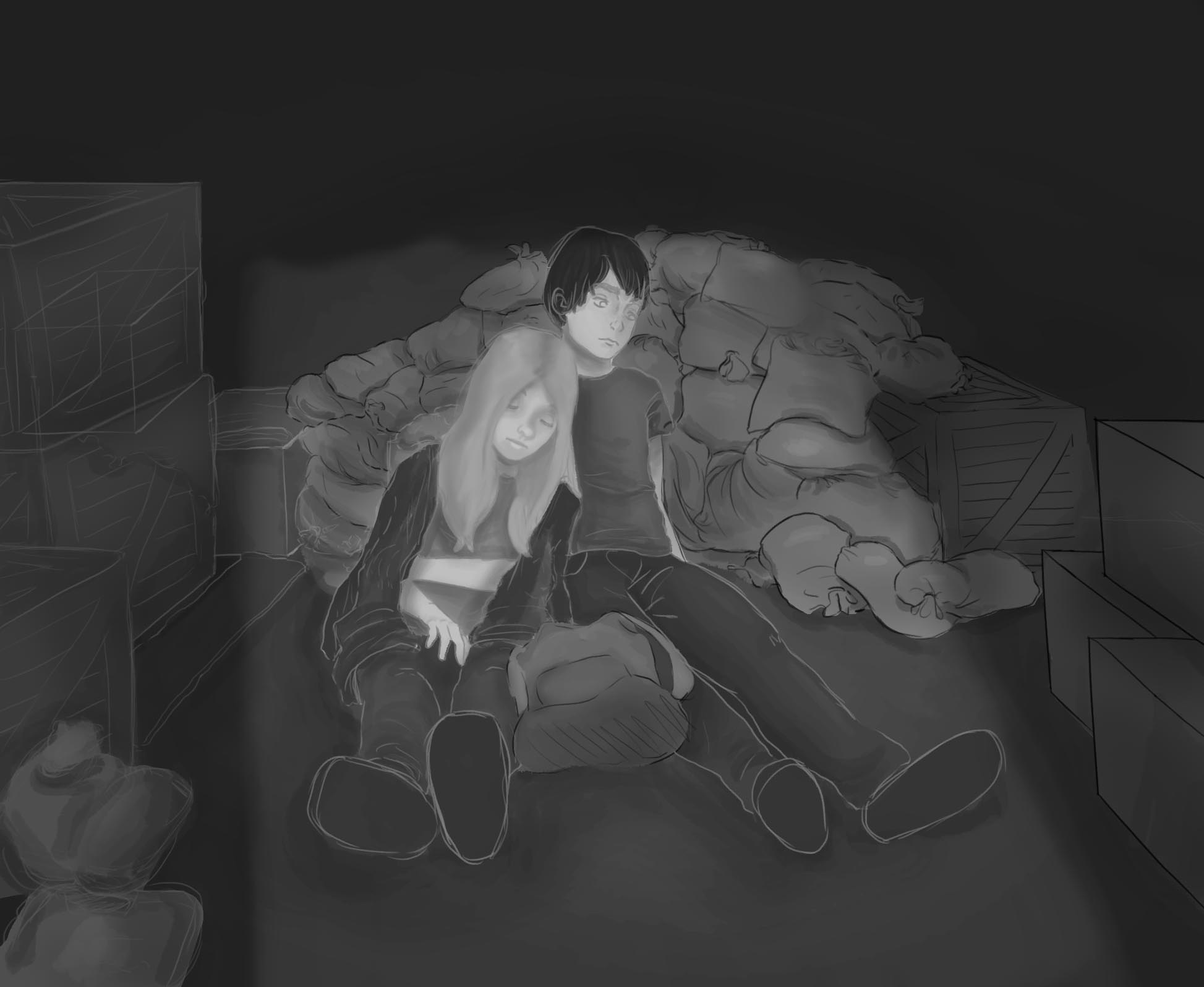
Thank you for sharing your sketchbook Sam! You have a unique style and feel to your work that I like. Sorry I don't really have any helpful critiques that Jonas and others more talented than I have pointed out. The feedback you incorporated with the light of the train car being open was cool. Way to get after it! Your approach to the work is inspirational.
Thank you so much! It means a lot to hear someone say all those things about my work. :)
I am ridiculously proud of this half ass drawing. I am going to keep working on it but I was really proud of how it started out :3 It's colors are pretty good and the values aren't half bad. I'm excited keep working on this one :)
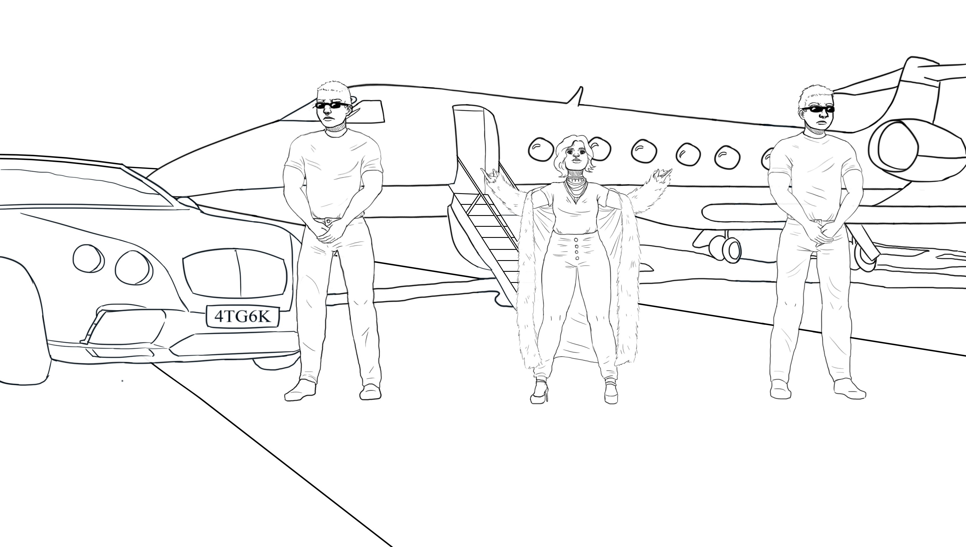
Some work I did for a client. I was kinda worried about not being able to draw the backgrounds but it turned out nicely. I am trying to work on perspective.

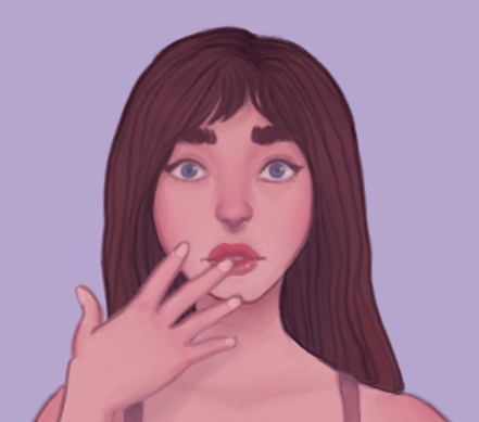
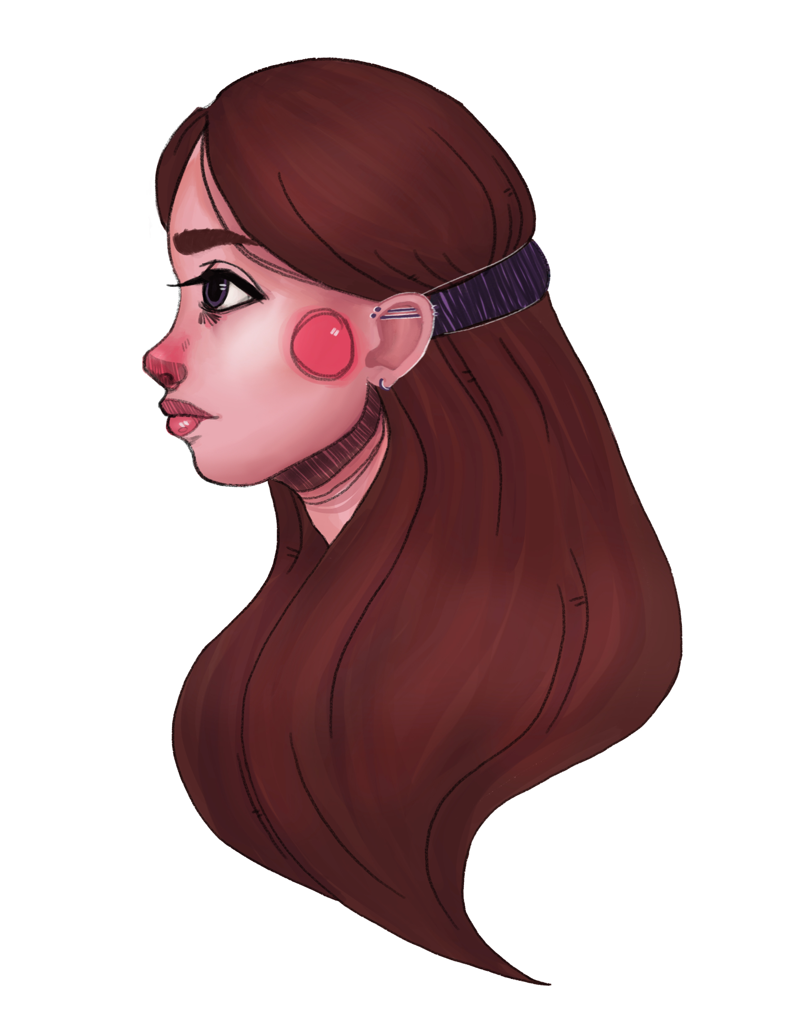
So I liked this one alot. I thought I did really good at rendering the face. However, I realized after posting it that the quality is garbage because I drew it so small -.- I usually don't do that but I was going to originally draw her whole body and I forgot to scale up the image before shading.
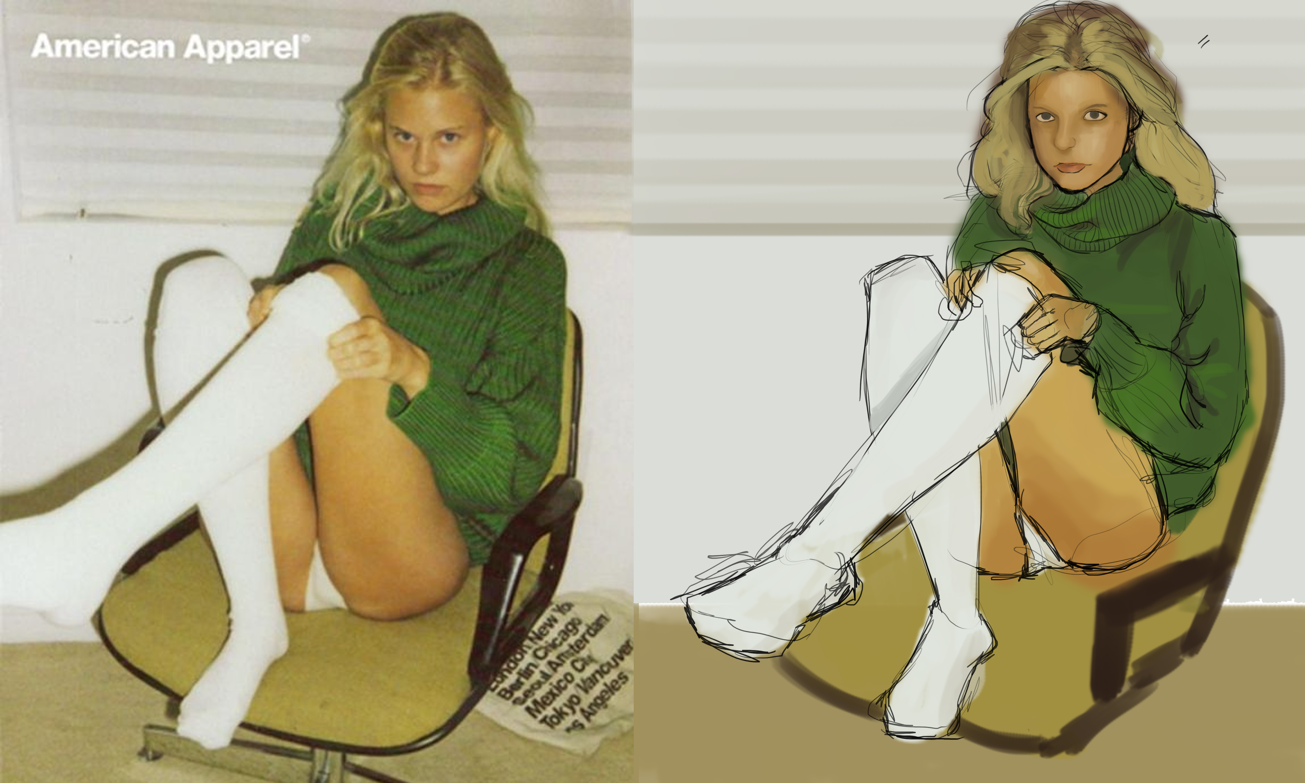
I've been really busy but I thought I'd post some practices I've done recently. Let me know if you have any opinions or criticism.
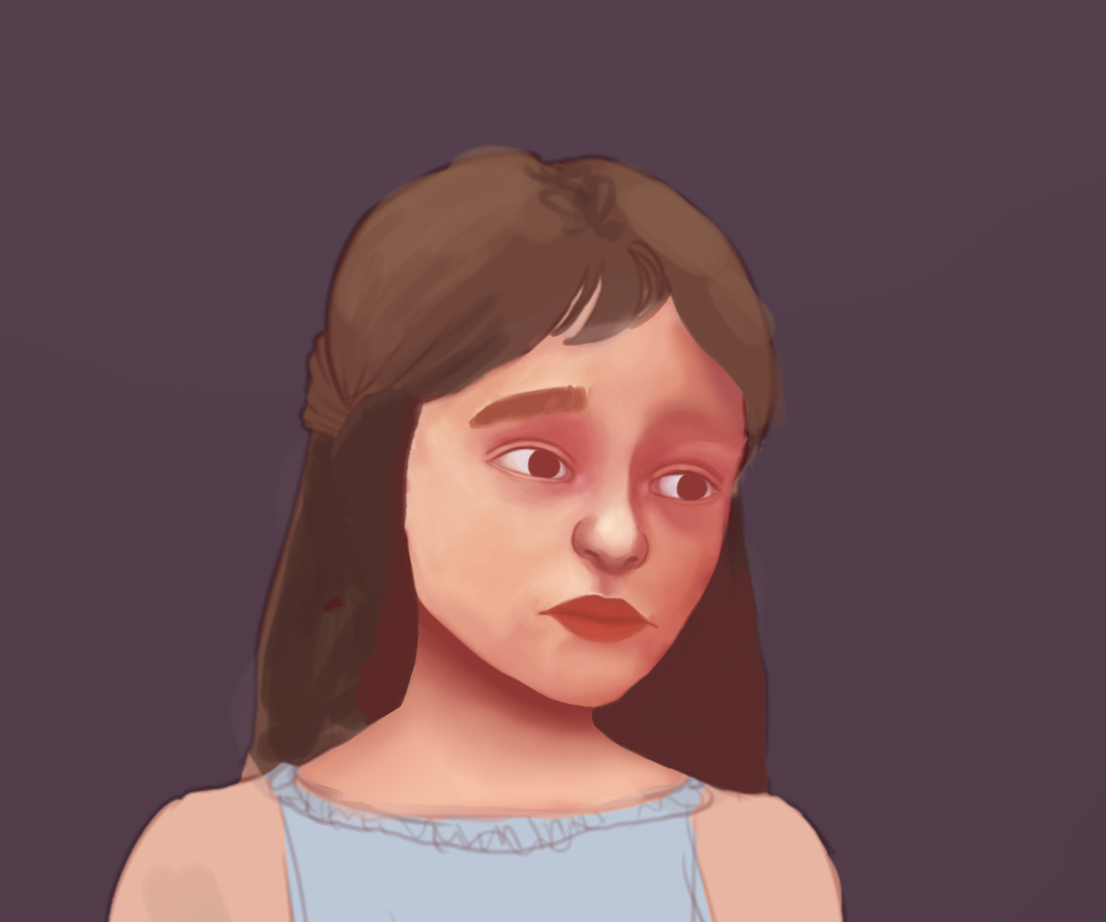

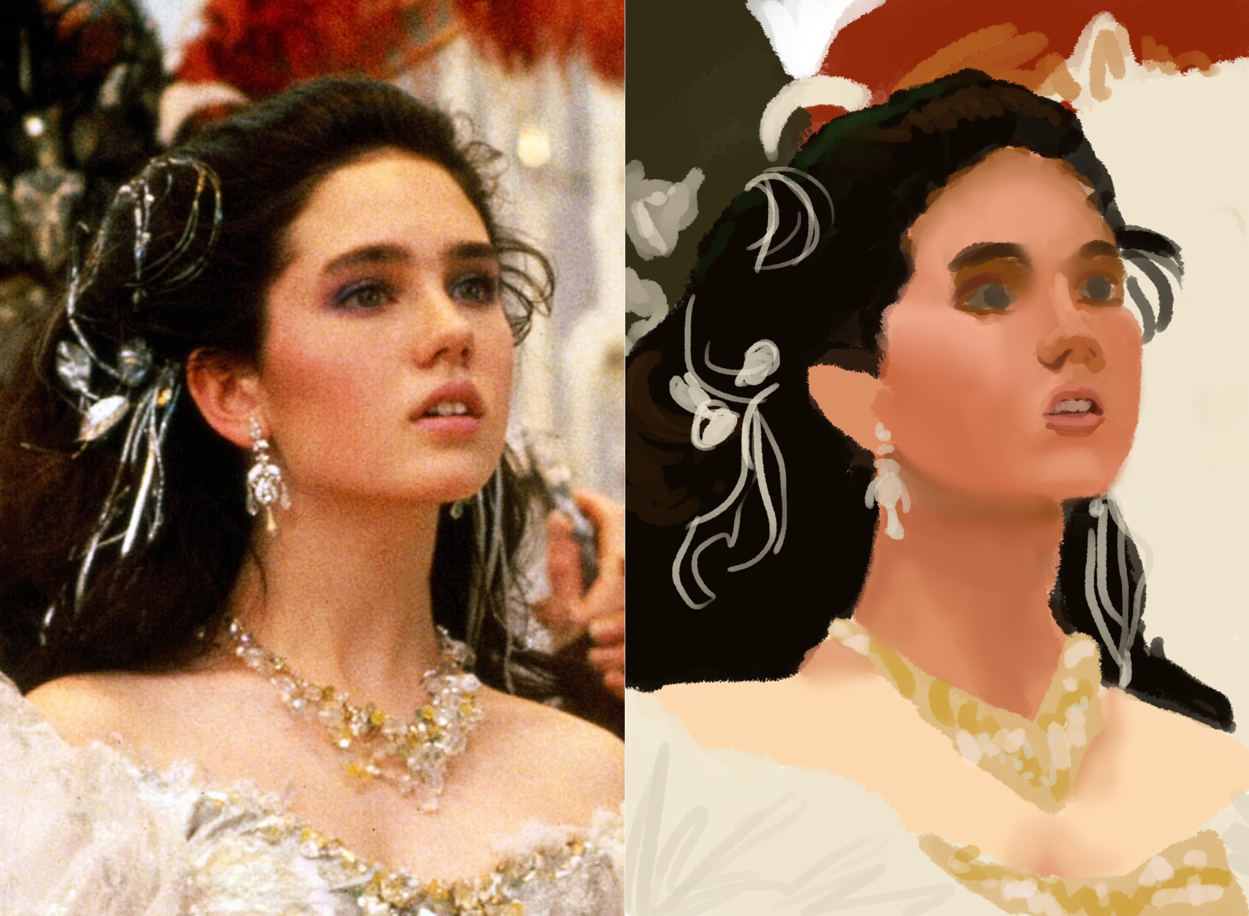

Hey there! I know I'm super late on this (you posted this, what, 3 months ago?) but I have something that'll come in handy in the future (hopefully).
So, you say that the overall skin color was not what you wanted, and you say that the shading on the nose is what you're really proud of. A technique called "underpainting" is a quick solution to this problem. Essentially, underpainting isolates the struggles of coloring and shading. While it does not remove them completely it does allow you to try out multiple color options and see how they would look on your rendered image without having to re-do the entire thing. I recommend you watching lots of tutorials on this subject because I doubt I will explain it adequately, although I will try my best.
In essence, what you need to do to make an underpainting is simply render the whole image in one color. This does not mean one shade, but simply the same hue. Most artists will choose a sepia color or just black and white, but this is solely up to what color you want your shading and lighting to be. Once you have your image, shading and all, you add color to the underpainting by layering transparent color over your pre-established values. You can do this by creating a new layer, adding color to the areas you wish color to be applied to, and changing the layer from "Normal" to "Multiply," "Overlay," etc, and see which one looks the best to you. Alternatively, you can do this by creating a new layer, applying color where you want to, and then turning down the opacity level on the layer to a transparency that fits your needs.
This reply was written with the assumption that you have a digital painting software that allows these features. I personally use Paint Tool SAI, but I know lots of artists use Photoshop, and you can use FireAlpaca as a free alternative.
Hope this helped! Happy drawing!
Just downloaded Autodesk Sketchbook pro which just went free! I really love it. I have been using a really old and messed up version of photoshop and it has a fair amount of issues (although still a great software). Sketchbook doesn't lag no matter the brush or size (a big issue in photoshop) and all the brushes feel so realistic and lovely! I don't think I'll ever return to photoshop.
Here is a quick sketch I did with it.
