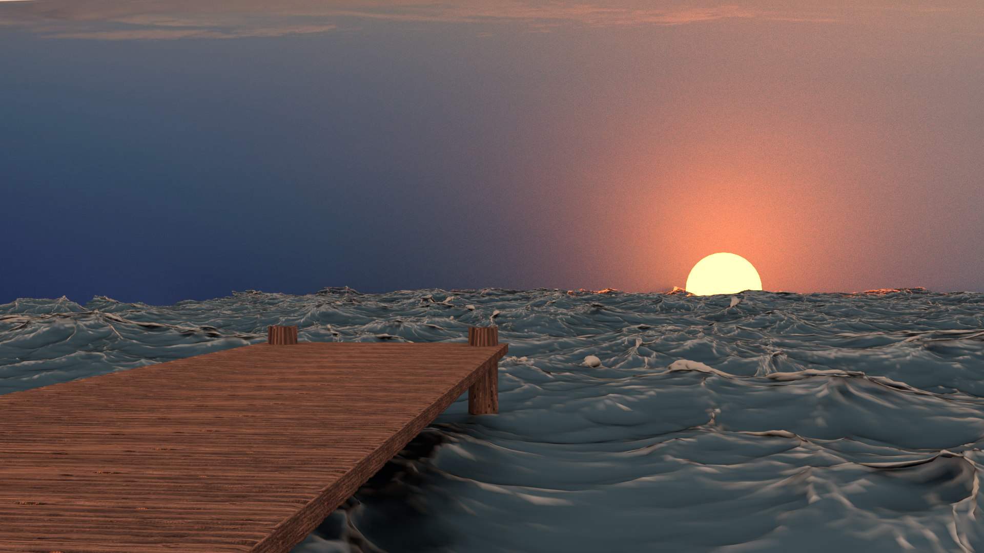
This September, all Blender Live Events will be dedicated to community critiques. That means each week in September we will select a few Citizen Pro members' Blender projects to critique live during a stream.
If you would like the focused eyes and insight of Kent and Jonathan Lampel to help push your Blender Art to the next level, please submit one of your projects to this thread. Both of us specialize in modeling, texturing, shading, and lighting but I may try to convince Wayne Dixon to guest-host an animation critique...
NOTE: While all Citizen members have access to watch these live critique sessions, only Citizen Pro Submissions are eligible for critique. And you must be an active PRO member during the time of the stream too ;)
Great initiative! Here's my submission:
https://cgcookie.com/u/tbrbn/projects/bulky-lizzard
Went through the creature modelling course, it was quite helpful but there's room for more I'm sure!
Hey cool - glad to see this come out of the creature course! Thanks for submitting ![]() tbrbn.
tbrbn.
Here is my project for critique, I wish I had more time to polish.
https://cgcookie.com/u/dostovel/projects/all-terrain-heli
I was going for a banged up, I-made-it-myself look, as if a mad industrial designer genius made it in his basement on his spare time. It is still a WIP because I plan to add more stuff to the model later down the road and make it all terrain. It will be able to be driven, flown, underwater and into space!
Oh and Wayne Dixon is available to do a guest critique stream this month! So if you've got animation work that you'd like him to review live, please submit here as well.
UPDATE: For tomorrow's stream, @jlampel and I will be reviewing the submissions from ![]() frikkr
frikkr ![]() polygondust
polygondust ![]() dostovel and
dostovel and ![]() tbrbn. Don't worry if you're not in that group. At this point we're confident that we can review all 11 submissions by the end of September!
tbrbn. Don't worry if you're not in that group. At this point we're confident that we can review all 11 submissions by the end of September!
Great! Thanks Guys :) , I really appreciate you taking the time to review my work, it will be a great help in improving the helmet when I rework it , and also for my portfolio projects that I will be starting at the start of next year to hopefully help me begin a freelance career.
I look forward to hearing what you have to say.
See you all tomorrow!
Edit* I just noticed the stream starts at 5PM my time, which is exactly when I finish work, So I may be a bit late. I am actually on holiday next Thursday and will definitely make it on time then , so if it benefits you to swap me for somebody else tomorrow rather than risking doing mine and me missing it (thus wasting your time when somebody else could be benefiting from it tomorrow) then just go ahead. I would feel terrible if you took time to critique my work and I wasn't even there and another person could have had their work reviewed in my place tomorrow.
If not then I will rush home and jump on the computer as soon as I get in :)
My apologies, Im sure I read the time as 8PM back when I RSVP'd .
Thankyou to you both @jlampel and @theluthier for holding my critique back till the end and then very kindly staying longer to go over what you said about it since I was too late to see it. Its that kind of commitment to the community that I love about CG Cookie :) . Much appreciated!
Kent and Jonathan,
Thank you so much for the live critique! I was bummed I couldn't make it, I was on campus at the time - but I was so happy to see the video when I logged in. Very cool after all the hard work going over your videos to get direct feedback from you!
Thank you for the positive feedback, it made me feel very proud of the model! I also enjoyed the critiques. I think I actually made the eye a bit darker because the highlight wasn't showing up on the render. Now that you mention it, it definitely looks too dark. I'll have to go back and fix that. It might wash out the little highlight on the eye, so I wonder if there's a way to make the highlight stronger?
Agreed on the flight feathers! Those bothered me, but I wasn't sure exactly how to fix them. For some reason the red and grey color overrode the details in the normal maps and textures. I can try to tone down the color more, and maybe make a node that exaggerates the normals and alphas. (Or filmic color management, which I also haven't used before!)
Jonathan, when you talk about brightening up the model with the histogram, is that post production or part of the render settings? Not sure what to tweak to get that effect! Now that your mention it, the red and green are definitely fighting each other - they are clashing, but they don't have to, so that's a good change to make.
Overall, great quality critique. Thank you so much for taking the time to make it thorough. This gives me a good list of things to work on to make the final animation better. I'll be tuned in for the rest of the critiques!
Thanks @jlampel and @theluthier !
Update: this week's stream will be by myself and Tim on Thursday, and will include the submissions by: ![]() shinsaku , vv001 ,
shinsaku , vv001 , ![]() gradyp , and
gradyp , and ![]() emissary-sound . We're trying to group these by topic, and the theme for this week is environments. If there's extra time I'll also include
emissary-sound . We're trying to group these by topic, and the theme for this week is environments. If there's extra time I'll also include ![]() silentheart00
silentheart00
Everyone else we will do next week or the week after! I'm saving the sculpts and characters for when Kent gets back since that's his forte. If anyone hasn't submitted but has an environment piece that they'd like critiqued I can try to get it in this week if you submit it soon.
Awesome ![]() frikkr and
frikkr and ![]() polygondust , I'm glad you found them helpful!
polygondust , I'm glad you found them helpful!
![]() polygondust Since it sounded like there were quite a few people who weren't quite sure how to use the histogram, I'll write up a blog post about it so that you all can get a thorough breakdown. I'd really recommend going through this course though if you want to learn right away. It covers the topic of adjusting color in the compositor in good detail: https://cgcookie.com/course/introduction-to-compositing-in-blender
polygondust Since it sounded like there were quite a few people who weren't quite sure how to use the histogram, I'll write up a blog post about it so that you all can get a thorough breakdown. I'd really recommend going through this course though if you want to learn right away. It covers the topic of adjusting color in the compositor in good detail: https://cgcookie.com/course/introduction-to-compositing-in-blender
I need some critiquing as I've only been using Blender for about a couple weeks or so. This was the second full project I did.

Is the stream suppose to be in the wee hours of the morning? If my guess is correct, I think everybody at CGCookie will be asleep at 2 am.
If I'm not wrong, the time anounced on the site adapts to your timezone. So you have 2 am when I have 9 am.
@jlampel
What I don't understand thow is that we are Tuesday today and the stream is said to be on Thursay (at 9 am for me). But then underneath it says "Starts in 1 day"... That's not logic.
Glad I'm not the only one that caught that.... I mentioned it in a Conversations with CG Cookie chat that as far as I can tell no one has looked at. Not that I'd mind... I'm usually up at that hour anyway :D
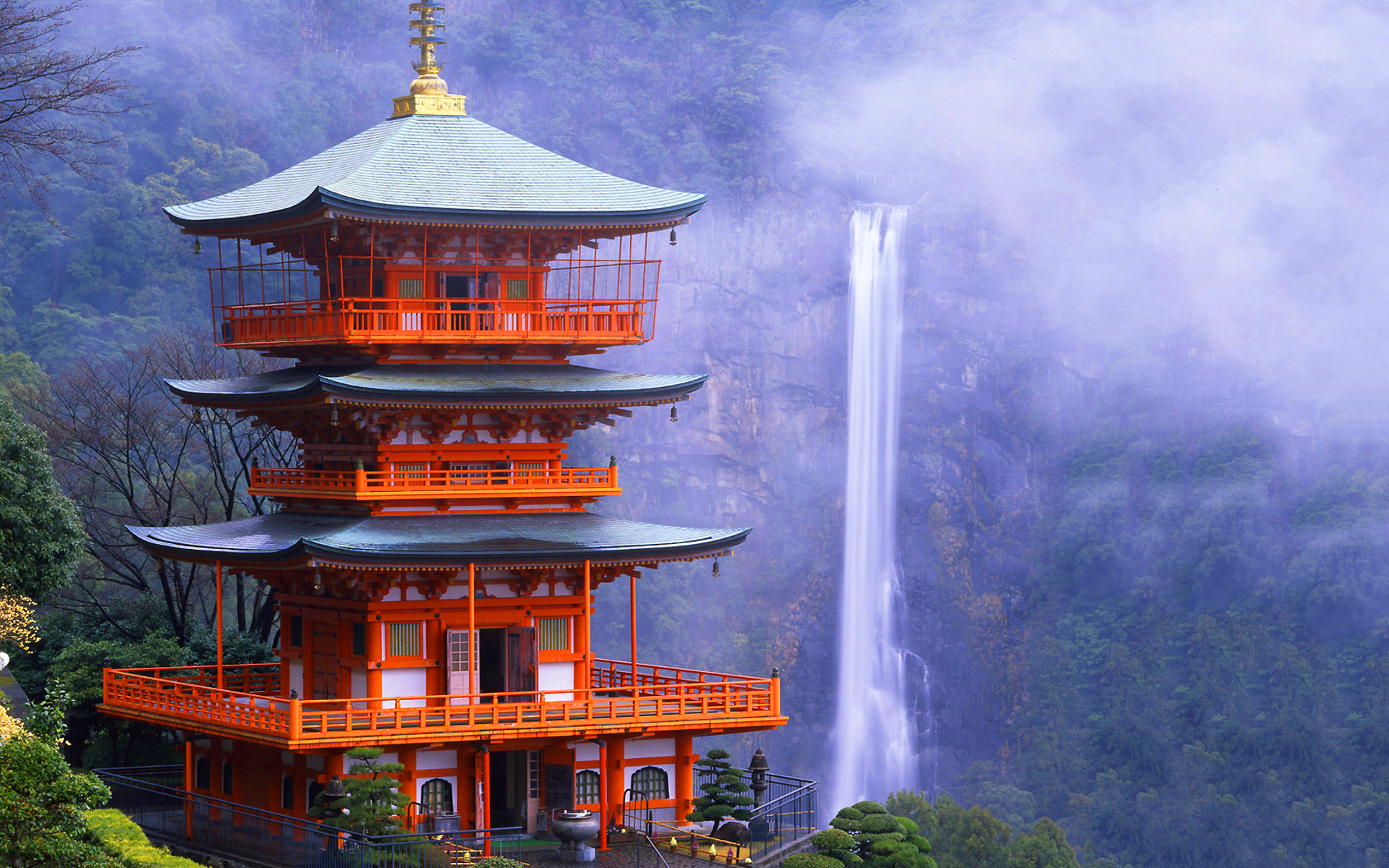
jlampel thanks for taking a look at my WIP temple. Stream was at 5am my time so I couldn't be there unfortunately. I agree 100% with the input provided. The proportions bothered me throughout the entire modeling process. I never thought of using a human shaped model to gauge proportions during modeling.

This is the reference image I used, Kumano Nachi Taisha temple in Japan. The plan for my final image is to include a similar background behind the temple. Thank you Jonathan and Tim for valuable input.