Hello all I guess it is time to start a new polybook. Been neglecting to post stuff I have been working on so I am going to dump a bunch of stuff now.
Here is my entry to a recent Weekly CG Challenge topic "Death" it looks really dark on my laptop but the computer I worked on it looked brighter.

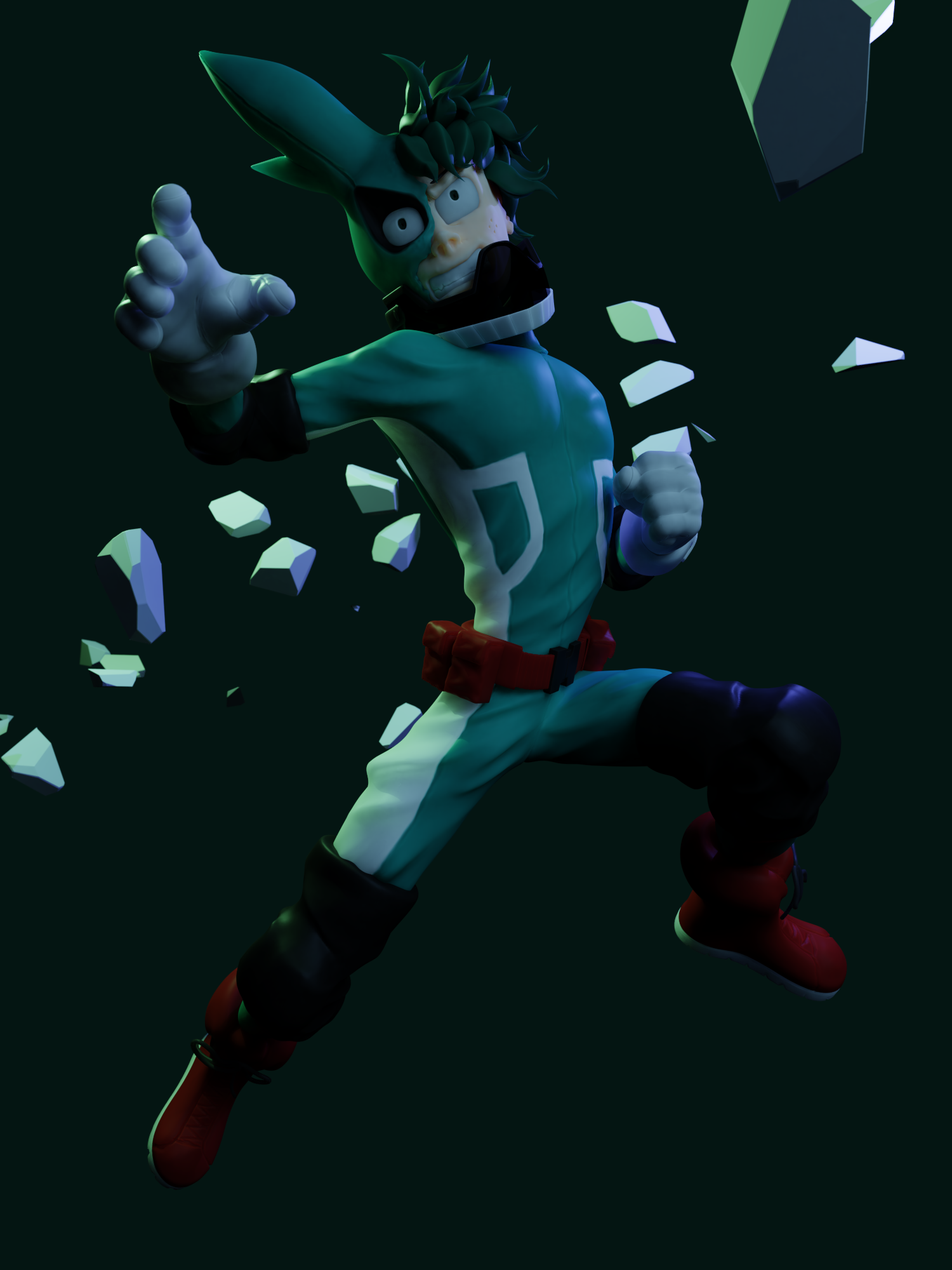
Currently working on a looping gif of Deku from My Hero Academia.
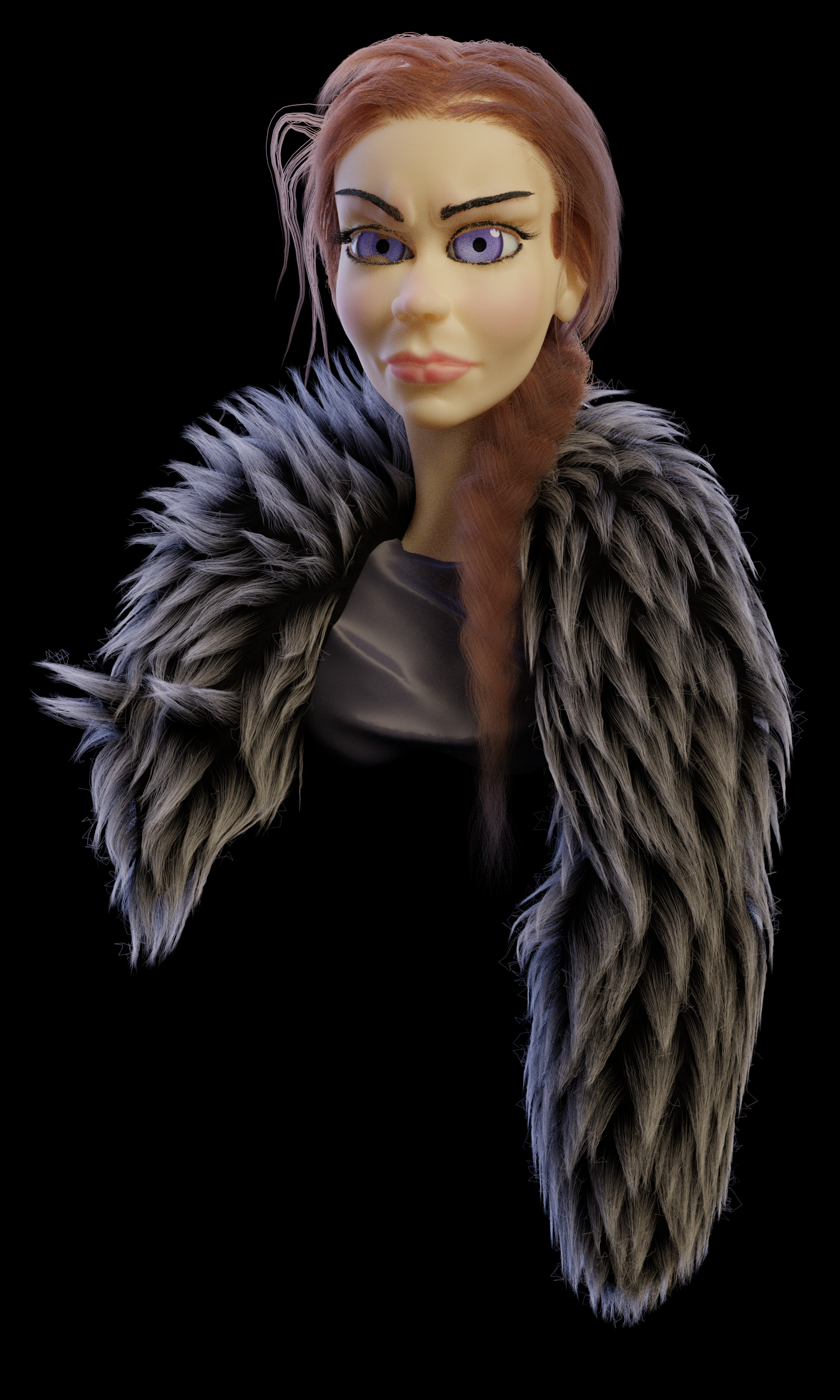
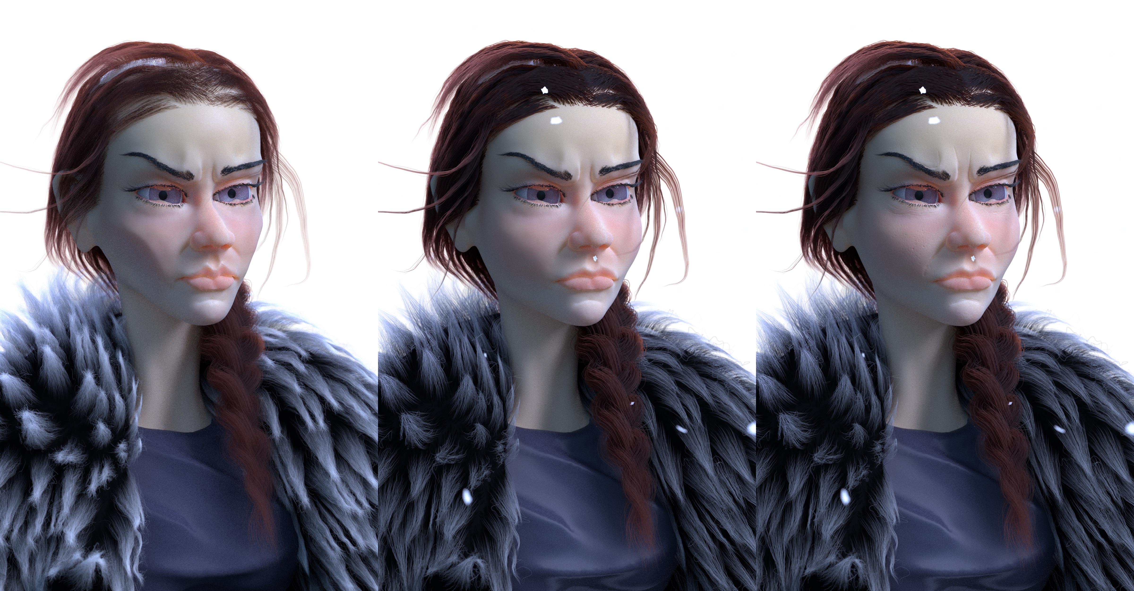
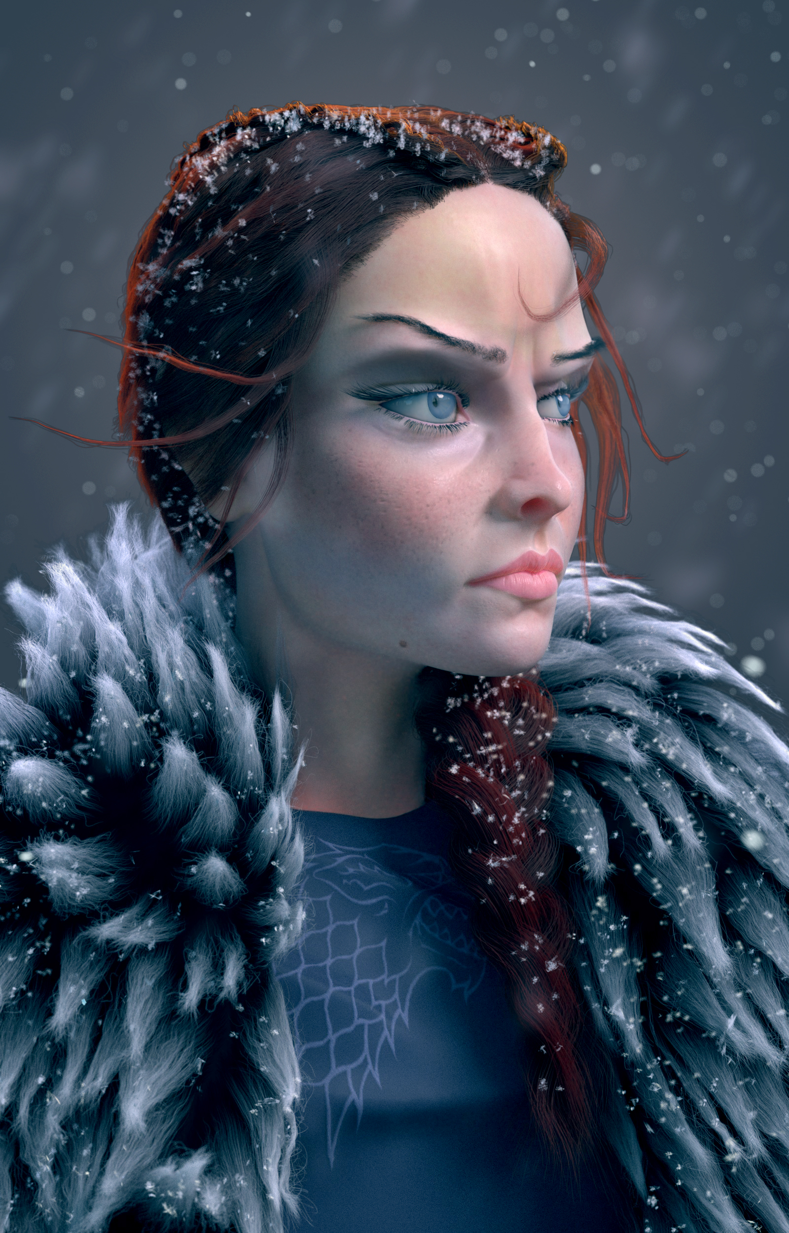
Also working on a character bust of Sansa Stark here is some progress renders. Currently trying to figure out how I want to stylize her face. Did a lot of experimenting on the shaders especially the skin and thanks to this blog post http://blog.lucasfalcao.com/p/four-tips-to-improve-your-sss.html I got it at a good place right now.
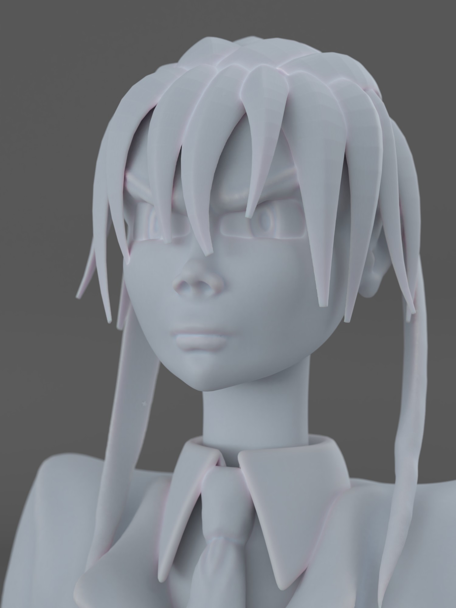
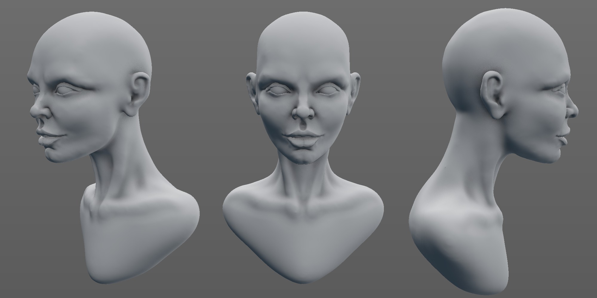
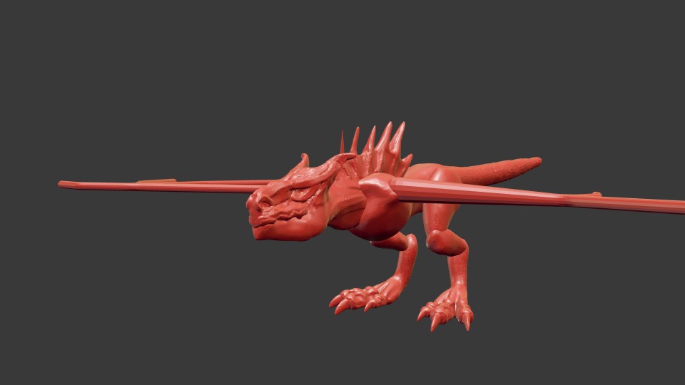
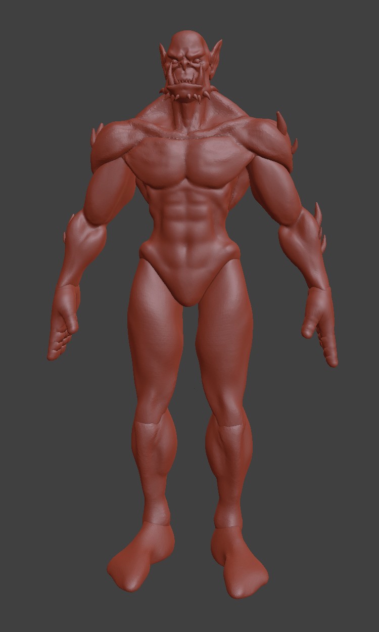
Also some quick speed sculpts did some experimenting on how best to present the models.

The "Death" one looks great! I love the lighting and the interaction between the body and the feathery wings. It really gives it a spooky floaty look. Also I hope I can eventually help with more technical terms than spooky and floaty.
Update on my Sansa render. Tried to improve the likeness. I am considering it near final if you see anything that sticks out please feel free to give a critique.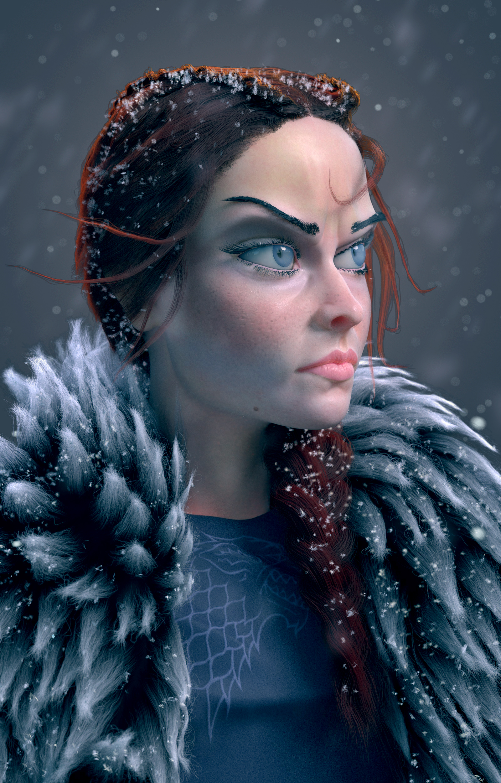
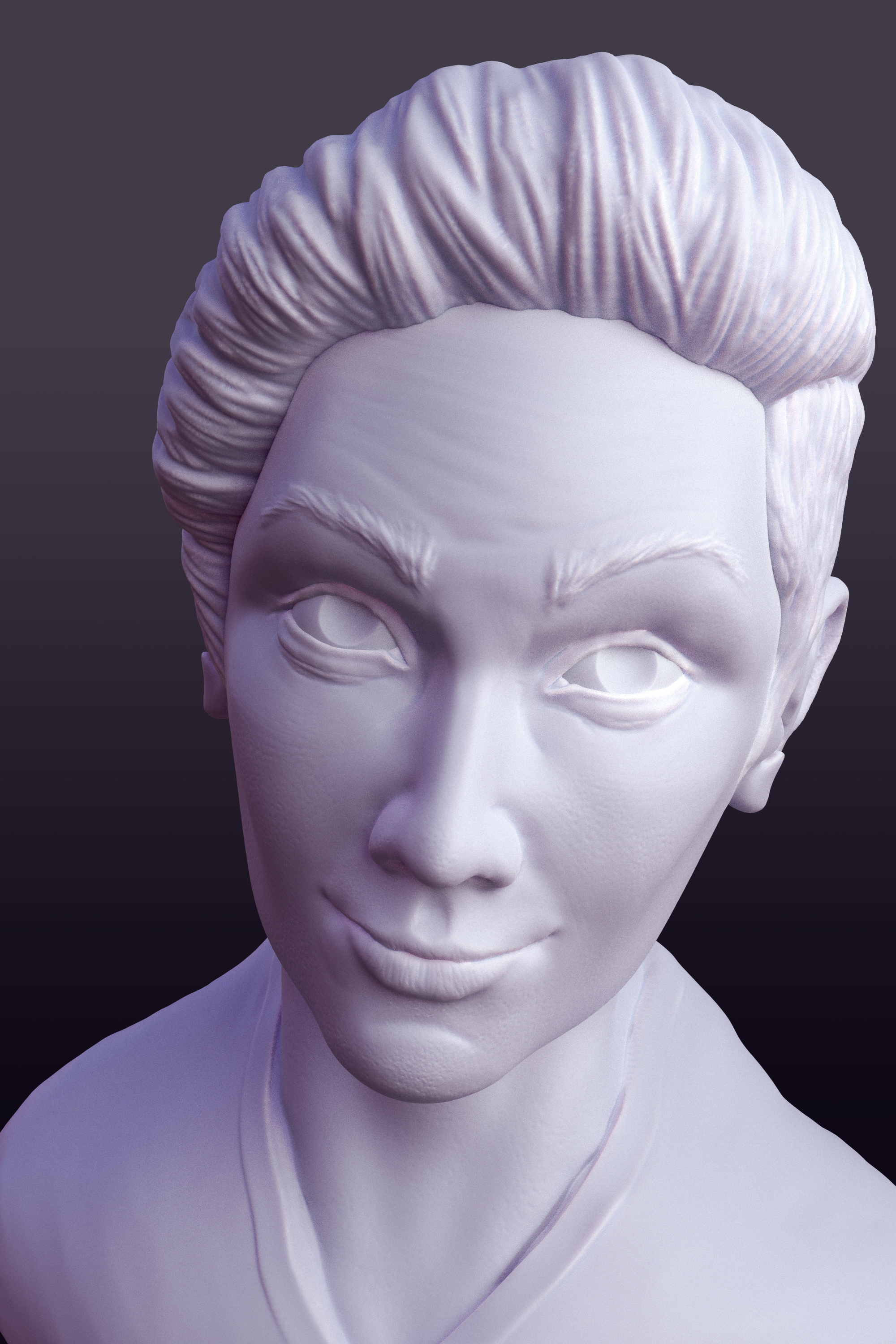
A 2-3 hour long speed sculpt trying to capture a likeness of Yanal Sosak
Thanks Laura! Your stylized female characters are something I strive to accomplish myself.
A quick photoshop liquify test based on some critiques I got about the eyes and the expression also thinning out the eyebrows

Finished my Deku looping animation 
Still working on the Sansa render mostly testing out lighting moods and expression tweaks.
While I work on finishing the Sansa portrait which is mostly waiting for renders to finish and tweaking I am getting started on an entry for the BlenderGuru Fantasy competition
Finally have an update. Started doing larger sample renders and they were taking forever so I lowered the samples and went with denoising. Did some editing to enhance the redness of the hair to make it stand out from all the blue. Increased the DoF. Shrunk the eyes and tweaked some of the shapes. Not sure on the background if I should go simple or more textured. Currently it is a blurred photo.
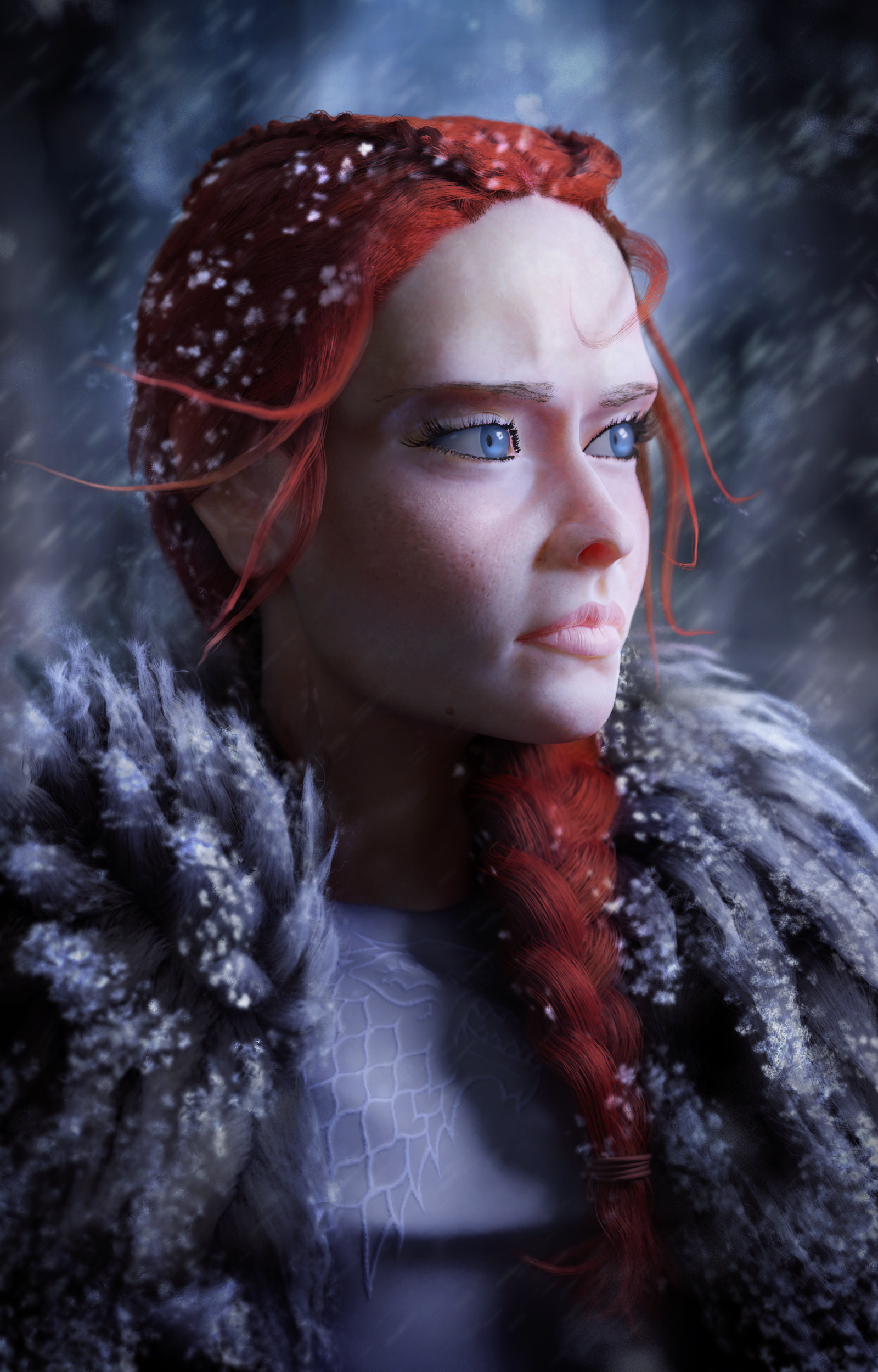
Id say the blurred photo works wonders. it brings the depth of view better out. and this kind of close up, if you had clrear background, it wouldn't work. nicely done!
Thanks Kaj I think I agree that it helps with the DoF. The more clear background conflicts with the more detailed character.
Curious if there is anything specifically that gives you the uncanny valley feeling Mark?
Looking good Cody!
Curious if there is anything specifically that gives you the uncanny valley feeling Mark?
I'm getting a bit of the uncanny feeling as well, so I made some notes that will hopefully help:
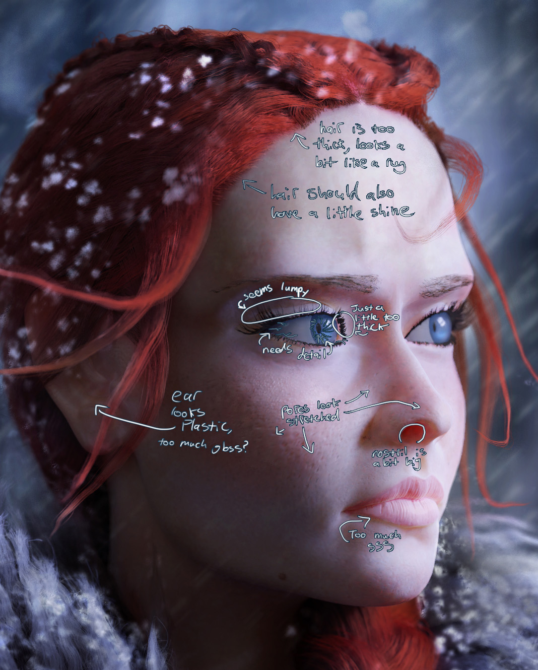
Another thing I forgot to mention above is that the eyebrow hairs are too thin and you may want to try painting a density map for your SSS, so that you can have more scattering where there is cartilage and loose skin and less where there is bone. E.G. the base of the nose between the eyes should have much less SSS than the tip of the nose.
You're well on the way though, keep it up! Faces are one of my toughest enemies, so props for tackling such a difficult subject.
As usual I haven't posted in awhile, but I am back again.
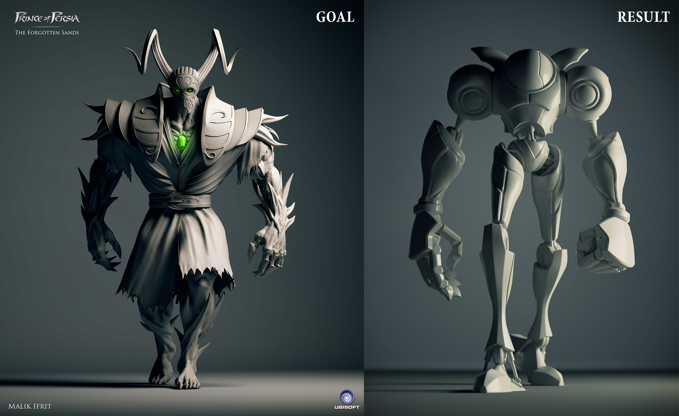
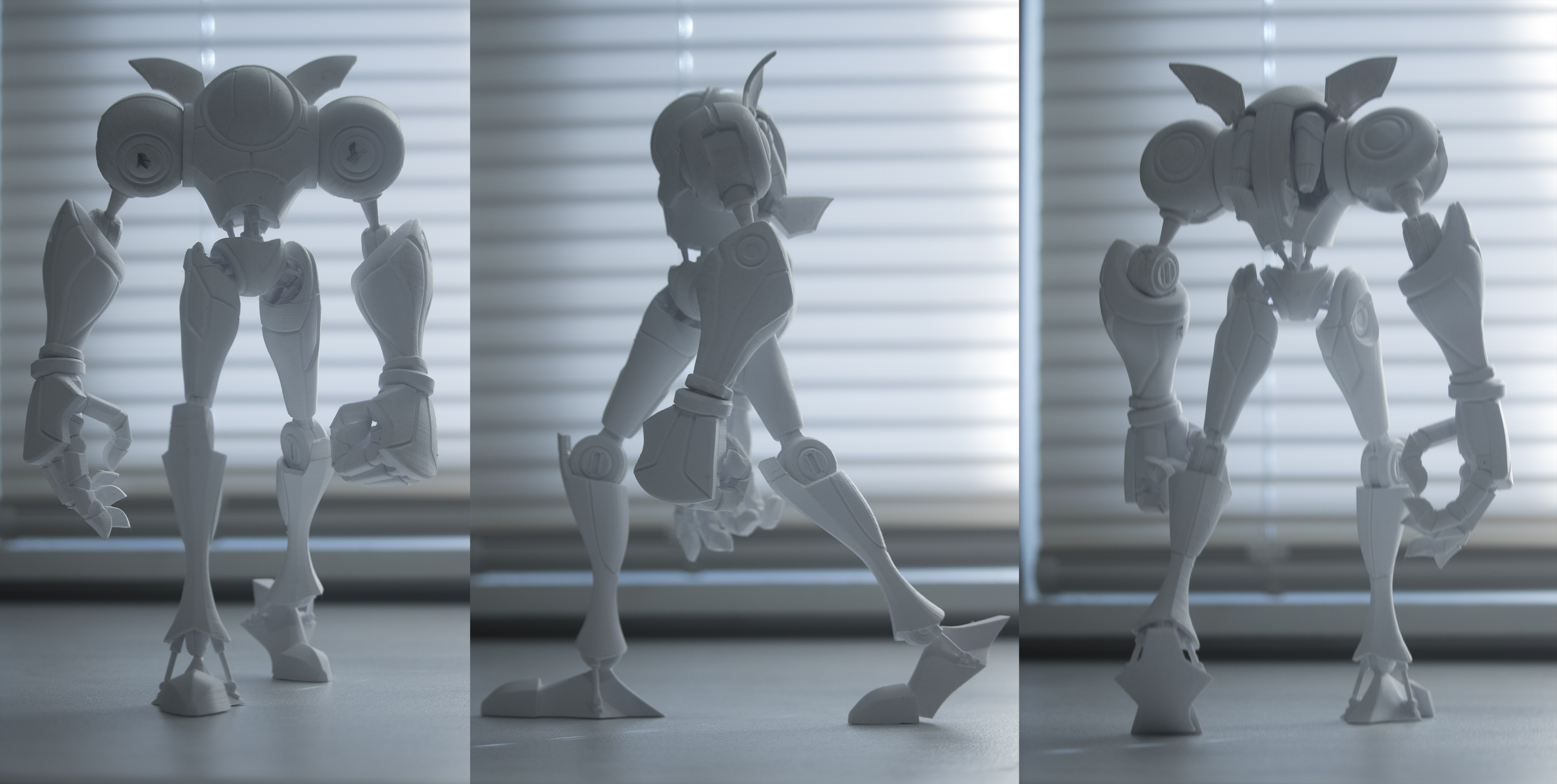
Here are 2 models I did recently a werewolf sculpt and a robot. Both were used for the matching a lighting reference challenge.
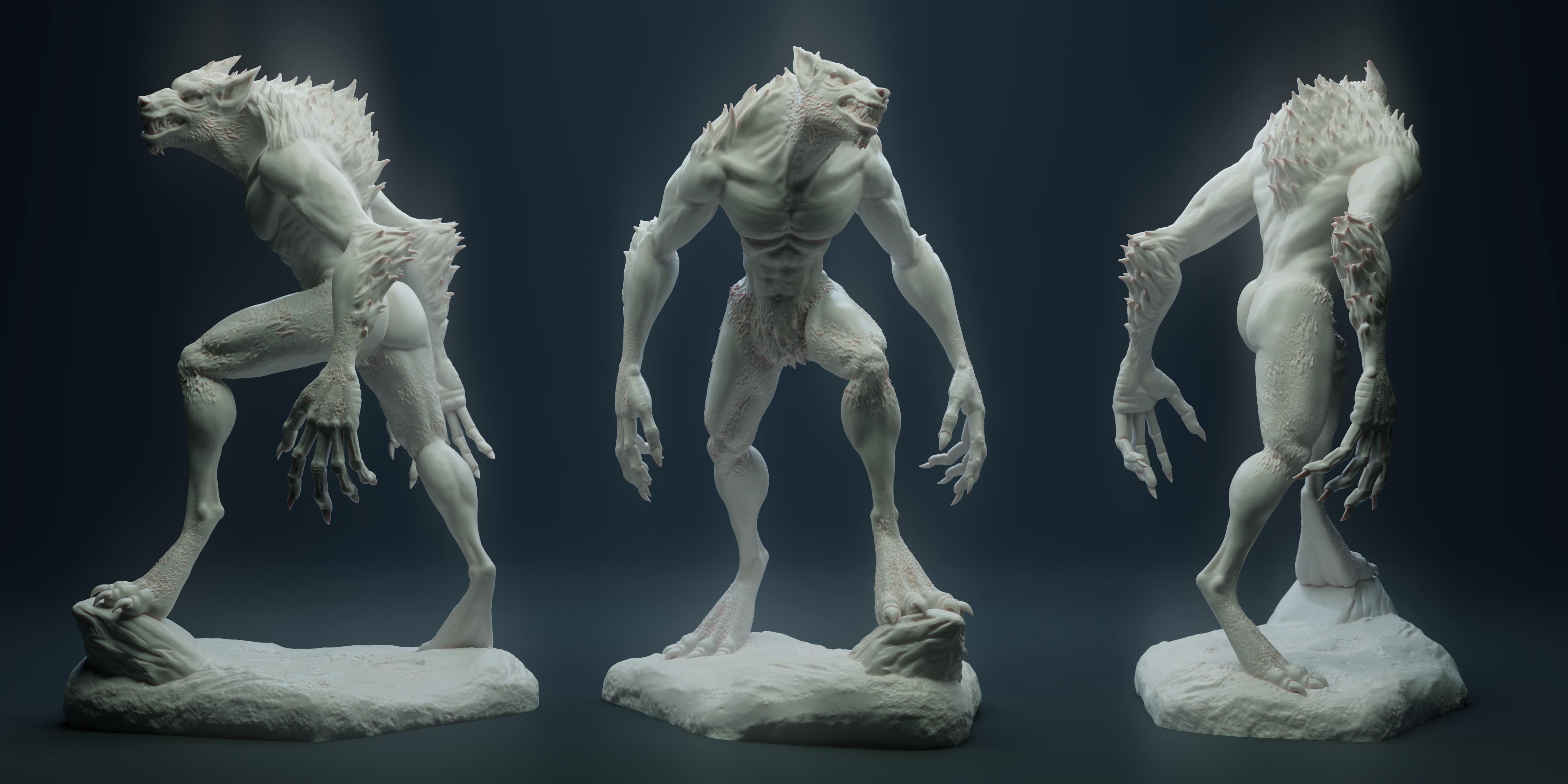
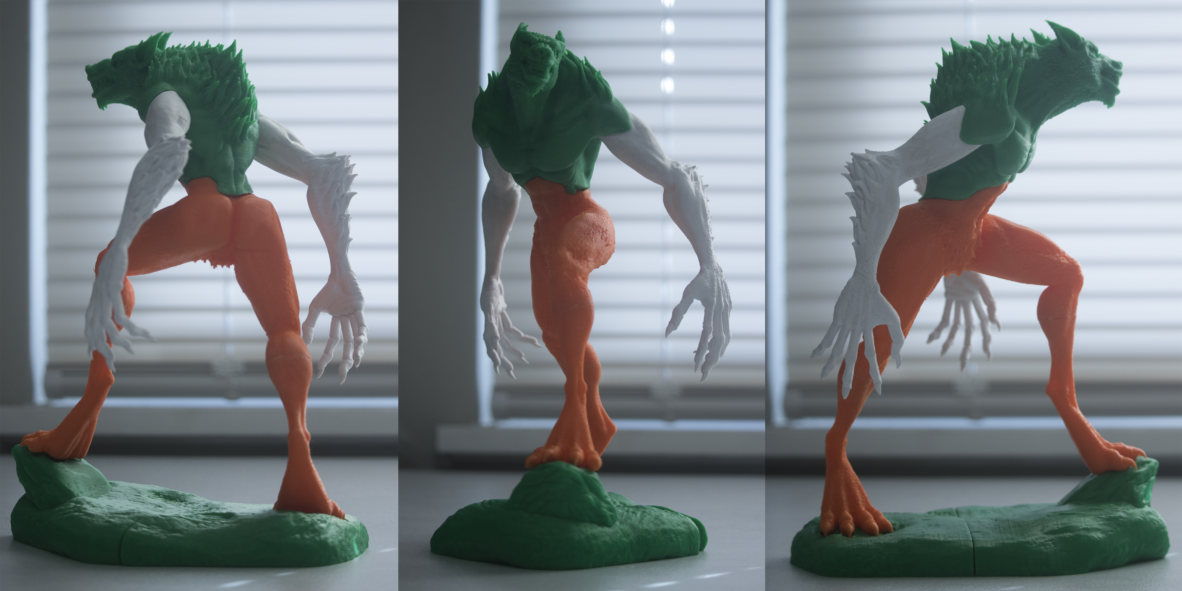
I also printed both these models as 9" tall figures. I plan to eventually sand/clean up the prints and paint them.
Also I got a little bit of a late start on SculptJanuary 2018. I am currently on the Day 6 Topic and trying to catch up.
Day 1 - Nose and Mouth
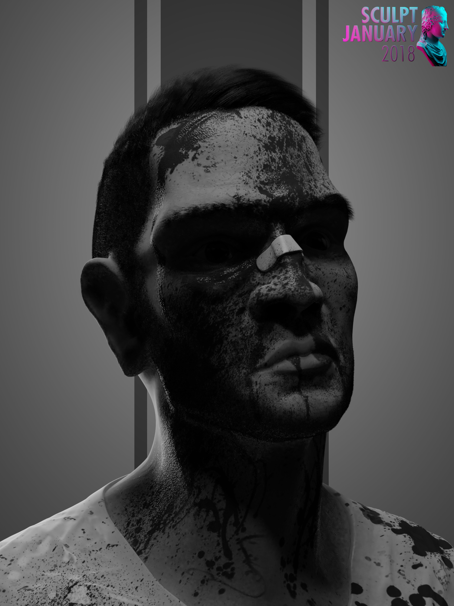
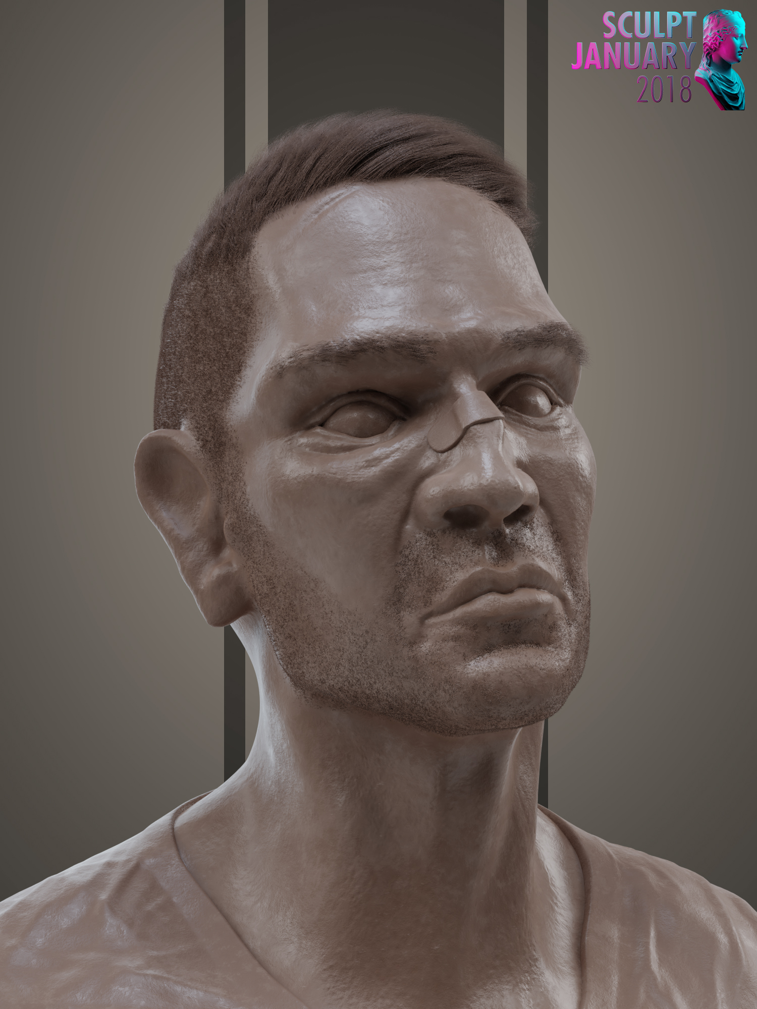
Day 2 - Mask
Referenced an oni mask from the cartoon Jackie Chan Adventures.

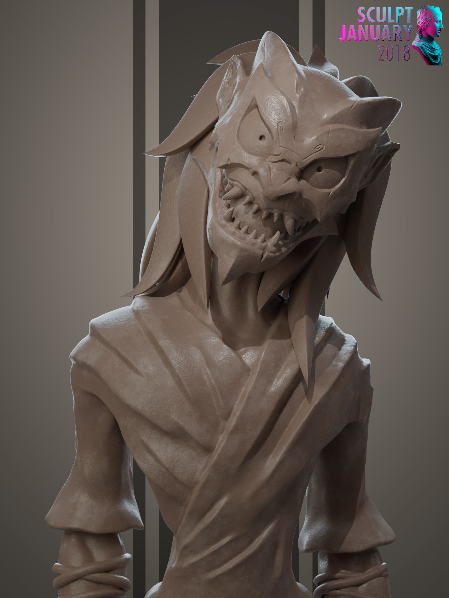
Day 03 - Excitement

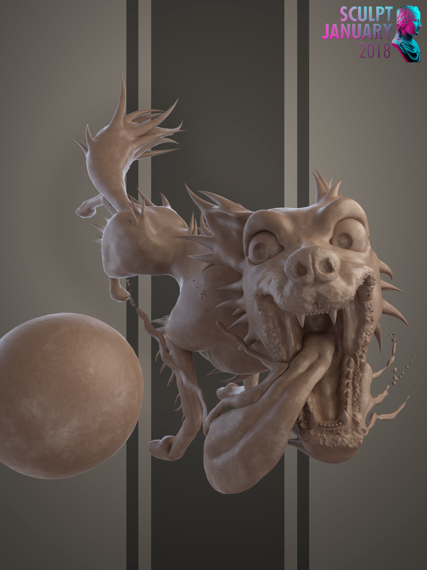
Day 04 - Desert
Really struggled on this one because I could not think of a good idea
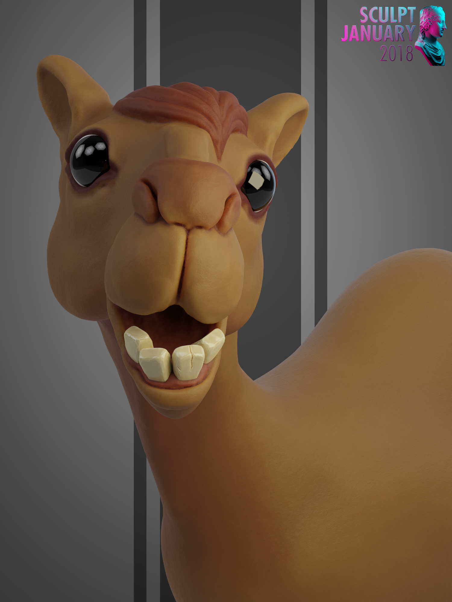
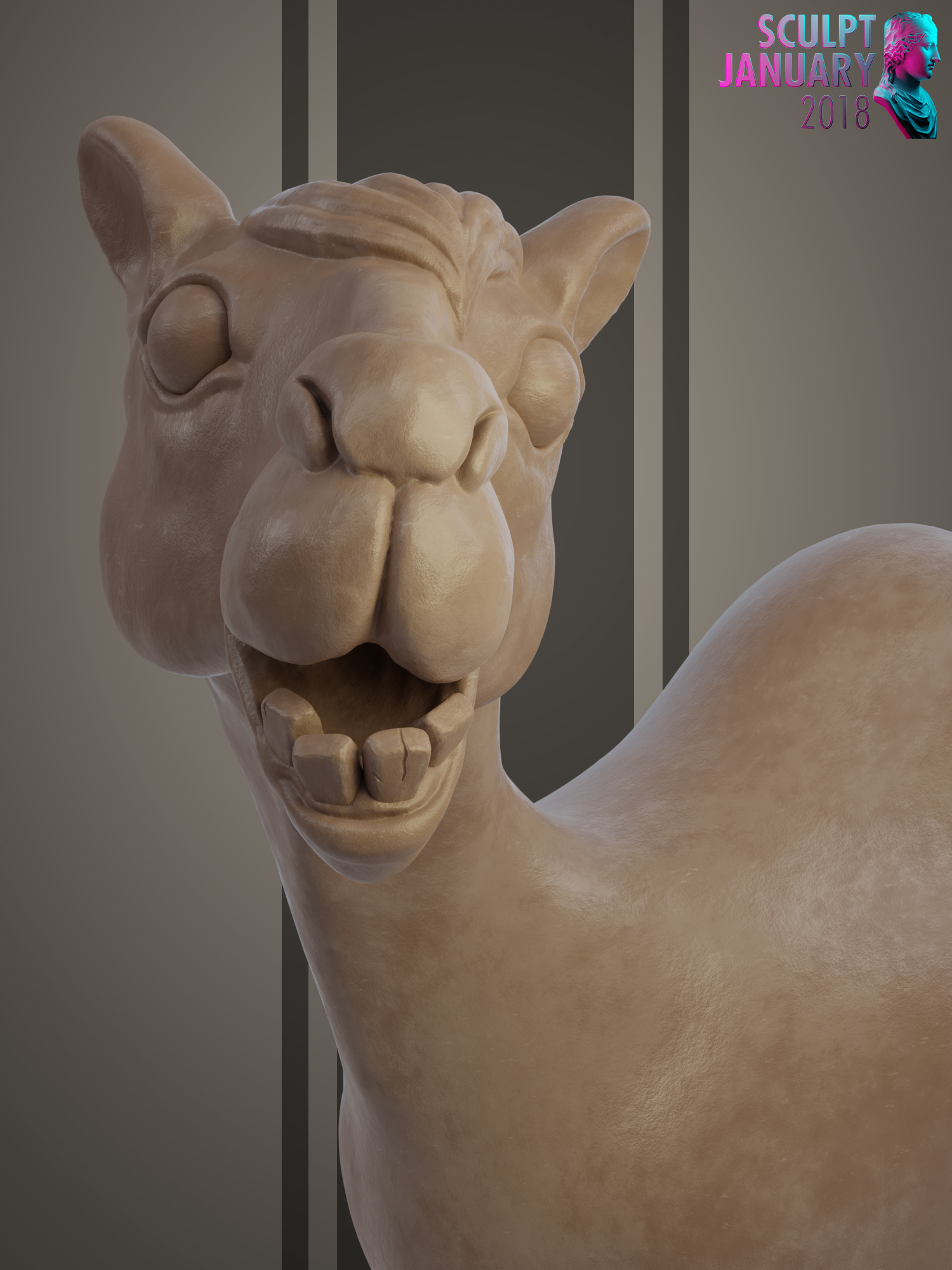
Loving the the dog! :) the camel looks bit off, maybe its those eyes. too shiny compared to the rest of the model. comparing to the dogs eyes which seems more in balance with rest of the image.
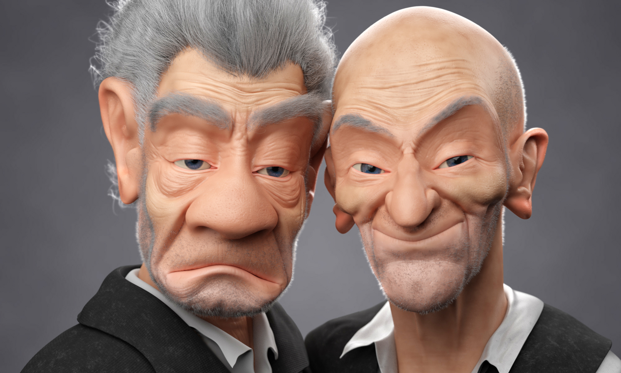
After the critiques from @theluthier and @jlampel in the live stream I tweaked my models a bit. I think it was Kent that said it looked like it could be a selfie so I changed up the pose and expression to make it feel more like a selfie and make them a bit more expressive.
I also put a bit of work into changing the hairline so it isn't as sharply defined. Mostly I switched from Interpolated Children to Simple and that helped it look natural.
It is pretty much done I am going to give it a couple days and look back at it to see if I notice anything wrong with fresh eyes then probably call it done.
Previous Render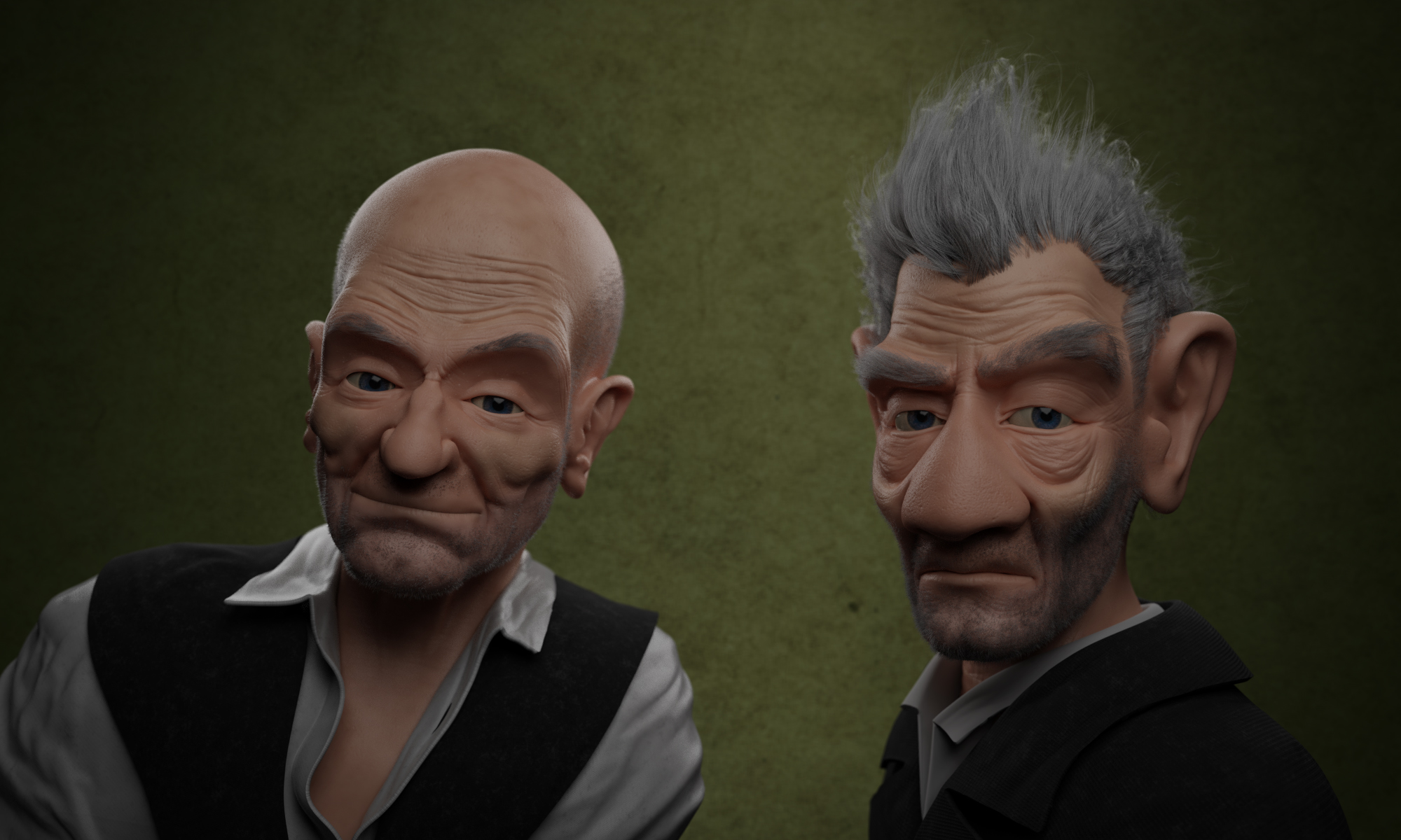
New Render