Final image as entry for the challenge:
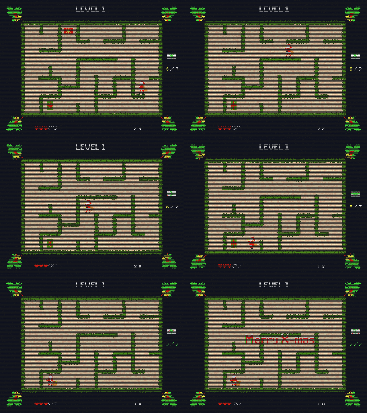 Posting it here, just in case I can't get it to look right in the Gallery (I am struggling with some unwanted compression there).
Nice idea. I know nothing about gifs, what are the color limitations and is there anything else you would have to consider. Do you need to use a different resolution, does the frame rate matter? Do they always look pixelated and sort of blurry?
Gif uses a color palette that can hold up to 256 different colors ( compared to 256 x 256 x 256 > 16 000 000 in an 8 bit JPEG for instance).
Resolution and frame rate also matter for the finale file size, but you can first make a GIF and then optimize it to reduce the file size and compare the quality with the original. (At least in the online Gifmaker I use, which is called Ezgif. That one works really well, but I have not tried any others, so I can't compare it...)
It doesn't have to look pixelated and the blurriness mostly comes from the lossy compression they use, but you can adjust the level of compression to minimize the blur.
![]() spikeyxxx thanks for answering the questions. Since it appears that file size and compression are issues, do I want to do something that is lower poly and doesn't have much detail? This is a hard one to come up with an idea for, especially since I am unsure the. limitations, if any, the gif will cause. Is Ezgif pretty easy to figure out how to use?
spikeyxxx thanks for answering the questions. Since it appears that file size and compression are issues, do I want to do something that is lower poly and doesn't have much detail? This is a hard one to come up with an idea for, especially since I am unsure the. limitations, if any, the gif will cause. Is Ezgif pretty easy to figure out how to use?
Ezgif is super simple to use: just upload a video or image files (accepts all sorts of formats) and press "make a GIF".
Then you can worry about compression and so. Maybe take a look at some ready made GIFs online, to see what is possible.
Doesn't have to be low poly, but don't go too crazy with details or realistic materials.
My first attempt at pixel art, a lot trickier than I expected:
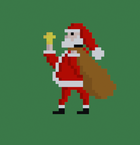
Subdivided a Plane into 32 x 32 squares and then assigning colors to each square. My first material was a Transparent Shader, so that was assigned to everything and then I filled in some squares black to get a 'shadow figure/silhouette'. After that just swapping black squares with other colors...
Still not happy with his right hand and the bell...that will need some more work...but in general, not too bad, I'd say.
Here's what I have so far:
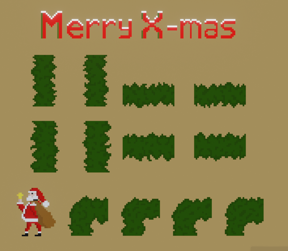
One of the biggest challenges is to try and keep things consistent.
Have considered turning this into 3D with colored cubes, but, apart from the fact that that would be a lot more work, I think that would ruin the old computer game look, giving it more of a Lego vibe..and I really like where this is going...but still, maybe try a small piece to see how that looks...
Made a T piece of the hedge and started building a maze, only to discover that my Santa was too small, compared to the space between the 'walls' 😭
Couldn't simply scale him up, because then the pixel size would not be the same.
Re-made him from the small (pixelated!) version, but I am not overly happy with the result...probalby better to make him from scratch from the (unpixelated!) silhouette.
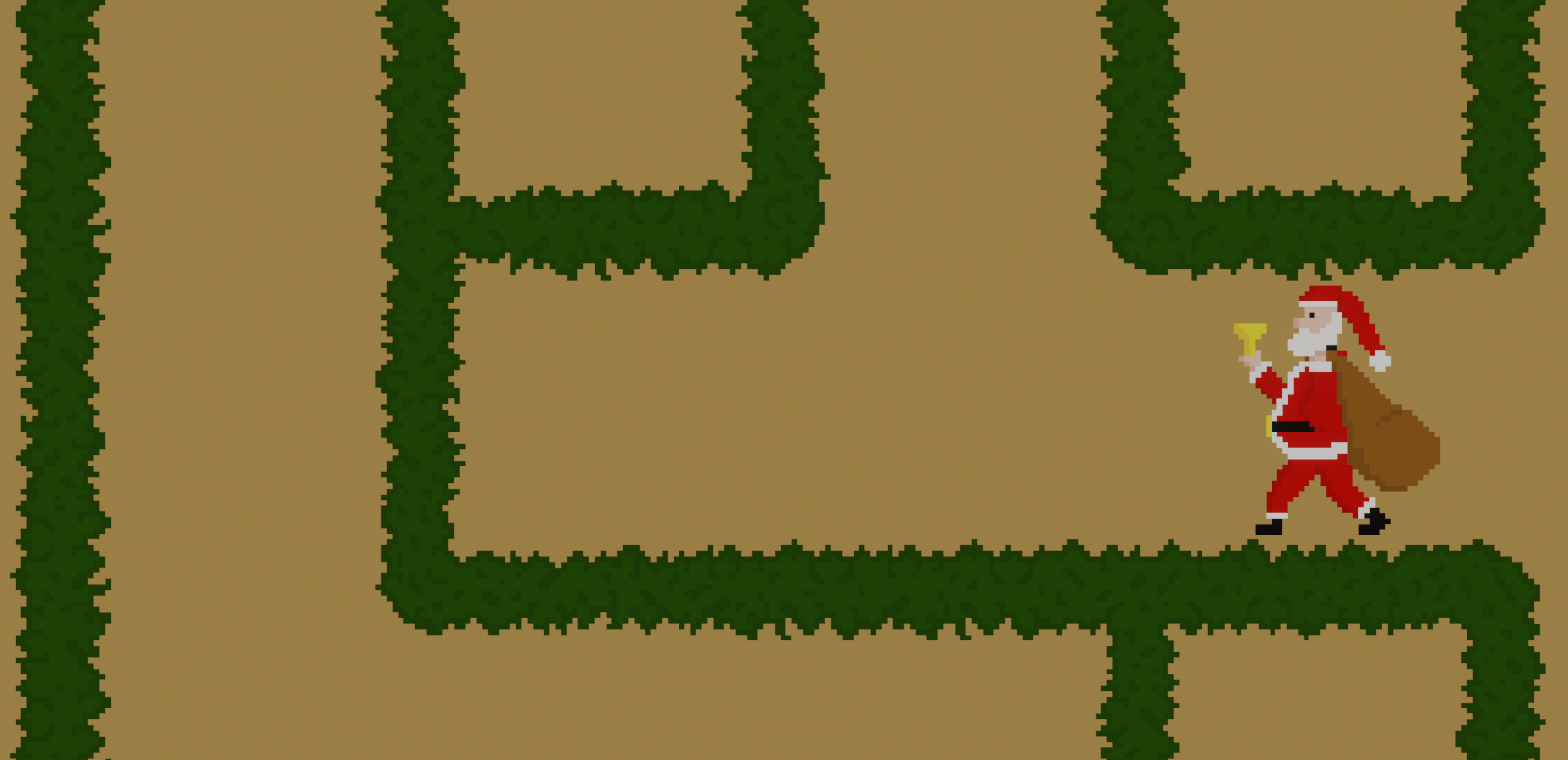 The thing is: changing one single pixel has a dramatic effect on how something looks when making pixel art...
Cool! Your Santa looks great. Did you take that old pixel art course on cgcookie, by any chance?
Thanks ![]() jammingammon !
jammingammon !
No, I didn't even know there was a pixel art tutorial on CGCookie...I did see JLampels Voxel one, but, although I first tried a similar automated technique, that does not work at all for 'real' pixel art; each pixel has to be colored by hand. The funny thing is, that it is one of the rare occasions, where you should not work from photo reference...
There's some REALLY old ones by Tim Von Rueden, a former concept artist from cgcookie, I believe? Maybe not relevant here though, I think they were photoshop based. Anyway, cool pixel art. Looks like a holiday-themed pacman clone.
![]() jammingammon I almost exclusively ever watched Blender tutorials here, so I missed that...Checked out some YT tutorials, but most of them where not really tutorials (the ones I watched at least), but more like "Five mistakes to avoid when making pixel art"...
jammingammon I almost exclusively ever watched Blender tutorials here, so I missed that...Checked out some YT tutorials, but most of them where not really tutorials (the ones I watched at least), but more like "Five mistakes to avoid when making pixel art"...
I did indeed have Pacman in the back of my mind 😊
Re-made my Santa and tried to make a walk cycle; he is running to collect all the presents before Christmas:
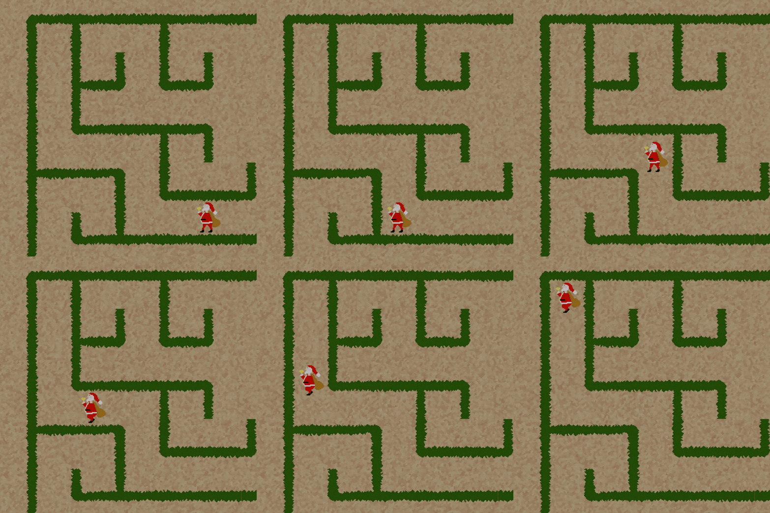
Some more testing:
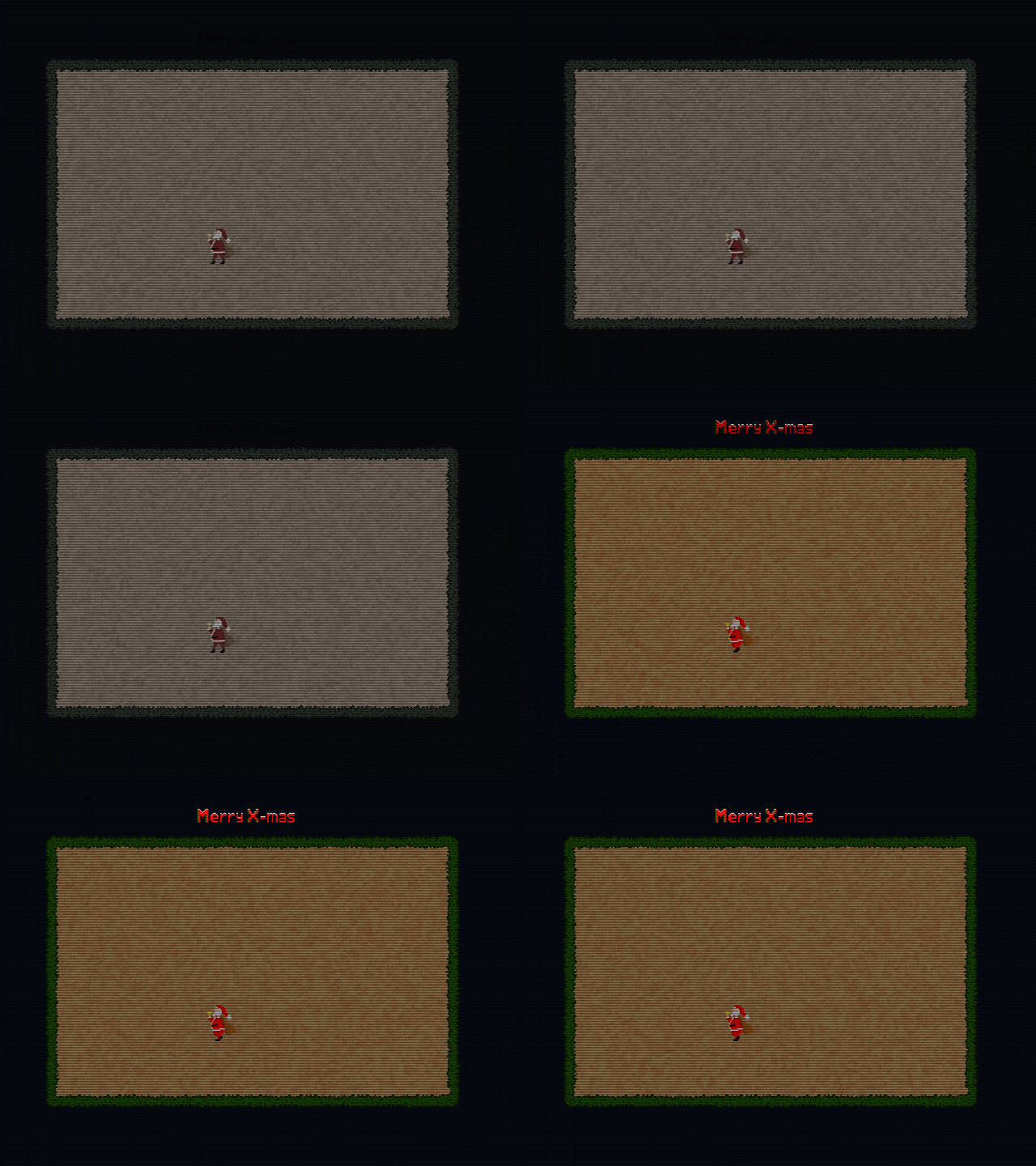
Wanted to create a 'screen distortion' effect as well, but I don't think I can do that, because that would bend the scanlines and even the pixels, so that would mean a crazy high resolution (and thus also filesize) and it would look horrible on a phone, for instance...
And for those interested, here are the Nodes for the scanline effect:
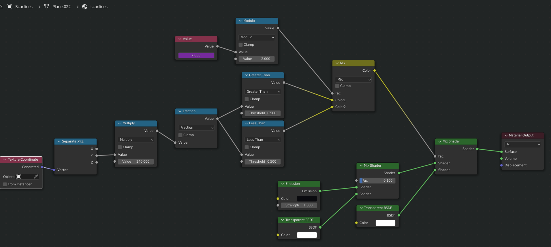 The Value Node contains the frame number and the Modulo 2 makes the odd numbers 1 and the even numbers 0.
The Y of the Generated Texture Coordinates goes from 0 to 1, so the multiplied version goes from 0 to 240 and the fraction (what comes after the decimal point) is half the time greater (or less) than 0.5 so this gives 240 white lines and 240 black lines, which corresponds with the vertical 480 pixels (the resolution I use is 640 x 480).