Don't know what's wrong with those Faces, but to 'solidiy' lines, you can use a Skin Modifier, or make them into curves:
Make sure they are separate Objects and that you are in Object Mode and then:
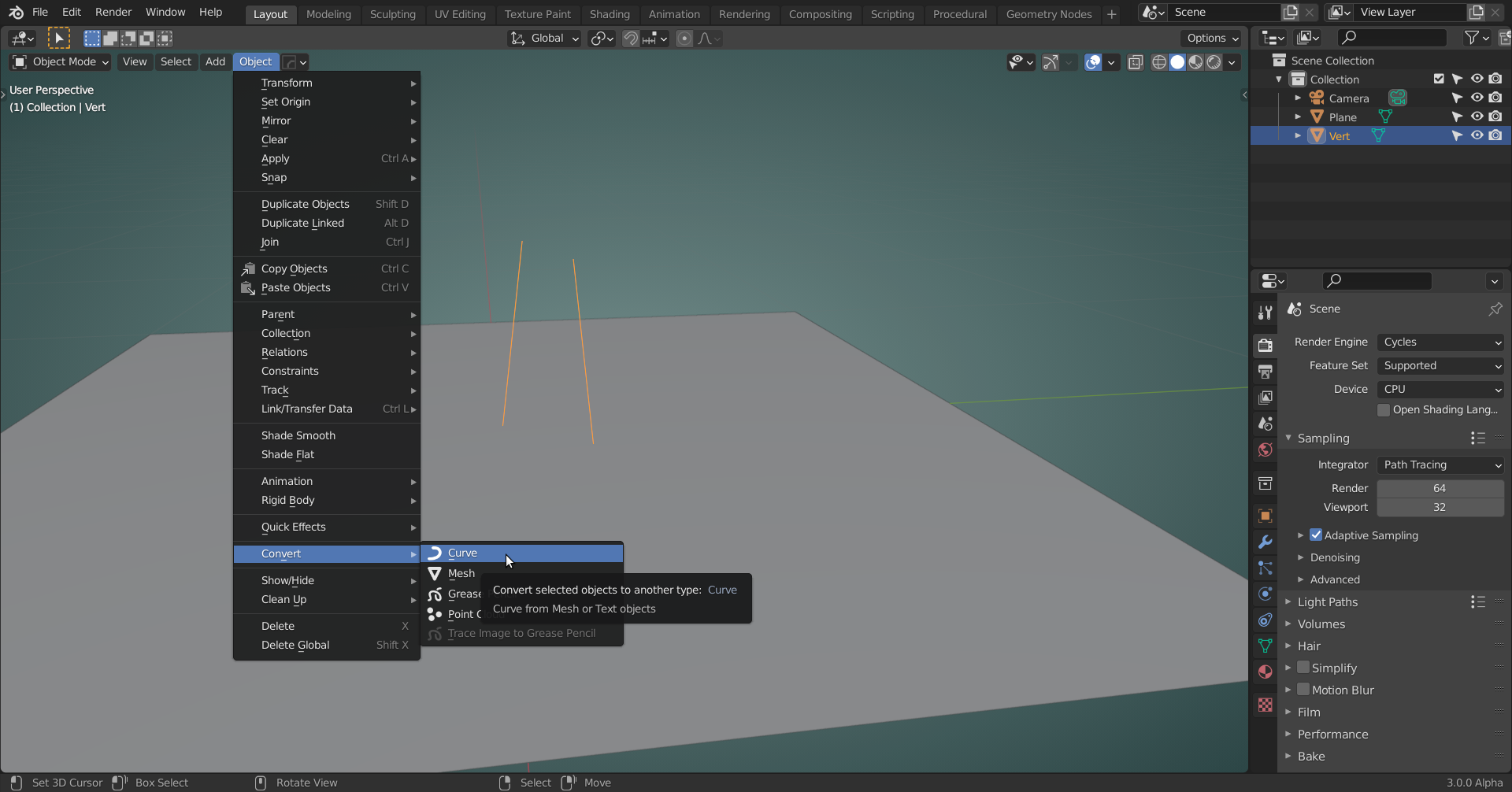 Now you have a Curve Tab in the Properties Panel, where you can set a Bevel and change the Resolution if you want:
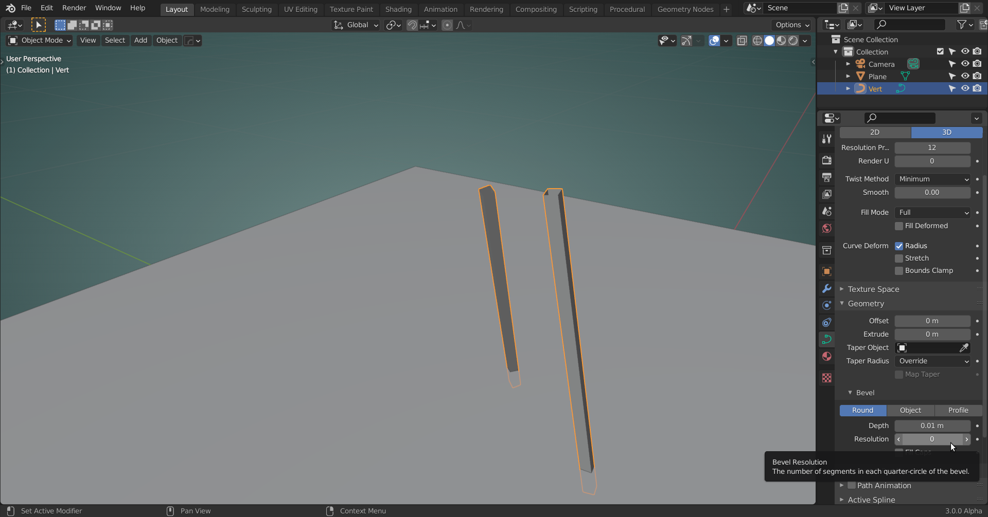
Spikeyxxx's solution worked! I'll post another picture of the room when I've made a few more changes to it
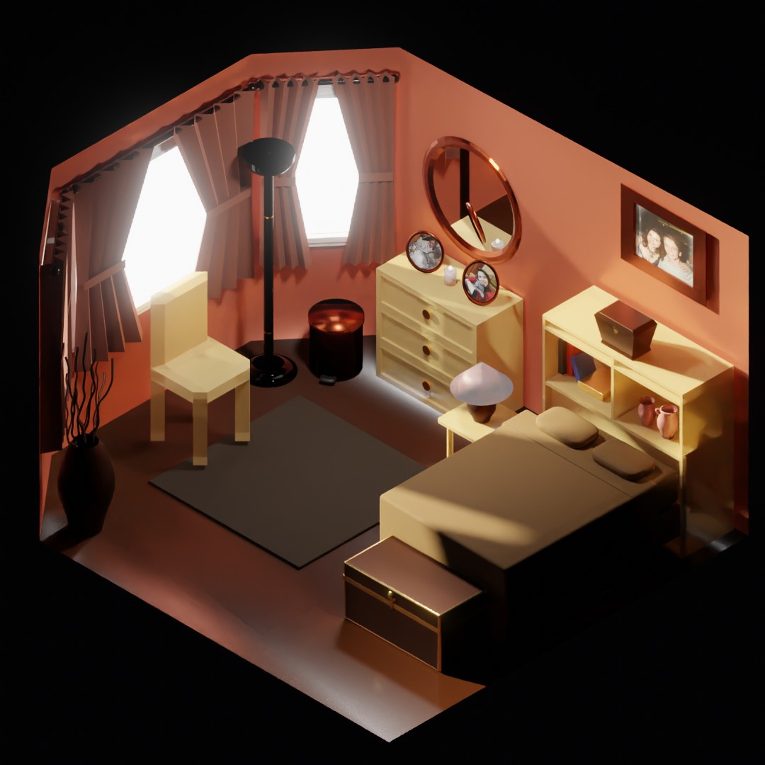
I used Spikeyxxx's solution for the twigs coming out of the floor vase. I also added a candle, a couple of boxes, a chair, and a couple more pictures. Thanks, everyone, for your suggestions and feedback!
![]() laurettabucher could you post a link (via dropbox or so) to your .blend file? I'd like to investigate those transparent legs and side.
laurettabucher could you post a link (via dropbox or so) to your .blend file? I'd like to investigate those transparent legs and side.
Thank you very much for the offer, spikeyxxx. I actually figured out what happened. I had the alpha under the material for the headboard, the dresser, and the chair set to around 0.5 instead of 1. Now that I've set it to 1, the headboard and the legs of the chair no longer look transparent to me, and I added another light so the seen is more visible:
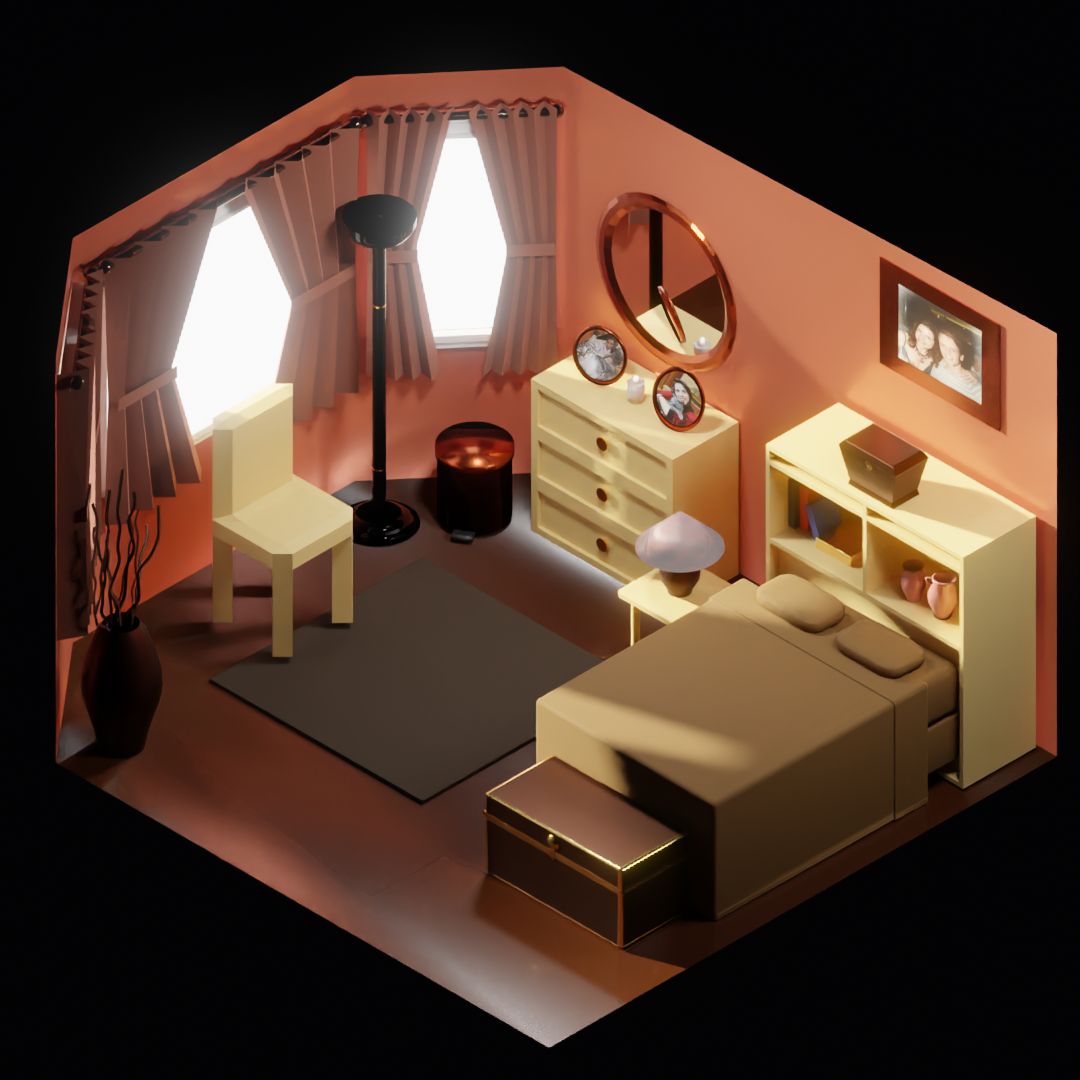
That's a great looking room! Love the addition of the picture frames and the candle!
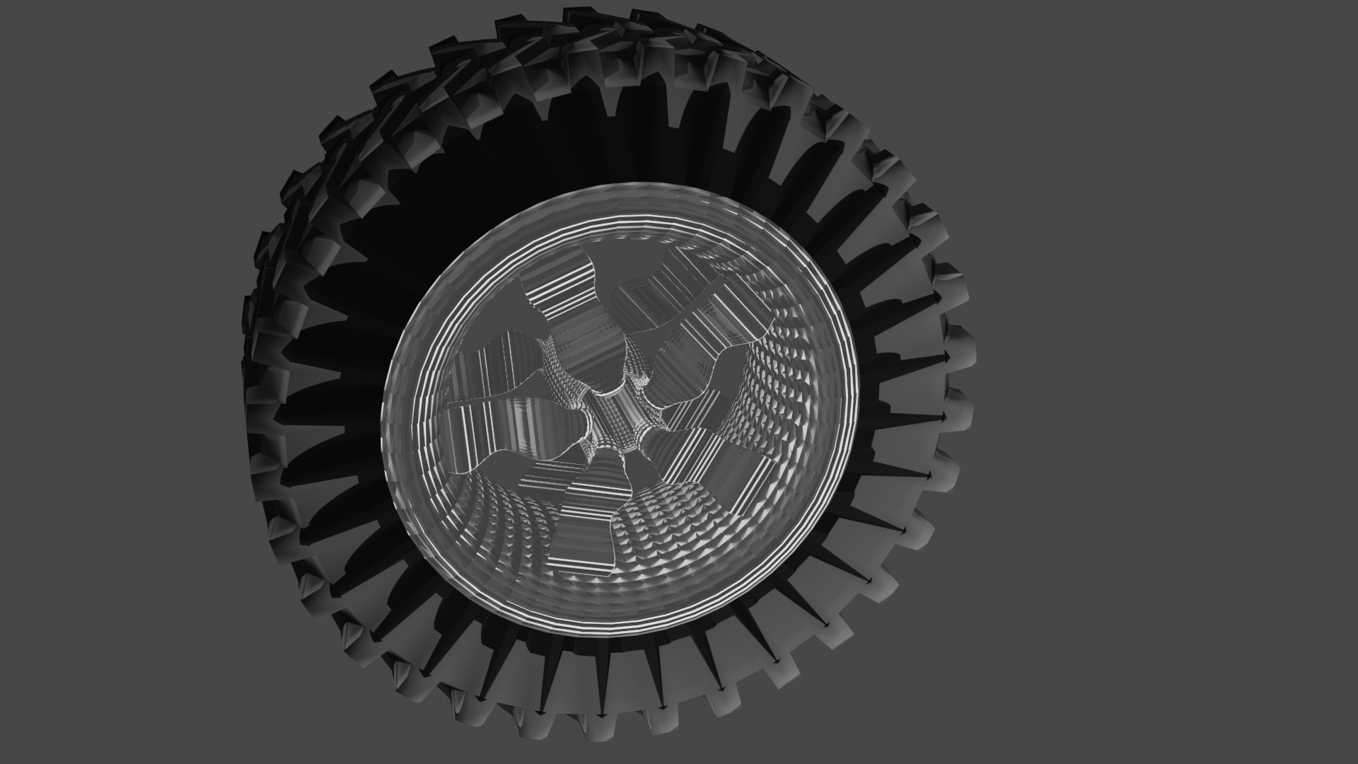
Here is my second attempt at a tire using Spikey's tread tutorial, as suggested by Adrian. I still had difficulty with getting the array on the rim to work and think it had something to do with the exact placement of my empty. I also realize that the lighting is odd and that it created this hall-of-mirrors like effect on the rim (which I actually kind of like).
I also did a screen shot of the tire in Evee so that you can get a better idea of what the model actually looks like:
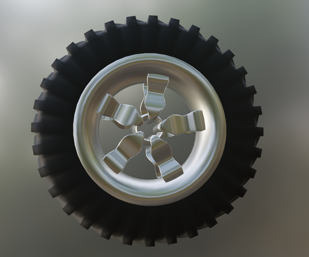
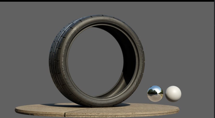
Make sure you have a flat surface under the wheel so the light bounces off the bottom too. You can rotate HDRI in dev mode to adjust lighting position.
For instance,
![]() laurettabucher much better!
laurettabucher much better!
There are two things that I notice: there seems to be no form of connection here:
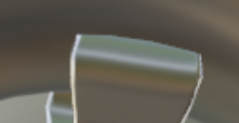 looks like intersecting geometry...can be pretty hard to clean that up though. You'd need at least a hole in the (curved!) rim or some kind of welding seam...
And the sides of the tire don't seem to be 'flat', cab best be seen with the weird shadowing render:
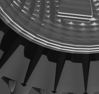 which might be on purpose, but it looks overly complicated to manufacture a tire that way and there would be no functionall advantage, probably just creating more air resistance when driving...
Yes, this seemingly simple exercise has many unexpected 'things that can go wrong' ;)
Vue Thao, your tire looks amazing!
Spikeyxxx, you're right that there is no connection in those two parts of the rim and that there is overlapping geometry. That is simply because I was having so much difficulty making the rim this time using the array modifier and the empty, probably because I couldn't get the empty positioned exactly right, but maybe for some other reason. I tried a bunch of different things to try to get the array to work well enough to create an entire rim, but nothing I did worked, so I eventually just used 3 overlapping meshes to make the rim, including one where I did use the array modifier.
As far as the sides of the tire being flat is concerned, I actually followed your tutorial, Spikeyxxx, as closely as I could to make the tire, and the sides did look flat until I right clicked on the mesh and chose the "shade smooth" option. I was surprised that it had that effect, but I kind of liked the way it made the top part of the treads look, so I left it. I certainly agree with you, though, that this tire would not be particularly functional if it were real ;-) .
If it's a shading issue, that makes it look non-flat, did you use Auto Smooth:
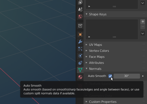
?
Also, some extra edge loops on the sides might help...
For the placement of the Empty, I usually start with a circle and then delete most, so I only have one segment (in your case 1/5 of the circle) left and model from there. That way I can place the Empty at the Origin of the circle...(in Object Mode: SHIFT+S > Cursor to Selected, SHIFT+A > Add Empty.)