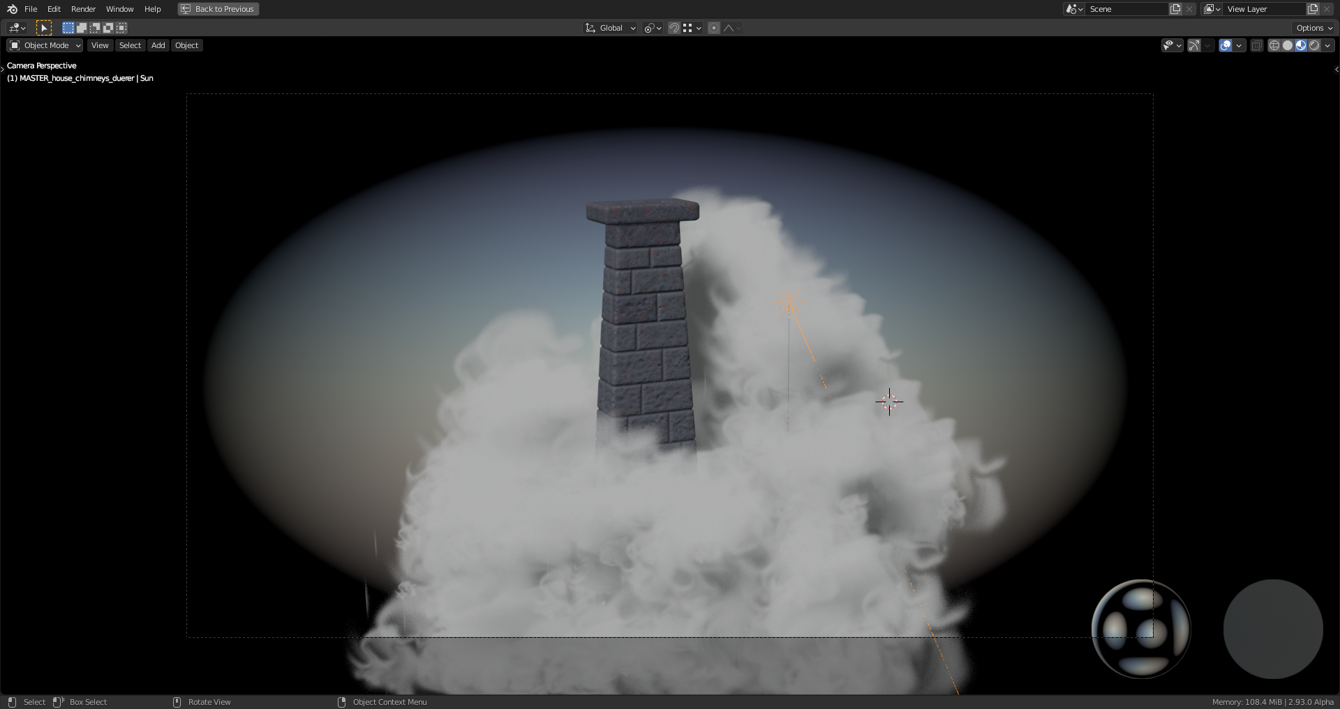
This thread is about my contribution to the "Fantasy House" model.
Both chimneys still need a more detailed "Color Texture" before they can be called "finished":
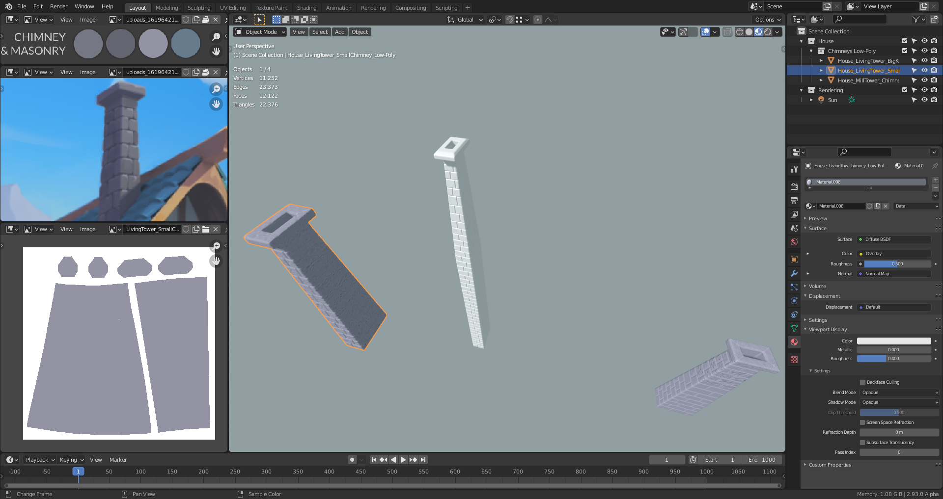
I've uploaded this file to Google Drive as WIP_house_chimney_duerer_01.blend in folder SPICE-VENDORS-HOUSE\SCENES\MODELS\WIP\HOUSE\EXTERIOR .
PS: The third (white) chimney is optional and reaches down to the ground level where a kitchen could be).
Thank you very much, ssimonsez11 😀! Maybe there's a smarter way to do this but with the tight time frame I didn't want to experiment too much and risk standing there in the end with empty hands 😉.
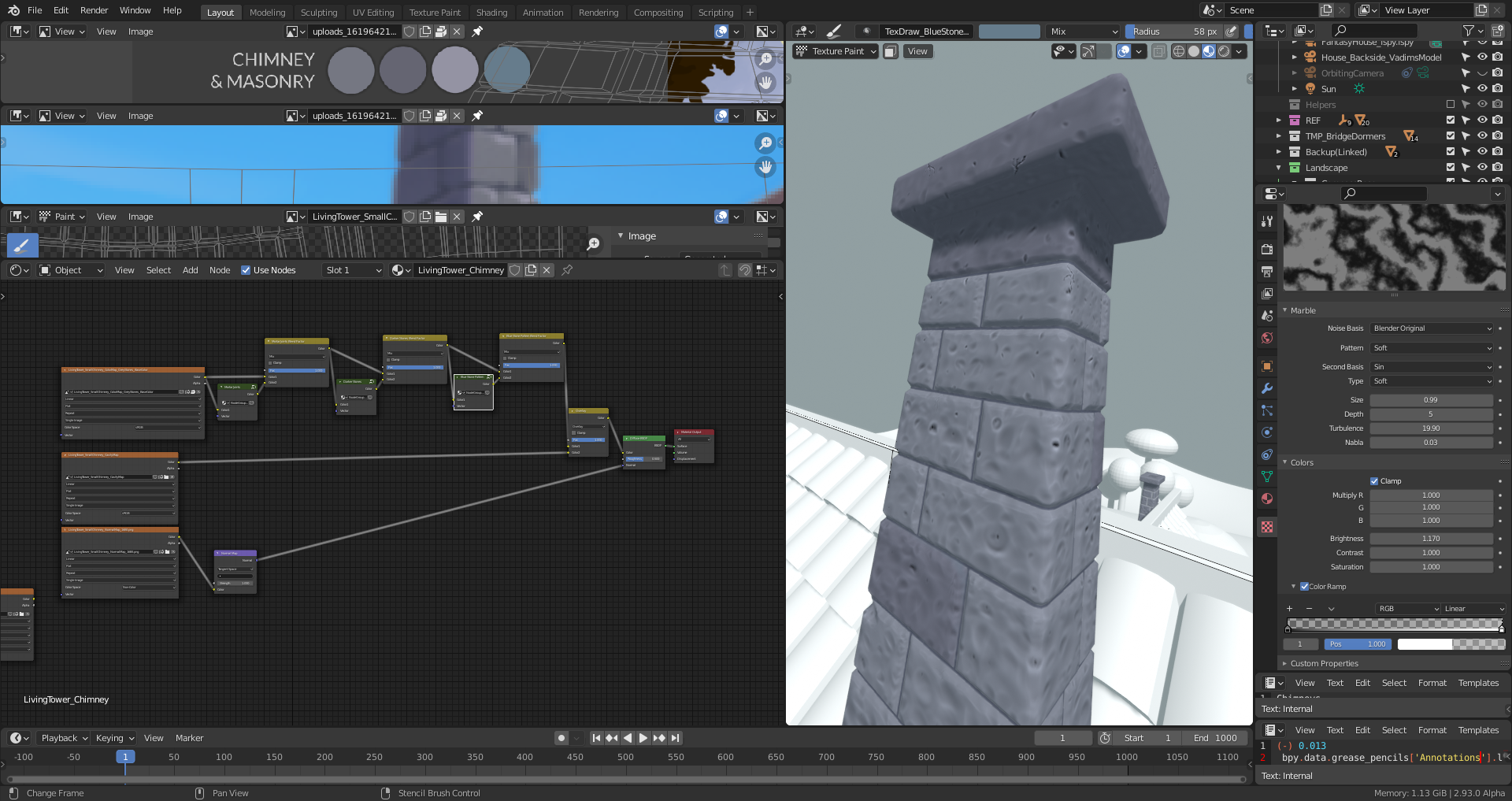
I'm currently applying some finishing touches on the chimneys using Danny Mac's "Layer Painting" workaround for Blender here:
![]() duerer Nice work! Your chimneys have progressed enough for me to include in the final assembly. You're welcome to keep working on the color map, just let me know when you're 100% finished.
duerer Nice work! Your chimneys have progressed enough for me to include in the final assembly. You're welcome to keep working on the color map, just let me know when you're 100% finished.
NOTE: Please don't save over the master file when you finish.
"Color Texture Painting" finished:
1) Left House Side Chimney

2) Right House Side Chimney
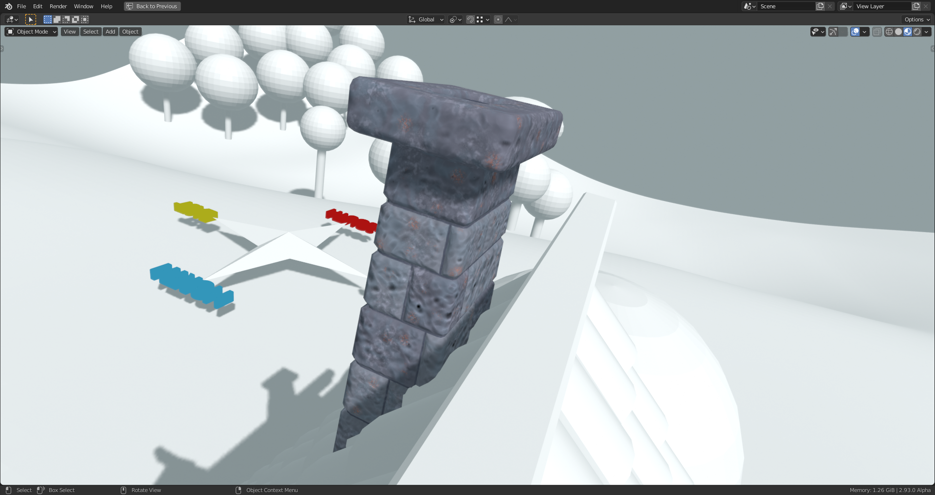
@theluthier I'll save my finished chimneys in the WIP folder. Should I bake the "Color Texture" for each chimney into one texture or leave the node setup for "Layered Texture Painting"? I'll also deform the edges in the silhouette slightly so that they don't look that straight.
I've just tested my chimneys with Kent's @theluthier newest scene file (version 10b):
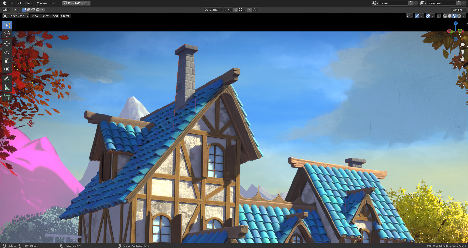

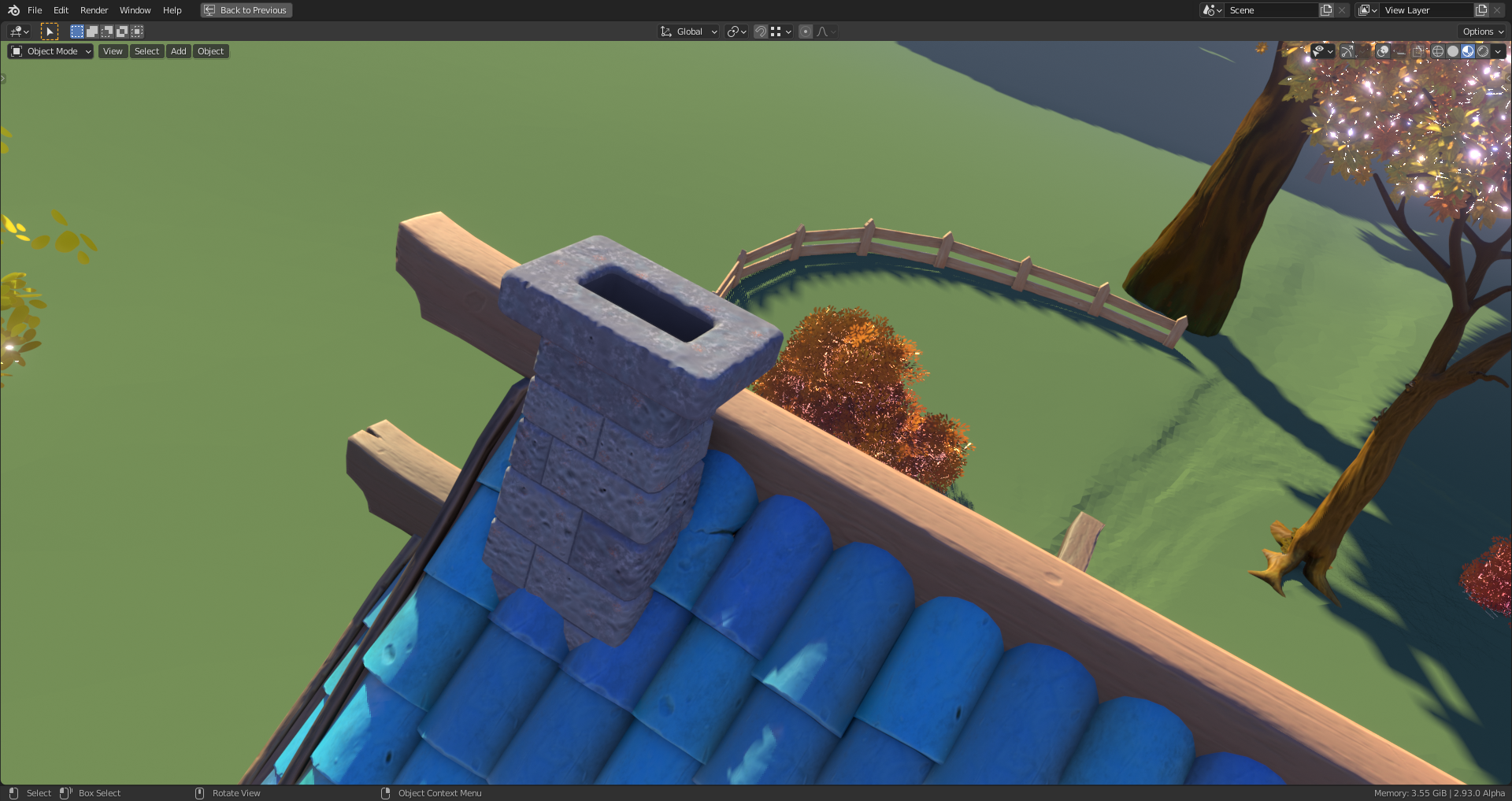
I've added a slight displacement to the chimneys in order to avoid straight edges in the silhouette:
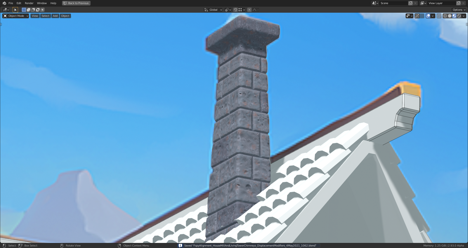
Just some quick notes on the "Color Texture":
1) A blue-grey color brushed on the model with a procedural "Marble" texture is intended to add a kind of "grain" to the stones in order to break up the monotone grey or dark grey base color.
2) White and orange patches added with a procedural "Cloude" texture shall evoke the impression of lichens growing on the stones
As I said during the stream, let's talk about your chimneys! First of all I really like the additional color details you've added via the layer painting method! Distinguishing the mortar and varying the brick colors is a nice upgrade.
I'm not 100% sure if you're finished to you but you've reached a finished state to me. If you were planning to do this things below, humor me. But I've mastered your chimneys and optimized them in these ways:
The texture savings from the above methods takes your 51 MB total down to 4 MB. Again if you were planning on doing this already, good thinking! You're welcome to run through the process for experience but I'd like to keep the mastered version as is.
In closing I want to offer a suggestion. It's something you can take or leave. Between Collab 2020 and Collab 2021 I've learned that you are an incredibly detailed, technical 3D artist. You work intricately with modifiers, object relationships, and outliner organization. There's nothing wrong with this, especially not in your personal projects. But I must say that I'm a little scared of your .blend files 😅 Your final chimney file isn't bad but your axle from last year and your house blockout from this year was dizzying.
Again there's nothing wrong with this so long as you can make sense of it. But when working on a team project it helps a lot to consider the other people that will need to interact with your scene. In other words keeping the file simpler than complex goes a long way.
Sorry for the wall of text - I've been meaning to find time to express this feedback for over a week. Most importantly you have been an amazing team leader! Lobbying for your team members, very present throughout the forum, going above and beyond with the house blockout, AND you created a solid asset that will be featured. Thanks so much! As always it's a pleasure working with you, Ingmar 🤝
@theluthier I totally agree with the changes you made in the file. That's one of the reasons why I saved it as WIP. The 2K textures and the separation of the "Color Textures" into individual layers were just temporary in order to make later adaptions easier if needed. You're also right with your assumption concerning the second chimney. I finally would like to thank you for the collaboration and for your professional advice 😀🤝! There couldn't be a better Spice Lord than you 😀!
Testing an idea for the "Chimney Beauty Shot" experimenting with @adrian2301 's cloud creation method presented by Kent @theluthier in his livestream for week 4 ("Finalization"):
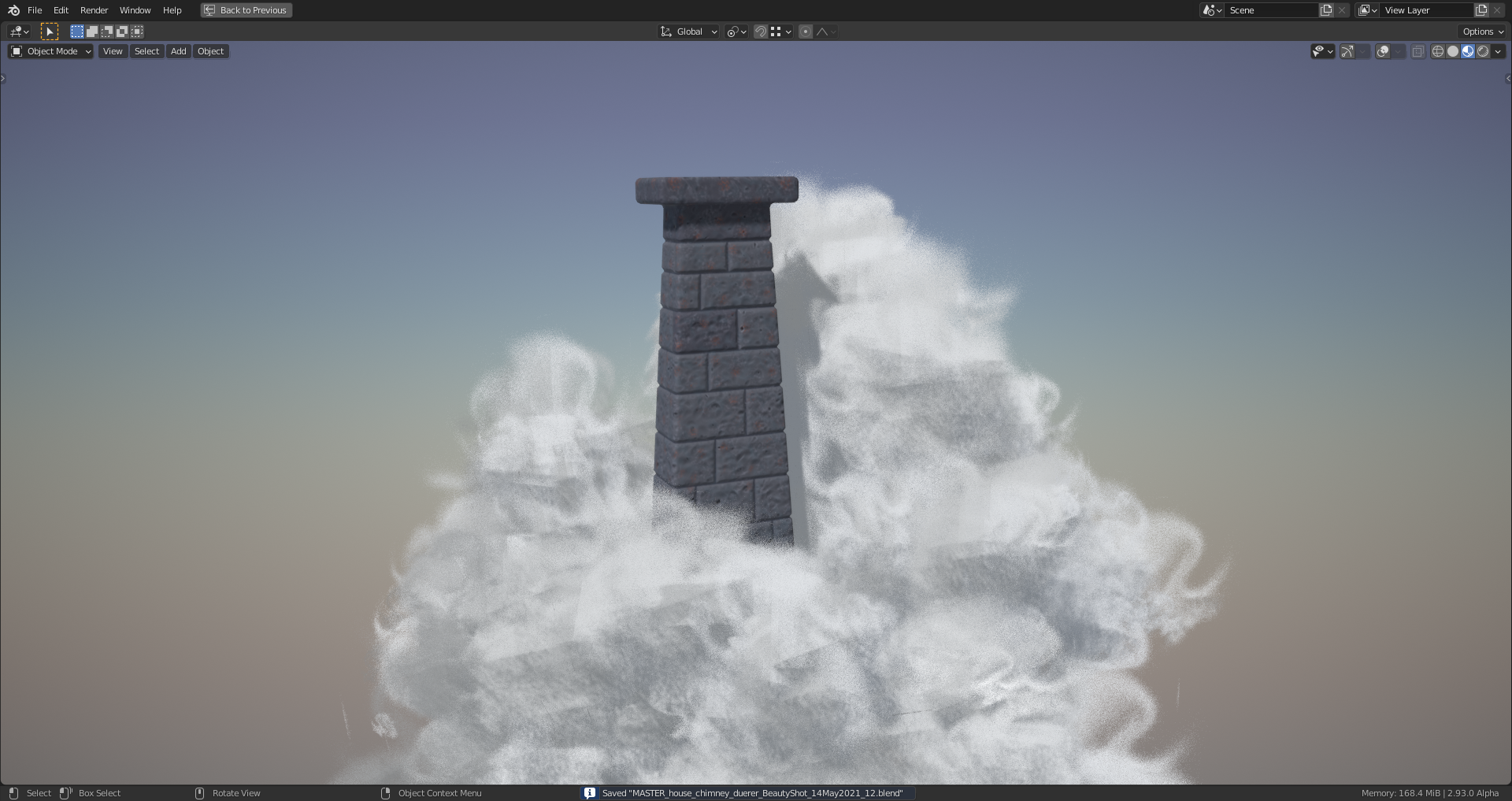
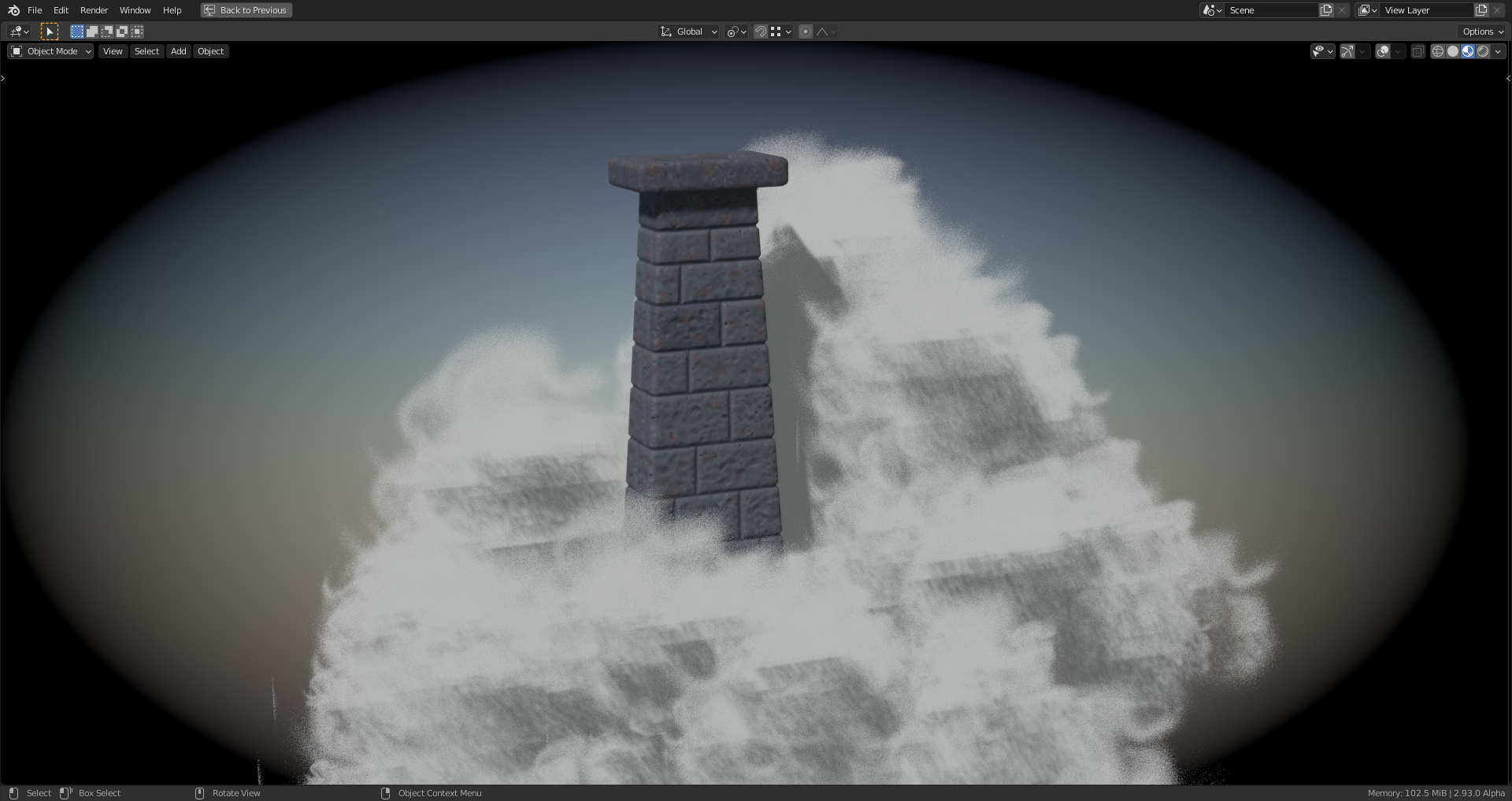
![]() splat21 What do you think?
splat21 What do you think?
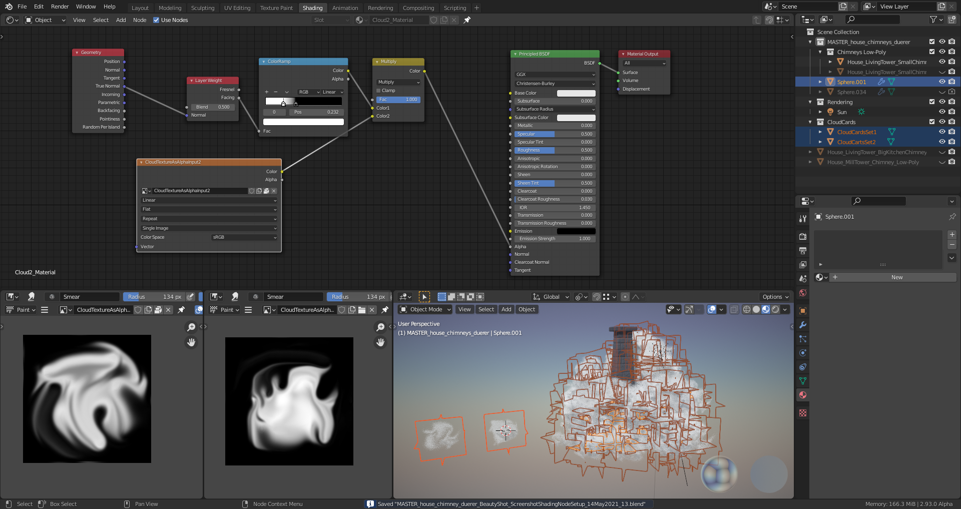
My node setup for one of the two cloud carts sets with one separate texture for each set:
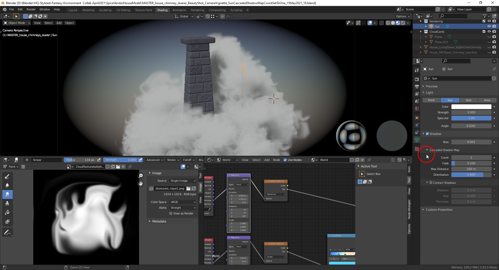
With the "Cascaded Shadow Map Count" for the "Sun" lamp set to 1, the vignette screenshot from above looks much better:
