here I will be posting my wips of making the Background Nature stuff
Great job ![]() tijnkroon , full points plus bonus.
tijnkroon , full points plus bonus.
From you first post in this WIP thread, all 3 look great, for the background 2 or 3 is probably the direction to go for efficiency. I think 3 is my favourite. Maybe look at making one large tree top and have several trunks from the ground up to look like a cluster of trees. What do you think?
made an update to the tree leaves. I saw the amazing leaves of ![]() danitufi and wanted to try that out on the tree clusters.
danitufi and wanted to try that out on the tree clusters. 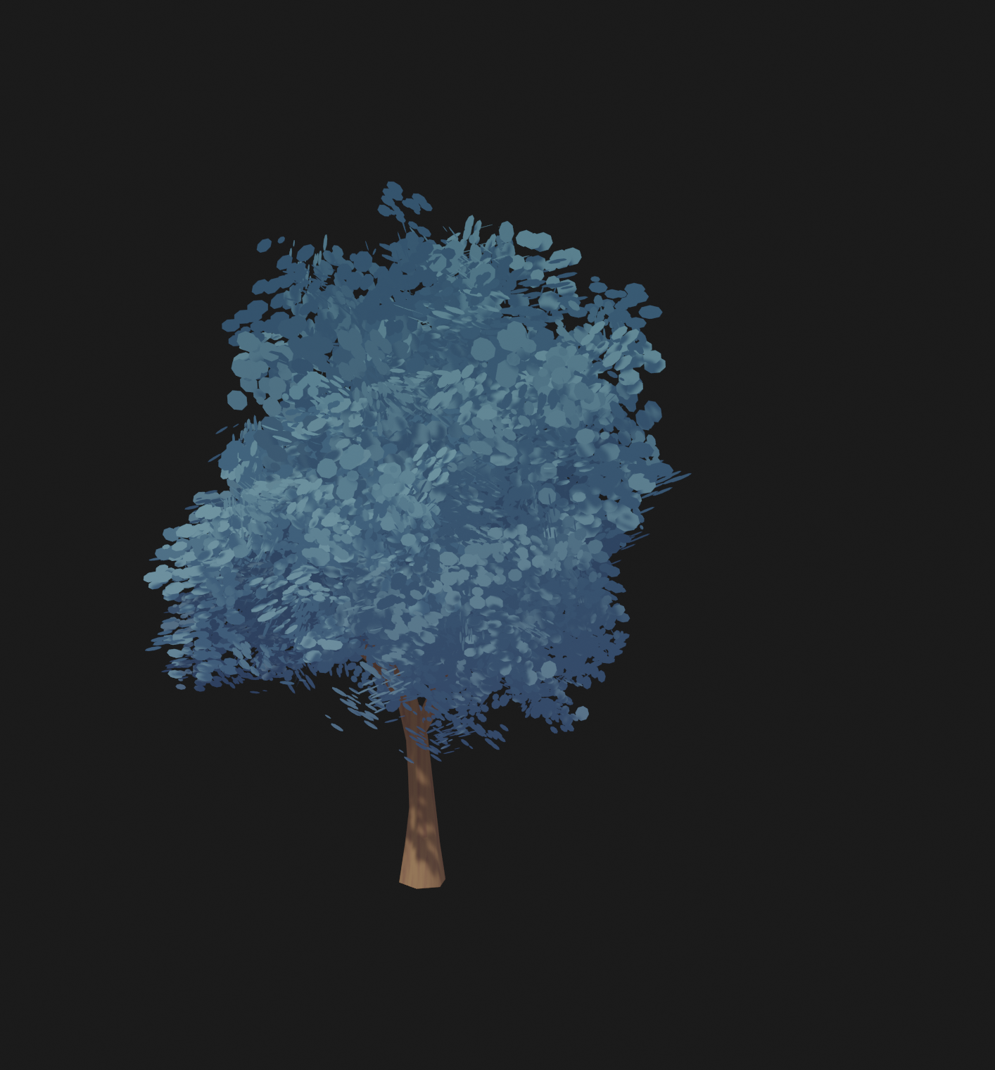
I also started to experiment with the geometry nodes to populate the scene. 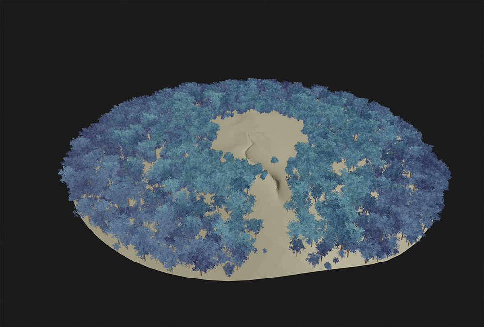
Homework Submission - Week 2 - Tree Clusters
@theluthier
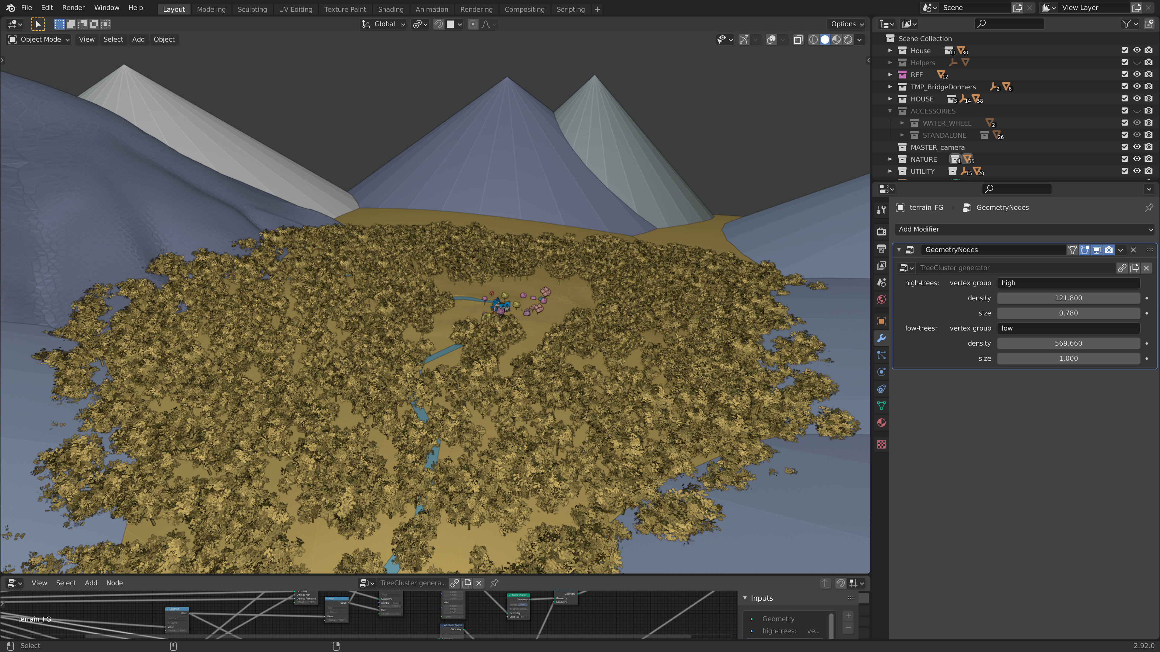
here's my second week submission. if you want to link it to the main scene you only have to link the geometry nodes in the NodeTree folder. then you have to add a geometry nodes modifier to the ground and weight paint the parts where your want to add the high resolution trees and low resolution trees.
the leaves are still a bit of a struggle. because the scene slows down a lot when I go in to render view.
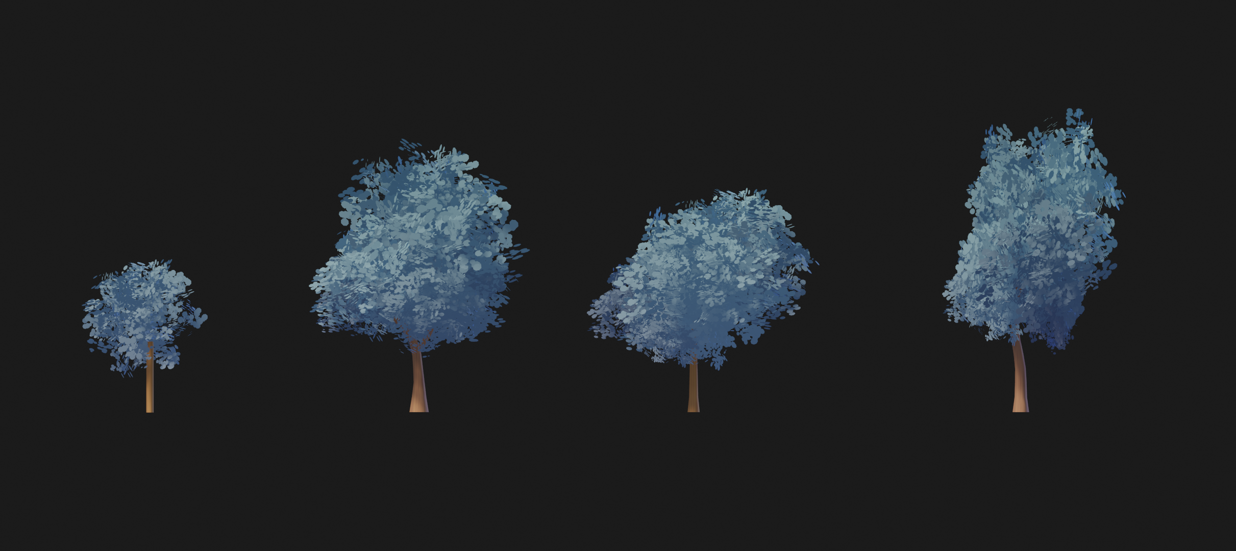
I'm so sorry @adrian2301 I totally missed your comment!!
that sounds like a great idea, because right now If I multiply the trees the scene really slows down. the down side on your idea is only that it quickly can look like on big blob instead of separate trees and the trees wil also lose a lot of depth in the leaves.
but I will try it out 👍
another day in searching for tree clusters that wouldn't explode my computer when it's multiplied.

Nice job here, these are looking amazing! Full points for week 2. As it looks like you guys found out, performance is going to be the biggest challenge here. So far the image planes with custom normals approach seems to be the clear winner in terms of performance, but for these background trees it seems that it's still pretty heavy if there is a lot of them.
For that reason, I really like both 1 and 3 of your above tests, and I'd probably lean towards #3 since it appears to have the fewest amount of image planes. See if you can get it all the way down to three or so planes per tree. You could also try using a technique similar to this since they will all be farther away: How to Fake a Large Scale Forest in Blender / Part 1 (Tutorial EN) - YouTube
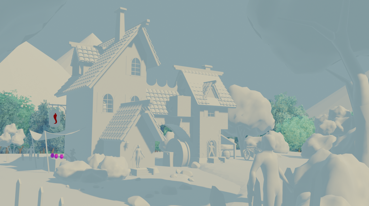
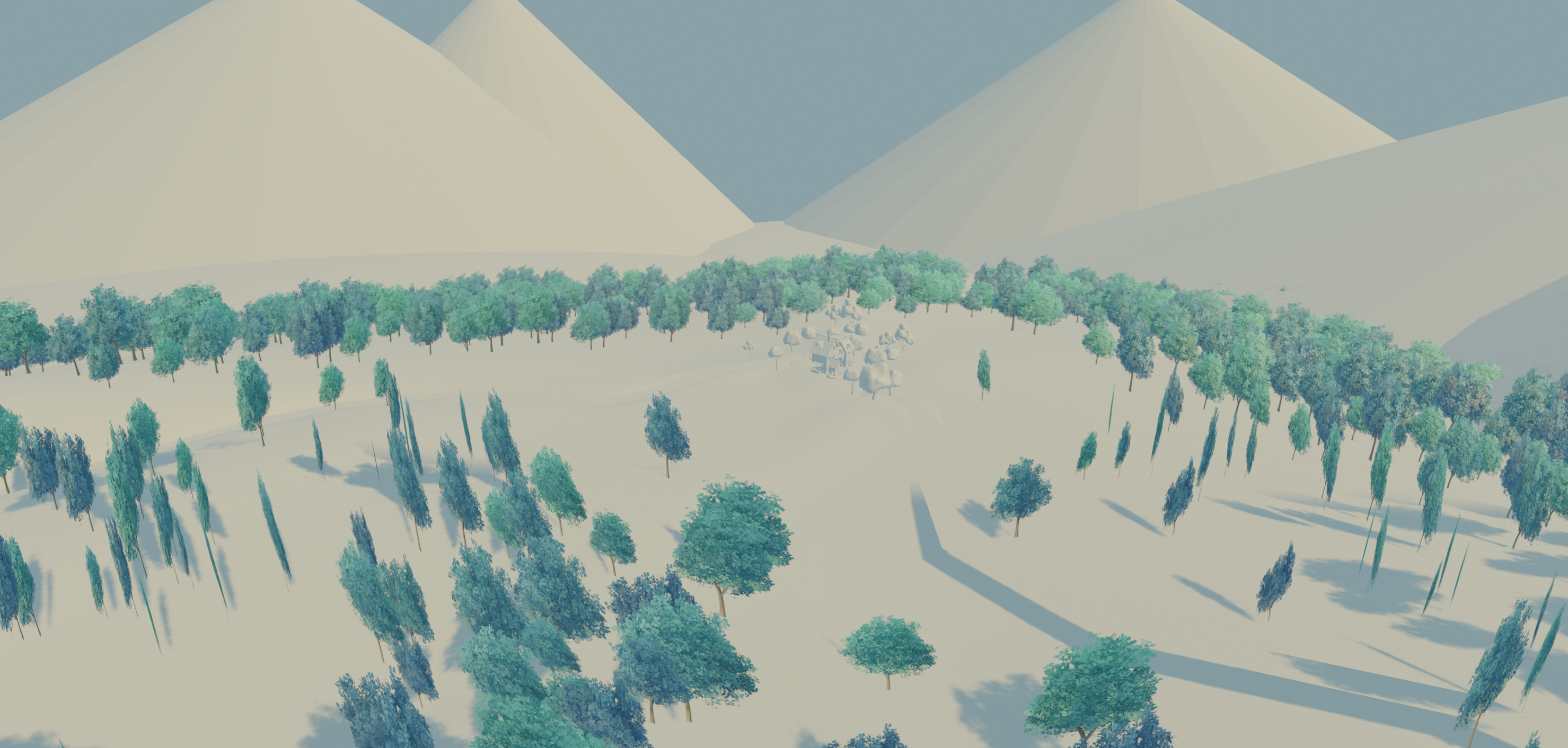
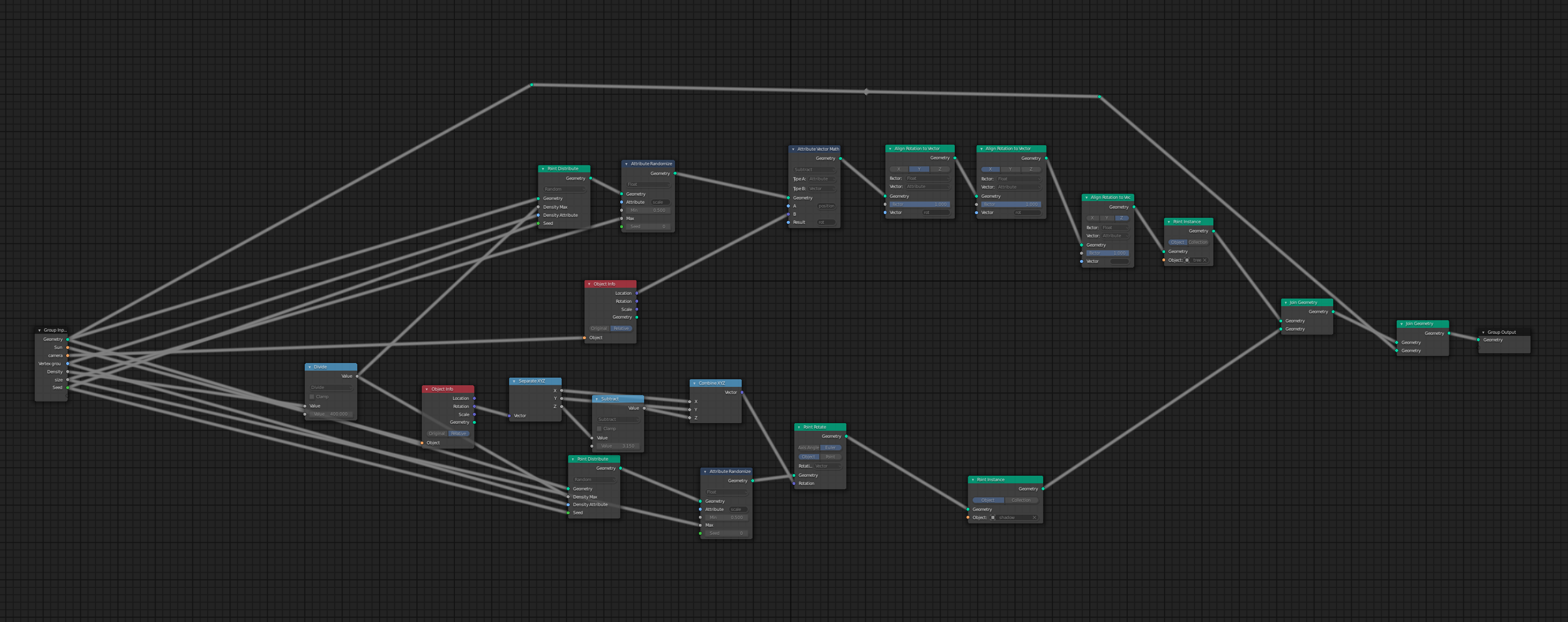
I tried out the techniek the @jlampel was proposing with the 2D trees, and it really helped with the performance of the scene!!! the only down side is that I have to use a lot of geometry and shader nodes. I don't know if that is going to be a problem. but on my side the scene was still running fine.
Nice work ![]() tijnkroon , Looks nicely populated with trees in the camera view, I'm not to familiar with GEO-Nodes but there is a guy I know ,
tijnkroon , Looks nicely populated with trees in the camera view, I'm not to familiar with GEO-Nodes but there is a guy I know , ![]() spikeyxxx .
spikeyxxx .
I do know you can weight paint to control placement, I don't think this is what you have done, but @theluthier or @jlampel may want to have a look into that.
Homework Submission - Week 3 - Tree Clusters
@jlampel
☝️you can see my submission in the post above☝️
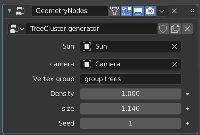
if the tree-clusters get imported in to the scene you first need to put the sun and the Camera names in the geometryNodes modifier in order to make it work.
This is great! Such a lightweight solution that I think you nailed. Full points for this week and a little extra. The one big downside here is that we can't have the trees following the camera like that because it will really slow down real time navigation and we could get some weird glitches where they pop over and under each other like below:
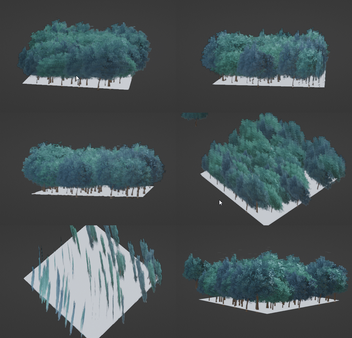
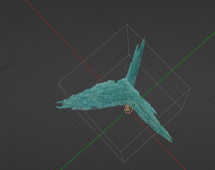
To fix this, there are two options. We could make each tree three planes like so:
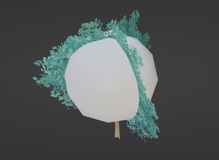
If we need more shading information, it could be that a different approach of sticking a leaf textured icosphere in there would do the trick:
Or, they could all point towards the center, since they'll be seen from farther away and we're assuming the camera will stay within the bounds of the foreground. As long as they look good from there, we're golden.
There is some artifact at the very tip of each tree, but that the only technical issue I see.
Thank you for being willing to do so much experimenting! You nailed the tree style right out of the gate and the models look awesome, so this last stretch of figuring out how to best optimize it will help us put as many of them into the scene as possible and really make people say "Wow, that's real time in Eevee?!?"
I want to reiterate how impressive your work with the BG trees has been ![]() tijnkroon. Achieving a populated forest effect with as little resource usage as possible is not a small task. You've done an incredible job dissecting this challenge and creating a super promising result.
tijnkroon. Achieving a populated forest effect with as little resource usage as possible is not a small task. You've done an incredible job dissecting this challenge and creating a super promising result.
What do you think of @lampel's proposed solutions: A) Making each card 3-sided or B) positioning them all to face the center of the scene? I'm keen to know your thoughts so I can begin populating the assembly!
I think it might be handy to try the 3 sided cards. because if the trees are all pointing in to the center, the viewer will immediately see that the trees are planes instead of 3D.
kinda like this:
small update time!!
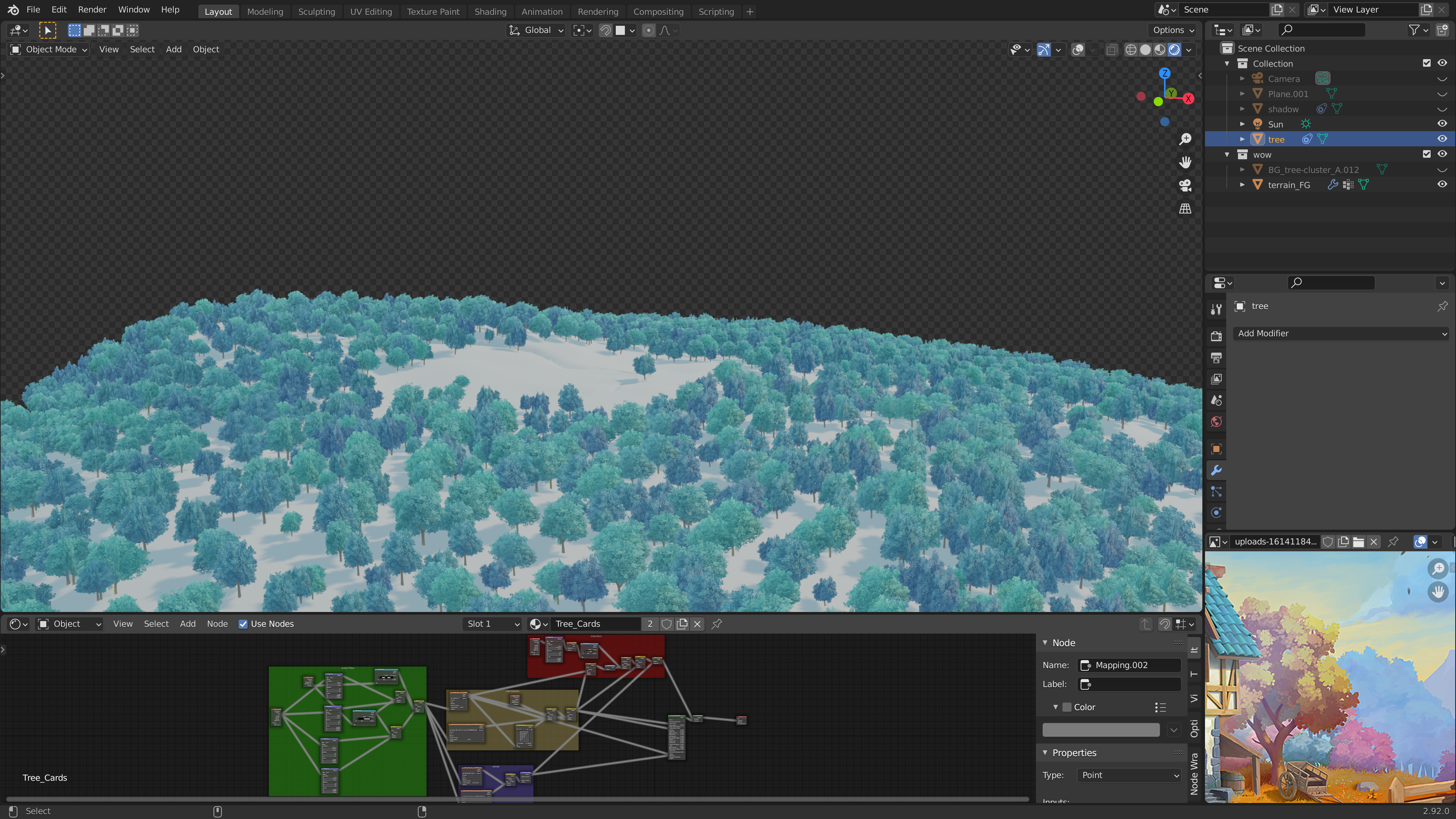
I tried out the 3 sided plane trees and it worked out really well!!! also noticed that I didn't put my normal map to non-color but that's fixed now.
Fantastic!
If you don't know what you're looking for, you won't notice that they are plane trees!