Will be working on the barrel for the standalone accessories team. Just making the thread and starting now!
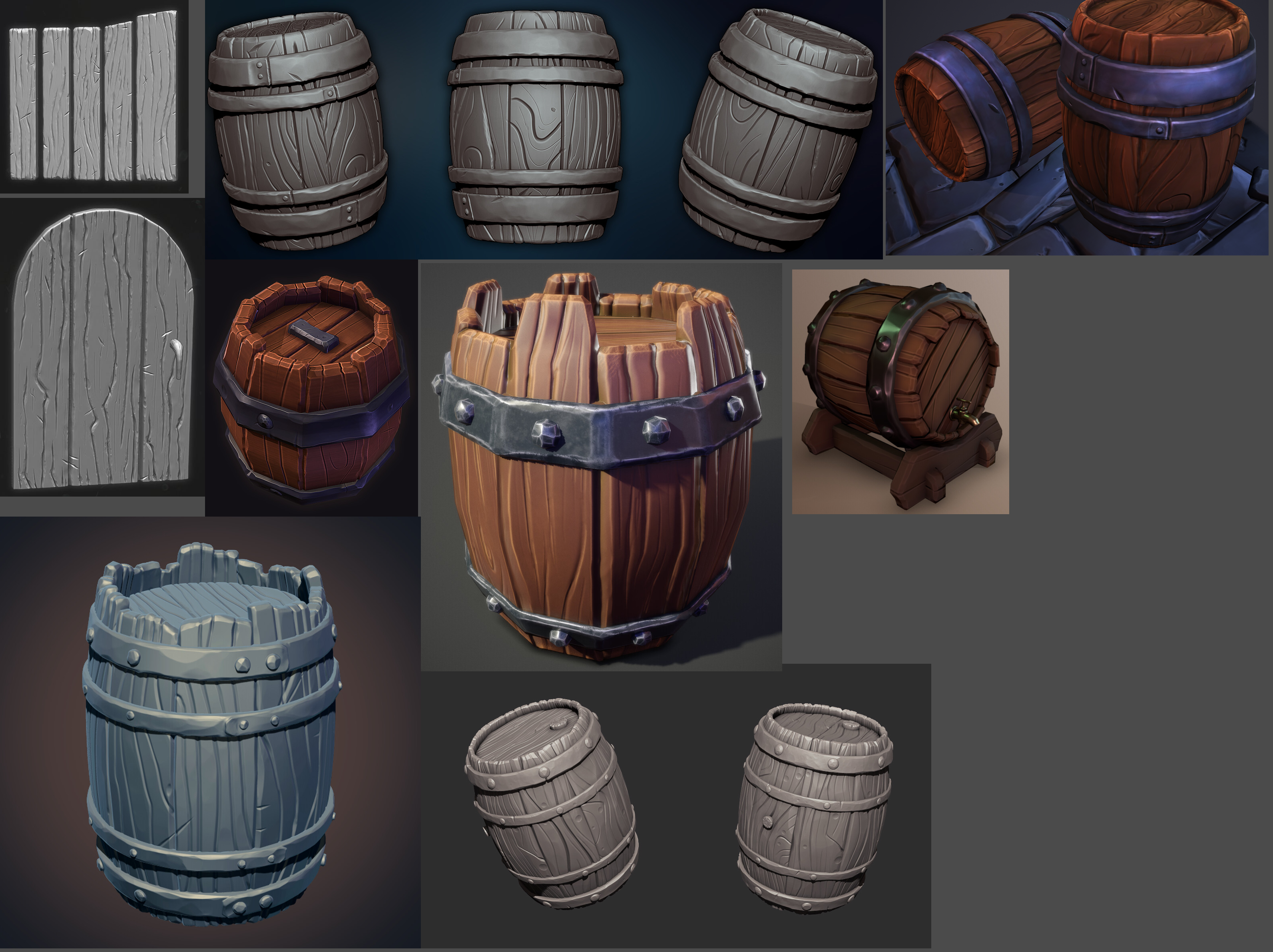
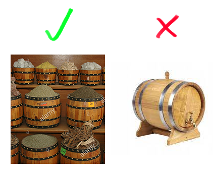
I started by collecting a bunch of reference images I like of barrels done in a style more or less compatible with our style guide.
Then I blocked out the shape trying to be careful to match the concept very closely.
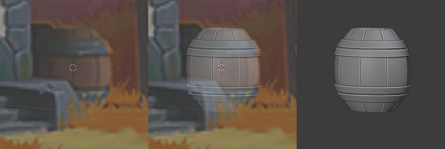
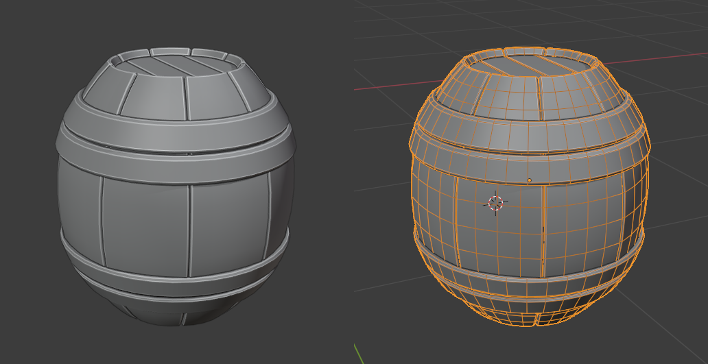
.. and that's how far I've gotten so far. If anybody has any feedback, I would really love to hear it! Going to take it to sculpting on the weekend.
That's just a weirdly shaped barrel to begin with. But your model follows it very closely, so good work on that.
If I had to critique something, I'd say the flat planks on the top don't need to be fully modeled since they won't contribute to the silhouette.
nice work, its perfectly matching the reference :)
i also think it will be viewed from several angles so better to model it completly unless its covered partly by someting else of course .
Excellent work, Wolfgang ![]() wograebn 👍! I'm looking forward to your sculpted barrel 😀!
wograebn 👍! I'm looking forward to your sculpted barrel 😀!
Looking at it with fresh eyes, something wasn't sitting right with me. It's such an oddly proportioned barrel. How is that practical, what is it used for?
I had assumed the barrel is vertically symmetrical because they usually are. But looking at the concept more closely, if that were the case then beneath the lower set of iron rings, the barrel would extend into the floor. Instead it looks like it has a metal bottom. This is a stationary barrel, designed to sit upright, and therefore with a reinforced bottom (that's my interpretation anyways). Since it's a spice vendor's house I thought it could instead be used to store spices. You wouldn't want to put a spice barrel on it's side like you do with a wine barrel, and then the whole thing makes sense.
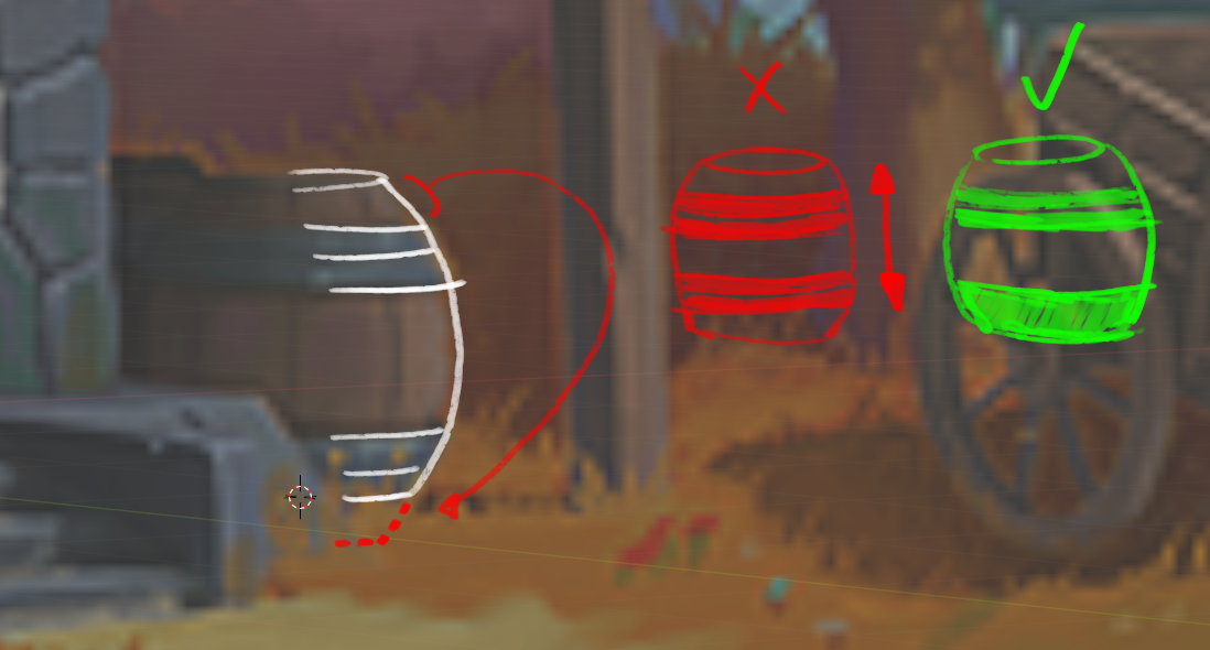
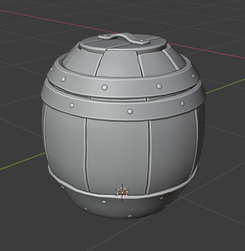
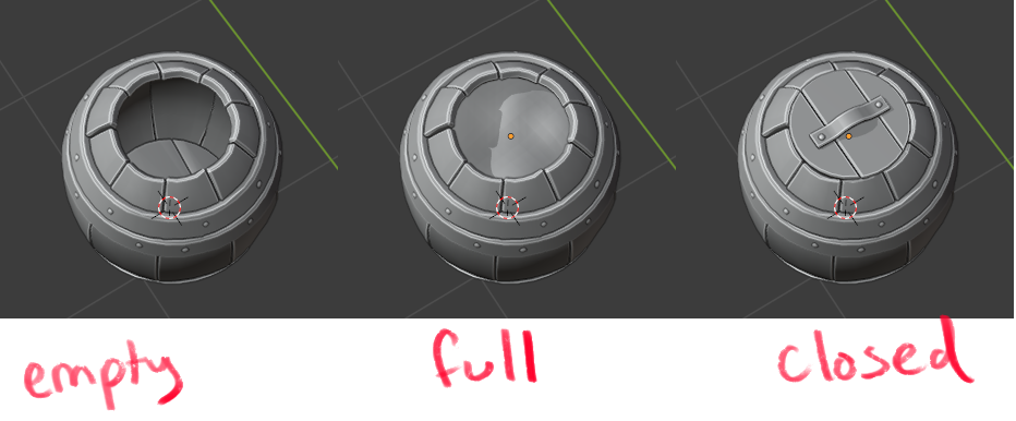
So I changed it to have a metal bottom, and messed around with the proportions a bit, and added a bit of randomness to the whole thing. Thinking about the comments above about being able to see it from all angles, I thought it'd be interesting to be able to look inside and added a spice layer. And a removeable lid for practicality's sake to keep the spices protected but also be able to access them easily. So now if the barrel gets duplicated around the environment (eg if there are more barrels round back), they can appear more varied by having some empty, or some with different colors of spices, or some with the lid on or off.

Finished with some wood sculpting tests, just on a basic plank of wood to hone in on style. Not really happy with any of them. Anybody got some good tips?
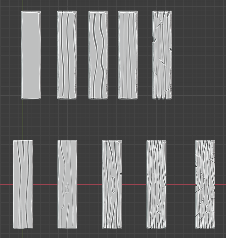
I think it's a good point about not needing to model things that aren't part of the silhouette. I think I'll try to bake a lot of the detail like cracks between planks down into a normal map and then the model can just be flat in those places and still look good from all angles.
![]() wograebn hey Wolf. Great job on the barrel! I wanna make your life a bit easier so I hope this little clarification will help. The barrel is indeed vertically symmetrical. Even more so, the metal ring is single on each side, but I like your version with double ring so I'd leave like that.
wograebn hey Wolf. Great job on the barrel! I wanna make your life a bit easier so I hope this little clarification will help. The barrel is indeed vertically symmetrical. Even more so, the metal ring is single on each side, but I like your version with double ring so I'd leave like that.
![]() wograebn I like your design 😀.
wograebn I like your design 😀. ![]() harbinger_ua confirmed my assumption of a symmetrical barrel since there's grass growing in front of the front barrel which can hide the bottom part of that barrel.
harbinger_ua confirmed my assumption of a symmetrical barrel since there's grass growing in front of the front barrel which can hide the bottom part of that barrel. ![]() wograebn and
wograebn and ![]() harbinger_ua Could it be a cabbage barrel?
harbinger_ua Could it be a cabbage barrel?
![]() wograebn Just a quick reminder. We still need a name for our team? What's your vote?
wograebn Just a quick reminder. We still need a name for our team? What's your vote?
1) Shabby Chic
2) All Access(ories)
3) Shabby Fresnel Chic
4) The Stan Dalones
Homework Submission - Week 1 - Barrel
@theluthier
Submitting for this week. Will update tomorrow based on the feedback
Brillain WIP thread ![]() wograebn! From collecting reference, to analytical modeling, to sculpt tests - It's the kind of pro workflow I love to see. You've earned full points and then some 👍
wograebn! From collecting reference, to analytical modeling, to sculpt tests - It's the kind of pro workflow I love to see. You've earned full points and then some 👍
I really don't have any constructive feedback to give...just keep doing your thing! I can't wait to see your sculpt tests applied to the barrel 🤩
![]() wograebn Congratulations to 130 points 👍! I can barely wait to see your sculpted barrel 😀!
wograebn Congratulations to 130 points 👍! I can barely wait to see your sculpted barrel 😀!
Homework Submission - Week 2 - Barrel
Really sorry I'm late on this one. I *seriously* underestimated the time it would take me. And fear I got carried away and drifted too far away from the requested style into simplified overtly stylized territory. I'll take another swing at in more in the style that I am seeing ladymito, Dave, etc producing. I also checked in the file to Google Drive in case you want to take a look up close and check if I did it right 🙈.
