I'm happy to be part of this Collab. Working in Nature Section.
Homework Submission - Week 1 - MG Bushes
How can I achieve this nice gradation using only nodes? Is there any way I can apply gradient from bottom to top?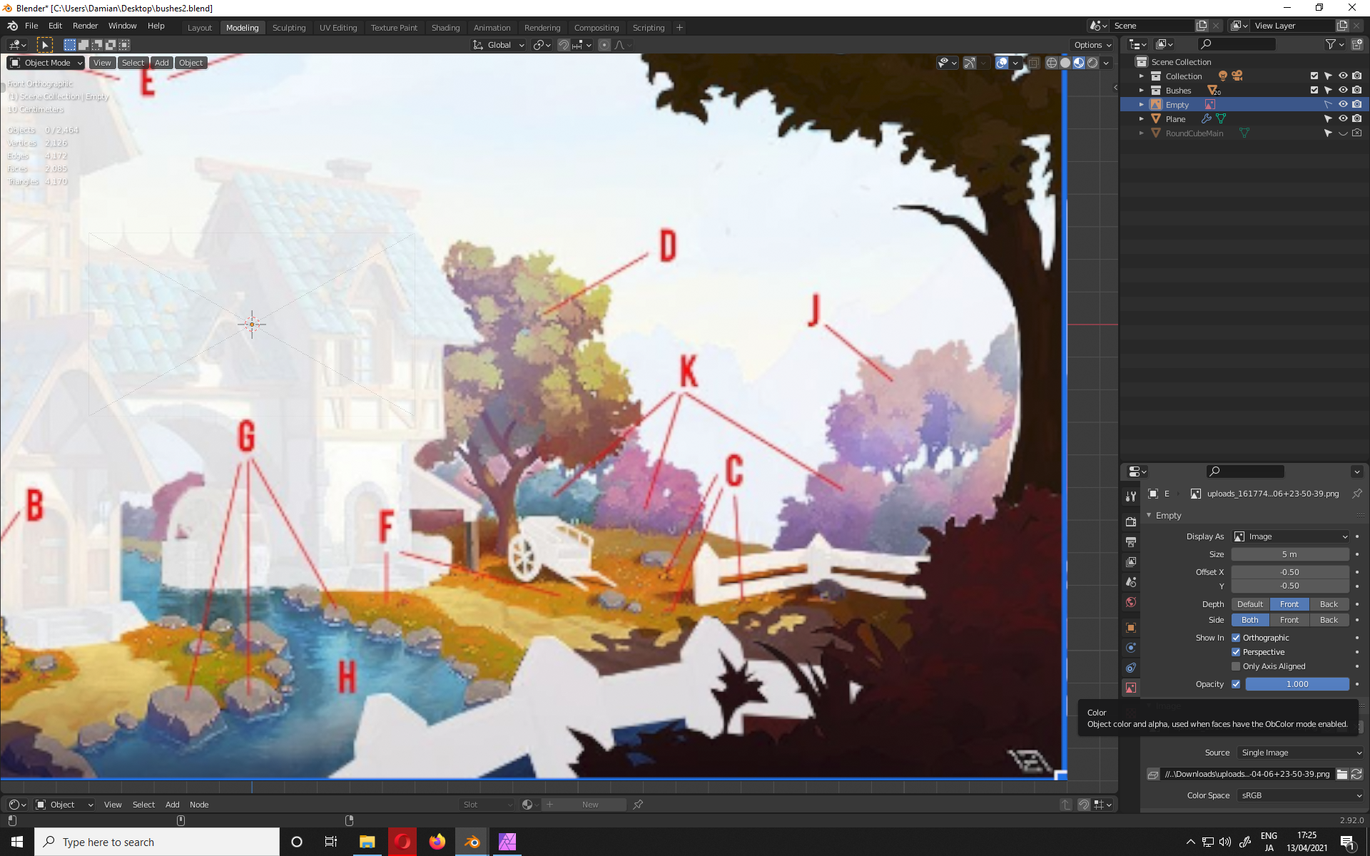
Basic gradient:
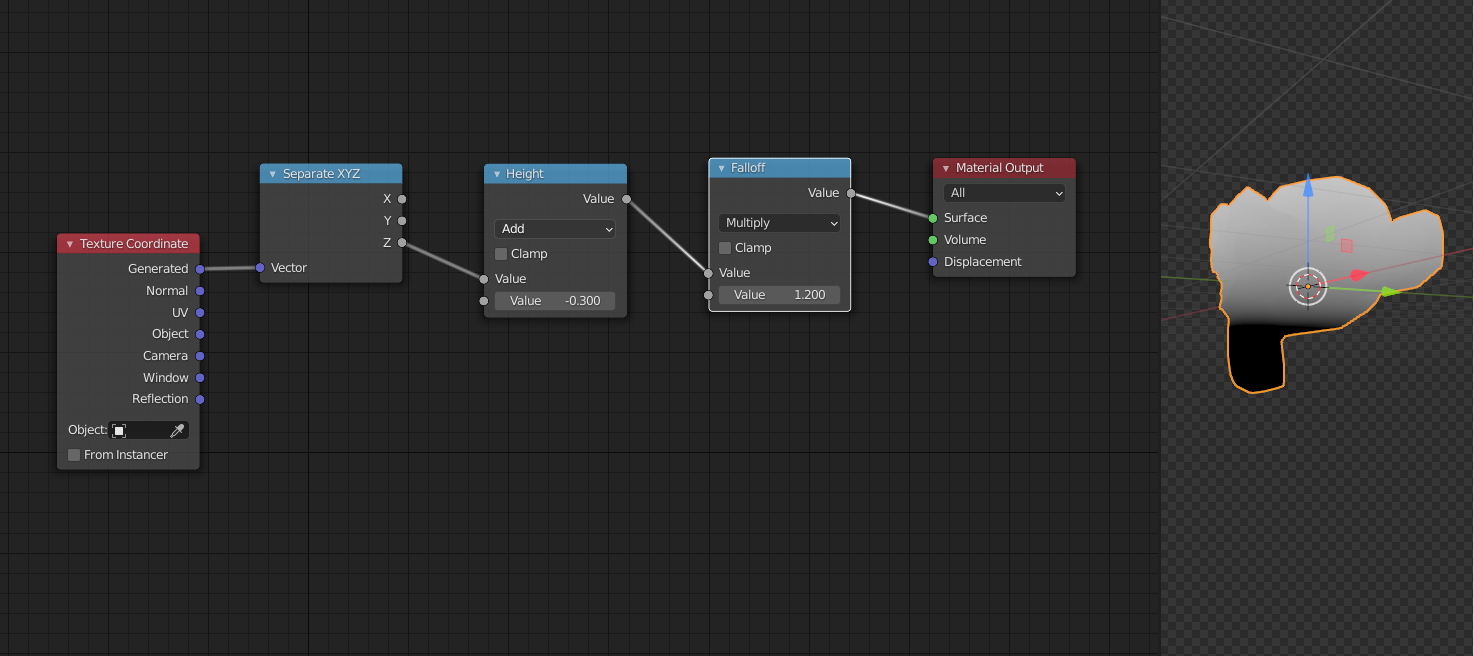
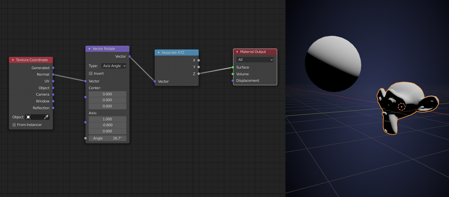
or something like this:
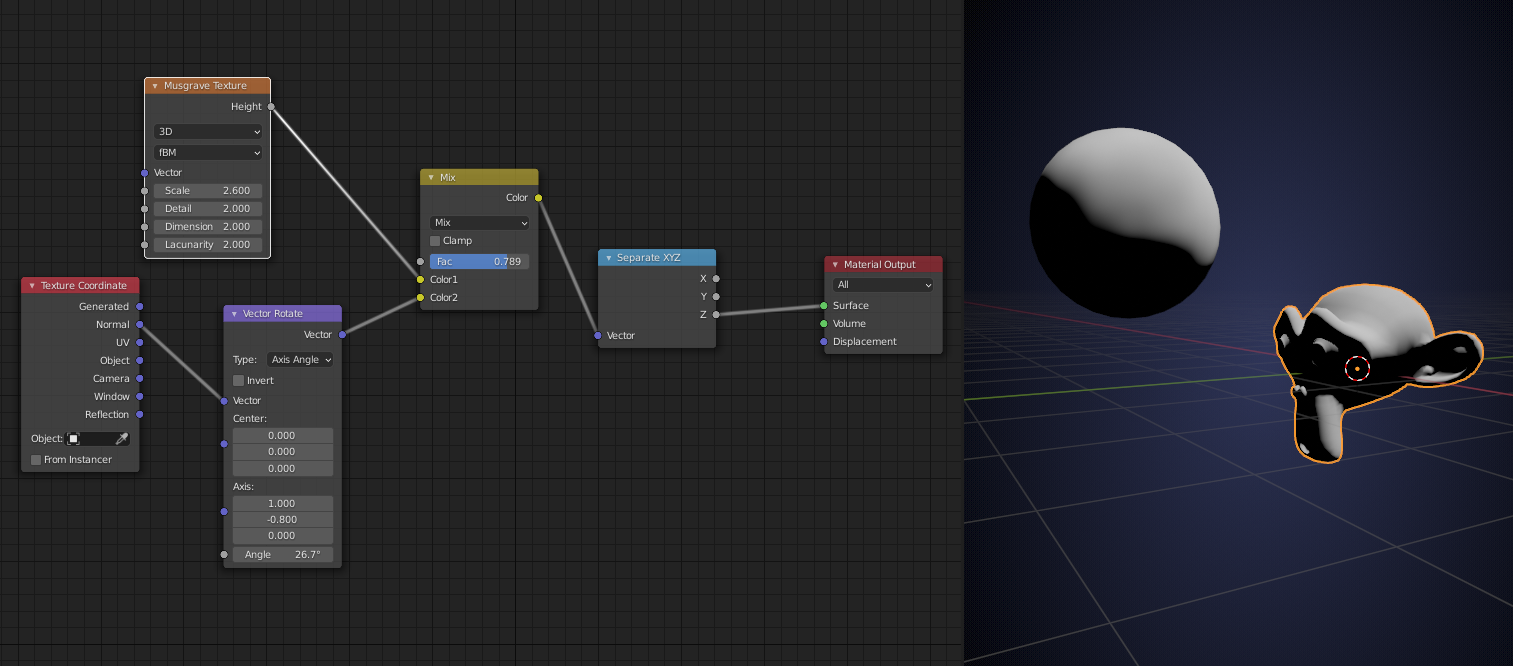
maybe introduce some noise:
The sky is the limit.
![]() dyoc Your bush brush is really cool. I love the contrast and leaf shapes you are able to make with it. Nine vertices!?! Wow!
dyoc Your bush brush is really cool. I love the contrast and leaf shapes you are able to make with it. Nine vertices!?! Wow!
How is? For this bush I used levees model made in blender. Its better than alpha plane?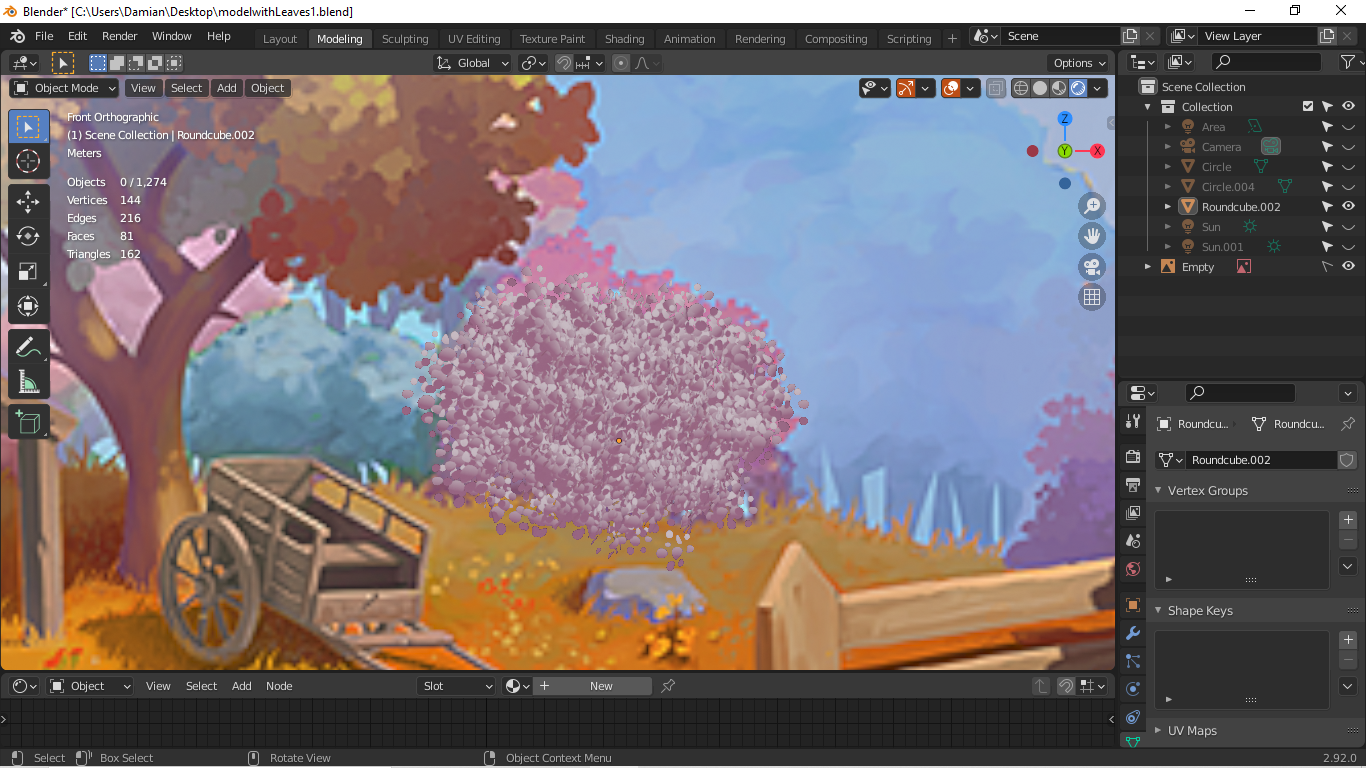
You're the last homework submission left for Week 1! Sorry it's so late - But your bush tests look very promising. Lots of good examples. Excellent work this first week.
You've achieved a "leafy-nes" that I'm happy to see. Structurally I feel like the bushes in the art are more clumpy that yours:
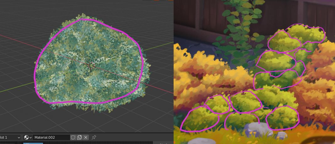
Yours is like one giant clump. Figuring out how to isolate the clumps while still maintaining a unified bush object would be ideal.
Perhaps some transferring of normals from a simpler bush mesh could be the answer. Have you seen the Ghibli tree tutorial? He goes over the concept there.
This example looks extremely promising too:
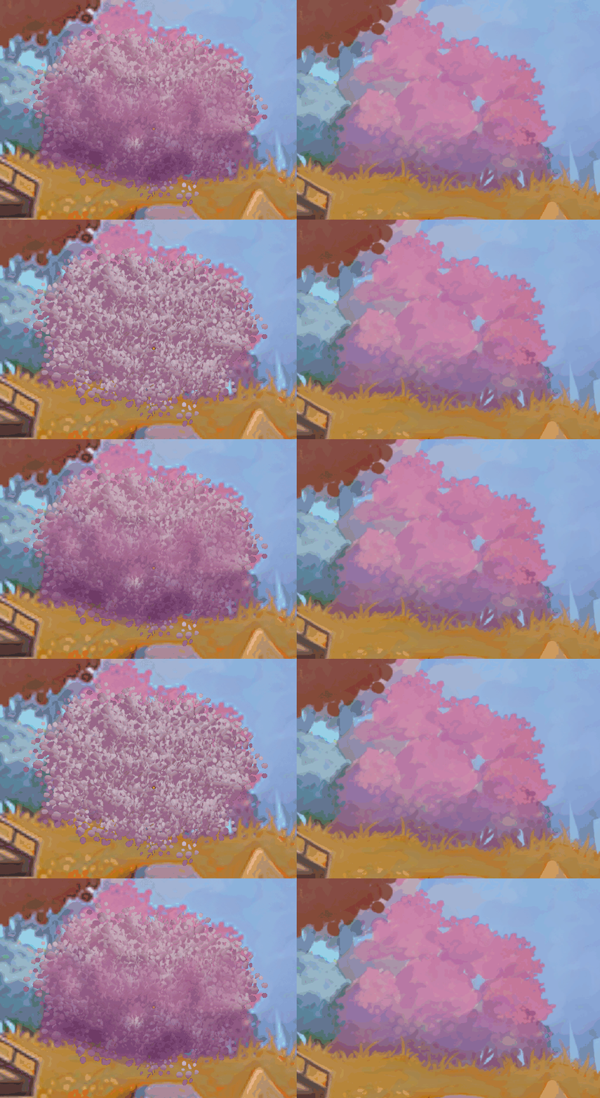
Only criticism is that it feels very flat. I'd like to see more definitive light to shadowed regions. Potentially could also be solved with normal transfer.
Keep the test coming for week 2! You've got a glorious result in your sights 👍
Thank you Jonathan. I'm sorry, that last week I've been absent. Now ill watch livestream ;)
Thank you Kent! Ill improve this, ill make better shadows;) Yours shadows looks really great;)
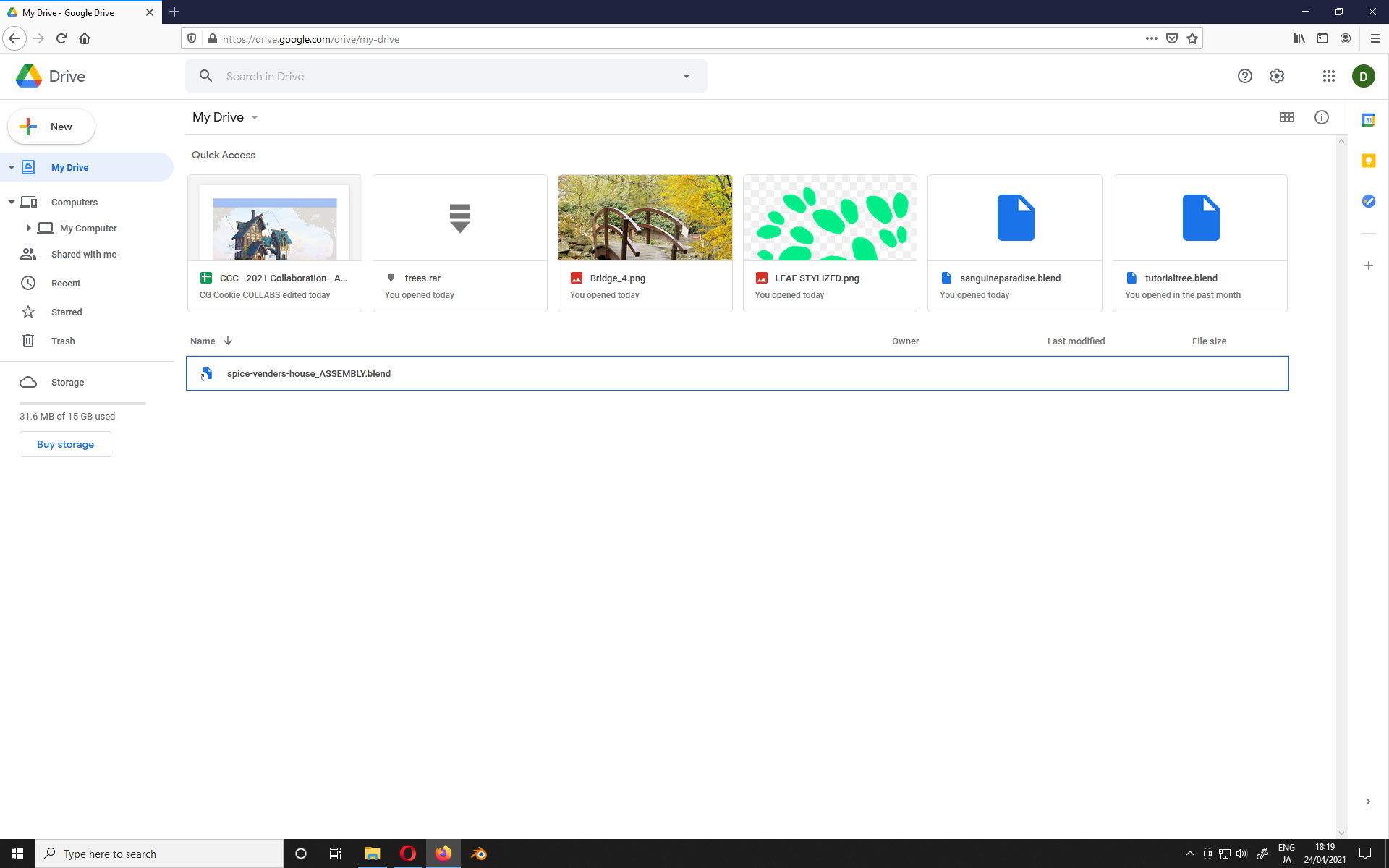
Hmm, I'm not sure if my google drive is set up correctly. It should looks like this?

