Homework Submission Week 2 - Sculpting and Baking
@theluthier
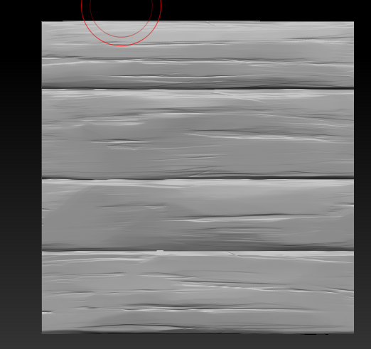
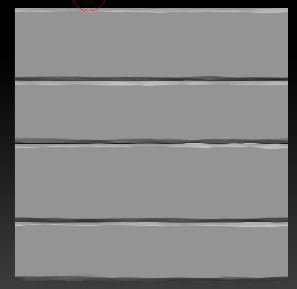


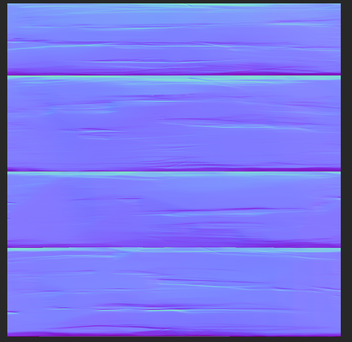
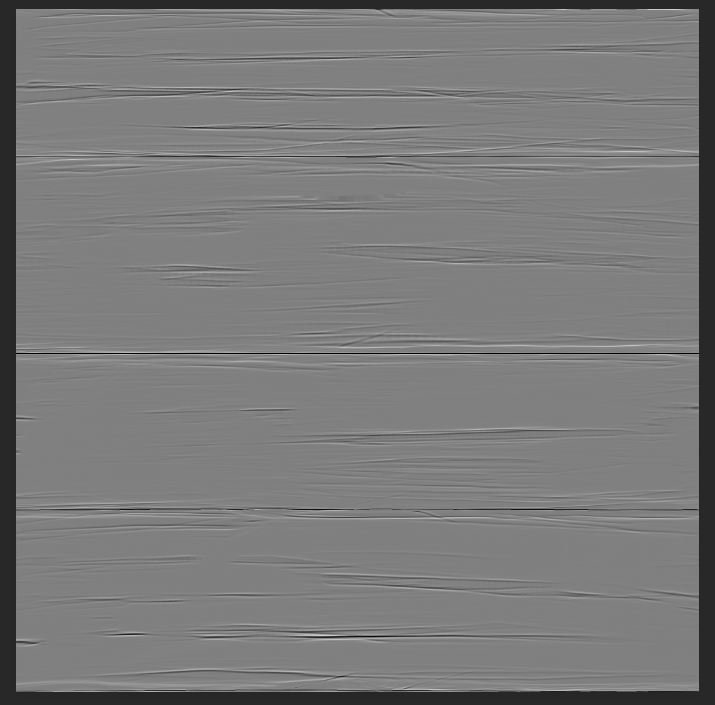
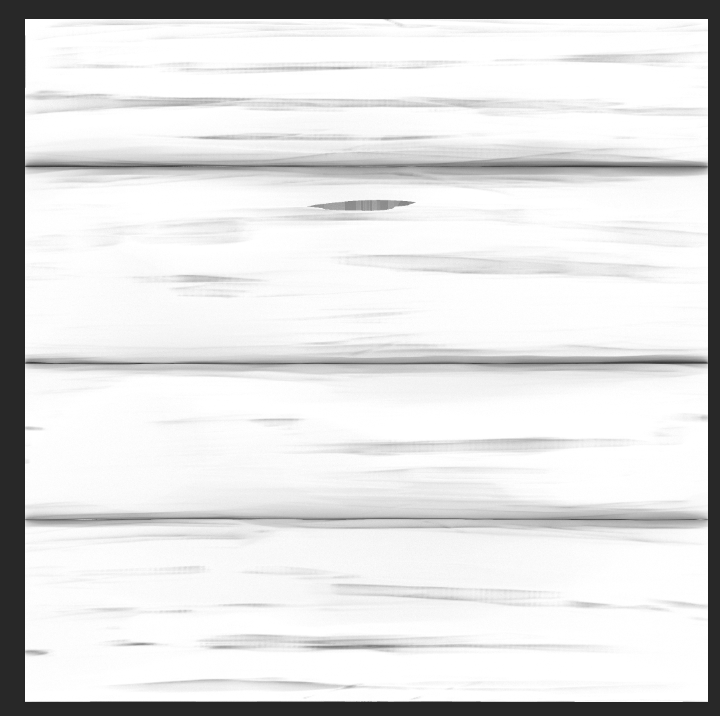
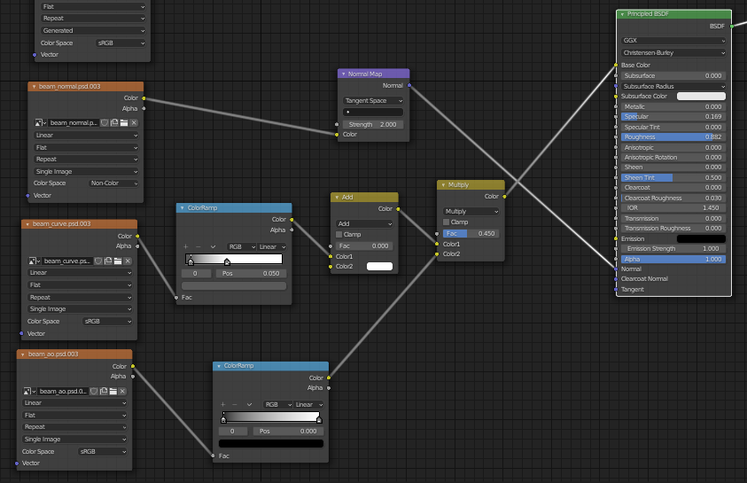
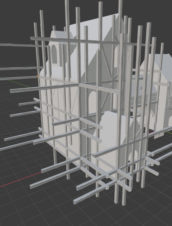
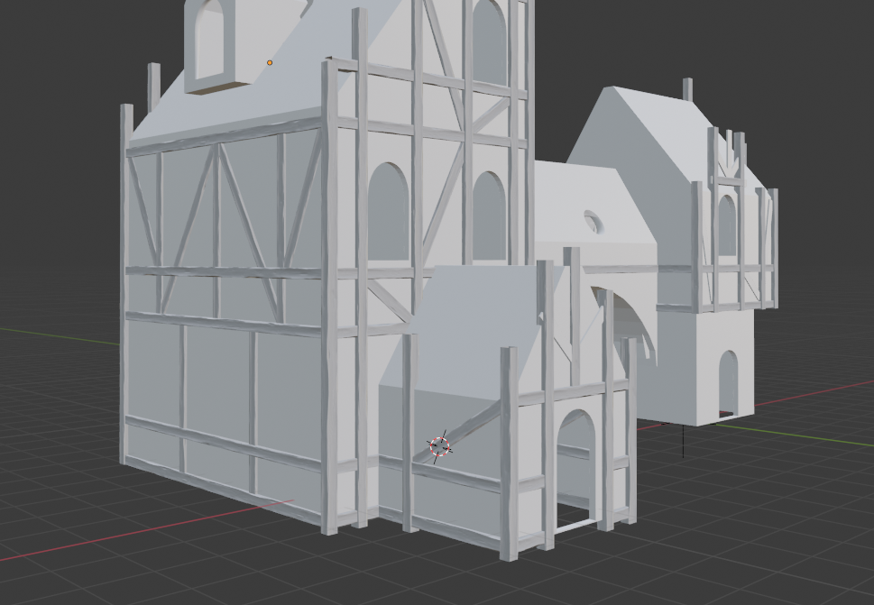
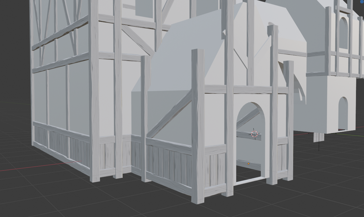
Now my final thoughts is despire the struggle, I've learned a lot and for that I am grateful. I also like to thank the many people who helped me with the sculpting week which, unlike week1, was quite hard for me. So thank you BananaOn'aStick1 (whoever you are on CGcookie) for all the advice related to baking (never forget to smooth meshes), ![]() jakeblended for the tips about how to handle the wainscotting (I manage to have a 1024px plane),
jakeblended for the tips about how to handle the wainscotting (I manage to have a 1024px plane), ![]() blanchsb for the feedback on my result and the FAQ, and the people I forget to mention as well and the community in general.
blanchsb for the feedback on my result and the FAQ, and the people I forget to mention as well and the community in general.
Yes!! I was hoping to see a little bit of sculpting exploration on the wood this week. It's a great general texture so far. I'd recommend about 50% of the boards be like this and the other 50% have a variety of splits and dings in it. But no need to rush, sculpting is next week.
Another idea for the wainscoting (and many aspects of the house) could be trim sheets. Are you familiar with those? I've never used them myself but they're a really clever technique commonly used with game assets.
I didn't know about trim sheets at all and consisdering how cool it sound (just watched a quick tutorial) it's definitely an option worth exploring.
thank for the feedback :)
ps : I've also explored more or less my pipeline for assets and even though the result is ugly (see below). It's only worth 10 triangles and baked both normal map and ambient occlusion map so happy to be unhappy with the style :)
that aint ugly, its looking really nice already i kinda look forward the the end result of this project :D
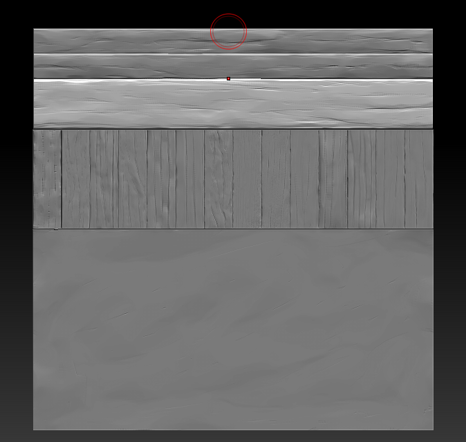
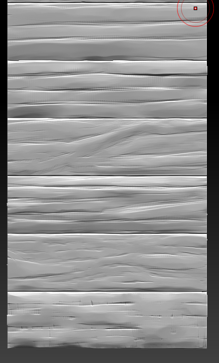
Pssst, in stead of a trim sheet, maybe you could use this technique:
https://cgcookie.com/questions/13975-collab2021-hq-stylized-fantasy-environment?page=2#answer-49397
I believe giving it tribute and interperetation will win over the Xerox mentality.
Having said that I am loving the details already. This is just looking amazing so far oonelombax
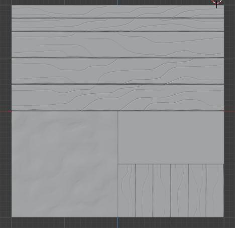
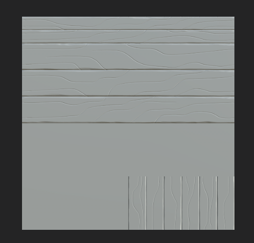
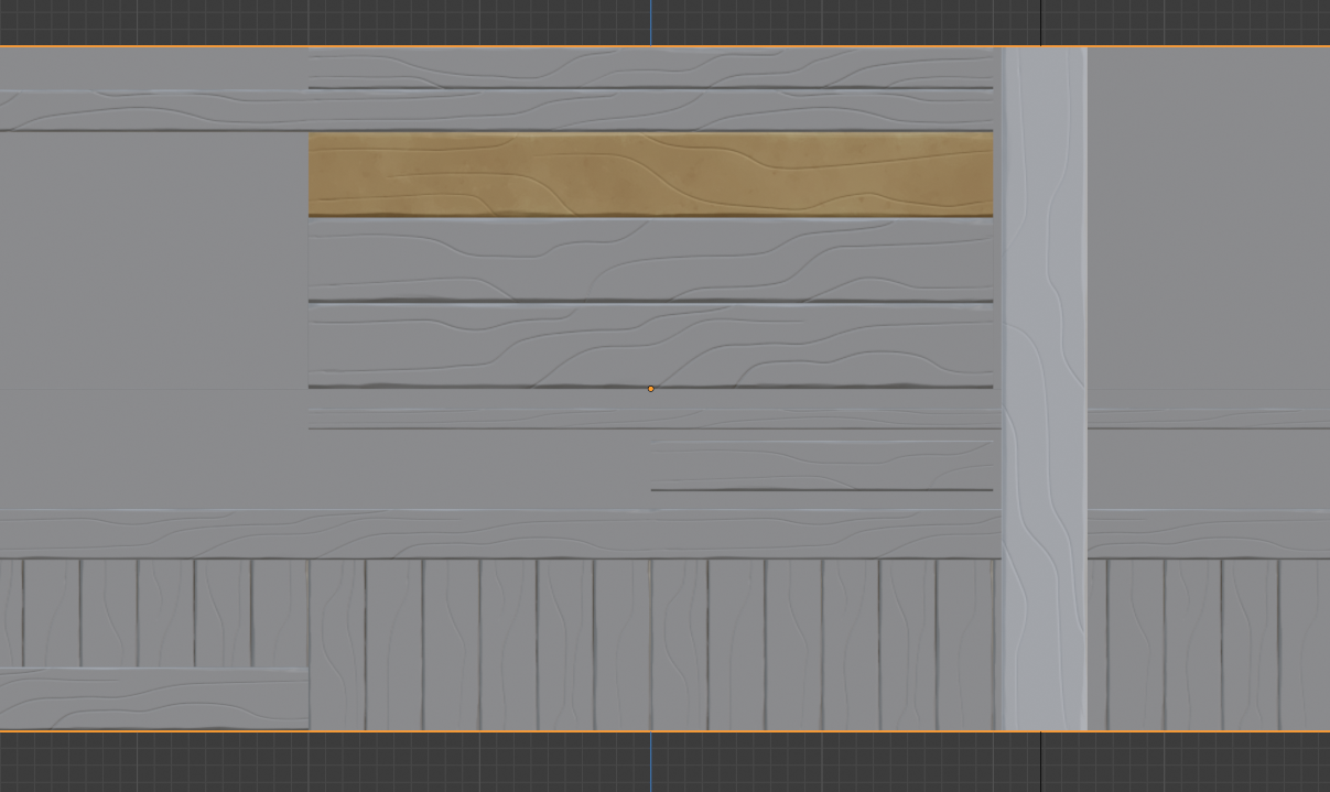
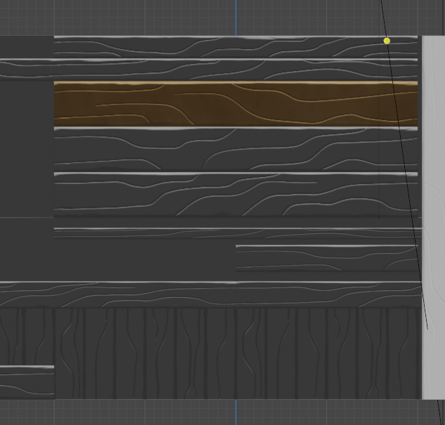
I don't mean to rock the boat, but I like this the best personally:

It's within the style of the art imo as well as resembling the stylesheet details. Generally more appealing to me than the second attempt - which I respect going further stylized 👍
You've earned full points + extra for delving into sculpting already. Keep up the good work!
oonelombax OK I think I see my mistake: You're updating the description of this thread rather than posting Homework submission replies. I looked for a new reply with "Homework Submission Week 2" in bold at the top.
Sorry for the confusion! Ideally everyone would add homework replies to maintain the history of the asset where updating the description loses the Week 1 submission. My apologies for not being clear about that.
Now I see the incredible work you've done for week 2! Man, the wood looks sooo good. Beautiful work and added the wainscoting as a bonus 👏
No critical feedback from me. Just keep doing what you're doing! Cheers for calling out the members that have helped you along the way. This community is so good for that.
Homework Submission - Week 3 - Wainscotting
@theluthier here's the work I've done so far, I was late for submission and I don't mind not being graded for it. Now onwards to the work done.
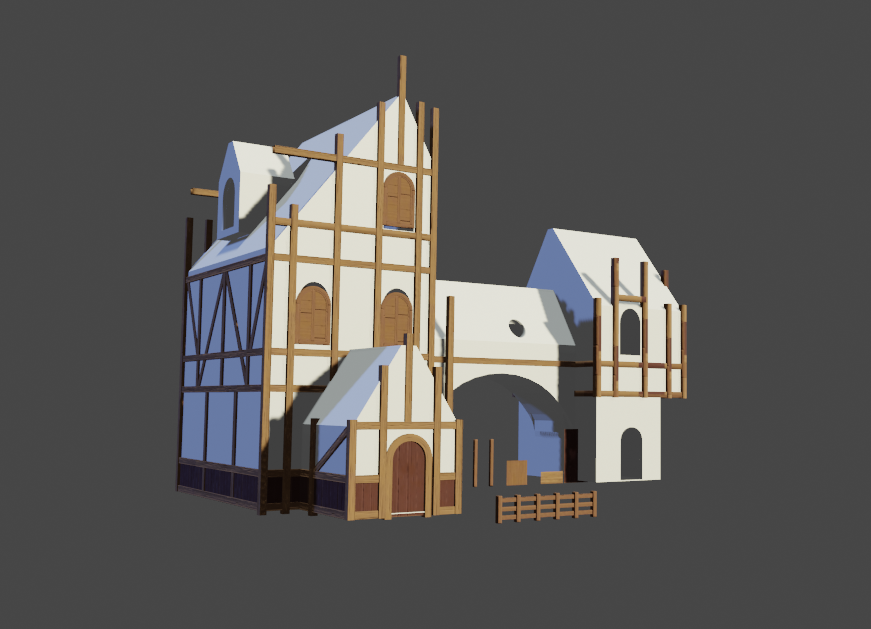
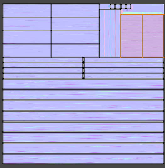
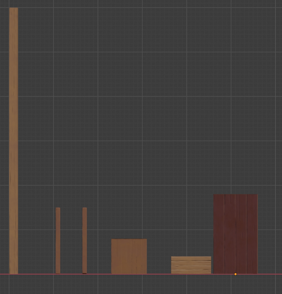
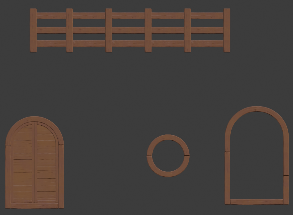
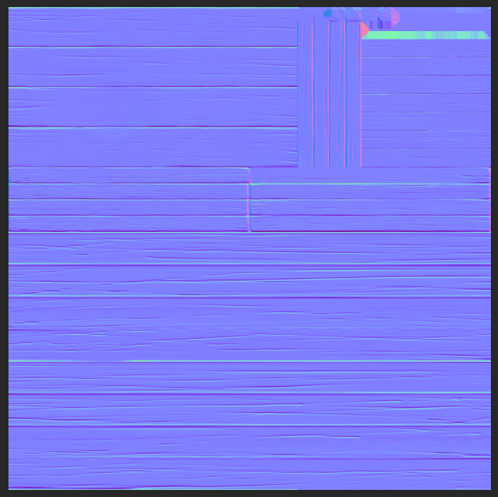
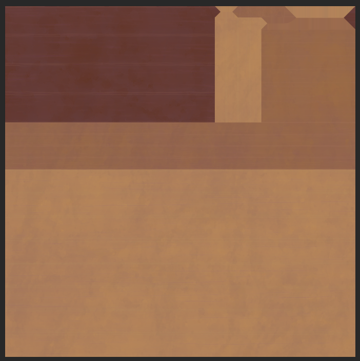
I haven't uploaded my files yet. My blend file are a mess but will clean up everything and upload it :)
You've made my trim sheet dreams come true! This is what I was hoping to push for the house but gave up when considering how to coordinate the effort between so many people. So glad that you did this 🤝
The hard part is how to implement this into the scene now. I'd like to take it all but there's some loose ends to tie up firs:
If you're OK adding those then I'll link them all into the final scene and give you extra points! Otherwise it's kinda awkward having window wood with no glass and door without metal bits. Let me know what you think and sync to Google Drive asap!
@theluthier I've been re-doing my scuplt so it match better a stylized style, here's sneak peak.
I set up a deadline by friday for the trimsheet with color (last time, I allowed myself extra time with the week-end and ended up not submitting in time).
For specific part, like the door knob, the metal hinge/bracket and unique wood piece, I think we could put them all in one texture.
basically, the trimsheet take care of every repeatable part and another texture takes care of unique stuff (this is what I've understood from this post
If I met my deadline, I'd like to explore blending texture actually and see what I can do about adding moss to the wainscotting.
Finally, to sum up my thinking
one 2K texture for the trim sheet
one 2K texture for specific parts
one 2K texture for seamless texture divided in four, 1 plaster tile, 1 moss tile, 1 glass tile, 1 for the roof tile.
Obviously, we're not there. I can figure out the trim sheet (there's some issue from the previous shot I need to fix) this week. If I have time, I can take a peek at the specific part or the tile texture but I doubt to have any decent result to be honest, I can run some test and I have a tutorial I've been meaning to learn to apply blending texture.
You decide where my next focus should be :) I don't mind
oonelombax, Your wainscoting is looking great! It seems as though you are pretty much finished. I would love to showcase your artwork in the TSMF blog. Consider isolating your asset in its own scene and show it in its best light. If you decide to do this, please provide a final render in an image with a minimum resolution of 1650 x 950 (like a letterbox aspect ratio). If you do create such a Money Shot, please post it here in your WIP and comment me. I am confident that other people in the project would also love to see your final results in the Blog. Thanks.