This is my project thread for the April 2021 collaboration.
I like where that was going, but I ran into some problems with it.
It was really tricky for me to get the leave alignment right with the sapling tree generator.
Also, when I zoomed in on the project image the leaves aren't maple leaves, they're just hexagonal leaves. I should honor that, and it'll save a fair number of vertexes.
I'm going to play with the geometry nodes and see if I can't come up with something I like better.
i really like the tree , those leaves are looking amazing too , nice work
Thank you yyukinoh1989.
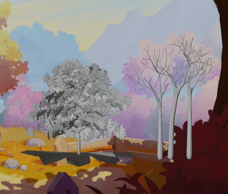
As much as I like what was going on with the sapling tree generator, it's a little too random.
Compare the sapling generated tree on the left to ones on the right.
The ones on the right are hand modeled with the skin modifier. They're much easier to control.
Now I just need to get leaves applied. (Not sure if I'll need a lot of smaller branches or not.)
![]() wardred I'd say that (at a guess) the trees on the right wouldn't really need any more branches because of how far away they are from the camera, but check in with you Team Leader to be sure about that hypothesis.
wardred I'd say that (at a guess) the trees on the right wouldn't really need any more branches because of how far away they are from the camera, but check in with you Team Leader to be sure about that hypothesis.
Other than that it's all looking good to me. 👍
wow i would not have thinked about modeling a tree trough a skin modifier , great idea , and its paying off :)
yyukinoh1989 Thank you, I'm pretty happy with the results.
Somewhere out there is a tutorial I think Kent did on creating a spooky tree that went over creating the tree with the skin modifier, and a single subsurf modifier to make it a bit rounded.
The only downside is once the modifiers are applied the branches alone are 80k vertexes! It's relatively easy to slide the redundant loops into each other then merge by distance, but that'll take me a minute to do.
Still exploring the best way to get leaves onto these beasts.
![]() vincav81 - I need to go back to the project guidelines a little. You're correct, from the perspective of the photo, I could probably reduce the number of limbs significantly and have leaves floating with no attachment to branches at all, and one wouldn't be able to tell because they're so far away.
vincav81 - I need to go back to the project guidelines a little. You're correct, from the perspective of the photo, I could probably reduce the number of limbs significantly and have leaves floating with no attachment to branches at all, and one wouldn't be able to tell because they're so far away.
If the goal is to be able to "fly" through the model, and be able to take good photos of it from other perspectives, it's possible one of the mid ground trees could become in focus, in which case having leaves obviously floating away from the limbs would be problematic.
Just messing with floaty leaves. I actually gave the stem some depth. . . but I think having a stem may have been a mistake.
I like the trunk form the skin modifier more, but I actually like the shadows from the sapling generator more.
Man, sapling generator, particles and the hair generator, geometry nodes. . . I never realized their were so many ways to try to model a tree.
Edit: On the last photo the trees in question are on the right.

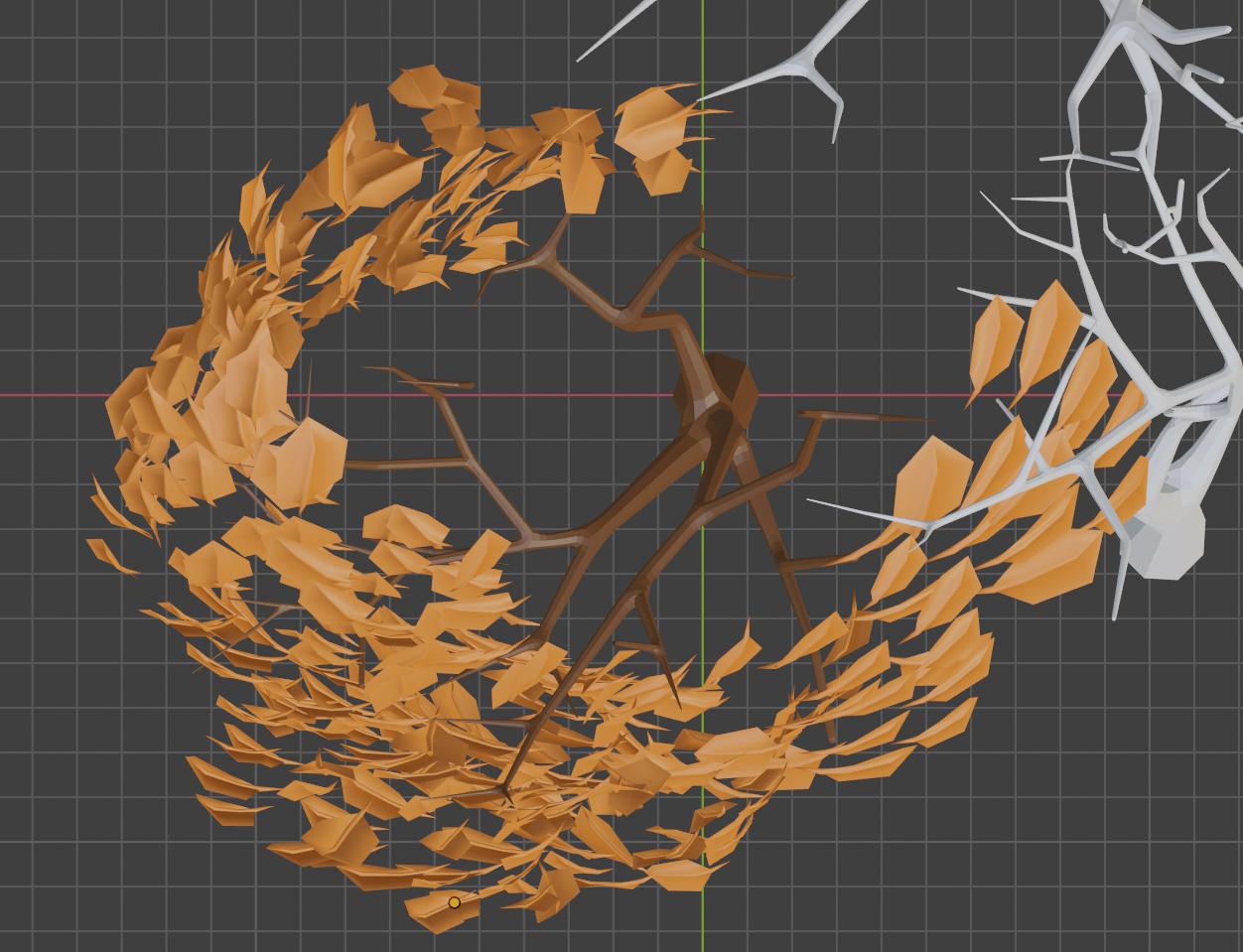
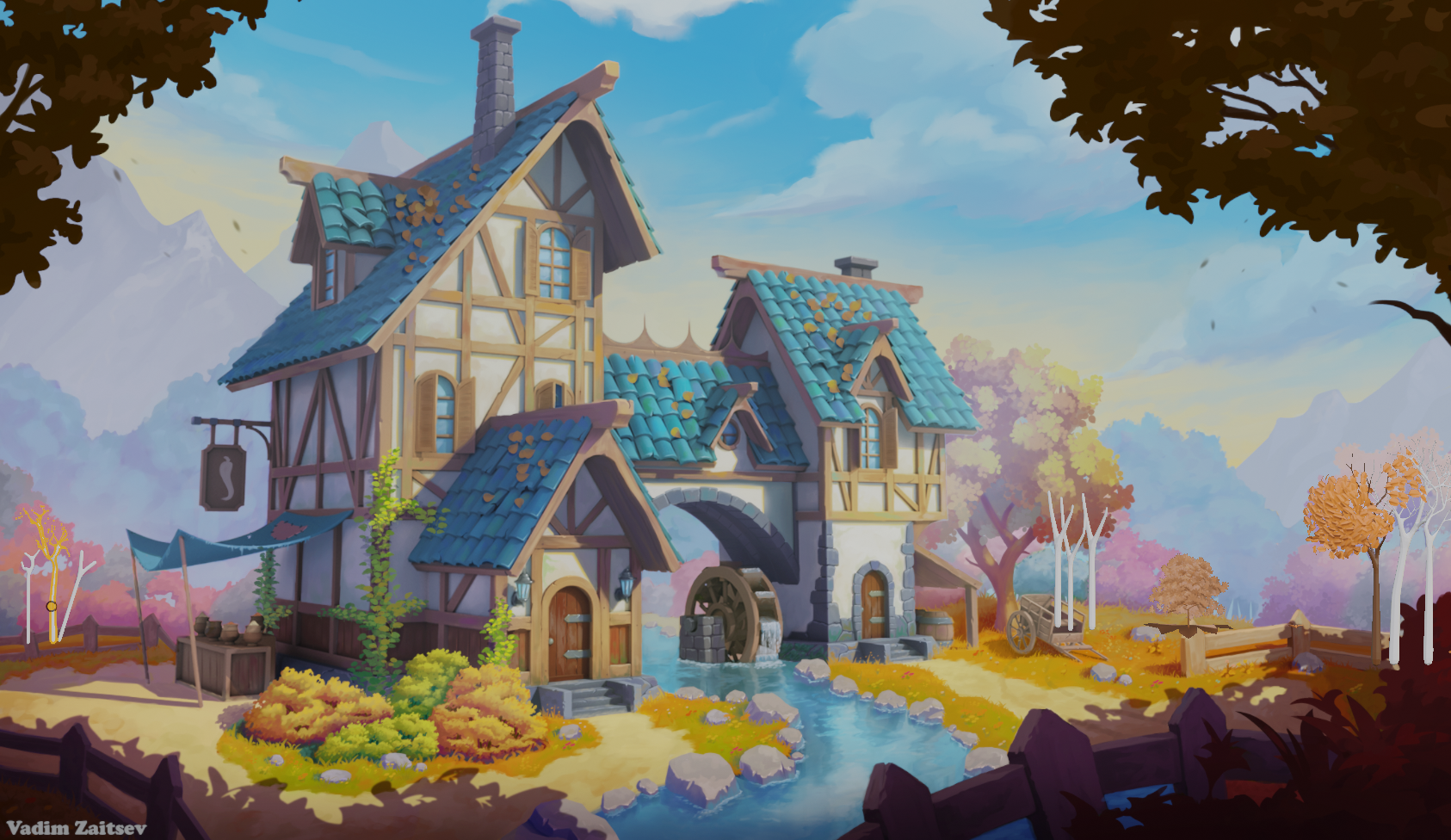
Homework Submission - Week 1 - MG Trees
@theluthier - Finally got to a spot where I could link you directly to this homework assignment.
The trees in the first image on the right are the most complete. I really like their branching. I'm still not quite as happy as I could be with the leaves themselves.
The tree in the middle with the huge maple leaf under it was the sapling generated tree. I like the shadows from that tree better than what's happening with the leaves on the right.
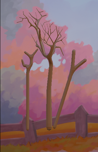
In the first image on the far right and left are some skeletal trees. Not sure if I should actually be doing anything with those or not, but it kinda looks like they'd be there from the reference photo.
I asked a question about the second image. I wasn't sure if I should be trying to recreate something that would look good if you walked up to it, which would end up being the middle tree, or if I should focus on just what one can see from the photo, like the two outer trees.
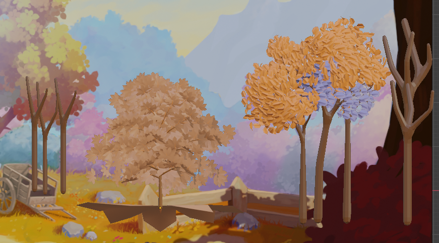
Wonderful week 1 work ![]() wardred! Very promising to see how far you've come already. You've earned full points from me 👍
wardred! Very promising to see how far you've come already. You've earned full points from me 👍
I stand beside the same feedback I gave you elsewhere about removing the small branches for MG trees. It's worth saving the geometry the further we get from the foreground zone. Therefore these MG trees will lean on the leaf volume hiding the missing small branches.
I want to offer 2 stylistic notes: The leafy feel good and "leafy"; clearly individual leaves are in use to good effect. However right now they feel a bit sparse and lacking a more solid core. I've been recommending foliage artists try the approach from this video:
It's not created with Blender and it's a bush instead of a tree, but the concept is what's important: A solid chunk of geometry representing the "core" of a leaf volume with a layer of alpha-mapped leaf cards making up the outter surface. When done well it's an effective illusion.
Hi Kent,
Thank you!
I agree. The shell I created. . . feels like a shell. There isn't enough interior volume which makes it look like a balloon with a loose covering of leaves and doesn't create any interesting shadows.
Leaves are definitely something I'll be working on for this week.
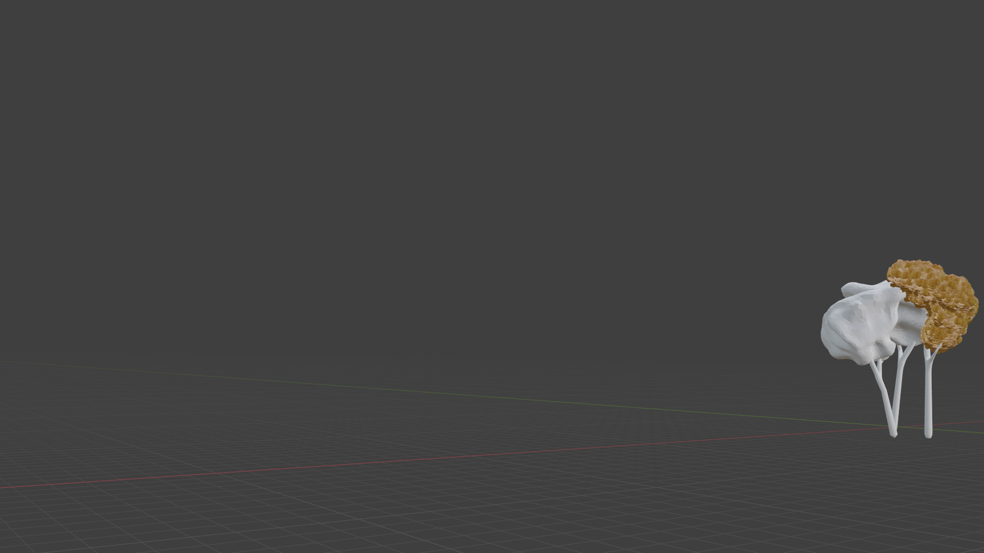 Homework Submission - Week 2 - MG Trees
@theluthier - Some progress.
I haven't made as much progress as I wanted this week. I still have more trouble than I like aligning things. I need to spend more time with the tutorials.
I'm loading what I have to my WIP file on Google Drive.
@jlampel,
Thanks for checking. I've corrected the broken links.
I was working on the leaves, but I have a ways to go on them.
Once I figure out their orientation, I have a fair amount of texturing to do to them.
Edit: I believe I've fixed the broken links.
Apologies for the late feedback ![]() wardred
wardred
I can see in your file that you're doing a lot to stay true to the artwork. This is admirable but you can relax this commitment when it comes to the MG trees. The idea is that I will be able to duplicate your tree around to several locations. Which means it shouldn't be to matchy matchy to a certain tree. Just get close-ish to the shape, within the spirit of the art, and you'll be golden👌
Also Lampel has run a test and confirmed that the alpha-mapped approach to leaves is far more efficient than the individual particles. Check out the livestream from Thursday (starting around 50 min) for a demo of this workflow. It's for a bush in the stream but the exact same workflow applies to tree leaves as well.
@theluthier - Thank you for the feedback!
I miss Thursday's streams. . . they're not at a good time for me, but I was excited to see the bush part of it. I'll be going through that this evening.
I need to get hopping on that as I have to get that done, and hopefully some texturing too.
Homework Submission - Week 3 - MG Trees
@jlampel - Using Kent's Thursday stream, I'm pretty happy with how my tree turned out. I tried using the second set of gradients plugged into the emission. . . but I didn't like the result as much, so it's not plugged in.
One thing I noticed about this method is how good it looks is highly dependent on the lighting of the scene.
Let me know if I should put together a slightly different shader or shaders for the trees on the left. The "lower" grouping of them are all red. The upper grouping is sort of a washed out blue/grey/green.
Any other feedback you have I'll gladly accept. The bark, for instance, has no texture and is just a solid brown color. Matches the artwork, won't really work that well for a walk around.
Let me know if I did any bone headed things like neglected to link everything you need access to. My leaf texture is in the appropriate place, and I tried checking the 'automatically pack' option, but there are so many of us if there's something I missed and can fix that will make it easier for you, please let me know.