
Here is the place where I would like to share my Blender projects, document my progress and hopefully get some feedback about what's already good and what can be done better and/or faster.
The scene with all assets:
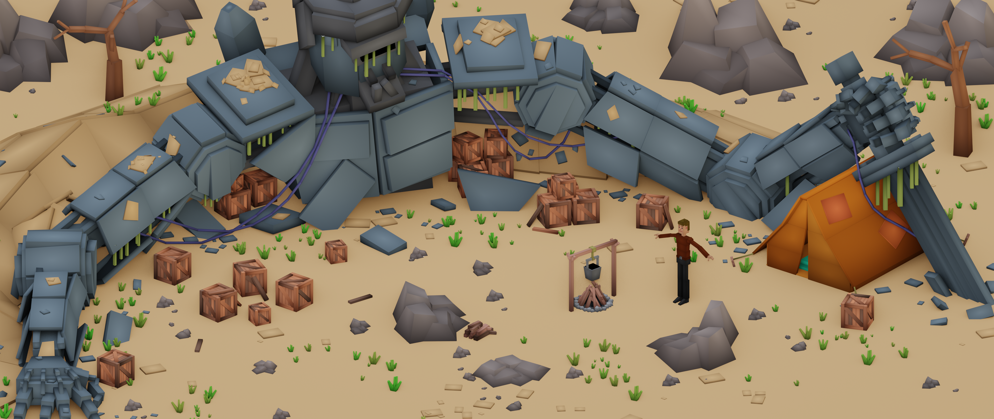
The placement and density of the props, grass and stones still could be tweaked but I'll leave it for now and proceed with the scene animation.
@adrian2301 I'll expand this a little bit 😉. Still a few days left until August 1st 🚀 ...
This is a screenshot from my WIP project of the "Lonely mountain" from the "Master 3D Environments in Blender" course on CG Boost:
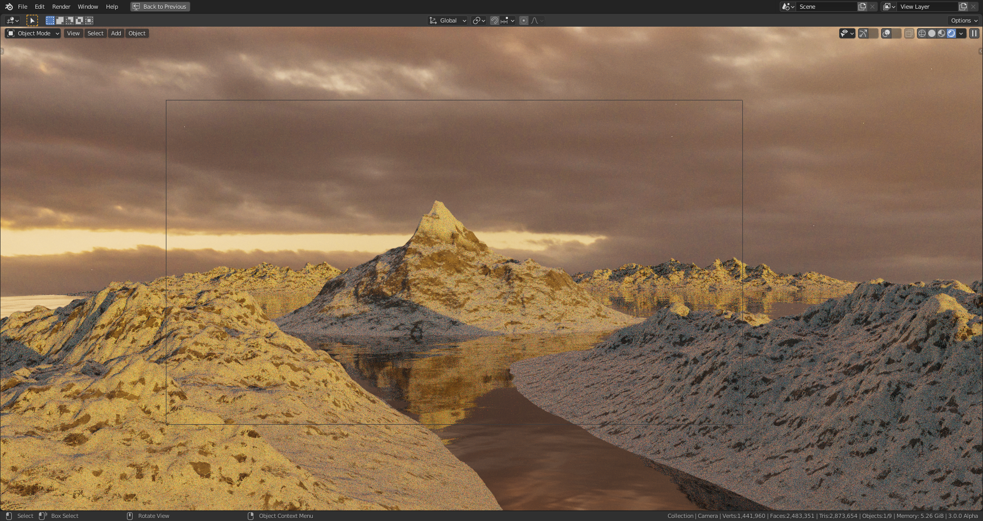
The file is currently very heavy (300 MB as file, more than 5GB in memory") due to the heavily subdivided mountains which I need for the procedural snow texture calculation on upwards pointing faces. I'll have to bake them and apply them on low-poly versions at least for the background mountains.
I've created a "Space Station Challenge 2021 WIP - Energize " thread in the "Blender Discussions".
My low-poly rocket from Grant Wilk's @remingtongraphics course as an exercise for my space station rocket:

Yea so for my scene I used the 1-2k textures, And because I had the trees I didn't subdivide my mountains as much
I also did not use the Experimental subdivision I just used supported because that took way too long to render lol.
you could also render your scene in layers. i didn't do that because I had just enough memory but he used it for his scene because his mountains were subdivided a lot.
![]() stickdonkey Thank you for your explanations and your advice 😀! I definitively need to simplify my scene not only to get it rendered in its current state but also with the trees, the fog and the ice on the water added 🤪!
stickdonkey Thank you for your explanations and your advice 😀! I definitively need to simplify my scene not only to get it rendered in its current state but also with the trees, the fog and the ice on the water added 🤪!
Just a little exercise of an ancient greek style pavilion (no references used):
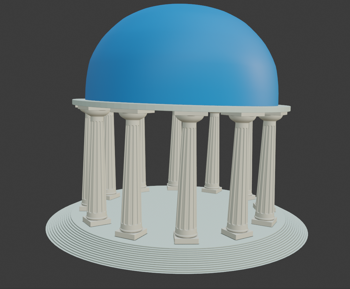
I created the stairs by beveling an edge with "Custom Profile" set to "Steps" and selecting "Percent" as "Width Type" (set to 100%). After selecting all vertices of the "Stairs" object, I used "Merge by Distance" for removing overlapping vertices.
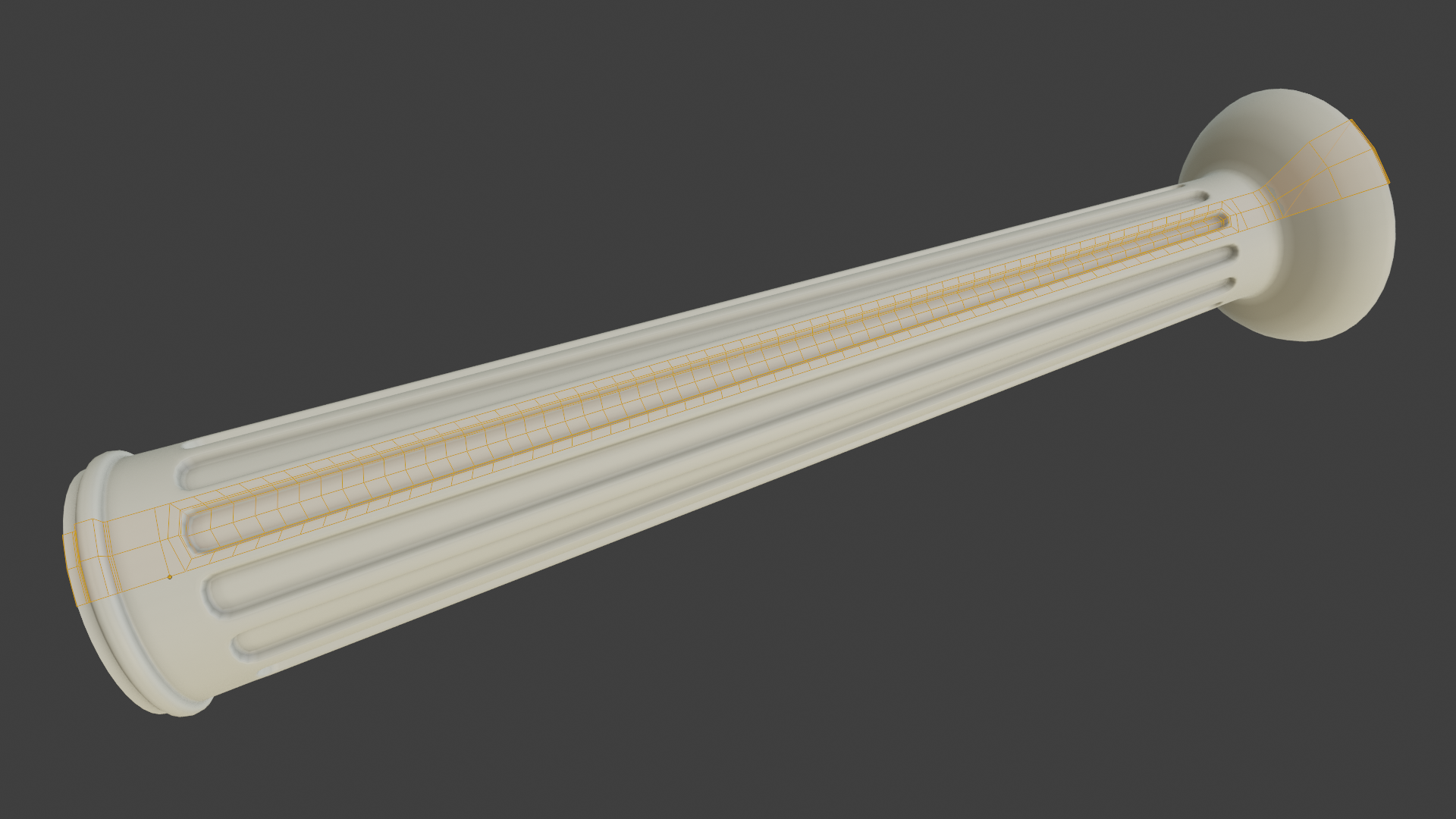
Thank you, @adrian2301 😀! I've created the columns using a method that I've learned some time ago. It took me some time to figure out how to do it right (or what I consider to be right 😉):
A toy brick house that I've modeled some time ago following Rob Tuytel's course on creating modular environments:
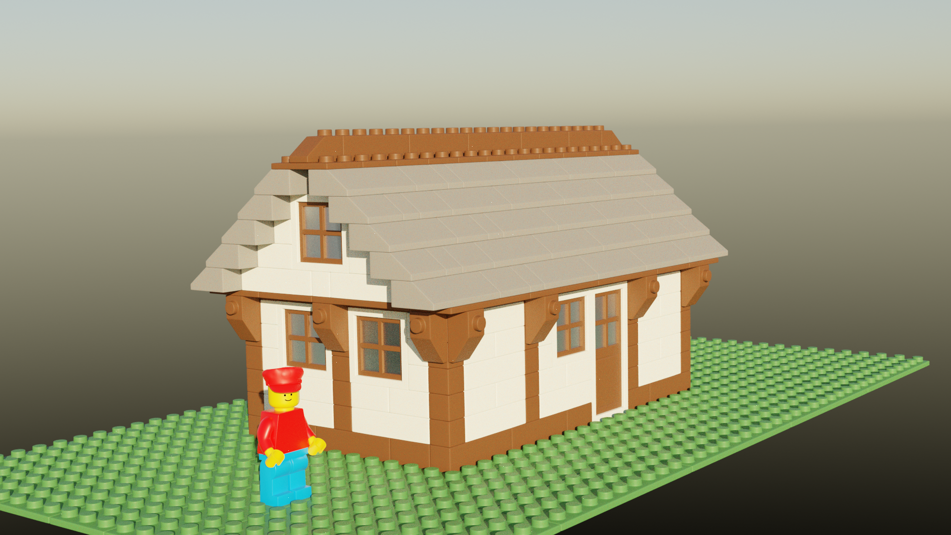
The character is a premade asset from the course resources.
Thank you, Sébastien ![]() slenaerts! I was a lot of fun to model it 😊. Hopefully, I'll gain the wisdom soon to model more advanced anatomy like in Kent's upcoming "Human Portraits" course 😀!
slenaerts! I was a lot of fun to model it 😊. Hopefully, I'll gain the wisdom soon to model more advanced anatomy like in Kent's upcoming "Human Portraits" course 😀!
Thank you, Sébastien ![]() slenaerts! This toy brick house is warm-up for modeling more realistic looking houses in big landscape scenes. Still a lot of learning ahead 😉 . . .
slenaerts! This toy brick house is warm-up for modeling more realistic looking houses in big landscape scenes. Still a lot of learning ahead 😉 . . .