Getting started with Blender? Watch our Blender Basics, the most popular tutorial series for getting started with 3D creation. Less than 60 minutes runtime, over 1 million views from Blender artists like you.
Blender 2.8 is here! Will you hit the ground running? The following are the most fundamental changes that have happened between versions 2.79 and 2.8.
1. A Revamped User Interface

The UI in Blender will change quite a bit. It shouldn't take very long to get used to, but old habits sometimes die hard!
Left click select
This change has generated the loudest buzz since it's the most central modification. Right click selecting will still be an option, but it will no longer be the default. The great thing is that you will now be able to right-click to get context menus (like in most apps), click in empty scene space to deselect, and left click + drag to box select.
Workspaces

So long, layouts! Workspaces, it is true, are a lot like layouts but with new functionality that give you more power to organize your workflow. You will find them as tabs above the top bar. They are more task oriented than the old layouts and can change which addons are enabled or which context mode you are working in. Going to the “Modeling” tab takes you directly to Edit Mode, which saves you an extra step. “Sculpting” not only takes you to sculpt mode, but adjusts your viewport to turn on matcap shading and only show what is relevant.
You can customize your Workspaces to perfectly suit your needs of course, to ensure smooth sailing as you switch between tasks.
Active tools in the toolbar

Instead of an assortment of single actions, the toolbar is now home to tools with widgets! Clicking on one of these tools will make it “active”, which means it is now assigned as your left click and drag action. Most of them also have custom manipulator widgets, which make some tools much easier and more intuitive to use.
This is a welcome change for beginners since it puts Blender's most important modeling functions front and center. For advanced users however, it will likely stay hidden since it is generally faster to just use the hotkeys and jump right into the action.
Top bar

Along with the new tools, there is a handy space for tool settings. Most modeling tools don’t have a lot of options, but sculpting and grease pencil tools do! You’ll be able to quickly access these along the top bar if you right click on the header and choose "Show Tool Properties". If you prefer the old school menu layout that used to be in the toolbar, you can find these same items in the Tool Properties tab of the Properties editor.
Themes

Layout, shapes, colors: you can customize 2.8 to your liking. New themes have been circulating for download and you can make the choice for what you find aesthetically pleasing and easy to navigate, so you can make a fresh start with 2.8 inside and out.
2. The dependency graph
Blender's dependency graph (a.k.a depsgraph) ensures efficiency in updating scene data after a change is made by a tool or setting. It's an under the hood change rather than an obvious one; the updates will vastly improve your workflow without you needing to think about it at all!
Behind the scenes, the depsgraph influences every area of Blender. The Blender wiki goes into detail about the changes made to dependency graph in 2.8. The key points are a much higher reliability of drivers, constraints, animation playback, and file linking.
3. Hello, High-End Viewport!
EEVEE

Get ready for gorgeous screenshots everywhere! We previously wrote about the massive change that EEVEE brings to Blender. The new real-time rendering engine brings Blender’s viewport up to speed with the best game engines out there, and looks incredible without the extensive render times of a path tracer. The ability to quickly tweak PBR materials, see game assets as they will appear in-engine, and paint while viewing layers of images is a massive game changer.

For now, EEVEE isn’t replacing Cycles, though the real-time engine will most likely dominate the 2.8 hype train for good reason.
Workbench

Solid shading is the fastest method of drawing your scene. In Blender 2.8 it becomes a highly performance focused renderer for modeling, texturing, animation, or scene layout. EEVEE and Cycles are for beauty or realism while Workbench is all about speed and clarity. With sharp shadows, cavity shading, and random colors, your details will practically jump right off the screen.

Wireframes

The old wire frame is no more: in Blender 2.8, Wire frames are rewritten from the ground up. They are now a part of a new overlay system, even fitting on top of EEVEE or Cycles. The wires now have Fresnel, optional colors, and a transparency effect when behind or inside other objects, all of which make it easy to see what’s going on. You can also enable wire frames on top of solid shading for all objects at once, which was a hassle to do in 2.79.
4. Grease Pencil: Much More Than Just Strokes
A new object type
The Grease Pencil used to be a tool to make quick notes in the viewport, but in the last few years it has evolved into a fully fledged animation tool. The old style tool is still available in the form of Annotations, and the Grease Pencil has been promoted to its own object type.
This means that you can easily switch between Draw, Object, and Edit mode for Grease Pencil strokes, add modifiers, and adjust the materials in a more familiar way.
Full 2D animation tool set
With more space for the Grease Pencil to breathe, there is room for more tools! Lines, arcs, curves, boxes, and circles are now easy to draw and can even be adjusted with widgets afterwards. Along with a new dedicated workspace, post effects, layer blend modes, and more, this makes Blender’s Grease Pencil capable of producing entire 2D Animated films.
5. Organization
Collections

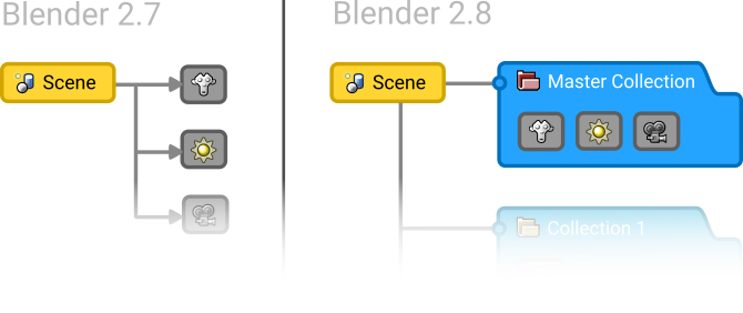
Blender used to be limited to 20 layers. Not any more! Collections have replaced them in a big way. You can have as many as you would like, nest them in a hierarchy that makes sense, and organize them via the outliner.
View Layers
Since Blender 2.8 is always rendering something in the viewport, render layers have now been renamed view layers and can be used for including or excluding things from the viewport as well as the final render.
Multi-object editing
A big change that didn’t get nearly enough press is Blender 2.8’s ability to edit multiple objects at the same time. That means you can use modeling tools on groups of objects at once while still keeping them separate! In the future, you’ll likely be able to sculpt or texture paint on multiple objects at once, and editing the properties of everything you have selected will become much easier.

Not a bad time to be new to Blender :)
That's very interesting.
The new spin tool is a-w-e-s-o-m-e
This might actually get me over from modo to blender, great stuff !
cheers for the overview, theres alot in there to get used to, but its a learning leap in the right direction i think. and one that ill enjoy taking.
Nice new changes hum.. Great!
Nice overview Jonathan! You mentioned all my favorite things about 2.8, and more 😄
A nice quick read to learn about upcoming Blender 2.8 :)