
With our first contest on the new site, we brought in a SLEW of new judges along with some returning ones to provide their feedback and critiques of the ones that stood out! So below are the judges critiques and even if your entry wasn't picked, you may still find something interesting and learn from the feedback given!
If you want to see the contest page and explore the entires for yourself, click HERE.
Judges Critiques
Autumn Goose
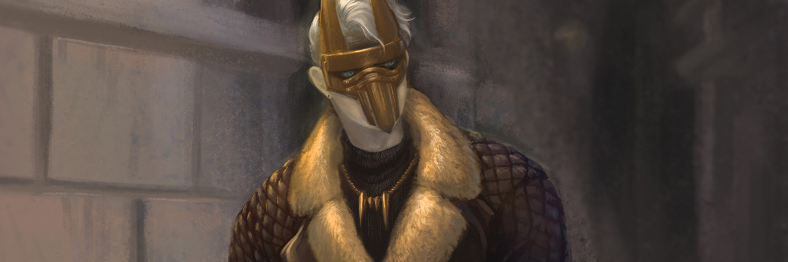
Gawki: Loving the values and shapes. This character feels very creative and well thought out in terms of personifying the doberman! It's a character that seems very self-aware and you can almost tell what their personality is by their walk and sense of high fashion. Not just a normal suit or usual formal wear which is rad! Also the small easter egg with the blood in the background is a great touch. They fit well in the K-9s! As for techniques, there's definitely a lot of areas that almost seem.. too fluffy? Almost way too many soft edges and not enough hard edges. The boots edges and in the dogs. I suggest trying to leave more textures and not over blend! Otherwise I'm still digging it. Good dog.
Jonas: the body language here is both casual and powerful. the fashion design is bulletproof. The wide collar and broad shoulders taper down to the thin boots with pleasing fluidity. Theres a buncha different textures in this design but they're all very harmonious. the teeth bling on the black sweater is YES.
Pui: Clothing designs: I've enjoyed Autumngoose's fashion piece quite much. It alures a certain quality of confidence in the character's post and posture. Something about this piece stands out quite a bit among the many entries.
Nate: Great use of color scheme to evoke mood in a setting, interesting costume design and use of setpieces, props and pets. Overall an interesting concept that is elegant, mysterious and brooding.
Pete: This piece makes a really strong impression. The mixture of masculine and feminine elements weave together in a way that makes this character extra intense. Her casual demeanor combined with the super aggressive getup create that sublime unease that makes a character truly creepy. Balancing opposing themes within a design is the key to creating interest and Autumngoose is totally making that happen.
Mathias Melly
Jonathan Amador
Oscar Lazo
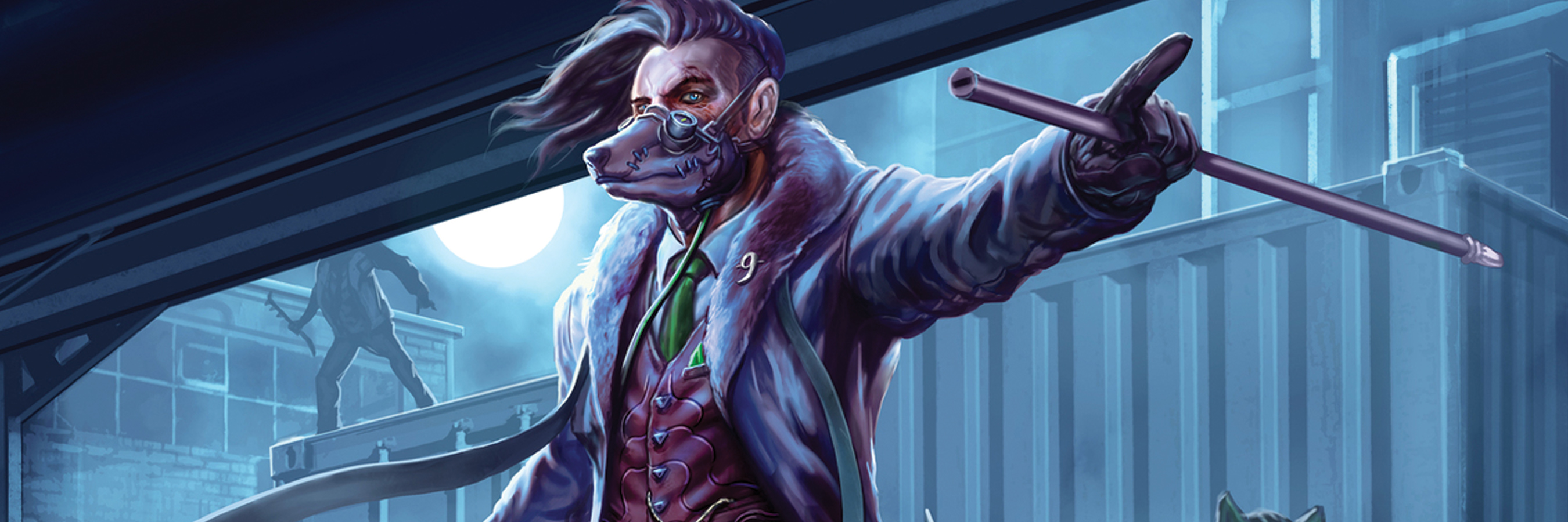
Sycra: This is such a cool composition! It really drew me in, and I'm very impressed with the amount of work that must have gone into this. I love that it's a scene, not just a character standing there. The rendering is top notch, I especially like the dog! Overall, it's just really great work!
Jonathan: I felt like this was the quintessential gangster scene, and my absolute favorite entry of the contest! The framing is simply cinematic, with several strategically-placed focal points inviting viewers to piece together the action. There's a satisfying feeling of movement here, and every area of the canvas has something interesting to look at.I am really intrigued by the lead character, and the fact that his mask looks almost more like a muzzle. It tells me that he's not merely a henchman hiding behind a mask, but rather an intimidating force to be respected. He has a very strong pose (on multiple levels) and I'm always a fan of that ever-dynamic, mid-action glance at the camera that he's showing. It makes the painting feel like a snapshot of a longer raiding sequence, which is awesome.Superb work all around, Oscar!
Yuushin7
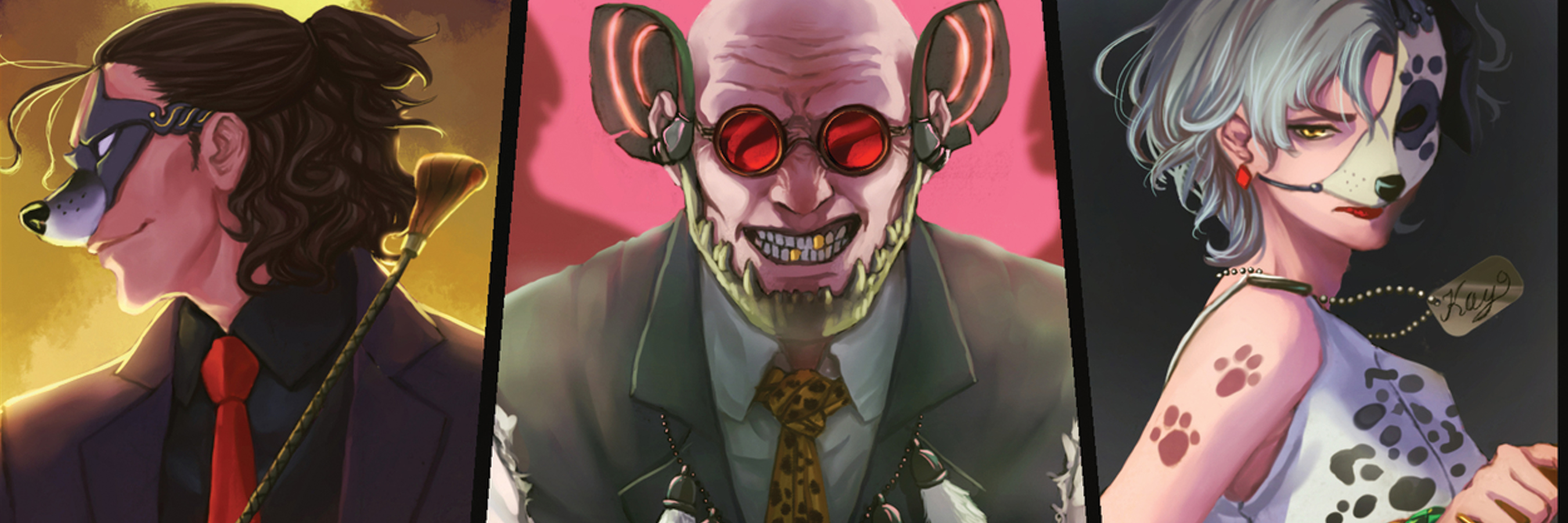
Sycra: This triptych is really cool and not just because you get 3 designs for the price of 1. I think Tony, Ruben and Lady were all drawn really well, although I must express my preference for Lady, the Dalmatian. I like that the artist arranged the characters in dynamic and unique positions. The individual personalities of the characters are evident also, and much is conveyed in these three panels. I would say that the middle character, Ruben, looks a little cluttered in his design, compared to the other two characters. I just don't really see many canine qualities to him, and there may be a bit too many design languages in him, but the other two are great, and as a trio, I think they still work. Good stuff overall!
Sean: That middle guy is BOOMING with “character”! There seems to be so much story in that small panel, that I truly wish the other two carried that much as well. I love the rabbit’s feet necklace, the red sunglasses and that expression, it’s executed very well! The others seem to lose that power as you look around the whole piece. The woman I will say is stronger than the man on the left, your choice of clothing design made her interesting besides some anatomy issues. Remember to flip that canvas! Also, I’m a bit confused on why you chose to keep the background of the women a grey color. The others have good color choice, and I think maybe adding a soft blue behind her would help push the piece, nothing wrong with using the primary colors! The man on the left I believe could've used a bit of the push in design. You’ve shown you can make interesting and fun design in your characters so don’t be afraid to use that strength when needed. You’ve got a knack for design, use it in your upcoming pieces for next time!
Victor: Another great entry. I really wish I could have seen more of each design, but the essential stuff is here: Each character stands apart and occupies its own design space. Though verging on tropy, I feel the artist managed to keep these designs fresh and interesting (there is a reason tropes work!) What hit me about this image is that I can instantly feel the dynamic of the three characters and build a story in my head from there: There is the cocky upstart, probably highborn in the ranks with a taste for killing (a sort of Jaime Lannister type), the Mob Boss who you only see his glowing red eyes behind a desk until the last scene when he reveals that he likes to get his hands dirty too, and the femme fatale with a dark and tragic past who has found a life in the K9. It doesn't even matter if these were the intended read, these designs ooze character and have the iconic clarity of manga baddies from my childhood!
Tabatha M
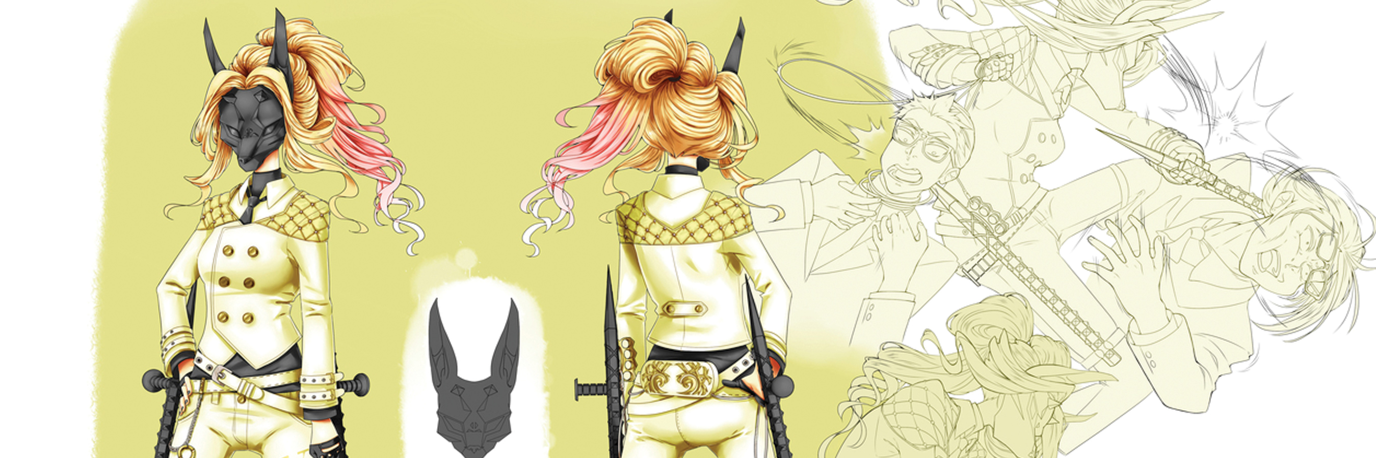
Pete: Every inch of this character feels thoughtfully designed without being overworked. I love how the shapes used in the weapons, shoes and mask all echo each other. Tabatha's super tight sense of style combined with the super tight execution makes this piece really satisfying to spend time exploring. It's always great to see the strongest parts of an anime style used to good effect.
Renato Prezioso
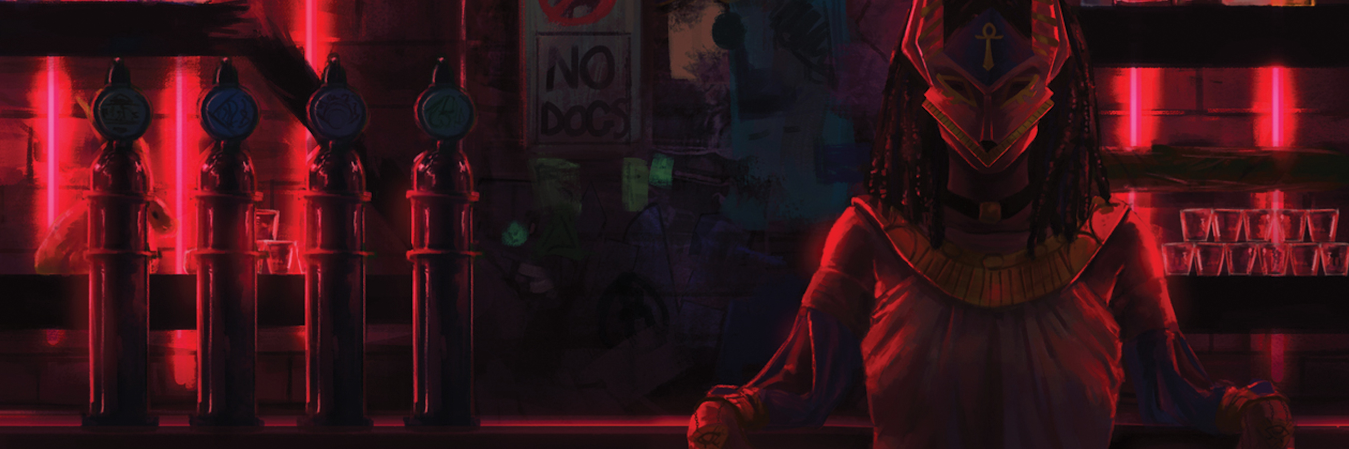
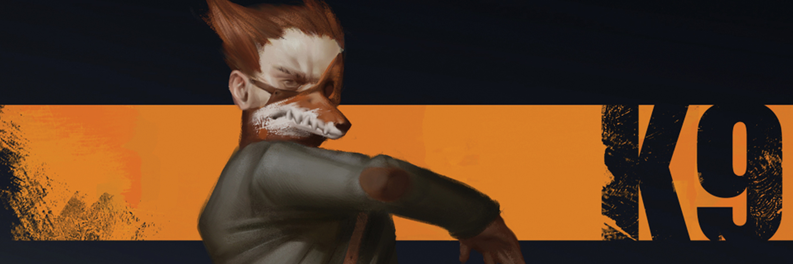
Pui: For my top picks, i want to focus on mood. The piece that Renato created, while having so little action going on, the lighting and contours of the focal character speaks volume. Good usages of neutrals and blues to off-balance the bloodlust glows and intends.
Yuushin7
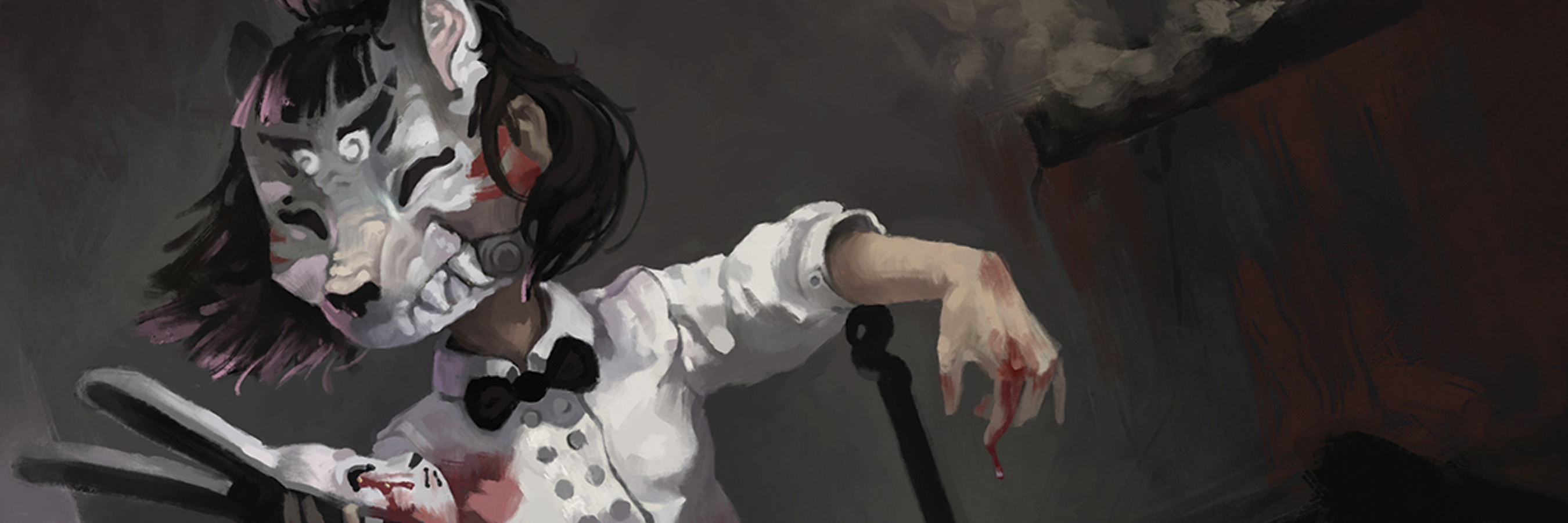
Gawki: The mask and the diagonal angle is great here. There's a sense of story happening which is great. Like a short victory! My least favorite part is probably the text? Seems to almost try to steal the show. Some parts feel very rough? The arm on the right seems a bit off. I think just because the sleeve from the shoulder to the elbow doesn't change in value. It's very flat. Liking the little drip of blood on the dumbster. Nice nice.
K Lewis
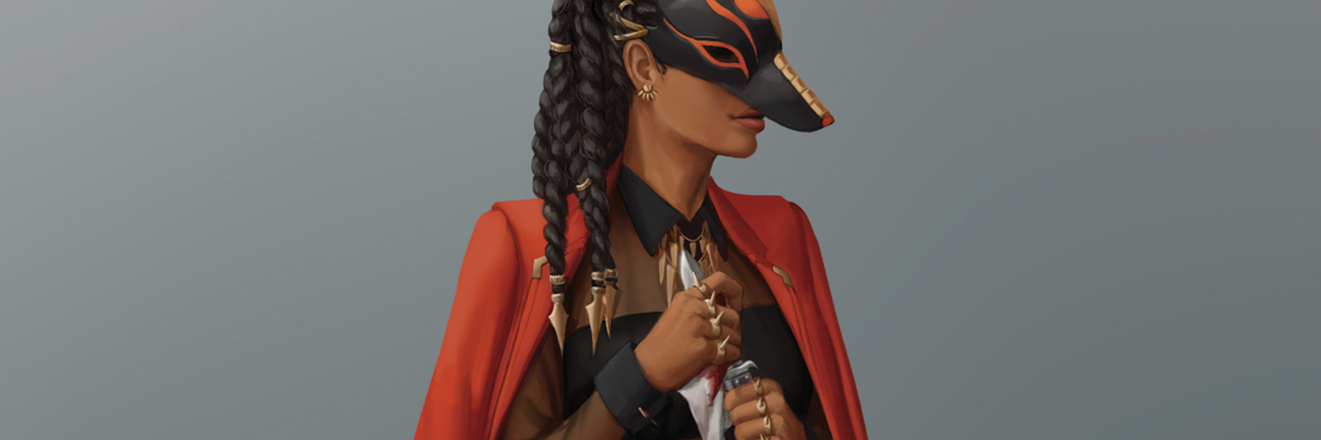
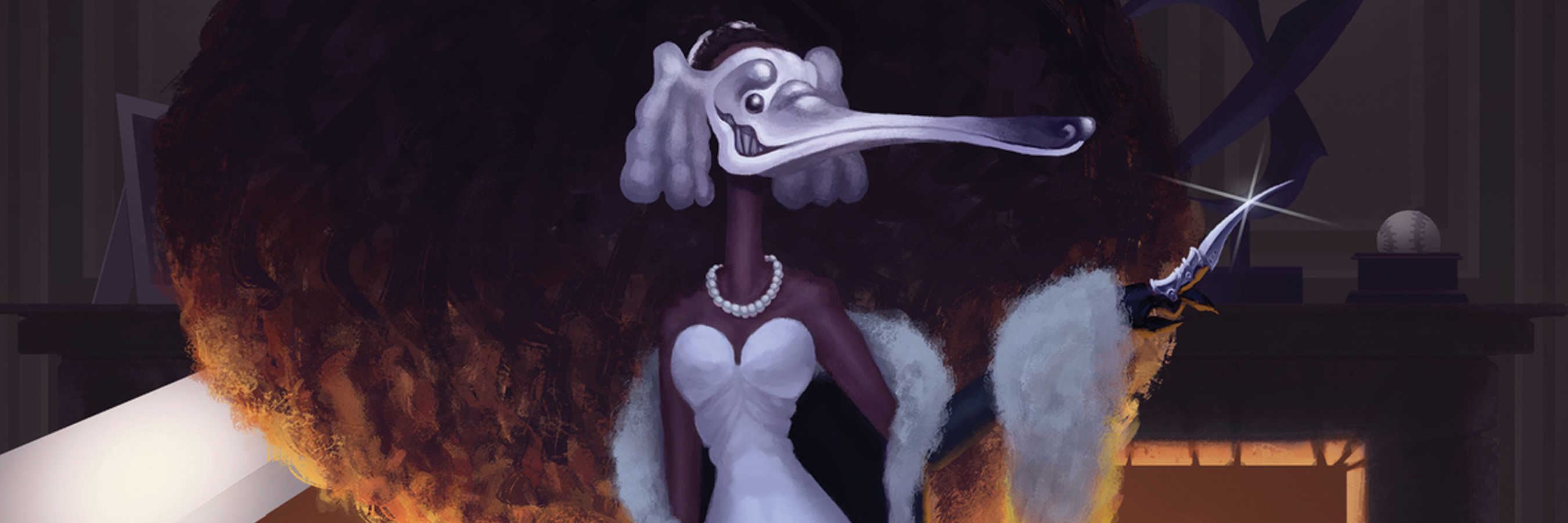
Victor: If the first place piece was my favorite take on the Poodle, this was my favorite Dobberman. I actually saw a lot of cool takes on Dobbermans but a lot of them fell into the trap of copying the animal anatomically rather than extracting what is iconic about the breed: sharp, angular, agressive features. This is the basis for the entire design and is carried out from the squared-off power-suit shoulders, to the spike tipped braids, the sharp cut in the tight skirt and finally the stilettos. There are no unnecessary folds, crinkles, or soft edges that would ruin the whole effect. The sheer shirt is at once incredibly high-class and fashionable and also a great callback to the rich colors and sheen of the doberman's fur. The palette and ratios are very well controlled, allowing for the accents of gold and red to have their full impact. Really just a stunning show of costume design, and one of the only designs that adequately captured the feeling of "high class" mentioned in the prompt! If I had to point out anything this design was lacking overall, it's putting thought into lighting (more drama, think catwalk), posture (more tight and upright! also the arms folded in make her seem small and shy), and pushing what is already working even further with shapes and silhouette. See how far you can go before it breaks, then reel it back in a bit.
Franknguyen
Gawki: Simple, but strong! Loving the softness of the values and the contrast. The dalmation is very clever and their postures and expressions are well executed! The rabbit masks are my favorite part, which is kind of too bad just because they shouldn't be the main focus. Kind of wish the there wasn't so much contract on the bottom? Just because my eyes kind of go to the top and bottom and just don't look at the rest of it. The weapons are probably my least favorite parts. They're very still and almost don't look like they belong in the image. Nice job.
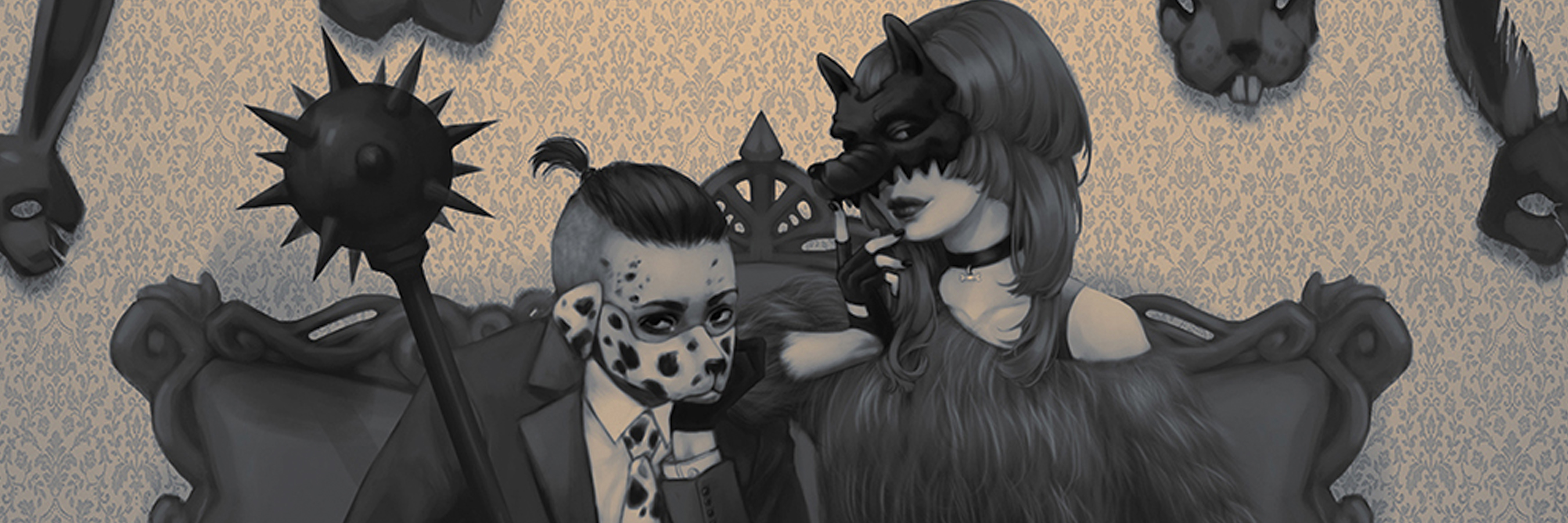
Jonathan: Like an old tabloid portrait, this painting is a great example of subtle but effective visual storytelling. The framing of the siblings is just perfect. I really get a sense of attitude from their body language, and how that contrasts with both the outrageous weapons they wield, as well as the showcase of trophies behind. They exude power and intimidation--and all they have to do is sit there.The characters are designed superbly, and I love the details that tie the K-9 concept together. Spots on the brother extending from his mask to his actual face, the sister with a collar and shaggy fur top... I really appreciate those details!A part of me wishes the painting was in low saturation color rather than pure monochrome, but the sepia hues still have a certain charm to them. Fantastic job, Frank!
Yuushin7
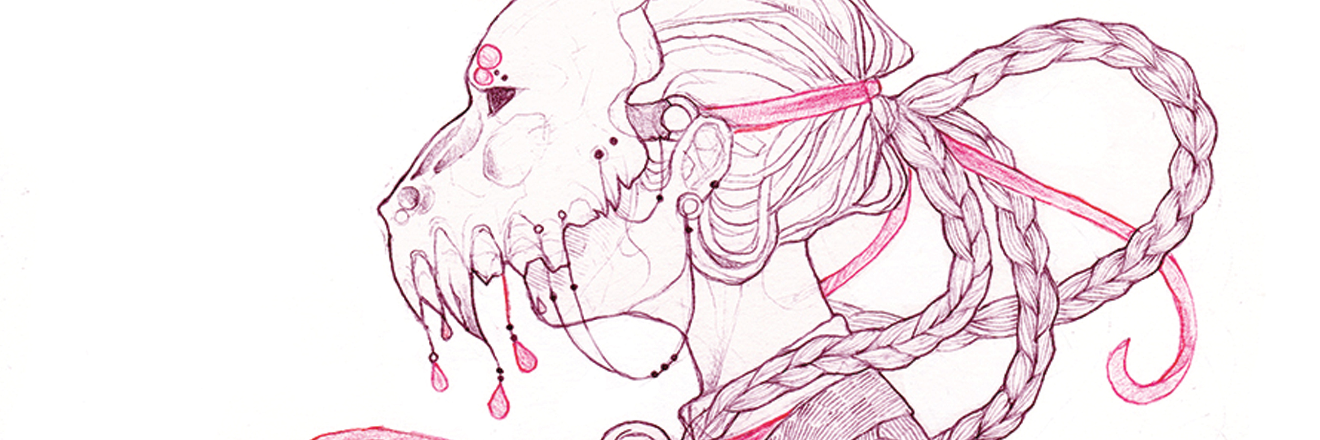
Sean: I don’t know if I’m being biased, But I love this one. The overall shape of this piece is strong! This could honestly be a manga cover or anime movie cover! It flows back and forth into itself and your eye is always moving with the flow of the lines. I believe the backbone of a drawing is the “shape”, if it’s strong, it will carry it all the way to the end. On top of the minimalist rendering and the great use of texture in the jacket and hair, this is a design you should be proud of and use as a stepping stone on your way to bettering your skills. That’s not to say there are some things that could use some attention. The bridge of the nose on the mask, the shading in that area doesn’t seem to make much sense, I can’t tell if it’s claw marks or markings, or if the nose goes into itself. I also feel the eye socket would be more rounded, shaping more of a skull of a canine, as the mask itself seems to be going back and forth between either full dog, or dog skull? Overall, the design is very strong and takes my number 1 spot, but remember to push “accuracy of object”, as with anything, especially in a minimalist style, faults will be exploited pretty quickly. Great Job, and keep it up!
Eilheart
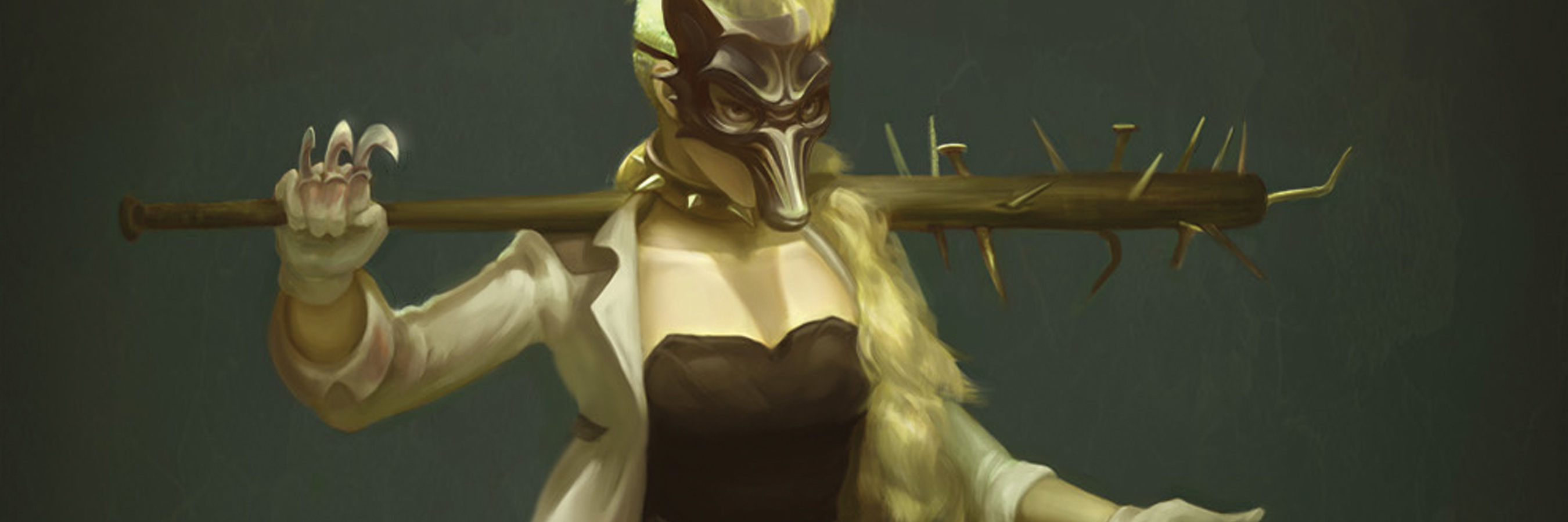
Nate: Thoroughly rendered, great proportions and costuming. The boots, in particular, are fantastic. This character was fleshed out, believable and painted with great skill.
Pete: This piece nails the gritty practical aesthetic that's so popular in TV shows right now. By using a few simple, well balanced clothing items and combining them with a couple extraordinary props, Eliheart has created a concept piece that looks like it's ready to be in a new Marvel series. The character looks cool and intimidating, but you can also imagine her being able to push up that mask and have a real personality.
Misschibiartist
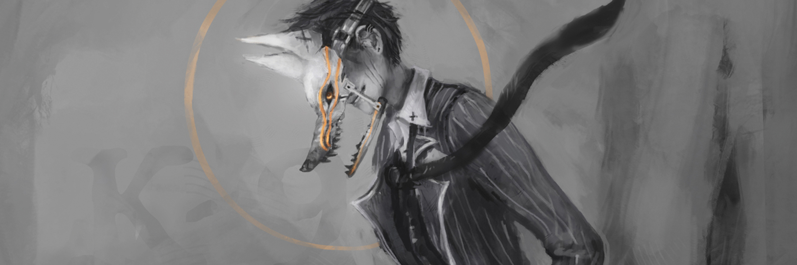
Nate: Monochromatic with a splash of gold really worked here. Contrast pushed the mood of the piece. The hint of a background was a nice touch. The painterly approach, pose and movement really sold this character. The bunny and the trap gave a hint to story, context and motive.
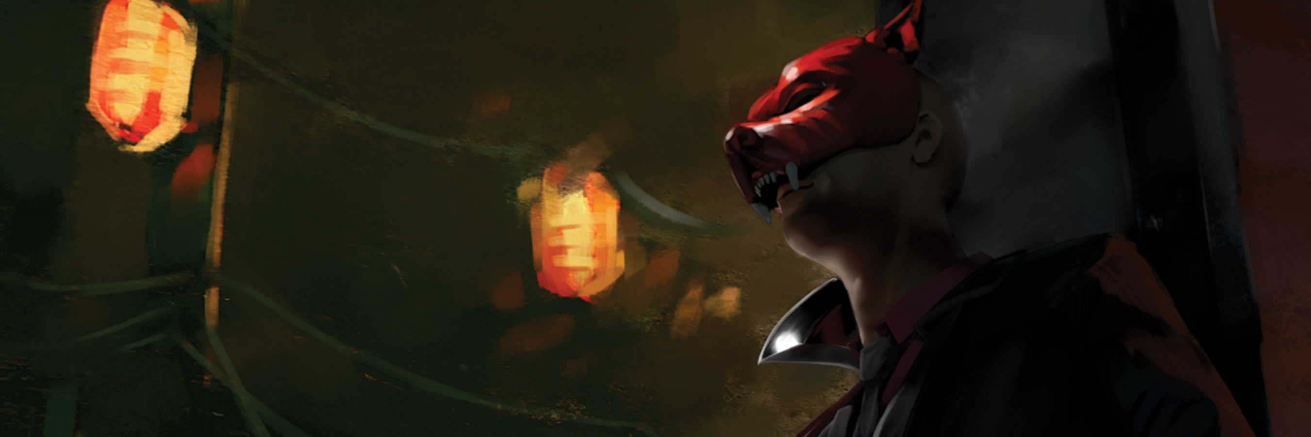
Jonathan: I was drawn to the low angle and smart use of selective color on his mask! It all fits together to create a great sense of atmosphere that feels tangible.I do feel like the values are a bit on the dark side overall, and I would have liked to see more of that bounce light adding some interest to the bottom right sector of the canvas. A hint of haziness, a faint highlight on his raised shoe... small choices like these can really push the illustration to the next level.Yet in it's current state, the painting is still superb. Keep it up, Lauren!

Thank you everyone for a great contest and all the valuable comments and critiques! There's so many good design and I had to double take when I heard I won a prize!
PS: Just wondering if anyone has received the prize email since I've only received on from Tim. Thanks!
Congratlations to the winners :) Nice contest, a lot of good entries:) It was fun and lesson for me. Until next time :D
Also as a side not when are emails going to be sent out? I'm itching to reward myself with an artpen for my intuos, I've wanted one for a while but I've been so broke haha.
I think I might actually revisit my piece and implement the things you mentioned, I do definitely agree that over all it's on the dark side
CONGRATULATIONS to top three winners! Loved the poodle design the first time I saw it~
I too would like CGcookie for holding this contest, all I really wanted out it was so see how well I'd fair against other designers, but most of all I wanted a top (professional) artist to critique my work. I mean don't get me wrong I was shooting for first place! (absolutely love amazon) but all I truly wanted was to be judged by a pro and too see what they thought so THANK YOU PETE! (my bf was excited when I told him you were MTG artist - he LOVES that game~ we have quite a few cards with your art on them!♥)
On a personal note, I'm always "afraid" to enter contest that are more ART as in I don't quite draw realism ( a lot of "real artists" do not view anime style to be art,...) So I kind of feel like the oddball/misfit in places like this *insert nervous laugh*~
Wow, what a contest! I wish I'd been able to join. There are some really awesome character designs!
Thank you CGcookie team and Tim for another great contest, and thanks to all the judges for taking the time for this! It was great fun joining in....and a big thank you to Nate Hillyer and Peter Mohrbacher for Your kind comments!
Man, these comments and critiques really mean the world to me. Thank you so much Sean for taking the time.
(Also thanks Yuushin for pointing that out, I was wondering what had happened there! Hopefully it can be edited.)
Awwww yiiiis! Didn't think honorable mentions would get comments/critiques as well, so happy :D
I can see and agree with all of your points, I just wish I had organized my time better so I could work on designs more, I had so much plans for this, but I got effed by my poor health choices and getting sick big time in the last week of September (when the biggest hustle was planned), so considering the circumstances I'm glad I even managed to get it done, didn't expect it to even get noticed among all of the creative designs that were posted (so I had to count on that presentation... which I have issues with too xD, but oh well...).
Congratz to the winners, they are well choosen. My favs amotng those and 1st and 3rd
PS: I see my name above works of two other people here btw, so you may want to change that :D Paolo Garner and Mel Padilla