The best part of running CG Cookie is seeing the incredible growth of skill within our community: as beginners become proficient in their chosen craft, the images they share with us through our Gallery are more and more impressive.
In 2016, this was especially true. And as hard as it was to pick a few images as our favorites, here they are! (Plus, a lot more in our Staff Picks section in the Gallery).
"Out of the Box - Creature 01" by Pieriko
Kent Trammell says:"This is such a fun, authentic representation of the Creature Box art as well as the style in general. The modeling/sculpting is top-notch as is the texture, material, and lighting. It's entirely appealing to me; a showpiece in my book. In addition to being a beautiful model to admire, Pieriko also shares a couple timelapses of his workflow. He also prepped the model for viewing online through Sketchfab: that's what I call a thorough presentation! One that does his model justice." Visit Pierrick Picaut's website, GumRoad page and his full environment course on the Blender Market, "The Cliff Tower"
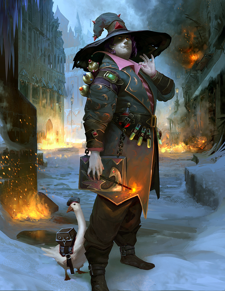
"Evil Goose With His Wizard" by Nikolai Lebedev
Tim von Rueden says:The piece won our Halloween Concept Art contest. Nikolai did an excellent job of conveying mood, lighting, and a sense of character in just one image. He created a believably rendered material and the fabric really is a high point in this piece. The muted colors add a nice touch and reflect the background quite nicely. Check out Nikolai's ArtStation profile
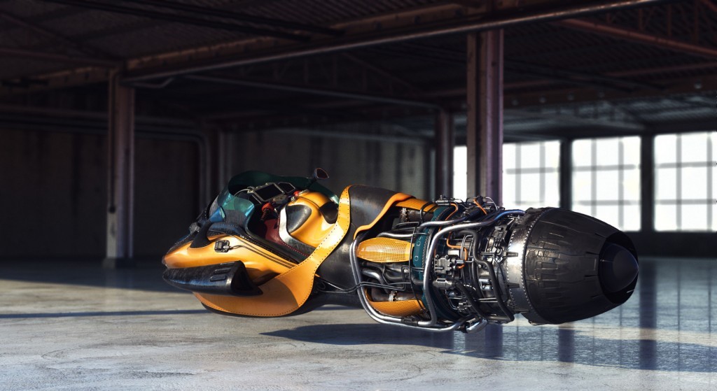
"Racing Hoverbike" by Piotr Bieryt
Kent Trammell says:This thoroughly impressive model and render is the kind of thing that made the 14-yr-old version of myself say, 'I have to learn to do this stuff!' It's got everything a CG junkie craves: A super-detailed model, fantasy design, metallic & car paint materials, and realistic lighting. While I know this thing doesn't exist, it's still entirely believable. Which is one of the great promises CG offers us. What's not to love?! Visit Piotr's ArtStation profile
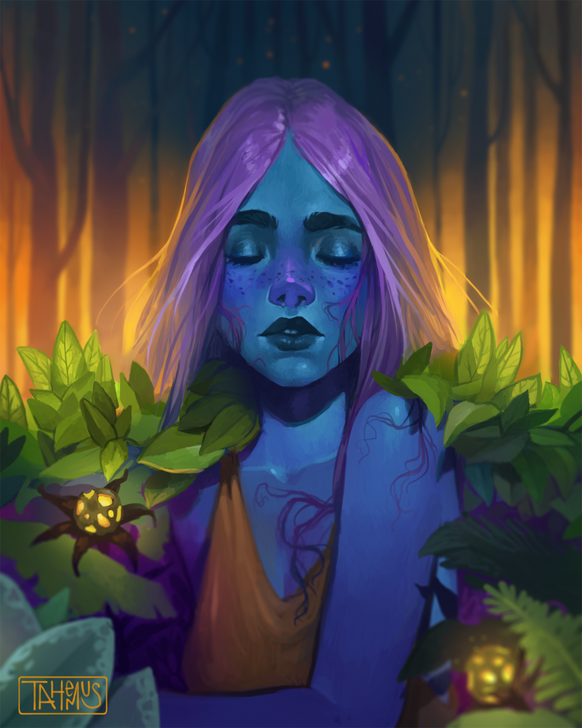
"Tetra" by Thomas Giebler
Tim von Rueden says: I always applaud artists for being bold with their color choices while still maintaining a sense of depth and believability. Thomas continues to explore that while creating such a fantastical mood that is hard not to notice. I love the shading and confident brush strokes to compliment such a scene that demands attention. I want to see more color exploration like this from artists - and this piece stands out to me as an example of one that works! Thomas aka Tahemus on Instagram
"Paradigm" by Reynante Martinez
Kent Trammell says: Reynante has been churning out awesome renders for a while now and this is my favorite of his 2016 pieces. He's one of those rare cream-of-the-crop CG artists with conviction and intention in each of his pieces. So often, CG artwork - mine included - is more about the technical achievement than the expression and achieving realism or a certain style becomes the whole point. But Reynante seems to use the technical achievement merely as a vehicle to get to the expression. This piece is a great example where good models, finely-tuned textures/materials, and dramatic lighting combine to express a powerful message. Be sure to check out Reynante's other impressive pieces in his gallery. Visit Reynante's portfolio
[Bonus] "Danbo in Autumn" by Tomatoes
Kent Trammell says:Though this is a little older than 2016, I couldn't leave it out: I absolutely love this render for two reasons. Reason number one is it's simplicity: it's common for critics to demand extreme levels of detail from a 3D render to make it exceptional. But it's not the truth - and this render proves it. It's so simple in the model, pose, and composition and it all compliments one another. The character is simple, which reflects the pose, an awe of autumn leaves, all wrapped up in the simplicity of a centered focal point for composition. Less is more in this case. The other thing that makes this piece so special is the lighting and treatment: the extreme depth of field makes for a wonderful backdrop for the character, making it almost impossible to focus anywhere else. It also makes the character feel very small, which to me again accents the simplicity of what is happening. And the yellow-to-pink-to-purple tones are so warm and perfect for an autumn feel.


Really impressive collection—there’s a great mix of styles and techniques that still feel inspiring even years later. Some of those environment pieces and lighting setups are especially striking. Anyone experimenting with compositing or digital art might also find useful resources like https://marketplace.skylum.com/backgrounds which offers a variety of high-quality backgrounds that can help achieve similar polished results.
Thank you so much and stay inspired! Looking forward to more of your awesome work and contest submissions in 2017 (I loved your unemployed grim reapers!).
I love every one of these. Reading this blog post just now and seeing all that amazing work has been a great way to get inspired for the coming year. Well done to all the artists, both featured on this page, and also to those that have filled the gallery and forum with great work throughout the year. And thankyou to the CGC crew for their hard work that has made it all possible :)
I agree. It's a privilege! Thanks for being a part.
Yes! There is a lot of talent in the CGC community. I too look very forward what 2017 has in store.
Hahaha LOVE the Star Wars metaphor! You're spot on with this analysis.
Yes these are great! So wonderful to be a part of a living community that allows constant learning and improvement and encouragement!
I absolutely loved the last one, the Danbo in Autumn. It takes all the stages of the CGI pipeline we tend to give a hardcore focus on and puts them to shame; composition triumphs and reigns above everything else in that image.
I Picture it this way: modeling and UV Unwrapping are like Darth Vader. Compositing and Composition are like Obi-Wan, and when the two of them meet the circle is now complete. And the one that looks like is no big deal and swings like and old man... if you strike him down, he can later come and haunt you because you failed to realize that he was more powerful than you could possibly imagine.
I agree, these are fantastic. There is a lot of talent in the CG Cookie/Blender Community. I can't wait to see what 2017 gives us.